
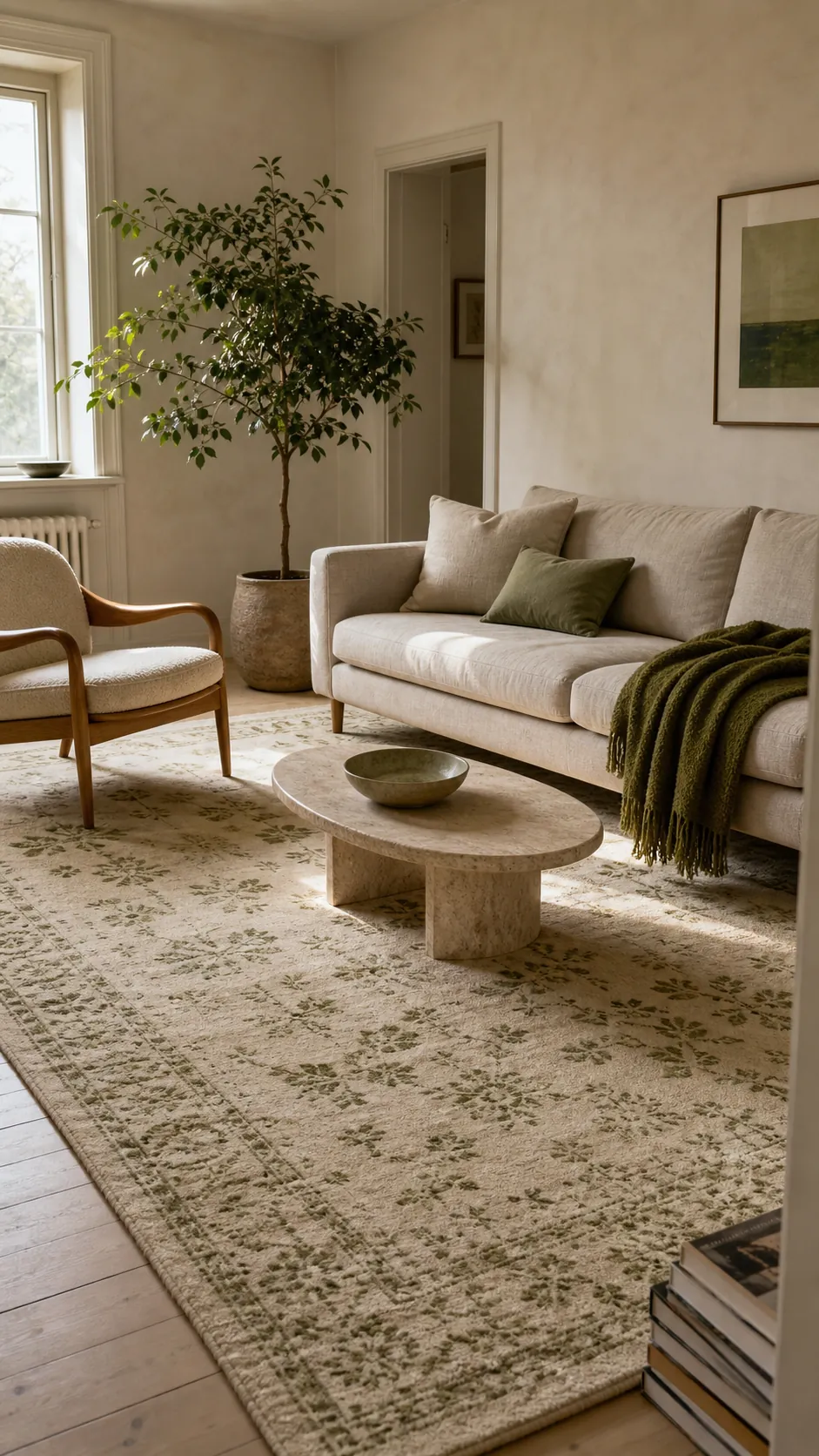
A beige, cream, and green living room rug can make a space feel calm without making it fade into one long stretch of oatmeal. The difference is rarely the color name on the product page. It is the contrast, undertone, scale, and placement you see once the rug is under your actual furniture.
That is why buying “a neutral rug with a little green” can still go wrong. A pale rug may disappear against a beige sofa, a cool cream may turn gray beside warm wood, and a beautiful pattern may look like a bath mat if it stops short of the seating. These ten ideas show how to make the palette work in real rooms, including busy homes where softness must survive shoes, crumbs, pets, and daily vacuuming.
Choose an Oatmeal Field With a Sage Border
Start with the quietest version of the palette: an oatmeal or flax-colored center framed by a slim sage border. The center reads as cream from a distance, while the border gives the seating area a clear edge. This is especially useful in an open-plan room where a neutral living room needs definition without a high-contrast pattern.
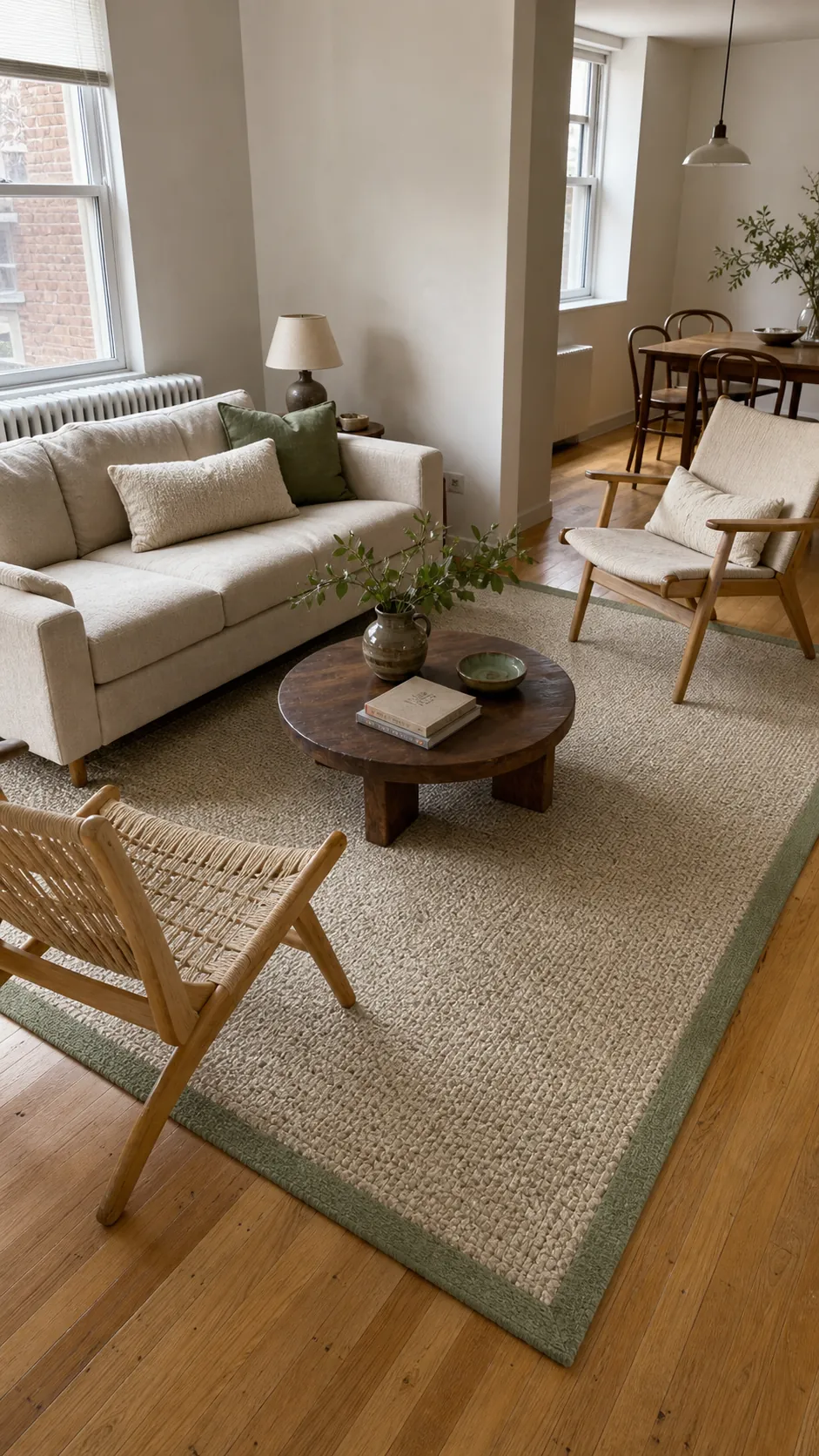
Let the rug extend beyond both ends of the sofa and place at least the front legs of every main seat on it. That connection matters more than chasing a perfect shade match. Repeat the sage only two or three times—a cushion, a glazed bowl, or a leafy branch—so the border feels intentional rather than isolated.
Layer a Small Olive Vintage Rug Over Natural Jute
Layering solves two common problems at once: a vintage-style olive rug may be too small or expensive at room-filling scale, while a large jute rug can feel flat on its own. Use the jute as the properly sized foundation, then center a smaller olive, cream, and faded tan rug over the conversation zone.
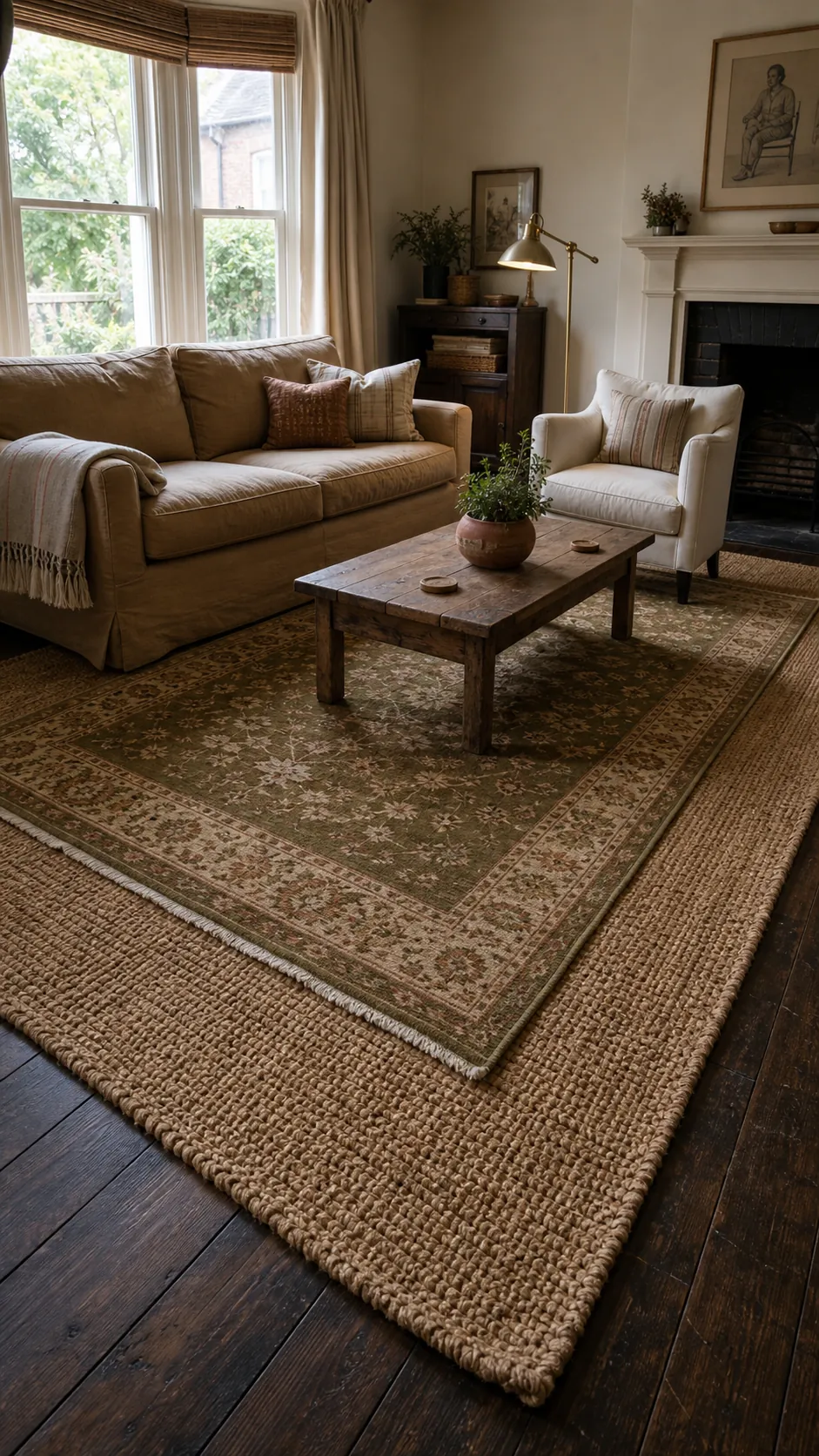
Keep the top rug large enough to sit under the coffee table with breathing room around it. A low pile prevents the layers from becoming a trip hazard, and a rug pad between them reduces rippling. This combination brings age and character to new upholstery without making the whole room look themed.
Use a Cream Grid With Moss Green Lines
A broken grid is a clean way to add green decor to a modern living room. Look for irregular moss lines on a warm cream ground rather than a precise black-and-white check. The softer geometry adds structure while keeping the room relaxed, and the green lines can bridge plants, painted cabinetry, or an outdoor view.
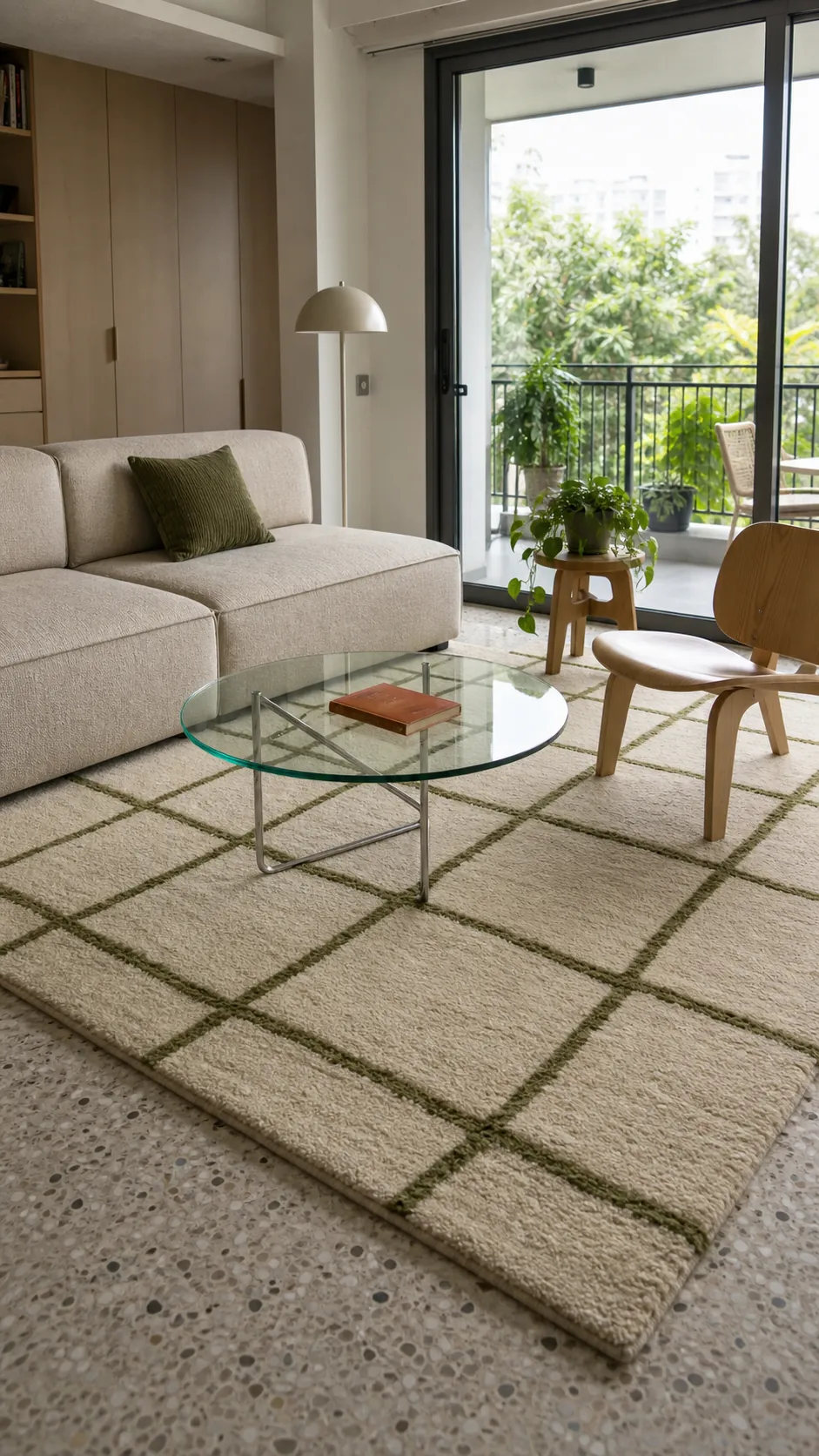
Choose a grid scaled to the furniture. Tiny repeats can look busy beneath a large sectional, while huge squares may make a compact room feel chopped up. A medium repeat that remains visible around the coffee table gives the eye enough pattern to register without competing with cushions or curtains.
Anchor Beige Seating With a Deep Forest Rug
If the room already contains a beige sofa, pale walls, and light wood, another cream rug may erase the furniture instead of grounding it. A deep forest green rug creates the missing contrast. The strongest result comes from a heathered or subtly striated surface rather than a perfectly flat block of color.
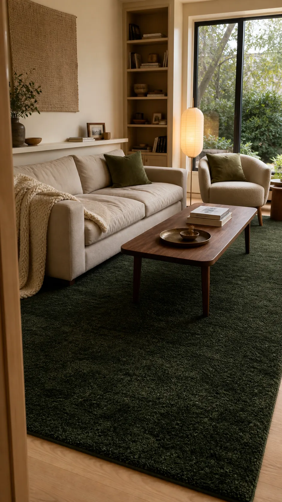
Dark rugs reveal lint and pale pet hair, so choose a mottled weave if low-maintenance living matters. Keep cream present above floor level through throws and lampshades. The visual weight then stays balanced: dark at the base, mid-tone through the sofa, and light near the upper half of the room.
Try a Botanical Rug With an Open Cream Ground
Botanical does not have to mean a dense jungle print. A rug with widely spaced olive leaves or abstract stems on an open cream field introduces movement while preserving calm. It works particularly well when the rest of the room uses solid upholstery and simple furniture silhouettes.
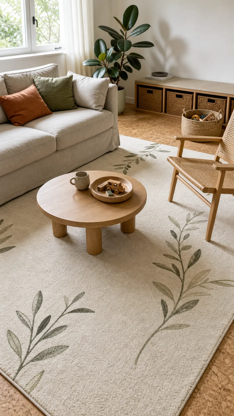
Let the botanical motif be the room’s main organic pattern. Real plants can still appear, but vary their leaf shapes and keep planters understated. If children or pets use the room, a washable low-pile construction makes a pale background more realistic. Rotate it periodically so sun exposure and foot traffic age the surface evenly.
Soften the Room With a Tonal Cream Shag
For a room that needs softness more than pattern, use a cream rug with two pile heights. The subtle relief catches side light and creates a design without introducing another print. Pair it with muted green cushions or a moss throw, allowing texture—not a busy motif—to carry the scheme.
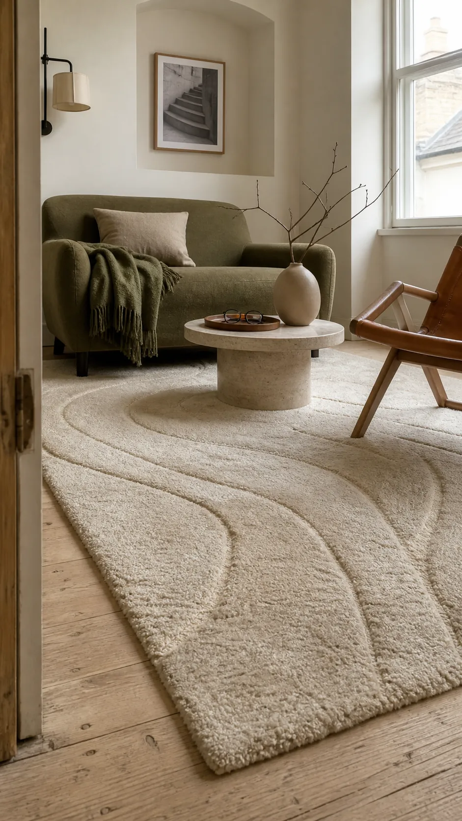
This approach is best in lower-traffic spaces or shoe-free homes. Deep shag around dining edges and door paths quickly collects debris and can impede furniture. A medium pile with a carved pattern offers much of the softness with easier vacuuming. Always check that doors and floor vents remain clear.
Pick a Muted Stripe to Widen a Narrow Layout
Broad bands of beige, cream, and desaturated green can visually widen a narrow living room when they run across its short dimension. Choose softly blended stripes instead of crisp nautical bands. The slight variation hides wear and lets the rug work with both traditional and contemporary furniture.
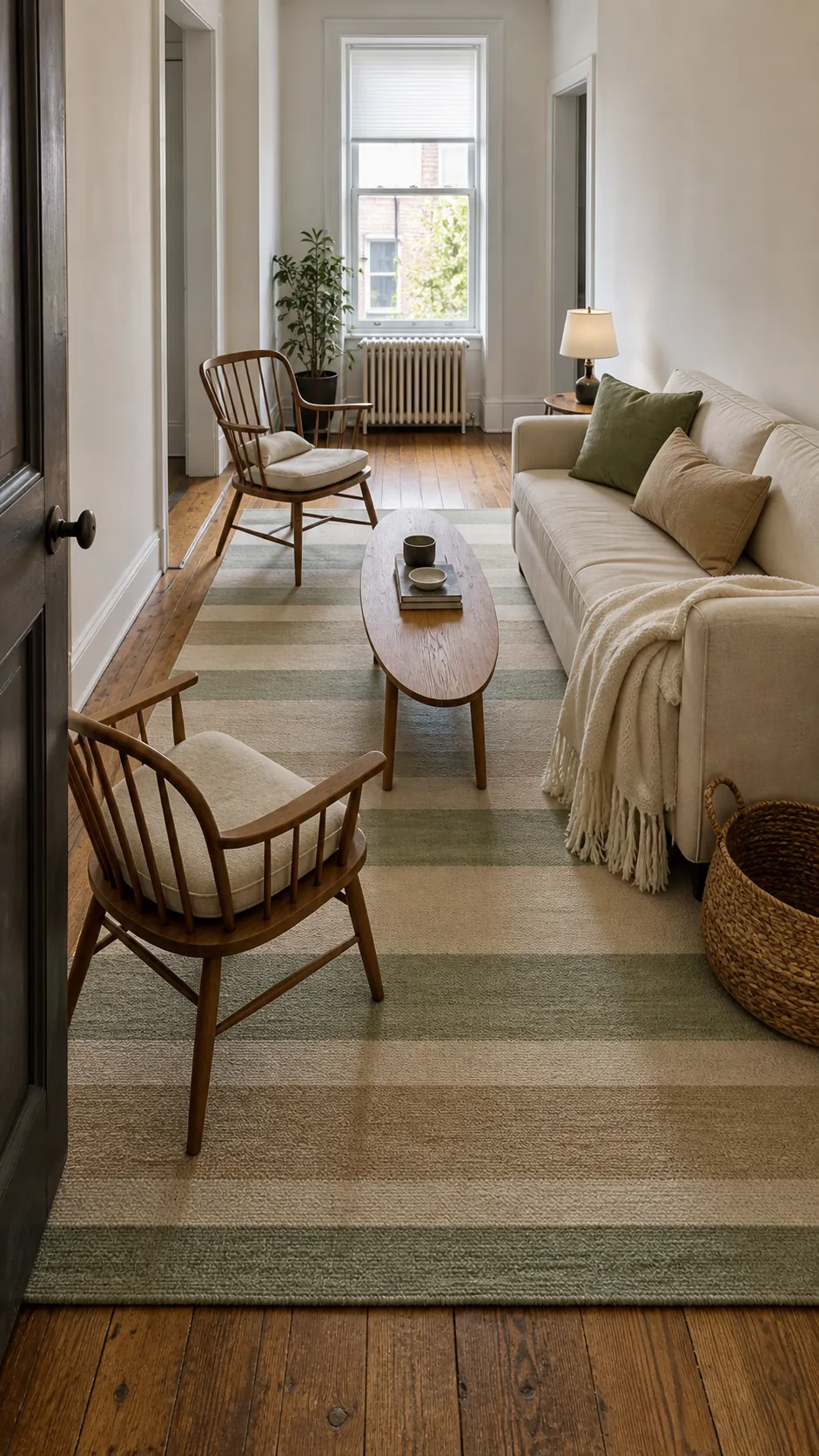
Orient the stripe deliberately before moving furniture back into place. The rug should still relate to the seating arrangement rather than simply follow the longest wall. If the room contains striped curtains or cushions, switch those textiles to solids or tiny-scale patterns so the directions do not fight.
Bring in Checks Through a Washable Flatweave
A soft checkerboard in sage and biscuit beige gives a casual room more personality than a plain neutral rug. A flatweave construction keeps the pattern practical beneath a frequently moved coffee table and is easier to clean than a thick pile. Look for softened edges and slightly varied yarn color so it does not resemble a hard tile floor.
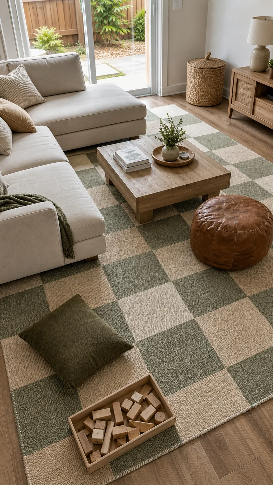
Checks already make a confident statement, so keep nearby upholstery mostly solid. Pull one square’s beige into the sofa and one green into a side chair or throw. A nonslip pad is essential because lightweight flatweaves can creep, bunch, and lift at corners in active family spaces.
Select a Distressed Medallion With Celadon Notes
A distressed medallion rug is useful when the room mixes old and new pieces. Choose one with a warm beige ground, cream worn areas, and restrained celadon details. Those faded green notes add depth without dominating, while the aged pattern makes normal day-to-day wear less obvious.
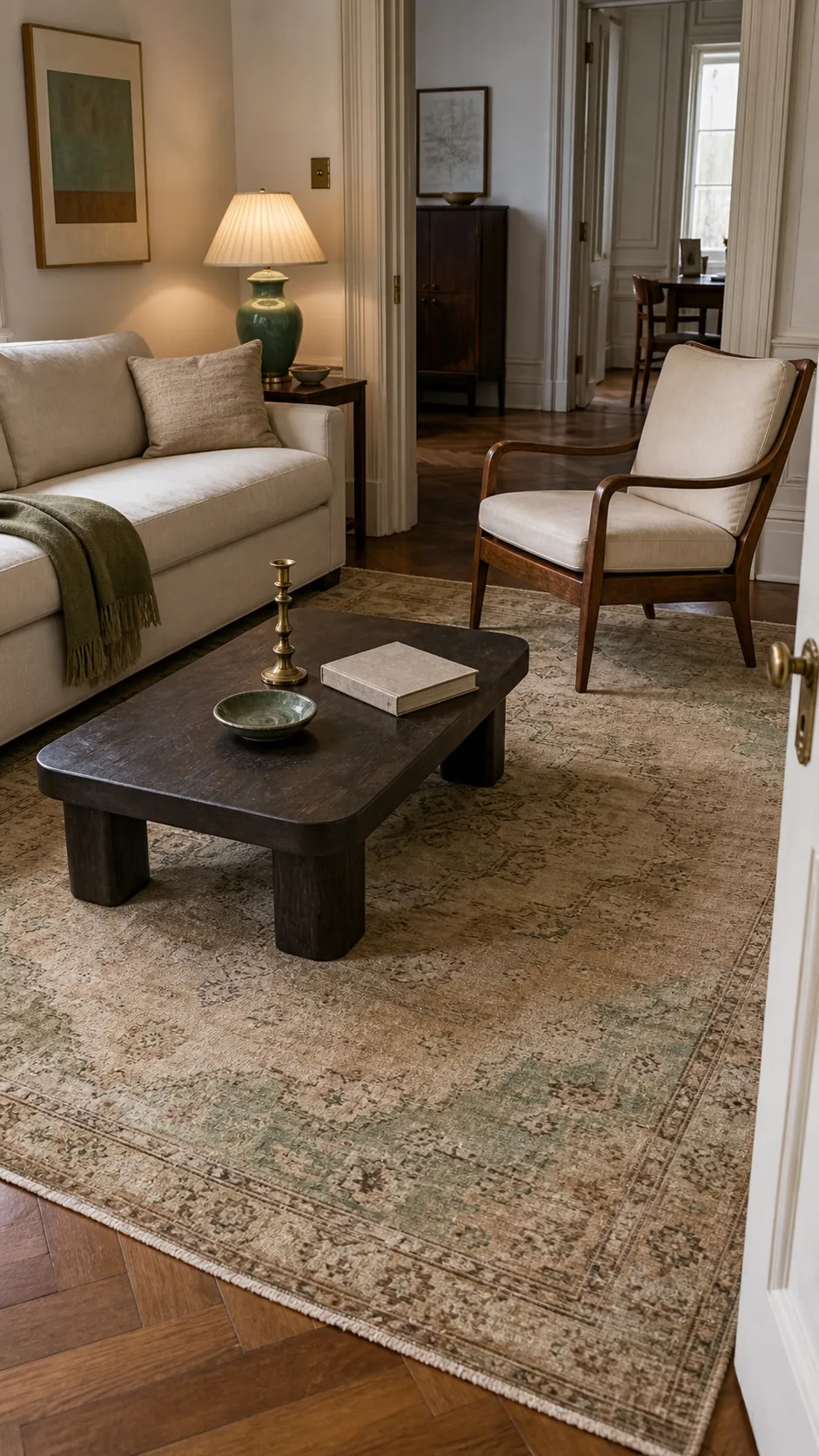
Do not try to match every faded color elsewhere. Repeat celadon once, perhaps in a ceramic lamp, and allow wood, linen, and aged brass to support the rug’s warmth. Center the medallion on the seating group rather than the room itself when the architecture and furniture are not perfectly symmetrical.
Finish With a Green Rug Framed in Cream
A green rug with a broad cream frame gives the strongest finish of the ten ideas. The green center can be olive, moss, or muted eucalyptus, while the border creates a clean pause before the surrounding floor. It is a smart choice when you want color underfoot but still need the rug to connect with cream curtains and beige seating.
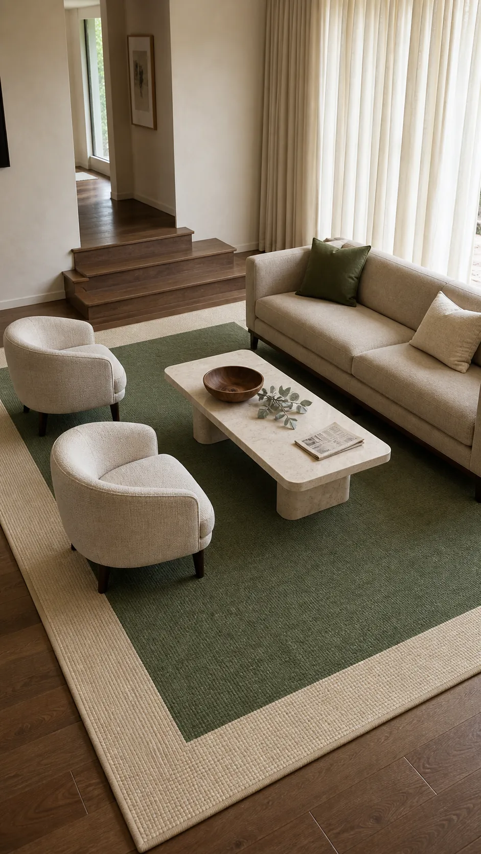
Measure from the furniture group, not just wall to wall, and mark the proposed outline with painter’s tape before ordering. The cream frame should remain visible around the coffee table and in front of the sofa, while the front legs of the main seats sit securely inside the rug. When scale, undertone, and daily care all fit the room, this restrained palette feels layered rather than “sad beige.”