Dark green can make a room feel grounded and expensive, but the wrong supporting colours can leave it heavy or oddly sharp. The safest approach is to balance its depth with a lighter value, then add one warmer accent that keeps the scheme inviting. Judge every pairing beside the actual green and in the room’s daylight, because a forest tone can shift toward blue, olive, or almost black as the light changes.
Warm Ivory and Oatmeal
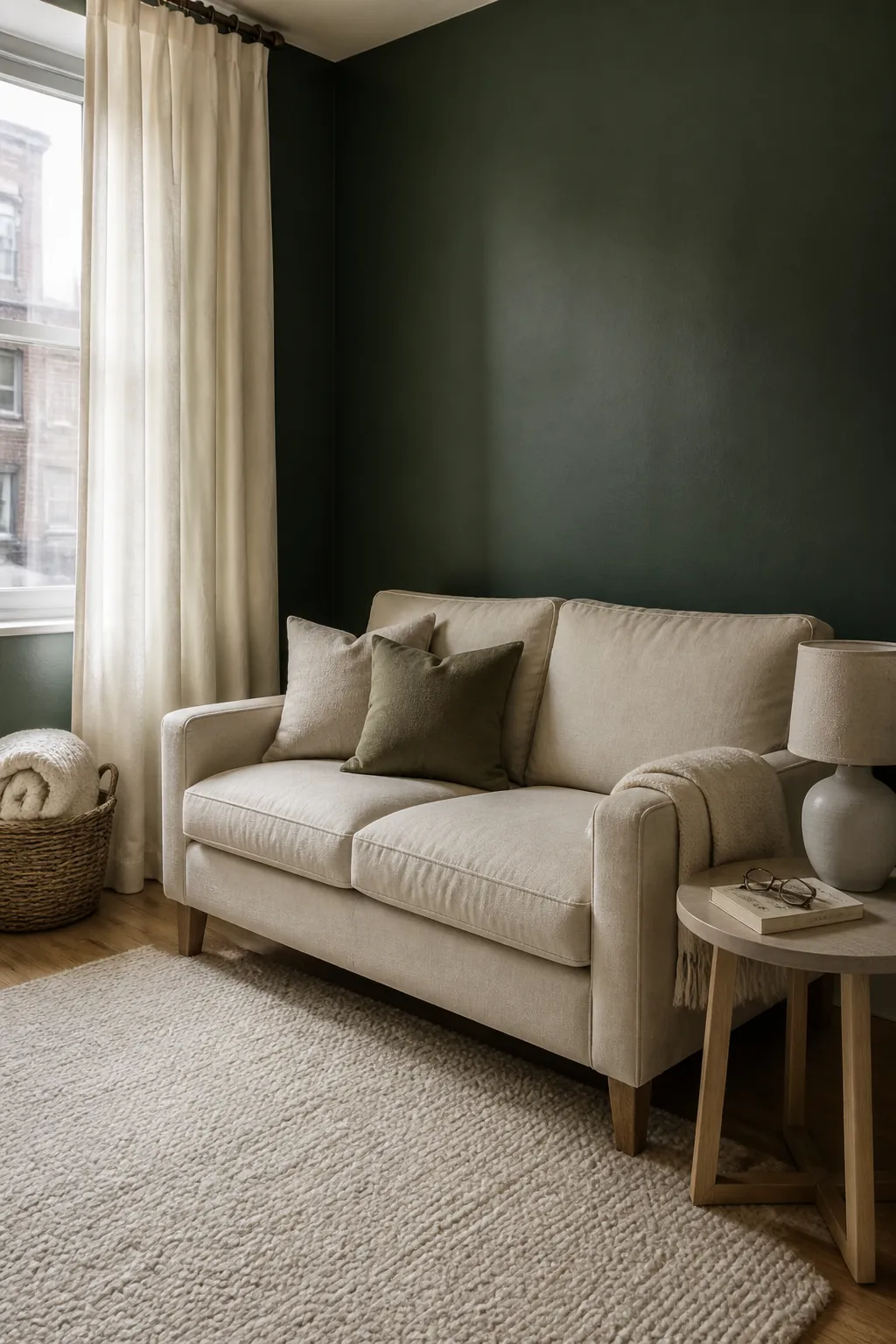
Warm ivory is the easiest answer when dark green walls or upholstery make a room feel enclosed. It gives curtains, ceilings, rugs, and larger seating enough brightness without the glare that pure white can create. Oatmeal linen and creamy wool also soften the visual boundary between pale surfaces and deep paint. Choose a cream with a beige or gentle stone undertone so the contrast looks calm rather than clinical.
Natural Oak and Camel
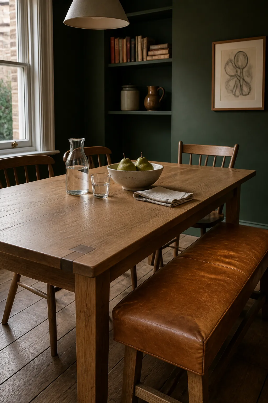
Natural oak brings warmth to dark green without introducing another dominant hue. Camel leather, woven baskets, and honey toned timber make a dark green interior colour palette feel relaxed and lived in. These materials work especially well when the green has an earthy or olive undertone. Repeat the warm brown in two or three places, such as a chair, a frame, and a lamp base, to make the combination feel intentional.
Dusty Pink and Muted Blush
Muted pink sits near green’s complementary family, so it provides visible contrast while remaining gentle. A dusty blush bedspread, faded rose cushion, or pink veined stone can lift a dark green bedroom colour scheme without making it sugary. This pairing is most convincing when both colours share a softened, slightly grey character. Keep the pink to textiles and one solid accent if you want the green to remain the clear focal colour.
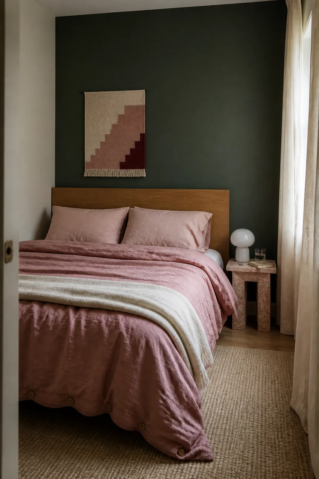
Terracotta and Soft Rust
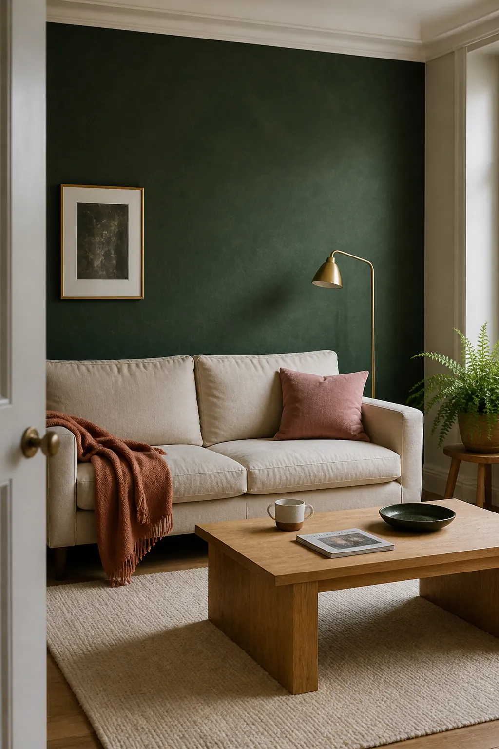
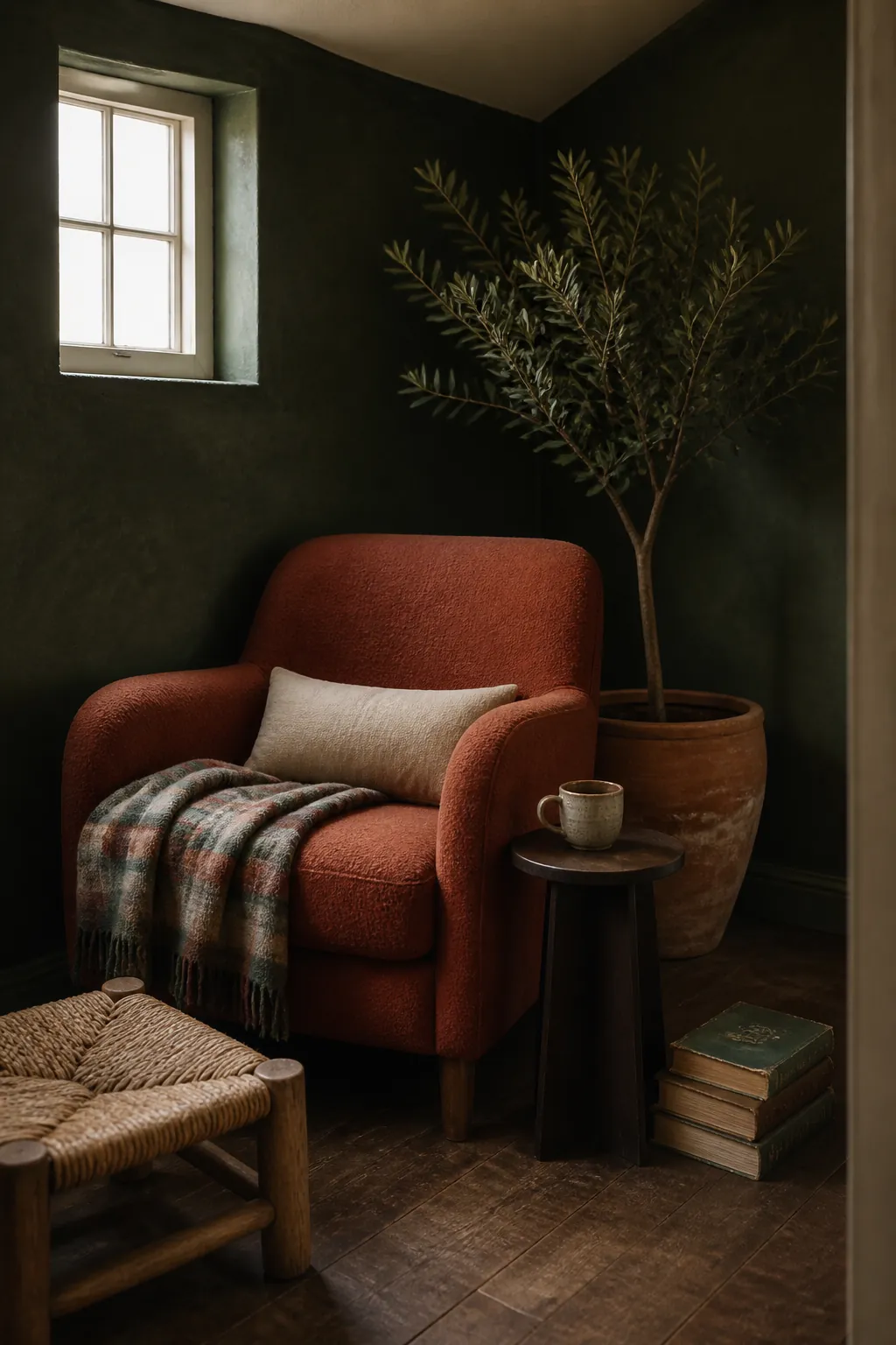
Terracotta gives dark green an energetic, earthy counterpoint that suits rooms with warm daylight. Use it through clay pots, rust coloured cushions, a patterned rug, or one compact occasional chair. The orange warmth prevents the green from reading cold, while the green stops the terracotta from feeling overly desert inspired. Let one colour lead and use the other as an accent, since equal amounts can make a modest room feel busy.
Dusty Blue
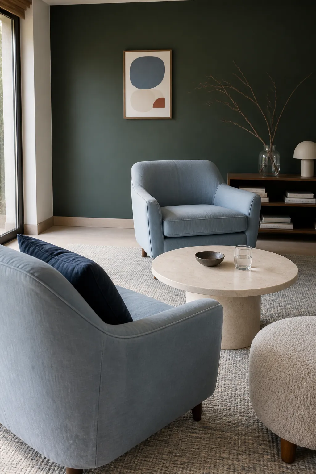
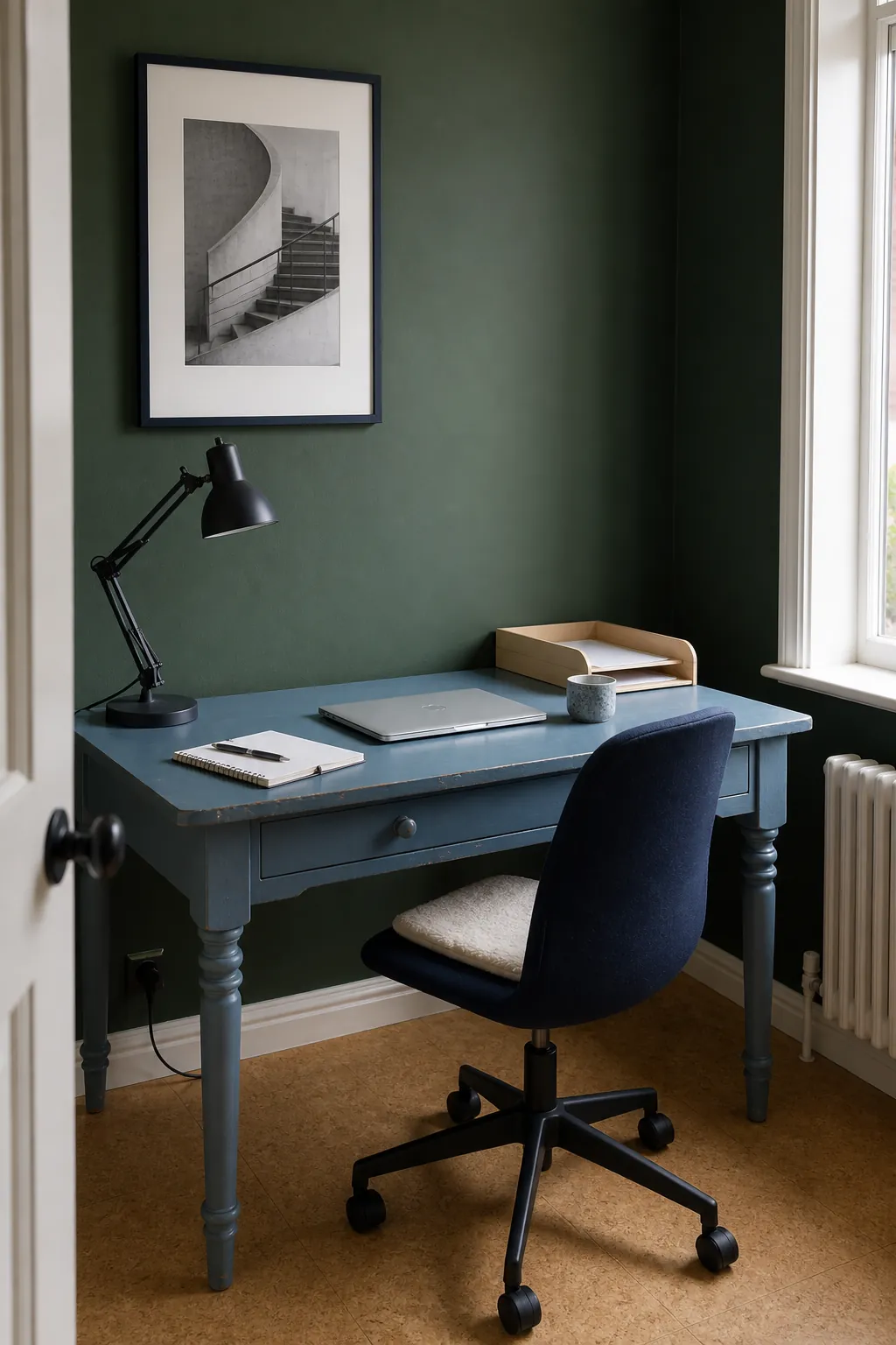
Dusty blue and dark green form a neighbouring colour combination that feels quiet and cohesive. The lighter blue adds separation in a smaller room without creating the sharp contrast of white. Woven upholstery and washed cotton are especially useful because their texture stops the colours from reading as one flat surface. Check the undertones before buying, since a very yellow green beside a crisp violet blue can look disconnected.
Aged Brass and Soft Black
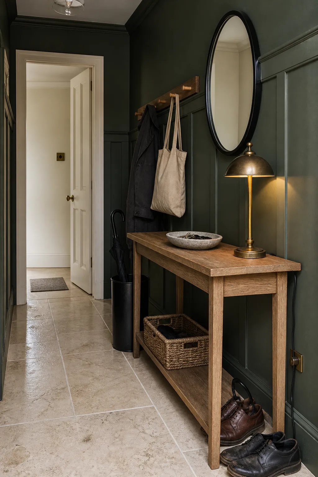
Aged brass adds a small flash of warmth that makes dark green accent decor feel polished. Soft black can then outline the scheme through thin frames, hardware, or a lamp without competing with the main colour. This combination works best when pale stone, cream fabric, or light timber still occupies a meaningful part of the room. Use metal and black as punctuation rather than background colours, and the finished palette will feel layered instead of severe.
Deep Navy
Deep navy gives dark green a layered, enveloping look when the room already has reliable daylight. Pale stone, cream boucle, or a light rug should separate the two deep colours so their shapes remain legible. A navy cushion or compact chair is usually enough to establish the connection without turning the whole room dark. Use navy in one concentrated area, then let lighter materials carry the remaining visual weight.