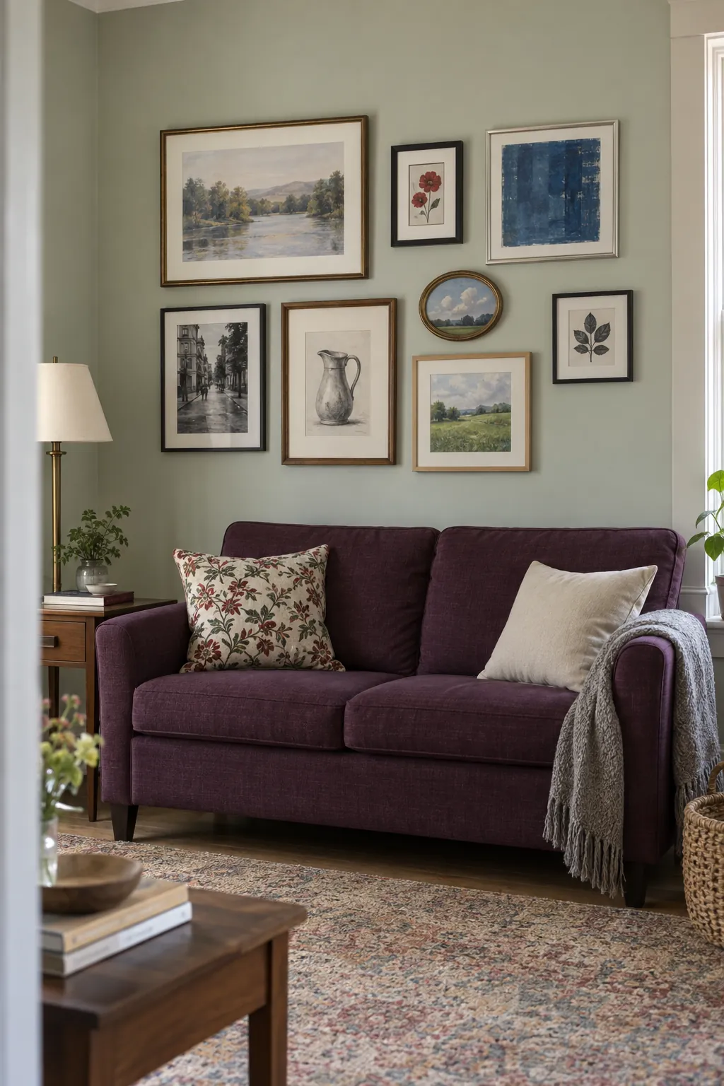
The pictures you love rarely arrive in identical frames. A thin metal border might sit beside carved wood, while a tiny print needs far more breathing room than a large photograph. Give the collection a few deliberate relationships and the differences become its strongest feature.
Limit the frame palette to three finishes
A wall feels collected when different frames still share a small material vocabulary. Try black, walnut, and aged brass, then choose pieces whose proportions suit the individual pictures. Repeat each finish in more than one part of the group so no frame looks like an accidental leftover. Set an especially shiny piece aside if it overwhelms the quieter ones.
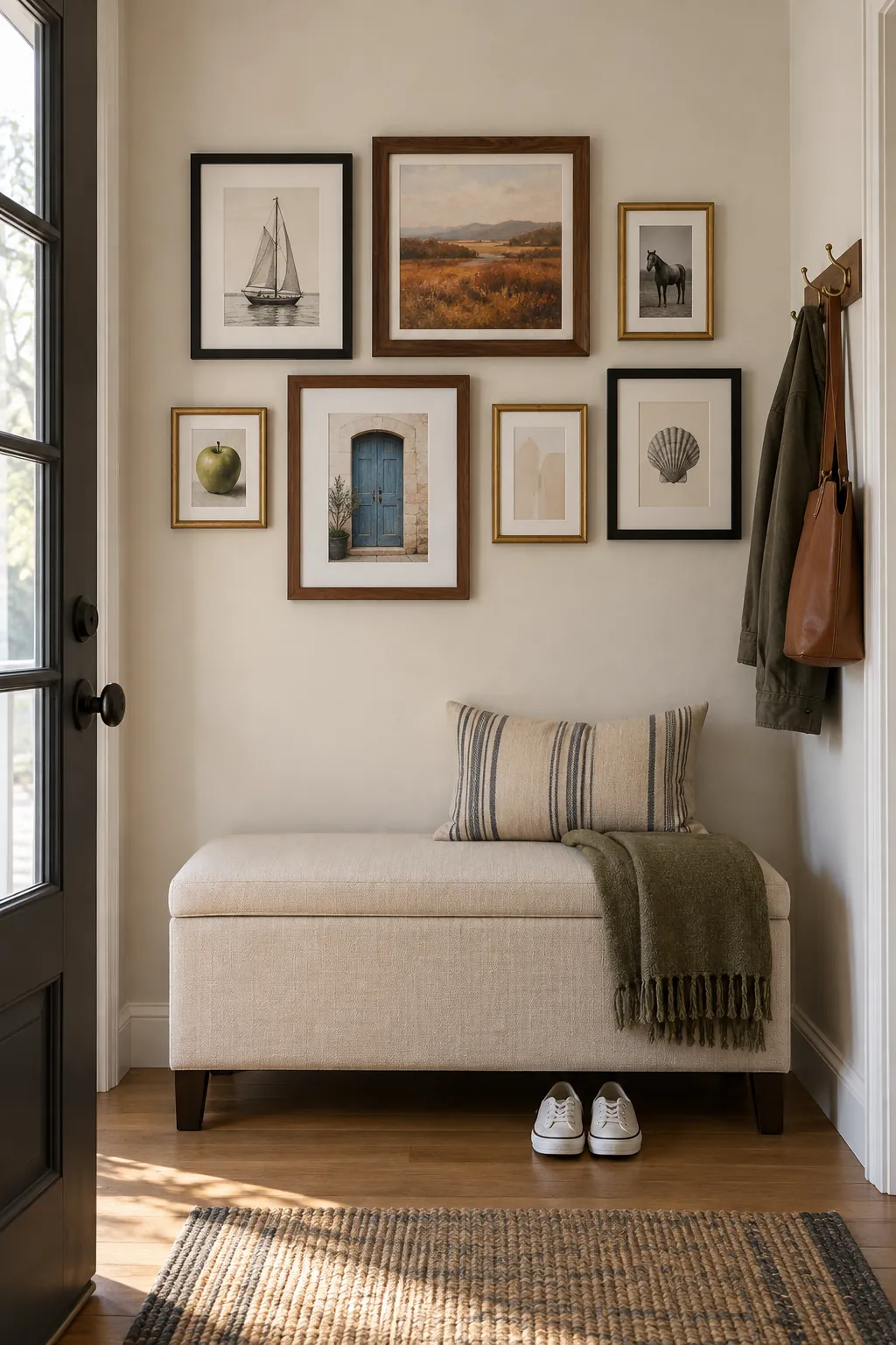
Unify the collection with pale mats
Matching mat colors can settle a wall whose frames vary dramatically in thickness. Choose a pale shade that works with the paper rather than mixing bright white and creamy borders without intention. The openings can differ because a large photograph and a tiny drawing need different amounts of surrounding space. Ask for archival materials where the artwork deserves long term protection. Judge the mats beside one another in the room’s daylight before ordering the full set.
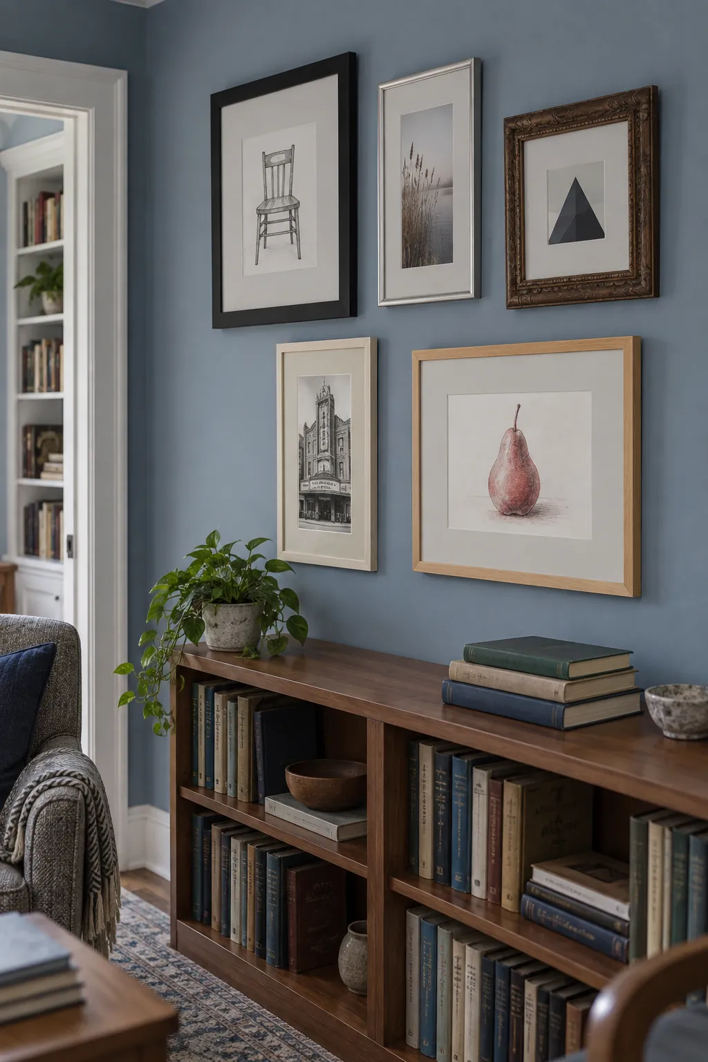
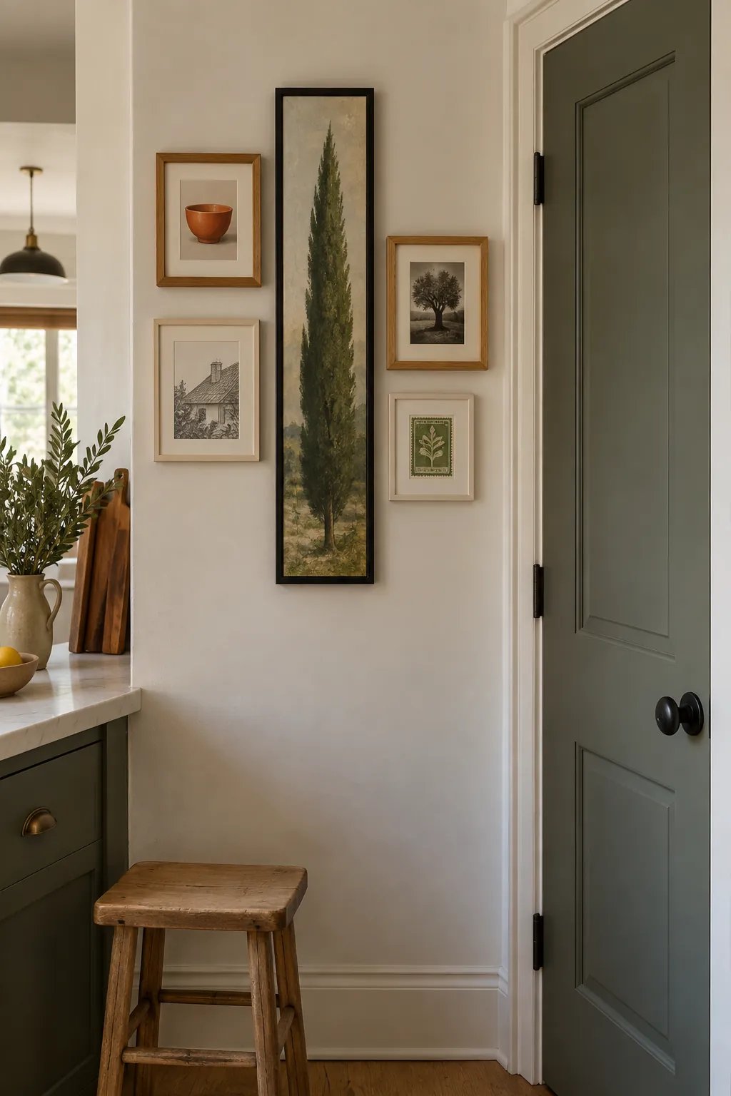
Build a vertical spine through the middle
A tall central frame can organize a narrow gallery without forcing every edge into alignment. Place smaller pieces on both sides of its height, keeping the arrangement close enough to read as a single unit. This vertical gallery wall works especially well where a broad horizontal group would run into a door casing.
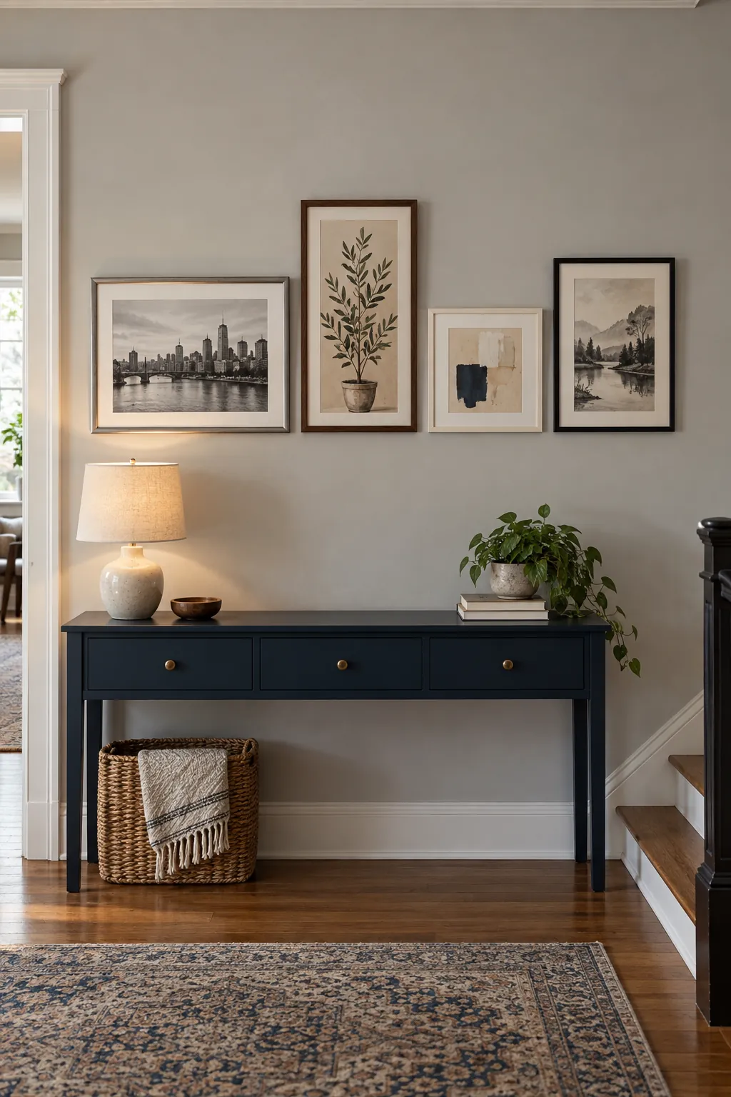
Align the lower edges above a console
A shared bottom line gives mixed sizes a tidy relationship to furniture. Mark the intended line above the console, then position each frame so its bottom edge meets it. The tops can rise and fall, creating movement without a disorderly base.
Choose the gap above the furniture with the tallest object on the console in place. A lamp should not cover the artwork that made you choose the layout. Look from the hallway approach to confirm that the group still feels attached to the console.
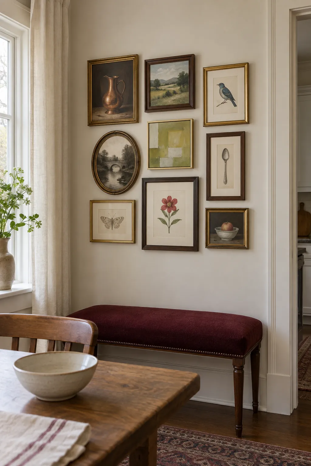
Keep a salon cluster compact
A salon style arrangement gets its character from a close conversation between unlike pictures. Gather small paintings, drawings, and photographs around one or two stronger pieces rather than distributing them evenly across an oversized wall. Leave clear gaps that let every frame profile register. If the group feels heavy, remove one dark picture before expanding all the gaps at once.
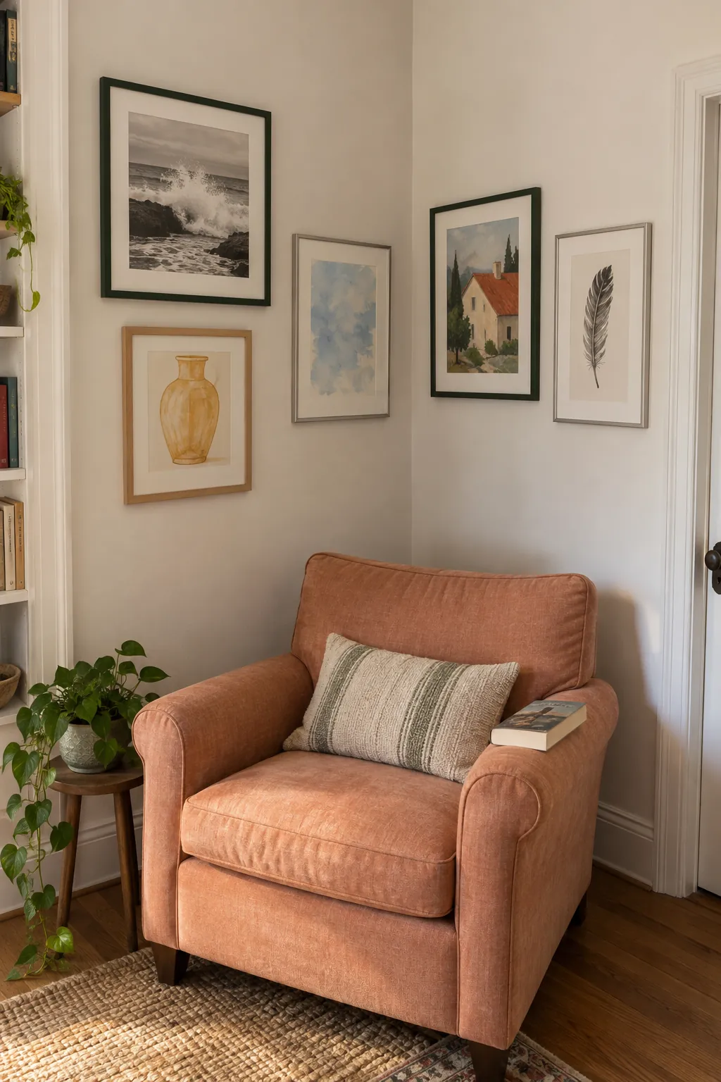
Carry the collection around a corner
A gallery can turn a corner when both walls belong to the same small zone. Keep the closest frames far enough from the corner that their profiles do not collide or cast confusing shadows on each other. Repeat a frame finish across the turn to connect the two views. Walk through the room before hanging because a layout that looks balanced from one side may disappear from the other. This approach suits a reading corner better than a busy route where projecting frames get brushed.
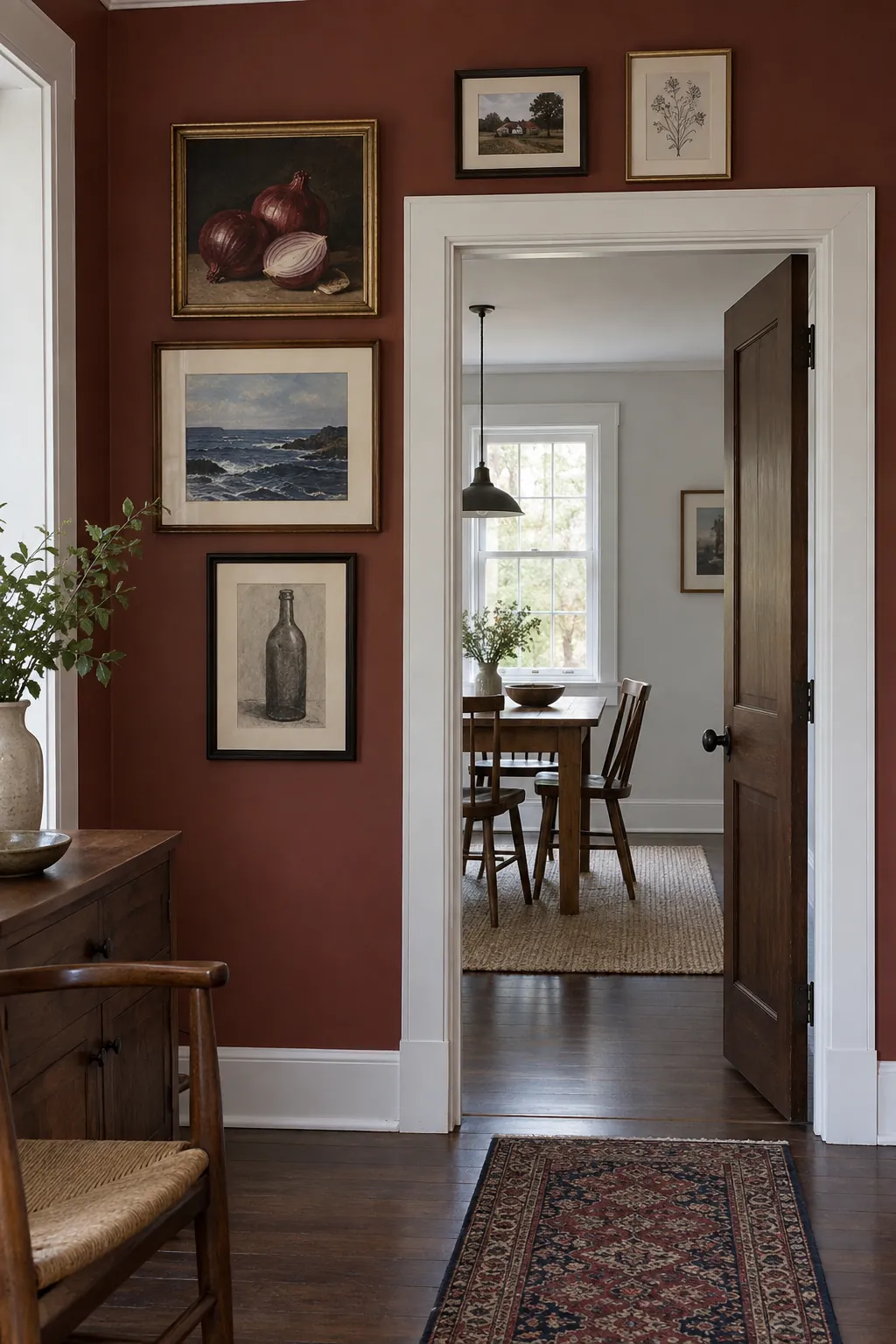
Give a doorway an uneven art border
The wall beside and above a doorway can hold a lively collection when the opening remains visually clear. Start on one side with the stronger group and use fewer pieces above, rather than tracing the door with a rigid frame outline. Check the door swing and keep artwork away from the moving leaf. Use secure hardware appropriate to each piece, particularly for anything above a passage.
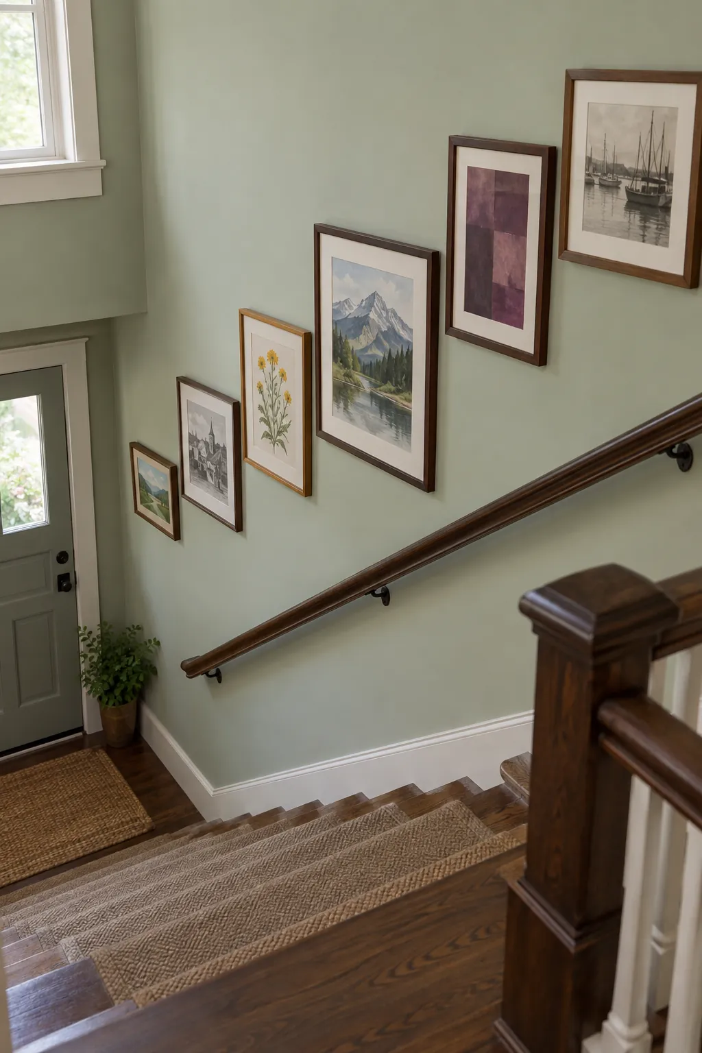
Let stair frames follow the climb
Mixed frames can follow the stairs without matching the size of every tread. Establish a rising path through the centers of the larger works, then use smaller pictures to soften the rhythm. Keep the arrangement comfortably clear of the handrail and any narrow walking area.
View the proposed layout from both the top and bottom before committing. Old frame wires can sag differently, so measure the loaded hanging points instead of relying only on outer dimensions. Use proper access equipment or professional help where the wall is difficult to reach safely.
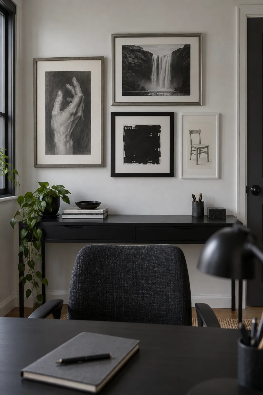
Keep the art monochrome and vary the frames
Black and white art lets frame shapes and materials supply much of the variety. Combine a charcoal study, a black and white photograph, and a simple ink print with different borders. Balance large dark areas across the group so one picture does not drag the composition to the side. A monochrome collection can still feel personal when the subjects come from your own interests.
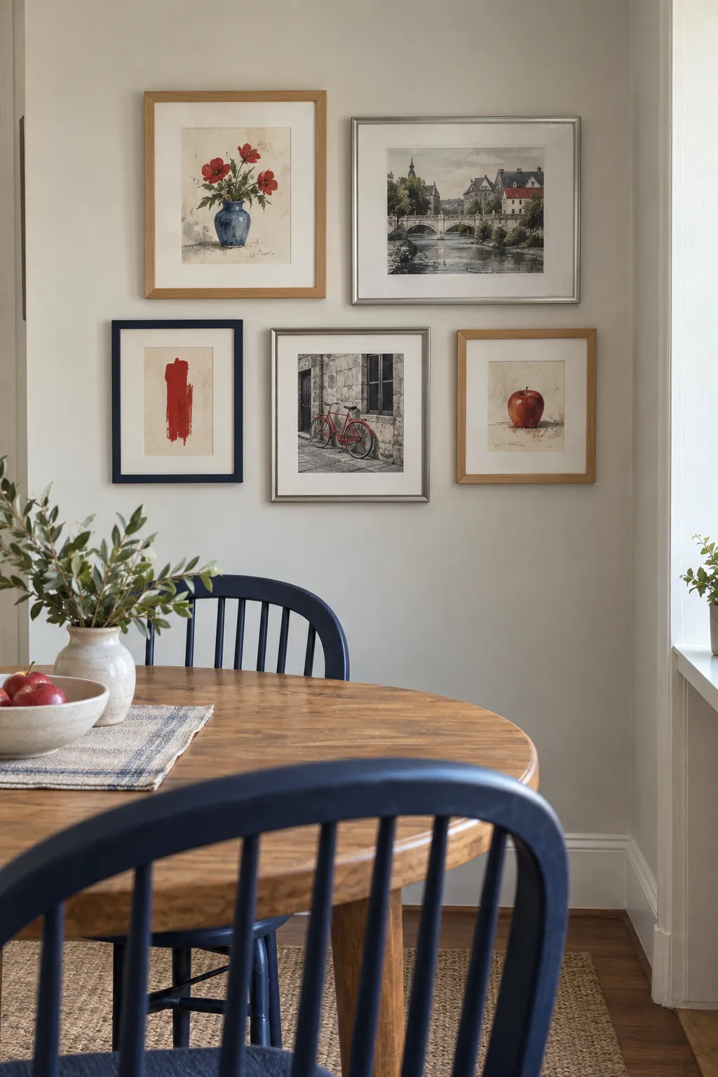
Repeat a small accent color across the art
A red detail in several pictures can connect a varied collection more subtly than matching every frame. Look for a small flower, a roof, or an abstract mark that repeats the accent at different scales. Keep the rest of the room restrained enough that the repetition remains visible. Do not buy filler art just because it contains the right color; the pictures should still earn your attention.
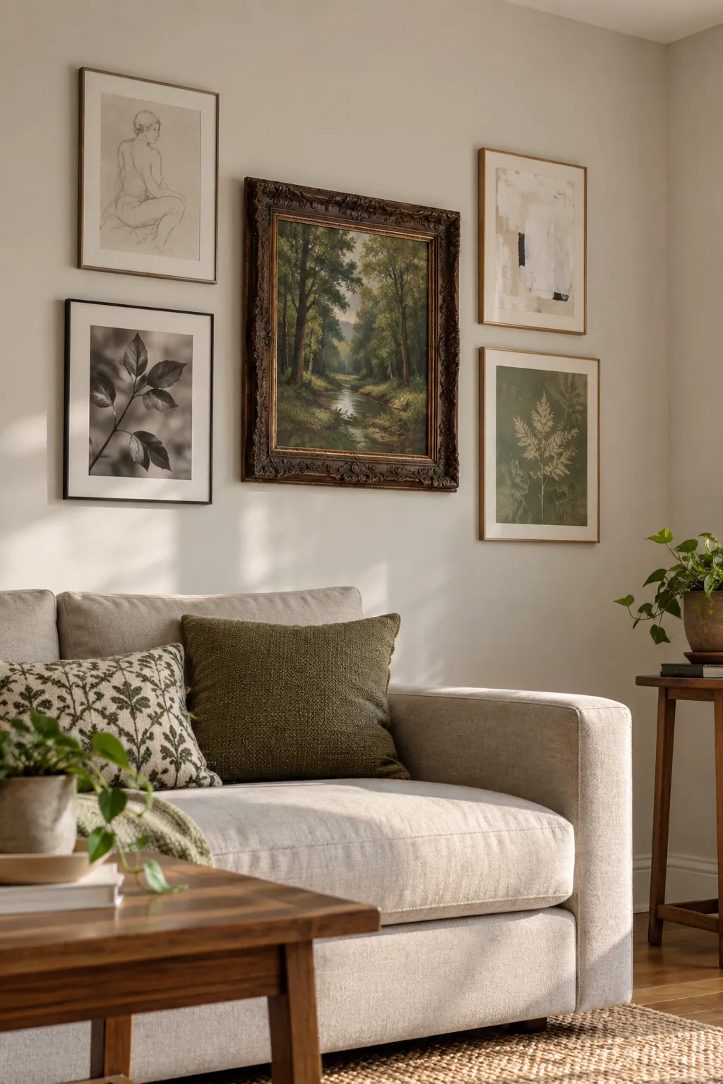
Pair one ornate frame with plain neighbors
A carved frame makes a strong focal point when its neighbors give it space. Place slim contemporary frames nearby and let their simple edges temper the ornament. The contrast works best when the art shares a tonal relationship even if the frame styles come from different periods. Check the actual weight of an older frame and replace unreliable hanging hardware before installation. A single elaborate piece is often enough to establish the character of the whole wall.
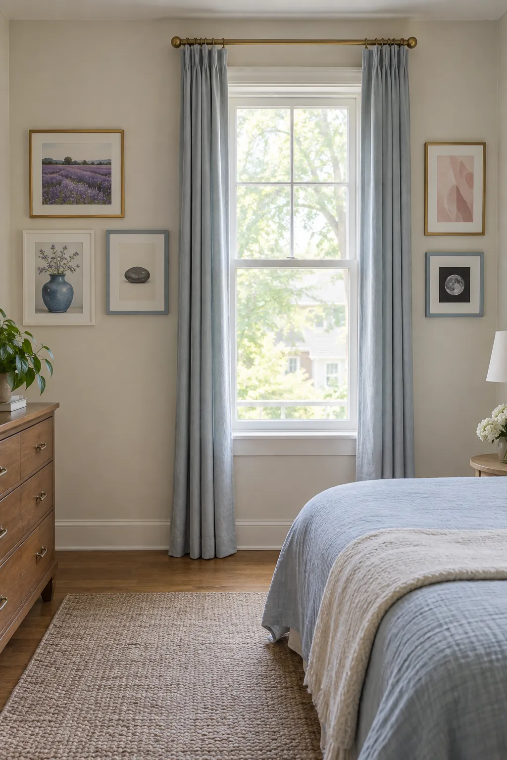
Use the window as a deliberate pause
Separate groups on either side of a window can feel connected without filling the space above it. Repeat a material or art color across both sides, while allowing the narrower wall section to hold fewer pieces. Keep curtains free to open fully so they do not cover or strike the frames.
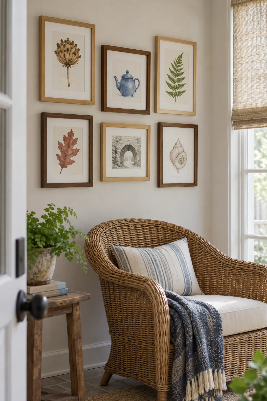
Mix wood tones with one repeated shape
Natural wood frames do not have to share the same stain to belong together. Repeat a simple rectangular profile while varying the wood from pale ash to deeper oak and walnut. Avoid placing all the darkest frames along one edge because their weight can pull the group off balance.
A woven chair or wooden cabinet nearby can make the collection feel connected to the room. Compare the frames against that furniture before adding another wood tone. The goal is a comfortable relationship, not an exact stain match.
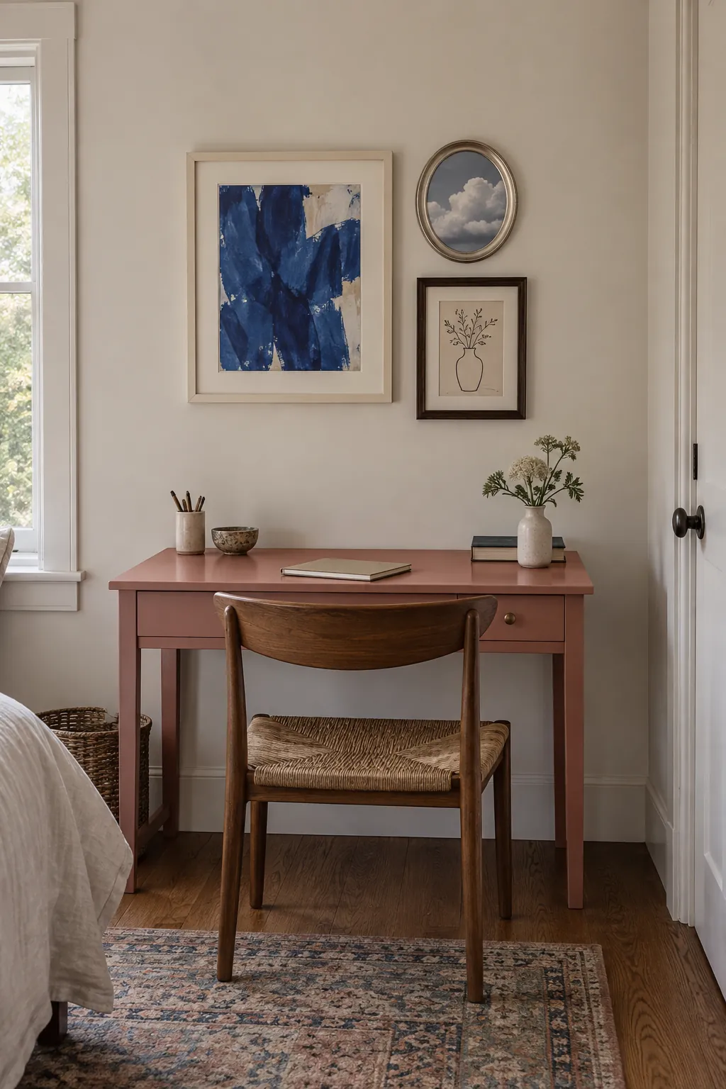
Make three unlike frames feel complete
A small gallery wall layout can begin and end with three good pieces. Choose one larger image and two smaller companions whose shapes differ enough to create a clear hierarchy. Keep the trio compact rather than stretching it to fill a whole sofa wall. This is an easy place to experiment when a large collection feels like too much commitment.
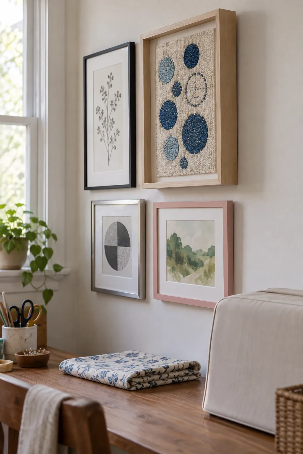
Include a framed textile among paper works
A textile changes the surface and texture of a gallery that otherwise consists of paper behind glass. Place it where its pattern can be read without competing with several equally busy prints. A deeper frame may project farther from the wall, so check how its shadow falls on nearby pictures. Use suitable mounting and spacing to protect the textile rather than pressing it tightly against glazing.
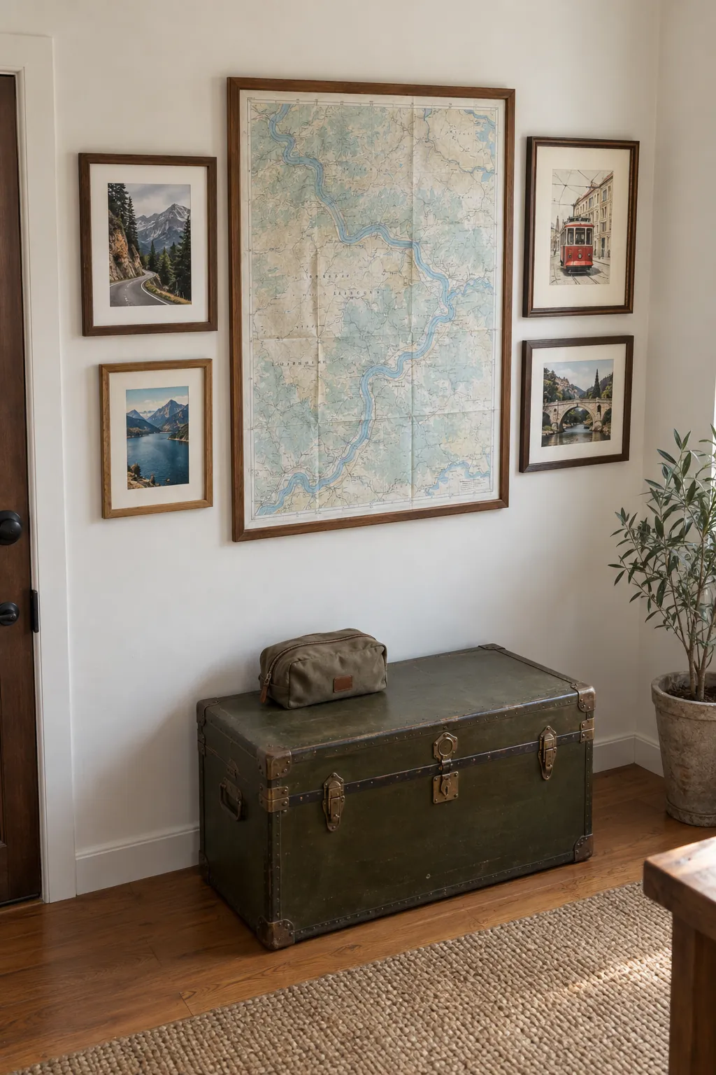
Build a travel wall around a folded map
A map offers a broad field of lines and color that can connect smaller travel pictures. Use a copy of a meaningful map and surround it with a few photographs or postcards from the same journey. Different frame sizes help accommodate the material without trimming away important details. Keep the collection selective so it recalls a trip rather than reproducing every souvenir. Avoid putting originals in strong sun, where both paper and pigments can change.
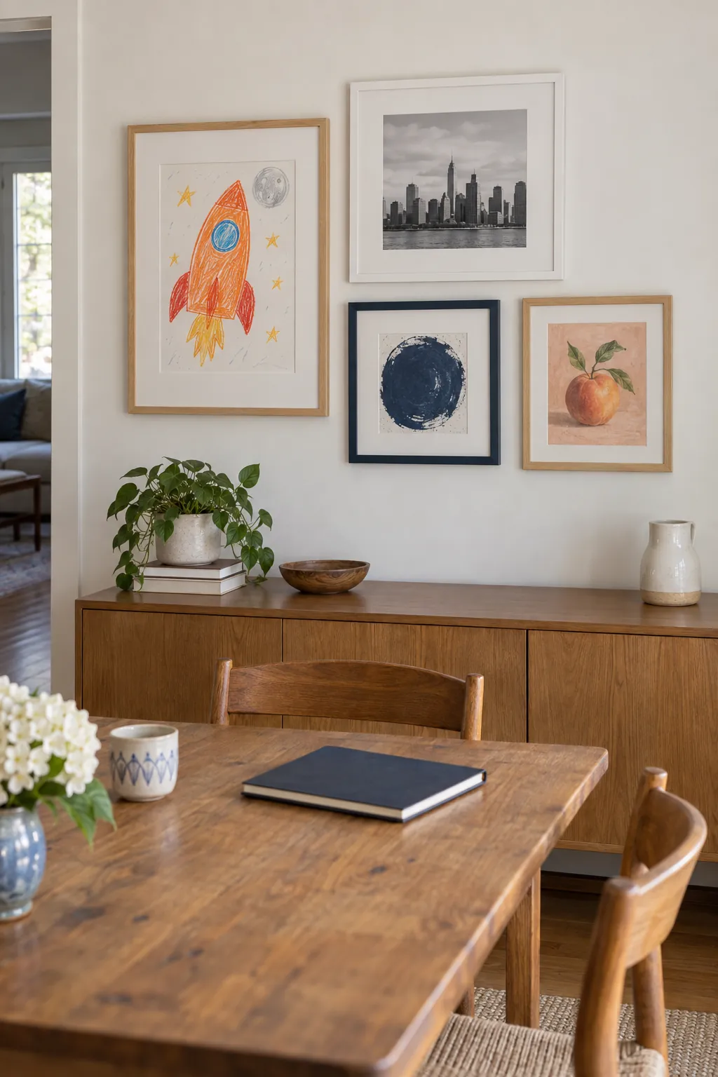
Mix children’s drawings with grown up art
Children’s drawings can belong in the main home gallery wall without being confined to a separate display. Give one expressive drawing a proper mat and combine it with quieter photographs or simple prints. A shared accent color can link the pieces without asking the child’s work to look more formal.
Use frames that an adult can open easily if you plan to rotate the drawings. Photograph the current arrangement before changing it so the balance is easy to restore. Keep heavy or fragile frames away from places where play could dislodge them.
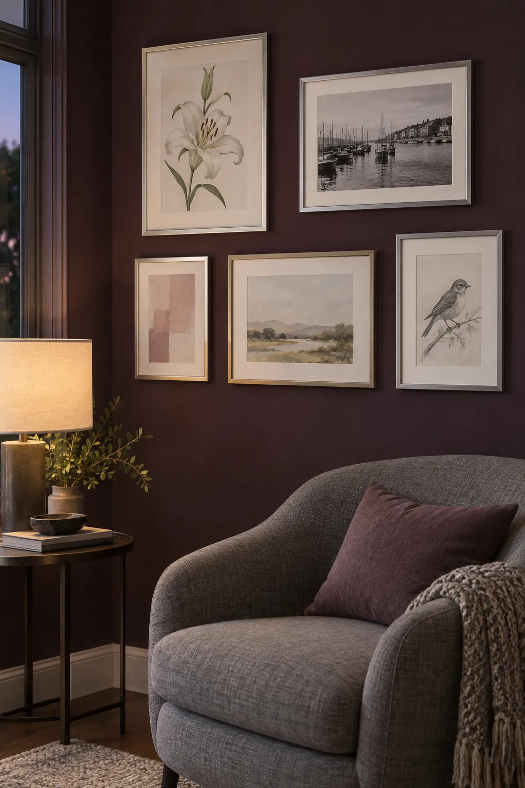
Let pale metal frames stand out on a dark wall
A deep wall color makes brushed silver and soft champagne frames particularly visible. Keep the artwork lighter than the wall in several places so the collection does not become a cluster of dark rectangles. Test the paint and frames under evening lighting because reflections can change the effect. Use a few matte frame surfaces to interrupt too much shine.
Choose one subject in several media
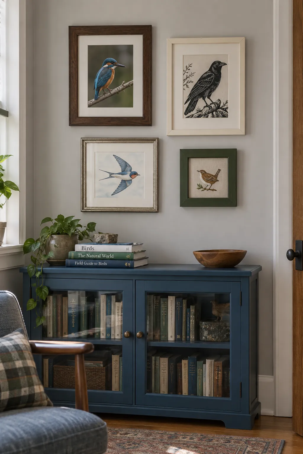
A shared subject can organize pictures whose frames have almost nothing else in common. A collection of birds might include a photograph, a linocut, a watercolor, and a small embroidery. Their different surfaces give the wall variety while the repeated subject supplies a reason for the grouping. Leave enough room around a detailed piece that it can be enjoyed at close range.
Offset the gallery to balance the sofa
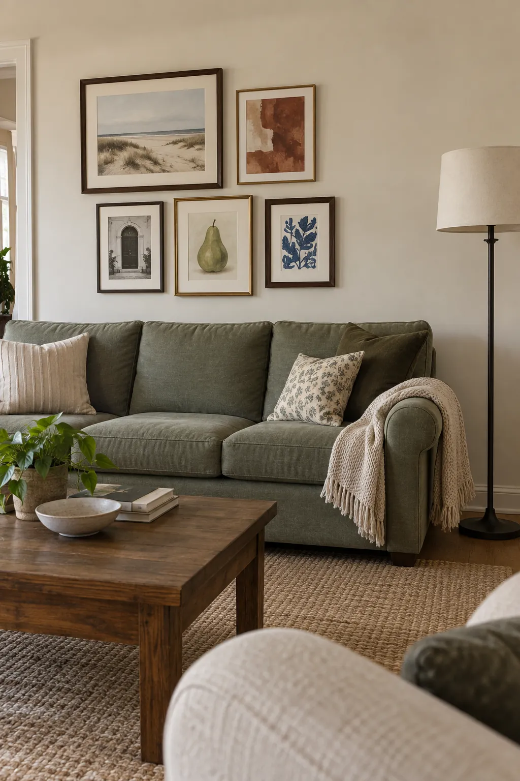
A gallery does not always need to sit on the exact centerline of a sofa. If a tall lamp or a substantial plant occupies one side, a slightly shifted frame group can balance the whole arrangement. Test the idea with full size paper shapes and include the lamp in your view.
Keep the group close enough to the seating that it still feels like part of the same zone. An extreme offset may make the artwork look as though it belongs to another piece of furniture. Check the view from the seat opposite, where the room’s balance becomes easiest to judge.
Plan the layout on the floor before hanging
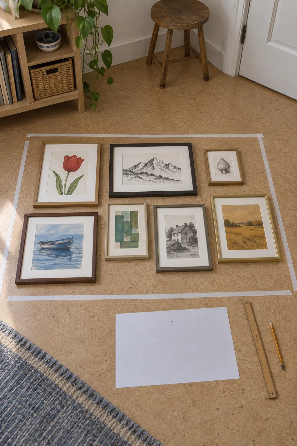
A floor rehearsal helps separate a frame problem from a spacing problem. Lay out the actual frames within the width and height available on the wall, using paper boundaries if necessary. Move one piece at a time so you can see which change improves the balance. Once the layout works, transfer the outer shapes to paper templates and mark each frame’s real hanging point. The most useful gallery wall inspiration is the arrangement that survives this test in your own room.