
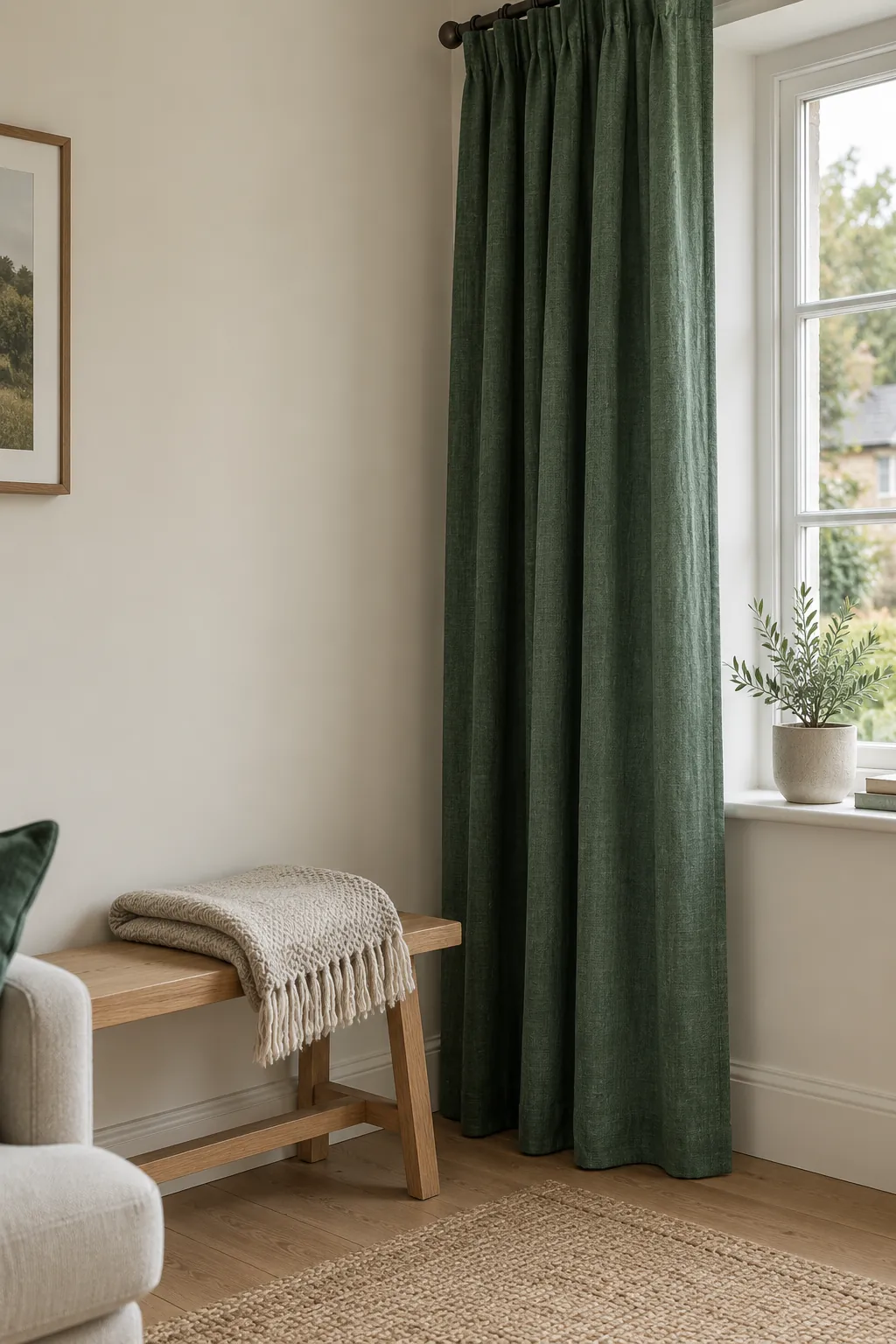
Choosing curtains or paint becomes expensive when the colour that looked right online feels wrong beside your floor. A good decision starts with what will stay in the room and how you want the green to behave. You can make the choice narrower before buying anything large.
If you need one starting colour, try warm white
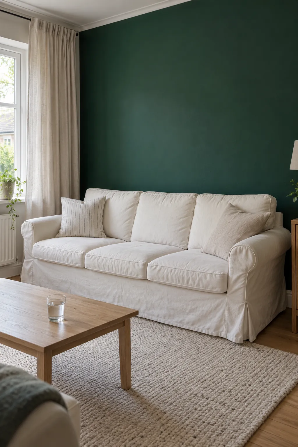
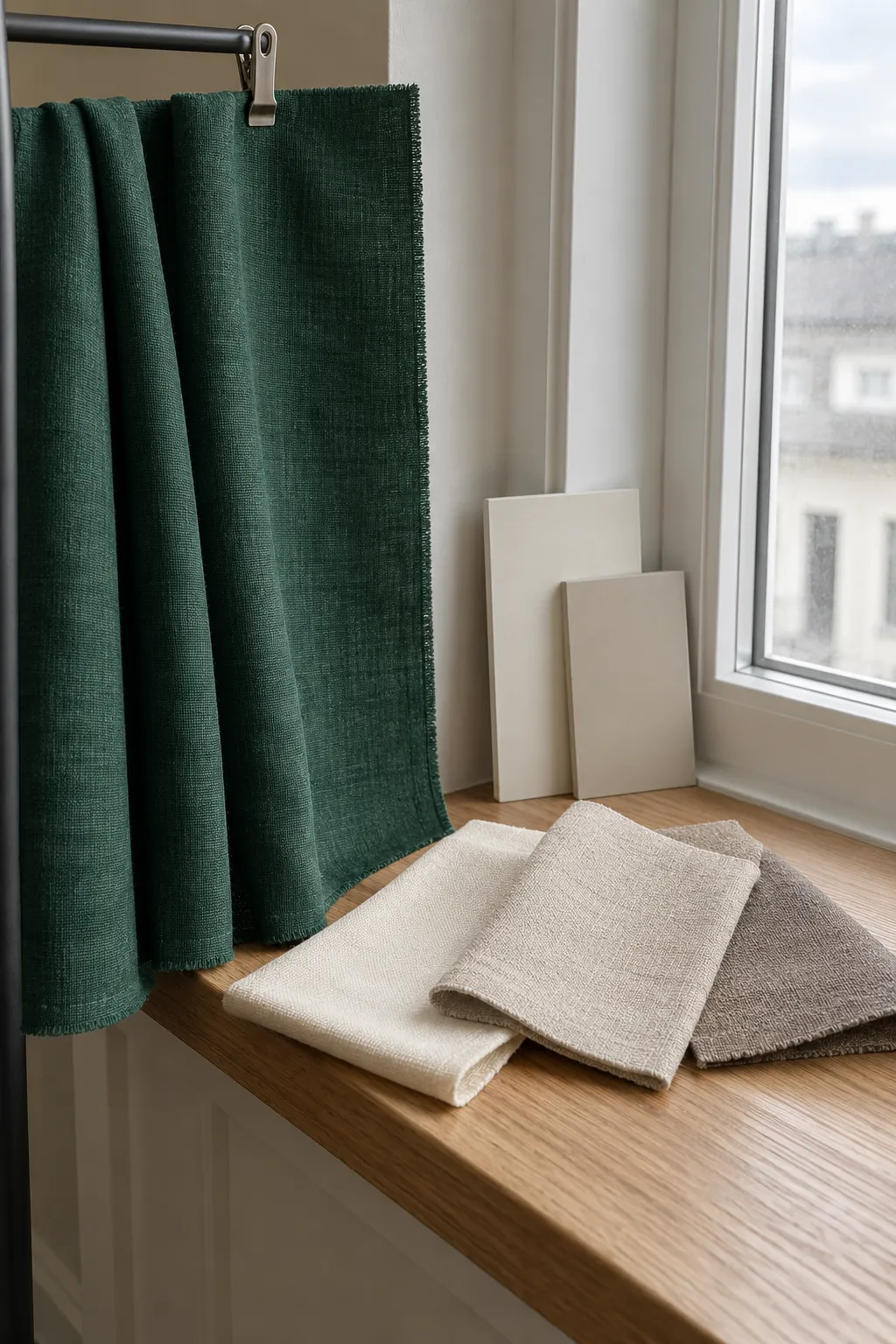
Warm white or a soft cream is a useful first companion for emerald green in a home. It offers a light background that lets a rich green wall, sofa or curtain keep its identity. Choose a neutral that works with the trim and flooring you already have rather than assuming every cream is interchangeable.
This is a starting point, not a universal best colour. Some creams lean distinctly yellow, and some whites look cool or gray next to a saturated green. If you want a softer emerald green interior color palette, compare warm white, oatmeal and light taupe samples beside the actual green material.
Use the fixed finishes to narrow your choice
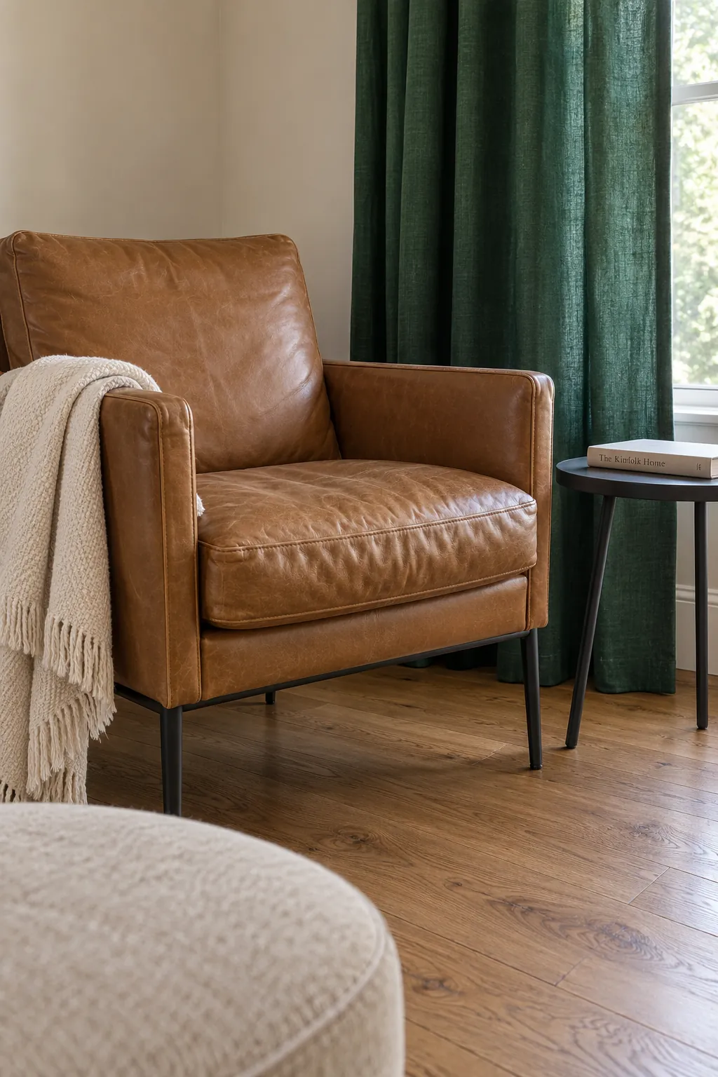
A floor is a much bigger colour influence than a small cushion. If your room already has warm brown timber, camel leather or a brick fireplace, those surfaces are part of the scheme even if you have not called them colours. Emerald green with natural wood often works because the wood brings warmth and the green supplies depth.
For a room with several brown surfaces, consider cream or beige as the bridge between them and the green. Adding a bright yellow curtain at the same time can create more visual competition than you wanted. If the floor is cool gray instead, check whether an oatmeal textile feels comfortable beside both it and the green.
Keep the surfaces you intend to retain in view when comparing options. Moving samples into a different bright room can hide the problem you are trying to solve. A pairing only needs to work in your home, under your light, with your existing furniture.
Choose a soft pink or lilac for gentle contrast
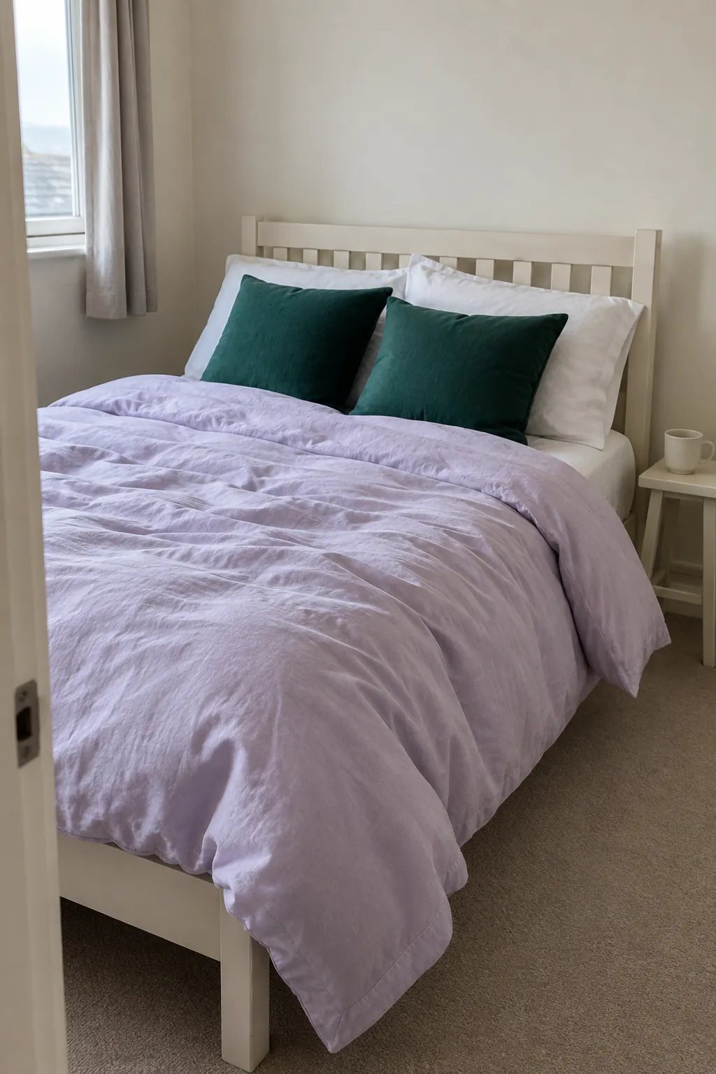
Dusty pink changes the mood of emerald without requiring a bright opposing colour. It can be a cushion, throw or bed linen rather than another large painted surface. Lilac is a cooler alternative that can suit a blue leaning emerald, especially when cream keeps the rest of the room quiet.
In an emerald green bedroom color scheme, let one rich surface dominate and keep the softer accent visibly lighter. Pale lilac bedding against green cushions is different from a deep purple wall behind a dark green headboard. If you want the bedroom to feel restful, test how much contrast you enjoy before using the accent across the whole bed.
Select a dark companion when you want definition
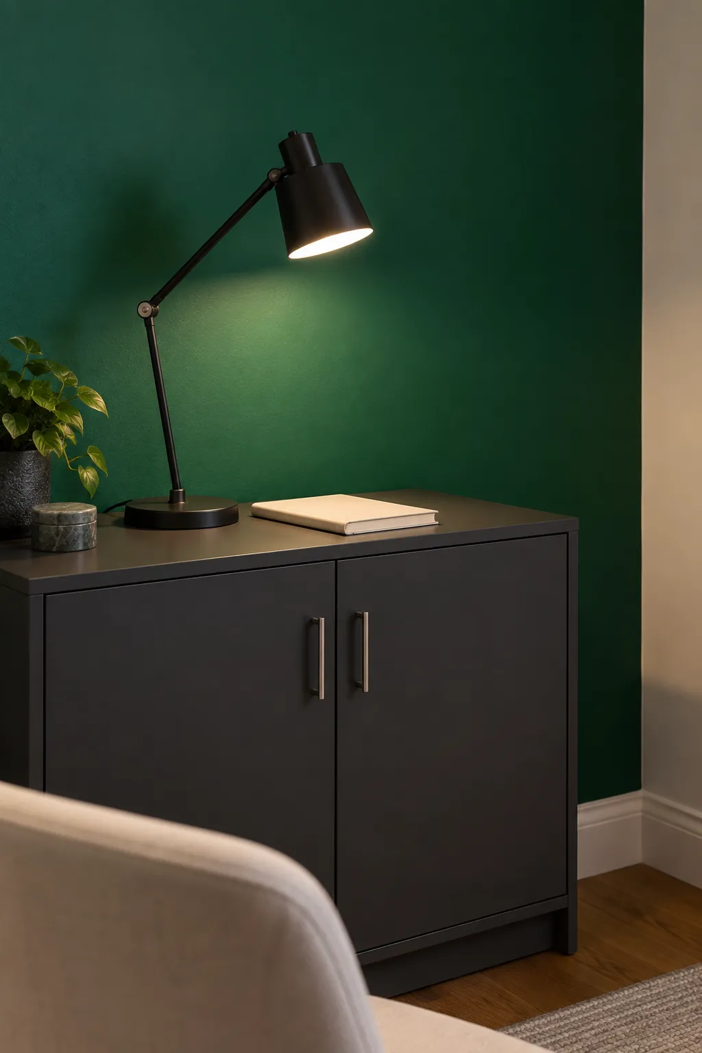
Charcoal, black and navy can make emerald feel more tailored. Use a thin black curtain rod, dark chair legs or a charcoal cabinet to introduce that effect in a limited area. Dark outlines can anchor the scheme without making every large surface equally deep.
A dark curtain beside a dark green wall may look beautifully enveloping in one room and obscure the window area in another. Judge it after sunset as well as in daylight. Add suitable task and ambient lighting because choosing a pale accessory cannot replace the light needed to read or work.
Repeat green through deliberate differences
You can combine emerald with other greens, but exact matching is often harder than it looks. A sage cushion may lean gray, an olive curtain may lean yellow, and a green sofa can shift with the direction of its velvet pile. Choose visibly different lightness or texture so the combination looks intentional rather than almost matched.

Compare materials where they will actually be used
A flat paint card is not the same as a curtain hanging over several folds. Ask for fabric samples when choosing emerald green curtains and textiles, then hold them upright near the window rather than leaving them on a table. Observe how the fabric changes when light passes through it and when it is backed by another surface.
For emerald green paint color combinations, place a substantial sample beside the floor, trim and main upholstery. Look at it on different walls using the manufacturer recommended sample method. Morning, late afternoon and artificial light can each make the same pairing feel different.
Photographs are helpful for comparing overall proportions, but phone processing can alter colour and brightness. Make the final decision while looking at the samples directly. If a neutral looks muddy or an accent seems too loud in the actual room, treat that reaction as useful information rather than a failure to follow a fashionable palette.
Give each colour a clear job
Choose whether emerald will be the main surface, a supporting textile or a small accent. Then pick a light neutral for breathing space and, if desired, one contrasting colour for interest. A green curtain can be the main statement in an otherwise cream room; a green vase has a much smaller role.
Begin by changing the item that is easiest to return or replace. A borrowed throw or sample cushion can tell you whether you prefer warm, soft or dramatic contrast before you order curtains or repaint. Keep the colour that works beside the furniture you see every day, even if the combination is quieter than the inspiration image.