
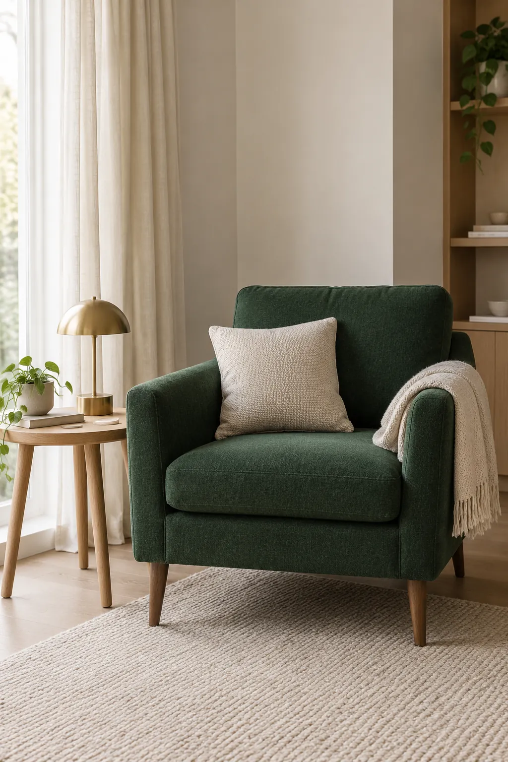
A green sofa can look wonderful in the shop and surprisingly heavy beside the rug you already own. Before adding another rich color, decide which surface should be the focus and which should provide breathing space. The pairings below help you make that choice with actual paint, fabric and furniture rather than a swatch alone.
Start with the feeling you want
Cream, warm white, beige, blush pink, terracotta, mustard, navy and charcoal can all work with emerald green. The best choice depends on whether you want the green to feel calm, warm or dramatic. Natural wood and brass can support these colors, but they are materials and finishes rather than substitutes for choosing a coherent palette.
Emerald is usually a saturated green with a noticeable blue influence, yet products sold under the name vary. A velvet sofa may look darker where the pile turns away from the light, while glossy green tiles catch much brighter highlights. Choose companion colors against the exact green item you own, not a color name on a screen.
Cream and warm white give the green room to breathe
If you want a forgiving emerald green interior color palette, start with a warm light neutral over a large area. Cream walls, oatmeal curtains and a pale rug let a green sofa remain the focus without making every surface compete. The useful contrast comes from lightness as much as from hue.
Check the neutral against your floor and existing trim. A very yellow cream may look heavy beside a cool emerald, while a sharply blue white can feel stark. Hold samples together in daylight and under your evening lamps, then choose the one that keeps both materials comfortable to your eye. For emerald green living room ideas in a dim space, a light rug and curtains can create contrast even when repainting is not possible.
Blush pink softens a strong green
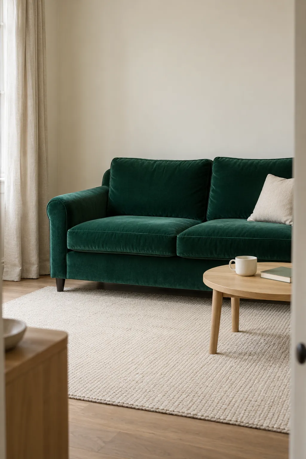
A dusty pink cushion, upholstered chair or duvet offers a softer contrast than bright red. Keep the pink muted if you want emerald to remain the stronger color; bubblegum pink creates a more playful and much louder scheme. A room with cream walls can accommodate the pairing through textiles alone, making it useful when you want to experiment without painting.
For an emerald green bedroom color scheme, try blush bedding against a green headboard and keep the bed linen around it simple. Choose a pink that still looks pleasant next to your skin tone if it surrounds a dressing mirror. Repeating pink in one small object elsewhere can connect the room, but you do not need matching pink accessories at every corner.
Terracotta and mustard add warmth in smaller doses
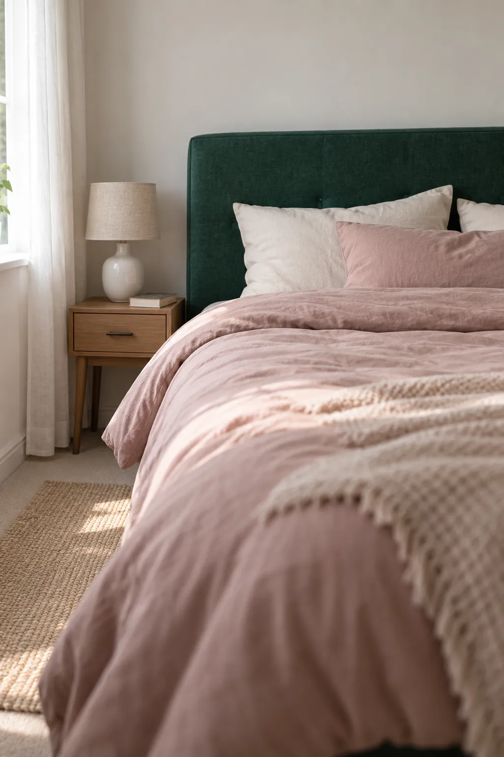
Earthy terracotta provides a warm counterpoint to emerald without the brightness of a vivid orange. Try it in a ceramic pot, a wool throw or a small upholstered seat before committing to a whole wall. The deeper and redder the terracotta, the stronger the contrast will feel.
Use mustard when you want a brighter accent
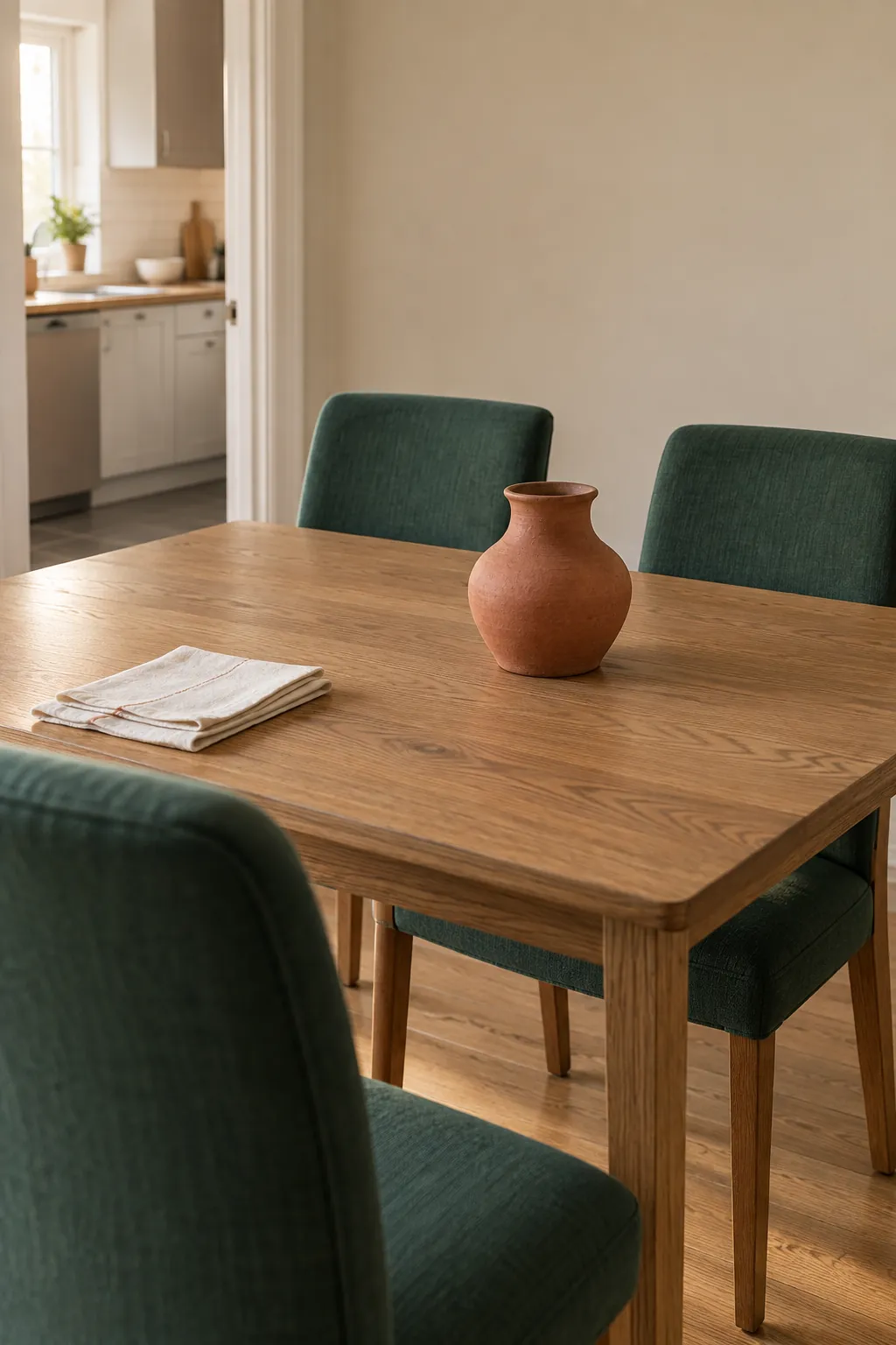
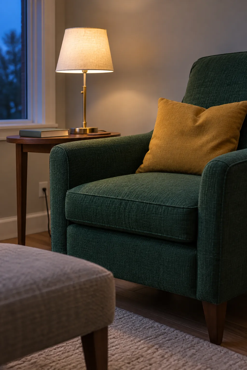
Muted mustard or ochre works well when a green room needs a little energy. A single cushion or curtain detail is often enough, especially if the sofa or walls are already saturated. Choose a dull golden yellow rather than a fluorescent shade when you want the result to feel settled.
Brass gives a related warm effect through reflected light, but it behaves differently from yellow fabric. A brass lamp can be a small highlight while a mustard rug becomes a large field of color. Treat those choices separately so the room does not accumulate more yellow than you intended.
Navy and charcoal create depth
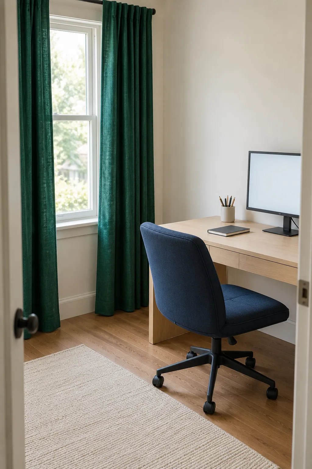
Emerald with navy can feel enveloping because both colors are deep and cool. Let one cover the main surface and use the other on a smaller element, such as navy curtains beside a green armchair. Pale bedding, a light ceiling or a cream rug can supply enough separation for the furniture outlines to remain visible.
Charcoal and black sharpen edges and suit restrained hardware or thin furniture legs. A full dark sofa against a full dark green wall may lose definition in weak light, so check the room at the time you use it most. Dark colors are a mood choice, not an automatic route to elegance, and they do not solve inadequate task lighting.
Natural wood makes a useful bridge
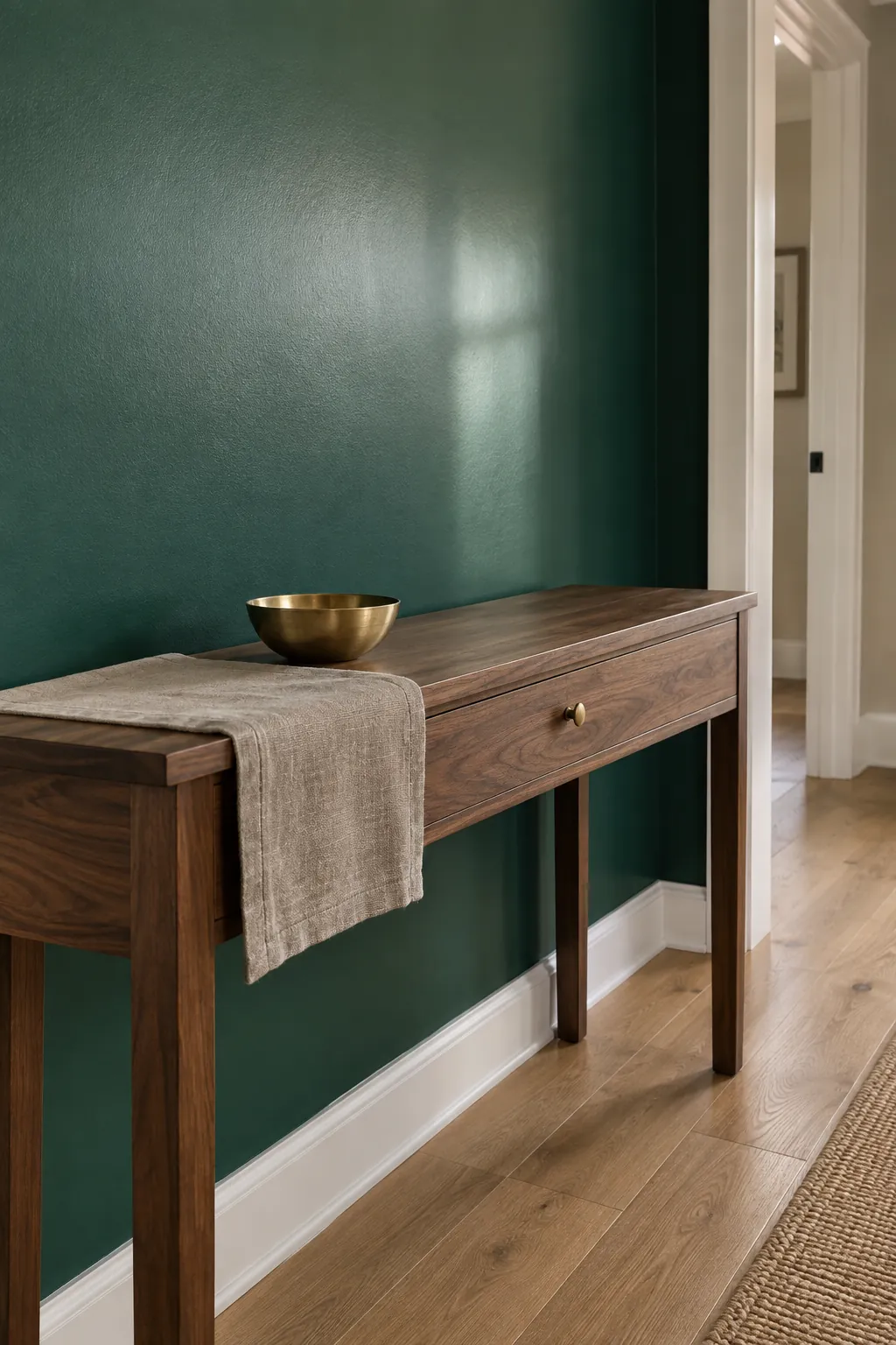
Emerald green with natural wood can connect cool saturated color to the rest of a home. Pale oak gives a lighter, quieter contrast, while walnut or caramel leather makes the palette warmer and richer. Use your existing floor as the starting point: several unrelated wood tones can distract more than an imperfect color match.
Taupe or beige upholstery can sit between the wood and green, especially when the room already contains several large brown pieces. Check that a grayish taupe does not appear unexpectedly mauve beside your green. Matte wood, linen and wool also balance glossy tiles or velvet, so an emerald green paint color combination often becomes more convincing when you consider texture as well as hue.
Test the palette before you buy the large pieces
Put the actual green fabric or paint sample beside your proposed neutral, accent and wood finish. Keep that small group in the room for a few days and look at it in morning light, evening light and under the lamps you normally use. For paint, follow the manufacturer instructions for a sufficiently large sample and assess it on more than one wall.
Begin with one main green element, one supporting neutral and one accent, then adjust their proportions to the room. This is a decision aid rather than a rule requiring exact percentages. If an accent only works in a photograph but bothers you beside the sofa every evening, change the accent before replacing the sofa.