
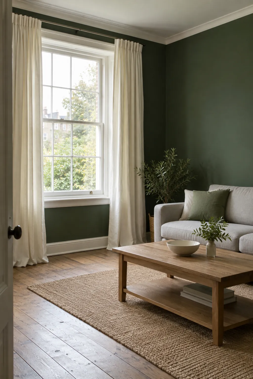
A room can look rich with the curtains open and unexpectedly heavy when they close. The useful choice is the fabric color that balances your daylight, furniture, and paint undertone. Start with cream or oatmeal if you want contrast, then consider taupe, dusty pink, clay, or a deliberate green match for a more specific effect.
Start with cream when the room needs relief
Cream curtains are the most forgiving starting point when dark green walls already dominate the room. They create a clear edge around the window without the sharper contrast of bright white. Choose a cream that looks softly warm beside your paint, rather than one that becomes noticeably yellow.
Compare the fabric with your sofa, bedding, and window trim before ordering a full set. A cream that matches white bedding poorly can look dingy even when it works with the wall. If your room has cool green paint and crisp white trim, an ivory that sits close to white may be the better neutral.
Use oatmeal linen to connect green with wood
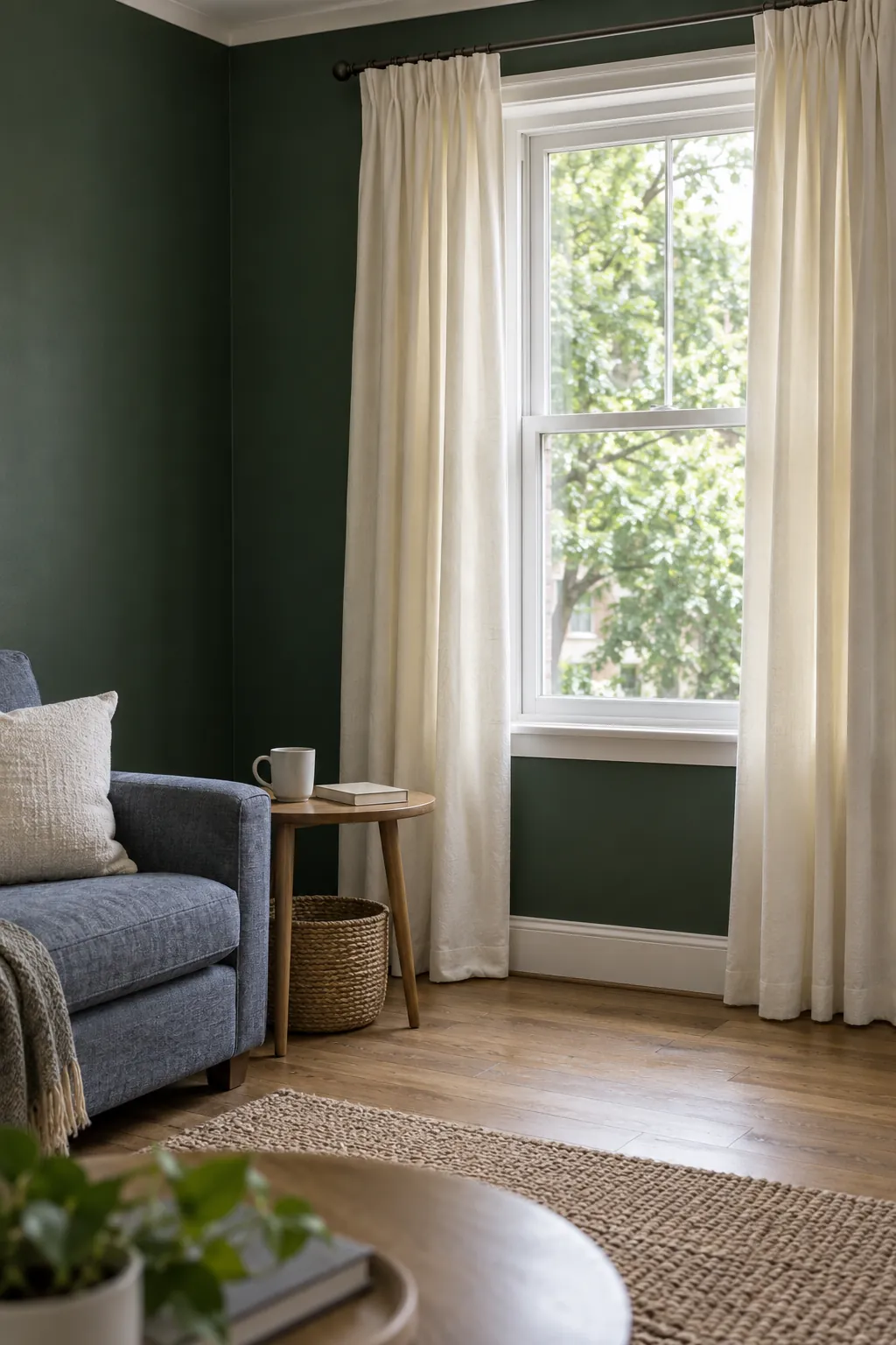
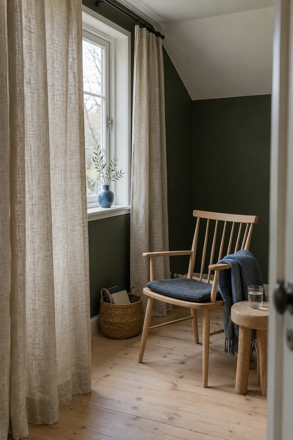
Oatmeal curtains bring a little more depth than ivory while keeping the window lighter than the wall. Their beige and gray threads can connect dark green paint with oak furniture, woven baskets, and a natural rug. This makes them useful when you want the room to feel relaxed rather than formally coordinated.
Linen curtains for dark green rooms need a fabric check as well as a color check. An open weave may soften daylight but offer limited privacy after sunset when indoor lights are on. Ask for a lined version or use a separate shade when privacy matters, and check the manufacturer’s care instructions because some linen fabrics shrink.
Choose warm taupe for a quieter contrast
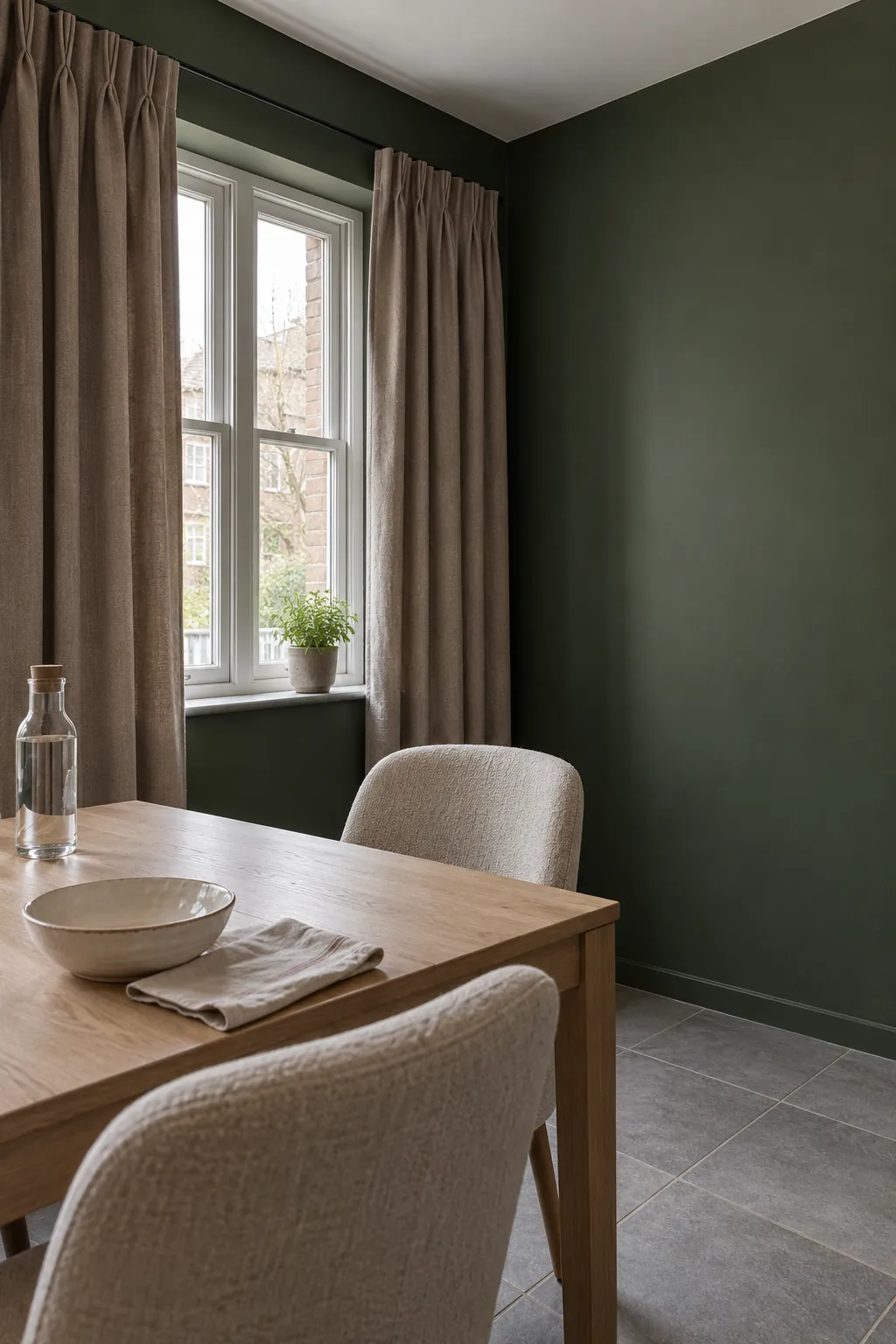
Warm taupe sits between the brightness of cream and the weight of brown. It works particularly well when the room already contains a stone colored sofa or a rug with mushroom tones. Look for a muted brown undertone instead of a strongly purple gray, which can feel disconnected from an olive leaning wall.
Try dusty pink without making the room sugary
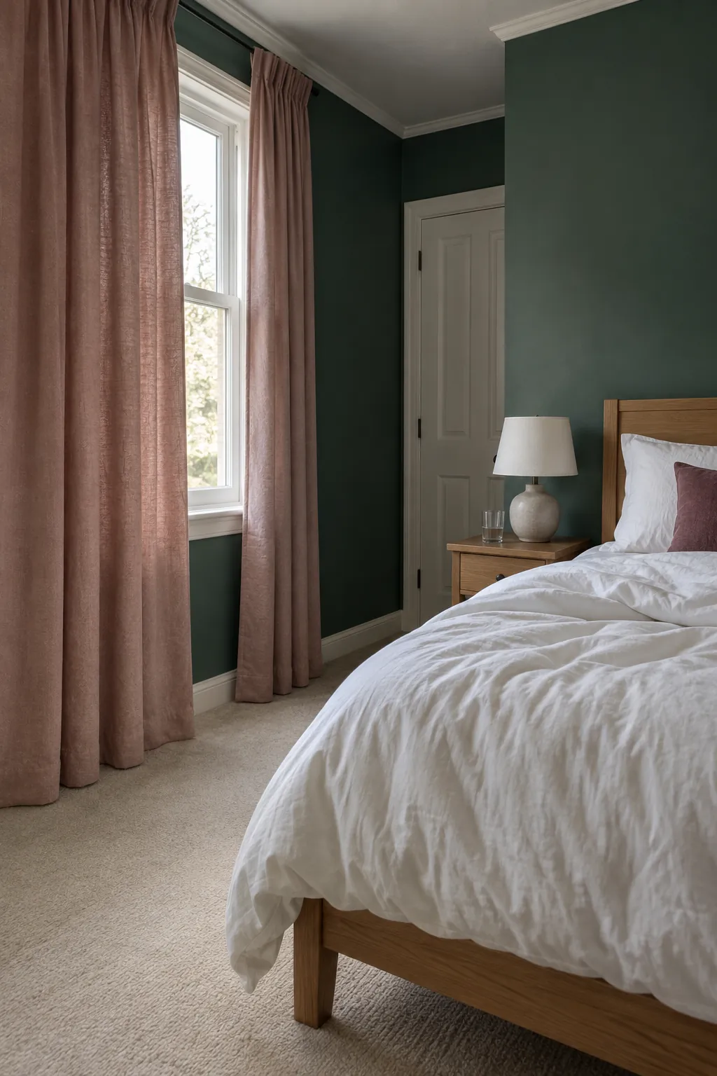
A muted rose or dusty pink curtain can soften dark green bedroom decor without turning the whole room pastel. Keep the pink subdued and let its lighter value provide contrast with the wall. White bedding and a simple timber bedside table give the color room to work.
Check pink samples under your evening lamps, because warm light can push some fabrics toward peach. If the result feels too sweet, choose a pink with more brown or gray in it rather than adding more contrasting accessories. Repeat the pink once in a small cushion or textile so the curtains feel connected.
Use rust when you want deliberate warmth
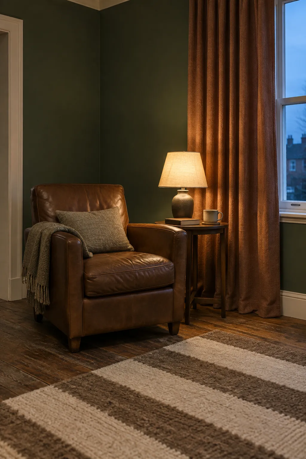
Clay and muted rust curtains create a stronger warm contrast than neutral curtains for dark green walls. They suit rooms with brown leather, warm timber, and earthy pottery, but a large orange fabric area can overwhelm a small room. Choose a softened clay shade before reaching for a bright saturated orange.
The color choice also changes how the room feels after dark. Dense rust velvet can look rich under a reading lamp, while a lighter woven cloth has a more casual effect in daylight. Carry a fabric sample around the room and check it beside the floor, since reddish wood and rust fabric can become too similar.
Let green curtains blend, but avoid a near miss
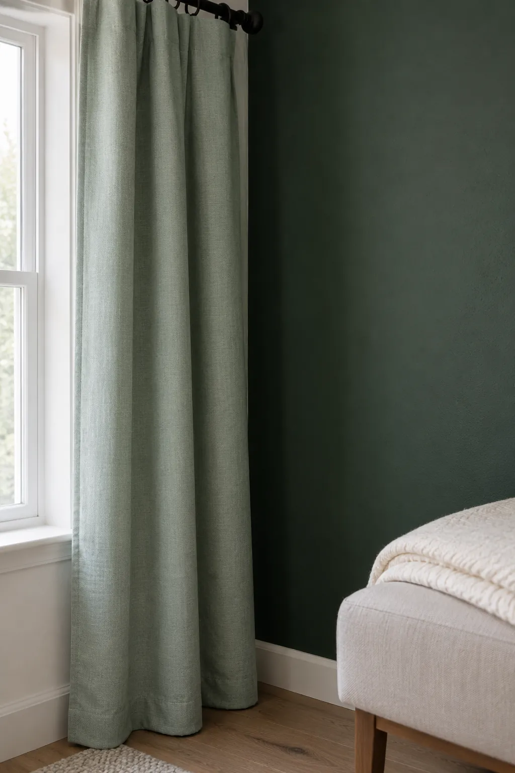
Green curtains can make the window treatment recede and help a bedroom feel enclosed. The challenge is undertone: a blue green wall and yellow green curtain may clash even though both are called green. Either find a genuinely close match or choose a clearly lighter or darker green so the difference looks intentional.
A small sample cannot show the full visual weight of a large curtain panel. Hang the largest sample you can get beside the wall and view it with the curtains drawn as well as open. For a dim room, keep bedding or upholstery light and avoid covering the window glass with the stacked fabric.
Separate color from light control
A dark fabric does not automatically mean better blackout performance, and a pale curtain can have a blackout lining. Choose the facing color for the room, then choose lining and construction for privacy, glare, or sleep. Check product specifications instead of judging performance from a lifestyle photograph.
For window treatments for dark green rooms, rod placement can matter as much as fabric color. Where the wall and fixing surface permit, extend the rod beyond the window so the open panels rest mostly beside the glass. Keep fabric away from heaters and moving doors, and follow the hardware maker’s mounting and load guidance.
Test the combination before committing
Put your two favorite fabric samples vertically beside the painted wall, not flat on a table. View them in morning light, afternoon light, and with the lamps you use at night. Compare them with the largest fixed surfaces, especially flooring and upholstery, because those colors will remain after the curtains arrive.
If you still cannot choose, decide which result matters more: a brighter window edge, a warmer palette, or a quieter continuous wall. Cream usually serves the first goal, oatmeal or clay the second, and a carefully matched green the third. Buy the option that solves the room’s actual problem rather than the one that looks best in an isolated swatch.