
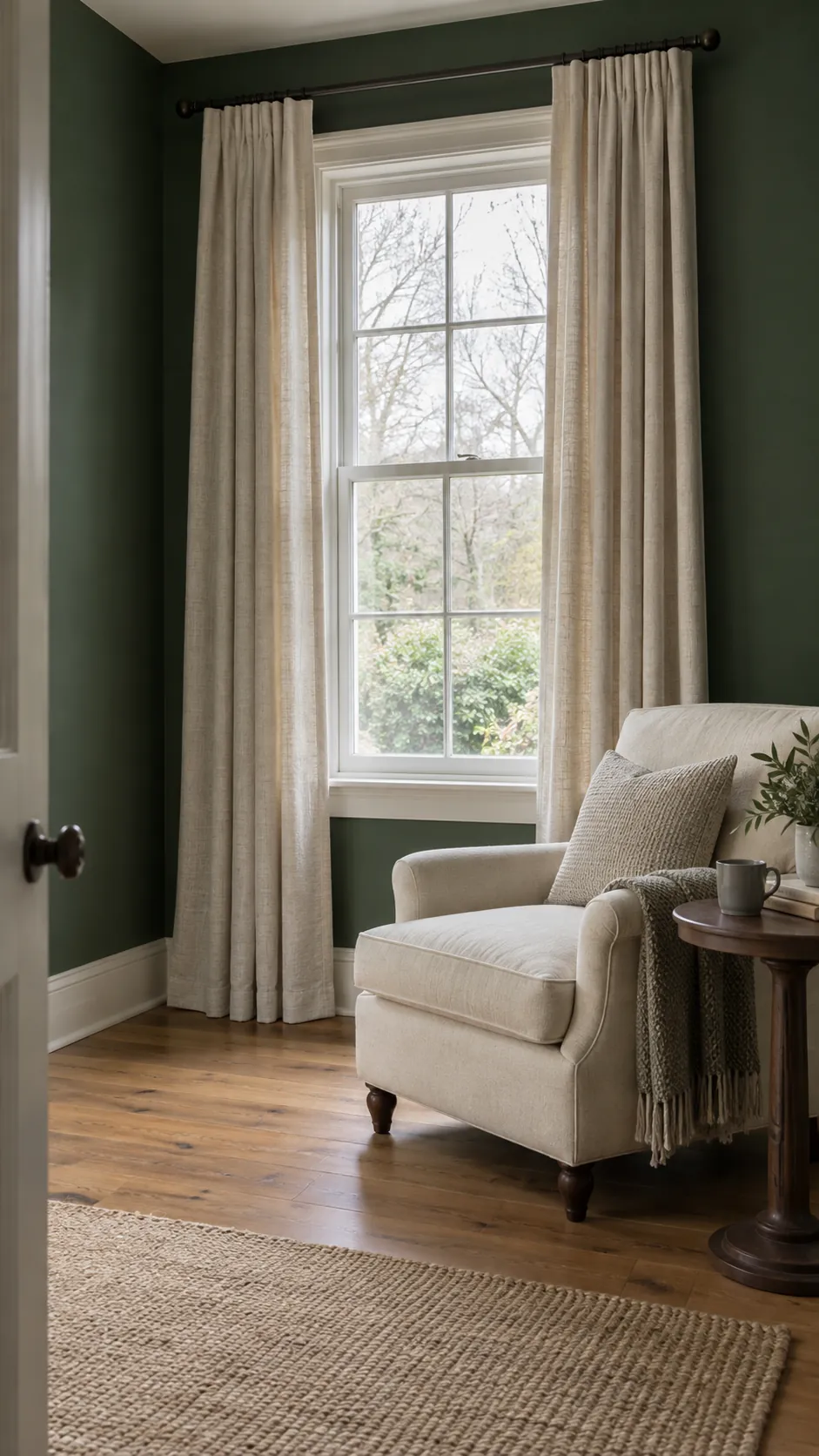
Dark paint can feel inviting in one light and unexpectedly dense in another. Your curtain choice should respond to the room you actually use, especially on a grey day or with evening lamps on. A pale neutral is a useful starting point, while muted warm colors or deep tones work when you want a more deliberate effect.
Use ivory when the window needs a lighter edge
Ivory is a strong first sample when a green room feels heavier than you expected. Its pale surface makes the window edge easier to read against the paint without the starkness of brilliant white. Cream curtains with dark green walls suit this role too, provided the fabric does not look noticeably yellow next to your trim.
Pale curtains can give visual contrast, but they cannot replace missing daylight or enough electric lighting. Keep open panels away from the glass where the available wall space allows. In a small room, check the color with the curtains fully closed because that large pale surface will change the balance.
Match the neutral to the furniture you already have
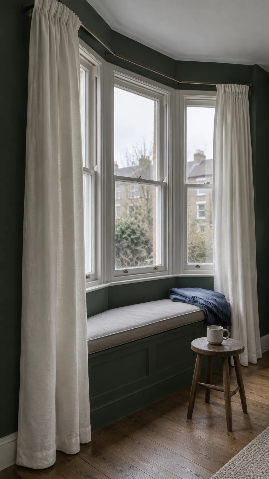
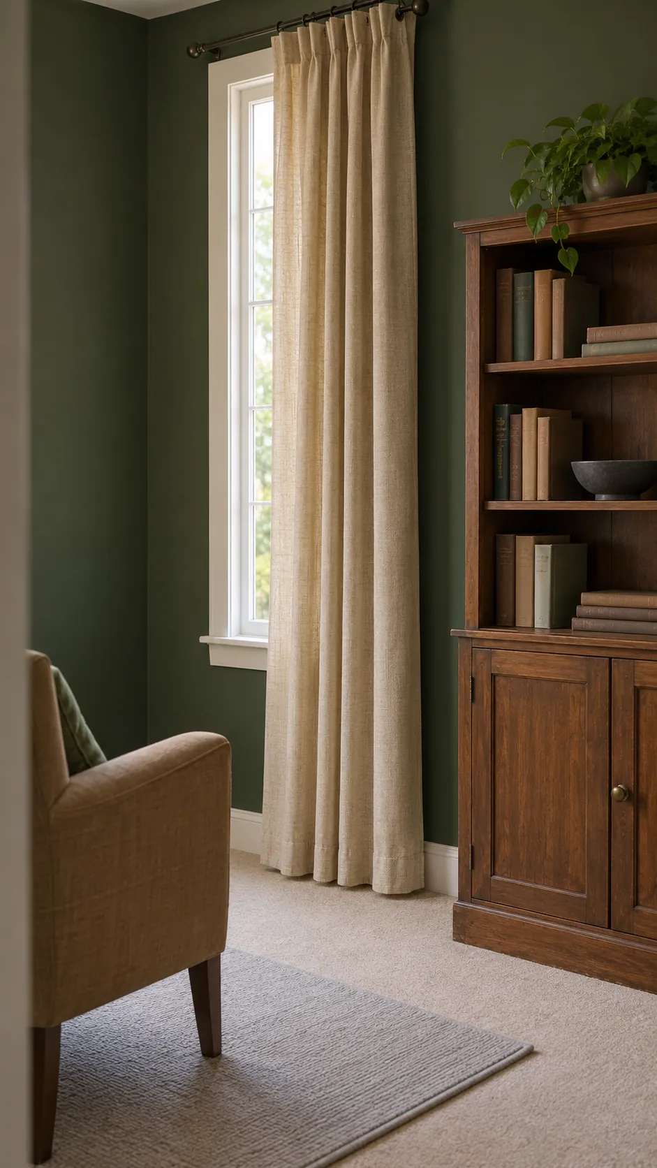
Oatmeal and warm beige are useful curtain colors for dark green walls when the room contains brown wood, tan upholstery, or a natural rug. They create a softer step between dark paint and lighter furnishings than crisp white does. Choose the neutral from the existing room rather than from a fabric name alone.
A gray beige sofa needs a different companion from a golden beige carpet. Hold the curtain sample beside both before deciding which surface should set the direction. Linen curtains for dark green rooms can add relaxed texture, but compare opacity and lining separately from the color.
Give a cool room warmth with muted clay
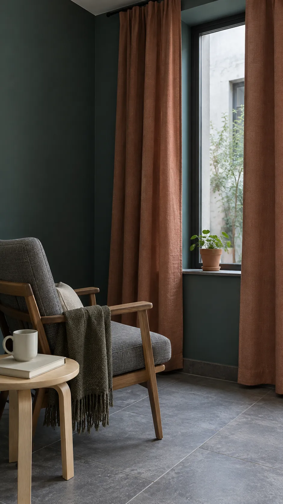
A clay or softened terracotta curtain can introduce warmth when the room’s daylight makes green paint feel cool. Keep the fabric muted, especially if your floor already has red or orange tones. This is a color effect, not a promise that the room will become physically warmer.
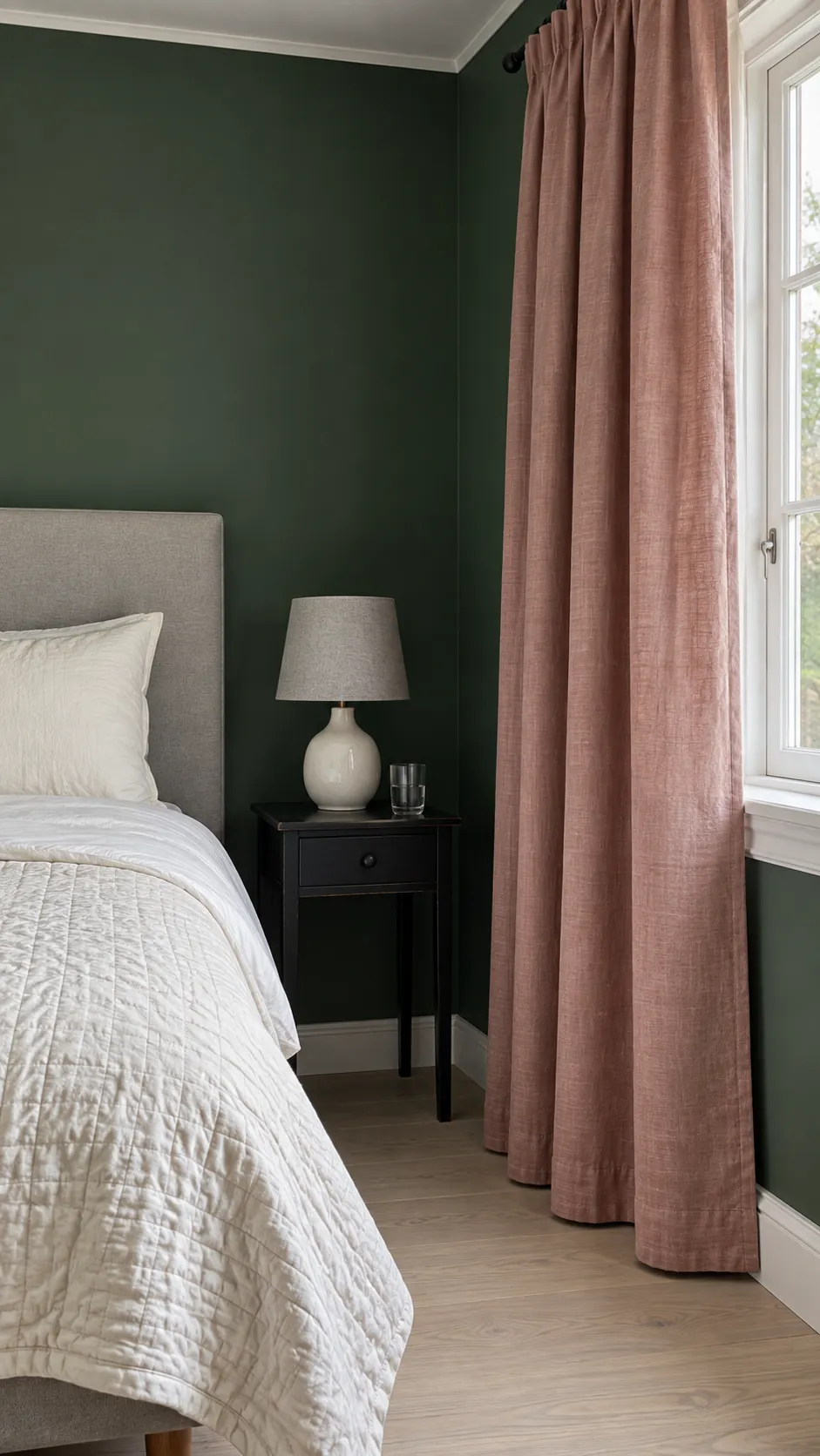
Consider dusty rose for a gentler bedroom contrast
Dusty rose offers a lighter warm accent for dark green bedroom decor. It works best when the bedding has a quiet neutral base and the pink does not compete with several other strong textile colors. A rose with a little gray or brown usually feels calmer than a saturated pink.
Warm lamps may shift the way both colors appear. Check your fabric beside the wall with the actual bedside lights switched on before committing to a full pair. If the combination looks too peachy, try a more muted rose rather than adding extra green accessories to compensate.
Choose a deep neutral only when you want enclosure
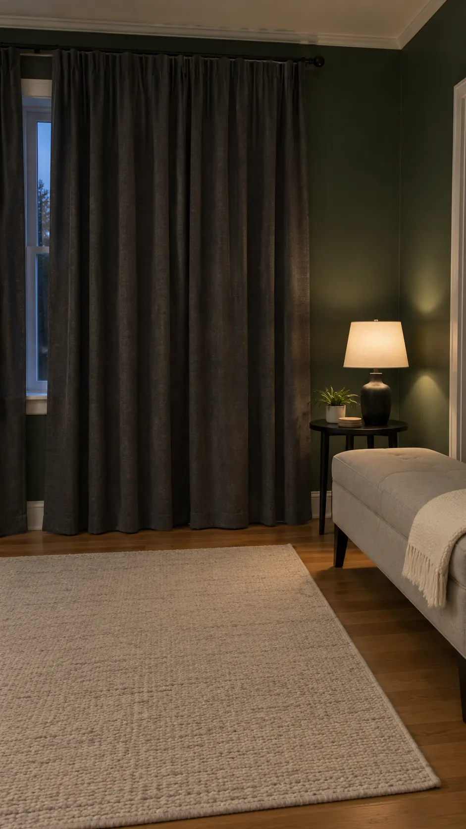
Chocolate, charcoal, and deeper taupe can make dark green wall and curtain combinations feel more continuous. They suit a room where you actively want a darker, enclosed atmosphere, rather than one where you are trying to lighten the window. Leave a pale area in the bedding, rug, or seating if you still want clear contrast.
Black is a stronger choice than charcoal and can look very flat beside deep green at night. A textured dark fabric may reveal more fold detail than a smooth flat cloth, but the result depends on the lighting. Bring home a large sample and view it from the doorway, where you judge the whole room rather than individual threads.
Use a pattern to connect the palette
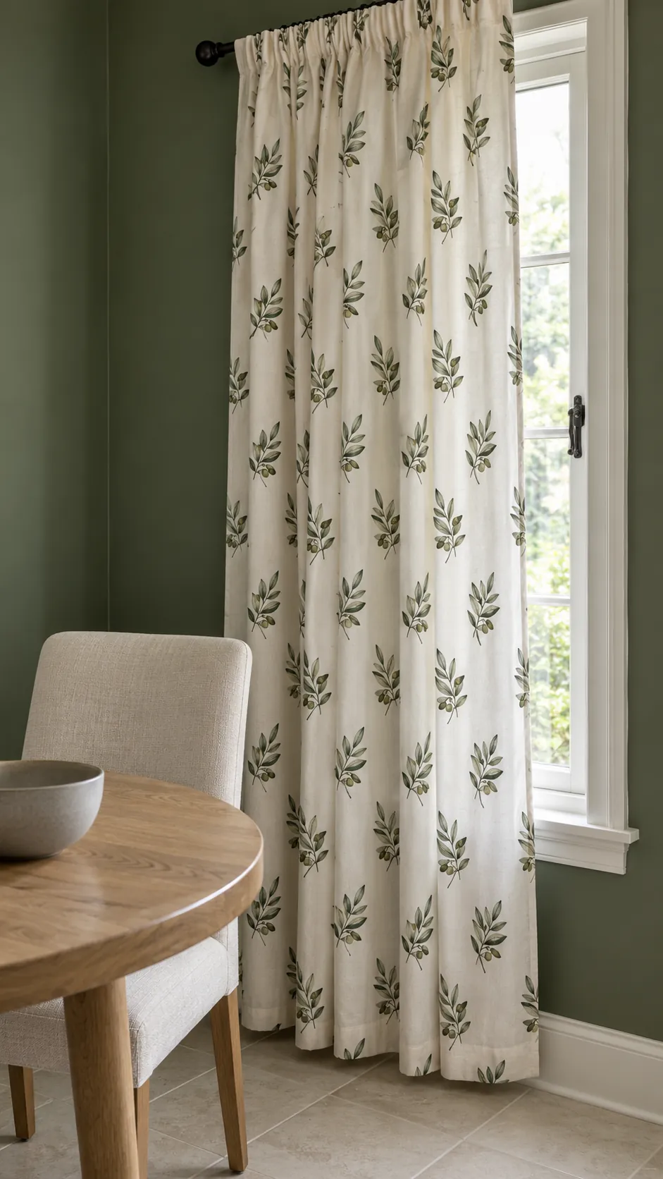
A curtain with a cream ground and a restrained green pattern can link the wall to neutral furniture. Choose a visible difference between the pattern and the wall so the connection looks deliberate. Small olive leaves on ivory cloth are one option, while a simple muted stripe works when botanical decoration does not suit the room.
Check the pattern repeat at the size of a full panel. A small sample may hide how busy a large repeat becomes when several folds overlap. Keep nearby rugs and bedding quieter if the curtain is the main pattern, and avoid choosing several unrelated green shades in different motifs.
Treat privacy and darkness as separate choices
Neutral curtains for dark green walls can still provide substantial light control when their construction includes suitable lining. Dark cloth can still admit daylight through an open weave. Read the product’s opacity and blackout information, and test a sample against a bright window when that option is available.
Sheer fabric offers softness during the day but may reveal the interior after dark when the lamps are on. A separate blind or lined outer curtain can cover that need without forcing you into a darker facing fabric. Follow fitting instructions and keep moving fabric clear of heat sources, door swings, and ventilation openings.
Choose by the room at its hardest time of day
If the room feels least comfortable on a grey afternoon, judge your samples then as well as in bright sunshine. View each fabric vertically beside the wall with a piece of bedding or upholstery nearby. Window direction is only one factor; nearby buildings, trees, season, and your lamps also affect the result.
Select ivory for a lighter edge, oatmeal for a natural transition, or a muted warm color for a more deliberate accent. Keep a deep neutral only if its enclosed feeling is part of the result you want. The right curtain is the one that still works when the room is being used, not just when the photograph looks good.