
A curtain sample that looks calm in a shop can turn cold, yellow or muddy beside a deep painted wall. Start with the mood you want at the window: a lighter frame, a quiet neutral layer or a deliberate colour accent. Then judge the fabric against the room’s fixed finishes and its evening lighting.
Start with the amount of contrast you want
Cream and soft ivory are the most dependable curtain colours for dark green walls when you want the window to feel lighter. Oatmeal and warm taupe give a quieter contrast, while dusty pink, muted terracotta and deep green create a more deliberate palette. The right choice depends on your floor, upholstery and the light that reaches the room, rather than the paint colour alone.
Think about how much space the curtains occupy when closed. A wide window covered in pale cloth becomes a large light surface; the same window in charcoal makes the room feel more enclosed. Decide whether you want that window to lift the room or blend into its edges before comparing fabric samples.
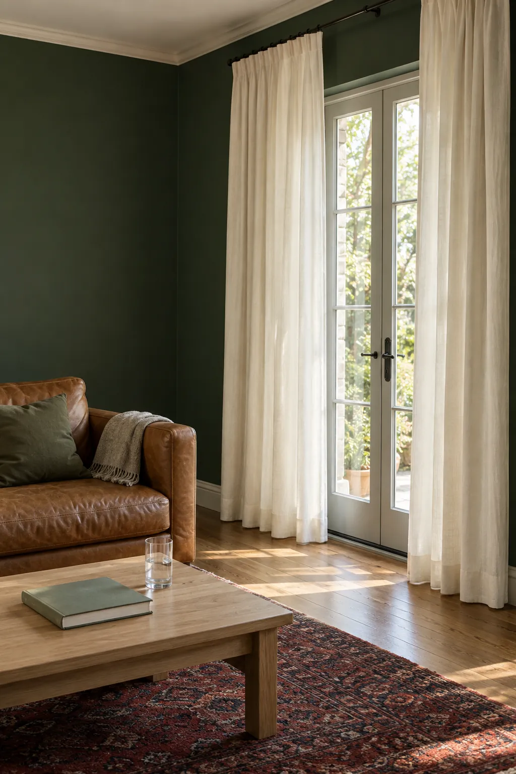
Cream and ivory soften a deep green room
Cream curtains with dark green walls create a clear contrast without the sharpness of bright white. They work especially well beside oak, walnut, warm beige upholstery and an ivory rug. Choose a restrained cream that looks softly warm in your room, because a strongly yellow fabric can look more yellow against a cool forest green.
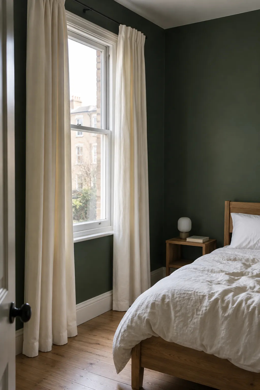
If your trim is crisp white, hold both ivory and off white samples beside it. A curtain can look dirty when its undertone sits awkwardly between the wall and the trim. For a bedroom, check the lining as well as the face fabric: pale curtains can provide blackout performance when their construction is designed for it, so a dark colour is not a requirement for sleep.
Oatmeal linen brings texture without a sharp edge
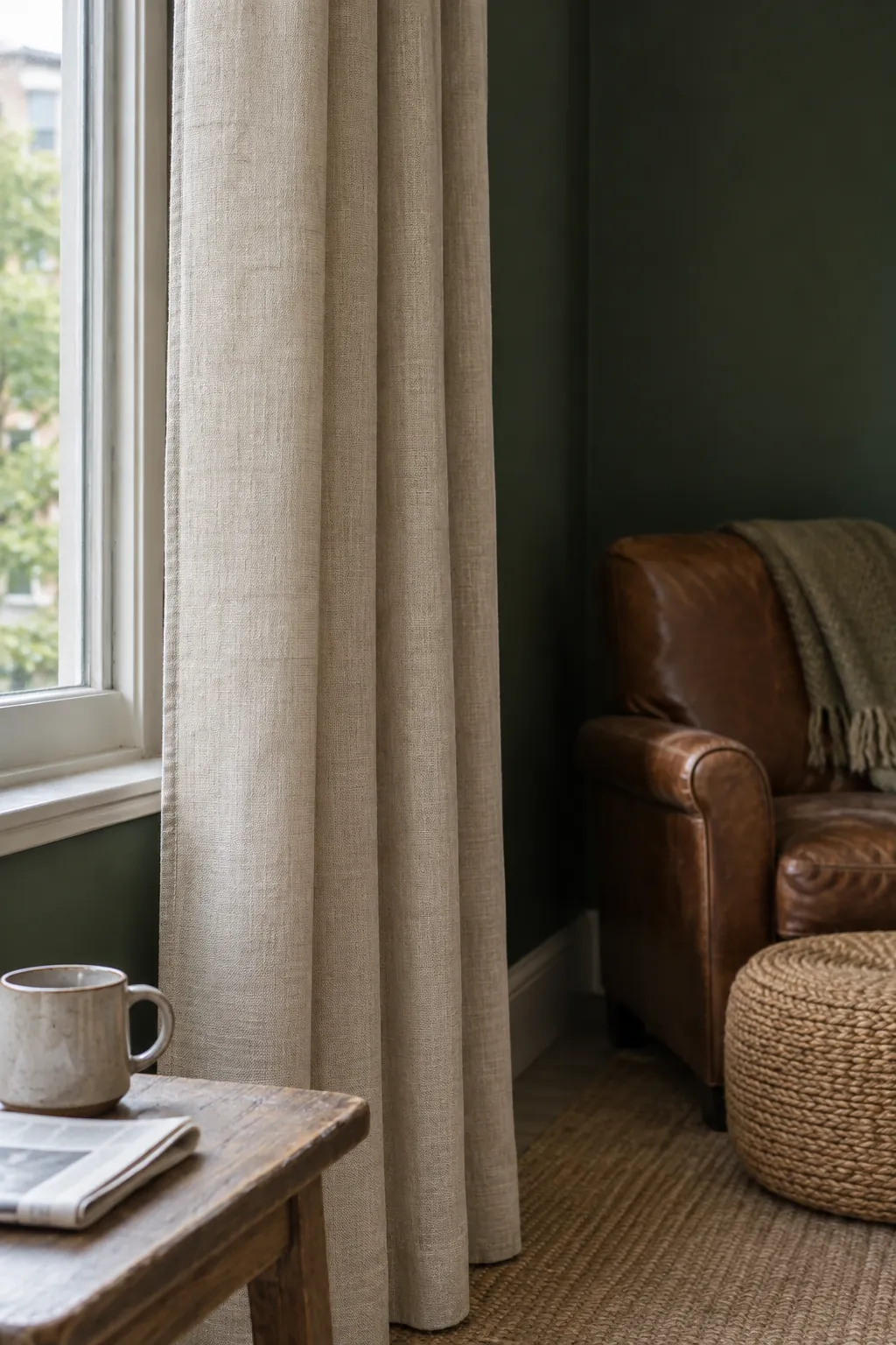
Oatmeal, flax and natural linen tones suit a room where white would feel too stark. Their mixed fibres connect dark green paint with timber, woven baskets and pale stone. This is a useful direction for relaxed dark green living room textiles, particularly when the sofa is already beige or tan.
Linen describes a fibre, not one fixed colour or one level of privacy. An open weave may show silhouettes after dark when the lights are on inside. If privacy matters, choose a lined panel or combine a light linen curtain with an appropriate blind, and read the care instructions before choosing a floor length that needs frequent washing.
Warm taupe makes the contrast quieter
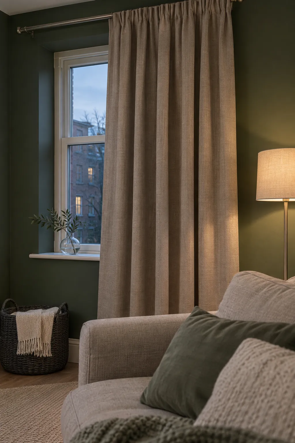
Taupe and mushroom curtains are good neutral curtains for dark green walls when you want depth without a strong colour accent. Choose a sample that relates to the undertone of your sofa or rug, rather than assuming every grey beige will work. A warm mushroom fabric usually sits more comfortably beside brown wood than a visibly blue grey does.
In a dim room, compare taupe with a lighter oatmeal before buying a full set. Dark green walls already absorb much of the light that reaches them, and a medium toned curtain adds less visual brightness than ivory. Use lamps for usable illumination and pale textiles for contrast; changing the curtain colour alone will not fix a room with too little lighting.
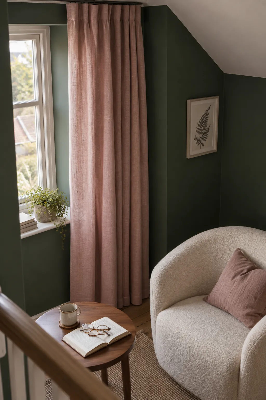
Dusty pink adds colour without a festive pairing
Dusty rose, plaster pink and subdued blush offer a soft counterpoint to deep green. Their muted quality matters: a vivid red beside saturated green can suggest a seasonal palette, while a greyed pink feels more restrained. Repeat a small amount of the pink in a cushion or ceramic piece so the curtains have a connection to the room.
Test the fabric beside the actual paint, not a screen image of it. A cool pink can look almost lilac beside a yellow leaning olive, and a peach pink can become stronger in warm evening light. Keep the bed linen or main sofa relatively simple while you judge the combination.
Muted terracotta warms an olive or forest palette
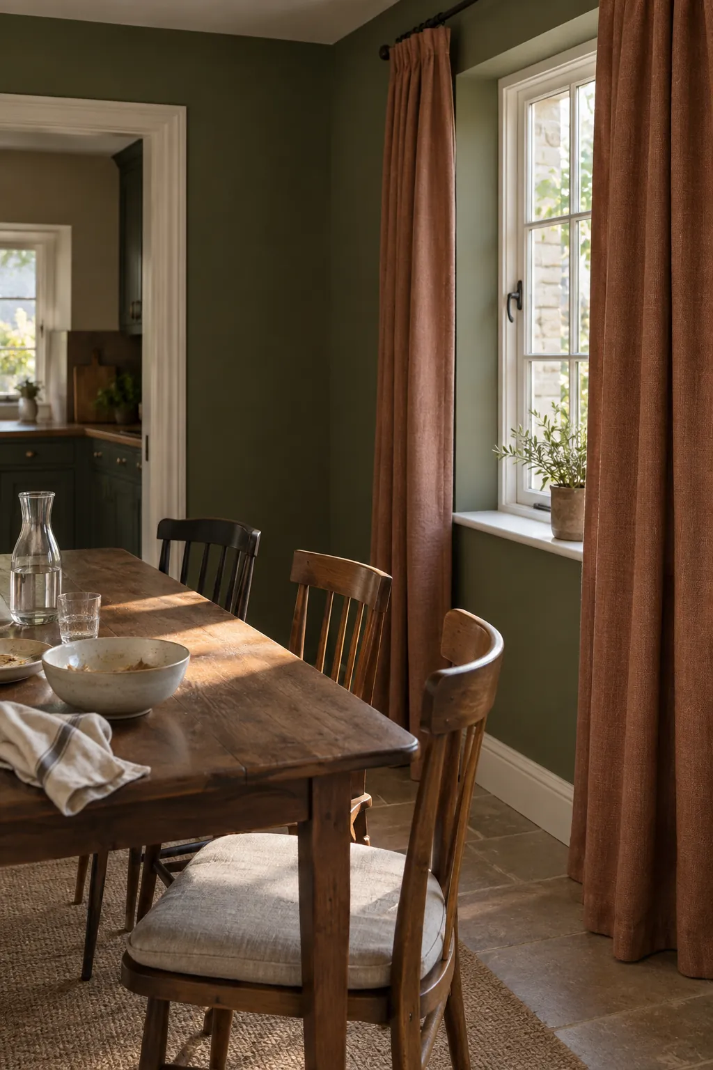
Clay, cinnamon and softened rust curtains can give dark green rooms a warm, earthy emphasis. They are particularly convincing with brown leather, aged timber and cream textiles. Choose a subdued cloth rather than a shiny orange fabric if you want the walls to remain the main colour statement.
Rust occupies a lot of visual space when the curtains are drawn, so check the whole panel effect rather than a tiny swatch. If your rug already contains terracotta, use that colour as the starting point and compare its undertone with the fabric. Avoid adding several unrelated warm accents while you decide; a limited palette makes the curtain choice easier to judge.
Green on green works when the undertones agree
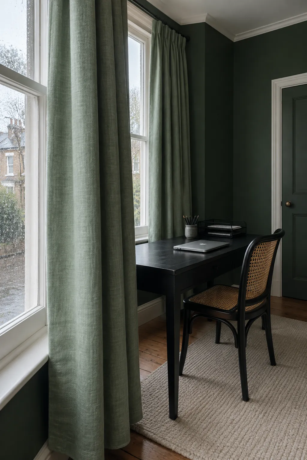
Green curtains can make the room feel enveloping, but matching them to painted walls is harder than matching two fabrics. Paint and cloth respond differently to light, so a near match can appear accidental. Try either a noticeably lighter green or a deeper shade in the same colour direction, then check both against the wall in daylight and under your usual lamps.
With a blue leaning dark green wall, a yellow olive curtain may appear disconnected even though both are labelled green. With an olive wall, a cool emerald fabric can create the same problem. Charcoal or navy can also support a moody scheme, but use them deliberately in a room where the lighting and pale furnishings provide enough relief.
Check the fabric and window before ordering
Choose window treatments for dark green rooms around their daily job as well as their colour. A living room may need filtered daylight and privacy, while a bedroom may need a separate blackout layer. Read the stated light blocking performance, because thickness, colour and the word linen do not tell you how well a curtain will darken a room.
Measure the track or pole and follow the maker’s guidance for panel width and heading fullness. Check where the radiator, vent or furniture sits before choosing the length. Keep curtains clear of heat sources according to the appliance guidance, and allow the panels to stack away from the glass where the window layout permits.
Finally, hang the largest samples you can obtain vertically beside the wall. Look at them with the curtains open in the morning and with the room lit at night. If cream looks too yellow, move toward soft ivory; if grey looks cold, compare warm taupe; if two greens fight each other, choose a neutral before committing to an expensive set.