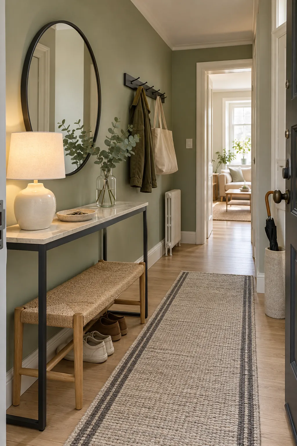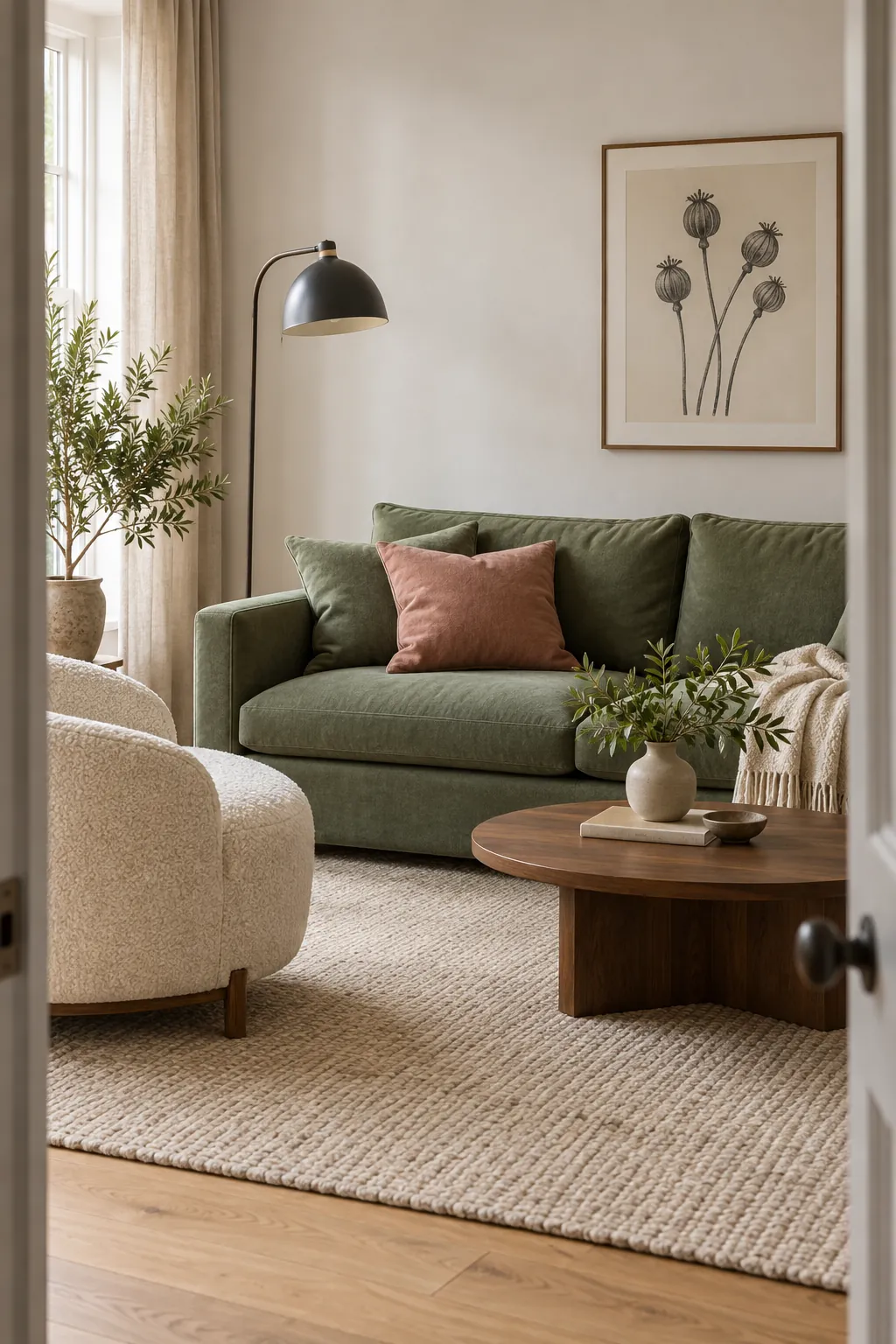
Green changes character more than most decorating colours. A yellow olive can feel warm and earthy, while a blue spruce can feel cool and formal. That is why a colour that looks perfect beside one green may make another look muddy or too bright.
The best starting point is to identify the undertone, then choose whether you want calm continuity or clear contrast. Warm greens usually suit cream, tan, terracotta, and warm wood. Cool greens respond well to crisp off white, blue, charcoal, and muted pink with a cool base.
Warm White Gives Green Room to Breathe
Warm white is the safest all purpose partner for sage, olive, moss, and forest green. It lifts the darker areas and gives the eye a quiet place to rest. Choose cream or ivory when the green leans yellow, but move toward a cleaner off white when the green has blue or gray underneath.
Use the white on the largest surrounding surfaces, such as the ceiling, curtains, rug, or bedding. This keeps a green interior color palette from feeling visually heavy. Compare samples beside existing trim in morning and evening light, since a white that looks neutral in the shop can appear yellow or gray at home.
Natural Wood Makes Green Feel Grounded
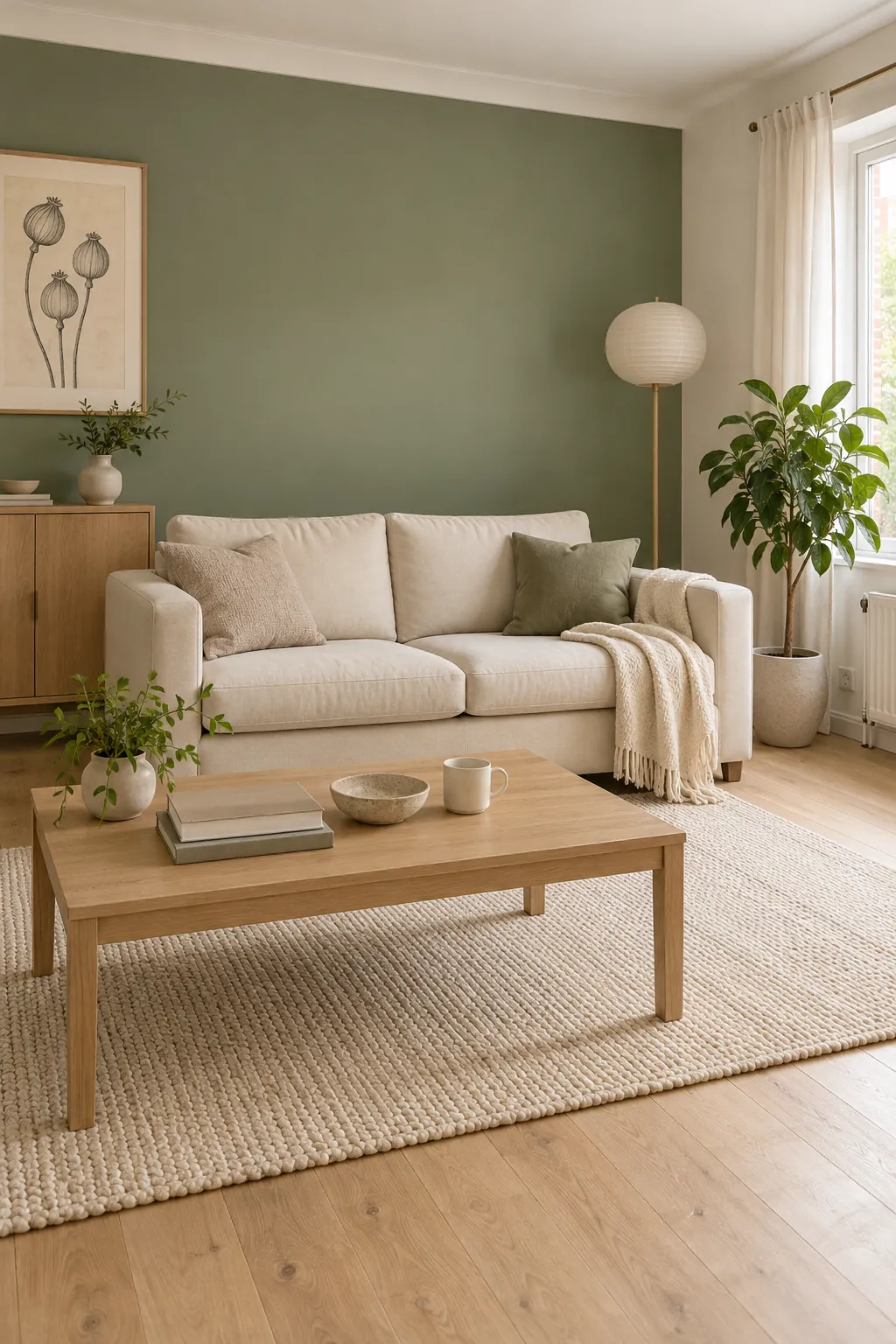
Green with natural wood works because both colours already appear together outdoors, but the wood tone still matters. Pale oak and ash keep sage or eucalyptus light. Walnut and medium oak give forest green more warmth, while reddish cherry can intensify an olive shade.
Repeat the same wood family in two or three places rather than mixing many unrelated finishes. A table, picture frame, and lamp base can be enough. If the floor has a strong orange tone, add cream or oatmeal between it and the green so the contrast feels intentional.
Dusty Pink Softens Deep Green
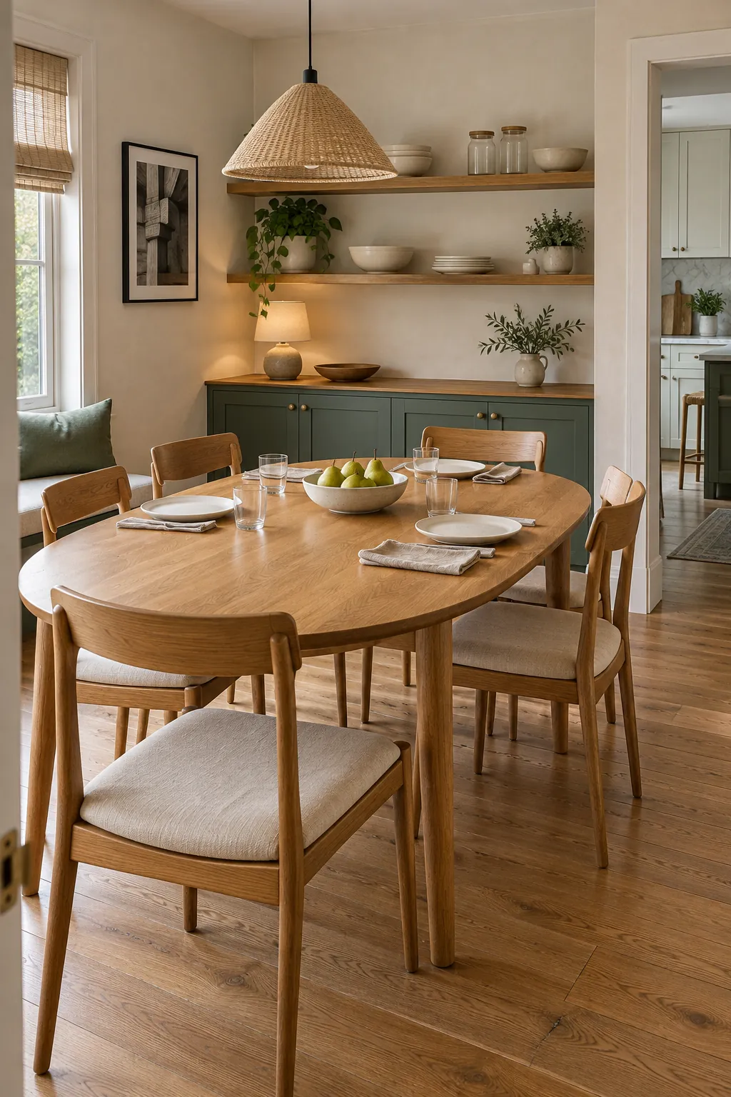
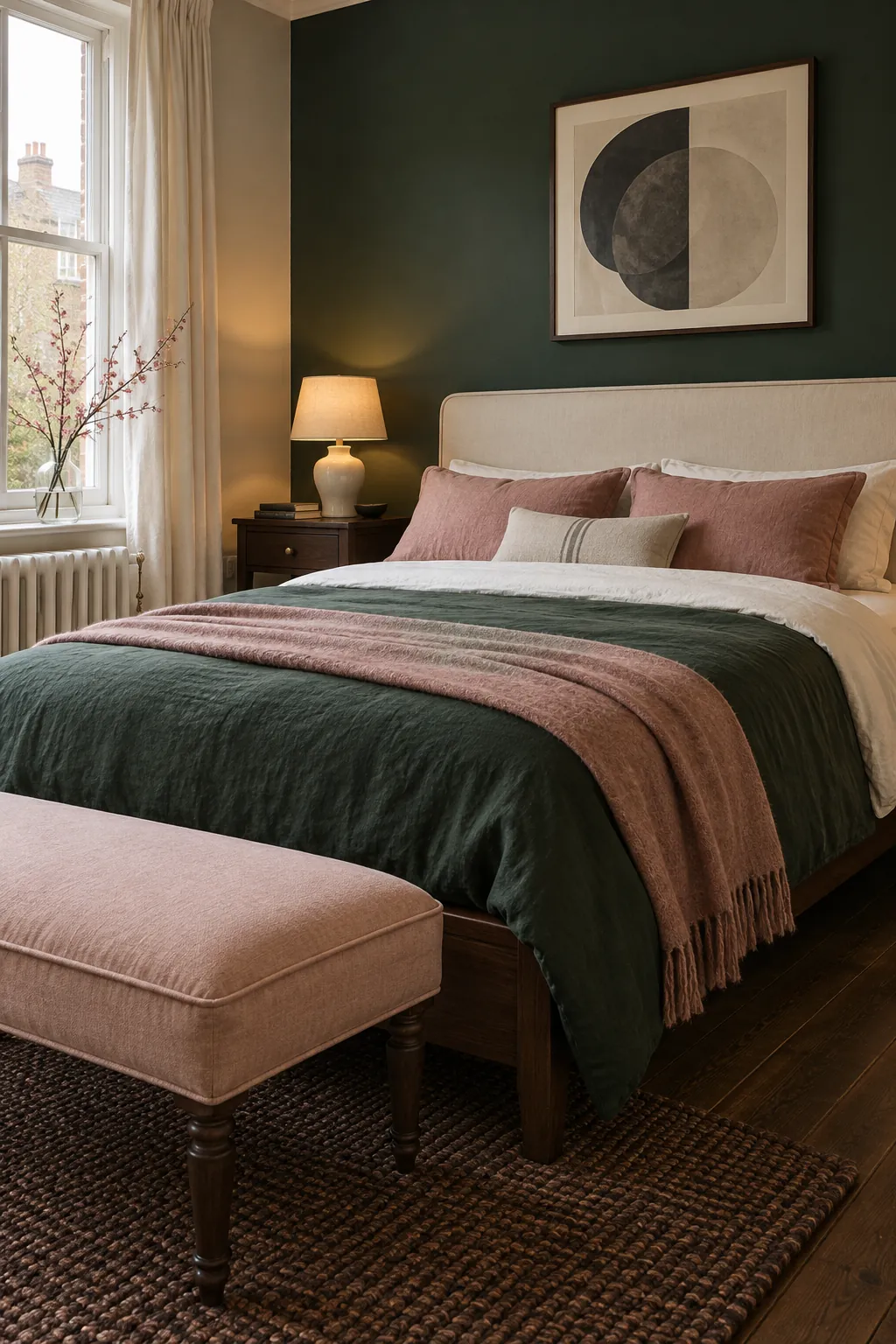
Dusty pink is a strong choice for a dark green room because it sits opposite green without the sharpness of a bright red. Muted rose, plaster pink, and faded blush bring warmth to pine, bottle green, and emerald. The gray content in these pinks keeps the contrast grown up.
Let one colour dominate and use the other in a smaller proportion. Green walls can take a rose chair or a pair of curtains, while a green sofa may need only pink cushions and one ceramic piece. Add cream, brown, or black between the two if the room starts to feel sweet.
Navy Creates a Calm Cool Palette
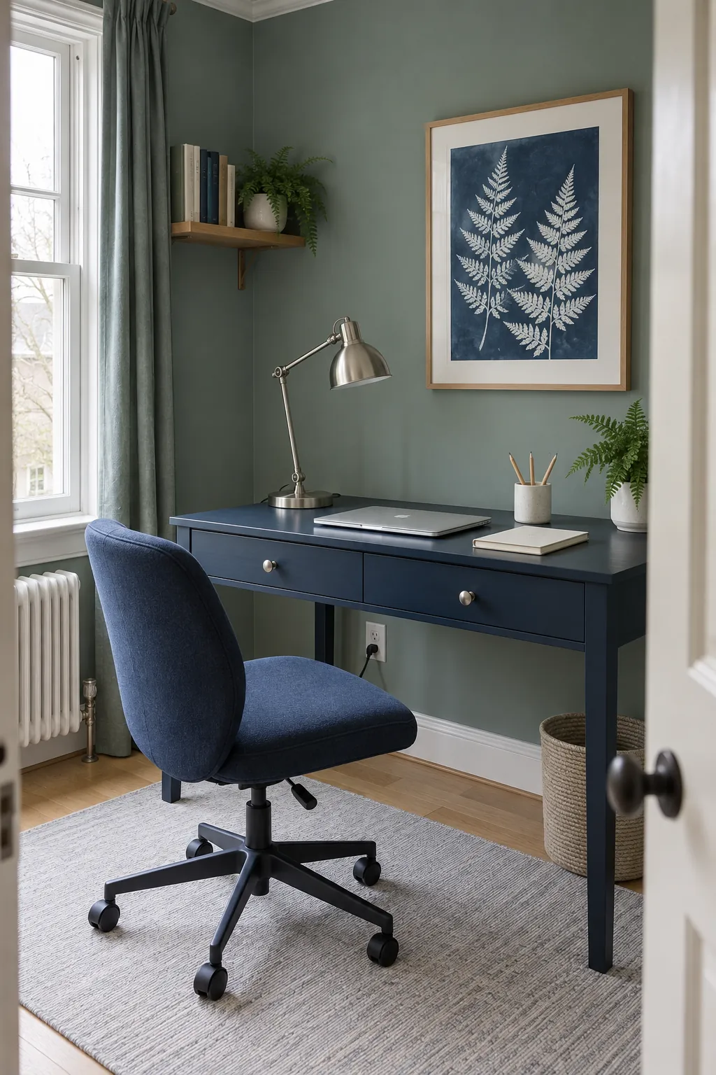
Navy works best with greens that contain blue, such as teal green, spruce, and cool emerald. The two colours sit close enough to feel calm, yet their different depths prevent a flat monochrome effect. A pale neutral is essential so both dark shades remain visible.
Try green curtains and textiles beside a navy headboard, or a navy rug beneath cool green seating. Use brushed nickel, pale stone, or cool white for small highlights. Check the combination after sunset because some cool greens lose their blue note under warm bulbs and may clash with navy.
Terracotta Warms Olive and Sage
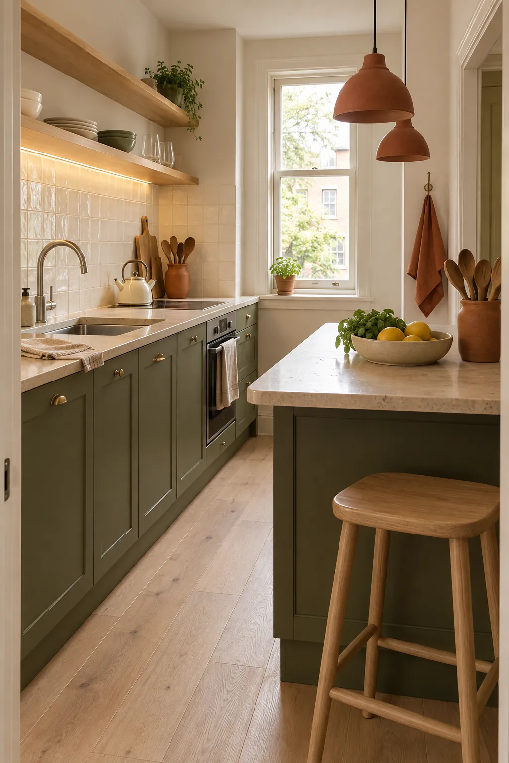
Terracotta brings out the yellow warmth in olive, moss, and muted sage. It is more grounded than orange and gives a green bedroom color scheme or kitchen a natural point of contrast. Clay tile, pottery, leather, and rust coloured linen can all carry this role.
Keep the clay tone concentrated in a few useful objects. One bench, a pair of lamps, or a patterned runner will usually do more than many small accessories. Add oatmeal and pale wood if the combination becomes too dense, especially in a room with limited daylight.
Charcoal Sharpens Green Without Harsh Black
Charcoal gives green structure when cream and wood alone feel too soft. It outlines sage without making it look sugary and gives emerald or forest green a quieter alternative to pure black. Choose a warm charcoal with olive and a cooler graphite beside blue green shades.
Use charcoal on pieces that already need visual weight, such as a fireplace surround, metal shelf, desk, or rug border. Leave enough pale surface nearby to separate the dark values. In a small room, charcoal works better as a frame than as another full wall colour.
Before you buy anything, place the green sample beside the proposed partner and photograph both in grayscale. If they merge into one value, add a lighter neutral or choose a clearer depth difference. This simple check reveals whether the finished room will have shape even when the colours are close.