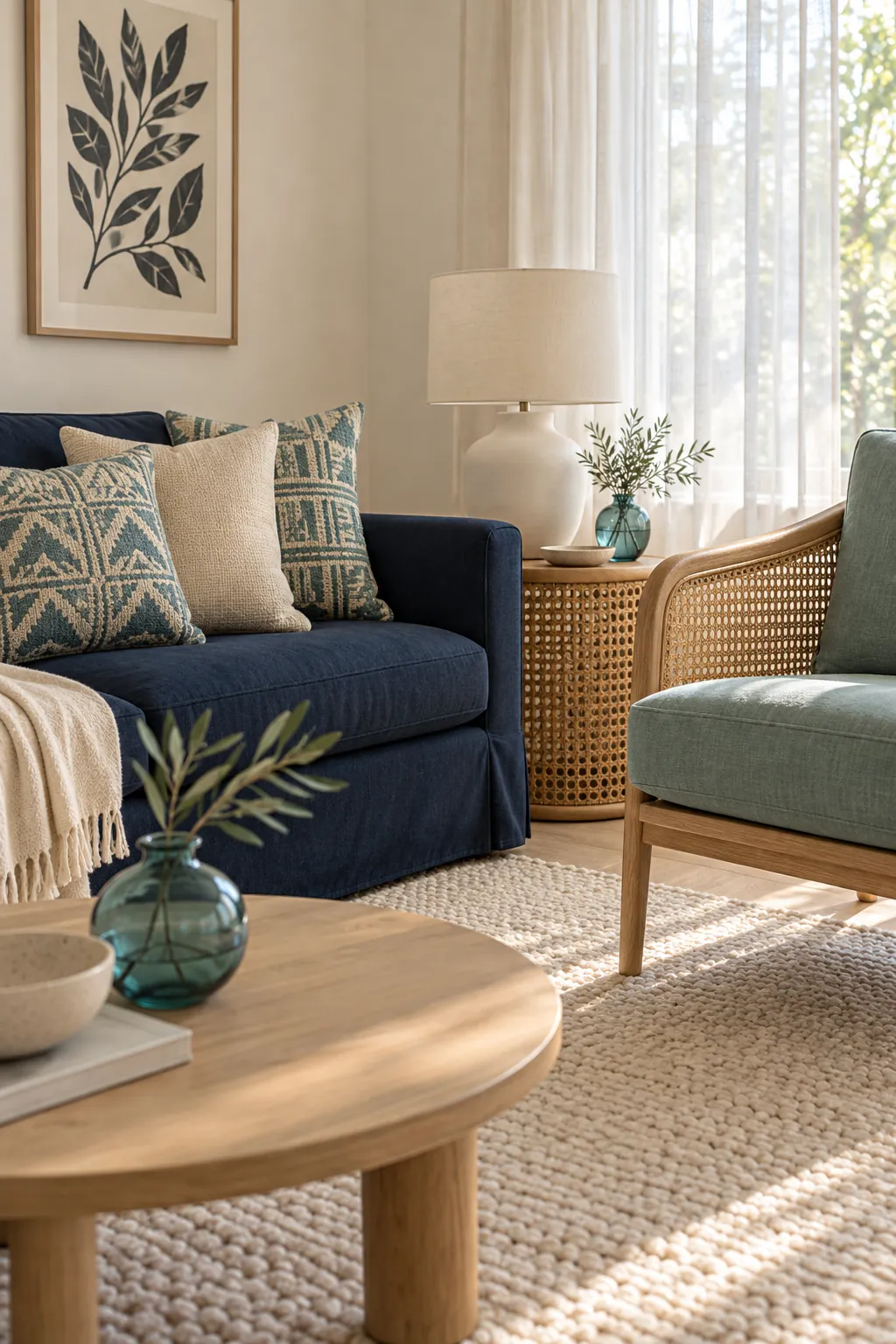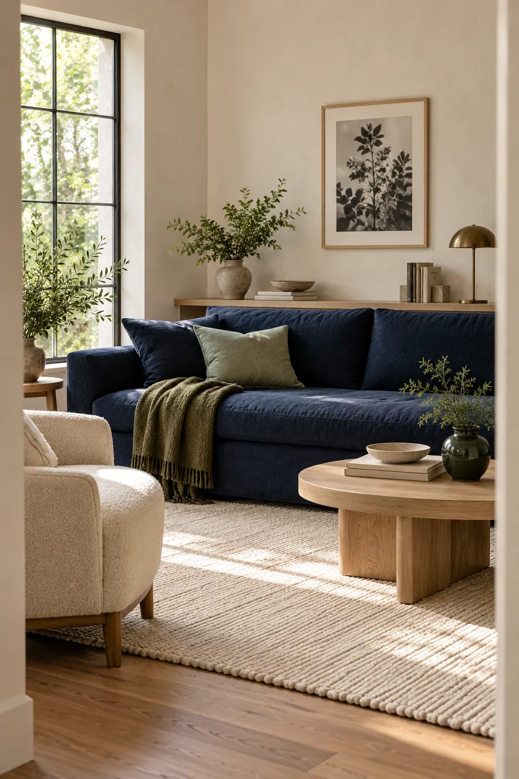
Navy works with more greens than most people expect. The strongest choices are muted sage, eucalyptus, olive, forest, and emerald. The right one depends on whether you want a light natural room, a warm earthy palette, or a deep dramatic effect.
The common mistake is treating navy and green as two isolated swatches. Their undertones, surface area, and surrounding neutrals decide whether the combination feels calm or crowded. Test samples beside the actual sofa, wall, cabinet, or bedding under both daylight and evening light.
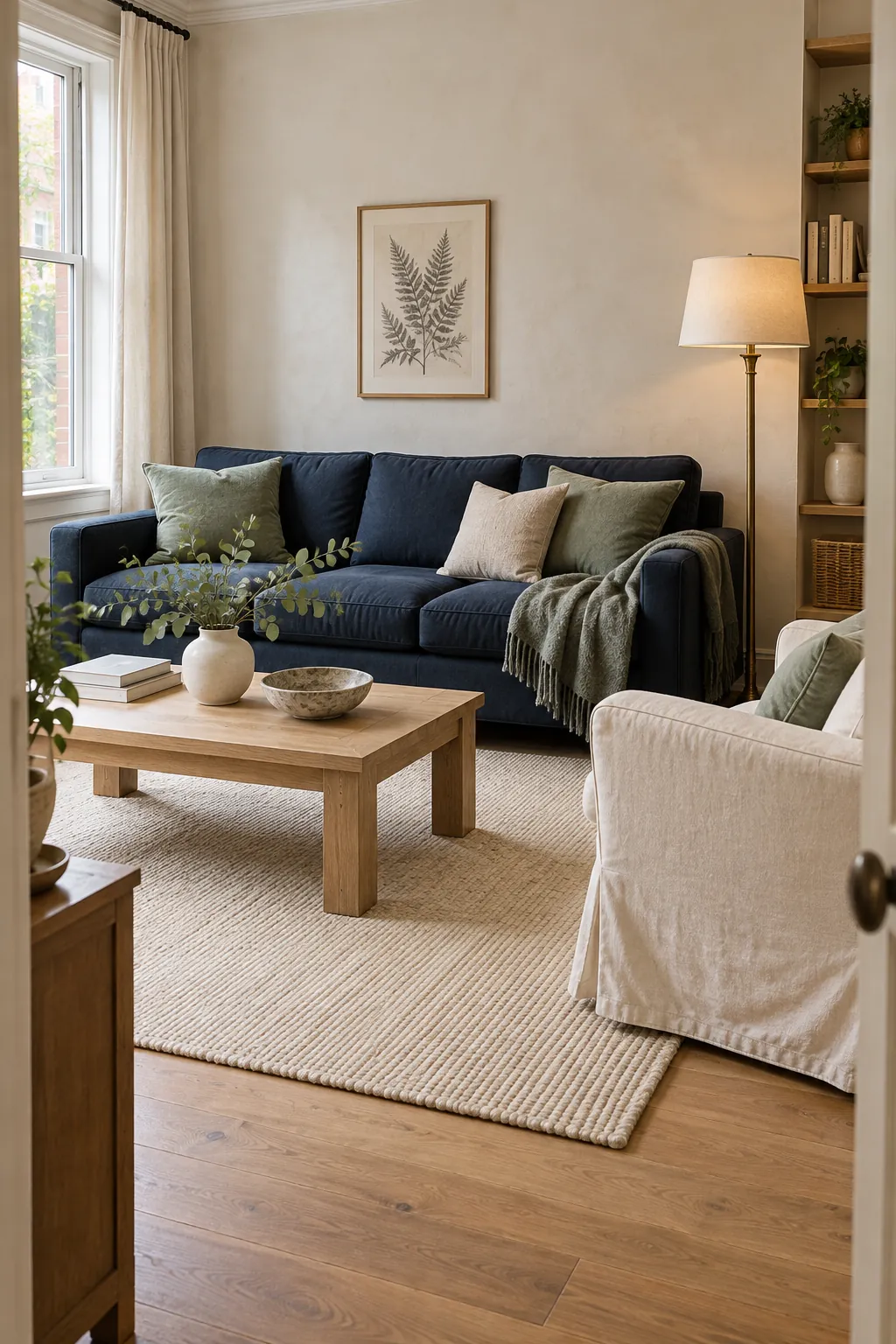
Sage green is the safest match
Sage is soft enough to lighten navy and gray enough to avoid a sharp color contrast. It works especially well when navy is already a large fixed element, such as a sofa, rug, or painted wall. Choose a sage that looks slightly muted rather than minty or pastel.
Warm white, oatmeal, pale oak, and aged brass can connect the two colors. A navy sofa with sage cushions will feel more settled when the rug and curtains add a broad light area. Repeat sage once more through pottery, a throw, or a small chair so it does not look accidental.
Olive green adds warmth
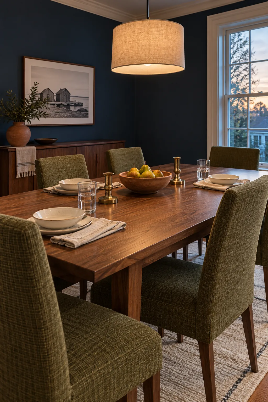
Olive contains more yellow than sage, so it gives navy a warmer and earthier character. This pairing suits rooms with walnut, leather, terracotta, or cream stone. It can also make a formal navy dining room feel more relaxed.
Keep the olive slightly subdued when the navy is very saturated. If both colors are strong, use cream across the largest remaining surfaces and bring in medium brown wood. Rust or clay can appear as one small accent because it supports olive without competing with navy.
Olive is practical for upholstery and curtains because it hides everyday marks better than pale sage. Its warmth also prevents a north facing room from feeling overly cool. View the fabric upright before buying, since the same sample may look darker on a vertical surface.
Emerald creates a jewel toned look
Emerald and navy create a rich palette because both colors have depth, but emerald brings more brightness. The combination works best when one color is clearly dominant. A navy bed with an emerald bench is easier to balance than navy walls, emerald curtains, and equally dark bedding.
Add cream linen, warm wood, or a soft blush detail to separate the dark surfaces. Brass can provide a useful highlight, but limit it to lamps or small hardware. Too many reflective gold pieces can make the two saturated colors feel theatrical.
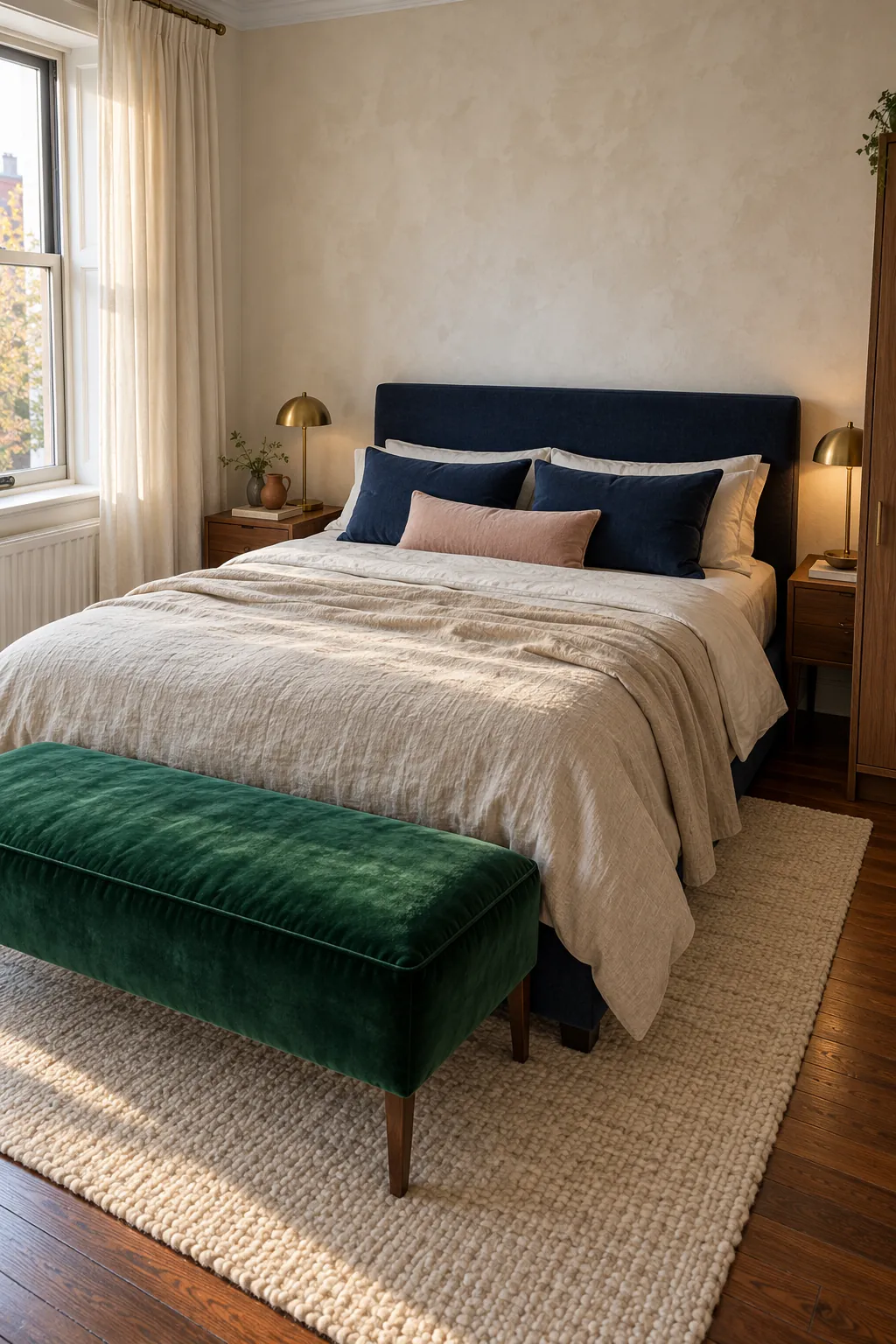
Forest green suits a quiet study
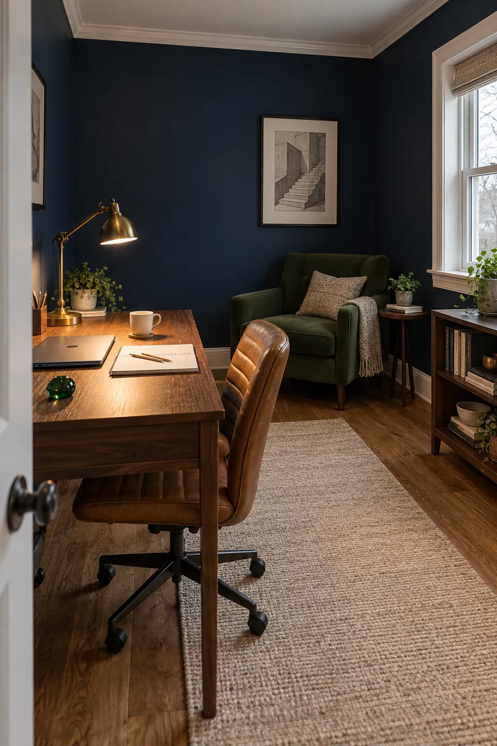
Forest green and navy are close in value, which creates a restful enclosed effect. This is useful in a study, library, or reading nook where you want concentration rather than brightness. Give each color a different material so the eye can separate them.
Try matte navy walls with a forest green wool chair, or a navy rug beneath green painted shelving. Oak, walnut, and tan leather add visible texture between the dark colors. A focused lamp is more useful than many decorative lights because it creates one clear area of contrast.
If the room has little daylight, keep the ceiling and window trim warm white. This preserves the cocooning mood without losing the room edges. Avoid cool gray as the main neutral, since it can drain warmth from both navy and forest green.
Eucalyptus keeps the palette fresh
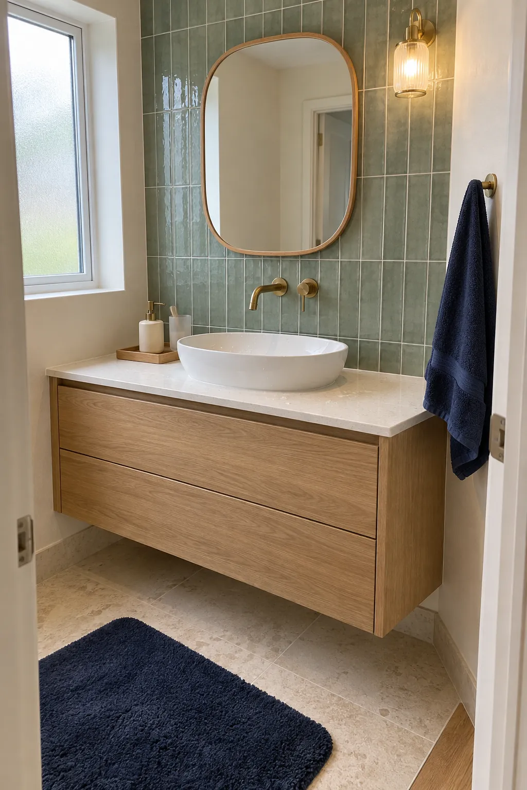
Eucalyptus green sits between sage and blue green. Its soft cool undertone connects naturally with navy, while its lighter value keeps a bathroom, entryway, or bedroom from feeling dense. It is a useful choice when you want color without a strong contrast.
Pair eucalyptus paint or tile with navy textiles, warm white stone, and light wood. Small black details can sharpen the combination, but warm metal usually feels more welcoming. Keep the grout or trim quiet so the two main colors remain easy to read.
Blue green needs visible separation
Teal and other blue greens can sit close to navy on the color wheel. That closeness feels harmonious, but similar values may blur together. Choose a noticeably lighter or brighter blue green, then separate it from navy with cream, natural cane, or a warm wood edge.
Pattern can help when it contains both colors plus a light neutral. A rug, curtain, or cushion with navy, blue green, and cream makes the relationship look deliberate. Keep the rest of the room quieter so the pattern remains the bridge rather than one more competing feature.
Start with the fixed navy surface, then compare green samples against it in the room. Pick the green whose undertone supports the existing wood, stone, and light. When the colors have clear roles and enough neutral space, navy and green feel layered rather than mismatched.