
Have you ever walked into a bedroom and felt instantly relaxed? It isn't just about the mattress or the thread count of the sheets. Most of the time, that feeling of peace comes from a well-thought-out interior design color palette. The colors on your walls and in your decor directly affect your mood and how well you sleep at night.
In this guide, we will look at how to build a modern interior color palette that turns your bedroom into a sanctuary. We will cover everything from choosing neutral foundations and earthy tones to using the 60-30-10 rule for a balanced look.
Neutral foundations for a modern interior color palette
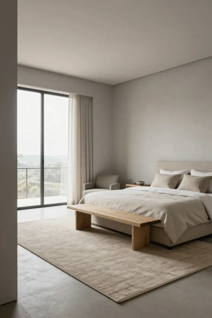
Start with neutrals if you want a timeless look. A modern interior color palette often relies on shades like soft gray, warm beige, or off-white. These colors provide a clean backdrop that makes the room feel larger and less cluttered. Unlike stark white, which can feel cold, warm neutrals create a cozy atmosphere. They are easy to work with because they go with almost any furniture style. If you want to change your decor later, a neutral base ensures you won't have to repaint everything.
Using earthy tones to create a contemporary color palette
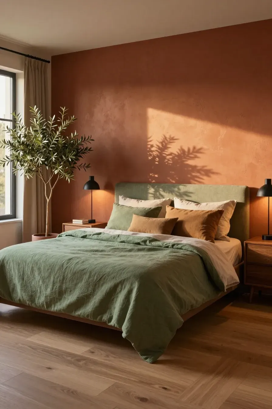
Earthy tones are a staple of any contemporary color palette. Think of colors found in nature, like terracotta, sage green, and muted ochre. These colors bring a sense of the outdoors inside, which helps lower stress. To use these effectively in a bedroom, try a clay-colored accent wall or linen bedding in a mossy green. These shades feel grounded and sophisticated without being too loud or distracting when you are trying to wind down.
How to pick cool blues and greens for better sleep
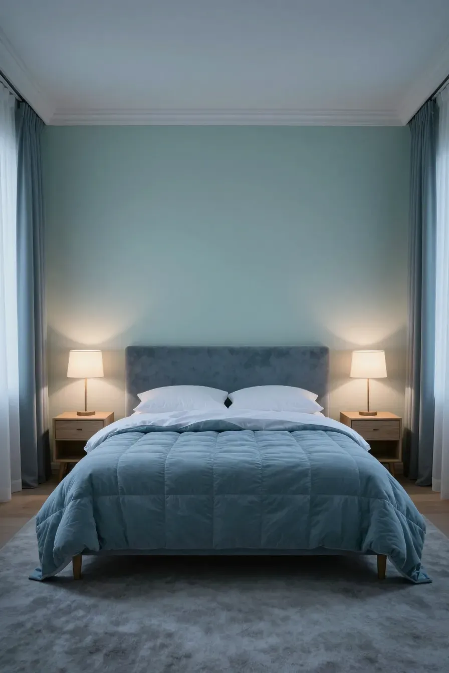
Cooler colors are scientifically linked to better rest. When selecting an interior design colour palette for sleep, look at dusty blues or soft mint greens. These colors can lower your heart rate and create a sense of calm. Avoid bright neons or high-energy teals. Instead, look for shades with gray undertones. These 'muddy' versions of blue and green feel more mature and are much easier on the eyes in the evening light.
Adding depth with a moody and dark modern colour palette
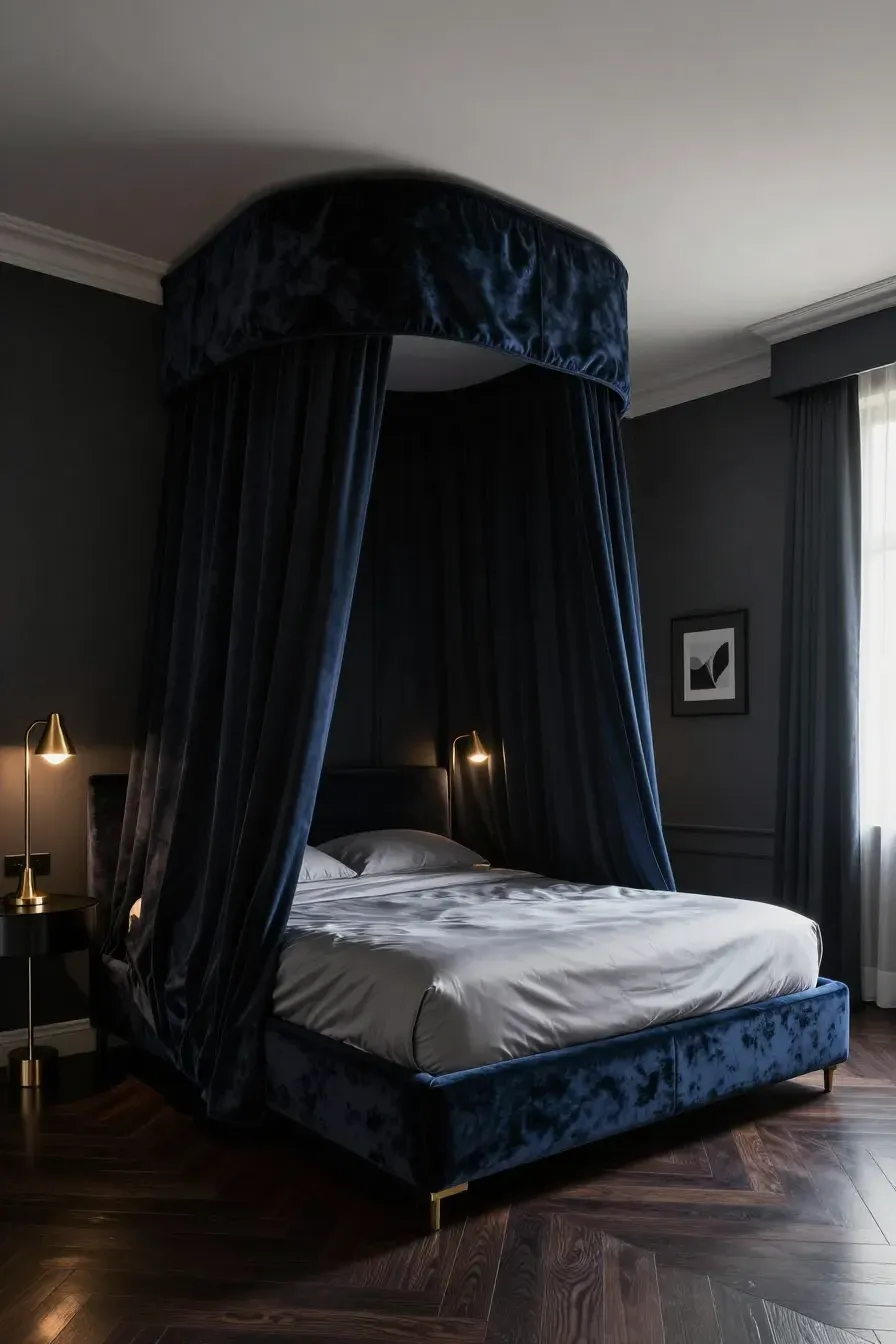
Don't be afraid of dark colors. A dark modern colour palette can make a bedroom feel like a high-end hotel suite. Charcoal gray, navy blue, or even deep forest green can make the walls feel like they are receding, which creates a 'cocoon' effect. This is great for people who prefer a very dark room for sleeping. If you go dark on the walls, keep the ceiling light to prevent the room from feeling like a cave.
Applying the 60-30-10 rule to interior design color schemes
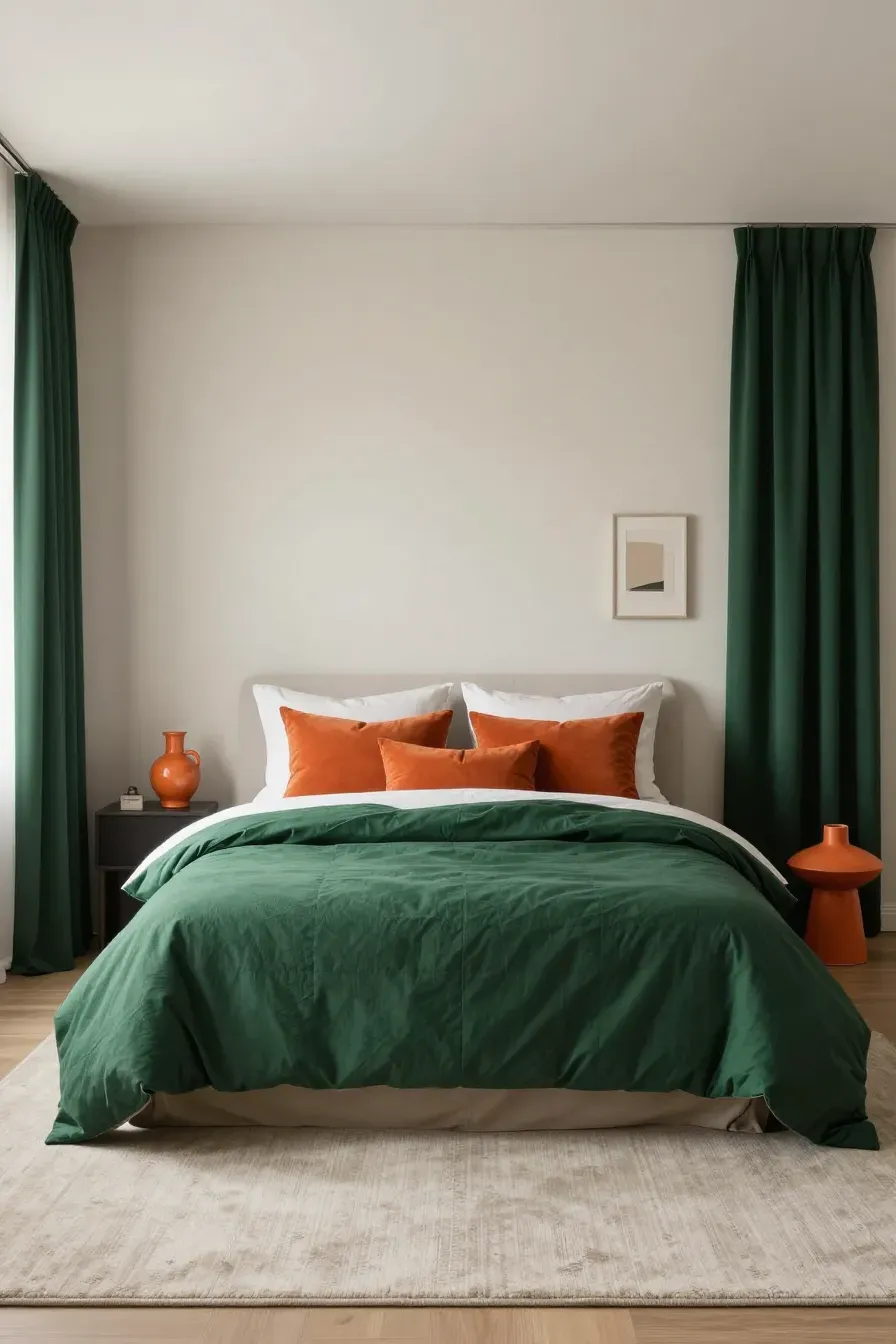
One of the easiest ways to balance interior design color schemes is the 60-30-10 rule. Use your primary color (usually a neutral) for 60% of the room, like the walls and rugs. Use a secondary color for 30% of the space, such as the upholstery or curtains. The final 10% is for an accent color, which you can use for pillows, lamps, or artwork. This ratio ensures your house color palette interior looks intentional and organized rather than random.
Ways to coordinate furniture with your home color palette interior
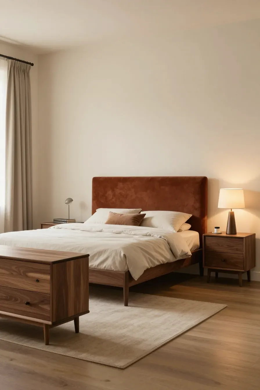
Your furniture should complement your home color palette interior, not fight it. If you have a warm-toned palette, look for wood furniture like oak or walnut. For cooler palettes, black, white, or light maple furniture works well. If you have a statement piece of furniture, like a velvet headboard, make sure its color is part of your 30% secondary color or 10% accent color to keep the room cohesive.
Choosing the right paint finish for indoor color schemes house
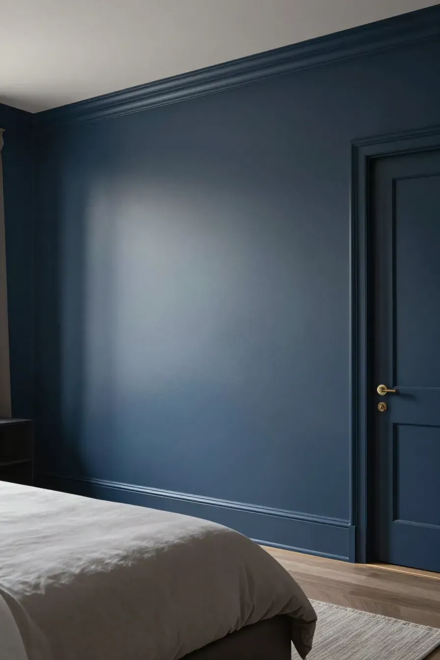
The finish of the paint is just as important as the color in indoor color schemes house. For bedrooms, flat or matte finishes are usually best. They don't reflect light, which helps hide imperfections on the wall and creates a soft, velvety look. If you have kids or pets and need something washable, an eggshell finish offers a slight sheen but is still subtle enough for a restful modern interior.
Balancing natural light with your interior design colour palette
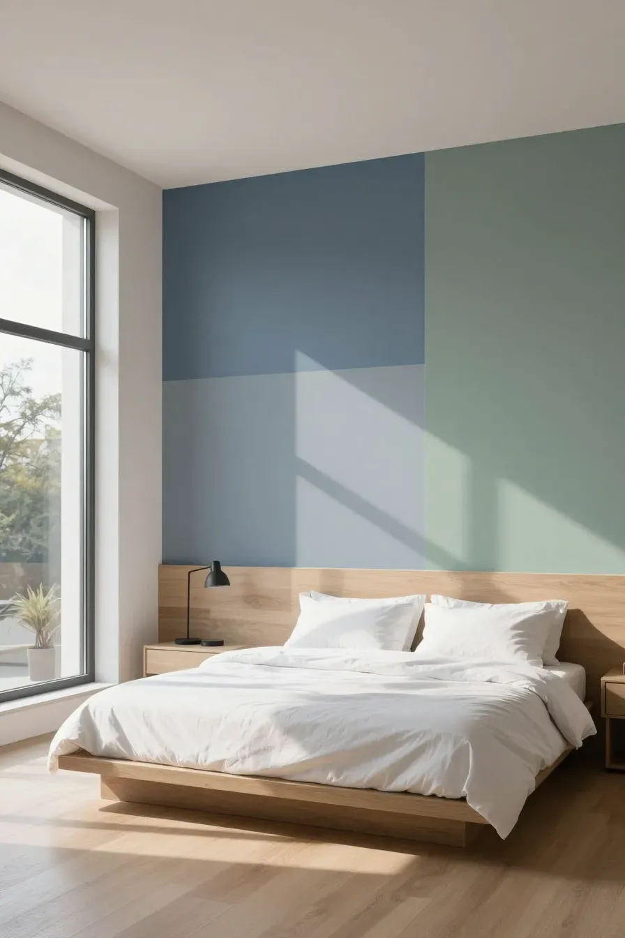
Natural light changes how colors look throughout the day. A color that looks blue in the store might look gray in a north-facing room with little sunlight. Before committing to an interior design colour palette, paint large swatches on different walls. Observe them in the morning, afternoon, and under your bedside lamps at night. This prevents surprises and ensures the color stays true to what you wanted.
Small changes to update your home decor color palettes without painting
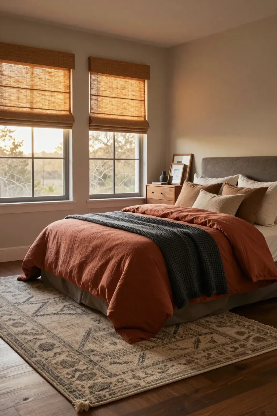
You don't always need a paintbrush to refresh your home decor color palettes. You can shift the mood by swapping out textiles. Change your duvet cover, add a new area rug, or replace your window treatments. Adding natural elements like bamboo shades or wooden picture frames can also introduce new tones. These small updates allow you to experiment with a new modern interior color palette without a major time commitment.
Creating a restful bedroom is all about choosing colors that make you feel at peace. Whether you prefer a light neutral look or a dark, moody vibe, the key is consistency. Start with a solid foundation, follow the 60-30-10 rule, and always test your colors in your room's specific light. Ready to start? Pick three colors today and see how they look together in your space.