
Have you ever walked into a room that felt instantly calming, yet looked like it belonged on the cover of a design magazine? Often, the secret isn't a bold splash of color, but a carefully layered mix of neutrals. Using a cream, beige, and taupe modern interior color palette allows you to create a space that feels both high-end and lived-in without relying on passing trends.
This guide will show you how to master these subtle shades to build a home color palette interior that feels cohesive. We will cover the technical differences between these tones, how to choose the right base for your specific rooms, and the small details—like lighting and texture—that prevent a neutral space from feeling dull.
Differences between cream, beige, and taupe tones

While they might look similar at first glance, these three colors have different undertones that change how a room feels. Cream is essentially white with a drop of yellow or gold. It is warm and inviting, making it a great alternative to stark white. Beige is a bit deeper, often containing brown or tan undertones. It mimics the look of natural sand or undyed wool.
Taupe is the most complex of the three. It sits right between brown and gray. Because it has a cool or slightly purple undertone, it feels more modern and sophisticated than traditional beige. Understanding these differences is the first step in creating a successful interior design color palette.
How to choose the right base color for each room

The best way to pick your base is to look at the natural light in your room. North-facing rooms often have a cool, bluish light. In these spaces, a warm cream or beige helps balance the chill. South-facing rooms get plenty of warm sun, so a cool-toned taupe can help keep the space from feeling too yellow.
Think about the room's purpose too. For a bedroom, a soft cream base creates a restful environment. In a home office, a mid-tone taupe provides a professional, focused backdrop. When building your interior design color schemes, start with one dominant neutral for the walls and use the other two for furniture and accents.
Using texture to add depth to a neutral interior design color palette
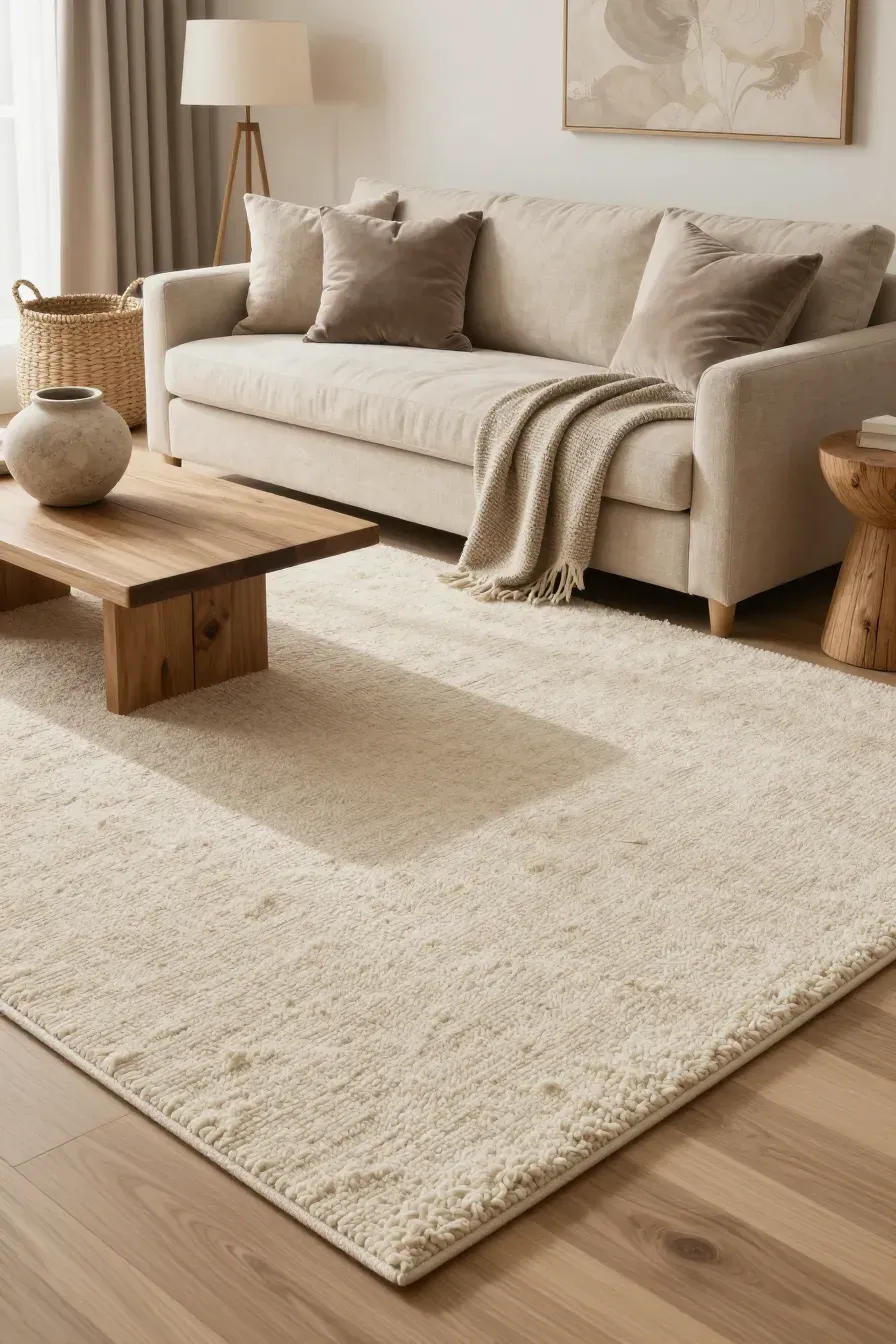
Without texture, an all-neutral room can look flat and boring. When you stick to a limited contemporary color palette, you need to mix materials to create visual interest. Think about layering a chunky wool rug over a smooth hardwood floor, or placing velvet taupe cushions on a linen beige sofa.
Natural materials are your best friend here. Consider using woven baskets, stone vases, and bouclé fabrics. These textures catch the light differently, creating shadows and highlights that make the room feel rich and layered even without bright colors.
Selecting wood finishes that complement a modern colour palette
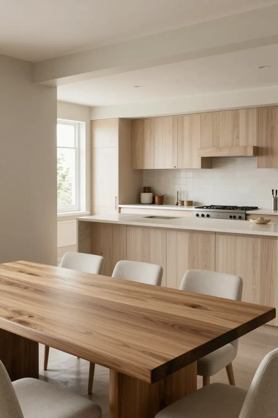
Wood adds warmth to a house color palette interior. For a cream and beige scheme, light woods like white oak, ash, or maple work beautifully. They keep the space airy and bright. If your palette leans more toward taupe, you can use medium-toned woods like walnut or cherry to provide a bit of grounding contrast. Try to avoid woods with very orange or red stains, as these can clash with the subtle undertones of a modern colour palette.
Lighting choices that keep neutral interior design colour schemes from looking flat
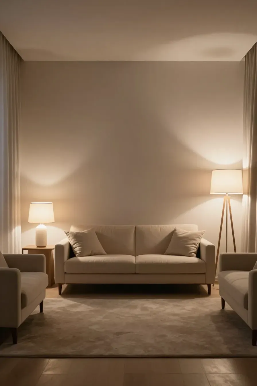
Lighting can make or break indoor color schemes house designers create. Avoid using only one overhead light, which can create harsh shadows and make neutrals look muddy. Instead, layer your lighting. Use floor lamps, table lamps, and wall sconces to create 'pools' of light.
Pay attention to the bulb temperature. Warm white bulbs (around 2700K to 3000K) enhance the coziness of cream and beige. If you want the taupe elements to look crisp and modern, look for 'cool white' or 'daylight' bulbs, but be careful not to go too blue, or the room will feel clinical.
Adding contrast with metal accents and darker neutral shades
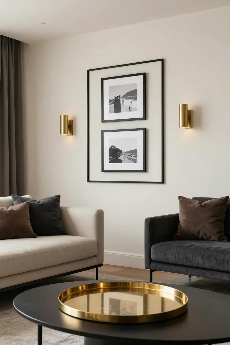
A modern interior color palette needs a bit of 'weight' to feel finished. You can achieve this by adding small touches of darker neutrals like charcoal gray, chocolate brown, or even matte black. Use these for picture frames, curtain rods, or small furniture legs.
Metal finishes also provide contrast. Brass and gold look wonderful with cream and beige because they share warm undertones. For a more contemporary look, black iron or brushed nickel pairs well with taupe. These metallic hits act like jewelry for the room, giving the eye a place to rest.
Practical ways to use this contemporary color palette in high-traffic areas
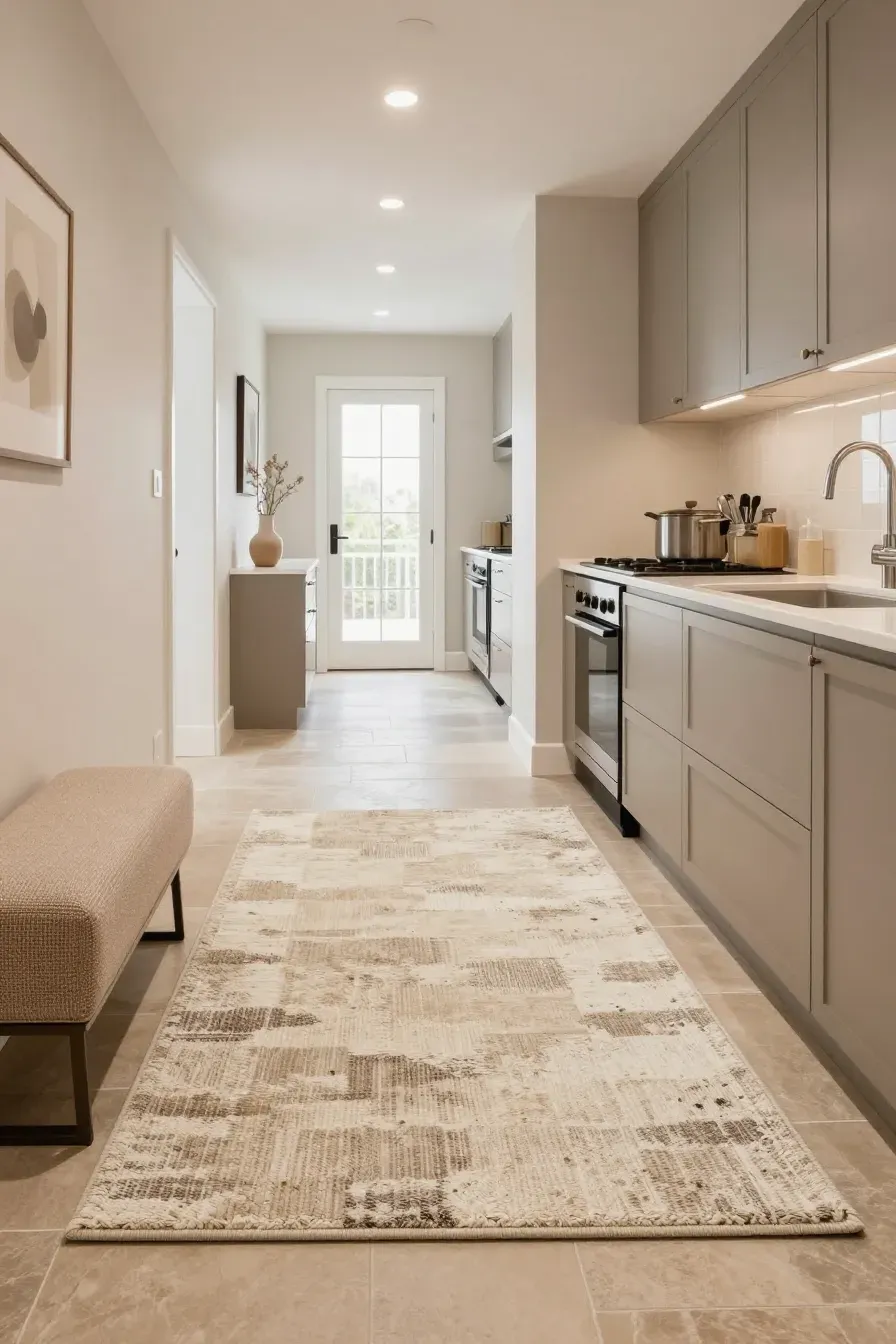
Many people worry that a light interior design colour palette isn't practical for families or pets. The trick is choosing the right materials. In high-traffic areas like the entryway or living room, use performance fabrics that are stain-resistant.
For flooring, look for multi-tonal rugs that incorporate cream, beige, and taupe together. A patterned or speckled rug hides dirt much better than a solid light-colored one. In the kitchen, taupe cabinetry is a smart choice because it hides fingerprints better than pure white or cream.
Maintaining a cohesive house color palette interior from room to room

To make your whole home feel connected, use the same three colors throughout but change the proportions. For example, your living room might be 60% beige, 30% cream, and 10% taupe. In the next room, you could flip it so taupe is the main wall color.
Using the same trim color (like a soft off-white) in every room is another way to tie the house color palette interior together. This creates a flow that makes the house feel larger and more intentional as you move from one space to the next.
Creating a beautiful home doesn't require a rainbow of colors. By mastering the balance between cream, beige, and taupe, you can design a space that feels timeless and sophisticated. Start by identifying the natural light in your home and choosing one base shade to build upon. Once you have your foundation, layer in textures and subtle contrasts to bring the room to life. Ready to refresh your space? Pick up a few paint samples today and see how these neutrals look in your own light.