
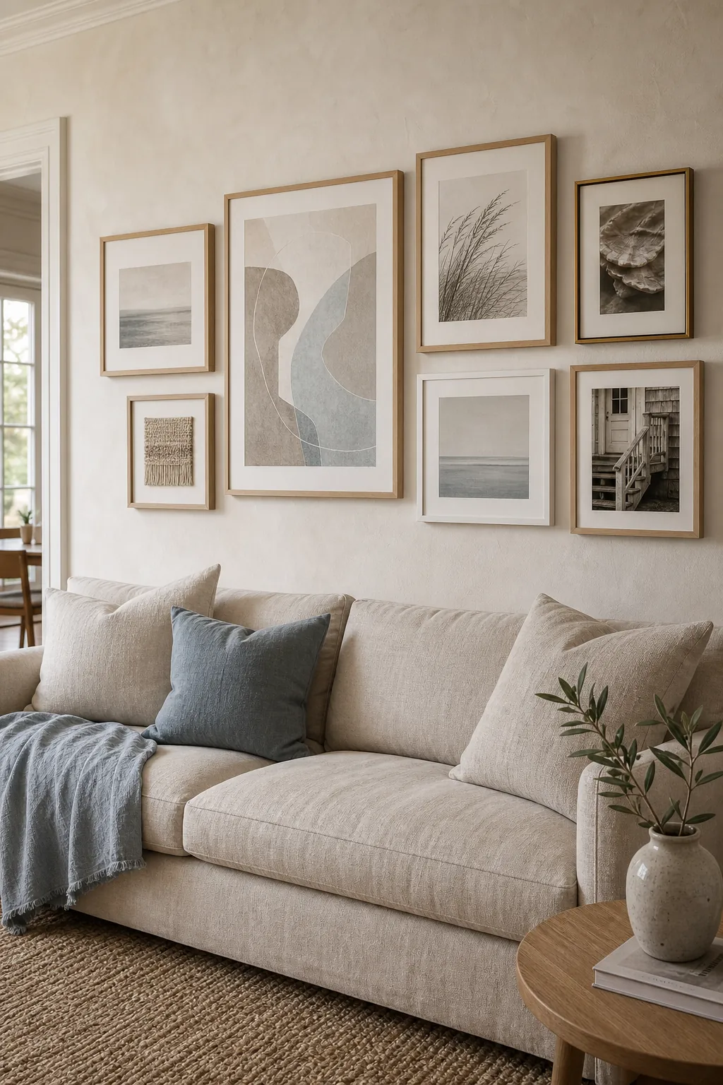
A coastal gallery wall can go wrong in two opposite directions. Fill it with anchors, boats, and navy stripes, and the room starts to feel like a themed rental. Make every print pale beige, and the whole arrangement disappears into the wall. The more convincing approach sits between those extremes: quiet coastal references, tactile materials, and enough contrast to make soft neutral art feel intentional.
You do not need an ocean view or a matching set of expensive prints. You need a clear visual thread, a layout that fits the furniture below it, and a disciplined edit before anything is hung. This guide walks through that process so your coastal gallery wall feels collected, calm, and personal rather than styled from a single box.
Define Coastal by Mood, Not Motifs
The best coastal decor rarely announces itself. It suggests salt-washed light, wind-softened color, natural fibers, and the irregular lines found along a shore. That gives you a much richer starting point than a list of beach symbols.
Begin with three words that describe how you want the room to feel. Airy, weathered, and quiet might lead to chalky whites, driftwood brown, faded blue-gray, and art with plenty of breathing room. Warm, organic, and relaxed could point toward sand, oatmeal, muted terracotta, sea-glass green, hand-thrown ceramics, and loosely rendered botanical forms.
Those words become your filter. A shell study may fit; a glossy “Beach This Way” sign probably will not. A charcoal sketch of dune grass can feel more coastal than a literal lighthouse because its line, texture, and movement support the atmosphere of the room.
A useful rule: let the coast influence the palette and texture first, the subject matter second.
Build the Art Collection in Three Layers
A wall made from one type of image tends to look purchased rather than gathered. Instead, build the collection in three layers: an anchor, supporting pieces, and small details.
- The anchor: one larger work that carries the strongest shape or value contrast. Try a soft geometric abstract, a cropped black-and-white architecture photograph, an ink study of windblown grass, or an aged textile fragment.
- The supporting pieces: two to four medium works that repeat one or two colors from the anchor without copying its subject. These can include abstract tide lines, a pale botanical study, a close-up photograph of shell texture, or a small block print.
- The details: one or two compact pieces that add personality or change the rhythm. A handwritten postcard, a tiny family photograph, a pressed leaf, or a woven sample makes a frame wall feel like yours.
Keep the collection cohesive by repeating one element at least three times: the same off-white mat, a pale oak frame, a charcoal line, or a dusty blue accent. Do not repeat everything. If the subject, frame, size, and color all match, the result will feel flat.
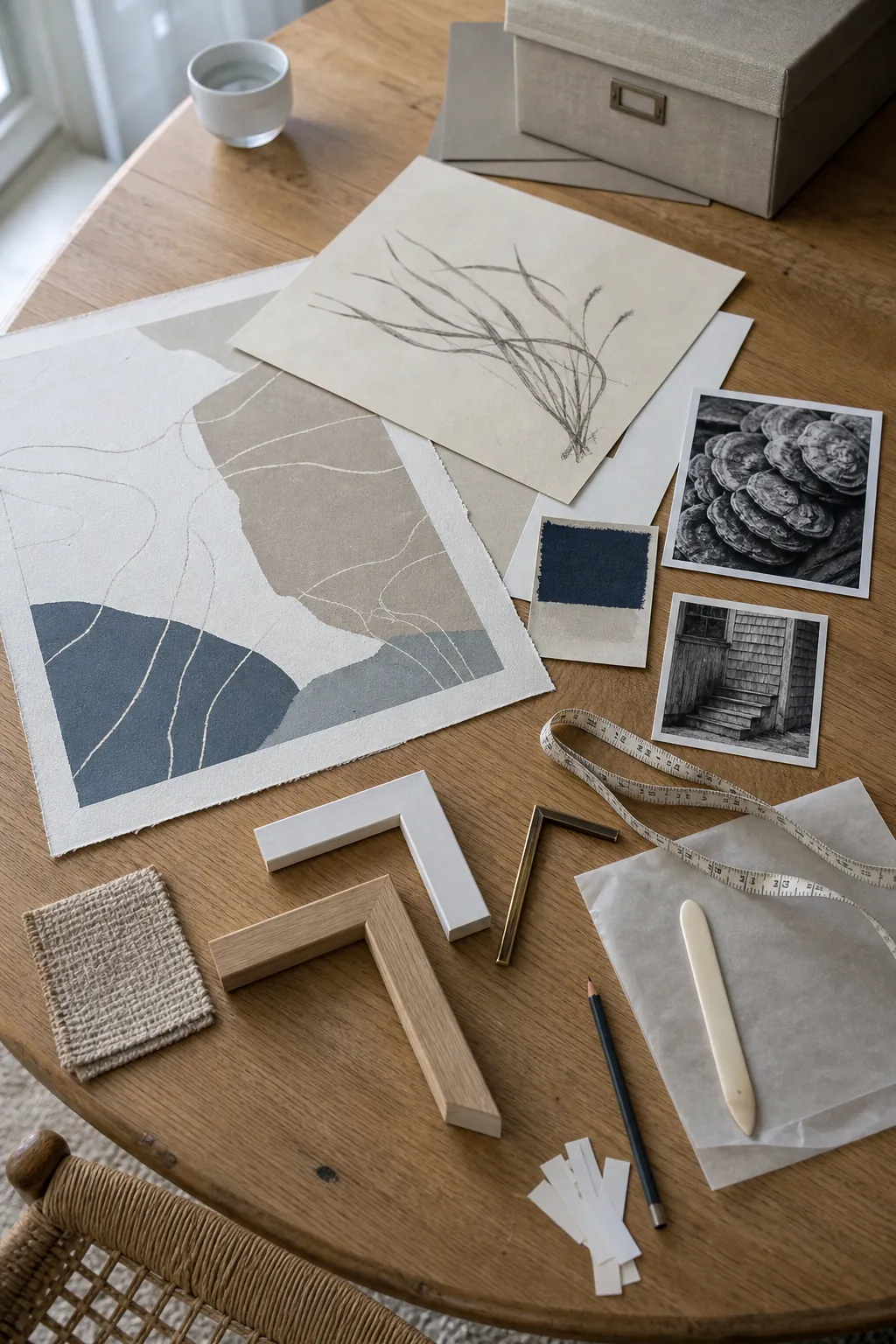
If you are starting from nothing, shop your home before buying more wall art. Look through old travel photos, postcards, fabric remnants, sketches, and books with damaged but beautiful plates. A personal fragment gives generic neutral art something to orbit around.
Choose a Layout That Matches the Room
The floor is useful for arranging frames, but it can mislead you about scale. A cluster that fills the rug beside you may look undersized above a long sofa. Measure the available wall area first, then choose a layout that responds to the room.
Use a grid for visual quiet
A grid of four, six, or nine same-size frames creates the calmest result. It works especially well in a bedroom, dining nook, or orderly home office. Vary the art inside the frames, but keep the mats and frame finish consistent so the eye reads the group as one larger work.
Use a balanced cluster for a collected look
A loose cluster suits a living room, stair landing, or entryway where you want more personality. Start with the largest piece slightly off-center, then build outward. Align at least one edge of each frame with an edge nearby. That hidden grid keeps mixed sizes connected without forcing symmetry.
Use a horizontal row above long furniture
A single row or shallow two-row arrangement works above a sofa, sideboard, or headboard. Let the complete grouping relate to the furniture as one unit. If it is much narrower than the piece below, it can look stranded; if it pushes beyond both edges, it may feel top-heavy.
Whichever structure you choose, treat the full arrangement as a single shape. The visual center of that shape—not the center of one favorite frame—should sit comfortably at eye level or in relationship to the furniture below.
Give Soft Neutrals Enough Contrast to Hold the Wall
Neutral art is not the same as low-contrast art. Cream on cream can be beautiful up close but vanish from across the room. A successful soft decor scheme needs a few darker notes to outline the composition.
Use charcoal, weathered brown, muted indigo, or deep olive in roughly three small places. That could mean one narrow black frame, two dark brush marks, and a shadow line in a photograph. Distribute contrast instead of concentrating it in one corner; otherwise one side of the gallery wall will feel heavier even when the frame sizes are balanced.
Texture also creates contrast without adding loud color. Pair smooth photographic paper with deckled watercolor paper, linen mat board, raw oak, woven fiber, or a softly aged metal frame. These materials make a neutral arrangement readable through shadow and surface rather than saturation.
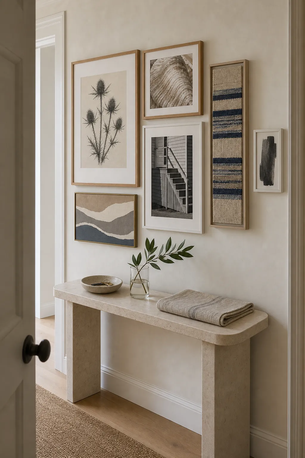
Step back and squint at the whole wall. You should still be able to see a balanced shape and a few gentle focal points. If one area turns into a dark block, spread those pieces apart. If everything dissolves, add one deeper frame or artwork with a clearer line.
Mix Frames Without Creating Visual Noise
Matching frames are the easiest route, but they are not the only route. Mixed frames can make home styling feel more lived-in as long as you limit the variables.
- Choose no more than two dominant finishes, such as pale oak and warm white.
- Add one minor accent finish, such as aged brass or slim charcoal, to only one or two pieces.
- Keep mat colors close even when frame finishes vary.
- Spread repeated finishes across the arrangement rather than stacking them together.
- Use an oval or round piece sparingly; its different silhouette will naturally become a focal point.
Frame depth matters too. Thin frames feel lighter and more contemporary; a deeper timber profile reads as weightier and more rustic. Place deeper frames near the anchor or lower half of the grouping, where their visual weight feels grounded.
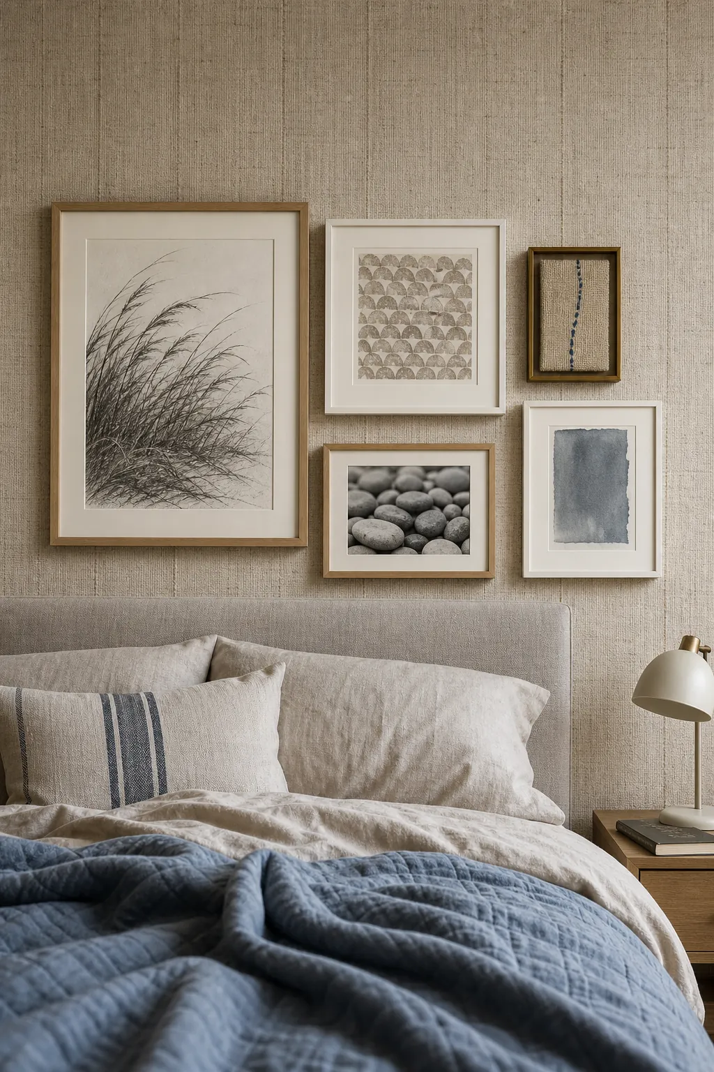
If your existing frames already feel chaotic, do not replace all of them. First change the mats to a shared warm white or oatmeal. A consistent field around the artwork often does more for cohesion than perfectly matched molding.
Measure the Wall Before Making Holes
The most common source of gallery-wall frustration is trying to solve the composition while hanging it. Make the decisions at full scale first.
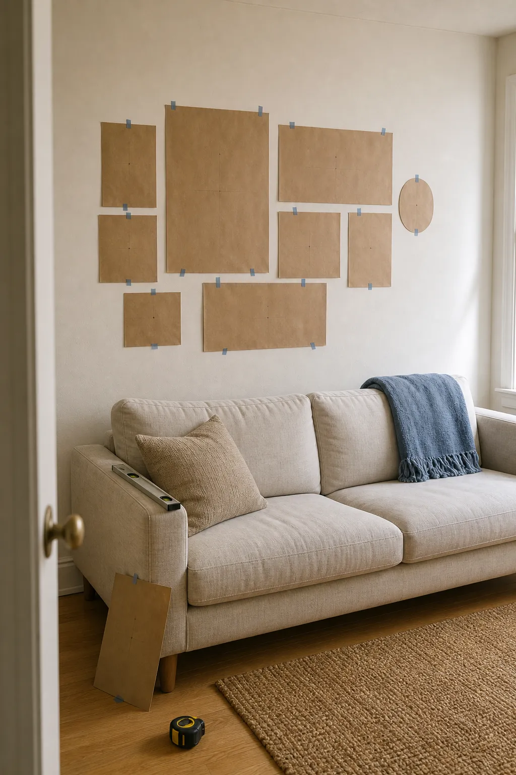
- Measure the wall and the furniture below it. Mark the intended outer boundary with low-tack painter’s tape.
- Trace every frame onto kraft paper and mark the exact hanger position on each template.
- Tape the templates inside the boundary, beginning with the anchor piece.
- Use a consistent gap. Two to three inches is a reliable starting point for most mixed arrangements; tighter gaps feel denser, while wider gaps need a larger wall.
- Photograph the templates from the main doorway and from your usual seat. The camera makes lopsided visual weight easier to spot.
- Leave the paper layout up for a day before installing the hardware.
For an open wall, a center point around typical eye level is useful. Above furniture, let the relationship to the sofa, console, or headboard guide you instead. The bottom of the arrangement should feel connected to the furniture—not floating near the ceiling and not crowding the upholstery.

Renters can use weight-rated removable picture strips for suitable frames and wall finishes, following the product limits carefully. Paper templates are even more valuable here because repeated repositioning can weaken adhesive or mark paint. For heavy, glazed, or valuable work, use hardware appropriate to the wall construction rather than improvising.
Edit an Almost-Right Gallery Wall
If the wall is already hung and something feels off, resist the urge to buy more art immediately. Diagnose the problem in this order:
- Scale: Is the complete arrangement large enough for the wall or furniture?
- Spacing: Do a few irregular gaps break the visual rhythm?
- Weight: Are the darkest or largest pieces crowded on one side?
- Connection: Does each frame align with at least one nearby edge?
- Contrast: Can you still read the grouping from across the room?
- Personality: Is there at least one piece that could belong only to you?
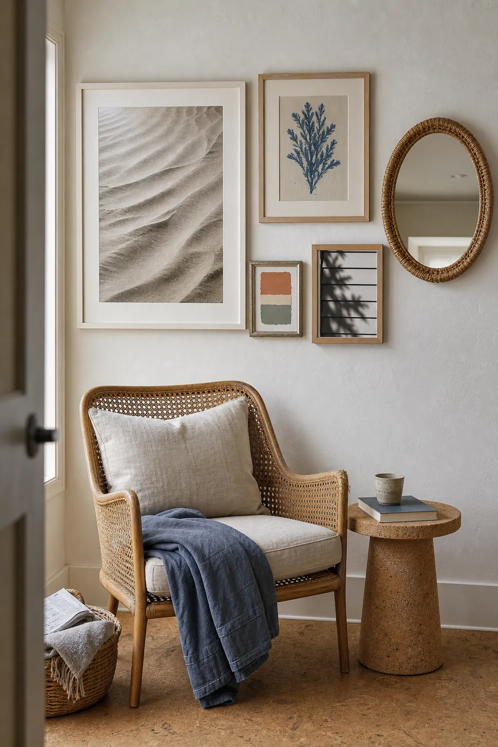
Often the fix is small: move the anchor two inches, separate a cluster of tiny frames, replace one generic print with a personal photograph, or repeat a dark accent on the lighter side. A coastal gallery wall should feel easy when it is finished, but that ease comes from editing.
The final test is simple. From the doorway, notice the mood before the individual pictures. If the room feels lighter, calmer, and more layered—and only then invites you closer to inspect the art—the wall is doing its job.