
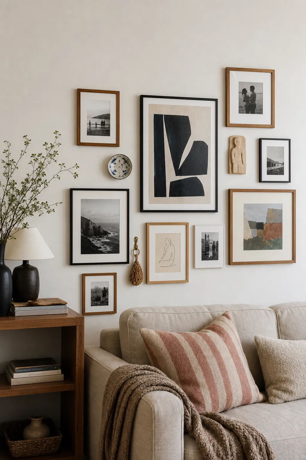
A good gallery wall should feel personal before it feels perfect. The strongest rooms are rarely filled with identical frames in a rigid rectangle. They usually have a rhythm: one larger anchor, a few quieter pieces, a photo that carries memory, and one or two small objects that make the whole wall feel collected rather than ordered from a single cart.
The hard part is not finding enough wall art. It is deciding what belongs together, how much space each piece needs, and where the arrangement should stop. If your photo wall feels messy, too high, too sparse, or too busy, the fix is usually a structure problem, not a taste problem. Start with a simple visual rule, then let the meaningful pieces do the work.
Start With One Anchor Piece
The easiest way to make a gallery wall look intentional is to give it a visual anchor. This can be a large print, a framed family photo, a textile, a mirror, or a dimensional piece that has enough size to hold the arrangement together. Without an anchor, a frame wall can turn into a scatter of small rectangles that never quite settles.
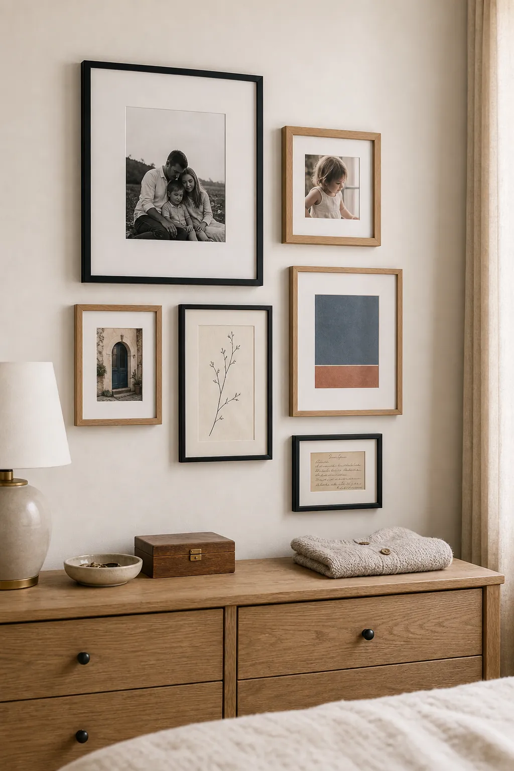
Choose the anchor first and place it near the visual center of the grouping, not necessarily the mathematical center of the wall. Around a sofa, console, bed, or dining bench, the wall decor should relate to the furniture below it. The lowest frame usually looks best several inches above the furniture, close enough to feel connected but not so close that the arrangement feels cramped.
Think of the anchor as the piece that explains the rest of the wall. A large black-and-white portrait can make mismatched family photos feel deliberate. A warm landscape print can give small botanical sketches and wood frames a shared mood. A woven textile can soften a photo wall that would otherwise feel too flat.
Use Repetition Without Making Everything Match
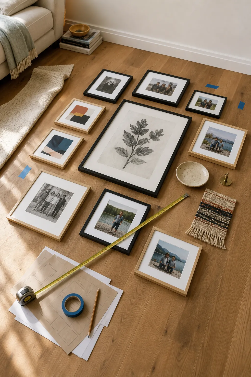
A mixed media wall needs one or two repeating elements so it does not read as random. The repetition can be a color, a frame finish, a subject, a mat color, a shape, or a mood. You do not need every frame to match. In fact, a wall made only from identical frames can feel flat unless the photos or prints are powerful enough to carry the sameness.
Try repeating black in three places, warm wood in two places, or a soft cream mat across several pieces. If you are mixing wall art with personal photos, let one palette lead. For example, sepia family photos, charcoal line drawings, and a small brass object can feel connected because they share warmth and age. Bright travel photos, color-block prints, and a lacquered object can work if they share saturated color.
The goal is not symmetry. The goal is recognition. A visitor should be able to sense why the pieces belong near each other even if the frames, sizes, and materials vary.
Give Small Objects a Real Job
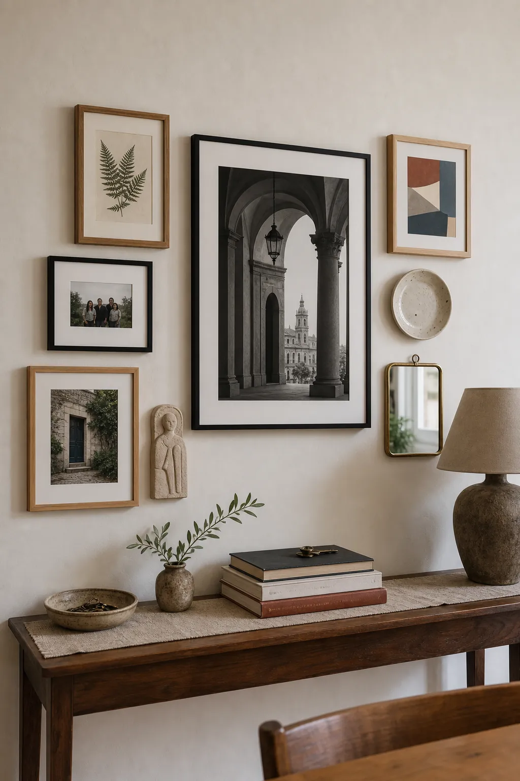
Small objects can make a gallery wall memorable, but they need a role. A plate, tiny shelf, framed key, wall-mounted vessel, woven basket, vintage hook, miniature relief, or sculptural sconce should solve a composition problem. Use it to break up too many rectangles, add texture beside flat photographs, pull color across the wall, or create a pause between dense areas.
If you add small objects only because there is an empty gap, the wall can start to look cluttered. Instead, choose objects that have a reason to be there. A ceramic plate can echo the round shape of a mirror. A tiny ledge can hold a postcard that changes seasonally. A brass hook can connect to warm picture lights or hardware in the room.
Keep dimensional pieces shallow unless the wall has room to breathe. In narrow hallways, avoid objects that stick out where shoulders or bags can hit them. In living rooms and bedrooms, shallow objects are usually easier to blend with frames than deep shelves packed with decor.
Control the Spacing Before You Hang
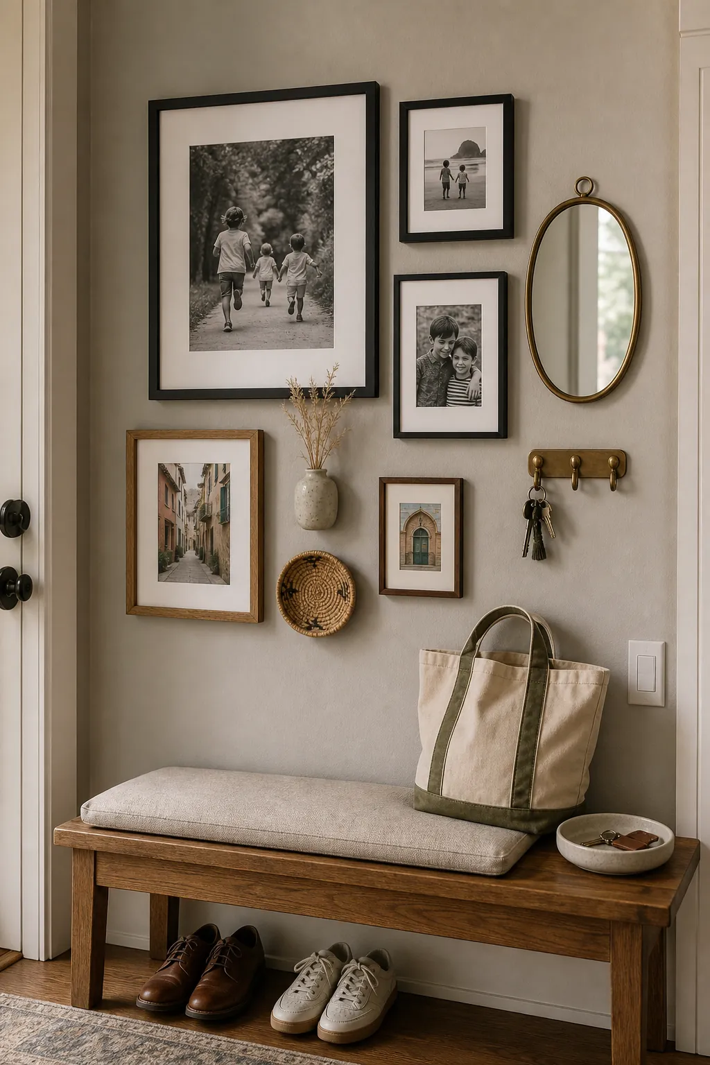
Most gallery walls fail at the spacing stage. When pieces are too close, the wall looks crowded. When they are too far apart, the grouping falls apart and each frame feels stranded. A practical starting point is to keep the gaps visually consistent, then adjust for scale. Larger pieces can handle slightly larger breathing room, while small photos often need tighter spacing to feel connected.
Lay everything on the floor first. Trace paper templates if the pieces are valuable, heavy, or hard to rehang. This extra step saves the wall from a patchwork of unnecessary holes and helps you spot problems before they become permanent. When the layout looks good on the floor, photograph it from above. That photo becomes your hanging map.
Check the outside edge as much as the inside gaps. A gallery wall can be loose and organic, but it still needs a boundary. The outer shape might be a soft rectangle, a stair-step line, or a relaxed oval. If one frame drifts too far away from that invisible edge, it will look like a mistake.
Match the Layout to the Room
A gallery wall above a sofa has a different job than a gallery wall in a hallway. Above furniture, the arrangement should feel grounded and wide enough to relate to the piece below it. In a hallway, the wall can stretch longer and tell a story as you walk. In an entryway, a tighter grouping near a bench, console, or mirror usually feels more welcoming than art scattered across the entire wall.
For a living room, use at least one larger piece so the wall does not feel too delicate from across the room. For a bedroom, softer art, personal photos, and quieter frame finishes often feel better than high-contrast clutter. For an entry or stair landing, a mix of photos, art, and small objects can bring personality to a space that otherwise becomes purely functional.
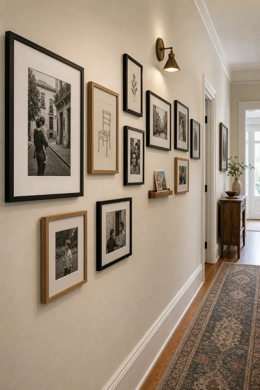
Mix Personal Photos With Art Carefully
Personal decor is what makes a gallery wall feel alive, but photos need editing. Too many similar snapshots can make the wall read like a bulletin board. Choose photos that vary in distance and mood: one close portrait, one candid family moment, one travel scene, one black-and-white image, one quiet detail. Then mix them with art that gives the eye a rest.
Matting is especially useful when personal photos feel too small or too busy. A generous mat can turn a casual print into something that feels framed with intention. It also creates white space inside the frame, which helps a dense photo wall breathe.
If every piece is sentimental, the wall may lack contrast. Add one graphic print, one simple sketch, or one textured object to create rhythm. The meaningful pieces will stand out more when they are not all competing at the same emotional volume.
Try a Shelf Only When It Belongs to the Composition
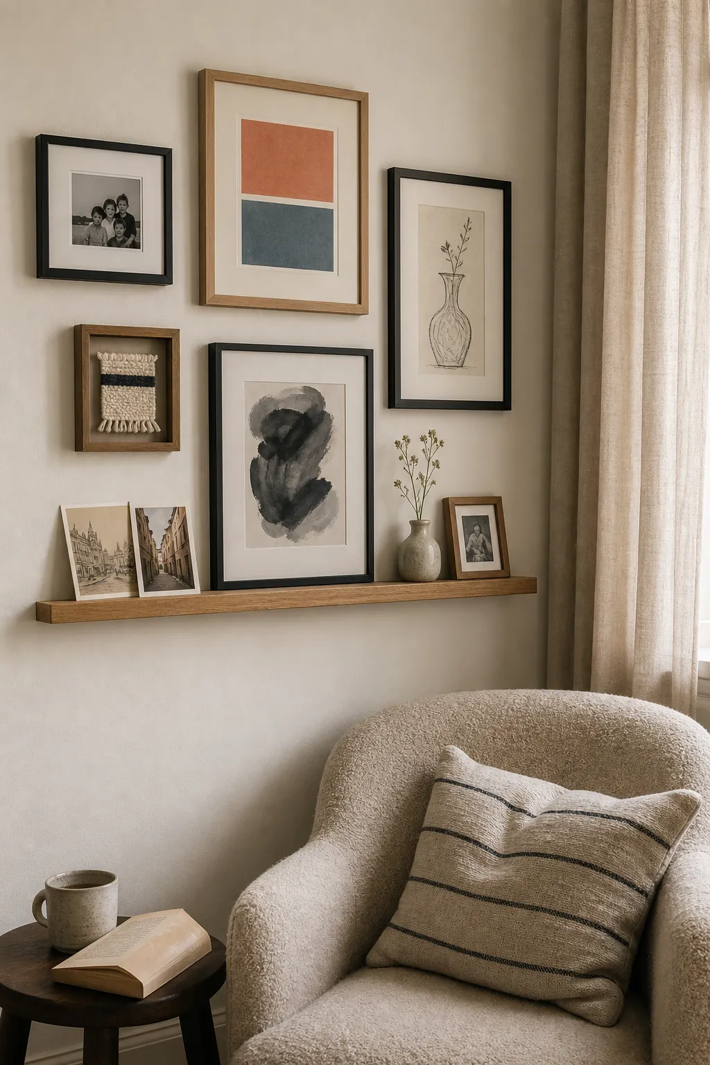
A small picture ledge or shallow shelf can work beautifully in a gallery wall, but it should not feel like an afterthought. Use it when you want flexible art, layered frames, postcards, tiny ceramics, or a small object that changes with the season. Keep the shelf visually light and let it connect to the surrounding frames rather than floating separately above or beside them.
If the wall already has many small frames, one shelf can become visual noise. In that case, choose either a true gallery wall or a shelf wall, not both. The exception is a design where the shelf is clearly part of the overall structure, such as a lower ledge anchoring photos with larger art above it.
Let the Wall Evolve
The best gallery wall ideas leave room for change. You might start with a few pieces, then add a travel photo, a child’s drawing, a vintage postcard, a small relief, or a frame that finally solves an awkward corner. A collected wall does not need to be finished in one afternoon.
Before you hang anything, decide what the wall is allowed to become. If you want it to grow, leave a little breathing room at the edges. If you want a cleaner frame wall, keep the outer boundary tighter and edit more aggressively. Either way, the wall should feel like a point of view, not a storage place for every piece you own.
A gallery wall works when the arrangement tells the same story as the room. Use art for mood, photos for memory, small objects for texture, and spacing for calm. That balance is what turns a blank wall into personal decor that still feels designed.