
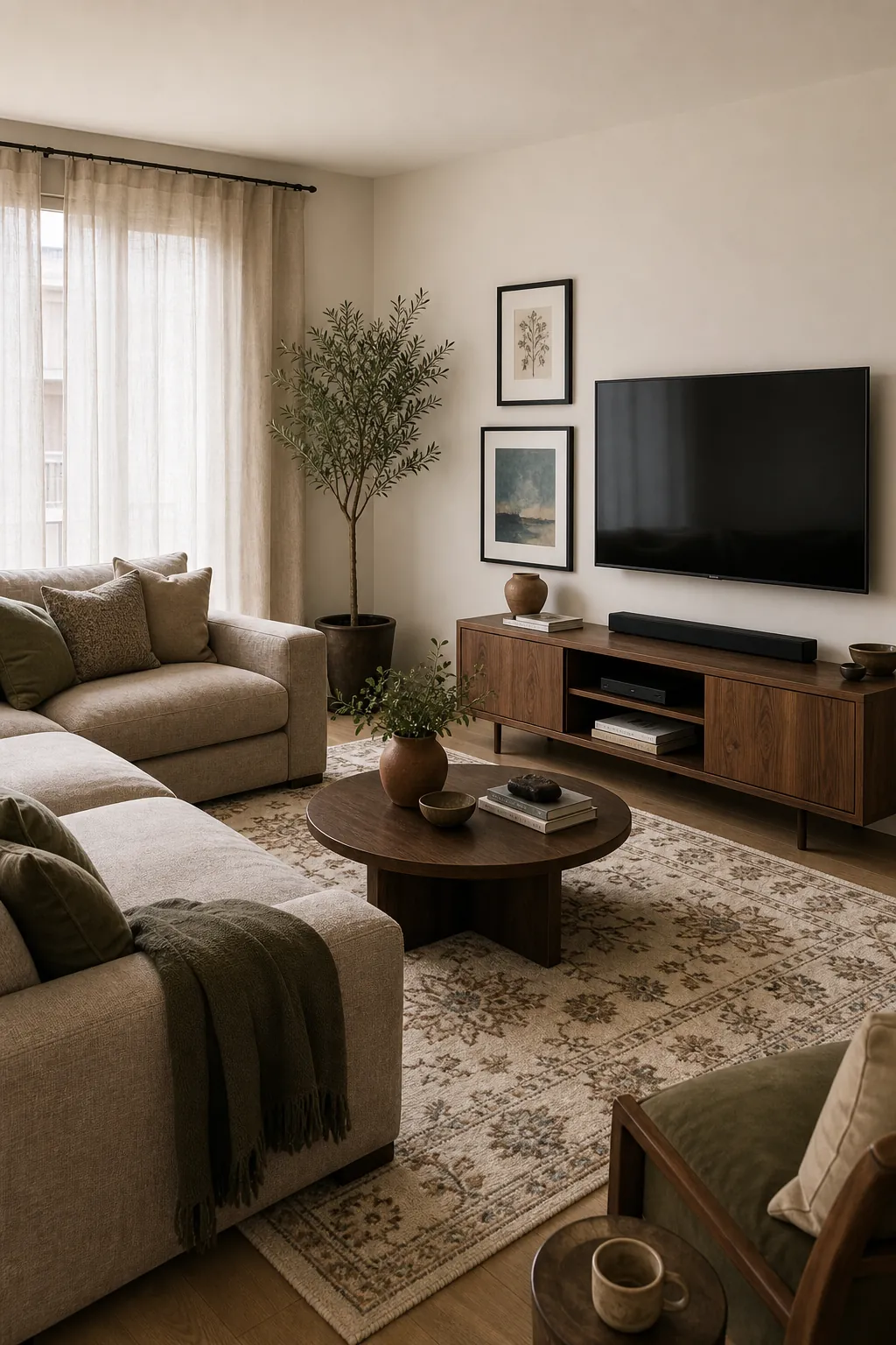
Good living room colour design starts with the pieces that are already hard to change: the sofa, flooring, rug, TV unit, curtains, and the amount of daylight the room receives. Paint is usually the last decision people want to make, but it should rarely be the first decision. A beautiful wall colour can still feel wrong if it fights the sofa undertone, makes the TV wall too heavy, or turns the whole room flat at night.
The best colours for living rooms are not universal. A calm cream, clay, sage, blue-grey, mushroom, greige, or warm white can all work beautifully when the palette has structure. The real skill is choosing a colour palette for the living room that has contrast, repetition, and a clear relationship between the walls, furniture, and accents.
Start With the Fixed Colours
Before choosing wall paints for living room colour, look at what is already fixed. Flooring has an undertone. Wood furniture can lean yellow, orange, red, grey, or brown. A sofa might be cool grey, warm taupe, green beige, caramel, navy, olive, cream, or rust. These colours do not disappear once you paint the walls.
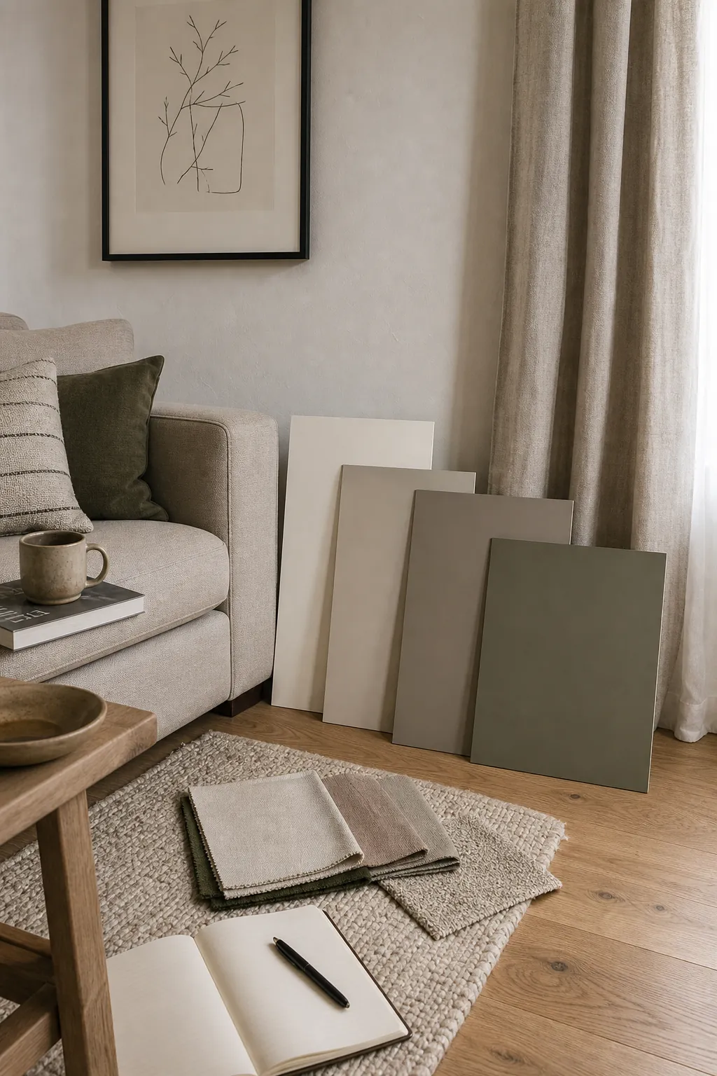
The safest palette is built from what the room already owns. If your sofa is warm beige and the floor is honey oak, a blue-white wall may feel chilly and disconnected. If the sofa is cool grey and the TV unit is black, a very yellow cream may look dull. Hold samples beside the sofa, floor, rug, and curtains in daylight and at night before committing.
Use a Base, a Support Colour, and an Accent
A living room colour combination becomes easier when you give each colour a job. The base colour covers the largest surfaces: walls, main sofa, large rug, or curtains. The support colour repeats in mid-sized pieces like chairs, cushions, cabinets, or art. The accent colour appears in smaller moments, such as lamps, books, ceramics, throws, or frame finishes.
For a calm modern living room, the base might be warm white walls and a mushroom sofa, the support colour might be olive or deep taupe, and the accent might be aged brass or muted rust. For a brighter room, the base might be pale blue-grey, the support colour might be cream and walnut, and the accent might be clay, ochre, or black.
A useful rule: repeat each important colour at least twice. A green cushion looks random by itself. A green cushion, a plant, and a small green detail in the art feel like a palette.
Let the Sofa Lead the Soft Furnishings
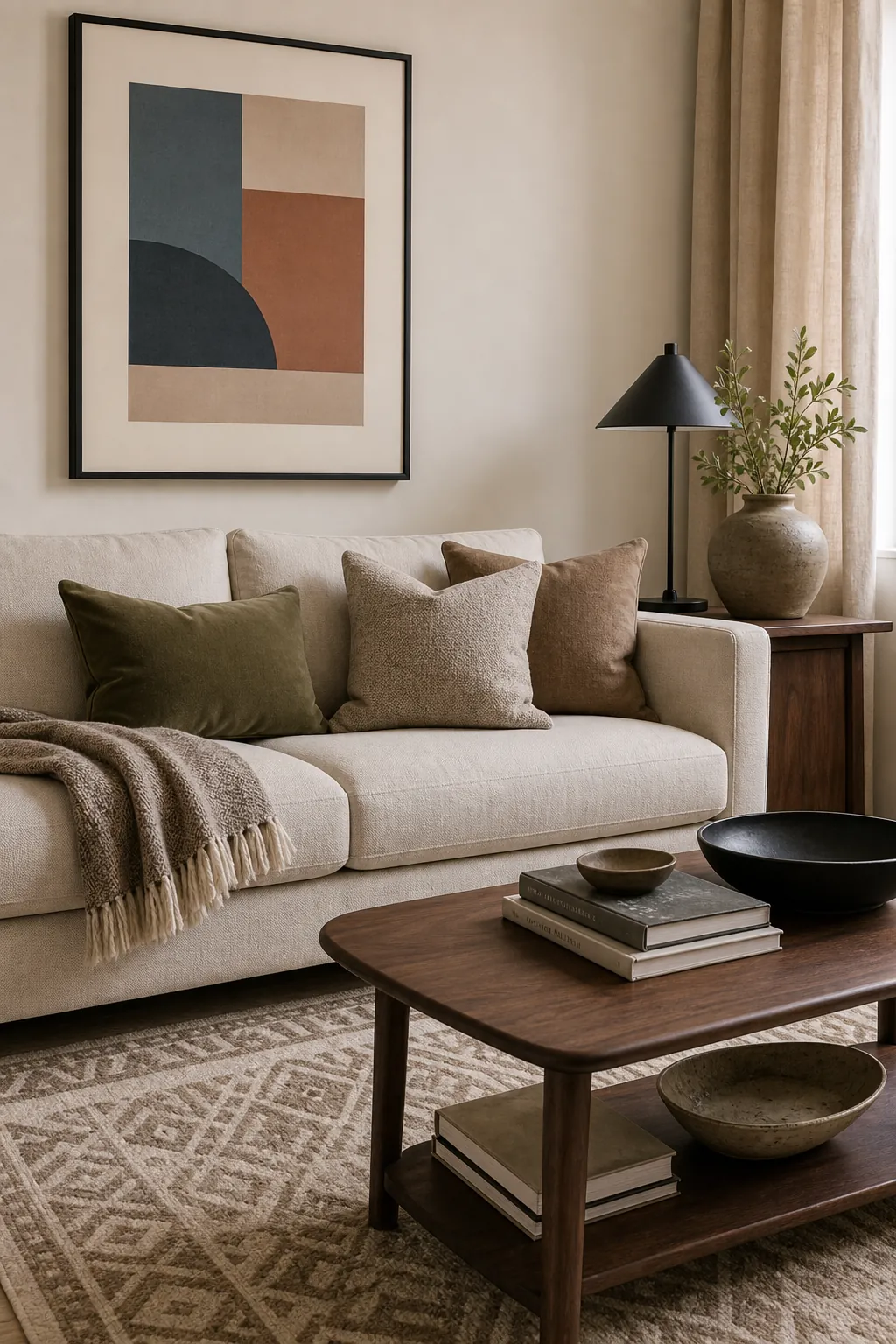
Sofa design in living rooms matters because it is often the largest solid colour in the space. If the sofa is plain, the rug and cushions can carry more pattern. If the sofa has texture, channel tufting, a curved shape, or a bold colour, the surrounding palette should give it room.
A beige sofa does not mean the whole room must be beige. Try warm white walls, a brown-and-cream rug, black side tables, olive cushions, and terracotta pottery. A grey sofa can become softer with oatmeal curtains, walnut furniture, muted blue art, and warm metal finishes. A green sofa can look intentional with cream walls, black frames, natural wood, and a rug that repeats a smaller green tone.
Treat the TV Wall as Part of the Palette
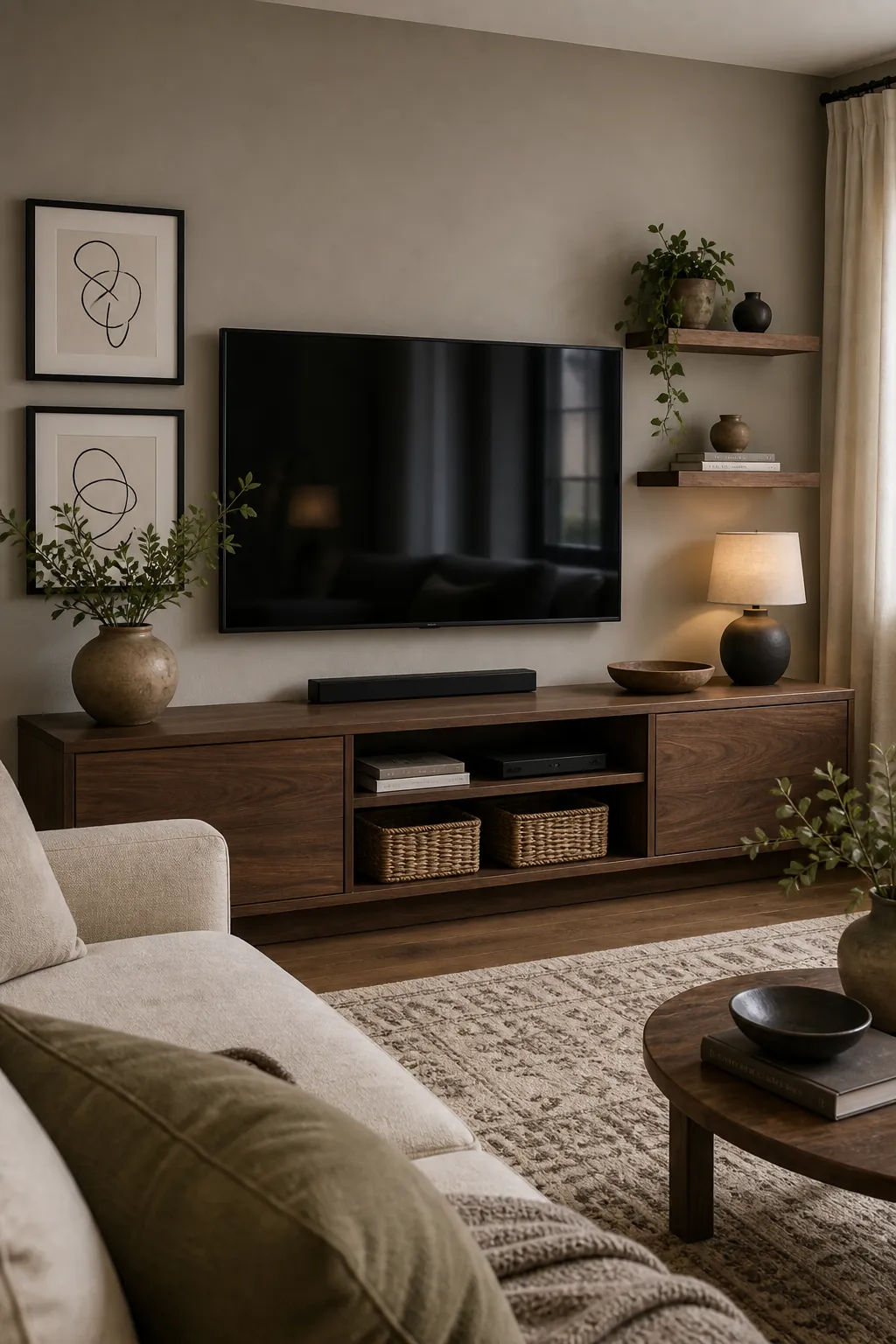
TV wall design affects colour balance more than people expect. A black screen already adds a strong dark rectangle. If the wall behind it is too pale and empty, the TV can look harsh. If the wall is too dark without enough softness nearby, the room can feel heavy.
For a modern TV unit design, try connecting the TV wall to other dark accents in the room. A charcoal media unit can relate to black frames, a dark coffee table, or slim black lamp details. A warm wood TV unit can connect to side tables, a picture ledge, or woven baskets. If you paint the TV wall, choose a colour that still works with the sofa and rug, not just with the screen.
Choose Warm Colours for Comfort, Not Just Trend
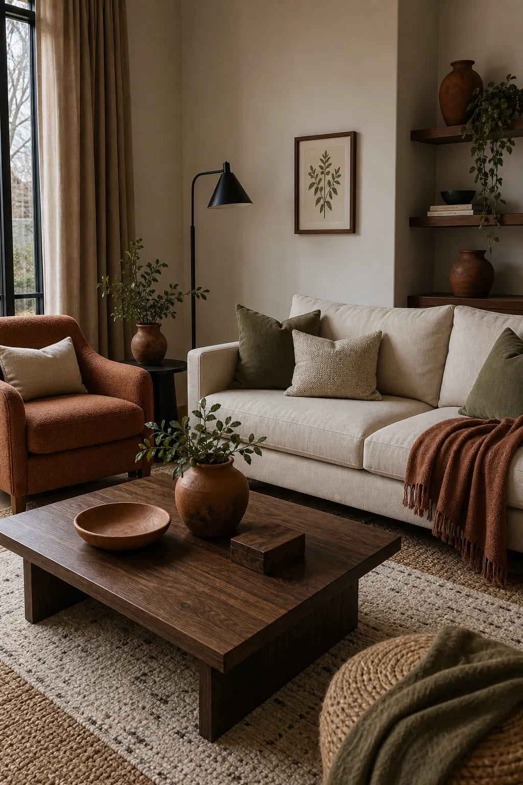
Warm living room colour ideas work best when they are controlled. Terracotta, clay, caramel, cinnamon, olive, cream, and walnut can make a space feel grounded and welcoming, but too many warm colours can become heavy. Balance them with cream walls, black accents, pale linen, or a quiet blue-grey detail.
This is where wall colour combinations for living rooms matter. A clay wall can look beautiful with a cream sofa and dark wood, but it may overwhelm a small room if the curtains, rug, and cushions are also warm and saturated. A warm white wall with clay, rust, and olive accents often gives the same cosy feeling with more flexibility.
Use Cool Colours to Create Air and Contrast
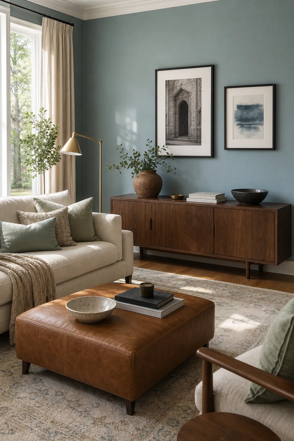
Cooler colour combinations for home living rooms can make a room feel fresher, especially when there is strong daylight or warm flooring. Soft blue, blue-grey, sage, eucalyptus, smoky teal, and muted green can calm visual noise and make wood tones look richer. The key is to keep them muted enough for everyday living.
If cool walls feel too cold, add warmth through wood, woven textures, brass, terracotta, cream upholstery, or a rug with a warmer ground. If the room already has cool grey floors and a grey sofa, avoid making every surface blue-grey. Add cream, walnut, tan leather, or clay to keep the palette from feeling flat.
Make Small Living Rooms Feel Deliberate
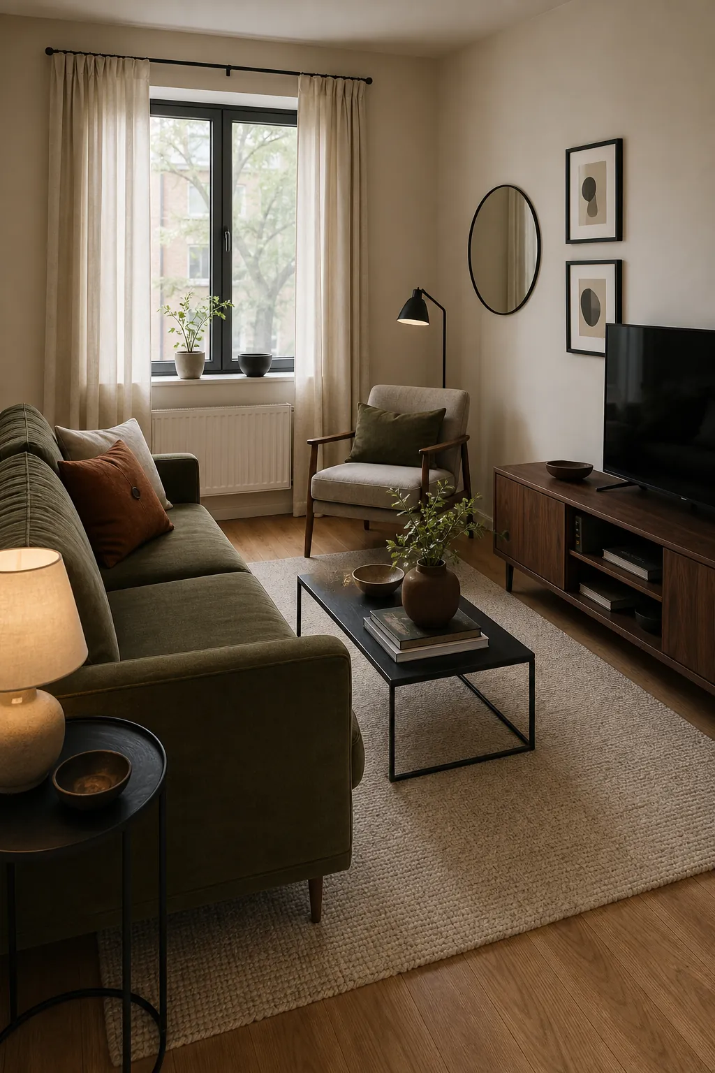
Small living room colour design does not have to mean white walls and tiny accents. A small room can handle colour when the palette is edited. Choose one dominant mood, repeat finishes, and avoid too many unrelated contrast points. A pale wall with a deeper sofa, a patterned rug, and one strong accent can feel bigger than a room with many small colours scattered everywhere.
Use colour zones carefully. The seating area can have one palette, the TV wall can have a related darker note, and the reading corner can repeat one accent from the sofa. What matters is that the eye can travel around the room without hitting a new unrelated colour every few feet.
Test the Palette Before You Paint
The final living room colour combination should be tested in the actual room. Paint large sample boards, move them behind the sofa, beside the TV unit, near the curtains, and next to the rug. Look at them on a bright morning, a cloudy afternoon, and under lamps at night. The colour that looks best on a screen is not always the colour that works with your light.
Living room colour design works when every big surface has a relationship to the next one. Start with the fixed tones, build a base-support-accent palette, let the sofa and TV wall influence the plan, then test everything in real light. That process creates a room that feels designed instead of simply painted.