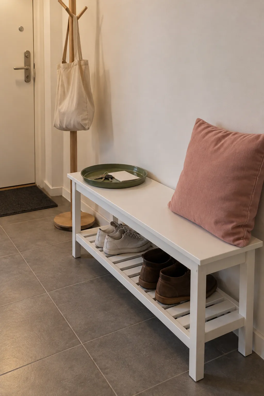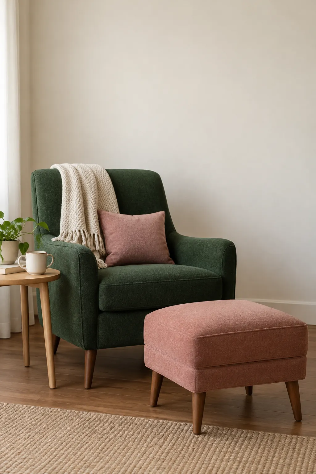
A pink cushion can look gentle in the shop and surprisingly peach beside your sofa. The safest way to build this color pairing is to start with the finishes you will keep, decide which color should lead, and test the smaller accents before buying the expensive pieces.
Choose shades beside the finishes you already have
Begin with the surfaces that will stay: flooring, a large sofa, kitchen cabinets, or a stone fireplace. A pink that looks soft against white paper can turn peach beside honey colored oak, while a gray green can look colder beside blue toned tile. Put actual paint and fabric samples beside these finishes before deciding that a pairing works.
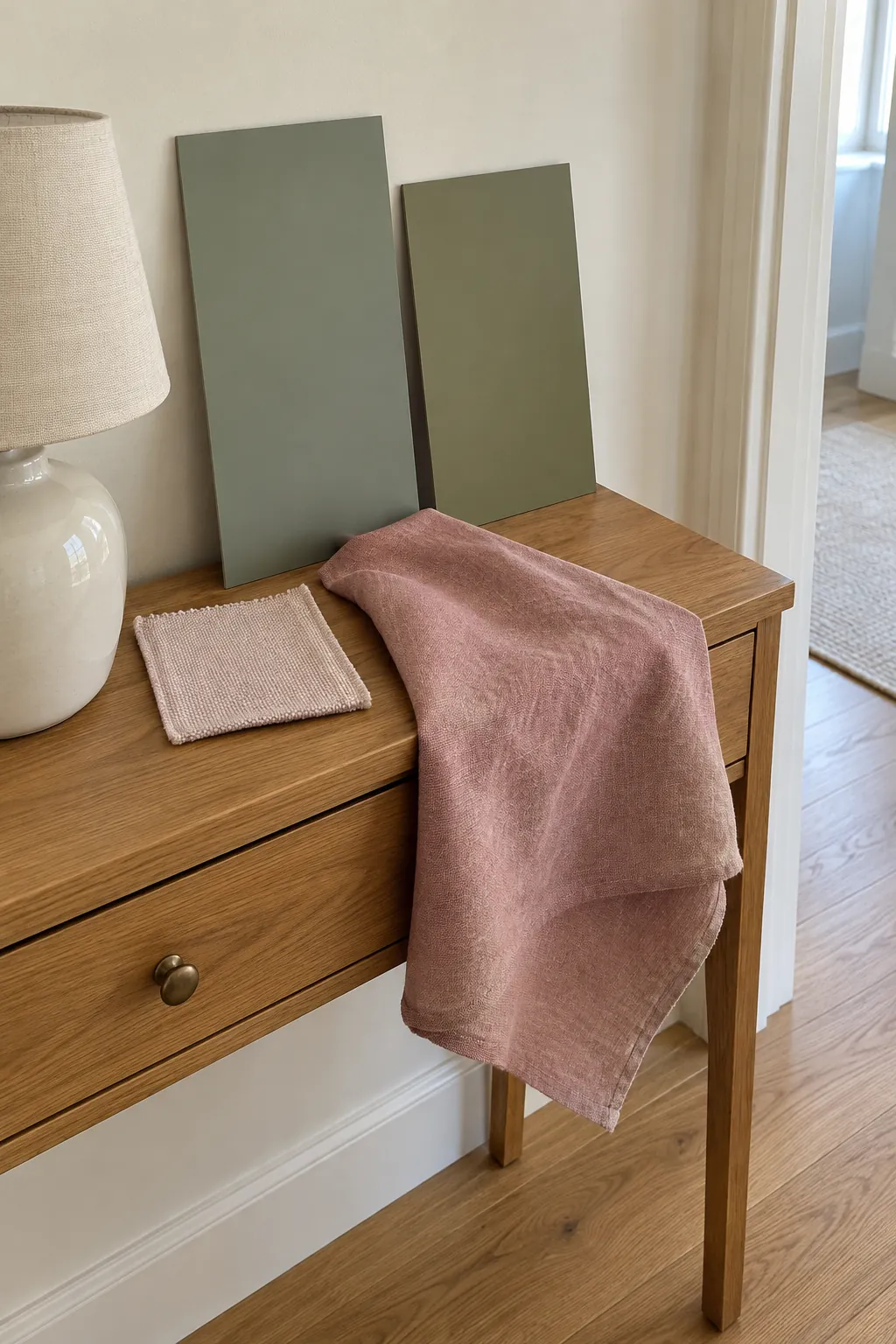
For sage green and blush decor, compare a muted gray green with a dusty rose rather than assuming every pale pink belongs with every sage. Olive often feels comfortable beside warm rose and cream; a cooler eucalyptus green can support a pink with a slight mauve cast. These are starting points, not fixed compatibility rules, because the light and adjacent materials change what you see.
Choose one sample pair and take it to the actual room. Hold the samples upright where curtains or walls will sit, then lay them flat where a rug will go. Reject a pairing if one color looks unexpectedly dirty or fluorescent next to a permanent finish.
Give one color more space
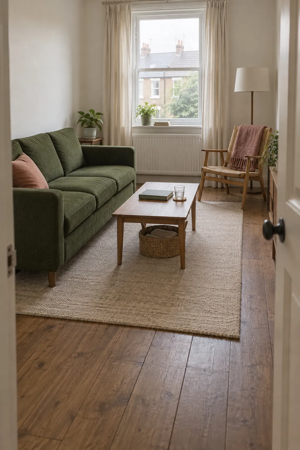
A green and pink living room feels easier to read when the two colors have different jobs. Let a green sofa anchor the room, keep the largest surrounding surfaces quiet, and introduce pink through a cushion and a separate chair or throw. The smaller pink areas draw attention without competing with every edge of the sofa.
The familiar 60, 30, 10 color guideline can help you sketch a hierarchy, but you do not need to measure the room into exact percentages. The useful question is whether a color dominates, supports, or accents the composition. If green walls already fill most of your view, a pink sofa may be enough pink on its own.
Try the arrangement from the doorway rather than judging each accessory up close. Move one pink object away from the sofa so the accent appears in a second part of the room. Leave a few surfaces empty so the palette has room to settle.
Use texture to separate similar tones
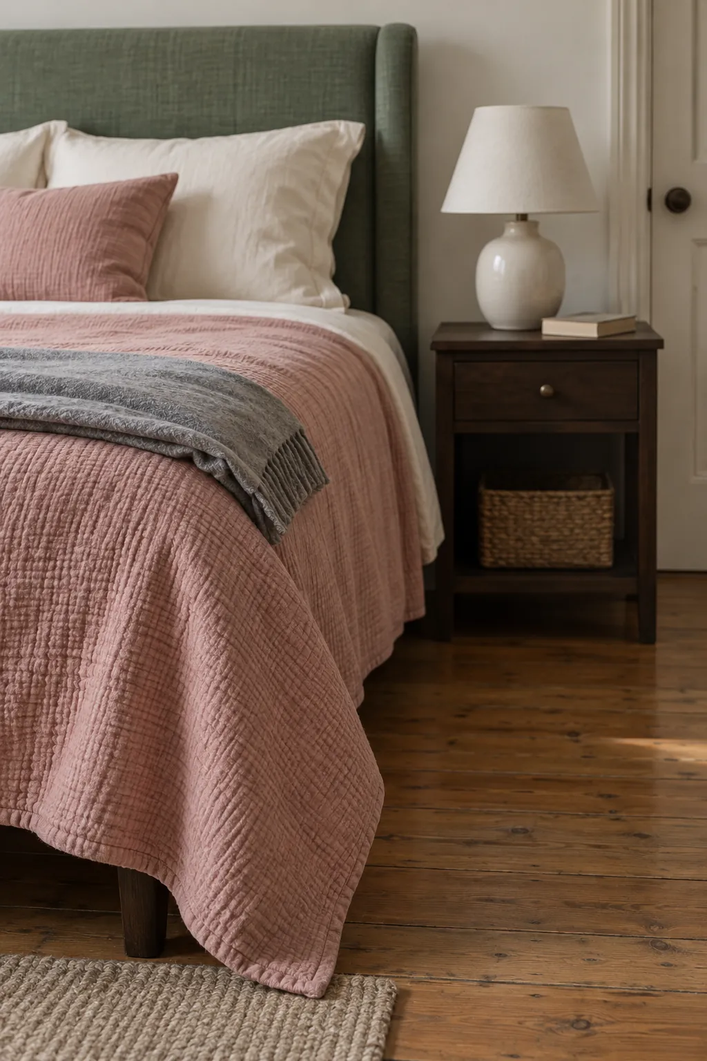
An emerald green and pink bedroom can carry stronger color than a pale scheme, but a shiny finish on every surface can make it feel restless. Pair a matte green wall with washed rose bedding, then use only a small amount of reflective metal. A darker bedside table gives the pale bedding a clear edge.
For a quieter version, keep the wall neutral and bring green into a padded headboard. Choose a rose coverlet with a visible weave and lighter sheets so the bed does not become one large flat block of pink. A plain bedside lamp gives the eye a pause between the fabrics.
Check the practical details before ordering. Confirm that the bedding can be washed as often as your household needs, and view velvet samples from different directions because the pile changes their apparent depth. Texture should make the room more useful as well as more interesting.
Connect curtains and walls without matching everything
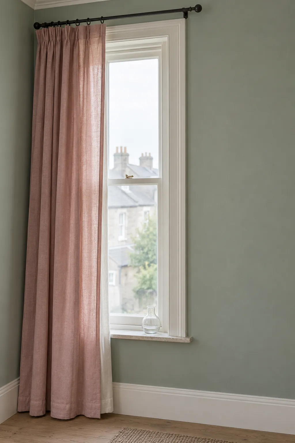
Pink curtains with green walls work best when the fabric remains a deliberate separate surface. A muted rose linen can soften a gray green wall, while a heavier mauve pink drape creates more contrast beside deeper green. Compare a generous fabric sample with the painted wall instead of choosing from a tiny online image.
Translucent cloth changes when daylight passes through it. Hang the sample at the window in the morning and again after sunset with your normal lamps on; a pink that seems gentle by day may become much warmer at night. Add a separate lining when you need privacy or light control rather than assuming the decorative fabric will provide both.
Keep nearby trim, blinds, and curtain hardware simple. If the window already has patterned glass or a busy view, choose plain fabric and let color do the work. In a rental, check the permitted mounting method and the weight rating before buying a heavier curtain.
Let a pattern join the palette
A botanical green and pink decor scheme does not need leaves on every surface. One fabric with green stems and small rose blossoms can explain the relationship between plain green seating and a pink ceramic bowl. Pull the colors from that fabric, but allow the solid pieces to differ slightly so the room feels collected.
Choose a pattern at the scale you will actually see from across the room. Tiny flowers may read as a blended texture from the doorway, while a large leaf repeat can become the focal point. If you introduce another pattern, change its scale and keep its color range narrower.
A dining nook is a useful place to try this approach because a removable table runner can carry the motif without committing the walls. Keep real greenery away from the edge where it can catch a sleeve or block conversation. Plain tableware lets the fabric and ceramics carry the color.

Test a small arrangement before buying the room
Start with objects you can move: a rose cushion cover, a green tray, or a fabric remnant. Arrange them beside the largest existing item and photograph the grouping from your usual viewing position. Use the photograph to judge placement, but rely on the real samples for color because a phone can shift the white balance.
Leave the arrangement in place through a normal day. Look at it in daylight and under the lamps you actually use, paying attention to whether the pink becomes too orange or the green looks dull. Change one piece at a time so you can identify what improved the result.
Only then commit to paint, upholstery, or custom curtains. Buy a replacement shade from the same sample you approved, and confirm return policies before ordering multiple pieces. A palette earns its place when it works with your home at the times you use it, not only in a bright product photograph.