
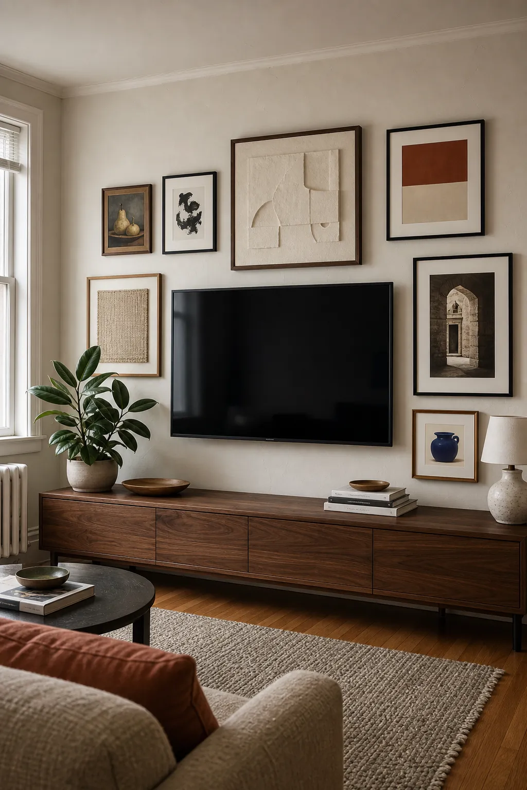
A television does not have to become the only thing you notice in a living room. The best living room gallery wall ideas around a TV work because they stop treating the screen like an awkward black hole and start treating it like the largest shape in a larger composition. That shift sounds small, but it changes every decision that follows: the size of the art, the space between frames, the width of the arrangement, and even what you do with the cords below.
The goal is not to disguise the TV at any cost. It is to create a TV wall decor scheme that still feels calm while you watch, looks finished when the screen is off, and includes art large enough to enjoy from the sofa. Use the ideas below as a planning system, then adapt the frame wall to your room rather than forcing a saved inspiration photo onto a different-sized wall.
Start With the TV as the Anchor
Begin with the screen already mounted or marked at its final size and height. Do not design an art arrangement first and try to squeeze the TV into whatever space remains. The television is the visual anchor, even if you do not want it to be the focal point. Its strong horizontal shape and dark surface carry more visual weight than several small prints combined.
Give the TV a little more breathing room than you give the frames. A practical starting point is roughly 4 to 6 inches between the screen and the nearest art, with about 2 to 3 inches between neighboring frames. These are planning ranges, not laws. A very large screen, thick moulding, or visually bold artwork may need more space. What matters most is that the gap around the TV looks deliberate and that the smaller gaps repeat consistently.
Before buying anything, mark a loose outer boundary for the whole composition. Relate that boundary to the media console, not just to the bare wall. A gallery that extends slightly beyond the TV but remains connected to the console usually feels grounded. An arrangement that stretches across every available inch can make the screen area look scattered.
Choose a Layout That Fits the Room
There is no universally correct gallery wall layout, but three structures solve most living rooms. Pick one structure before choosing individual prints. This keeps the wall from drifting into an accidental mixture of rigid rows and random asymmetry.
- A symmetrical grid suits formal rooms, narrow walls, matching frames, and anyone who wants the least visual movement while watching TV.
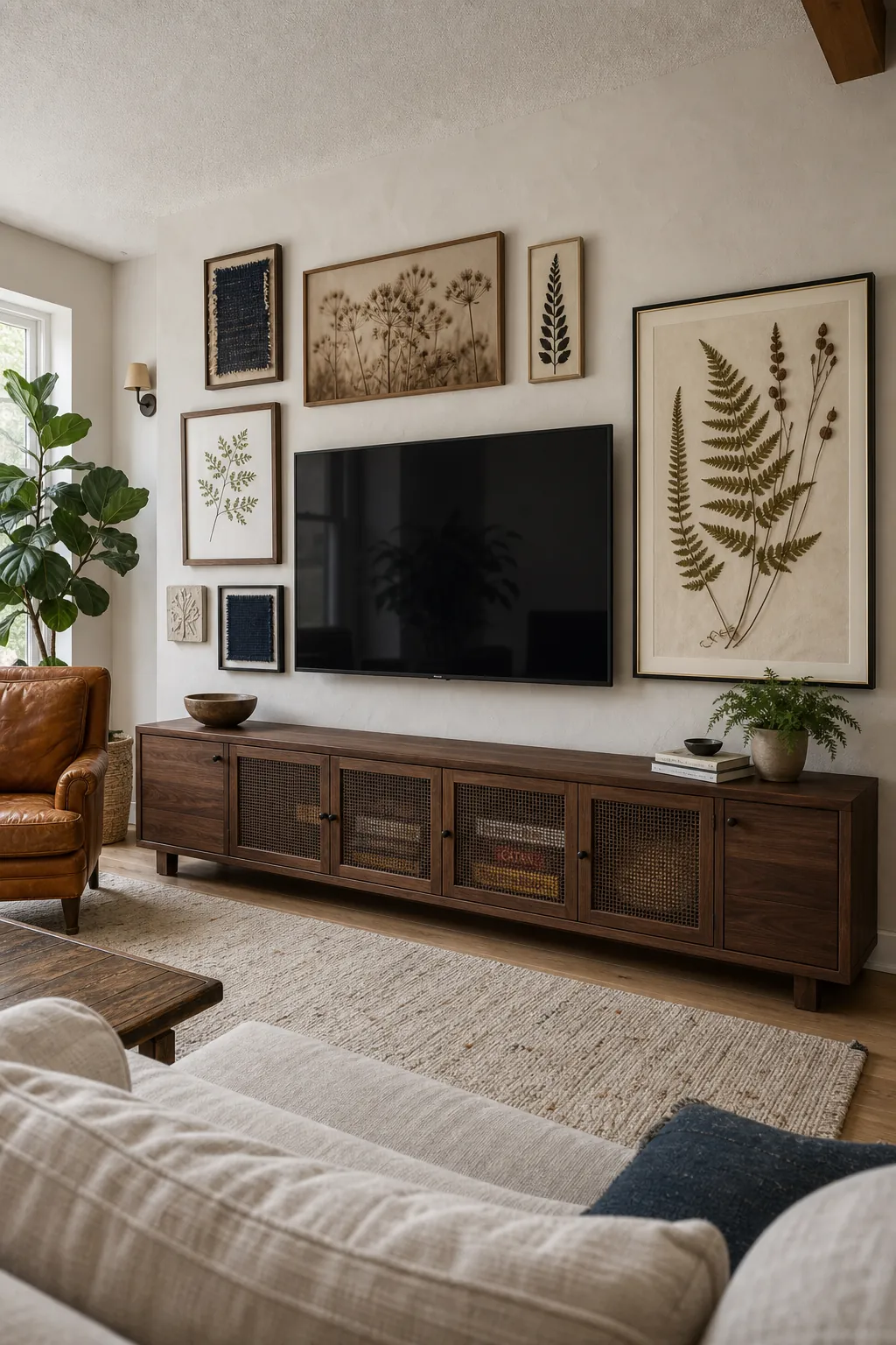
- An asymmetrical wrap works in relaxed or eclectic rooms. Use one or two substantial pieces to counterbalance the screen, then bridge the gaps with smaller work.
- A top-and-side arrangement is useful when a console, speaker, doorway, or plant limits one side. Keep the strongest line above the TV and let one side taper with intention.
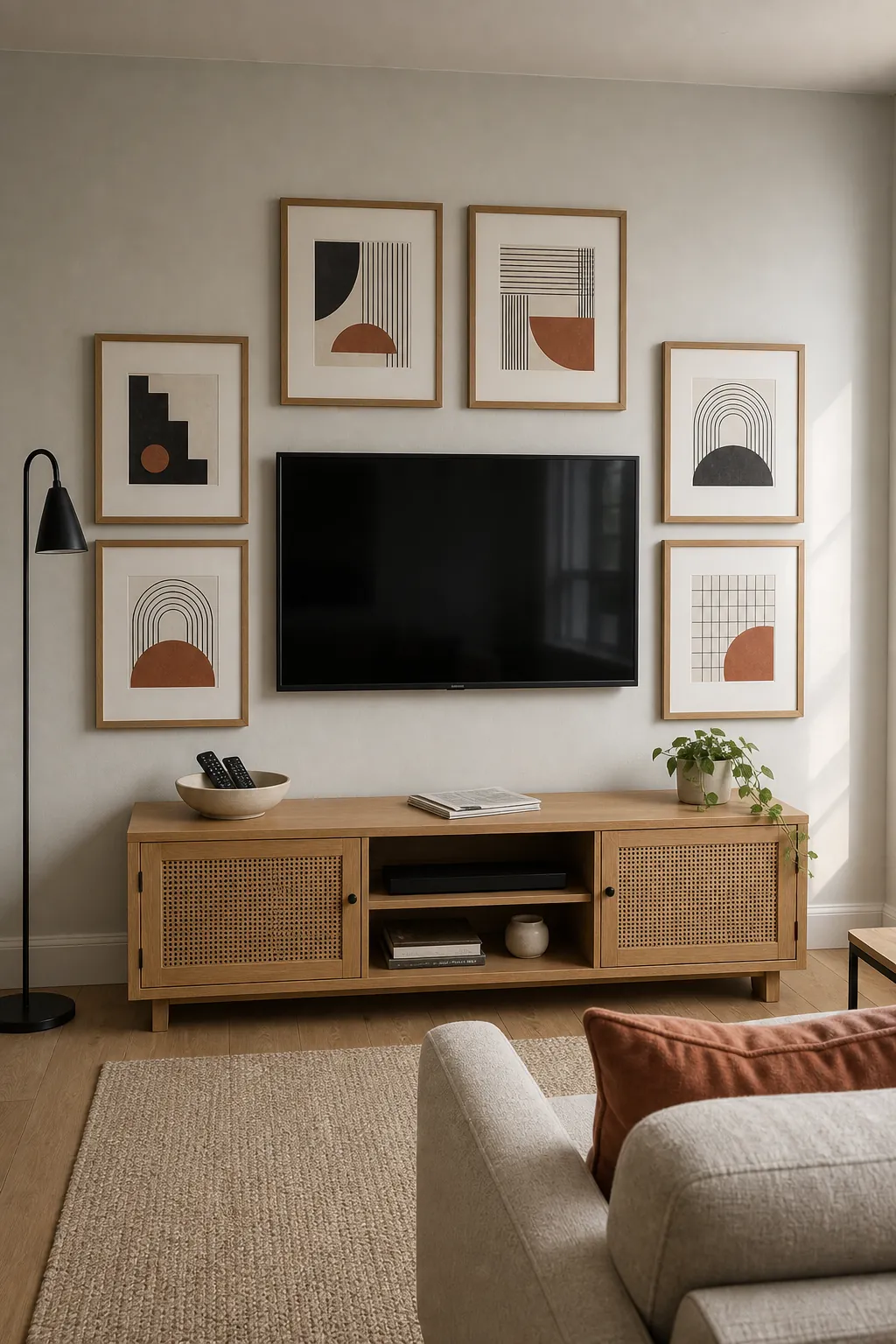
A grid is forgiving when every frame shares the same dimensions and mat width. An asymmetrical gallery wall demands more judgment, but it should still have an underlying order. Repeat an edge, keep the gaps similar, or align the center of a smaller piece with the top or bottom third of a larger one. Asymmetry needs balance; it does not need randomness.
Use Fewer, Larger Pieces for a Calmer Wall
One of the most common mistakes is surrounding a large TV with many tiny frames. The small pieces may look charming at arm’s length, but from the seating area they can read as visual confetti. If the room already has patterned textiles, open shelving, toys, or a busy view, adding dozens of small images usually makes the wall feel noisier rather than more personal.
For most rooms, start with five to eight medium or large pieces instead of a field of miniatures. Place a larger vertical work near one side of the TV to answer its visual weight. Use smaller frames as connectors, not as the foundation of the arrangement. A generous mat can also make a modest print read at a more useful scale without requiring oversized art.
Test the scale from where you actually sit. If you cannot understand an image from the sofa, it may belong in a hallway or reading corner where people can approach it. The TV wall is usually viewed from farther away, so it rewards bolder silhouettes, stronger contrast, and clearer subjects.
Create Cohesion Without Matching Everything
A good living room wall decor scheme does not require one frame finish or one type of art. It does need repetition. Choose two or three frame tones already present in the room—perhaps black from the TV, warm wood from the console, and antique brass from a lamp—and repeat each finish at least twice. That is enough to make an eclectic collection feel connected.
Use the art palette the same way. Pull two or three recurring colors from the rug, upholstery, pillows, or curtains, then let individual pieces vary within that family. Mix a photograph, a line drawing, a color-block print, a textile fragment, or a botanical study, but avoid filling every frame with equal detail. A few quiet pieces give the eye somewhere to rest.
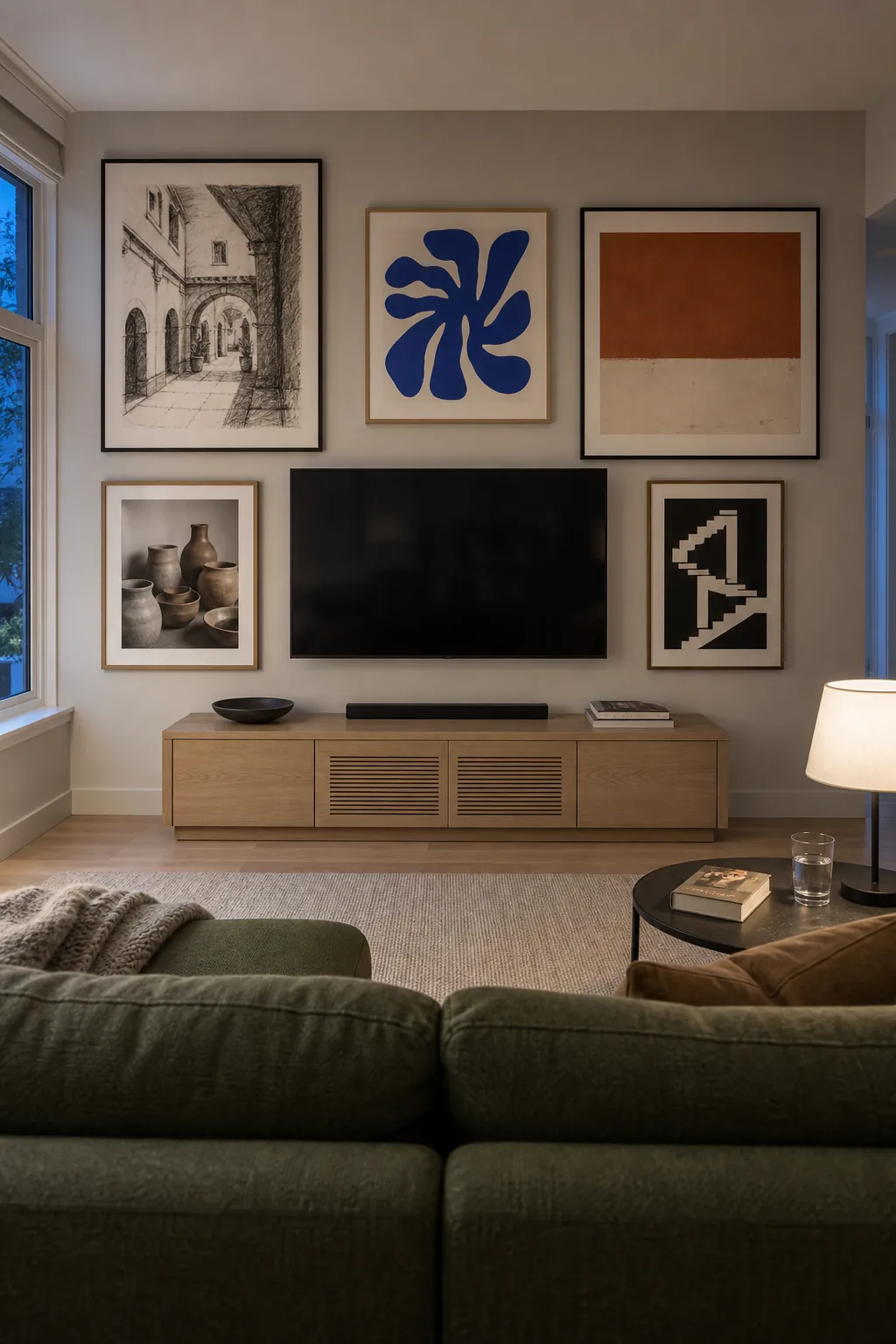
If the TV has a black bezel, you can either echo it with a few slim black frames or soften it with wood. You do not need to frame every piece in black just because the screen is black. In fact, a wall of identical dark rectangles can make the TV more obvious. Varying the frame material while controlling the gaps usually creates a softer result.
Protect the Viewing Experience
The wall should still function as a place to watch television. Keep high-contrast, highly detailed, or reflective pieces a little farther from the screen. Mirrors, glossy glass, and metallic prints can catch lamps or window light and create glare. If the room is bright, use non-glare acrylic, matte prints, or frames positioned outside the strongest reflection angles.
Also resist the urge to hang art below the TV just to complete a shape. The console already forms the lower boundary. Frames squeezed between the screen and console often compete with speakers, remotes, and decor while making the TV look too high. Leave that strip visually clean unless there is a generous, purposeful gap.
If you are sensitive to distraction, choose the symmetrical grid or place the most expressive art above and beyond the screen’s outer corners. This preserves a calm peripheral zone. Your gallery wall should enrich the room when the TV is off without demanding attention during a film.
Hide the Cables Before Styling the Frames
Beautiful wall art cannot compensate for a loose bundle of black cords. Cable management belongs in the design plan, not on the final-day cleanup list. If local electrical and building rules allow, use an in-wall power and cable management solution installed correctly. Otherwise, paintable surface raceways can create a neat vertical route to the console without opening the wall.
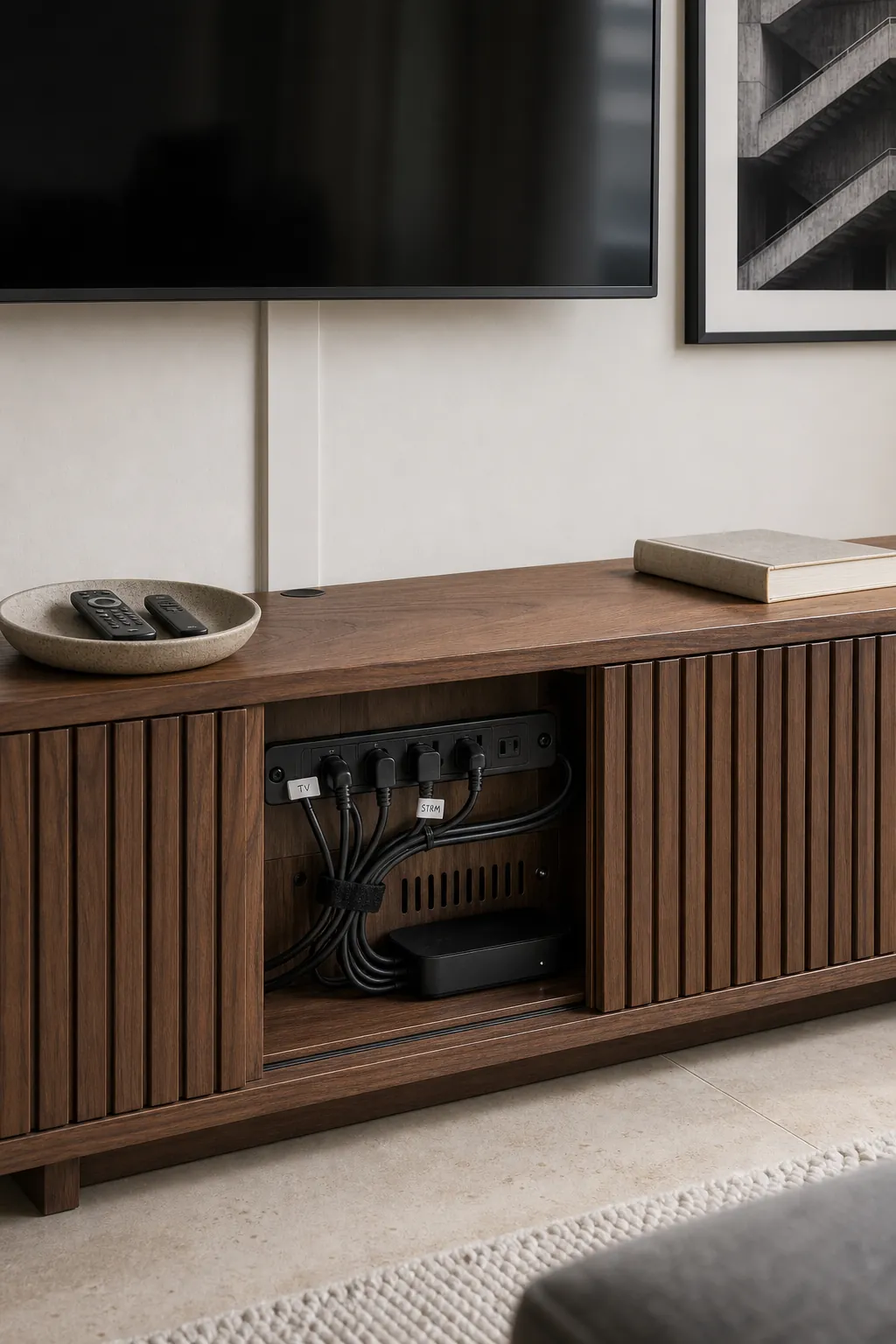
Gather streaming boxes, power strips, and game equipment inside a ventilated cabinet where possible. Label the cords before hiding them, allow airflow around electronics, and keep access to anything that needs regular resetting. Once the technical clutter is controlled, style the console sparingly. A low bowl, a stack of books, or one plant is often enough beneath a detailed frame wall.
Plan the Whole Gallery at Full Size
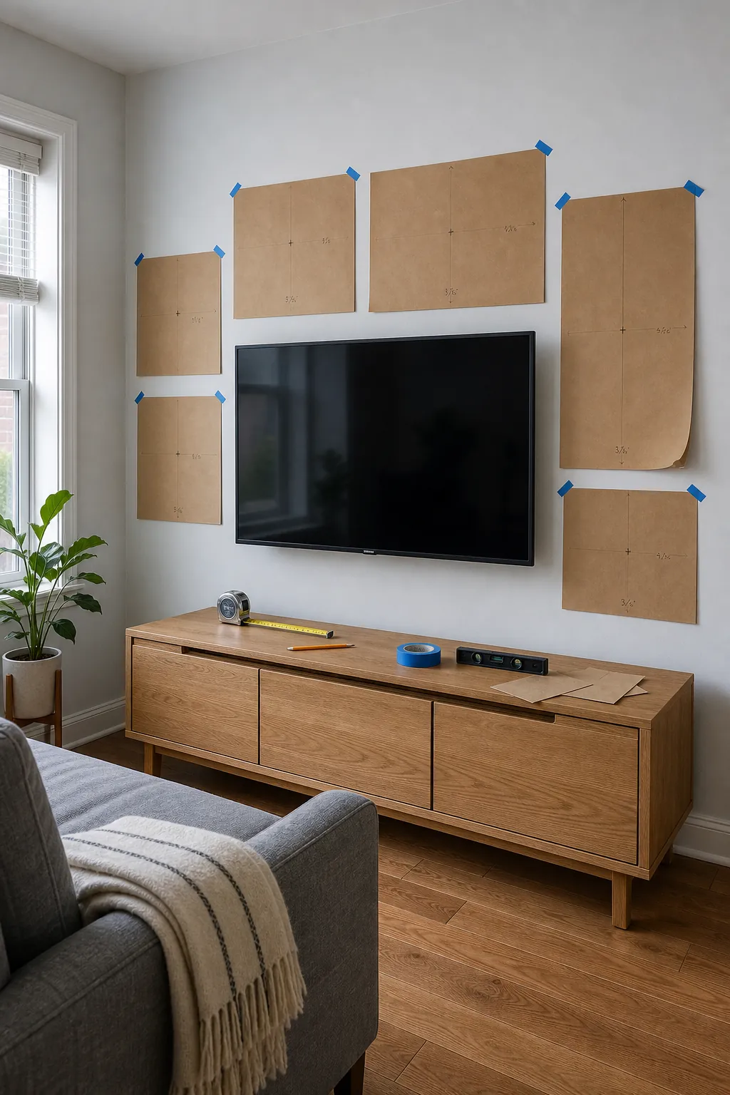
The cheapest way to avoid misplaced holes is to mock up every frame at full size. Trace the frames onto kraft paper, wrapping paper, or flattened shopping bags. Mark the hanging point on each template, then tape the shapes to the wall with low-tack painter’s tape. Photograph several versions from the main doorway and from the sofa.
- Place the largest art first and establish the TV breathing room.
- Add medium pieces to balance the screen’s left and right sides.
- Use the smallest frames only to resolve gaps or soften an outer edge.
- Check that the gallery relates to the console and does not collide with curtains, sconces, speakers, or doors.
- Live with the paper layout for a day, checking both daylight glare and evening lamplight.
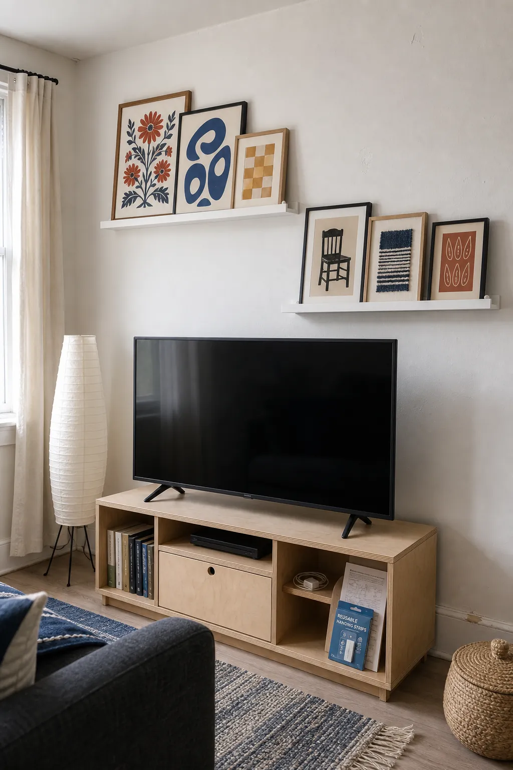
Renters can use properly rated removable picture-hanging strips for compatible frame weights and wall finishes, following the manufacturer’s preparation and removal instructions. Another option is one or two securely installed picture ledges, which concentrate the holes and let you rearrange art later. Do not place leaning frames where they can slide into the screen, and use anti-tip measures in homes with children or pets.
Make the Final Edit From the Sofa
When the wall is hung, remove a few console accessories and sit down. Look first at the entire composition, then turn on the TV. If a bright frame catches your eye through every scene, move it outward. If the arrangement seems to sag, raise the lowest side pieces or strengthen the top line. If the TV still dominates, add one larger piece rather than several smaller ones.
The strongest gallery wall around a TV is not the one with the most art. It is the one where the screen, frames, console, and empty wall feel like parts of the same plan. Keep the spacing consistent, choose art that reads from the seating area, and let negative space do some of the decorating. When those three decisions are right, the television can remain practical without owning the room.