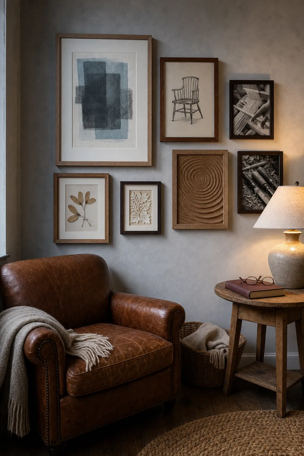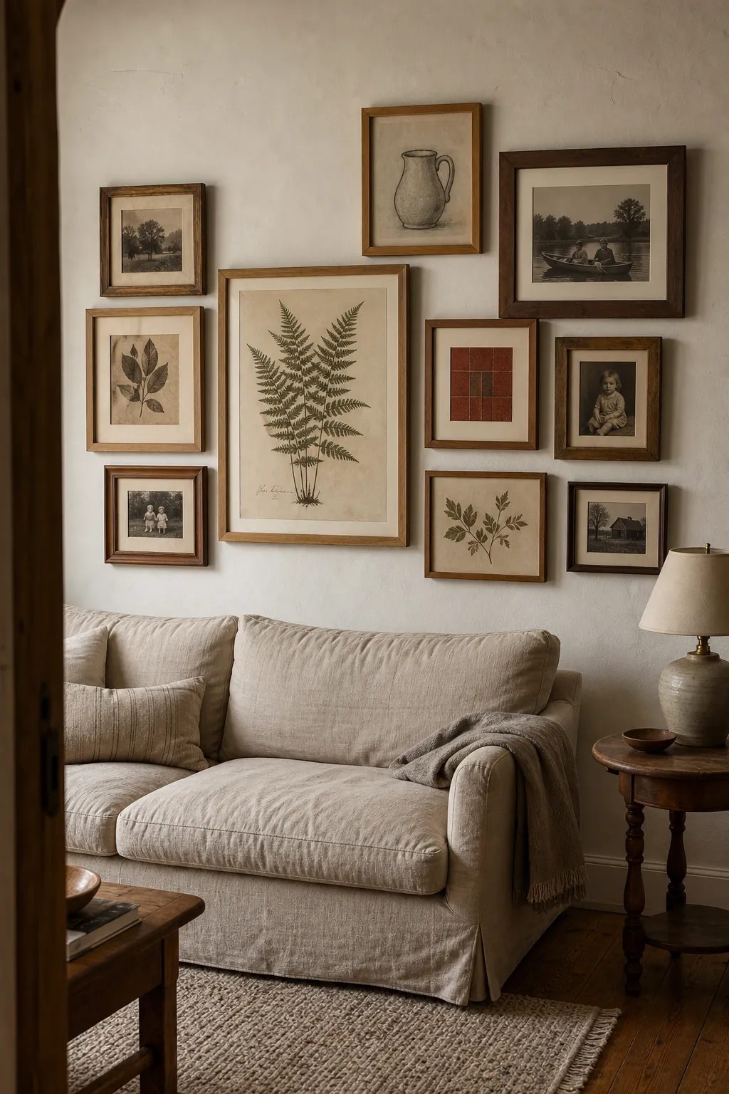
A rustic gallery wall works best when it looks collected, not crowded. The wood frames bring warmth, but they cannot do all the organizing for you. The real work is creating one clear focal point, repeating a few tones, and giving every piece enough breathing room. That is what turns separate photos and prints into a display that feels personal and settled.
If your current frame wall feels busy, resist the urge to buy more decor. Start with what you already own, edit the selection, and build outward from the strongest piece. These rustic gallery wall ideas show how to use wood grain, meaningful art, consistent spacing, and room-specific layouts without making the result look like a matching frame kit.
Start With One Large Anchor Piece
The most common reason a gallery wall looks nervous is that every piece is small and every piece is asking for equal attention. Choose one substantial photograph, painting, mirror, or textile as the anchor. It does not have to sit dead center, but it should be the first thing your eye finds. Place the next-largest frame across from it rather than directly beside it, then use smaller pieces to bridge the space between them.
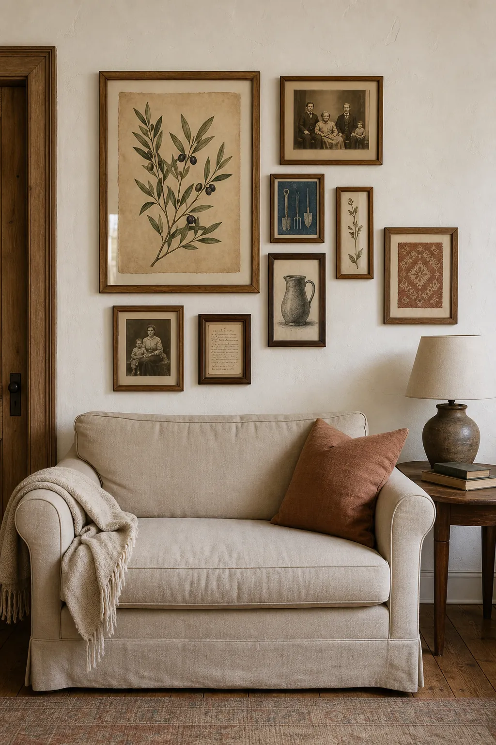
Think of the full arrangement as one object inside an invisible rectangle. A strong anchor gives that rectangle weight. Before making holes, lay the frames on the floor inside a taped boundary that matches the available wall space. Photograph two or three versions from directly above. The best layout is usually the one you can understand at a glance, not the one that fits every item you hoped to use.
Mix Wood Tones Through a Shared Undertone
Matching every wood frame can make a rustic display feel flat, while mixing every possible finish can create visual noise. A useful middle path is to repeat a shared undertone. Honey oak, aged pine, and medium walnut all feel different, but their warm brown base lets them belong together. Add one darker frame for contrast, then repeat that dark note once elsewhere so it looks intentional.
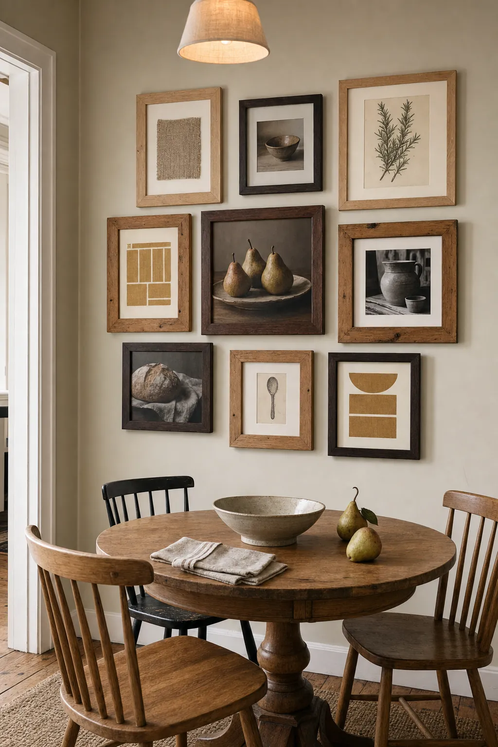
Let the room help you edit. In a space with an oak table, include at least one oak frame. Near a walnut console, repeat walnut on the wall. The frames do not need to match the furniture exactly; they only need a visible relationship. A limited wood palette makes varied frame profiles feel collected rather than accidental. Avoid lining up all the darkest pieces on one side, where they will pull the whole composition off balance.
Choose Art That Tells One Layered Story
Rustic decor gains character from age, texture, and association. Instead of filling every frame with generic farmhouse quotes, combine personal photographs with old letters, a small charcoal drawing, a pressed botanical, a block print, or a scrap of meaningful fabric. The subjects can vary if the color story or emotional tone repeats. Sepia photos, cream paper, faded ink, and muted clay accents naturally connect pieces from different sources.
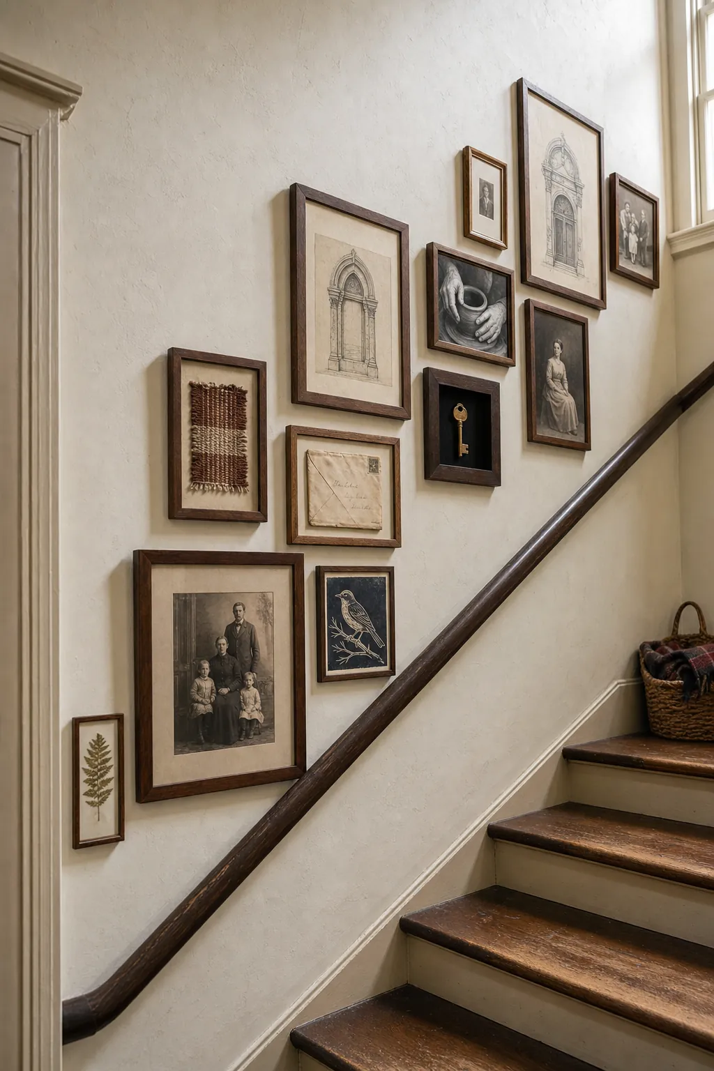
Edit for meaning as well as appearance. Nine memorable pieces will feel richer than twenty-five filler prints. If you love more items than the wall can hold, rotate a few seasonally rather than shrinking everything to fit. This keeps the gallery wall readable and gives special objects room to register. It also leaves space for the collection to grow naturally instead of looking finished on the day it is installed.
Use Consistent Gaps to Calm an Asymmetrical Layout
An asymmetrical gallery wall can include different sizes and shapes, but the gaps should still feel deliberate. Pick a spacing standard—often about two to three inches for medium frames—and hold it as consistently as the frame shapes allow. A simple cardboard spacer makes this easier than measuring every gap independently. Keep a few edges aligned along invisible horizontal or vertical lines so the eye has places to rest.
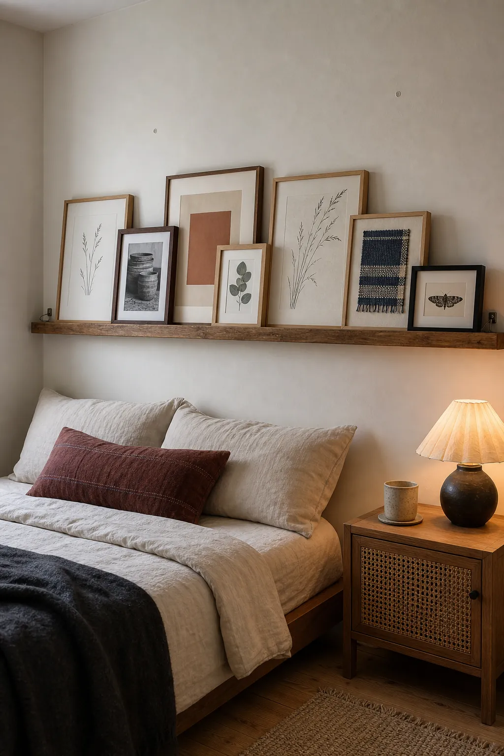
For renters or anyone who changes art frequently, a wood picture ledge creates the same rhythm with fewer wall holes. Overlap only a small portion of neighboring frames so the images remain readable, and secure leaning pieces where children or pets could reach them. Whether you use nails or a ledge, spacing is the quiet structure that lets mixed frames look purposeful.
Size the Whole Display to the Furniture Below
A frame wall does not float independently from the room. Above a sofa, sideboard, bed, or entry console, the complete arrangement should feel connected to the furniture rather than stranded near the ceiling. Mock up the outer boundary with painter’s tape, then step back from the main doorway. If the gallery looks like a narrow postage stamp over a wide sofa, enlarge the overall footprint or use fewer, larger pieces.
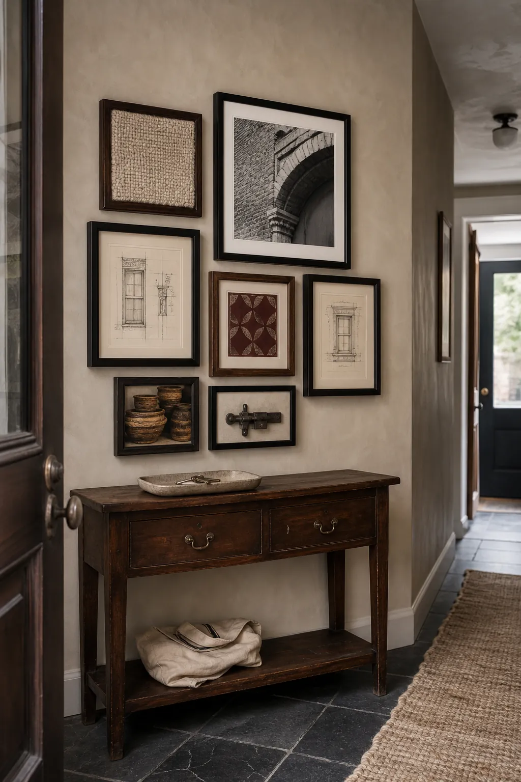
Use the visual center of the whole group—not the top edge of the highest frame—as your height reference. In a pass-through space, check the composition while standing. Near seating, also check it while seated. Leave a comfortable band of wall between the furniture and the lowest frame, but not so much that the two elements lose their relationship. The goal is one layered vignette, not a wall display hovering above another unrelated object.
Finish With Tactile Details and Gentle Light
Wood frames already add grain, but one or two other textures make rustic wall decor feel deeper. Try a woven textile panel, a shallow carved relief, handmade paper, or a pressed plant specimen. Keep dimensional objects light and securely mounted. The point is not to fill every gap; it is to interrupt the repeated glass-and-frame surface with a material that rewards a closer look.
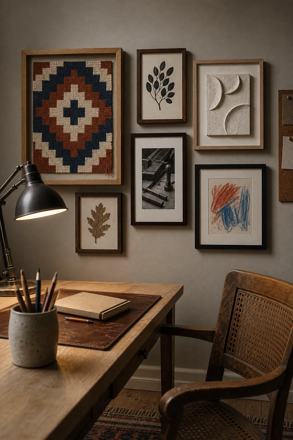
Use warm, diffused light rather than a harsh spotlight that creates glare on every pane of glass. A nearby table lamp or shaded wall light can reveal wood grain and paper texture without making the arrangement theatrical. Before calling the wall finished, remove one small piece and look again. If the remaining shapes feel clearer, leave it out. A convincing rustic gallery wall is defined as much by its pauses as by its frames.