
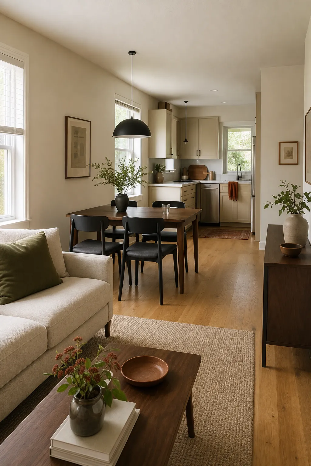
An open-plan small home does not need every zone painted a different color to feel interesting. In fact, the most common color-flow problem begins when a living room, dining area, kitchen, and hall share long unbroken walls but are treated like four closed rooms. The eye sees all four palettes at once, along with cabinets, flooring, upholstery, and art.
A better open plan color palette uses one continuous foundation, one repeated secondary color, and a small number of accents that change emphasis by zone. This keeps the home visually open while giving each function its own identity. The ideas below focus on palettes you can actually repeat across a small floor plan.
Map the Longest Sightlines First
Stand at the front door, the main sofa, and the kitchen sink. Note every wall, cabinet, rug, and doorway you can see from each position. Those are the surfaces that must cooperate. A color can be beautiful close up and still feel jarring when it sits in direct view of another saturated color twenty feet away.
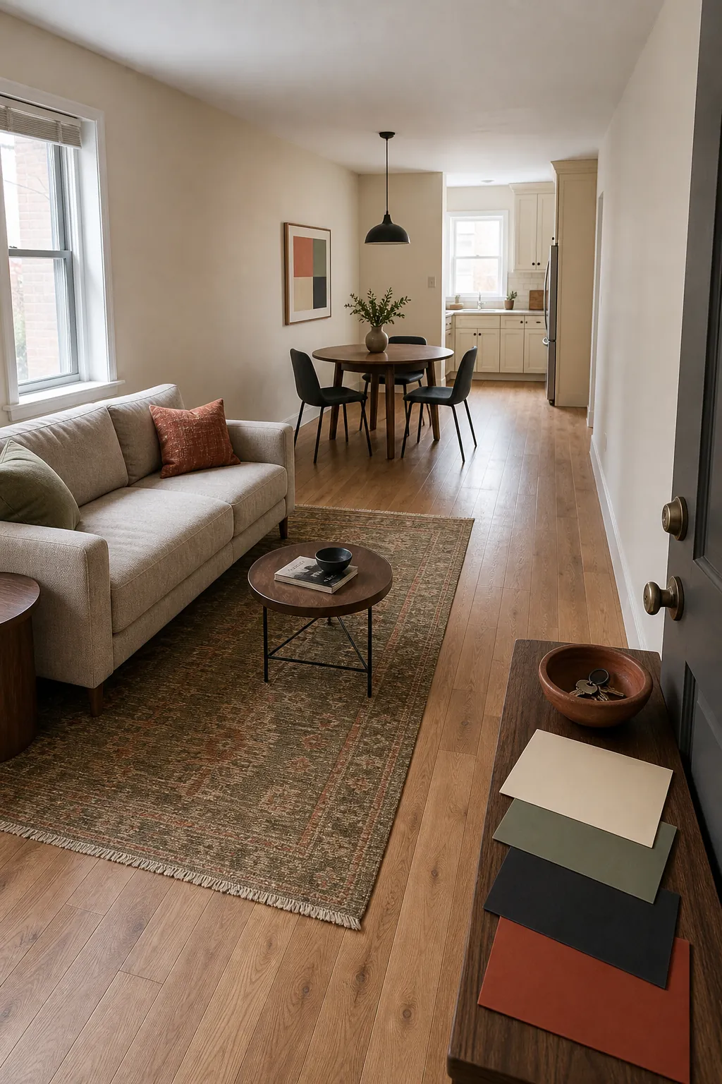
Also mark walls that cross two zones without an architectural break. Those walls usually need one color from end to end. Stopping paint halfway along a flat wall creates a line that the architecture does not support. Save color changes for inside corners, cased openings, beams, cabinetry, or clearly defined alcoves.
Choose One Foundation Neutral
The foundation neutral does not have to be white. Warm cream, pale putty, soft mushroom, light greige, or a muted stone color can carry the shared walls and hall. Choose it from the fixed finishes: flooring, counters, tile, and large upholstery. A warm oak floor often prefers a cream or putty with a related undertone over a sharp blue-white.
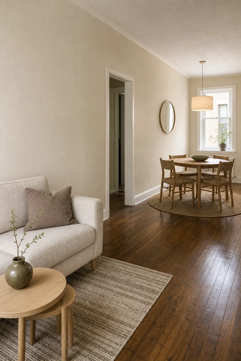
Continue the foundation across the longest wall and through the most visible circulation zone. That continuity is what makes the footprint feel generous. If you want variation, change sheen rather than hue in hard-working areas: washable matte or eggshell on walls, durable satin on trim and cabinetry.
Repeat One Secondary Color in Every Zone
Pick one secondary color that works with the foundation and the fixed materials. It might be muted olive, dusty blue, terracotta, charcoal, or walnut brown. Then repeat it at different scales: a living-room rug, dining-chair fabric, kitchen towels, and one object near the entry.
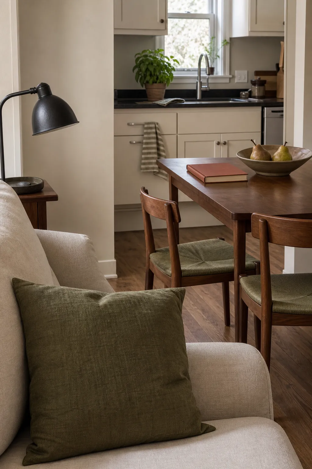
The items should not match exactly. A deep olive chair can relate to a pale olive stripe and a leafy green plant without looking like a set. Repetition gives the eye a thread to follow, while changes in value and texture keep the home styling natural.
Define Zones With Rugs and Upholstery
Paint is not the only way to separate functions. In a small open concept decor scheme, rugs, upholstery, and lighting fixtures can establish zones while walls stay continuous. Use the living rug to hold the fullest version of the palette, then pull two or three of its colors into the dining and kitchen areas.
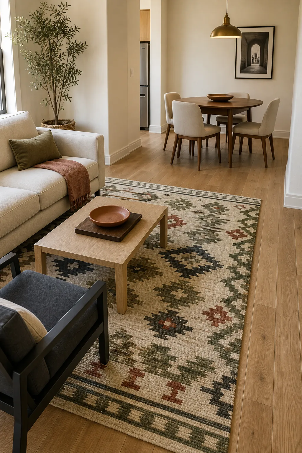
Keep the rug large enough for the front legs of the main seating. A tiny rug creates another visual fragment. Over the dining table, a pendant can echo the warm metal or dark wood used in the living area, creating a clear destination without another wall color.
Use Cabinets or an Alcove for Stronger Color
If you want a bolder color, put it on a surface with an obvious beginning and end. Kitchen cabinets, an entry niche, a built-in bookcase, or the back of a defined dining alcove can handle more saturation than the middle of a long shared wall.
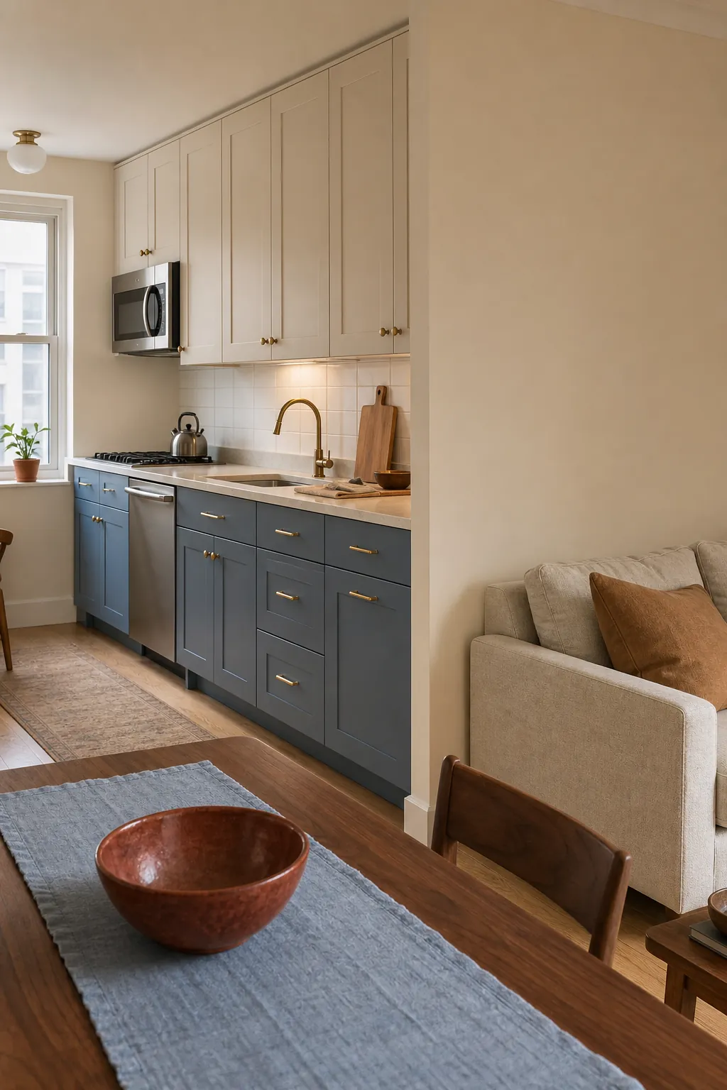
When a bold wall faces painted cabinets in a small space, avoid two colors that are almost—but not quite—the same. Either match them intentionally or let one be dominant and make the other clearly different but related. A near-match often reads as a mistake from across the room.
Balance Color for Different Light Exposures
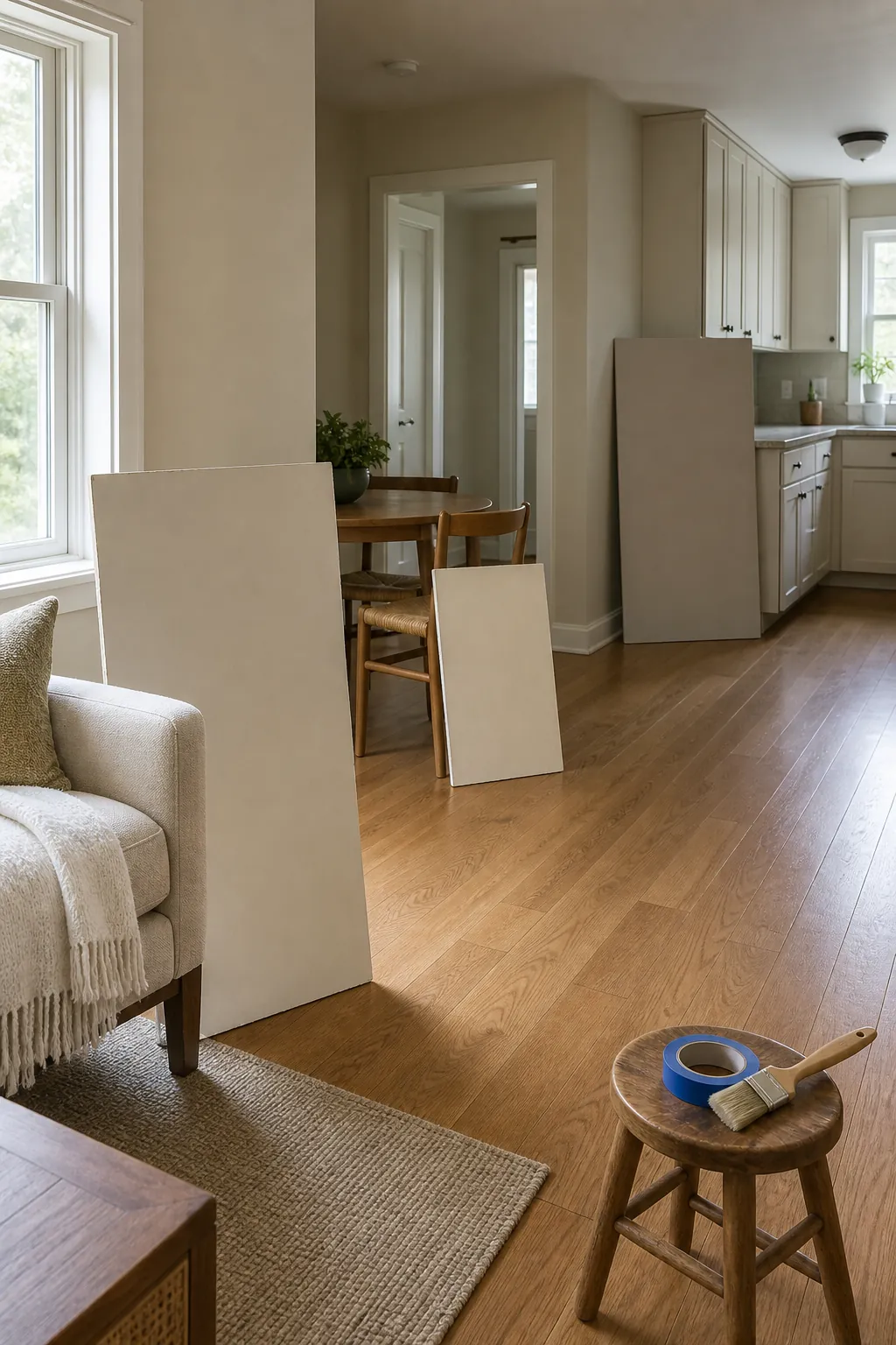
One open floor can contain several kinds of light. The kitchen may receive cool morning light while the living area glows warm in the afternoon. Paint large movable boards and check the same color in every zone. The best foundation may look slightly different across the day, but it should not turn dirty in one area or fluorescent in another.
Repeat lamp color temperature across visible zones too. A cool kitchen fixture beside amber living-room lamps can split the floor plan more aggressively than paint. Similar warm-neutral bulbs make the whole home color palette feel coherent after sunset.
Build a Five-Color Whole Home Palette
A practical five-color formula is: one light foundation neutral, one medium secondary color, one darker anchor, one warm natural material, and one small accent. For example: cream walls, muted olive textiles, charcoal details, walnut wood, and rust accents. Another option is pale putty, dusty blue, deep navy, light oak, and muted terracotta.
Use every color somewhere, but change the proportions by zone. The living room might feature olive, the kitchen might emphasize cream and walnut, and the entry might carry charcoal with one rust detail. Cohesion does not require identical rooms; it requires recognizable relationships. When the shared walls, sightlines, and lighting agree, a small open plan home can hold real color without feeling chopped up.