
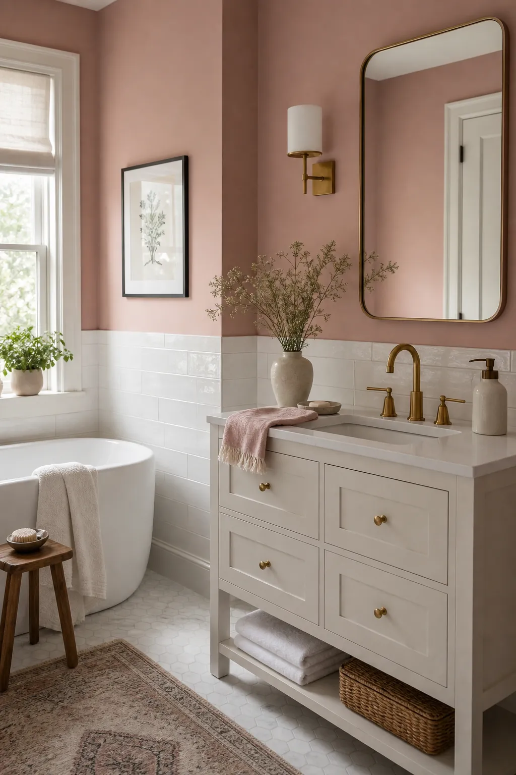
A soft pink bathroom can go wrong in two very different ways. It can feel too sweet, like every choice was made because it was pink, or it can feel accidental, as if blush walls were added to a room that wanted something else. The calm, grown up version sits in the middle: pink is present, but it is edited, grounded, and supported by materials that make sense in a bathroom.
After reading real homeowner discussions about pink bathrooms, the same concern kept showing up: people were not afraid of color. They were afraid of a pink bathroom that fought the tile, clashed with the hardware, or looked childish once towels, rugs, art, and lighting were added. That is the right problem to solve. Soft pink decor works best when it is treated like atmosphere, not novelty.
Use these ideas as a practical bathroom styling filter. Before adding anything, ask whether the piece makes the room calmer, cleaner, warmer, or more intentional. If it only adds more pink, it may be the wrong choice.
Start with a muted pink, not a candy pink
The easiest way to make pink feel grown up is to choose a shade with a little dust, beige, clay, or peach in it. A soft pink bathroom does not need to look pale or washed out, but it should avoid the bright bubblegum tones that can make the room feel themed. Think plaster pink, blush beige, faded rose, or a barely warm shell pink.
This matters most when you already have fixed finishes. If the floor is beige, cream, taupe, gray, or black and white, the pink should bridge those colors instead of ignoring them. The wall color should look like it belongs to the tile, not like a separate decoration layered on top. Test samples near the vanity, shower, floor, and mirror because bathroom light can shift pink quickly.
Use white as breathing room
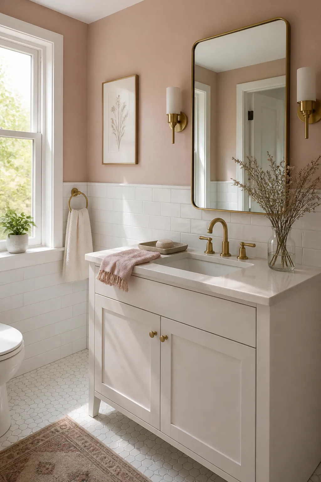
White is what keeps a blush bathroom feeling fresh instead of heavy. White towels, a white shower curtain, white trim, white tile, or a clean white vanity can turn pink into a gentle background color. The key is to use white in larger, quiet surfaces rather than tiny scattered accents.
A white bathroom with soft pink decor often feels more elegant than a room where every visible thing is pink. Let the pink create warmth, then let white give the eye a place to rest. If the room is small or has no window, this white and pink balance is especially important because too much color can make the space feel closer and busier.
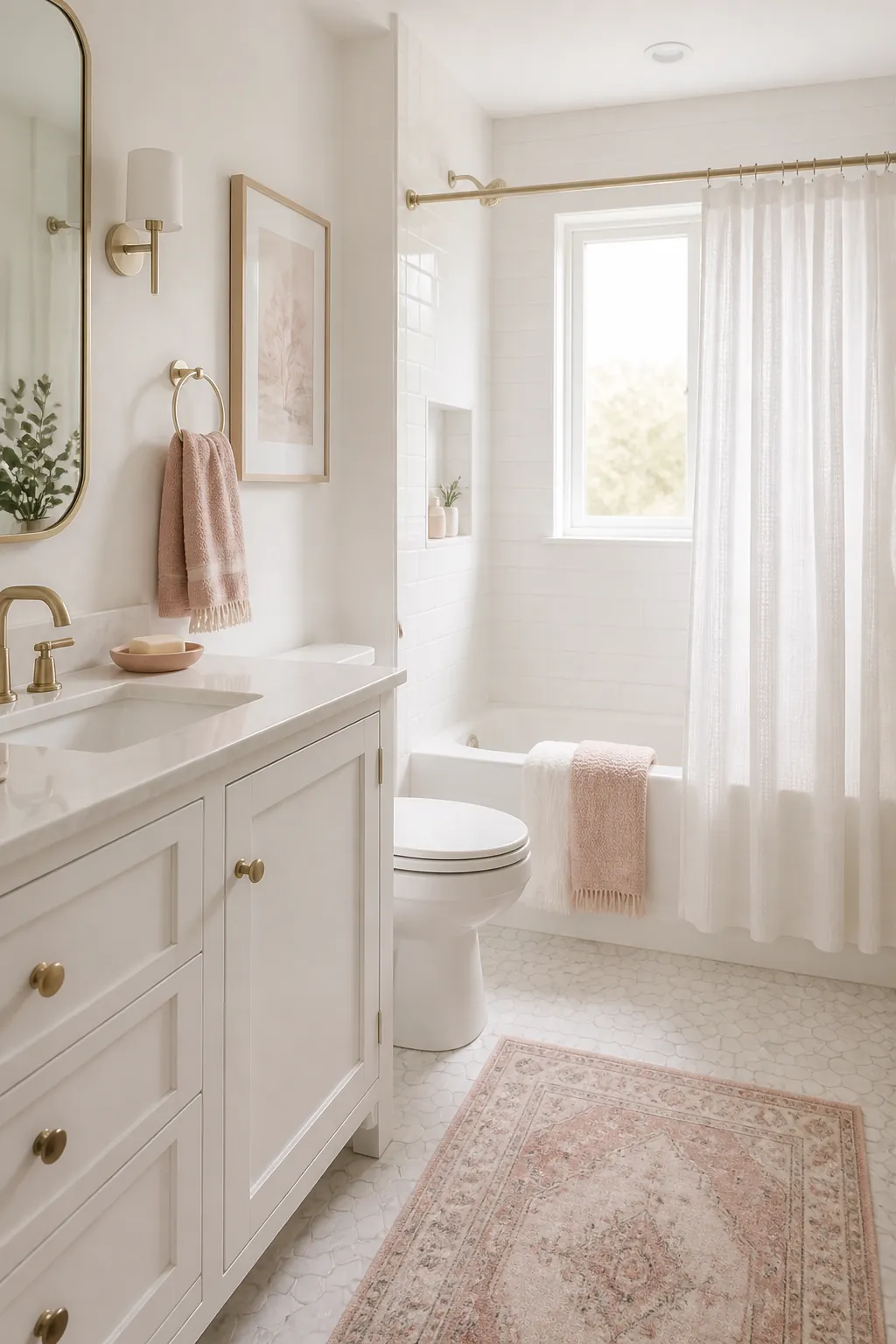
Treat brass accents like jewelry
Brass accents can make a pink bathroom feel polished, but too much brass can push the room into a hotel-lobby look. Use it the way you would use jewelry: a mirror frame, a faucet, cabinet pulls, a towel ring, a sconce, or a small tray. The best brass pieces have a warm, aged, or satin finish instead of a harsh yellow shine.
If your bathroom already has black, chrome, or nickel fixtures, do not force every metal to change at once. A mixed-metal room can still look intentional when the shapes are simple and repeated. For example, a black shower frame can sit comfortably with brass lighting if the rest of the bathroom decor stays calm. One strong metal story is good; one metal on every object is usually too much.
Repeat pink in soft layers instead of one loud statement
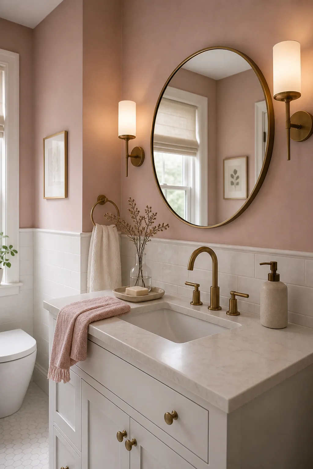
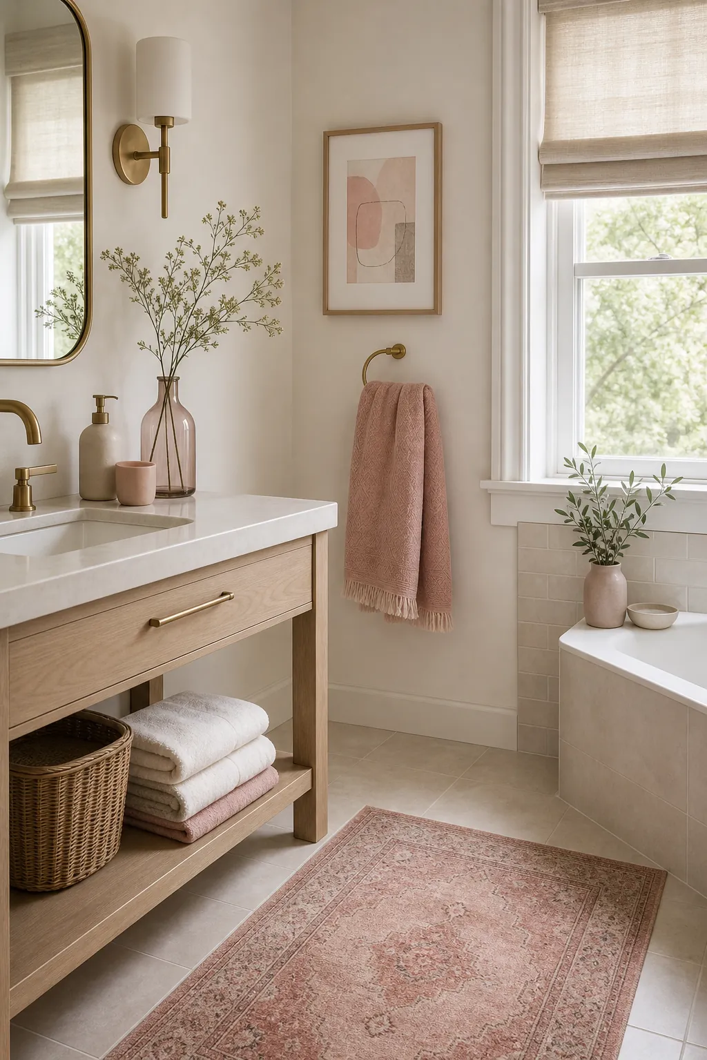
A grown up pink bathroom usually has more than one pink moment, but those moments are controlled. Try one main pink surface, then repeat the color in softer layers: a hand towel, framed art, a small vase, a bath mat with a faded rose tone, or a shower curtain pattern with pink worked into a neutral design.
This layered approach solves the biggest problem with pink bathroom decor: the room can look random when every item is a different shade. Choose one family of pink and stay close to it. Blush, dusty rose, and warm pale pink can live together. Neon pink, baby pink, mauve, coral, and hot pink in the same small room will usually feel scattered. Variation is good; unrelated pinks are noise.
Add one grounding contrast color
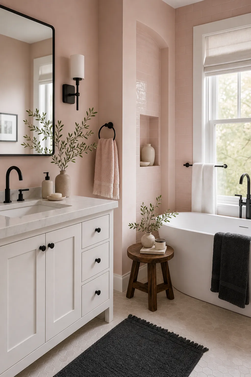
Soft pink becomes more adult when it has something grounded beside it. The safest choices are warm white, deep charcoal, walnut, olive, mushroom, taupe, or a little black. You do not need much contrast. A black frame, a charcoal runner, a walnut stool, or olive stems in a vase can be enough.
Contrast is also what keeps an elegant bathroom from becoming flat. Pink and white alone can be lovely, but a single deeper tone gives the room structure. If the bathroom already has black fixtures, use them as the grounding color rather than fighting them. If the room has warm wood, let that wood make the pink feel earthy. The goal is not drama; the goal is a room that has weight.
Keep the accessories edited and useful
The fastest way to make a pink bathroom look childish is to fill every ledge with cute objects. A calm bathroom needs fewer, better pieces: a real tray, one good soap bottle, folded towels, a framed print, a small plant if the light allows it, and a rug that feels like part of the palette. Leave some surfaces empty.
This is where bathroom styling becomes practical. Choose accessories that earn their space. Towels should feel soft and substantial. Art should be framed. Storage should hide visual clutter. A tray should gather the daily items instead of adding another object to clean around. Grown up pink decor is not less pretty; it is more disciplined.
A simple formula for a calm pink bathroom
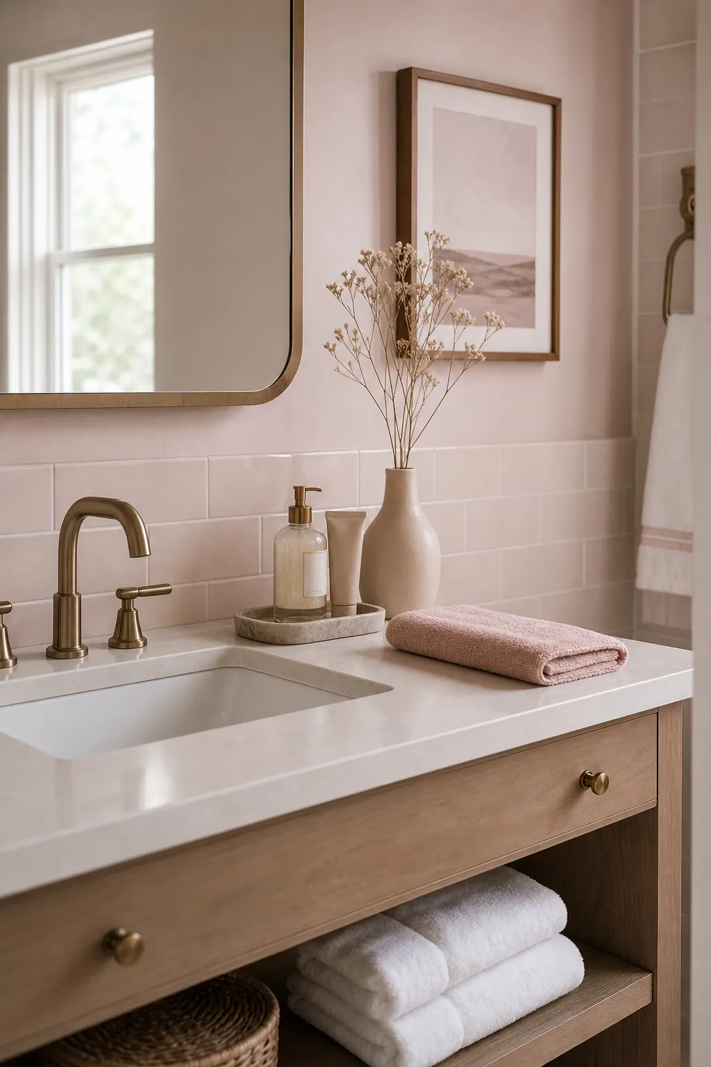
If you want the room to feel calm and grown up, build it from this formula: one muted pink, one clean white or warm neutral, one metal finish, one grounding contrast color, and one natural texture. That could mean blush walls, white tile, satin brass, a charcoal framed mirror, and a walnut stool. Or it could mean white walls, pink towels, chrome fixtures, olive artwork, and a woven shade.
The exact choices can change, but the restraint should stay. Pink is already a personality color. It does not need every accessory to shout. Let it soften the light, flatter the room, and warm up hard bathroom surfaces. When the palette is edited, a pink bathroom can feel calm, elegant, and completely grown up.