
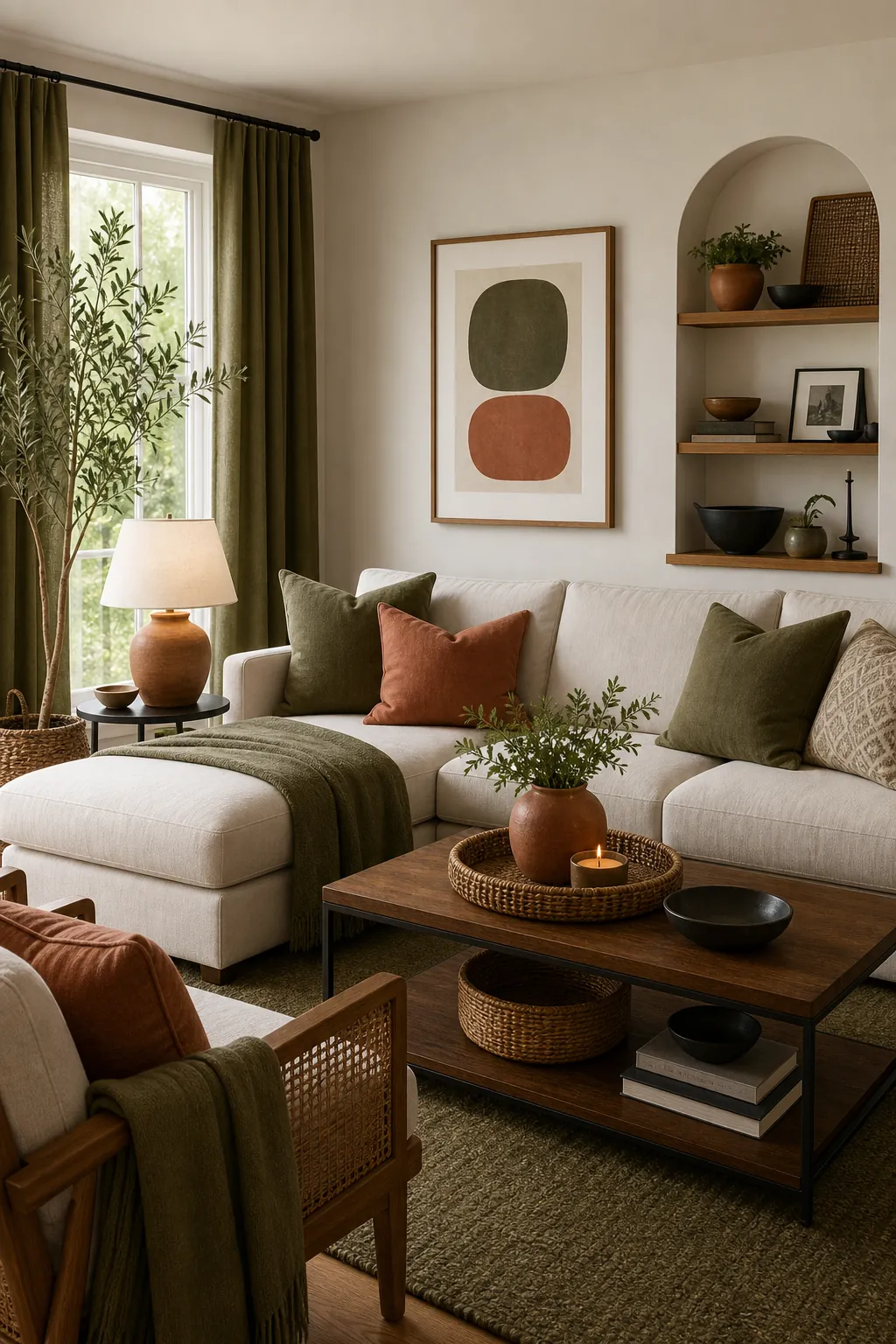
A room can have beautiful furniture and still feel slightly wrong. The sofa is fine, the rug is fine, the curtains are fine, but the whole room does not land. Most of the time, the problem is not taste. It is color math.
The formula that makes a room feel pulled together is simple: choose one dominant base, one supporting color family, one accent, and one repeating neutral or natural material that ties them together. The familiar version is 60/30/10, but the real magic is knowing what each part means in an actual room.
The Formula In Plain English
Think of your room in four layers:
- 60 percent base: the color family that covers the largest visual area.
- 30 percent support: the color that gives the room personality without taking over.
- 10 percent accent: the small color that creates life, contrast, or warmth.
- One bridge: a material or neutral that repeats through the room, such as wood, black metal, brass, linen, bamboo, or woven fiber.
This is not a strict measuring exercise. Nobody needs to calculate the square inches of a pillow. The point is visual weight. Big surfaces count more than small decor, and repeated colors count more than one lonely object.
Start With The Color You Cannot Easily Change
The biggest mistake is choosing a color palette from a pretty photo and then trying to force it onto a room that already has fixed finishes. Start with what must stay: flooring, countertops, cabinets, tile, a large sofa, built-ins, or a rug you love.
Those pieces tell you the undertone. If the floor is warm oak, a cold gray palette may fight it. If the sofa is blue-gray, warm cream and rust can work, but yellow beige may feel off. A pulled-together room respects the undertone before it adds new color.
Choose A Calm 60 Percent Base
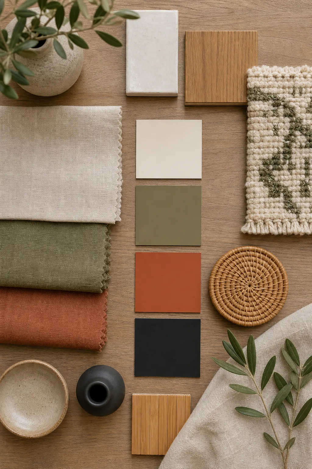
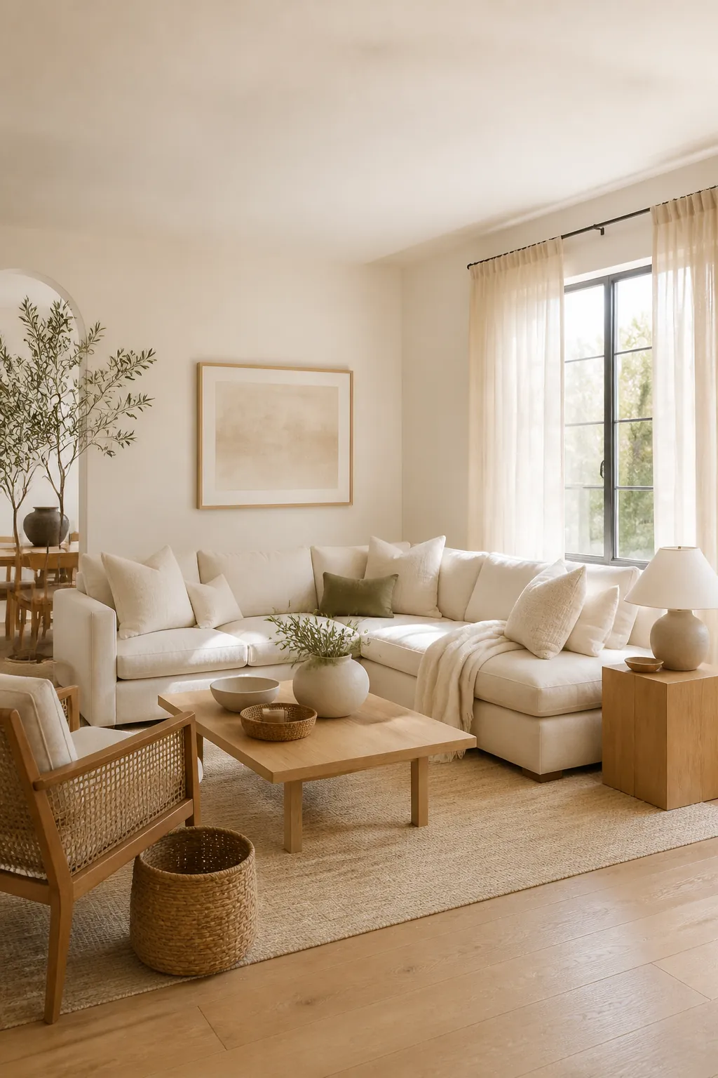
Your base is usually the wall color, main upholstery, large rug, curtains, or flooring. It does not have to be white. It can be warm cream, soft taupe, pale mushroom, charcoal, deep green, or another color you can live with in large amounts.
For most homes, the safest base is not stark white. It is a warm neutral that works with the natural light and the fixed finishes. The base should make the room easier to decorate, not demand attention every time you enter.
Make The 30 Percent Color Do The Personality Work
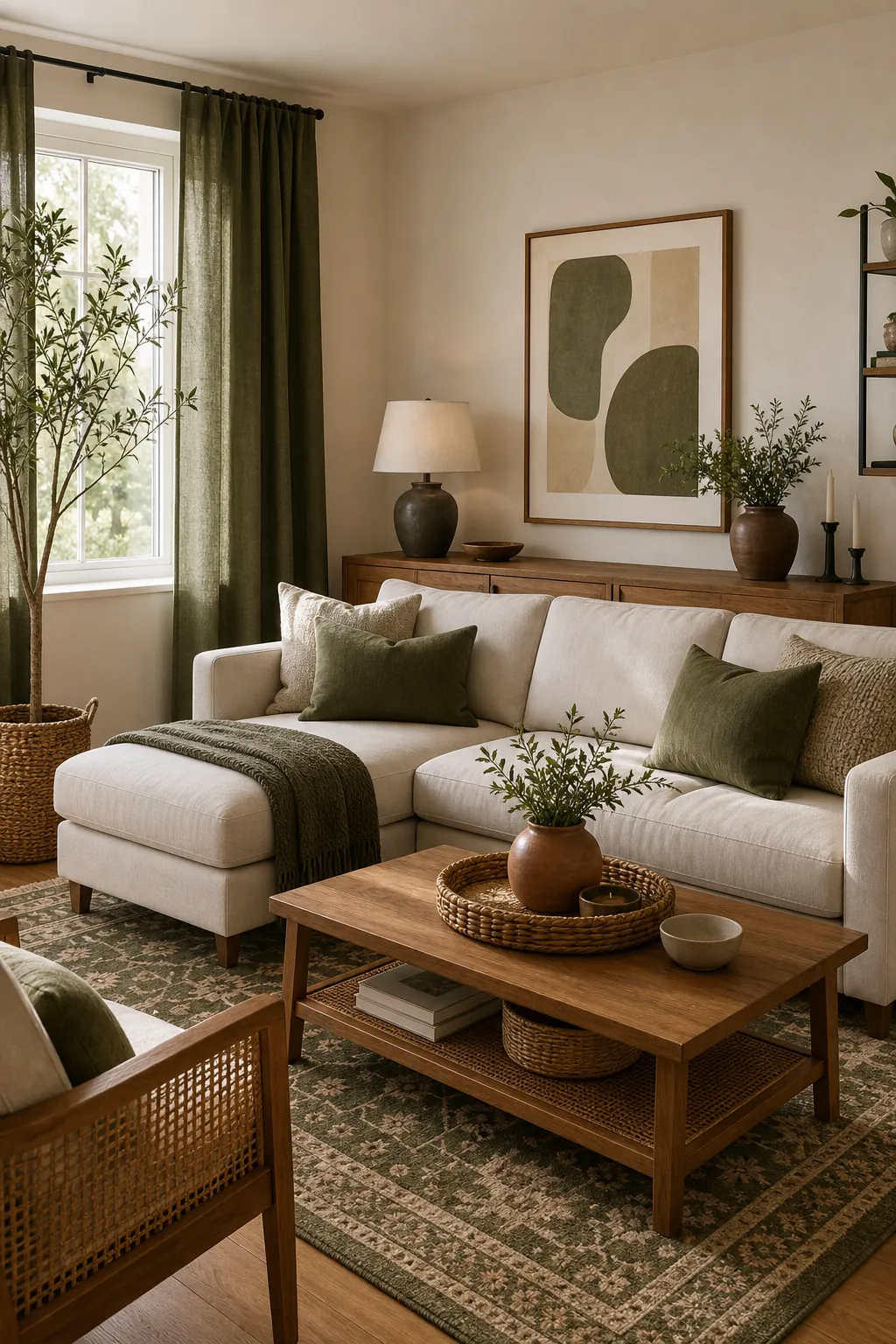
The secondary color is where the room starts to feel designed. It can show up in curtains, a rug pattern, pillows, an accent chair, a painted cabinet, art, or bedding. This color should be visible enough to matter but not so loud that it competes with everything.
Muted colors are easier to live with at this scale: olive, slate blue, clay, ochre, dusty rose, mushroom, navy, or soft black. If the color appears in more than one place, it reads as a plan instead of an accident.
Use The 10 Percent Accent Like Seasoning
An accent color should not be sprinkled everywhere until the room feels themed. Use it in smaller, stronger moments: a vase, pillow, lampshade, art detail, book cover, plant pot, or throw blanket.
The easiest accents are colors already suggested by natural materials: terracotta, rust, moss, indigo, ochre, deep brown, charcoal, or soft black. Accent color works best when it appears three times, in three different sizes. That might mean one pillow, one vase, and a small mark inside the art.
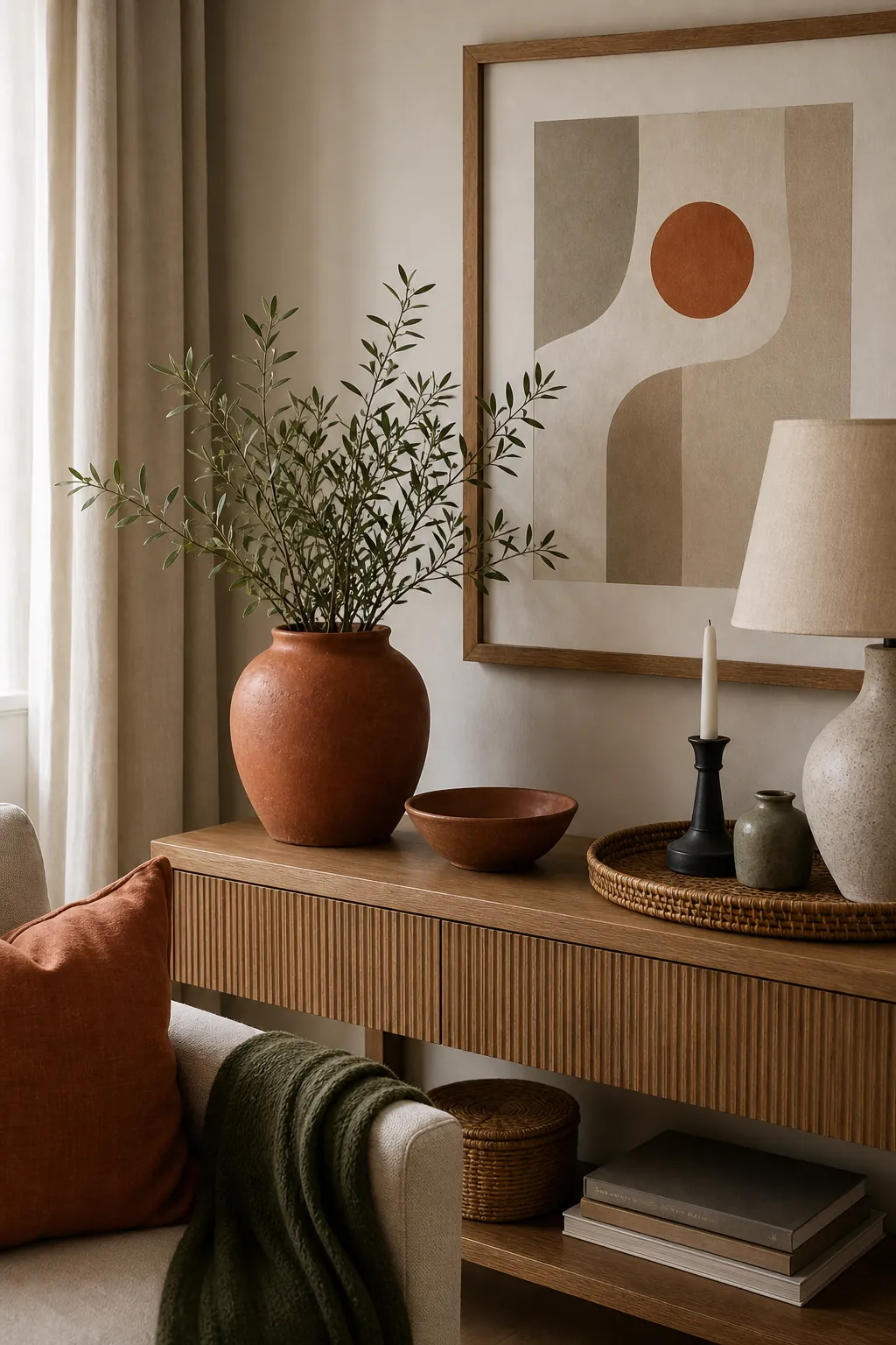
Add A Bridge So The Colors Stop Floating
The bridge is the part many people skip. It is not always a color. Often it is a material that appears around the room and makes unrelated pieces feel connected.
Natural wood, bamboo, rattan, linen, black metal, brass, matte ceramic, and woven fiber are all useful bridges. A bamboo tray, a woven basket, a wood side table, and a natural shade can help a color palette feel warmer and less flat.
Repeat Colors At Different Distances
If one green pillow is the only green object in the room, it looks stranded. Repeat the color far away from itself: a pillow near the sofa, a small green detail in the art, a plant or vase across the room, and a patterned rug that quietly echoes it.
Repetition is what turns color into cohesion. The pieces do not need to match exactly. In fact, they look better when the same color family appears in different textures: linen, ceramic, wool, leaves, art, and glass.
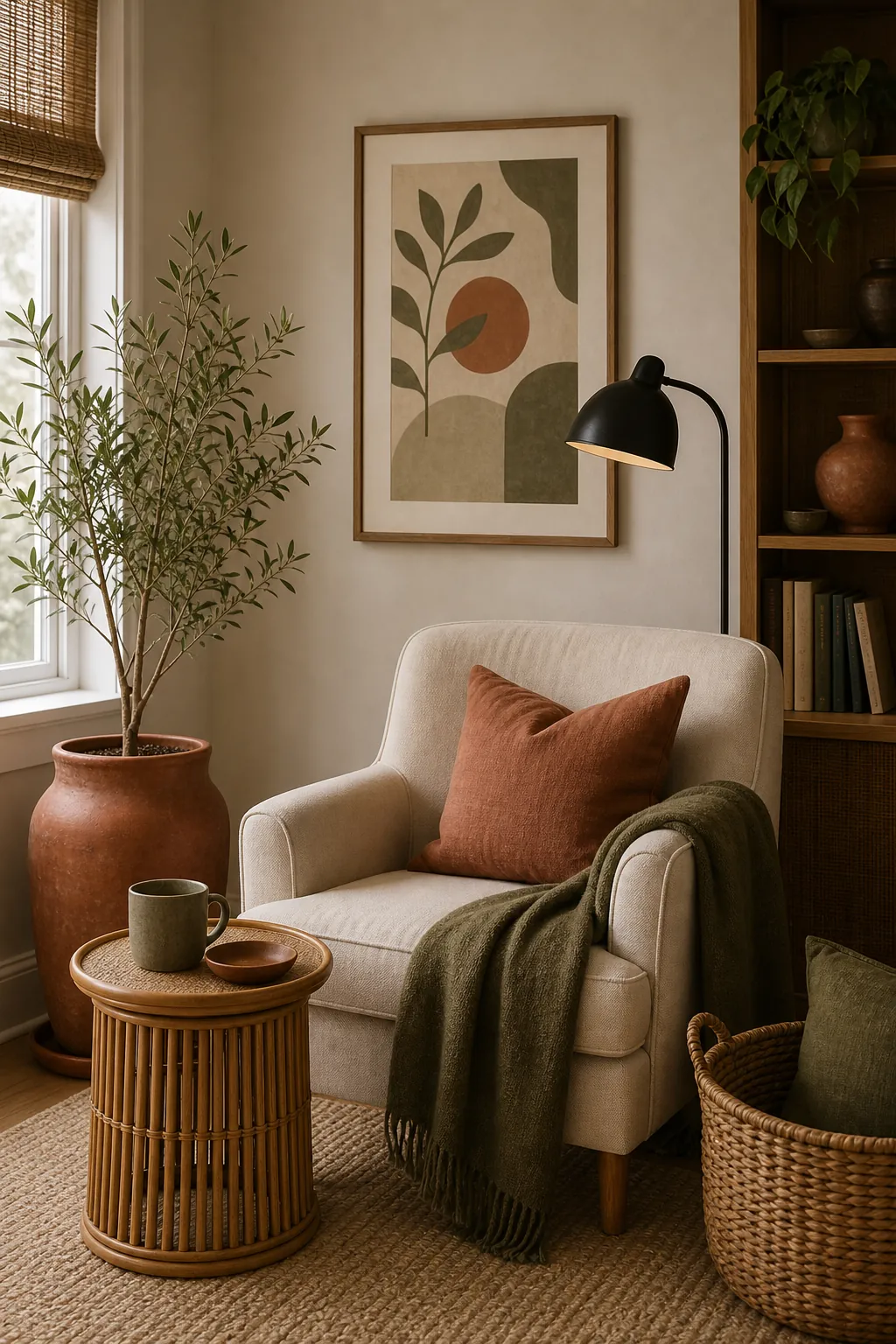
Do Not Let Every Room Start Over
A home feels pulled together when each room has its own mood but still belongs to the same house. You do not need identical colors everywhere. You need a few repeats: the same wood tone, the same black accent, the same warm white, or one color family that shifts slightly from room to room.
For example, a living room might use warm white, olive, terracotta, bamboo, and black. A bedroom can use the same warm white and bamboo, keep olive softer in the bedding, and use terracotta only in a small vase. The palette continues, but the room still feels fresh.
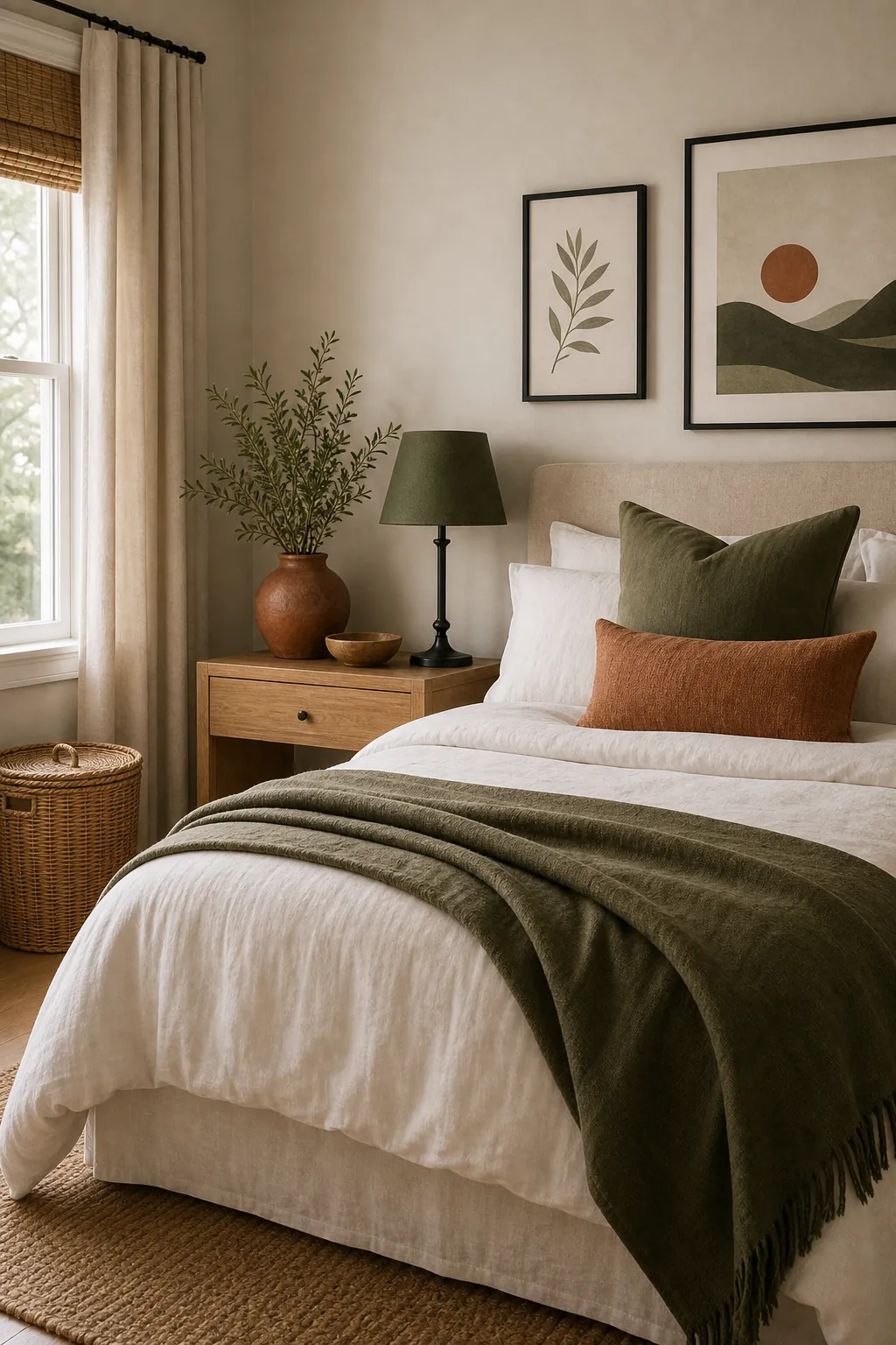
How To Fix A Room That Feels Off
If your room already has too many colors, do not throw everything out. Sort the visible colors into groups:
- Which color covers the most area?
- Which color appears only once and looks lonely?
- Which color fights the undertone of the floor, sofa, or cabinets?
- Which natural material could repeat to calm the room down?
Then remove or relocate the one-off colors first. Add repetition before adding anything new. A room that feels random often needs fewer color families, not more decor.
The Easy Room Palette Template
Use this template when you are stuck:
- Base: warm white, cream, greige, mushroom, charcoal, or another color you can handle in large areas.
- Secondary: muted olive, slate, navy, clay, dusty rose, ochre, or soft brown.
- Accent: terracotta, rust, black, brass, deep green, indigo, or one stronger color used sparingly.
- Bridge: wood, bamboo, woven fiber, linen, stone, ceramic, black metal, or brass.
The room is pulled together when the eye can trace the palette without effort. Choose the base, support it with one clear color family, season it with an accent, and repeat a natural bridge until everything feels like it belongs.