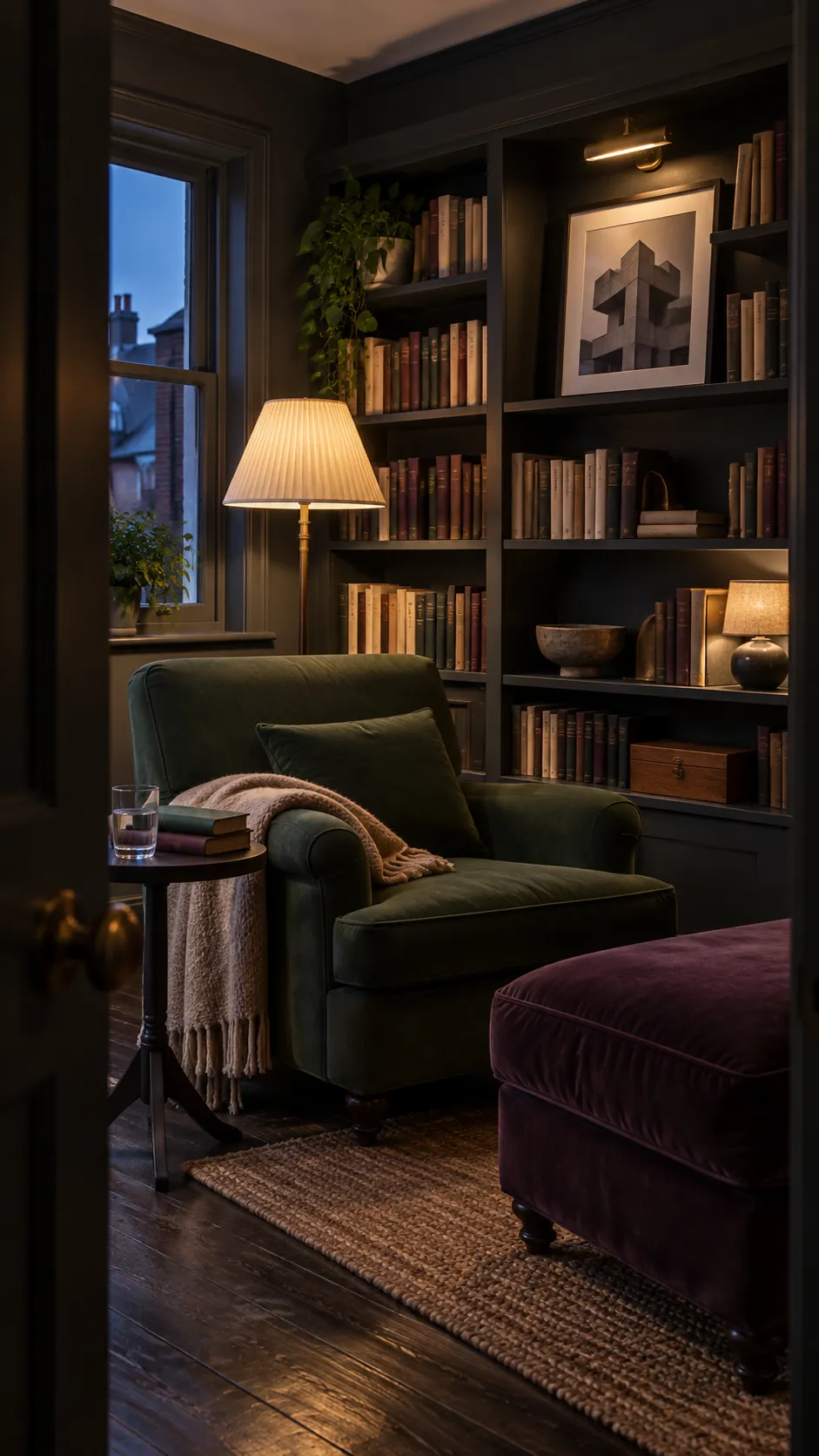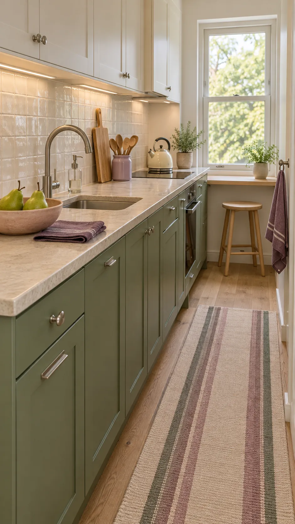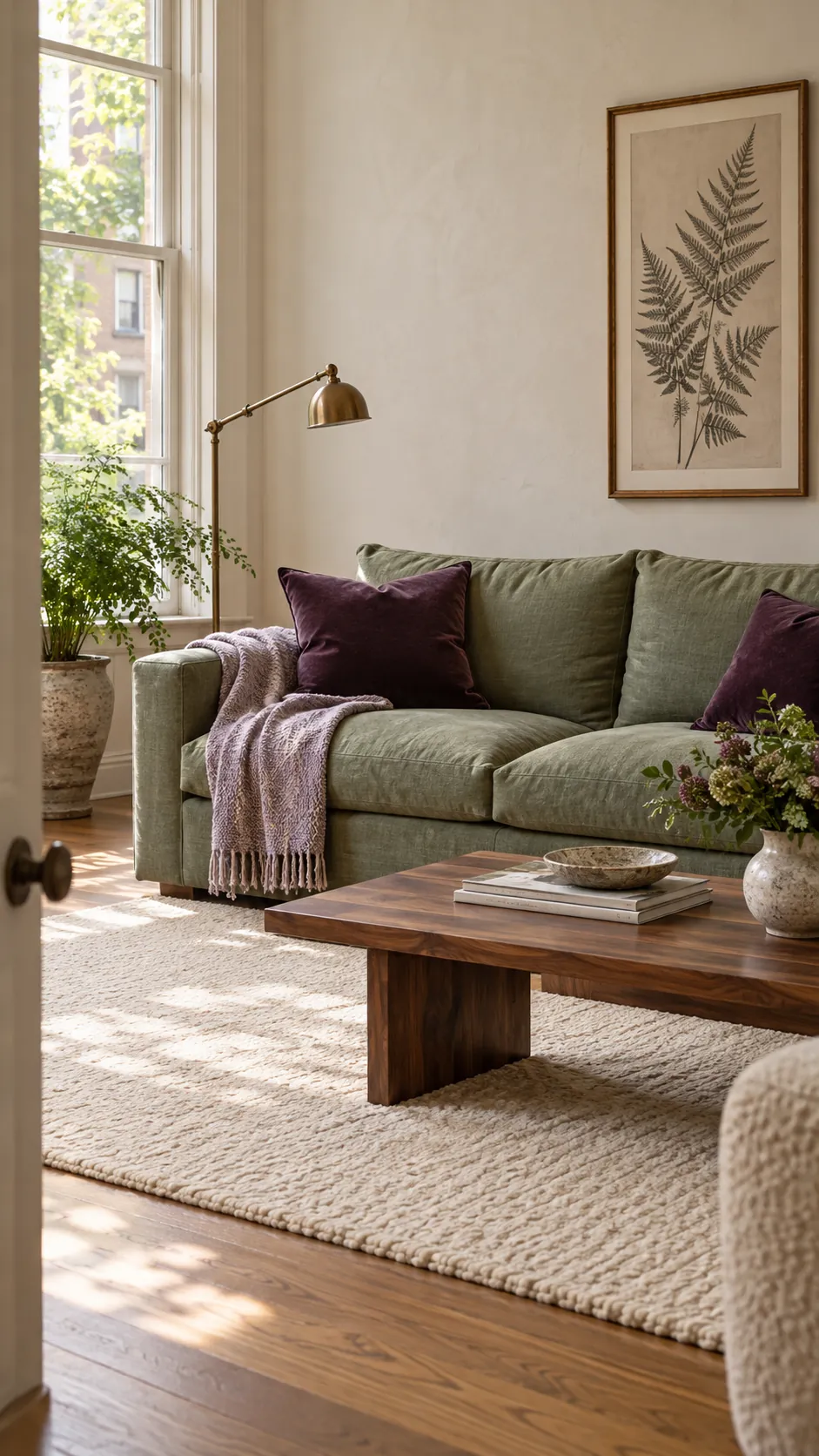
Purple and green can look rich and natural, or they can compete so hard that the room feels restless. The difference is usually not the color names. It is the undertone, the depth of each shade, and the amount of visual space each one receives.
The safest approach is to choose one color as the background and let the other appear in smaller, repeated accents. Then add a neutral that connects the pair to the fixed finishes already in the room. This gives you a clear way to make decisions instead of collecting unrelated swatches.
Start With Warm White and Natural Wood
Warm white is the most forgiving partner for purple and green because it creates breathing room without making either color look gray. Choose a creamy white when your purple leans red, such as plum, mauve, or orchid, and when your green leans yellow, such as olive or moss. Natural oak, cane, jute, and linen continue that warmth while adding texture.
Use white across the largest surfaces, then let green carry a major furniture piece and purple appear in textiles or art. This balance works especially well in a purple and green living room where a green sofa already has strong visual weight. Repeat the wood tone at least twice so it reads as part of the palette rather than a stray finish.
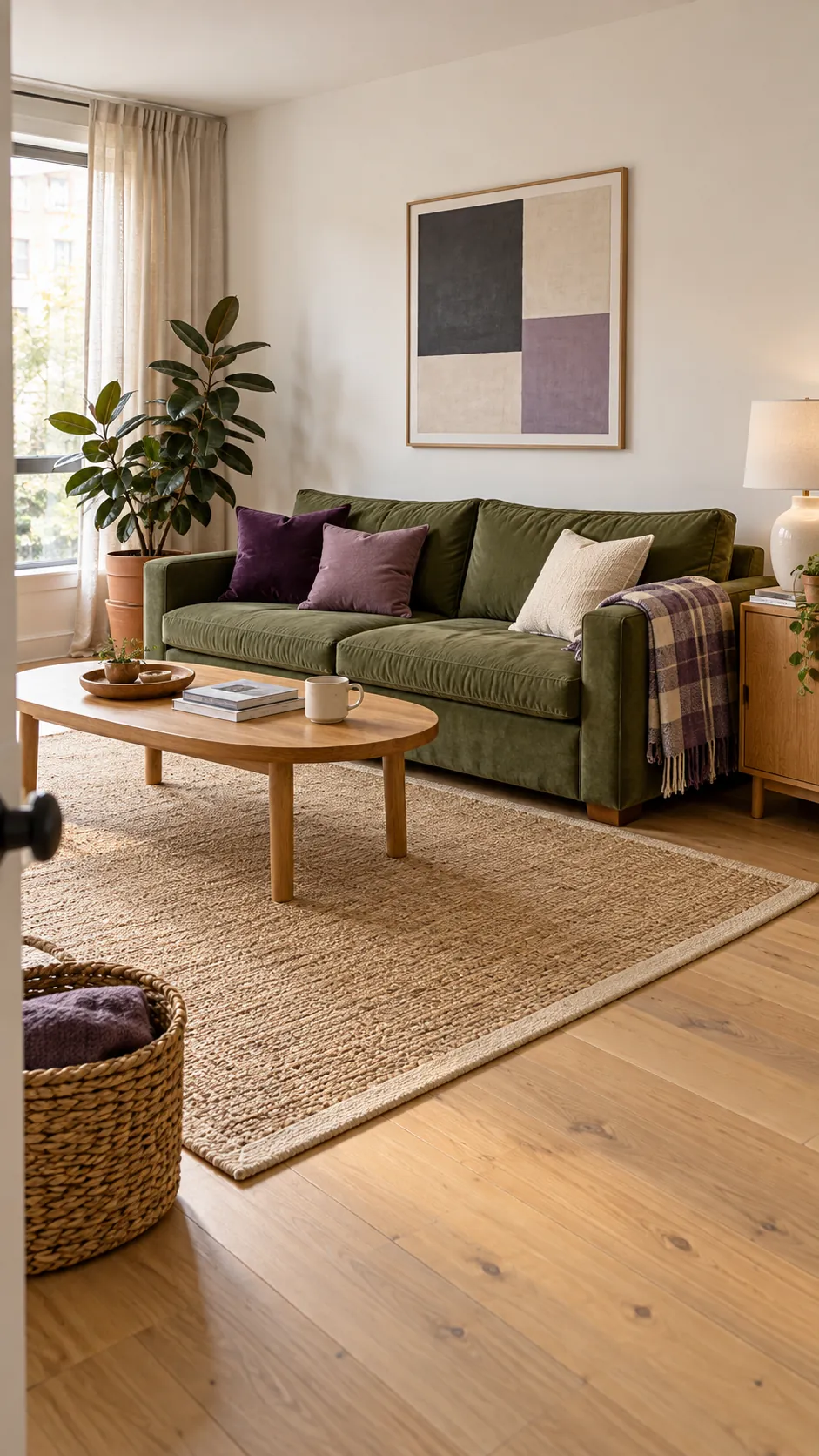
Soften Sage Green With Lilac and Cream
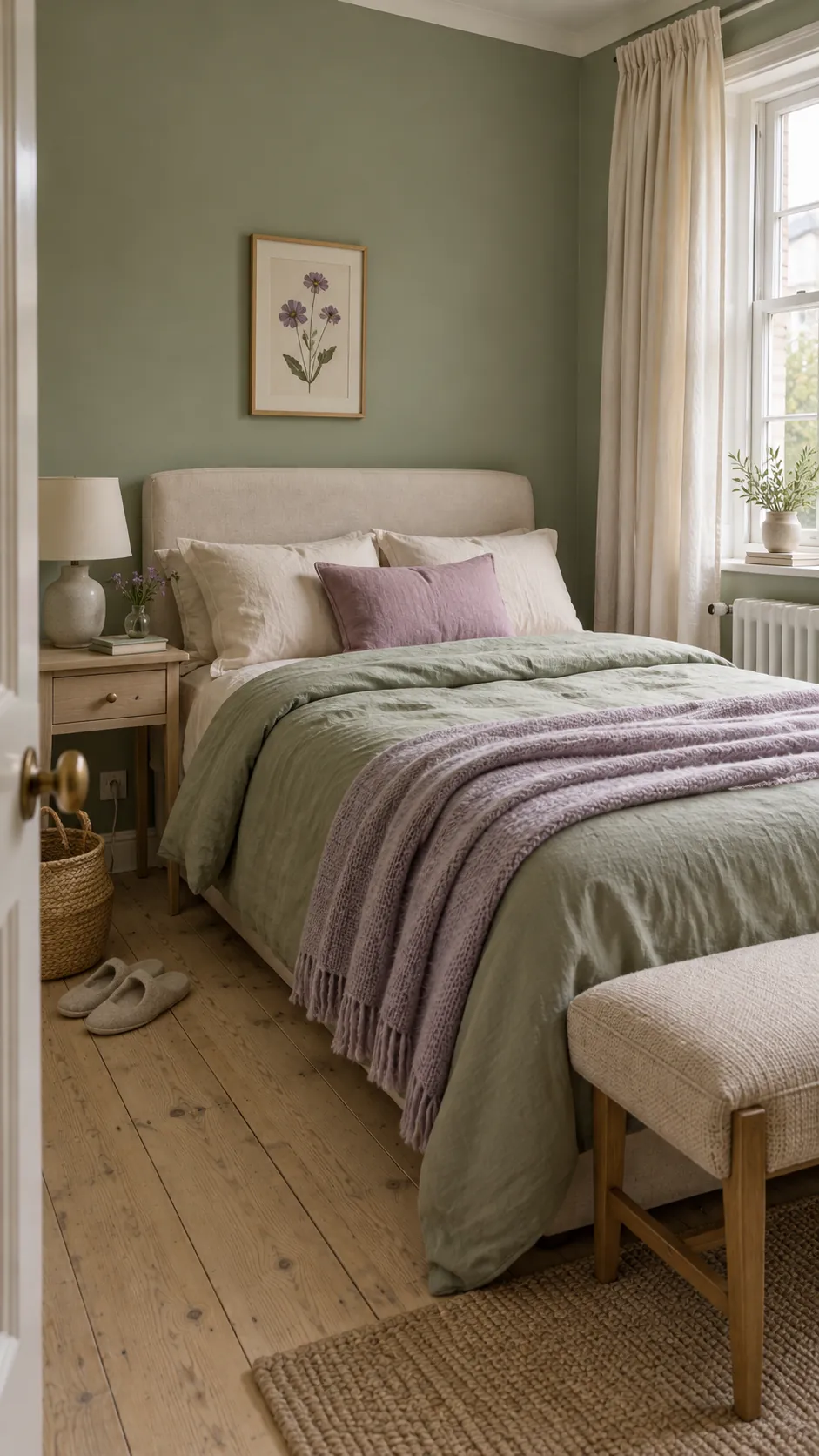
Sage green and lilac decor feels calm when both colors share a muted quality. A gray sage beside a very bright violet will look uneven, so choose a dusty lilac or pale lavender instead. Cream bedding, an ivory rug, or soft oatmeal curtains keep the pairing light without introducing another cool note.
This combination suits bedrooms because the contrast stays gentle at night and still has enough color in daylight. Paint or wallpaper can provide the sage field, while lilac belongs on pieces that are easy to change, such as cushions, a throw, or a lampshade. Test both swatches beside the floor and curtains because warm evening bulbs can make lilac appear pinker.
Make Emerald and Plum Feel Intentional With Brass
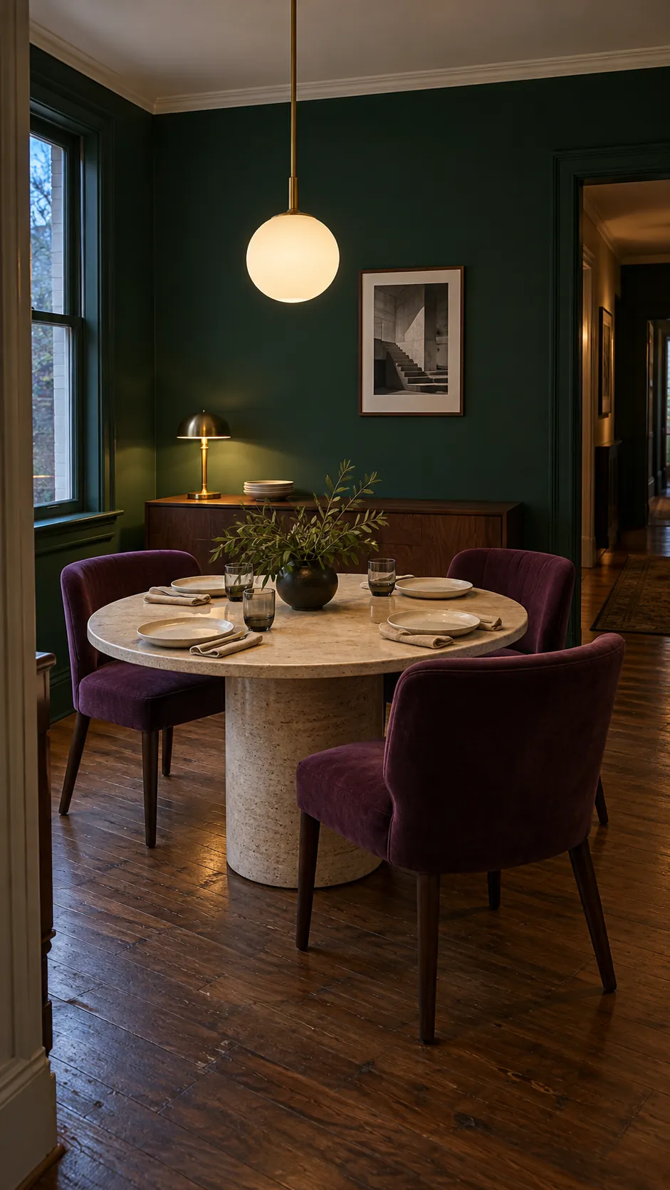
Emerald green and plum make a dramatic palette because both shades are saturated and deep. Brass gives the eye a warm point of relief and makes the scheme feel deliberate. Keep the metal to small highlights, such as a lamp stem, cabinet pull, mirror frame, or narrow table base, so it does not turn into a third dominant color.
Choose one jewel tone for the largest statement and reserve the other for a controlled accent. An emerald velvet chair can sit against a plum painted wall, but the rug, ceiling, and nearby upholstery should stay quieter. Dark walnut and soft black can anchor the room, while a pale stone surface prevents the result from becoming visually heavy.
Ground Olive and Lavender With Brown
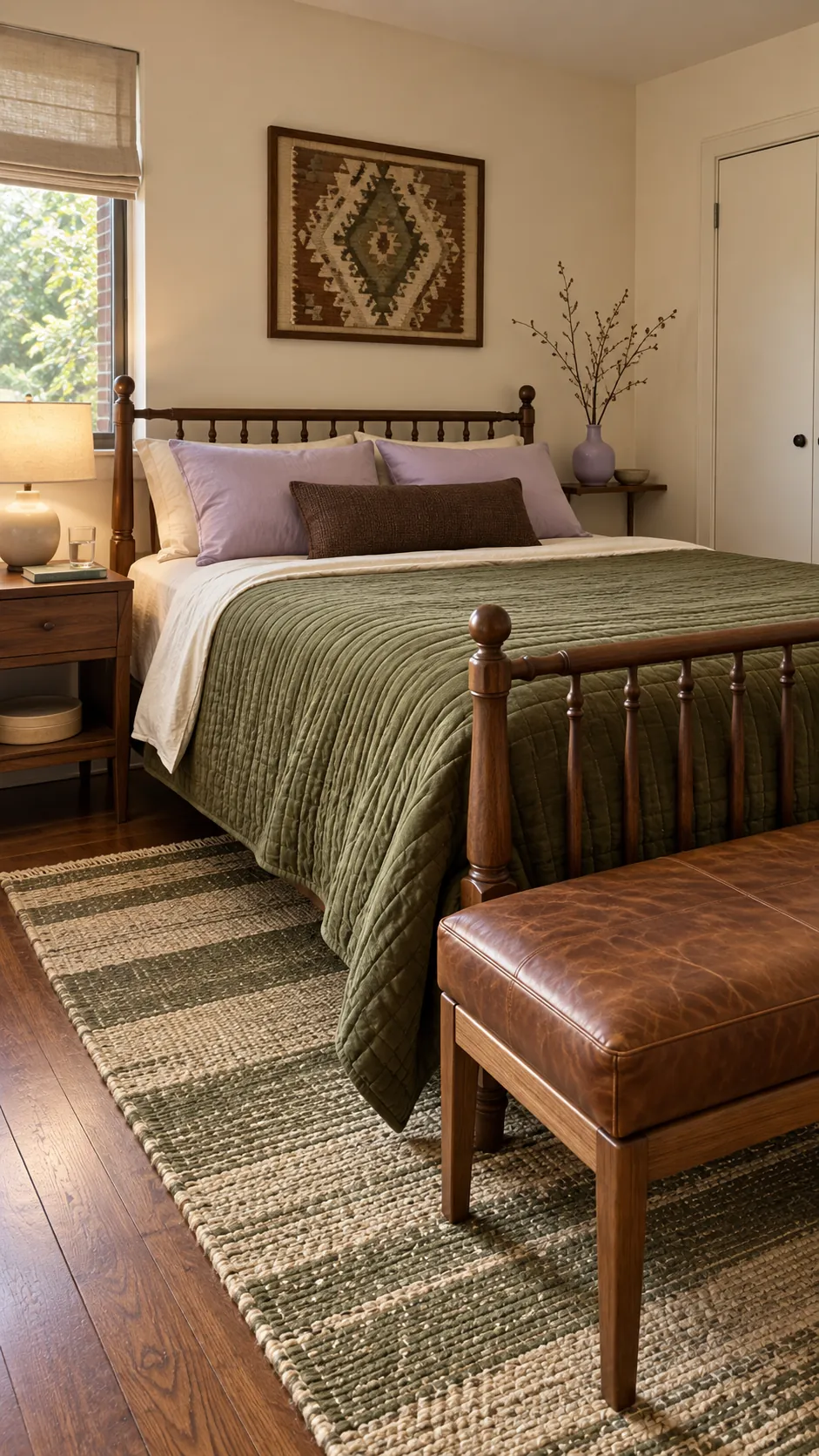
Brown is useful when olive green and lavender feel disconnected. It shares the earthy warmth of olive and gives pale purple a more mature setting. Look for chocolate, tobacco, walnut, or camel rather than a flat gray brown, then match the depth to the room: pale oak and camel suit light lavender, while walnut and chocolate support deeper violet.
An olive green and lavender bedroom can use brown through a timber bed, leather bench, woven shade, or framed art. These materials add contrast without demanding attention. Keep pure black limited, since too many sharp black lines can make the soft color relationship look fragmented.
Add Blush or Terracotta for Controlled Warmth
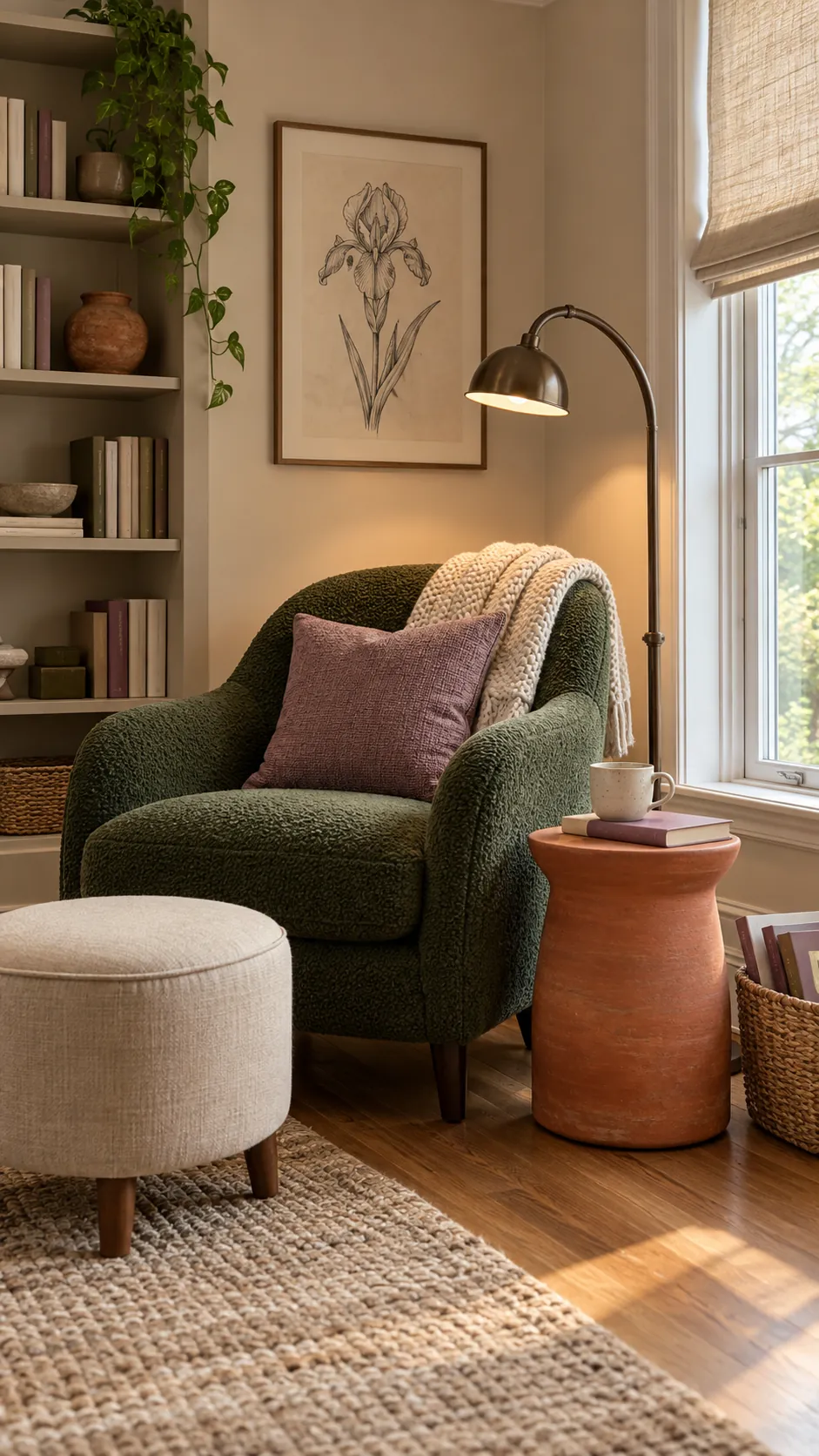
Blush and terracotta can bridge purple and green when the room feels too cool. Blush works with mauve, lilac, eucalyptus, and sage because it keeps the contrast soft. Terracotta is stronger and suits aubergine, olive, forest green, and moss, especially when the room already contains warm brick, clay tile, or reddish wood.
Introduce this bridge color in one or two compact areas. A clay vase, a muted rose cushion, or a small patterned rug is enough. Avoid scattering many tiny warm accents around the room, since they can make a green wall with purple accents feel busy rather than layered.
Use Charcoal for a Moody Purple Green Interior
Charcoal works when you want a moody green purple interior without using black as a harsh outline. It lowers the contrast between forest green and aubergine, then gives lighter details a place to stand out. Choose charcoal with a warm or neutral undertone if the room has walnut, brass, or cream, and a cooler charcoal if it has blue violet, marble, or nickel.
Lighting becomes part of the palette in a dark room. Use several warm sources at different heights, then leave some pale surfaces around faces, books, or work areas. Sample every dark paint on more than one wall and view it from morning through evening, because a color that looks balanced in sun can merge into a single shadow after dusk.
The most reliable final check is simple: photograph the room in grayscale. If the large purple and green areas become the same value, add a lighter neutral or reduce one color. If one area turns almost black while everything else disappears, move that darkest shade into a smaller role.