
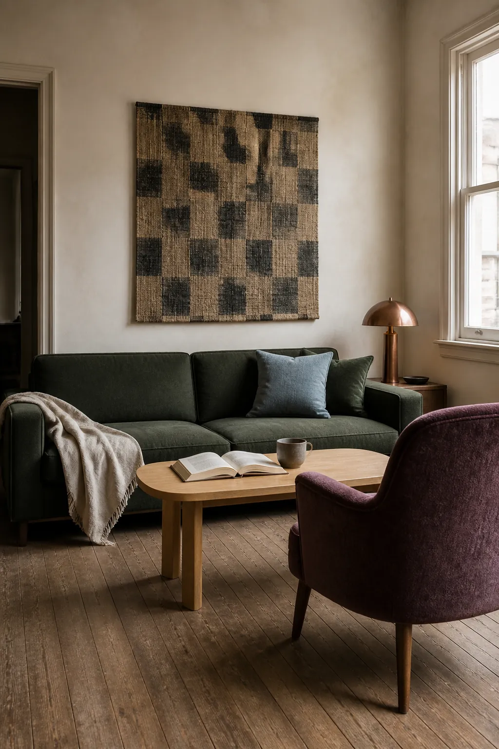
A dark green room rarely fails because green has no suitable companions. It fails because the palette ignores how much light the paint absorbs, which surfaces are already warm or cool, and where contrast is actually needed. A color that works beautifully on a cushion may do very little when the ceiling, floor, and largest furniture piece are all dark.
Begin with the green undertone and the room’s weakest daylight. Then choose one color to create relief, one material to add warmth, and one smaller accent to give the scheme direction. This hierarchy matters more than collecting many colors that technically coordinate.
Limestone and Flax Open the Room
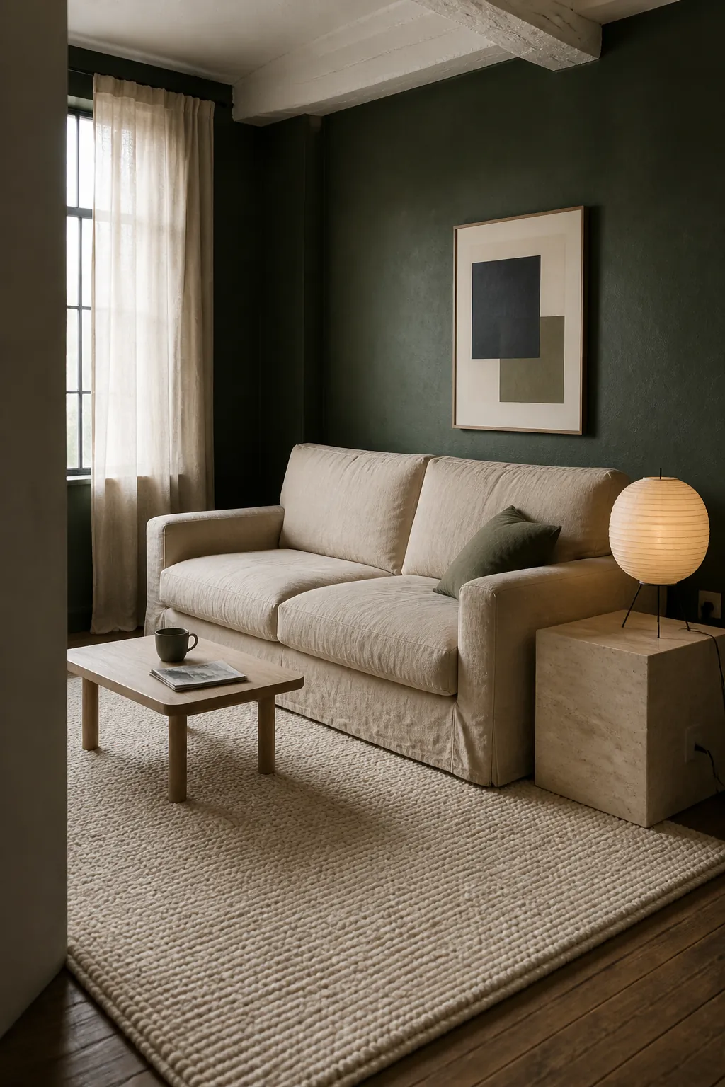
Limestone cream and natural flax are useful when dark green feels imposing but stark white feels too sharp. Their subtle gray and beige notes soften the boundary between a dark wall and pale furnishing. Use them on a broad sofa, large rug, curtain, or bed layer rather than relying on tiny ornaments.
The texture keeps these quiet colors interesting. Honed stone, loose linen, and woven wool all reflect light differently, giving the room depth without extra pattern. If the green has a blue undertone, choose a cooler limestone; olive green usually prefers warmer flax.
Pale Oak Adds Light Without Looking White
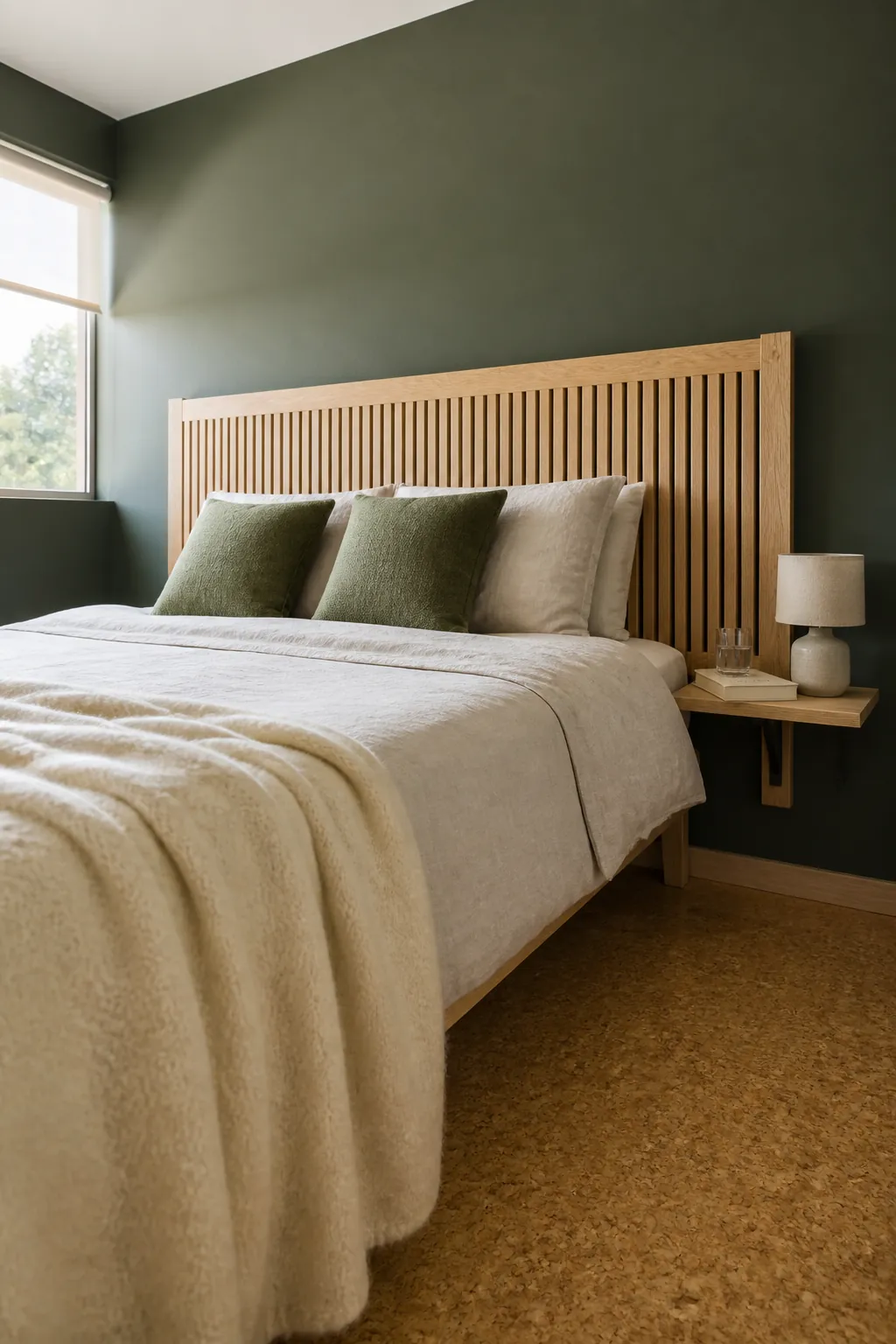
Pale oak is especially helpful in a dark green interior color palette because it supplies both brightness and warmth. Its visible grain also breaks up large flat color areas. A table, cabinet, headboard, or shelving unit can create more balance than several small wood accessories.
Keep the finish matte or lightly oiled so the wood retains a natural appearance. Yellow varnish can push the combination toward an outdated look, while very gray stain removes the warmth you need. Repeat the oak once in a smaller practical item to make the material feel intentional.
Plum Gives the Palette a Rich Counterpoint
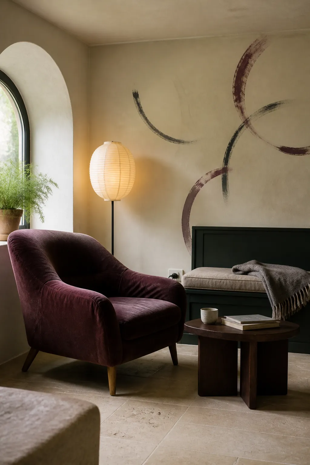
Plum and aubergine can sit beside dark green with less seasonal association than a clear red. The pairing works best when one color dominates and the other appears through a chair, curtain, or patterned textile. Choose a dusty purple with brown or gray in it instead of a vivid jewel tone.
A pale neutral should remain visible between the two deep colors. This might be a stone floor, linen sofa, or warm plaster ceiling. Without that interval, green and plum can merge into a room that feels darker than either sample suggested.
Copper Brings Warm Reflection
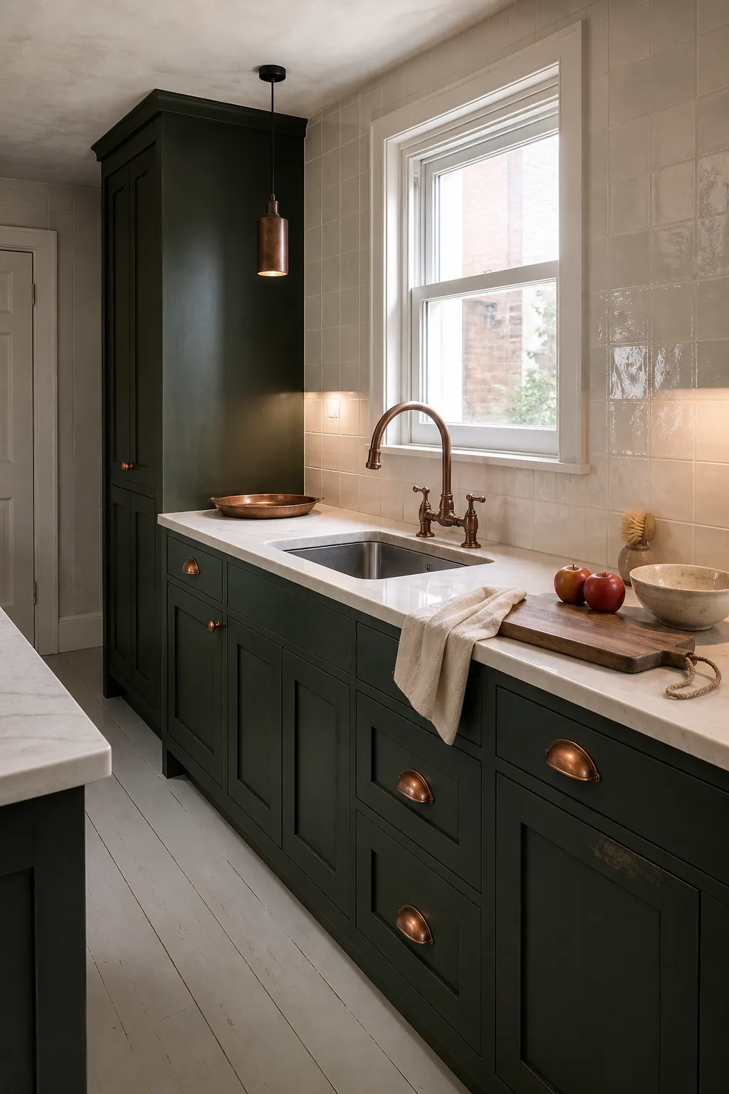
Copper, bronze, and aged brass return small points of light to a dark green scheme. They are most convincing on items that already need to be metal, such as taps, handles, lamps, and a tray. A naturally aged finish has more nuance than bright polished metal and is easier to combine with wood.
Use only enough metal to create a rhythm around the room. Matching every fitting can feel forced, while a single isolated piece can look accidental. In a kitchen or bathroom, repeat the finish on two or three functional elements and let stone or timber remain the larger warm surface.
Mist Blue Creates Airy Separation
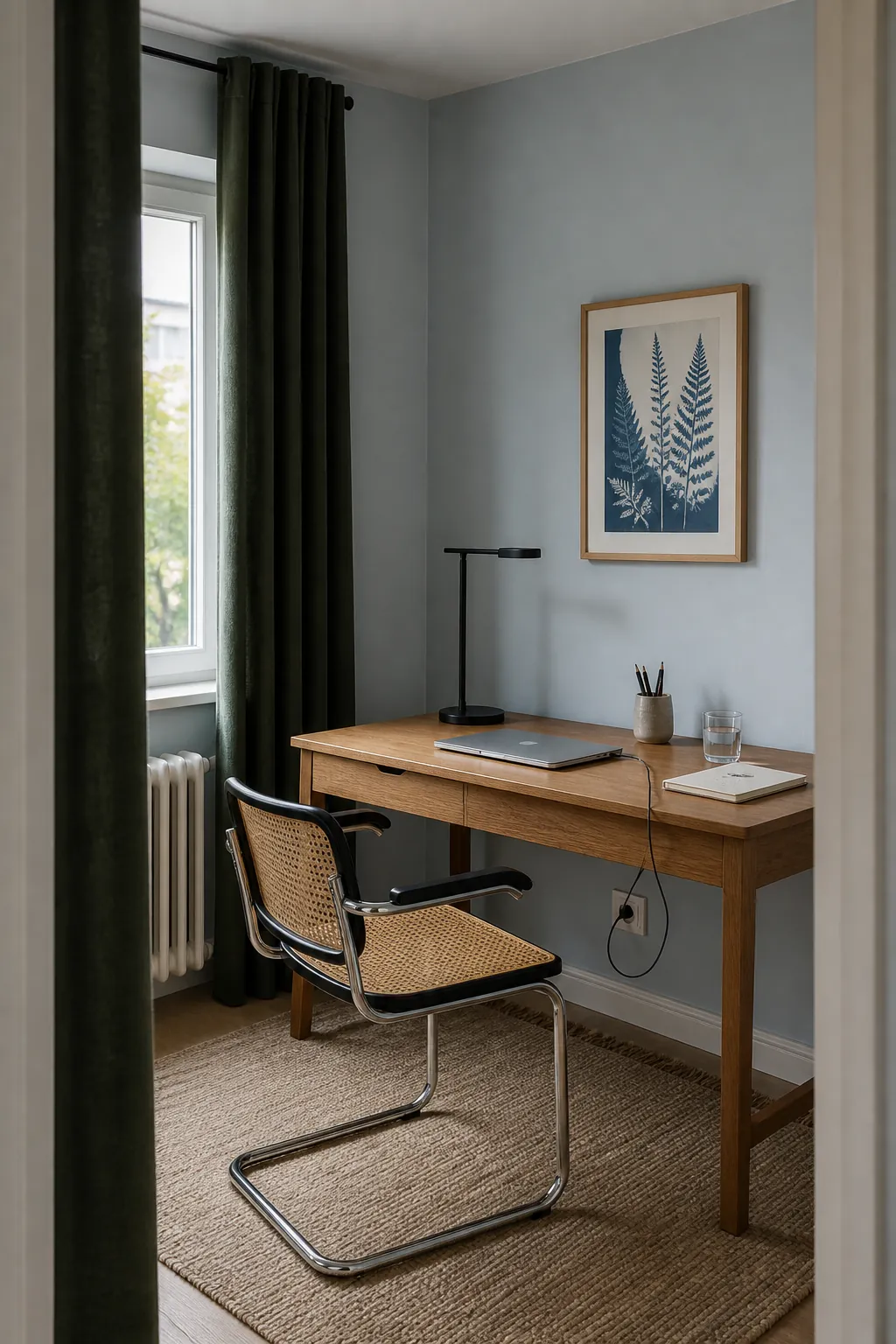
Mist blue shares a cool foundation with many forest greens but is much lighter in value. It can make dark green curtains and textiles feel considered rather than heavy, particularly in a bedroom or home office. Look for a faded blue that contains gray, not a clear bright pastel.
Natural fiber and warm wood keep the cool combination comfortable. A mist blue wall, green curtain, flax rug, and medium oak desk can form a complete scheme without another bold accent. Make sure the blue remains visibly lighter under evening bulbs.
Soft Clay Adds Earthy Warmth
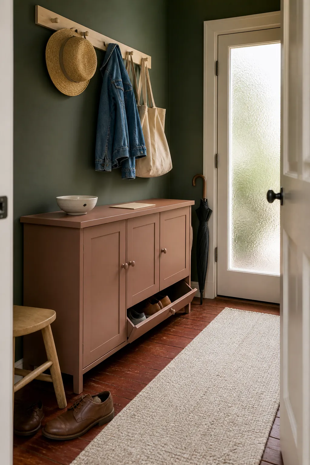
Soft clay sits between muted pink, brown, and terracotta, so it offers warmth without becoming a loud orange accent. It works well in ceramics, upholstery, a woven runner, or a restrained painted cabinet. Pair it with dark green and chalky cream for a grounded, approachable result.
Clay is useful when natural wood already has a red undertone because it connects rather than competes with the floor. Keep its saturation low and avoid adding several other earthy reds. One substantial clay surface and one smaller echo usually provide enough continuity.
Test the Combination at Full Scale
Dark green paint color combinations change dramatically with scale and finish. A small sample may look balanced while four walls absorb far more light, and a glossy fabric can appear brighter than the same hue in wool. Put large samples beside the floor, window treatment, and largest furniture item before committing.
Observe them through the least flattering part of the day, then switch on the lamps you actually use. If the room loses separation, increase the area of the pale color before adding more accents. The successful palette is not the one with the most interesting swatches; it is the one that remains readable when the room is dim.