Green and white can feel crisp, calm, and natural, but the pair often needs a third colour to keep it from looking flat. The right choice depends on the undertones. Olive and sage usually prefer creamy white, while blue green and emerald can handle a cleaner white.
Before adding another colour, compare the green and white in the actual room through a full day. If the white starts to look yellow, gray, or faintly green, the surrounding light and fixed finishes are changing it. Use the third colour to connect those existing tones rather than forcing a new direction.
Natural Wood Adds the Easiest Warmth
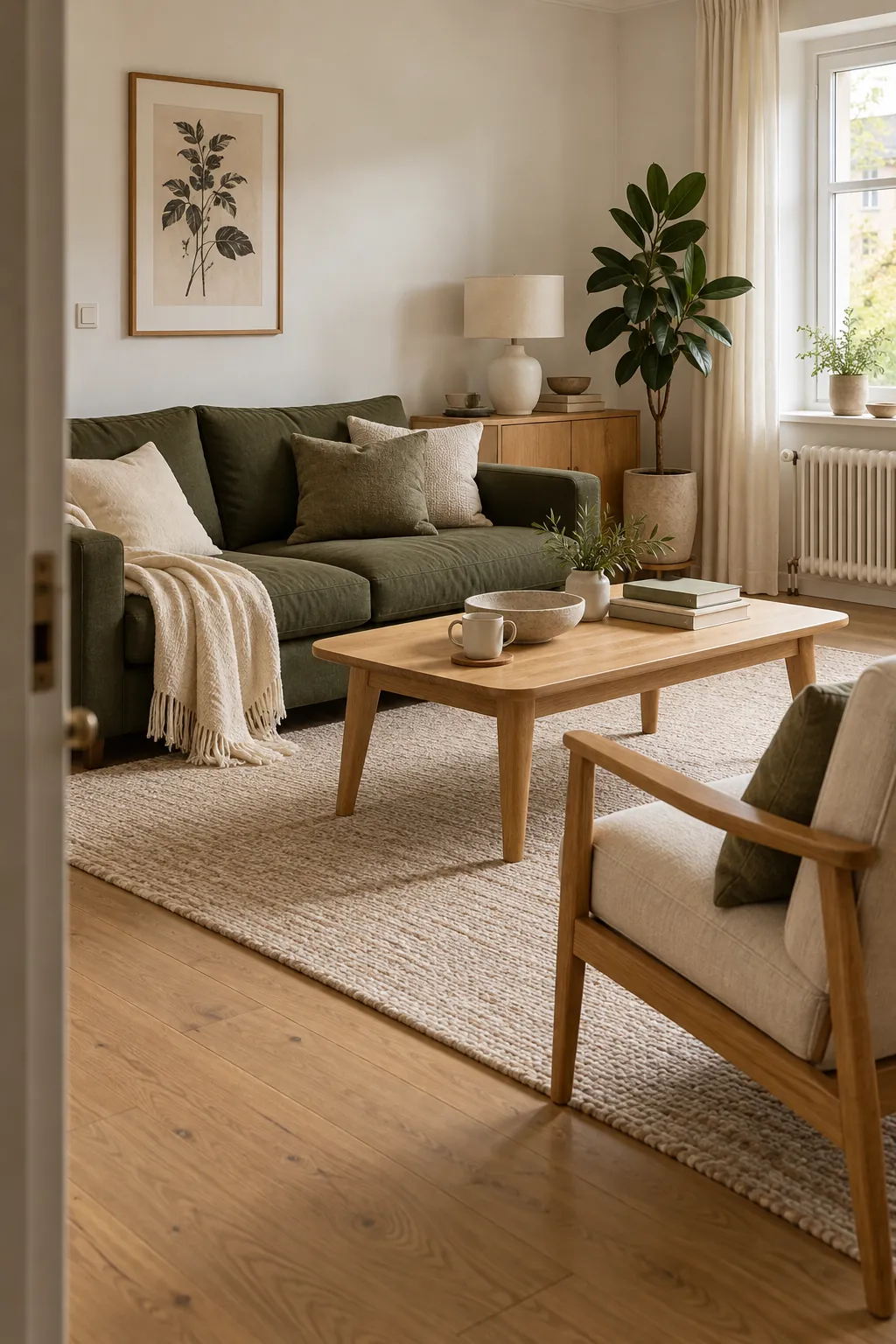
Natural wood is the most reliable addition to a green and white interior palette. Pale oak keeps sage green and white bedrooms light, while walnut gives dark green walls more depth. The grain also adds movement, which prevents a white surface from feeling blank.
Repeat one wood family through a table, frame, shelf, and floor rather than mixing several unrelated stains. If the wood has a strong orange tone, place cream, jute, or oatmeal between it and the green. This soft buffer makes the warmth feel deliberate.
Black Creates a Clean Graphic Frame
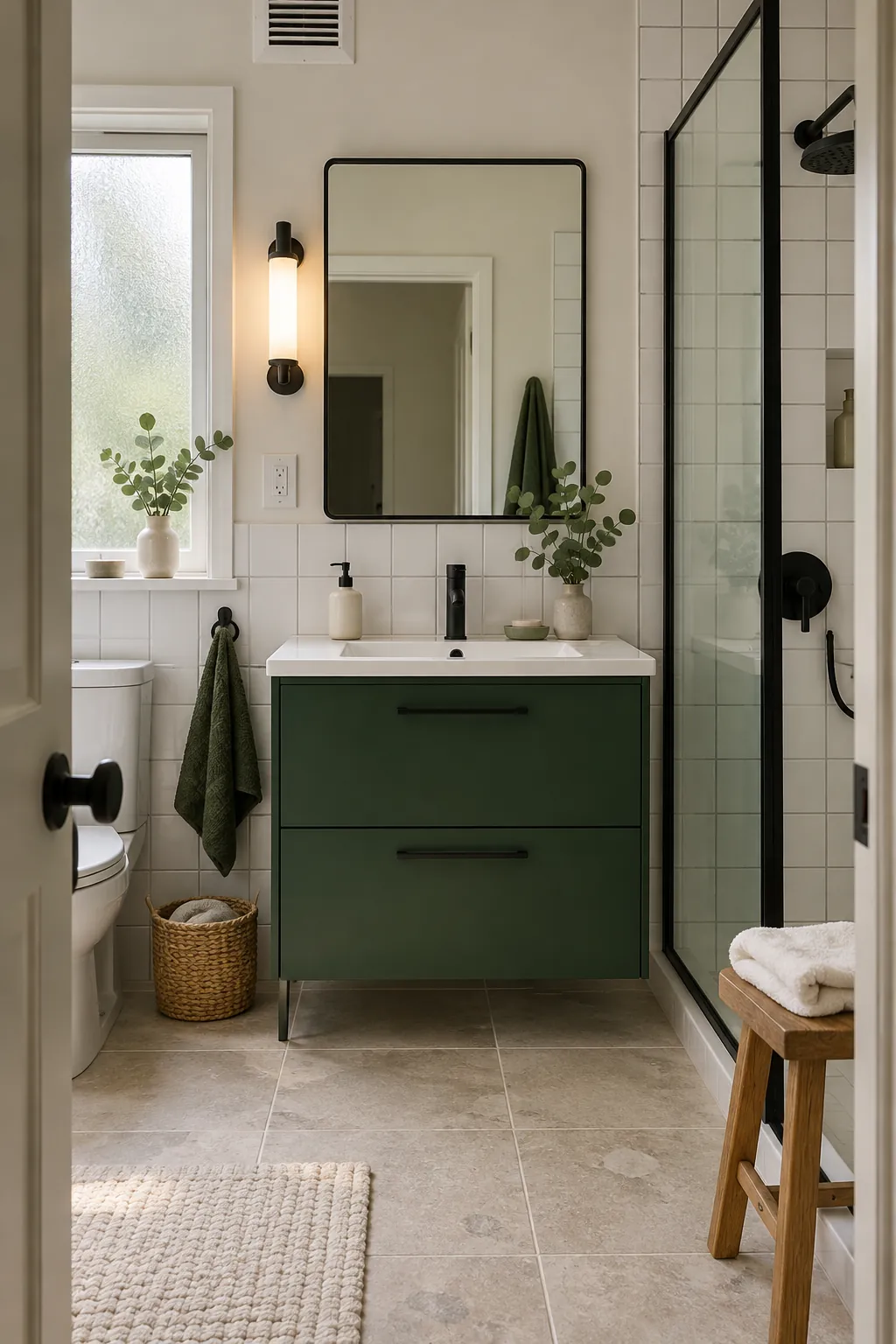
Black gives green and white definition, especially in kitchens and bathrooms where many pale surfaces can merge. Use it on thin lines such as window frames, cabinet pulls, a tap, a mirror edge, or a light fitting. Small repeated details are enough to create structure.
Choose softened black or charcoal when the green is pale or dusty. A sharp blue black can overpower sage and make creamy white look dirty. Keep the largest furniture and walls light so the dark accents behave like punctuation rather than another dominant block.
Brass Gives the Palette a Warm Highlight
Brass works with green and white because it adds warmth without taking up much visual space. It is especially effective with emerald, forest, and bottle green. Aged or brushed brass usually looks calmer than a polished yellow finish.
Limit the metal to functional details such as lamps, handles, frames, and a tap. Repeat it two or three times so it looks intentional, then stop. Too much gold can turn a fresh botanical green white scheme into something formal and heavy.
Terracotta Keeps Green and White From Feeling Cold
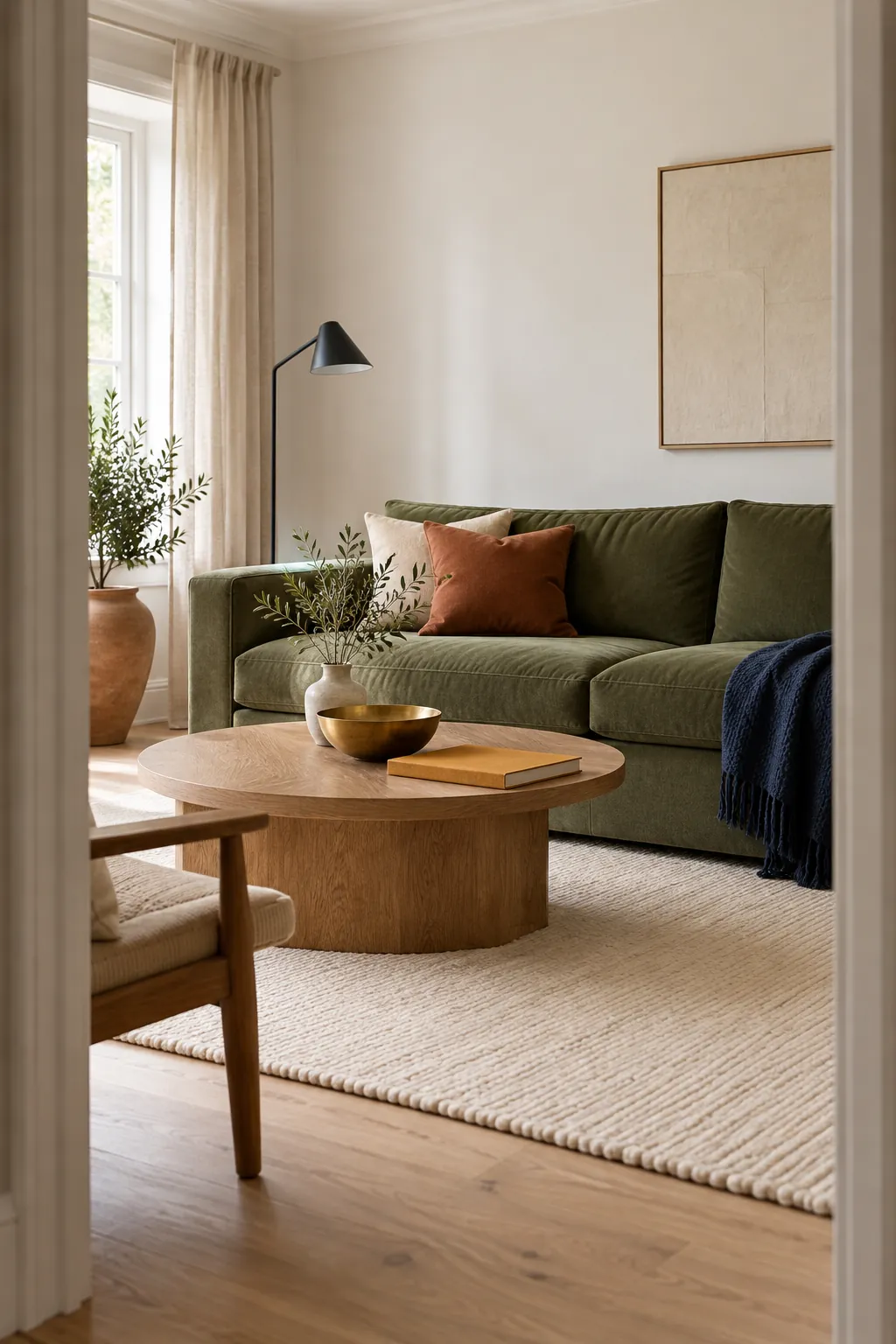
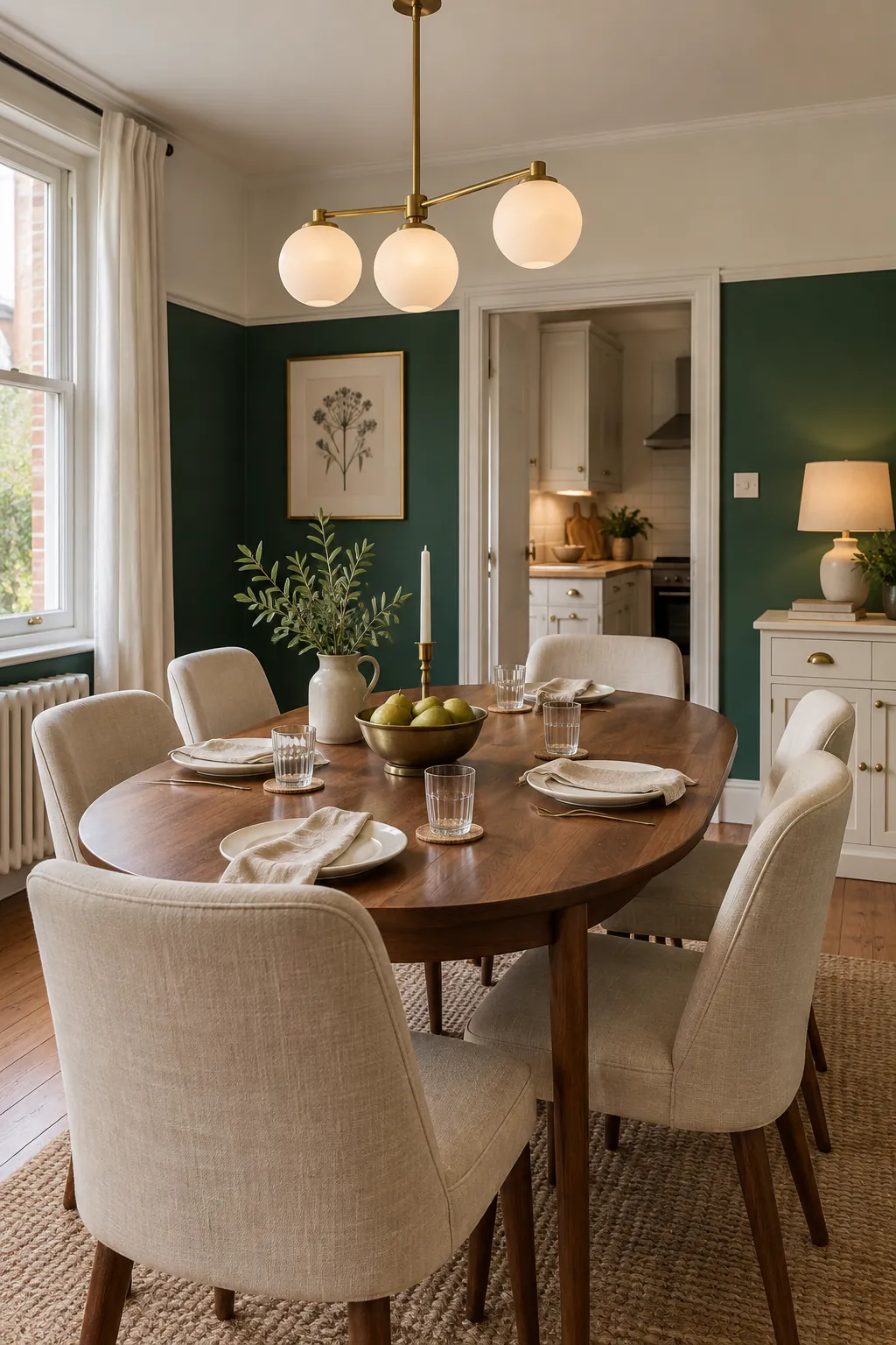
Terracotta is useful when green and white kitchen decor or a bathroom feels too clinical. Its red warmth sits opposite green, while the earthy quality prevents a harsh holiday contrast. Clay, rust linen, and warm leather can all carry this role.
Use terracotta in one medium size piece or a few connected objects. A runner, blind, and utensil pot can warm a white kitchen with green cabinets. Leave plenty of white between the warm accents so the room still feels fresh.
Navy Supports Cool Green and Crisp White
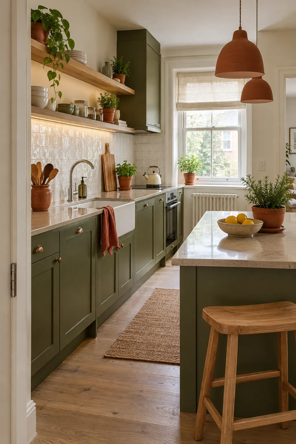
Navy belongs with green and white when the green has a blue undertone. Spruce, eucalyptus, and cool emerald sit comfortably beside navy, while crisp white keeps the two dark colours separate. The result feels calm and tailored rather than bright.
Place navy on a rug, headboard, or one piece of cabinetry instead of scattering many small accents. Add pale stone or brushed nickel for clarity. Test the scheme under evening bulbs because warm light can shift a cool green toward olive and weaken the connection.
Ochre Adds Energy Without Breaking the Natural Mood
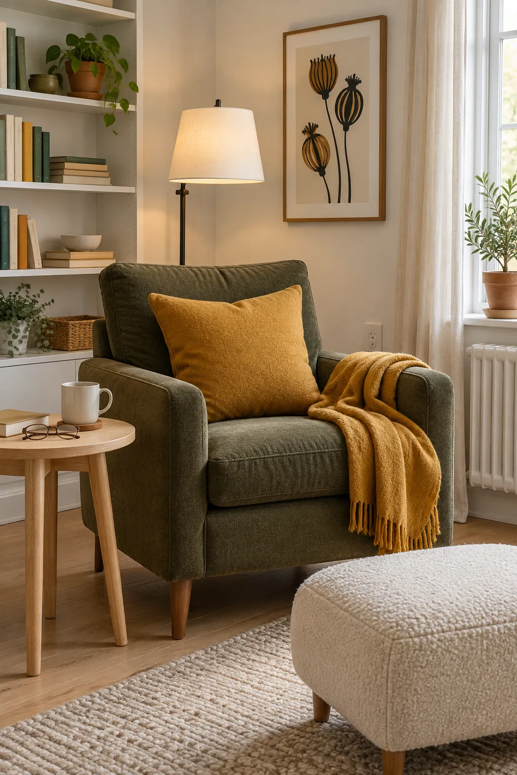
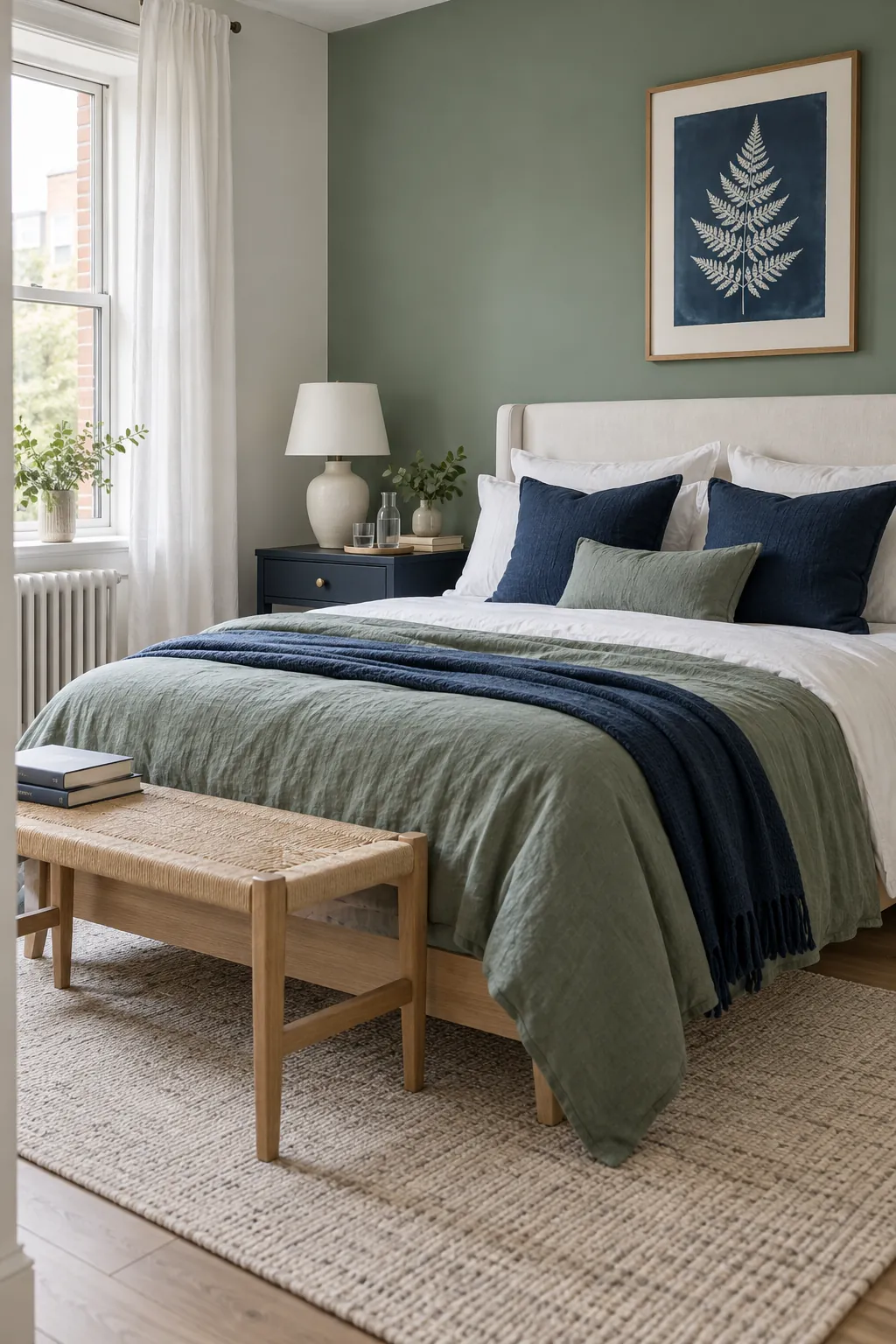
Ochre gives green and white a sunnier direction without the sharpness of bright yellow. It works particularly well with olive, moss, and muted botanical green. Because both colours have earthy depth, the contrast feels lively but still connected to natural materials.
Keep ochre to textiles and small upholstery, where it is easy to adjust. A chair, cushion, or woven shade can be enough in a green and white living room. Repeat a warm wood tone nearby so the ochre does not look isolated.
The final check is to remove colour from a phone photo. If the green, white, and third colour collapse into one gray value, increase the lightness difference. A balanced room needs tonal shape as well as a pleasing hue combination.