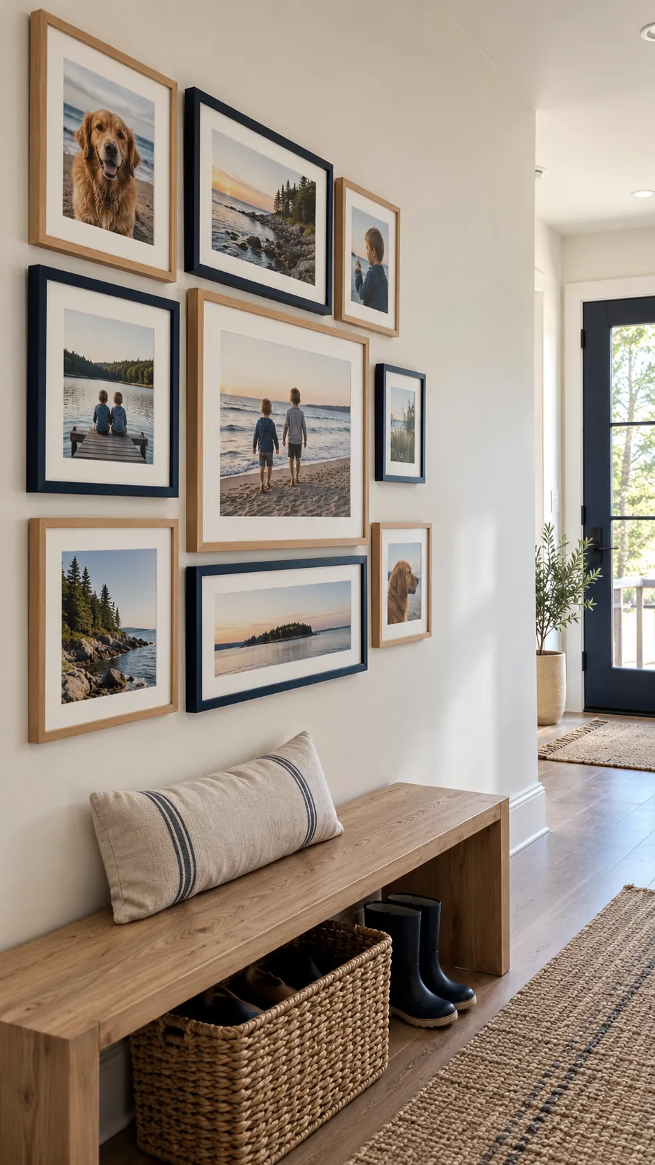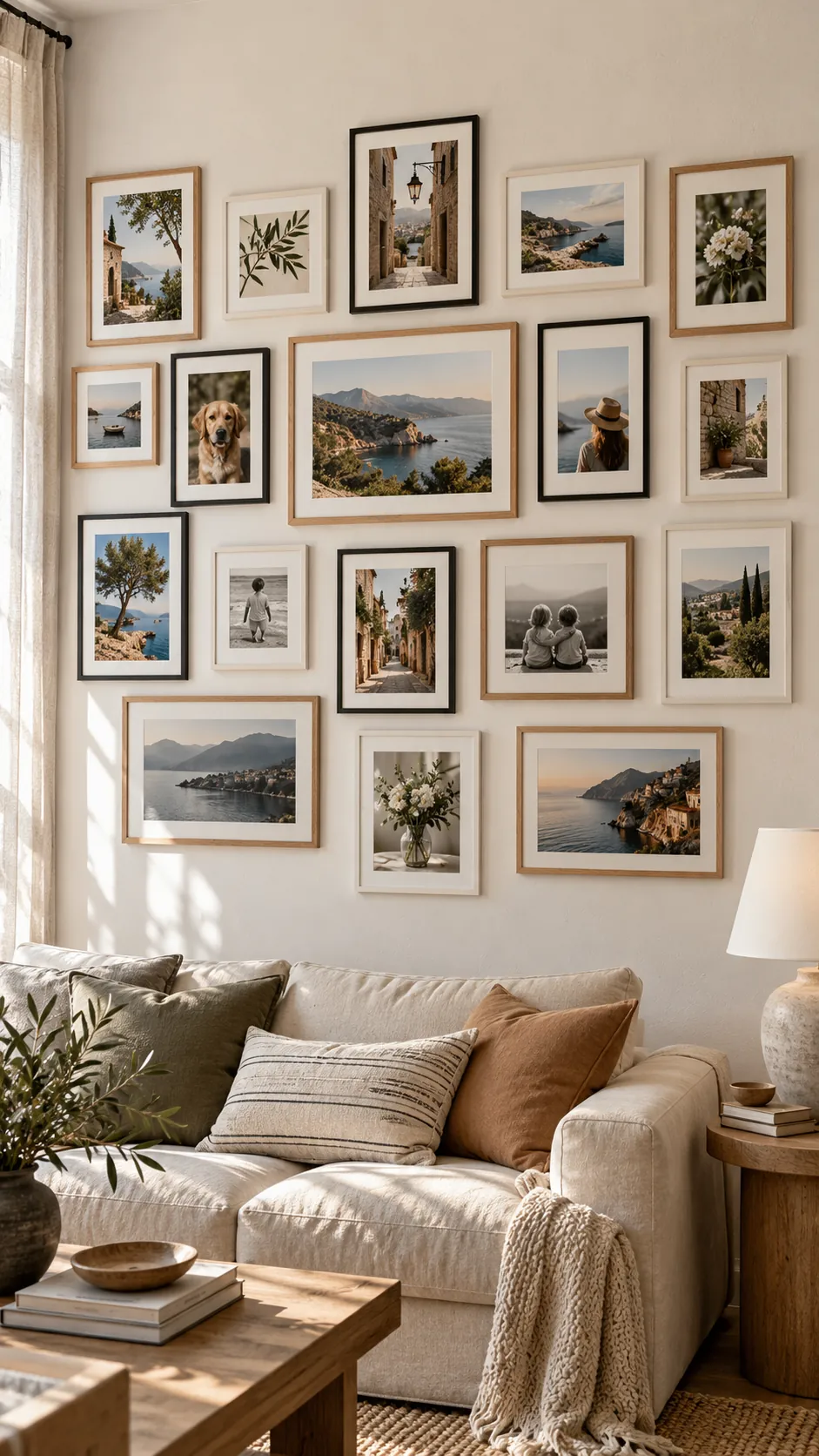
Mixed photo orientations can make a wall feel personal, but they also make small spacing errors easy to see. The most reliable approach is to choose one visual rule, such as a shared center line or a clear outer boundary, then let the frame shapes vary inside it. Mock the arrangement on the floor and with paper on the wall before you make holes.
Centered Anchor With Balanced Satellites
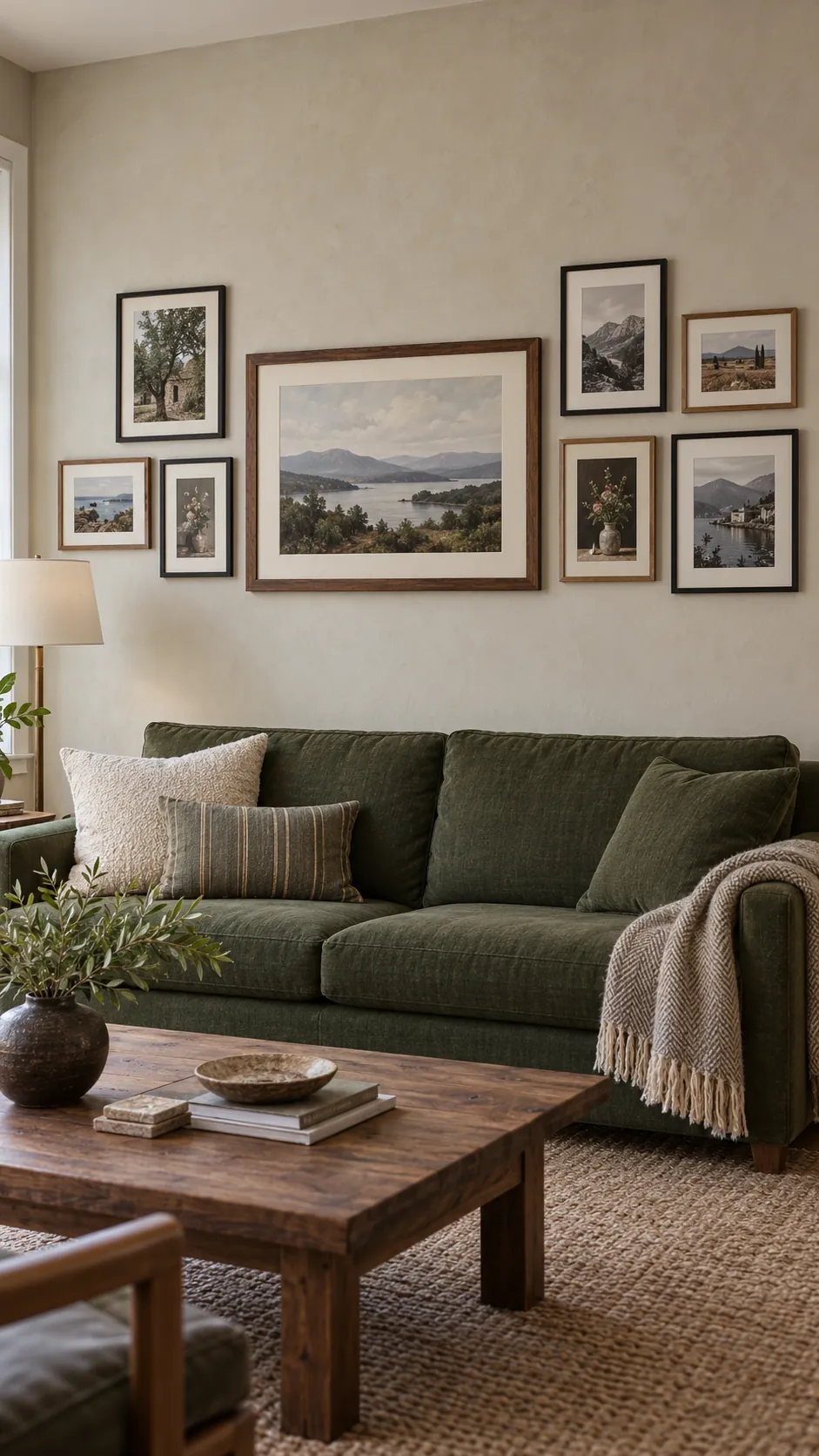
Start with the largest landscape photo near the visual center, then place smaller portrait frames on both sides. The side groups do not need to mirror each other, but their total visual weight should feel similar. Keep the gaps consistent so the large frame reads as an anchor rather than an isolated object.
Clean Shared Bottom Line
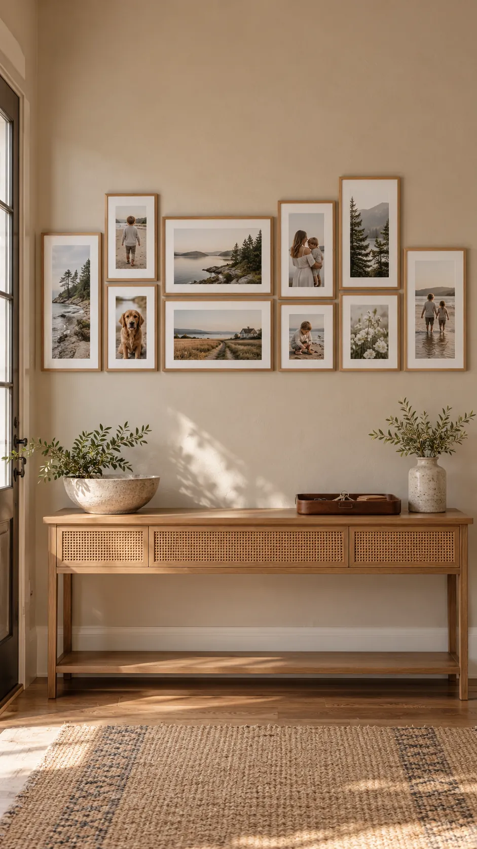
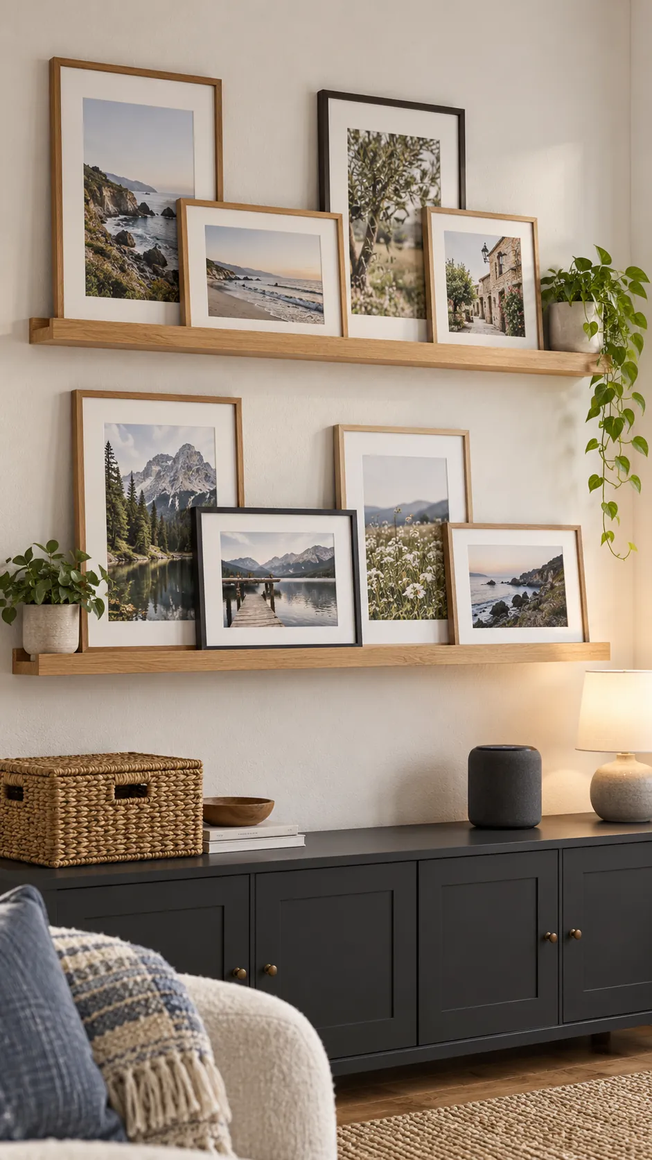
Align the lower edges of every frame to create a calm baseline. Portrait photos rise higher while landscape photos stay wider and lower, which gives the arrangement variety without losing order. This layout works especially well above a console because the furniture reinforces the same horizontal line.
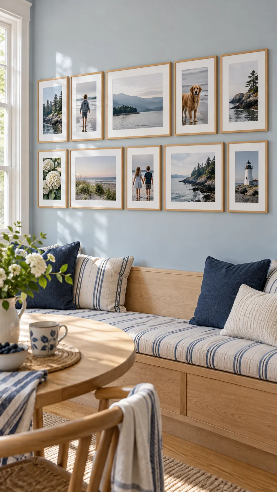
Two Row Picture Rail Grid
Create two loose rows and align several frame edges across each row. A landscape frame can occupy the width of two narrow portrait frames, which makes the mixed orientation look planned. Repeat one or two mat colors to connect family photos from different years and color palettes.
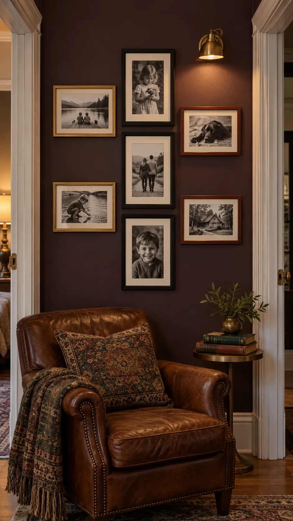
Vertical Spine With Side Branches
Build a vertical line from three portrait frames, then add landscape photos that extend to alternating sides. The central spine keeps the eye moving upward while the side pieces prevent the display from feeling narrow. This arrangement suits a tall wall section between doors or beside a reading chair.
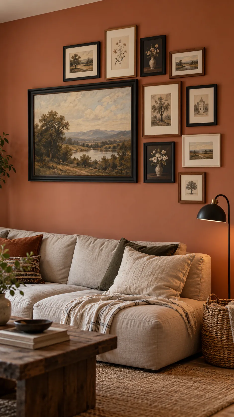
Asymmetrical Corner Cluster
Place the largest frame slightly away from center and let smaller frames gather around two adjacent edges. Leave the opposite edges more open so the cluster has direction and breathing room. A few repeated black frames can hold together a mix of wood finishes and photo tones.
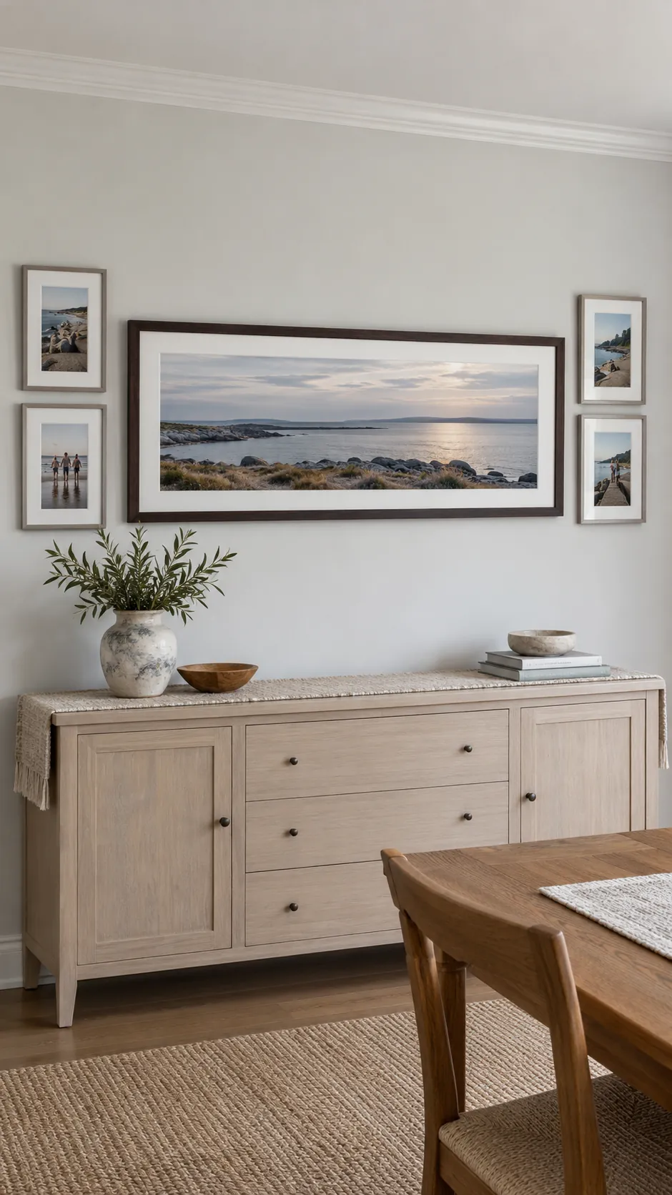
Wide Panorama With Portrait Ends
Use a wide landscape photograph as the middle of a long composition, then place pairs of portrait frames at each end. The upright frames act like visual brackets and stop the panorama from dominating the wall. Match the outer frame heights for a crisp boundary even when the inner gaps vary slightly.
Staggered Stair Step Rhythm
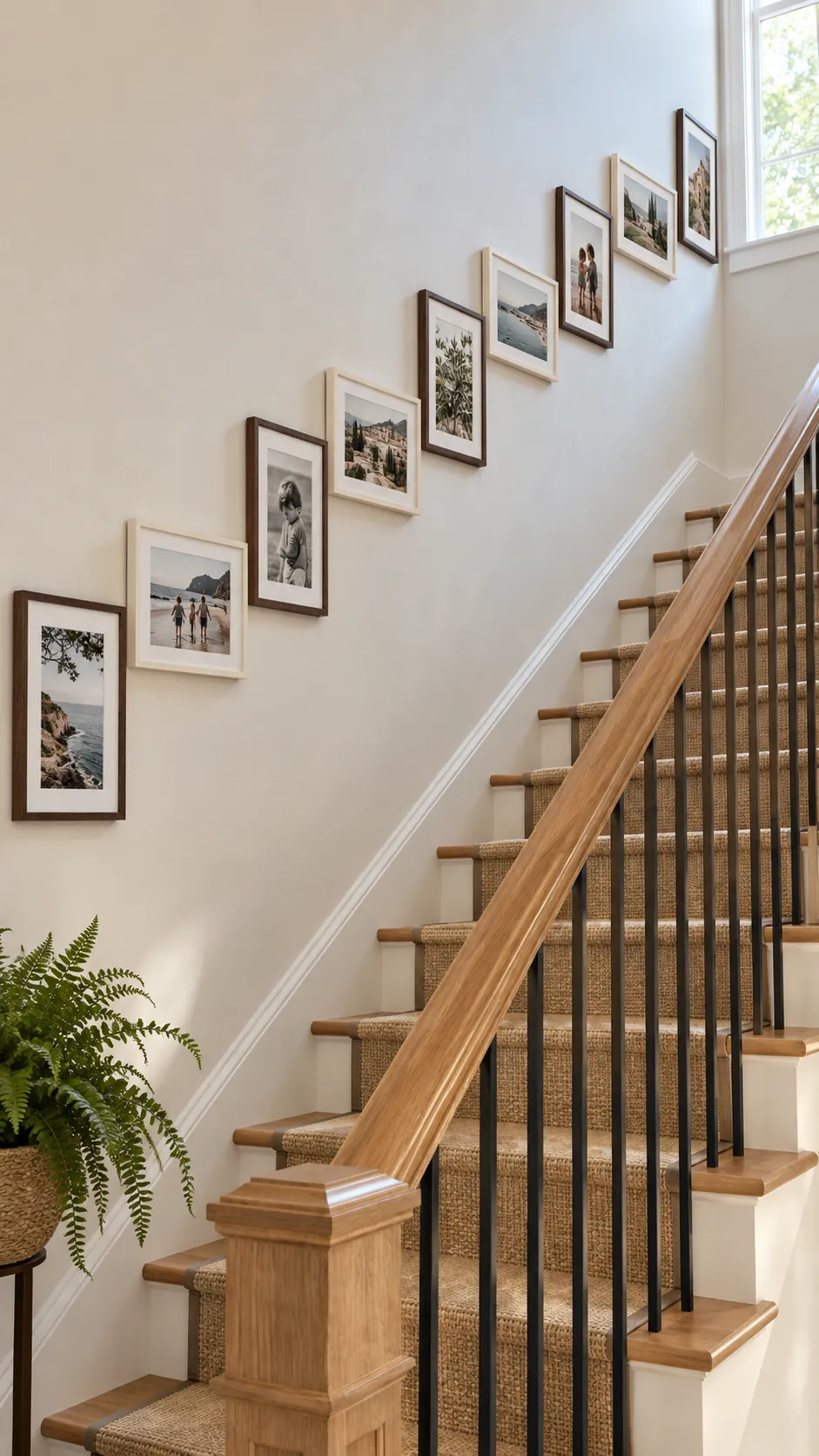
Raise each group gradually across the wall so the arrangement follows an imaginary diagonal. Alternate portrait and landscape frames to avoid a repetitive staircase made from identical shapes. Measure from the same corner of each frame so the spacing remains steady as the display climbs.
Compact Rectangle Boundary
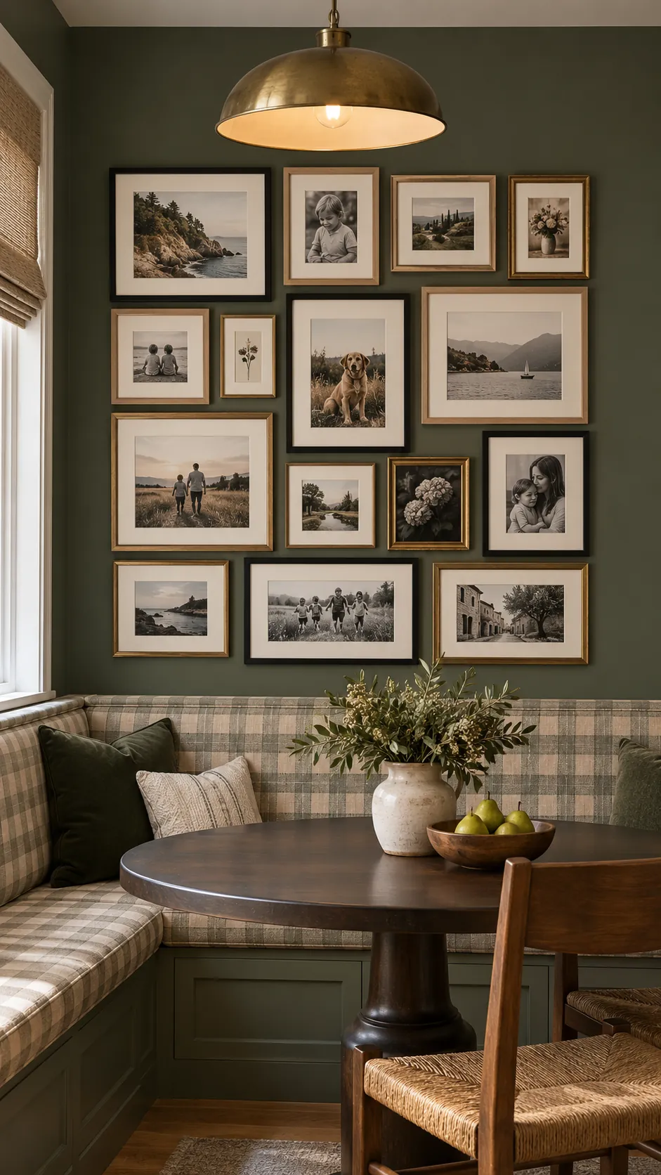
Arrange varied frames inside a clear rectangular outline, as if the whole collection were one large artwork. The internal edges can be irregular as long as the outside perimeter stays controlled. This method gives a busy family photo arrangement a tidy silhouette in a dining room or hallway.
Open Oval Organic Arrangement
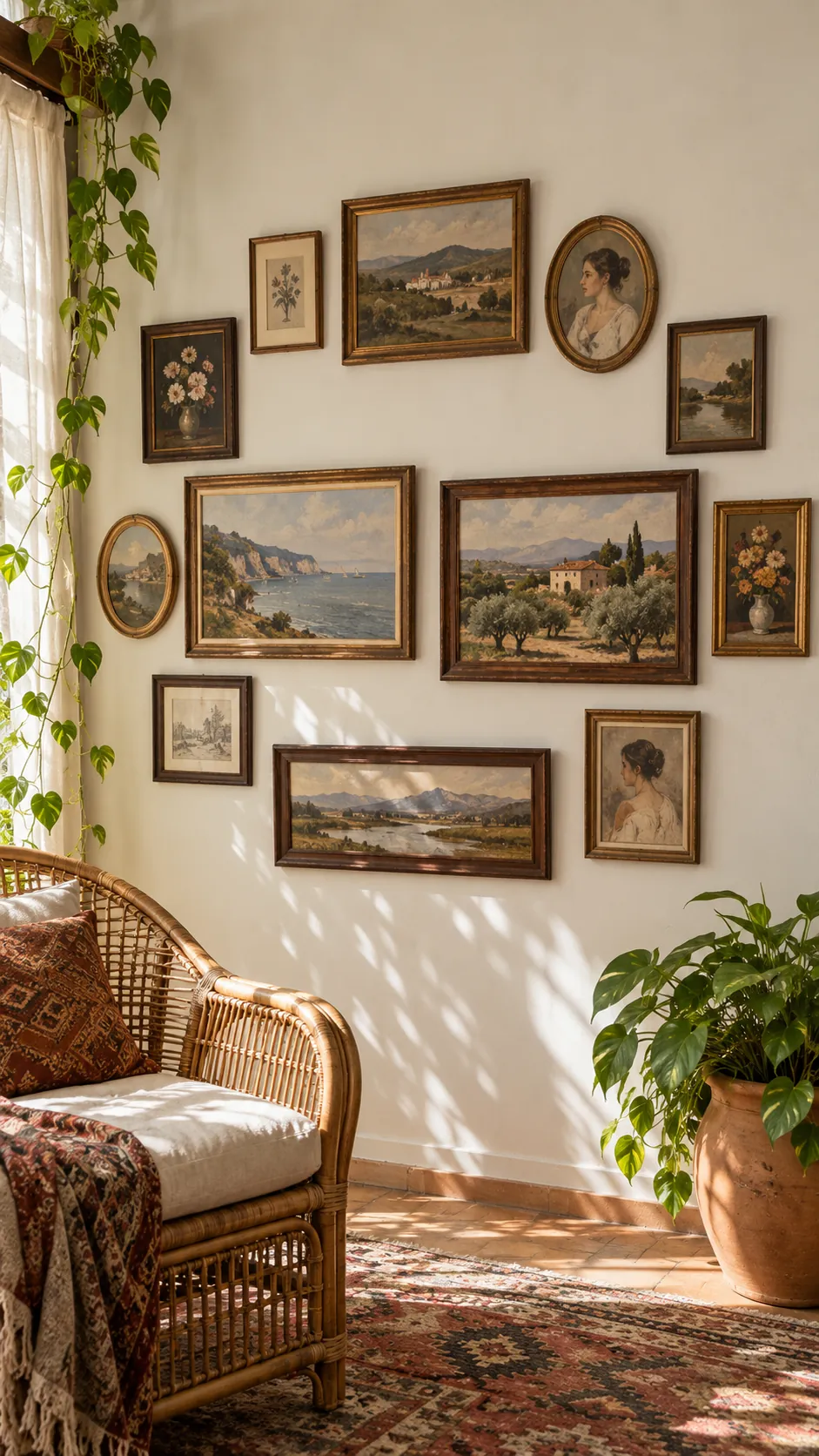
Curve the outer frames around an implied oval rather than forcing straight outer edges. Put heavier landscape frames near the middle and lighter portrait frames toward the upper and lower ends. Keep the center loosely filled so the result feels collected over time, not scattered.
Mirrored Weight Without Matching Frames
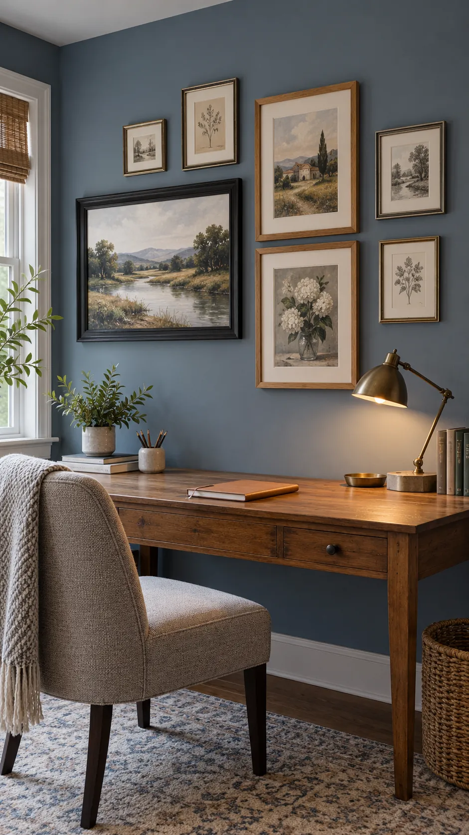
Balance one large landscape frame on the left with two stacked portrait frames of similar combined area on the right. Add smaller pieces around them while preserving that weight relationship. The wall looks balanced without becoming formally symmetrical, which is useful when your available frames do not match.
Shelf Led Layered Display
Rest several mixed orientation frames on a picture ledge and overlap their corners slightly. Place taller portraits behind shorter landscape frames so faces and important details remain visible. This flexible layout makes it easy to rotate family photos without adding new holes.
Central Cross Alignment
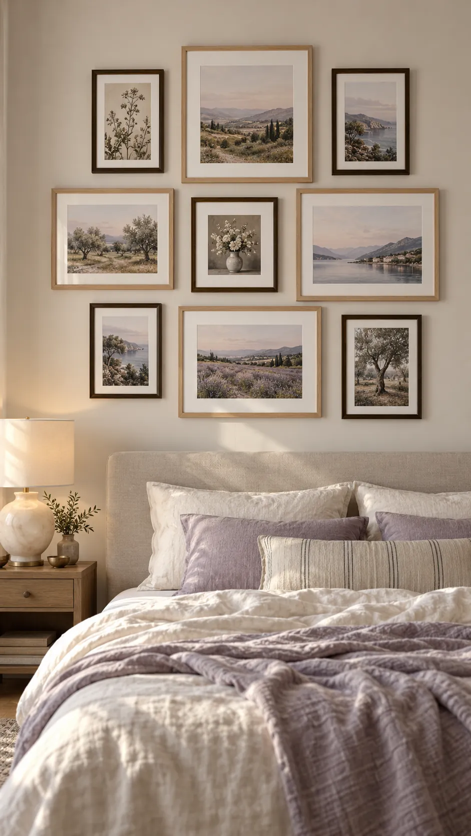
Choose one horizontal seam and one vertical seam, then align several frame edges to those two guides. The intersecting lines organize landscape and portrait photos without requiring equal frame sizes. Avoid letting every edge meet at the same point, since a little offset keeps the display relaxed.
Descending Size Cascade
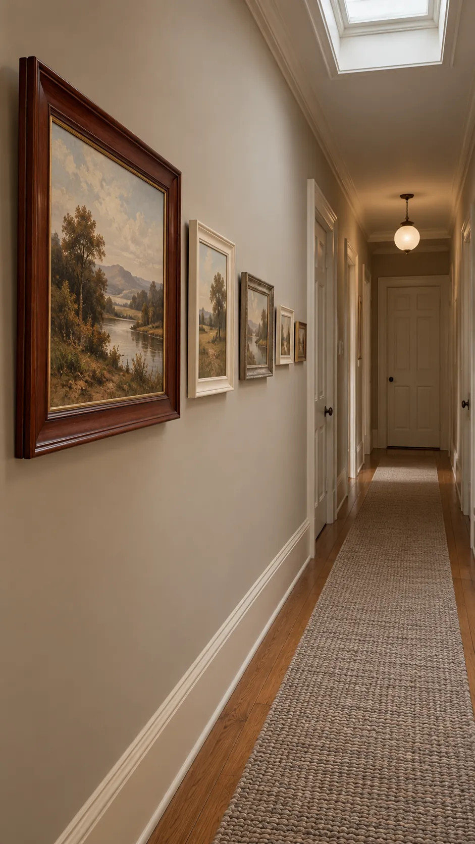
Begin with the largest frame and reduce the frame sizes as the arrangement moves outward. Change orientation along the way so the cascade feels varied rather than like a set of nesting rectangles. Keep the smallest pieces close enough to the group that they still belong to the main composition.
Doorway Wrap Composition
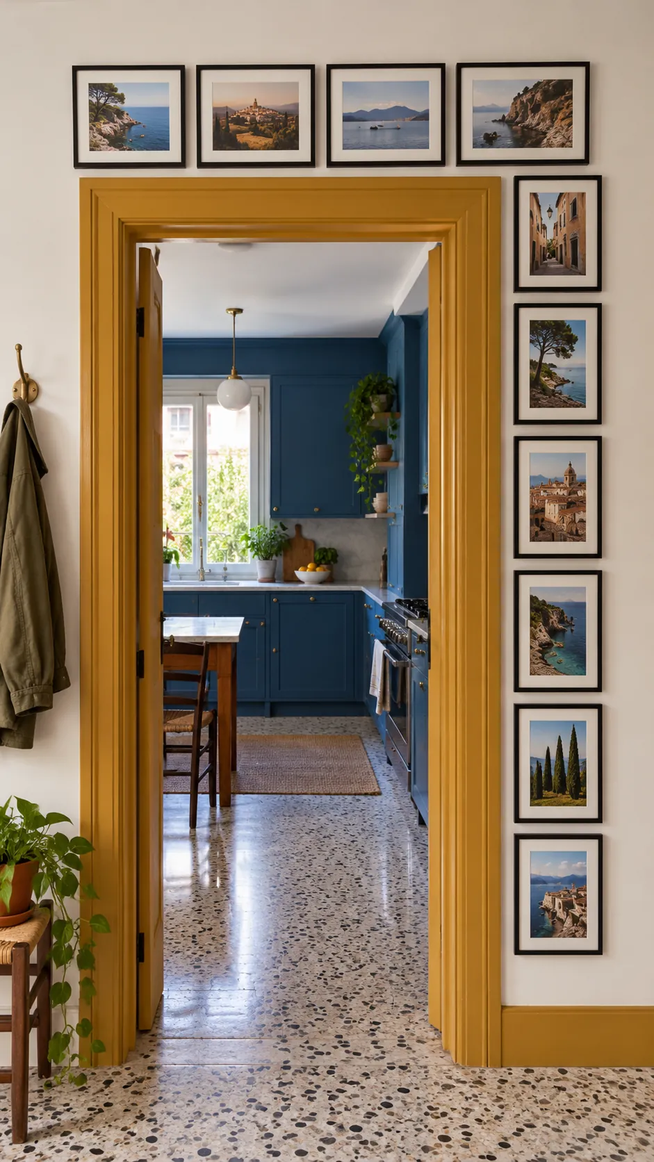
Extend a photo arrangement above and along one side of a doorway to use an awkward wall area. Place landscape frames above the opening and portrait frames down the side to follow the available proportions. Maintain one consistent distance from the trim so the architecture becomes part of the layout.
Three Column Mixed Grid
Divide the wall into three invisible columns and allow each column to contain a different mix of frame shapes. Align the top and bottom of the total display while varying the internal seams. Narrow portrait frames work well in one column, while a wide landscape frame can define another.
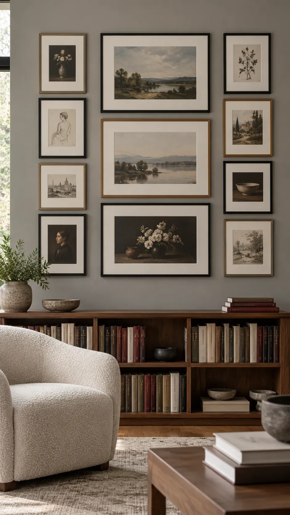
Low Horizon Above Furniture
Keep most frame centers close to a low horizontal band above a sofa or sideboard. Let a few portrait frames rise above that band to create interest without making the group top heavy. Check the full arrangement from the normal seated or standing viewpoint before choosing the final height.
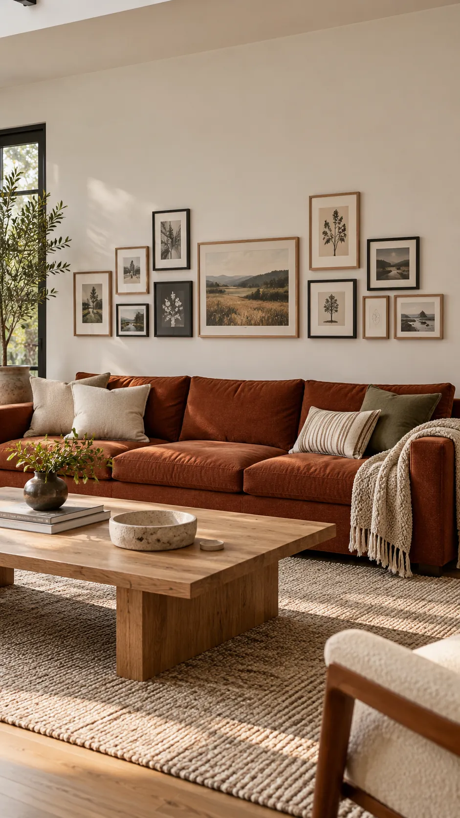
Expandable Edge With Room to Grow
Finish three sides of the arrangement and leave one edge deliberately loose for future photos. Use one or two small frames at the open edge as a visual bridge rather than ending with a large heavy piece. Trace the current frames on paper and save the spacing notes so later additions follow the same rhythm.