
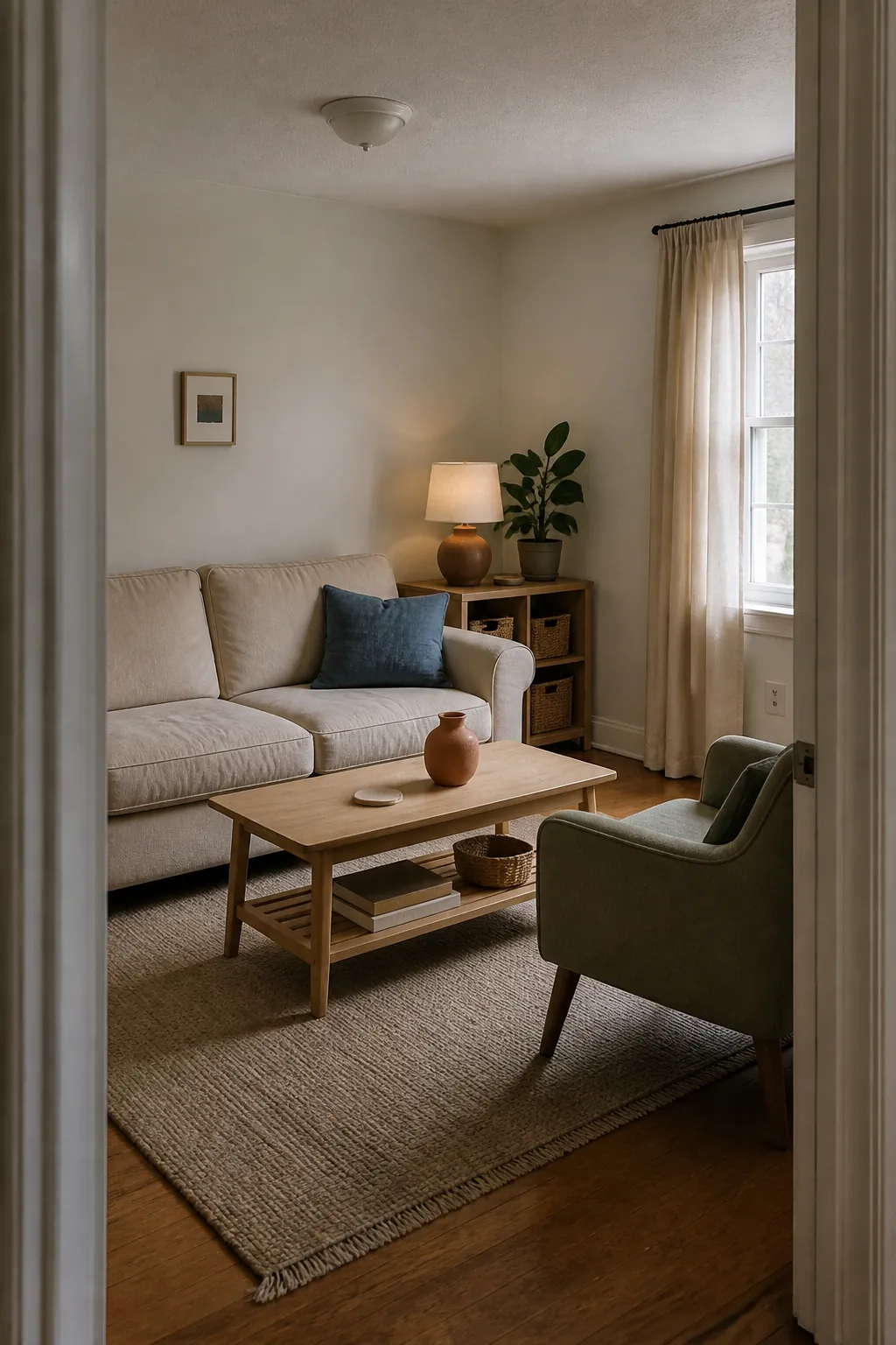
Color can make a small room feel personal without making it feel crowded. The trick is not to avoid color, but to control where it repeats, how saturated it becomes, and how much visual contrast appears at once. These 17 ideas use one clear color move at a time, so the room still has places for the eye to rest.
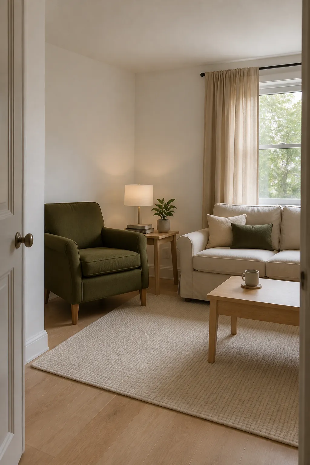
1. Pair Warm White With Muted Olive
Warm white walls keep the room bright without the sharpness of pure white. Bring muted olive into one substantial piece, such as a chair, duvet, or curtain, rather than scattering green accessories everywhere. Repeat it once in a smaller detail to make the choice feel intentional. Pale wood and flax-colored textiles bridge the two colors naturally. Keeping olive soft and slightly gray prevents the palette from becoming loud.
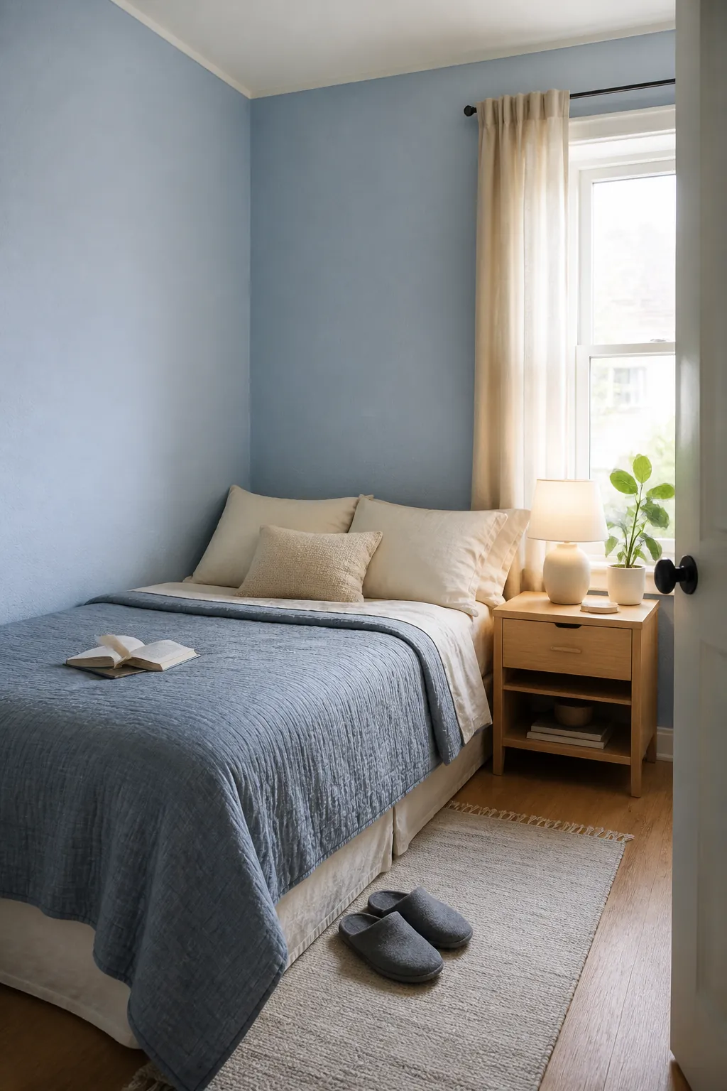
2. Build a Tonal Pale Blue Room
Choose pale blue for the walls, then use nearby blue-gray tones instead of adding several contrasting colors. A slightly deeper blue on a cushion or cabinet gives the scheme enough depth. Cream, light oak, and a little charcoal keep it grounded. Test the paint at morning and evening because blue can become cold in weak light. A tonal palette feels varied up close but calm across the whole room.
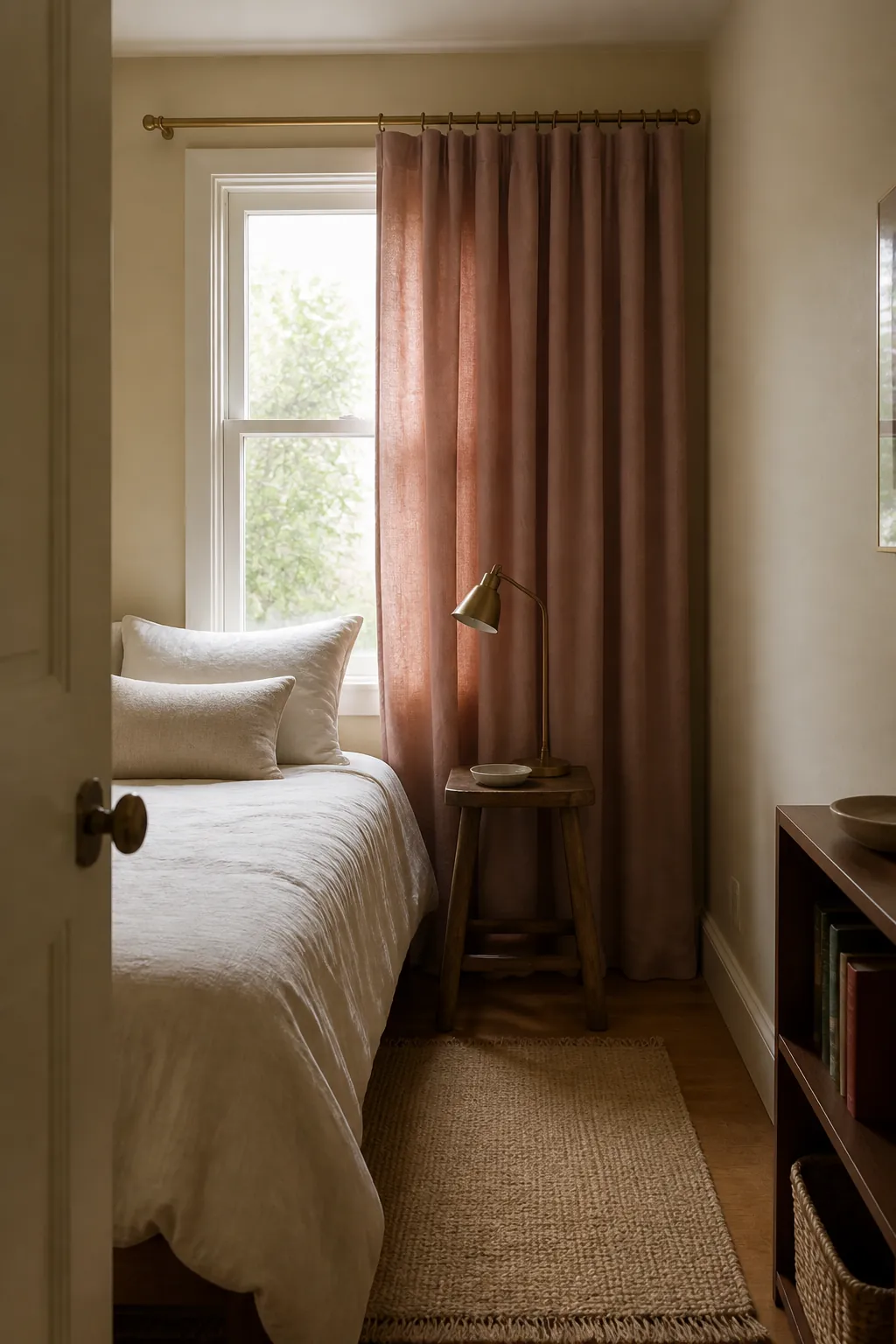
3. Soften Beige With Dusty Rose
Beige becomes warmer and less generic when it is paired with dusty rose. Use the rose on one textile plane, such as curtains or bedding, so it reads as a block rather than visual confetti. Repeat only a trace in a book spine or ceramic object. Walnut or aged brass can add definition without introducing another obvious hue. The result is gentle color that does not depend on a busy pattern.
4. Use Clay as One Grounded Accent
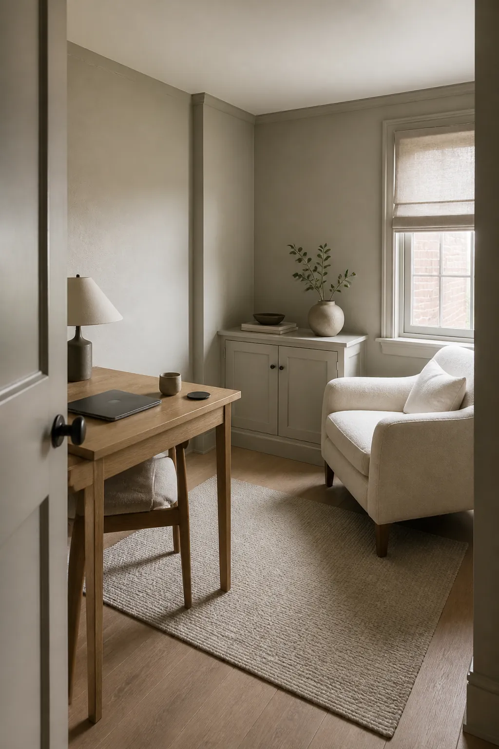
Clay works well in a small room because it has warmth without the intensity of bright orange. Put it on one chair, painted cabinet, or broad cushion rather than using many small terracotta pieces. Surround it with oatmeal, cream, and medium wood. A tiny black detail can sharpen the palette, but keep black secondary. One grounded clay shape is enough to give a neutral room a focal point.
5. Try Sage Walls With Natural Linen
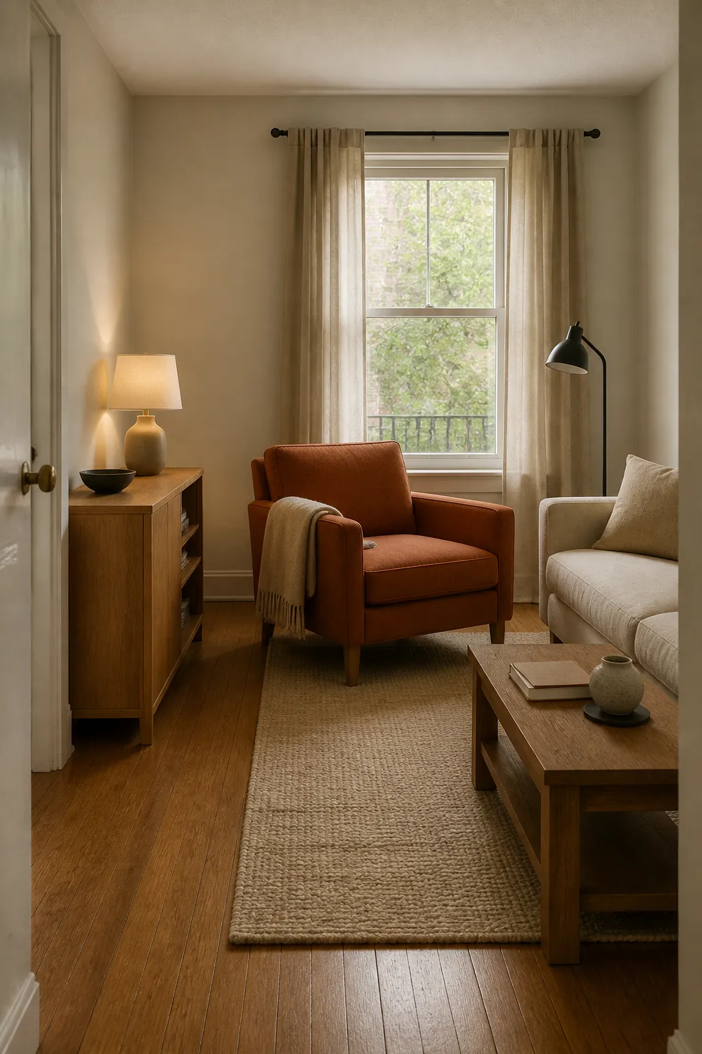
Sage walls create a soft envelope while natural linen keeps the room from becoming themed. Pick a sage with a gray or earthy undertone and sample it beside the actual window. Use linen across larger textiles so the contrast stays low. Limit wood tones to one light or medium family. Because the colors sit close to nature, the room can feel layered without needing extra decorative accents.
6. Add Butter Yellow in Small Doses
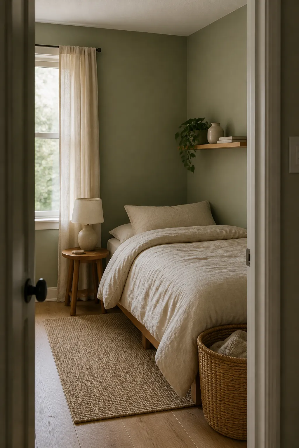
Butter yellow can brighten a dim room when it appears in a controlled dose. Try it on a compact side table, a single blind, or two matching pillows. Let warm white remain the dominant color and use pale oak as the transition. Avoid combining it with several other pastels, which can make a tiny room feel fragmented. The softened yellow should act like a patch of sunlight, not a full color theme.
7. Choose Mushroom and Soft Black
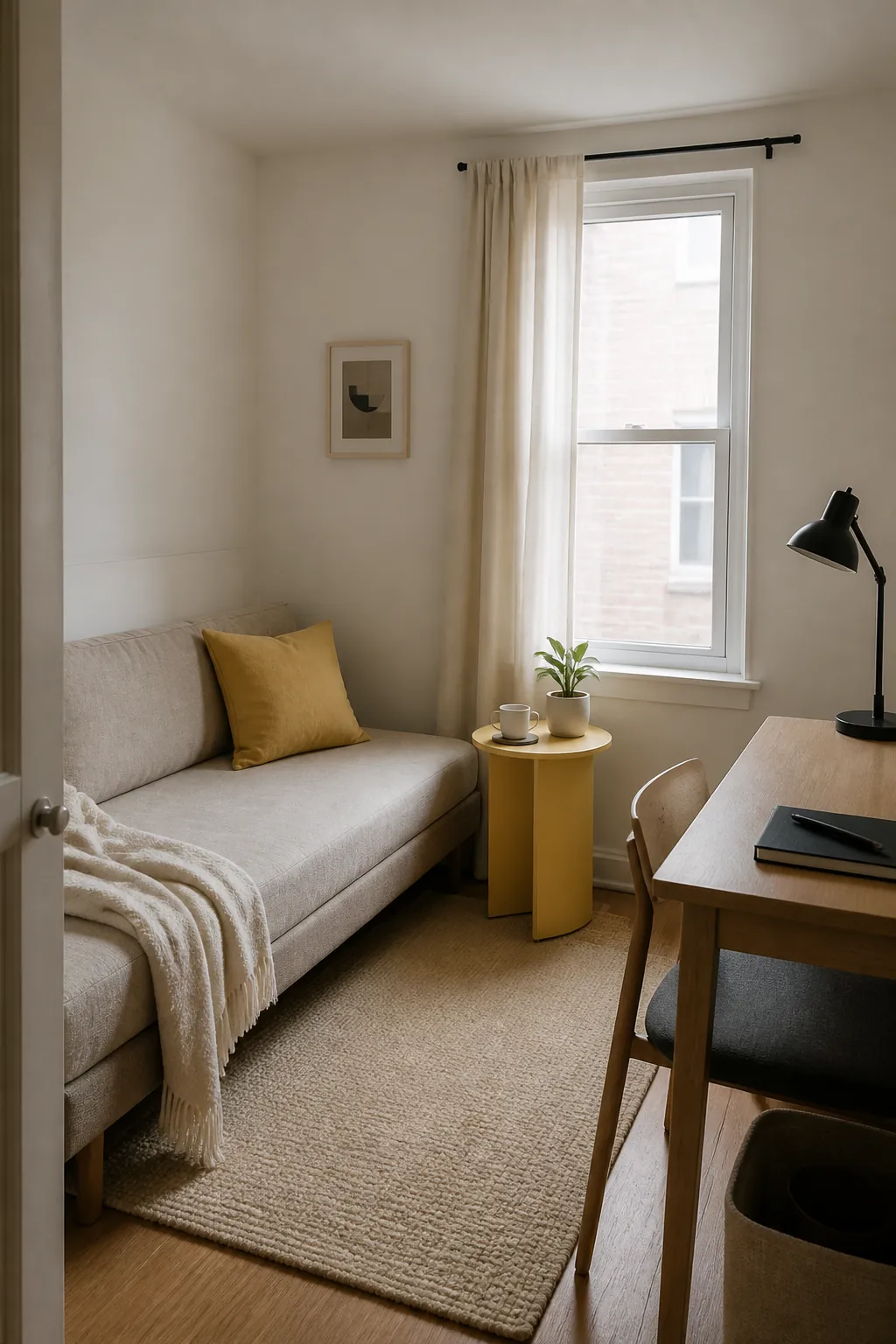
Mushroom gives a small room more depth than flat beige while staying quiet. Add soft black through thin lamp stems, a narrow frame, or chair legs rather than a heavy black wall. Repeat those dark lines in only two or three places. Cream fabric keeps the center of the room light. This combination feels structured because contrast follows the furniture outlines instead of breaking the room into colored zones.
8. Wrap the Room in Soft Greige
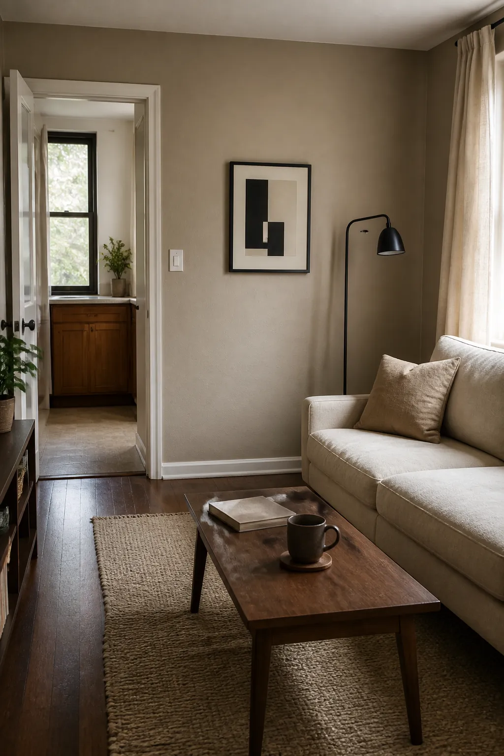
Using one soft greige across walls, trim, and a shallow cabinet reduces visual stops. Change the sheen slightly so the trim remains durable without looking outlined. Bring interest through texture: wool, linen, oak, and handmade pottery all read differently within the limited palette. Keep bright white out if it makes the greige look muddy. Color wrapping works because the architecture recedes and useful objects become clearer.
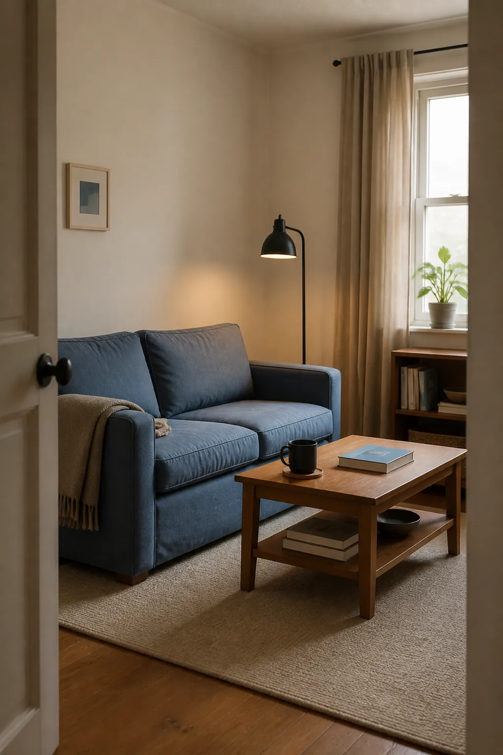
9. Combine Cream With Faded Denim Blue
Faded denim blue brings familiar color without the energy of a saturated navy. Use it on a sofa, bed cover, or full curtain length to create one calm visual mass. Cream walls and rugs soften its cooler cast. Add medium wood for warmth and repeat the blue only once nearby. The slightly worn quality of denim blue makes a compact room feel lived in rather than highly styled.
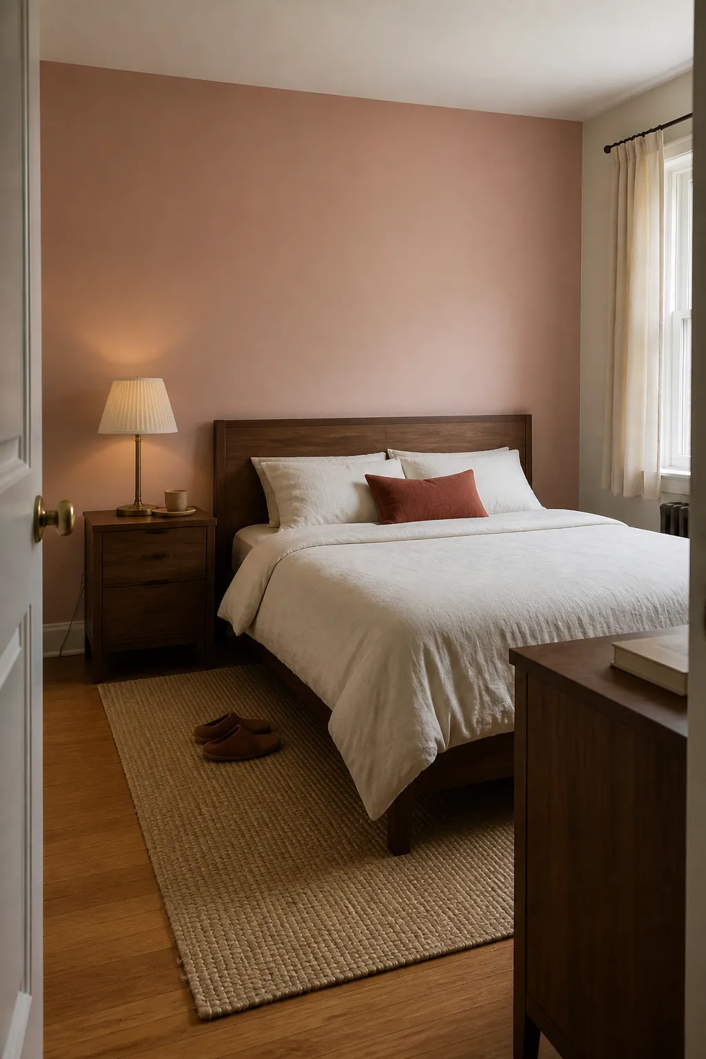
10. Ground Blush With Walnut
A pale blush can appear almost neutral when it is balanced by walnut. Keep blush on a broad matte surface, such as the wall behind a bed, instead of using many pink objects. Walnut furniture gives the color weight and keeps it from feeling sugary. Choose off-white bedding and a single muted red-brown detail. This palette stays composed because the dark wood provides one consistent anchor.
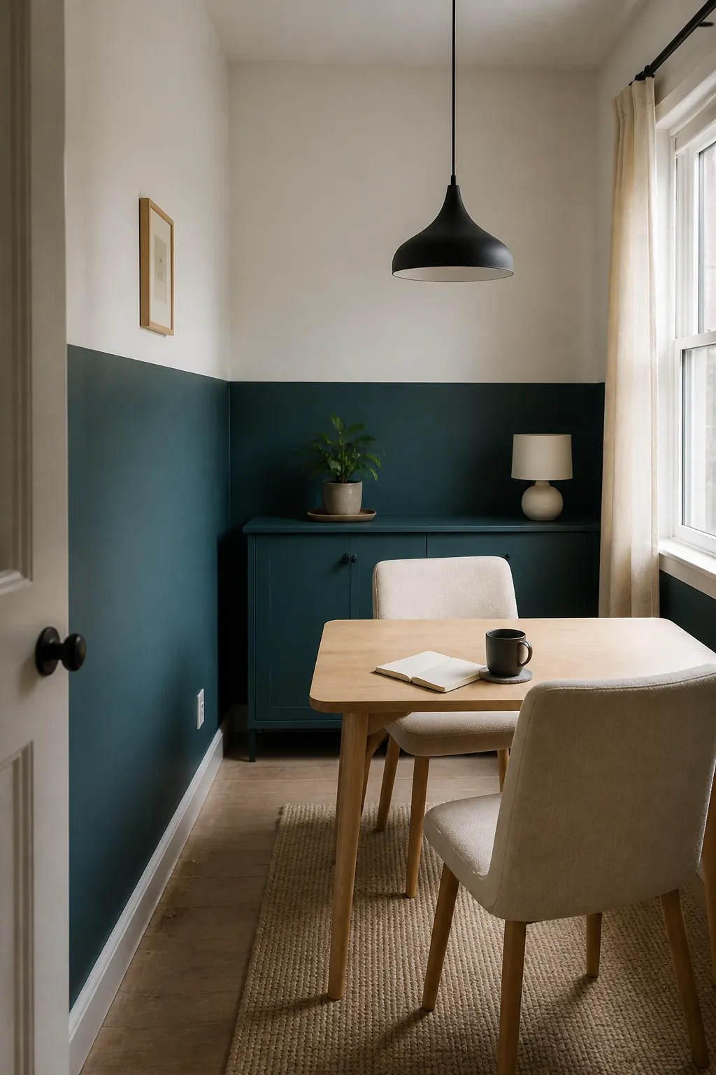
11. Use Deep Teal Below the Sightline
Deep teal can work in a small room when it occupies a defined lower area. Paint a low cabinet, the bottom half of one wall, or a built-in bench, then keep the upper wall warm white. The lighter upper zone protects brightness and makes the ceiling feel less enclosed. Repeat teal once in a small textile and stop there. A crisp, level boundary looks calmer than several unrelated accent patches.
12. Pair Putty Walls With Rust Textiles
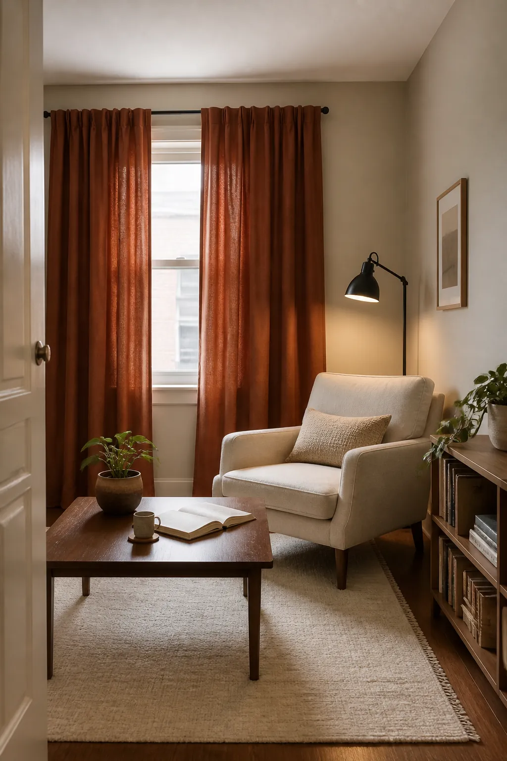
Putty walls offer a quiet mineral background that can handle a richer textile color. Add rust through one curtain pair, throw, or upholstered chair. Keep other fabrics in cream and oatmeal so rust remains the only strong note. Blackened metal or walnut can provide a small amount of definition. Because rust is concentrated in fabric, it can be changed later without repainting the room.
13. Make Lavender Feel Neutral
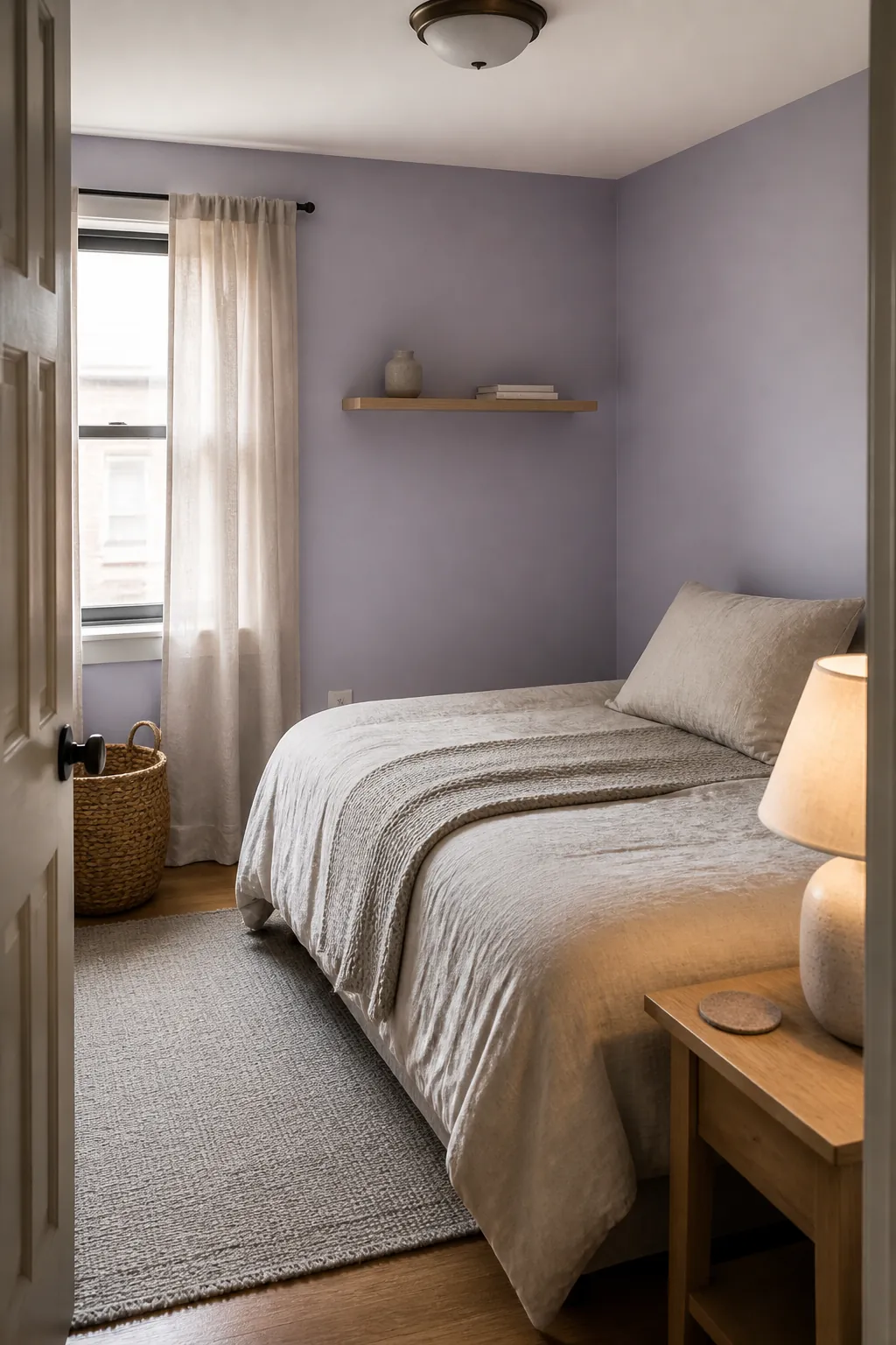
Look for lavender with gray in it rather than a bright candy purple. Pair it with warm gray, natural linen, and pale wood so it behaves like a quiet atmospheric neutral. Use the lavender on walls or one large textile, not both. Avoid adding pink, aqua, and yellow at the same time. The muted undertone lets the color change gently with the light instead of dominating every object.
14. Repeat One Accent Color Three Times
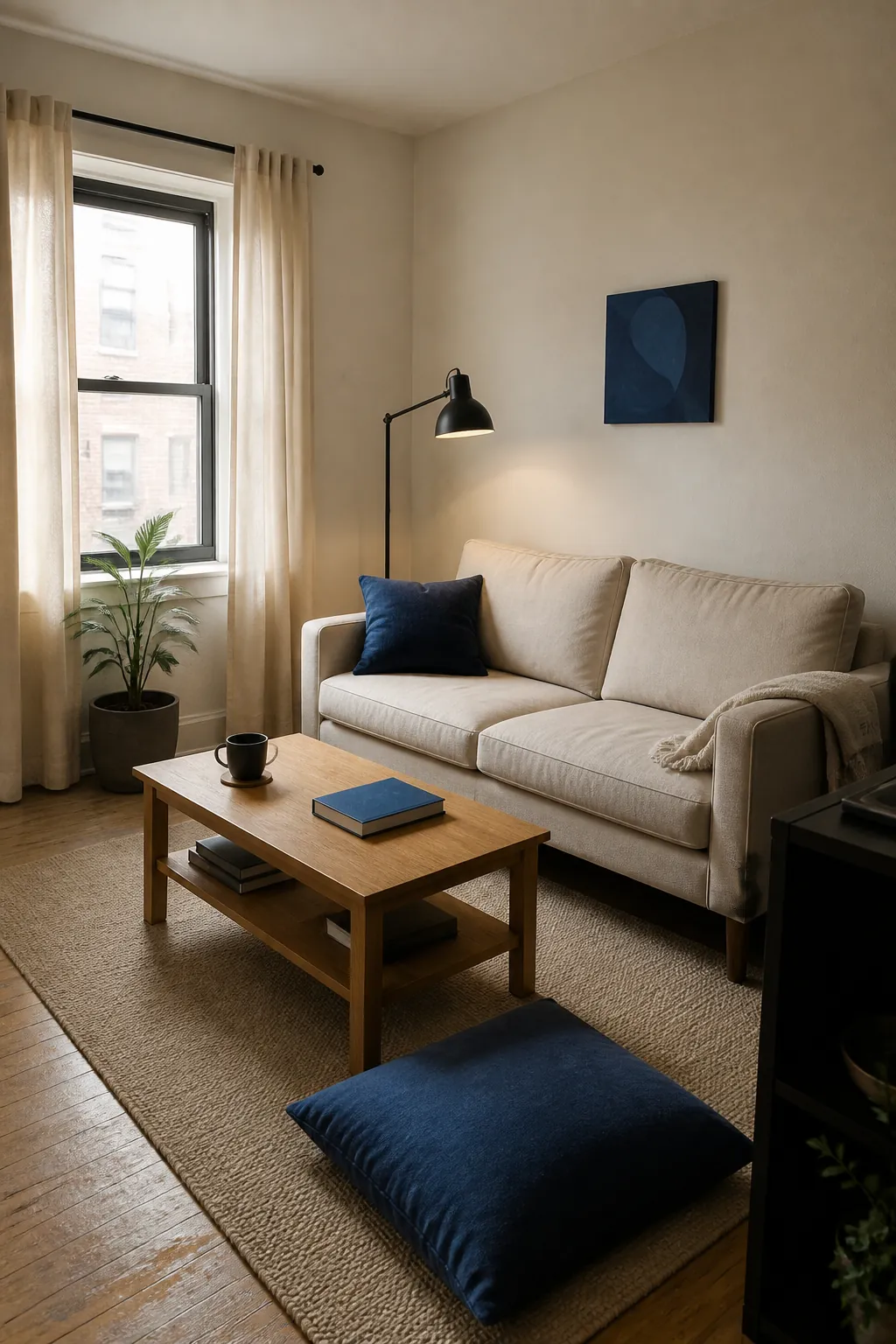
Choose one accent and repeat it at three different heights to lead the eye through the room. For example, muted cobalt might appear in a floor cushion, a book at table height, and a small artwork above. Keep the shapes simple and the amounts unequal so the repetition does not look staged. Everything else can stay cream, wood, and charcoal. Three controlled echoes create rhythm without turning every surface into a color opportunity.
15. Let a Rug Set the Limited Palette
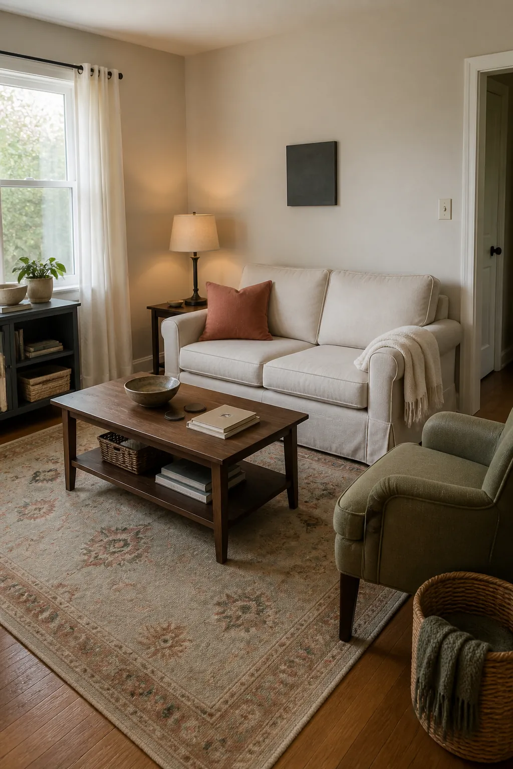
A rug can provide the palette if its colors are softened and its pattern is not too high contrast. Pull one light tone for the walls, one medium tone for upholstery, and one darker tone for a small accent. Do not try to match every color in the rug. Leave several surfaces plain so the pattern has breathing room. This approach makes buying decisions easier because each new item must belong to the same limited family.
16. Keep Walls and Curtains Close in Color
High-contrast curtains can divide a small wall into narrow strips. Choosing curtains close to the wall color creates a longer, quieter surface. You can still vary texture by using linen or a subtle woven stripe. Hang the fabric high and wide enough to clear most of the glass when open. The reduced contrast makes the window feel larger while leaving room for color in furniture or art.
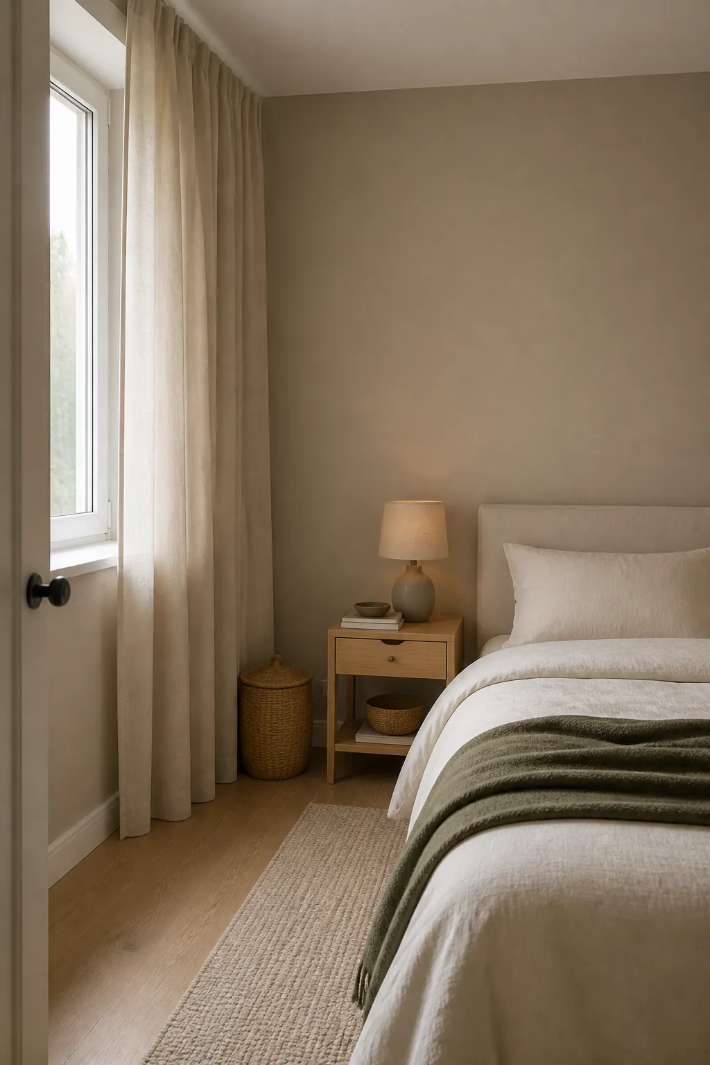
17. Test Every Color in the Room’s Light
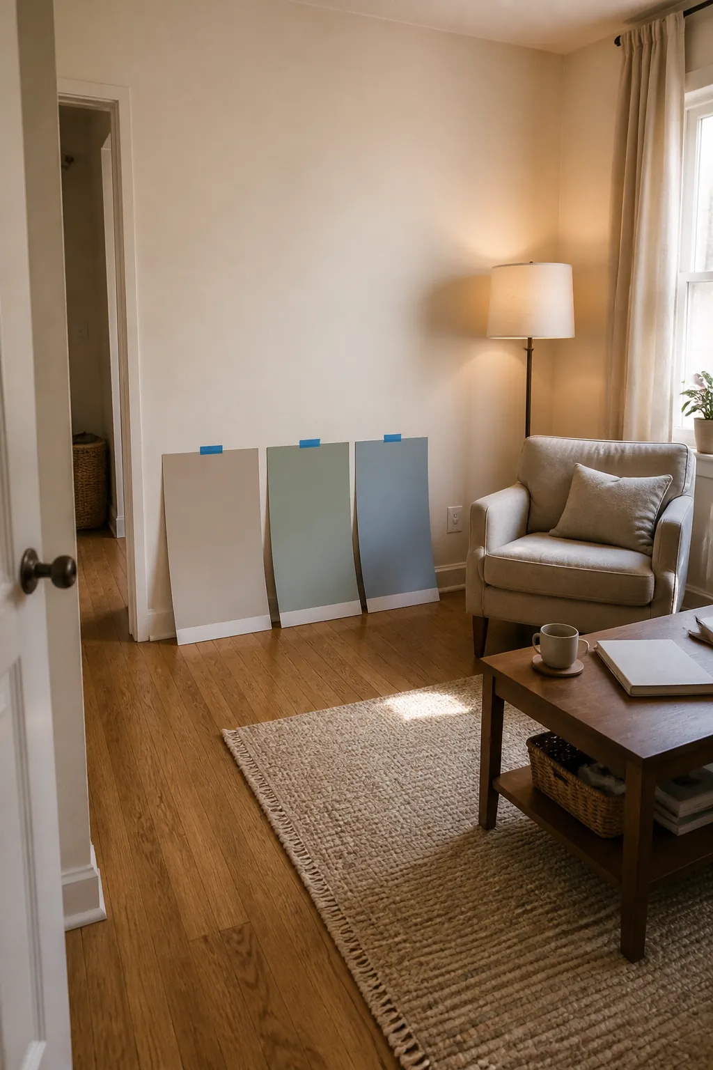
Paint chips are too small to show how a color will behave across an entire wall. Apply large removable samples and check them beside the floor, upholstery, and window trim. Look in morning light, on a cloudy afternoon, and under the lamps you use at night. Remove any option that turns harsh, muddy, or unexpectedly saturated. Choosing the calmest successful sample is more reliable than following a universal rule about light or dark colors.