
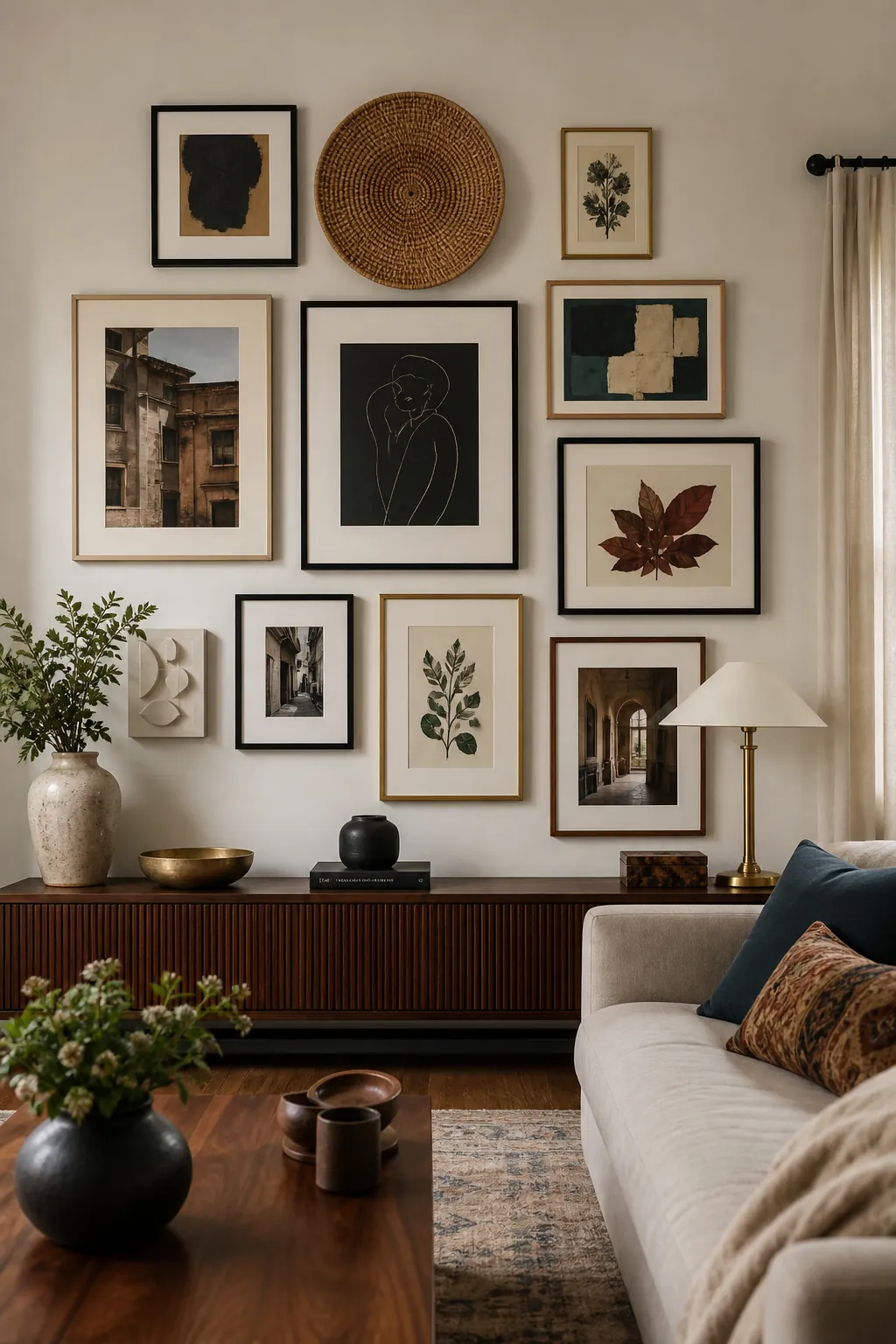
The strongest living room gallery walls respond to the seating, sightlines, and everyday movement of the room instead of simply filling an empty surface. Real-world questions are usually about scale—whether the wall is too small for the sofa, too crowded around a television, or too varied to feel connected. These 27 gallery wall inspiration ideas for living rooms offer distinct layouts for apartments, boho spaces, Scandinavian rooms, family photo walls, and collected eclectic interiors.
Create a Low Gallery Ribbon Above the Sofa
Seven landscape frames can form a quiet visual ribbon that follows the length of a linen sofa. Keep their centers close to one level, allowing the different architectural-door photographs to supply variation inside the disciplined band. The group should feel attached to the seating below, not stranded halfway toward the ceiling.
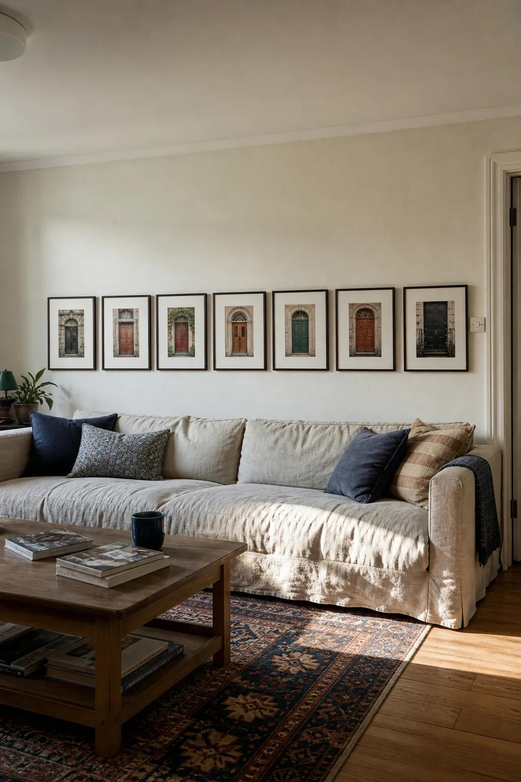
Arrange paper templates while sitting opposite the wall, because the low composition is designed for that sightline. Consistent gaps and a little clear wall at both sofa ends will make the horizontal sweep look deliberate.
Start With One Large Living Room Anchor
A large woven panel gives smaller object photographs and reliefs something substantial to gather around. Place the textile off center above the oak media cabinet, then let the secondary works step outward from its edges.
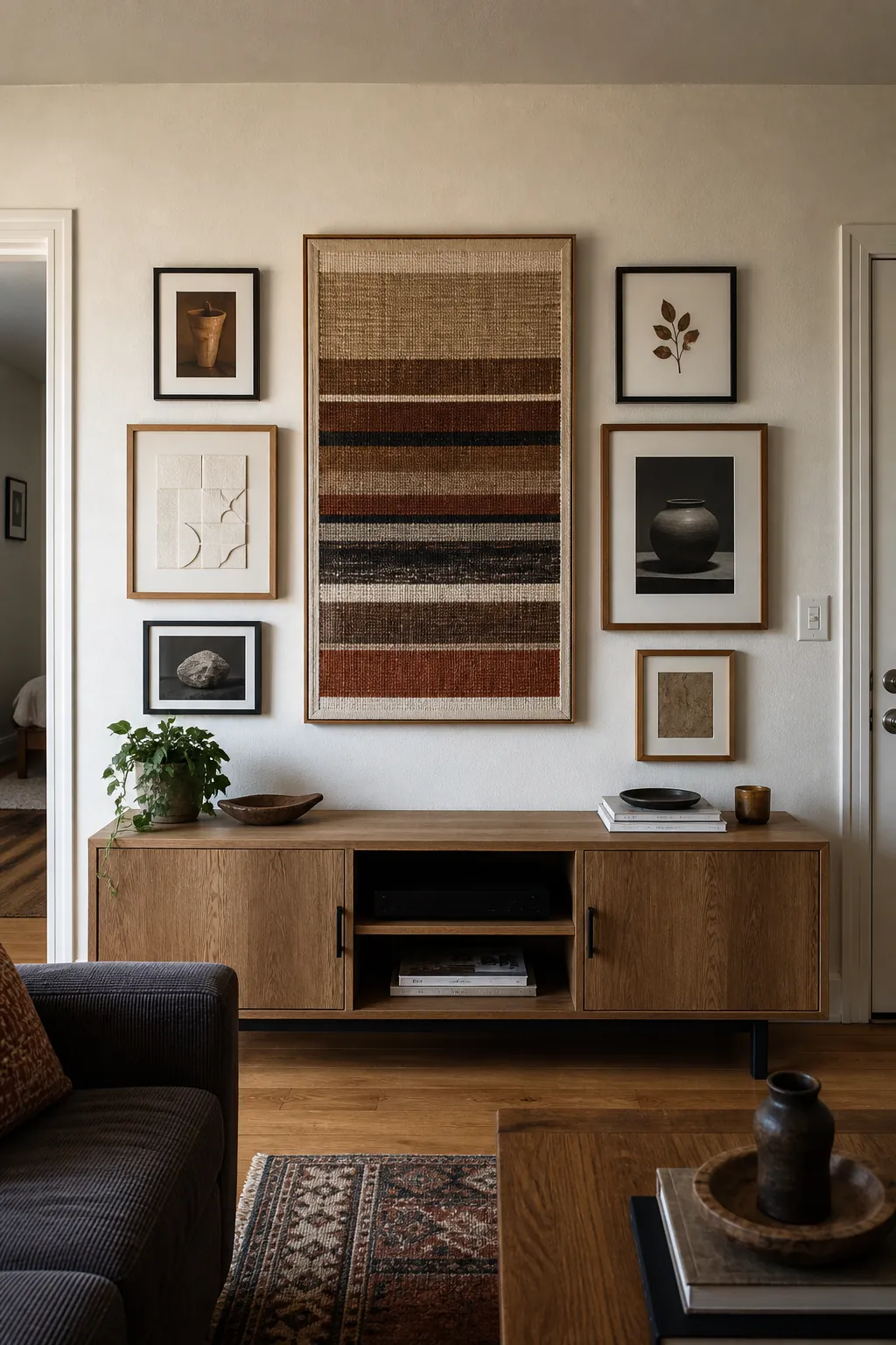
The surrounding frames do not need equal sizes, but their combined weight should keep the anchor from pulling the whole arrangement to one side. Repeat one fiber tone in a mat or cabinet object to connect wall and furniture. From straight ahead, verify that nothing visually merges with the television, speaker, or other equipment on the cabinet.
Sweep an Asymmetrical Arc Over a Sectional
An L-shaped sectional gives an asymmetrical gallery a natural direction to follow. Begin low near the shorter return, then let abstract paper shapes and candid photographs rise in a shallow arc toward the longer wall. Vary frame dimensions without changing the pace of the gaps, which keeps the curve readable.
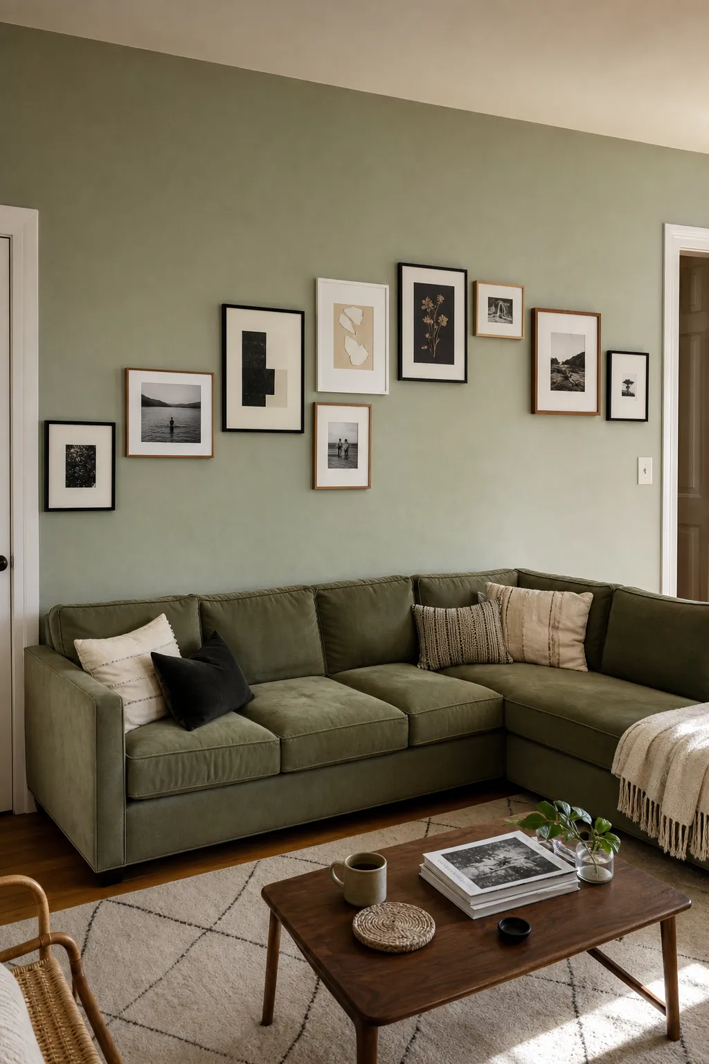
Judge the silhouette from the corner seat where both arms of the sofa are visible. The highest frame should still feel connected to the group rather than becoming a lone piece drifting toward the ceiling.
Use a Calm Nine-Frame Grid
Nine matching oak frames turn varied pressed-plant studies into one composed artwork above a compact sofa. Generous mats keep leaves, seed heads, and stems from becoming a dense patch of brown and green.
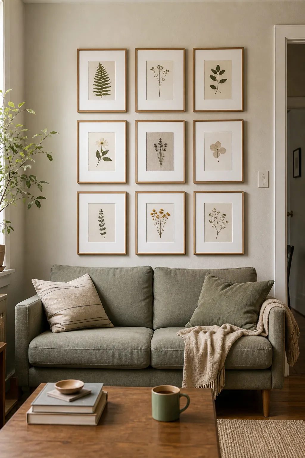
Lay out the complete grid on the floor and label every position before transferring measurements to the wall. Tiny spacing errors become conspicuous in a rigid scheme, so establish level rows from a single reference line. Keep the overall width related to the sofa and leave clear wall around the rectangle to preserve its calm effect.
Make Black-and-White Photography the Common Thread
Monochrome street photographs allow mixed frame finishes to coexist without making a small living room look disordered. Choose images of doors, stairs, and cast shadows that differ in subject but share a strong range of light and dark. Against a charcoal loveseat, pale mats prevent the collection from collapsing into one heavy mass.
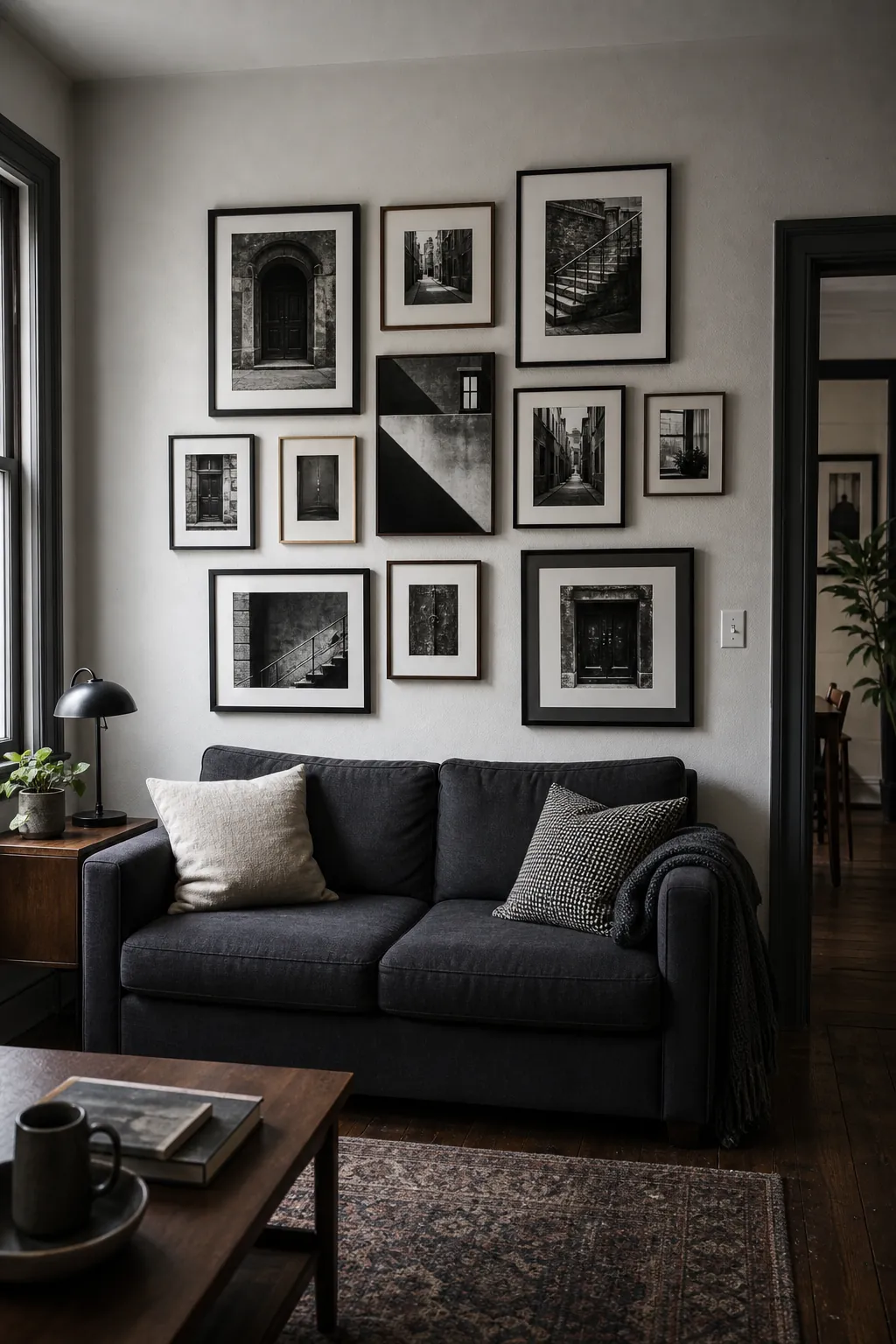
Distribute the darkest pictures instead of placing them all along the lower edge. Check the wall from the nearby armchair, where reflections and tonal balance may read differently than they do directly in front.
Layer a Boho Wall With Textile and Art
A woven indigo textile can lead a boho gallery while block prints, seed drawings, and photographs contribute finer detail. Let the fabric remain the broadest shape, then use a few slim brass frames to catch light above the low rattan sofa.
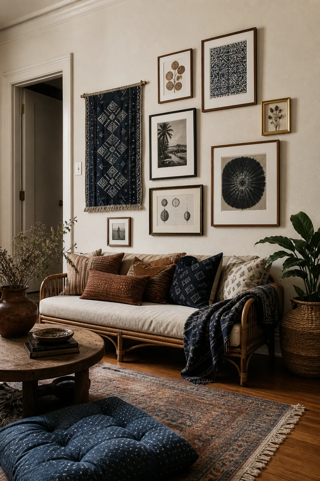
Keep the palette narrow enough that material differences feel rich rather than chaotic. Give the textile open space around its irregular edge and avoid tucking every gap with another tiny object. Make sure the lowest pieces remain clear of heads and cushions when someone settles into the sofa.
Keep a Scandinavian Gallery Light and Airy
Slim oak frames and sparse ink forms suit a Scandinavian room because neither introduces a hard visual border. Mix close architectural photographs with the drawings, using broad white margins to keep the collection brighter than the pale gray sofa. A loose arrangement can still feel orderly when all frame profiles remain quiet.
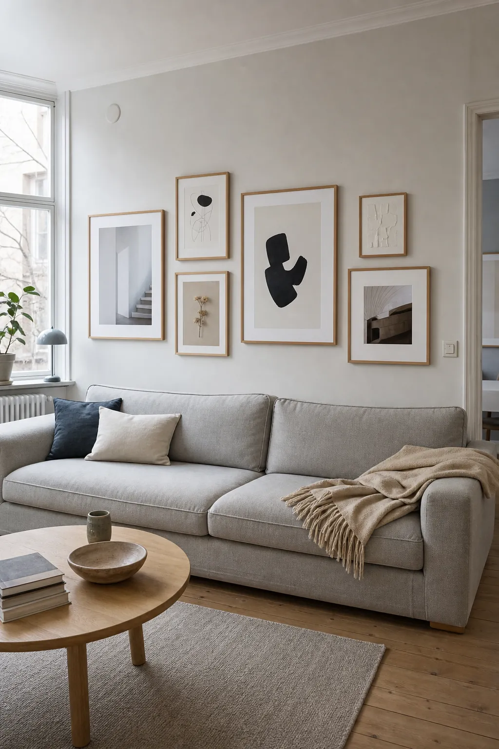
Favor fewer, larger intervals over a tight salon hang so the wall color participates in the design. Look from the sofa side as well as the doorway, checking that the lightest prints do not disappear in window glare.
Build a Vintage Salon Wall Beside the Bookcase
A bookcase can act as one firm edge for a dense vintage salon wall. Gather bird etchings, anonymous portraits, and a shallow hand relief in antique frames, allowing worn gilding and dark wood to converse with the leather settee.
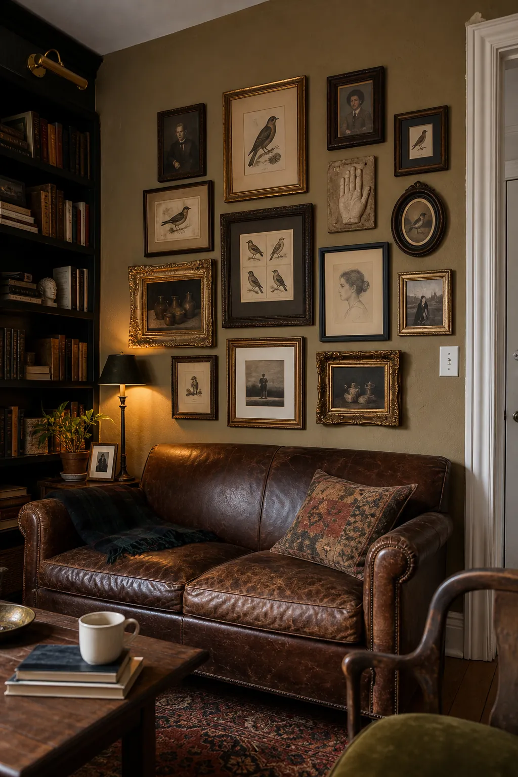
Start with the largest portrait near the furniture, then fit smaller works around it by shape rather than by strict rows. Preserve a narrow channel of wall beside the bookcase so the two compositions do not visually fuse. From the room’s diagonal view, move any bright frame that draws attention away from the collection as a whole.
Echo Midcentury Colors Across the Wall
Ochre, teal, and restrained red can carry midcentury energy across a gallery without matching every artwork. Alternate black and walnut frames around geometric color fields and pottery photographs, letting the darker outlines punctuate rather than enclose the group. The walnut credenza below supplies a useful material repeat.
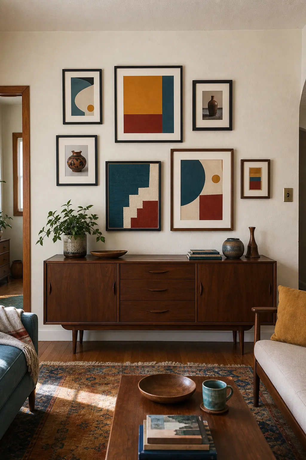
Spread each accent color across more than one area so the wall does not split into isolated clusters. Keep objects on the credenza low enough that their silhouettes do not crowd the lowest frames.
Choose Oversized Mats for a Quiet Neutral Room
Very wide cream mats give tiny charcoal lines and object photographs enough scale to face a full sofa. Their pale fields also create a controlled pause between the art and a textured bouclé upholstery.
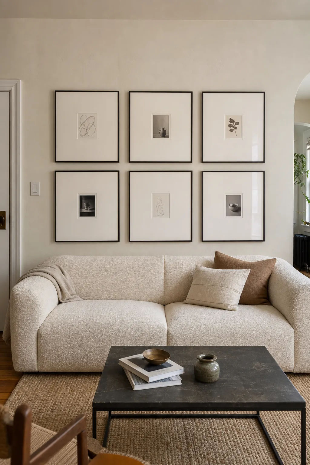
Select mat tones beside the wall and fabric, since two near-neutrals can reveal unexpected pink, yellow, or gray undertones when combined. Use crisp frame geometry to keep the expansive borders from looking empty or accidental. A straight-on sofa view should read first as a group of calm light shapes, with the small images rewarding a closer look.
Use Two Picture Ledges in a Rental
Two oak picture ledges let a renter revise a gallery without making a fresh hole for every new frame. Stagger cut-paper abstracts with photographs of building details, keeping the larger works on the lower ledge and smaller pieces above. Overlap corners enough to create depth without covering the interesting part of an image.
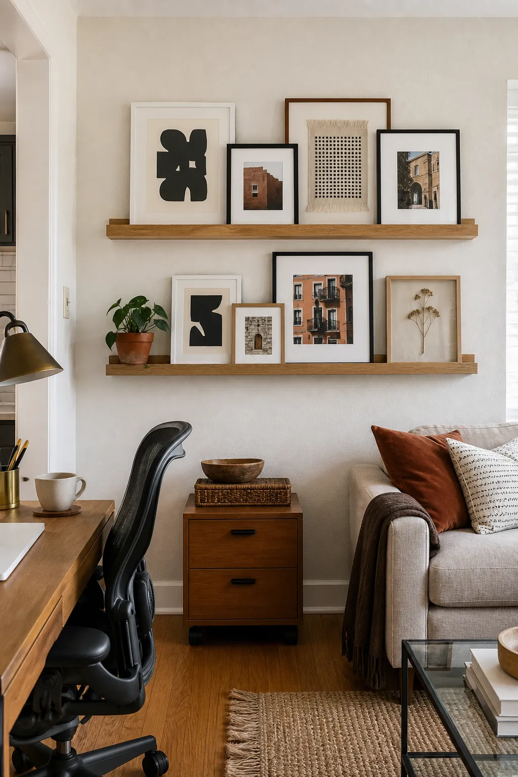
Confirm permission and mount the ledges securely; concentrating the holes does not remove the need to support their loaded weight. From the desk, check that leaning frames cannot be nudged by a chair, lamp, or frequently reached shelf.
Balance Art Around the Television
Pale stair photographs and airy line drawings can soften a wall-mounted television without pretending the black screen is art. Use the screen as the dominant rectangle, then place smaller works where they balance its visual weight rather than tracing an obvious frame around it.
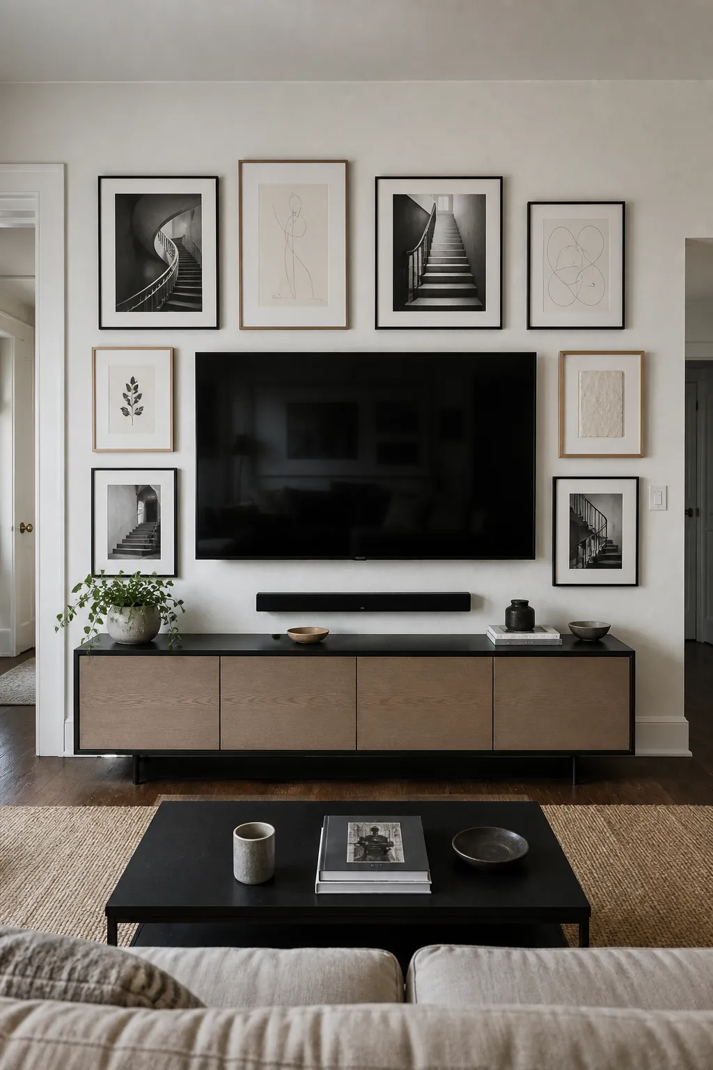
Avoid narrow gaps that make one corner look like a mounting mistake. Keep access to cables, controls, and any required airflow unobstructed when the frames are hung. Turn the television on during layout, because bright moving imagery changes which neighboring pieces feel distracting.
Wrap Art Around a Living Room Corner
Continuing art across perpendicular walls can make a corner banquette feel like a destination instead of leftover floor space. Carry market sketches and close street photographs around the bend through related mats, while allowing each wall a slightly different density. One frame placed near the corner on either side will visually hand the sequence across.
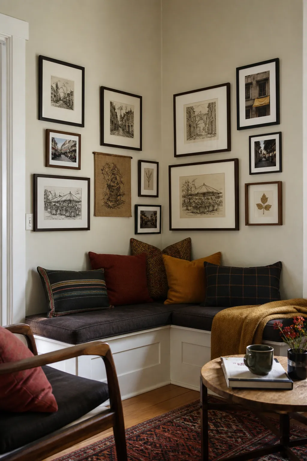
Do not force the two sides into mirror symmetry; the seating and available wall widths already differ. Inspect the turn from the open side of the room, where misaligned heights at the corner are easiest to spot.
Flank the Fireplace With Uneven Clusters
Uneven clusters can balance a plaster fireplace more naturally than identical stacks on both sides. Let botanical reliefs dominate one group and abstract prints lead the other, then connect them through similar light tones or frame finishes.
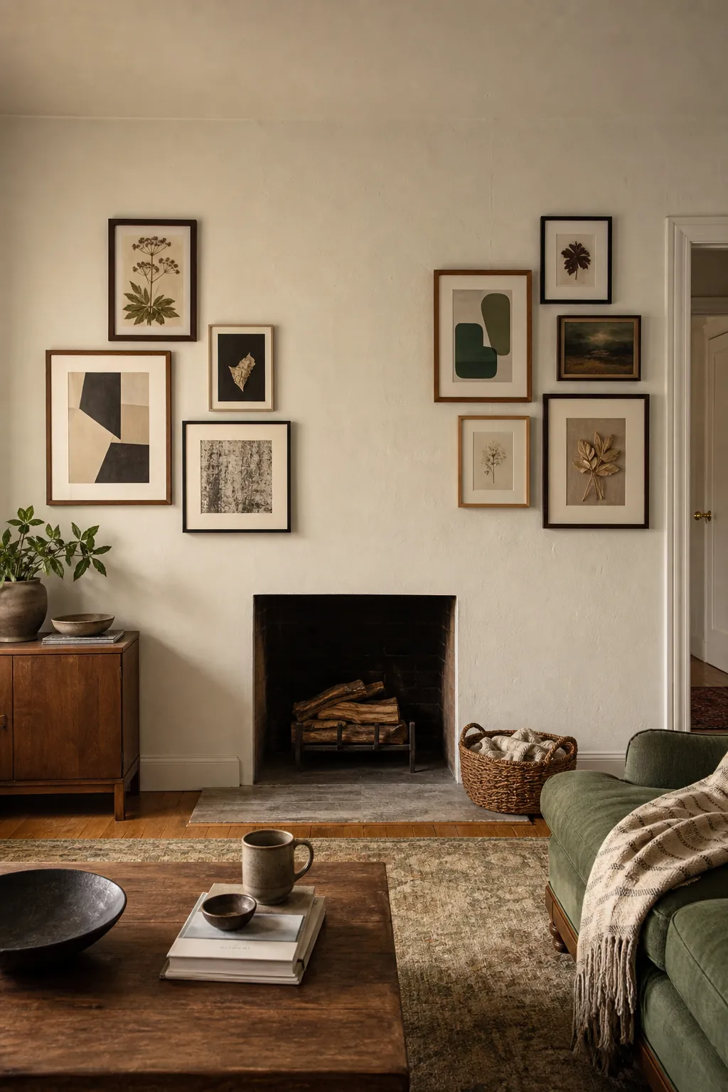
Compare the overall area and darkness of each side instead of matching frame counts. Follow the fireplace and artwork requirements for heat clearance, leaving working access to any controls or doors. Step back to the primary hearth-facing seat to confirm that neither cluster makes the firebox appear off center.
Climb a Tall Wall With a Vertical Composition
A double-height wall needs vertical momentum, but filling it uniformly can make the sitting area feel institutional. Place a large ink botanical at the lower center, then taper smaller silhouette frames upward along a shared axis. Wider gaps near the top allow the composition to fade into the architecture rather than end abruptly.
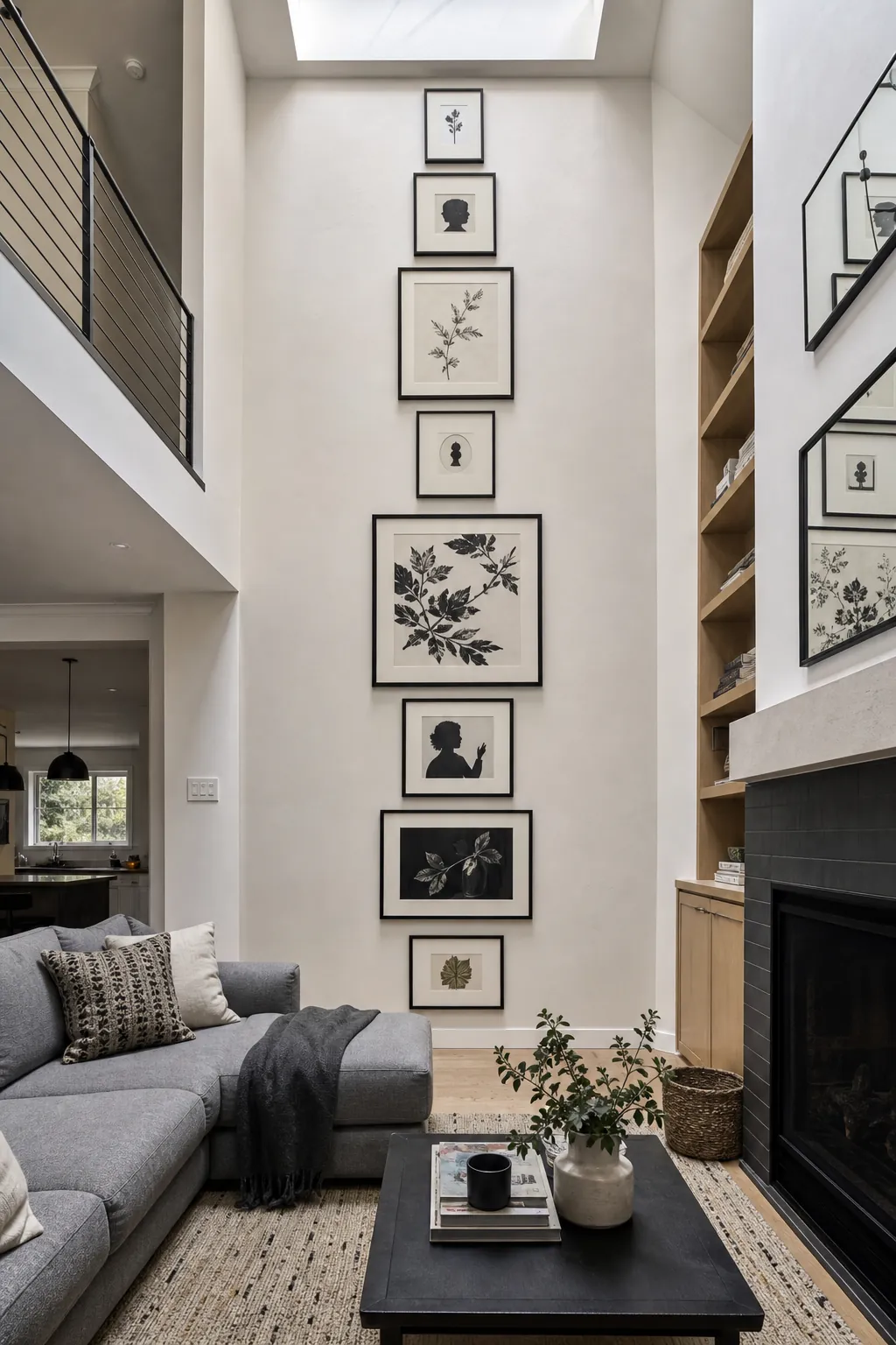
Map the entire climb from floor level and view it from the room entrance before any high work begins. Use a safe installation method suitable for the height and ensure upper pieces will not require frequent hands-on adjustment.
Fit a Five-Frame Cluster Into a Small Apartment
A compact five-frame diamond provides variety without consuming every open inch above a two-seat sofa. Give the indigo print the central role, balancing it with a seedpod study and smaller silhouettes around the edges.
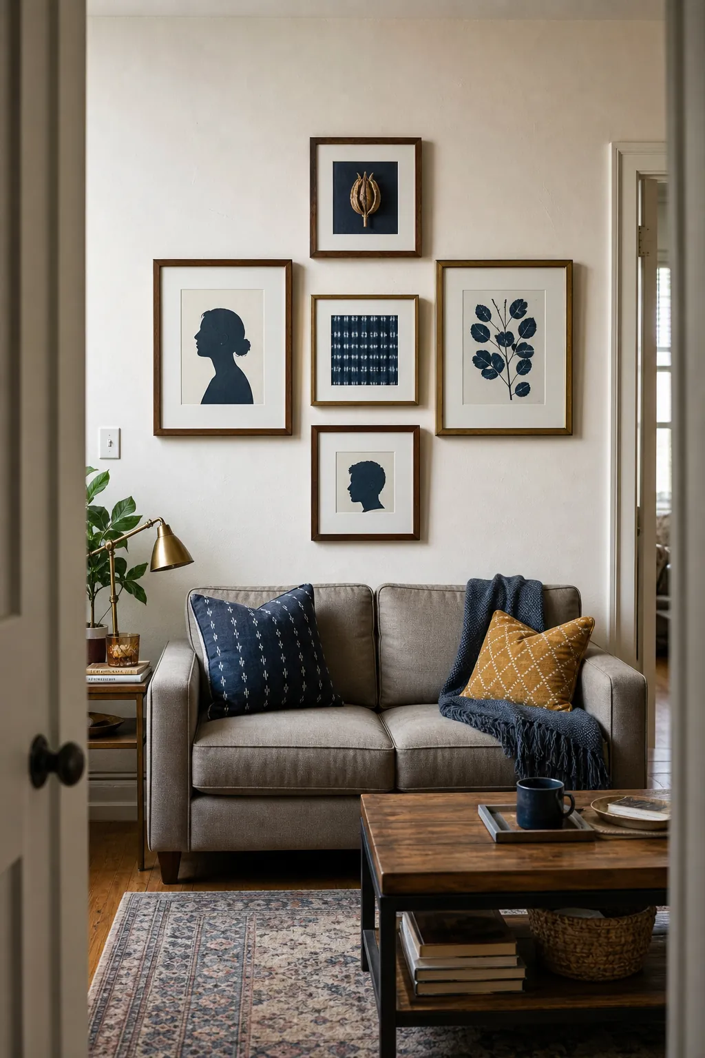
Hold the points of the diamond inside the sofa width so the grouping stays grounded. Preserve ample wall around the cluster; this negative space is what keeps a small apartment from feeling overdecorated. At the doorway, the five pieces should register as one shape before their individual subjects become apparent.
Turn Family Photos Into a Horizontal Timeline
A horizontal centerline can turn family photographs into a readable sequence without making every frame identical. Arrange candid images chronologically across the long console, mixing orientations while keeping the visual midpoint steady. Consistent printing or mat treatment helps pictures from different decades sit together.
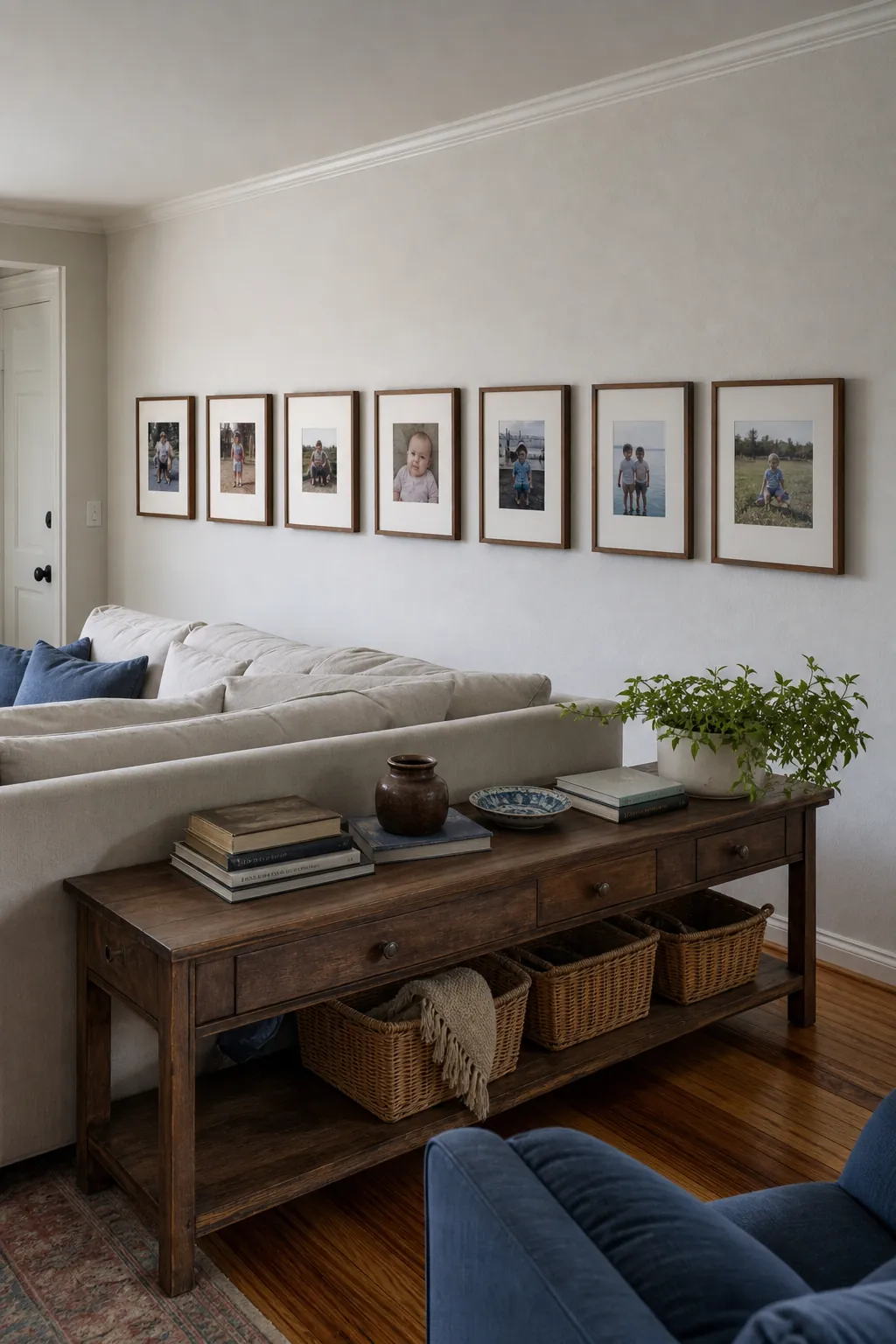
Choose photographs for gesture and atmosphere rather than trying to represent every event or relative. View the run from the room’s far end to catch a frame whose size or tone breaks the otherwise steady progression.
Curate Travel Details Instead of Landmark Posters
Photographs of market baskets, doors, tiles, and tools recall travel more personally than a set of familiar landmark posters. Combine these close details with a few on-location sketches so the gallery records how a place felt at human scale.
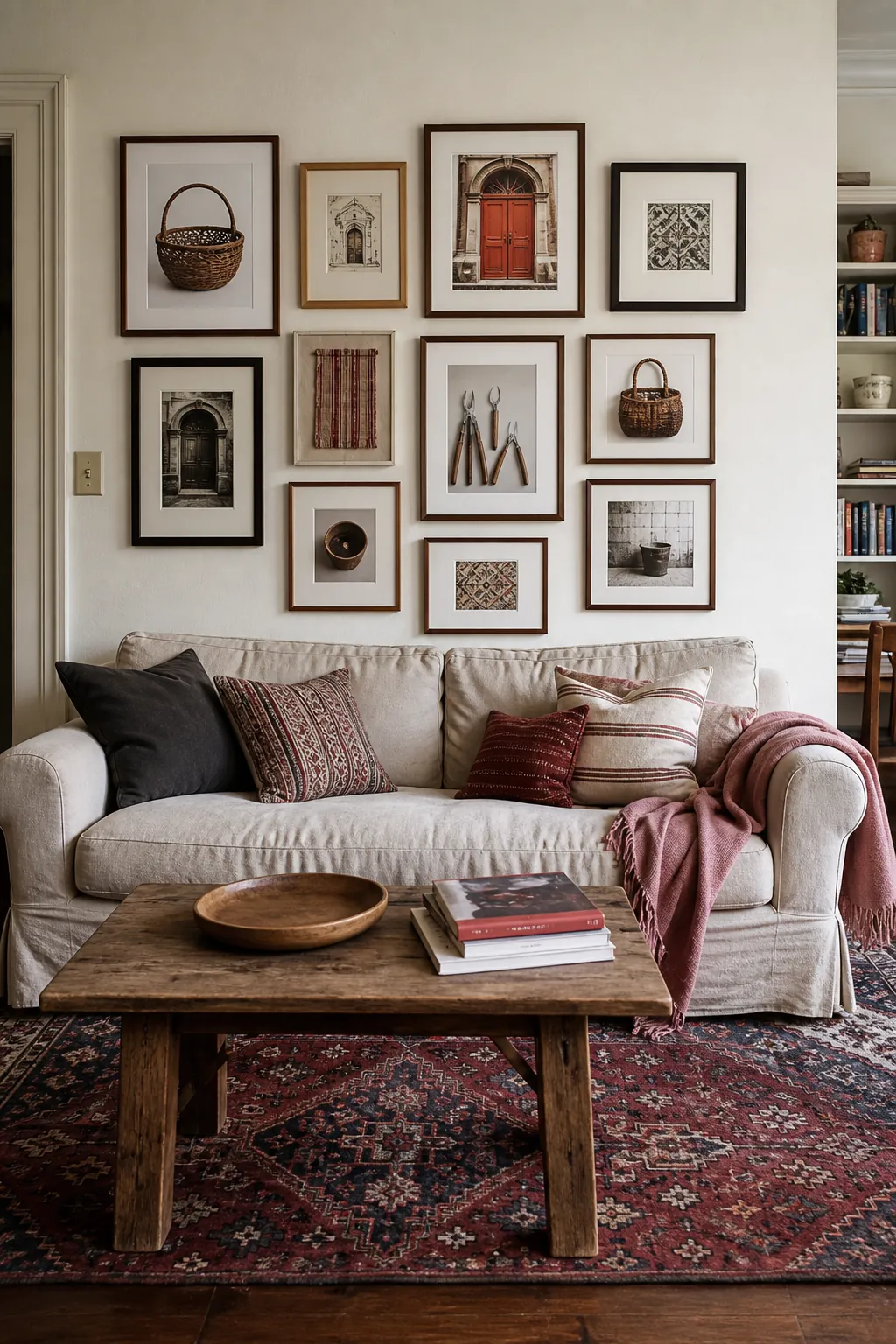
A limited treatment for frames and mats prevents several destinations from becoming visual noise above the slipcovered sofa. Edit out images that repeat the same color or viewpoint, even when the memory attached to them is strong. Stand near the coffee table to make sure tiny travel details remain visible without forcing the whole arrangement too low.
Compose a Botanical Wall Without Repeating One Plant
A botanical gallery gains depth when it studies different structures instead of repeating the same leaf in several frames. Pair a fern with a seedpod, culinary herb, and branching specimen, mixing pressed material with line drawings for contrast. The green velvet armchair can echo the subject without requiring every image to share its exact color.
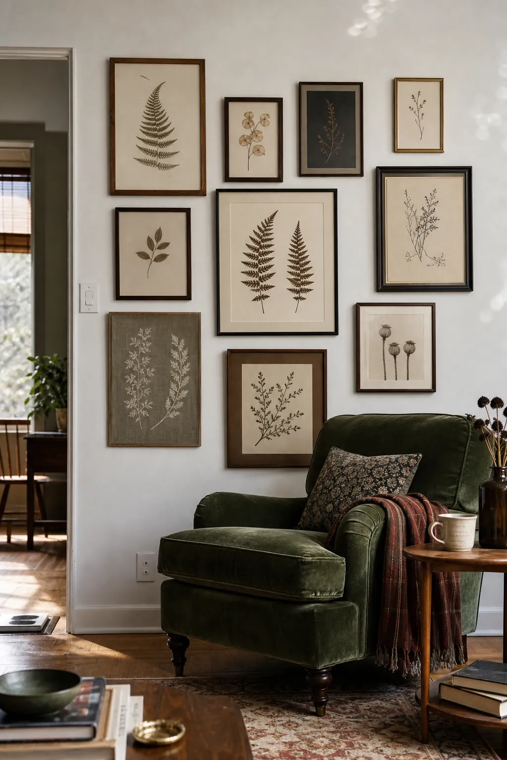
Vary the amount of white paper around each specimen so delicate and dense forms carry similar visual weight. From beside the chair, confirm that the collection reads as natural history rather than a block of generic green prints.
Rotate Children’s Art in Proper Frames
Front-opening white frames give children’s drawings a stable gallery even as the artwork changes. A rocket, cat, garden handprint, house, cloud, and wheel can coexist because the repeated frames establish the order.
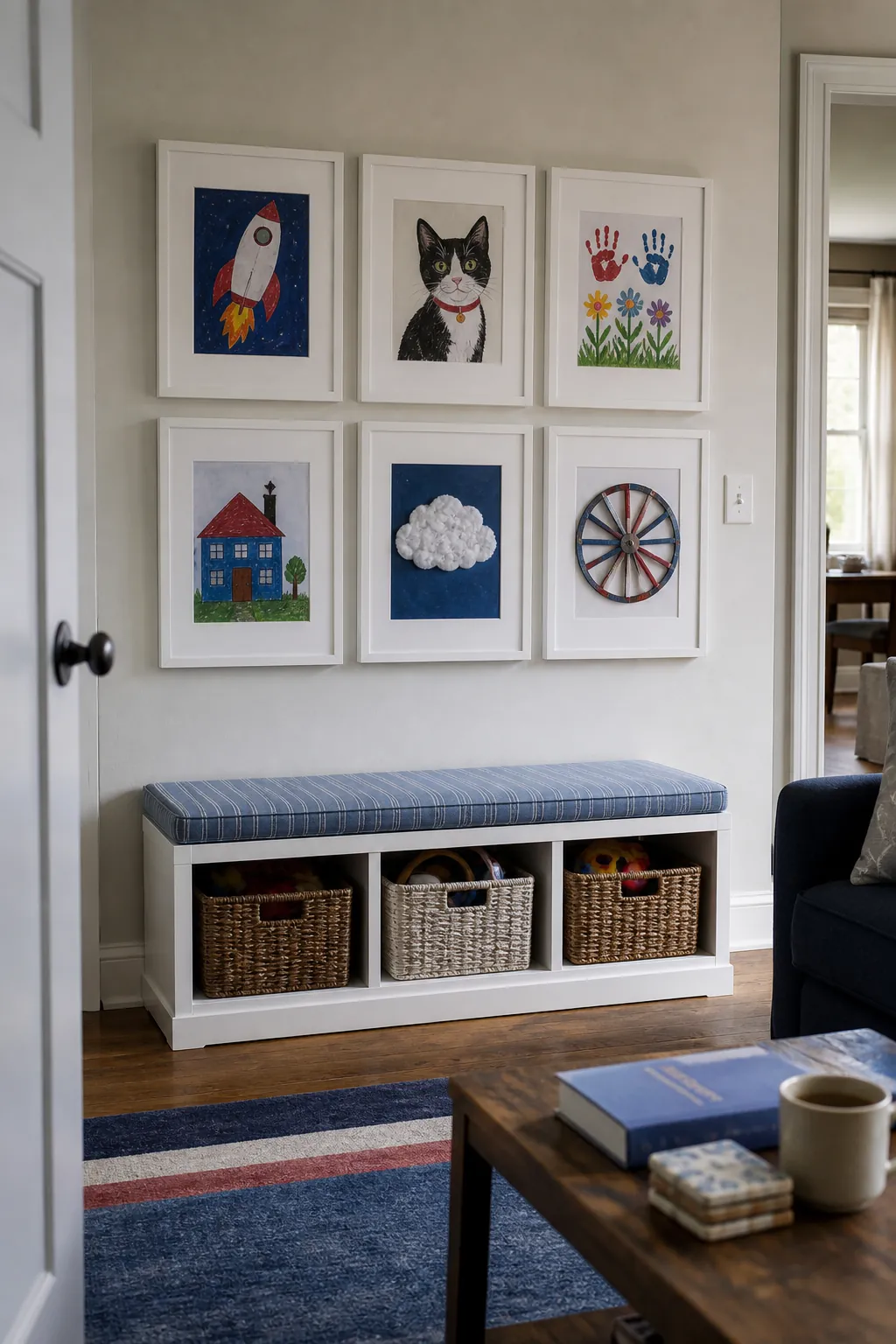
Mount the group above the family storage bench where new pieces can be collected and swapped as part of the room’s routine. Keep original dates or stories on the hidden back rather than adding visible labels to the wall. Open every frame after installation to verify that its door clears neighboring frames and bench objects.
Frame Music Memories Without Looking Themed
Music memories feel more personal when shown through details rather than a wall of record covers. Crop guitar strings, record grooves, and a concert crowd into near-abstract images, then add a few ticket fragments for texture. The result can relate to the record-player console without resembling themed entertainment-room decor.
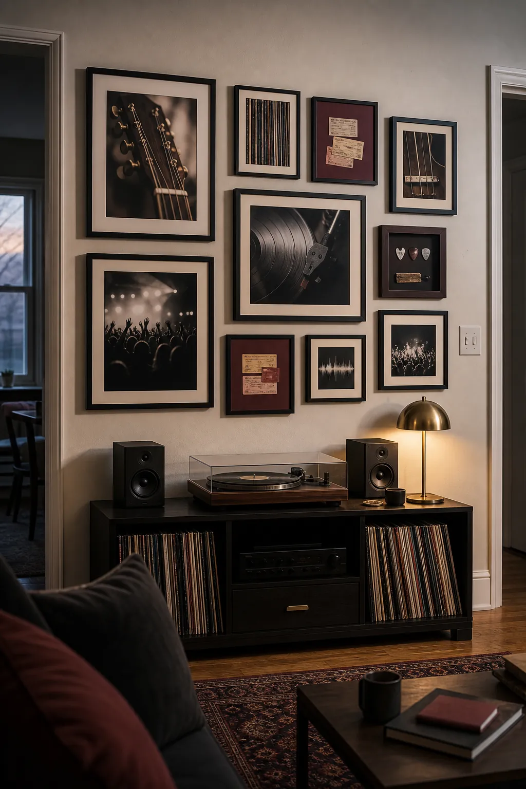
Use one subdued print treatment to reconcile sources of different ages and quality. Keep the lowest works clear of an open turntable lid, speakers, and hands reaching for albums.
Lean Large Frames on a Long Picture Ledge
Three large leaning frames give a long ledge enough scale above a low modular sofa. Abstract paper works and a textile create broad fields of texture, while two smaller overlaps break the row without filling every inch.
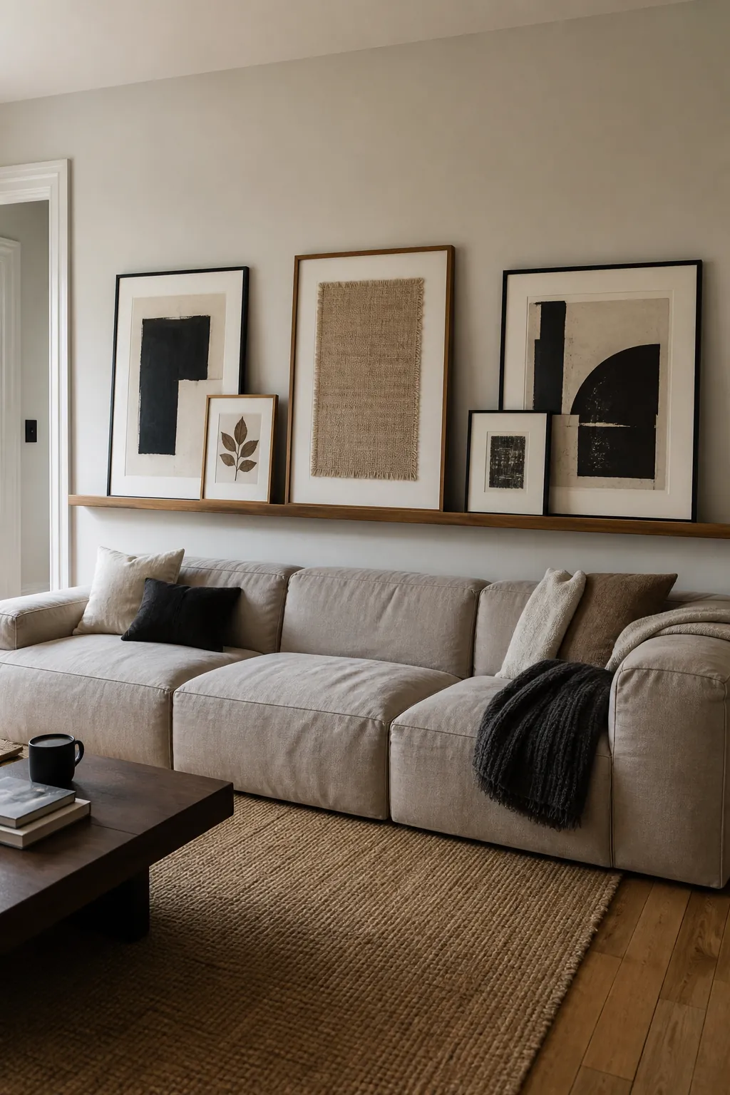
Give the tallest frame secure support and enough wall contact that it cannot tip forward. Shift the overlaps until each large artwork retains a recognizable silhouette. From a seated position, check that the ledge and frame bottoms sit comfortably above heads rather than looming over the cushions.
Suspend Art From a Traditional Picture Rail
A traditional picture rail allows shell, hand, and historic-tool etchings to hang with visible brass chains. Vary the chain lengths so the five frames settle into a composed group rather than a row suspended at one height. The vertical lines add formality that suits a period sitting room.
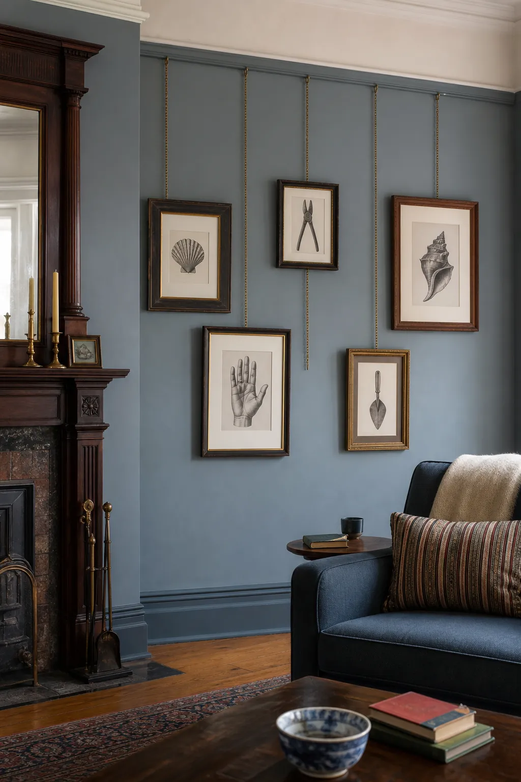
Use hanging components intended for the rail and the weight of each frame, then add discreet stabilizers if pieces shift in normal room movement. Check the composition from the fireplace corner, where crossing chains or poorly spaced verticals are easiest to notice.
Orbit Small Frames Around a Round Mirror
A round brass mirror can anchor small cameos, red floral gouaches, and intimate paper fragments near a living-room entry. Arrange the frames around part of the curve rather than forming a perfect decorative halo.
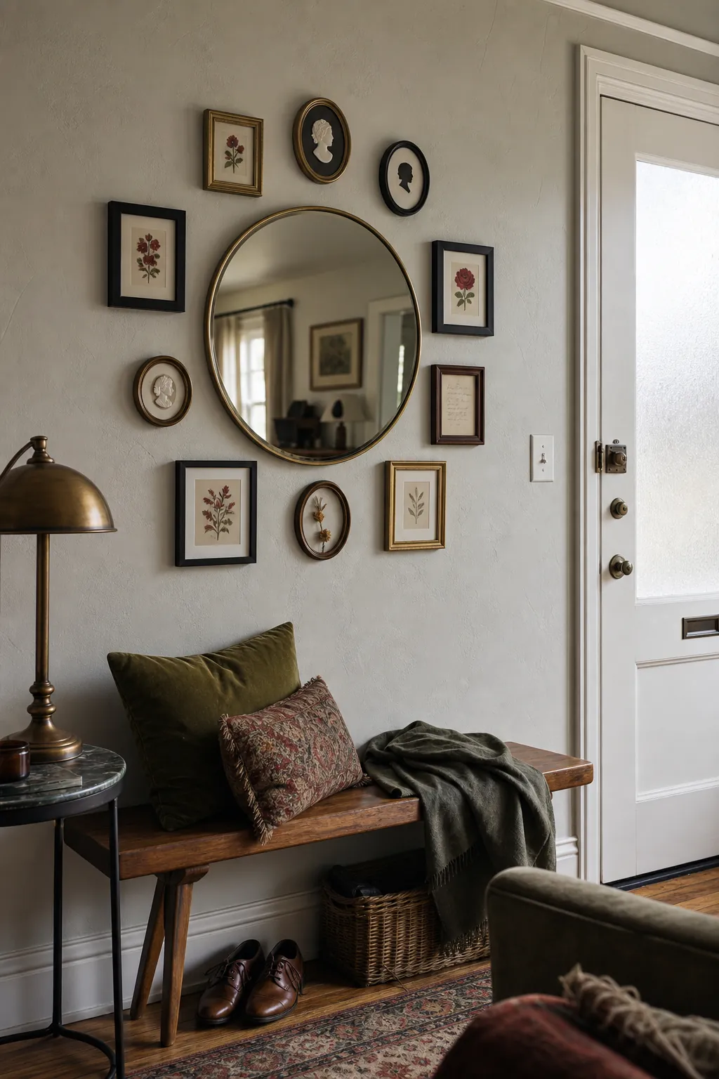
Let the closest edges roughly follow the mirror’s arc while preserving uneven gaps that suit the varied silhouettes. Aim the reflection toward the room, not directly at the entry clutter or a harsh lamp. From the nearby bench, make sure none of the petite frames disappear behind the mirror rim at an angle.
Let a Dark Accent Wall Unify Pale Art
A deep blue wall makes pale mats, white reliefs, and quiet architectural photographs read as a connected collection. The strong background reduces the need for matching frames, because every light shape receives the same dark outline. Camel leather below adds warmth without repeating the art palette.
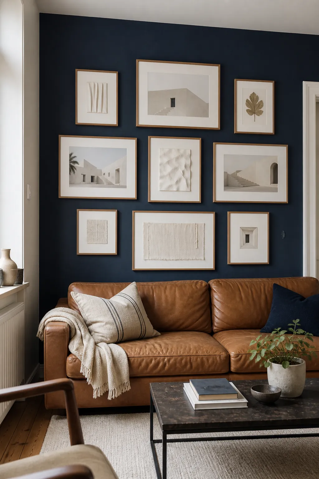
Sample the blue behind actual glazing, since reflections can amplify coolness and make cream paper appear dingy. Review the full wall from a distant corner to distribute the brightest works without creating a row of white squares.
Mix Tiny Art With Generous Negative Space
Seven tiny pieces gain importance when they occupy a compact boundary surrounded by abundant bare wall. Pressed petals, miniature portraits, and a recipe fragment invite a close view that suits a narrow console nook.
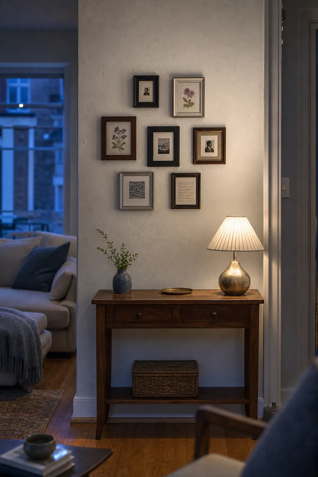
Keep the group tighter than instinct may suggest, using the console rather than the whole wall as its scale reference. Vary frame shape while limiting finish changes, so the collection feels intimate instead of fussy. Leave the neighboring wall deliberately empty; that pause is essential to the idea.
Contain an Organic Mix Inside One Rectangle
Twelve varied frames can look spontaneous inside while maintaining a crisp rectangular perimeter. Mix abstract prints, object photographs, a textile, and botanical relief, placing irregular shapes toward the center and straighter edges along the outside. This boundary gives a multipurpose storage cabinet a composed backdrop even when the individual works are eclectic.
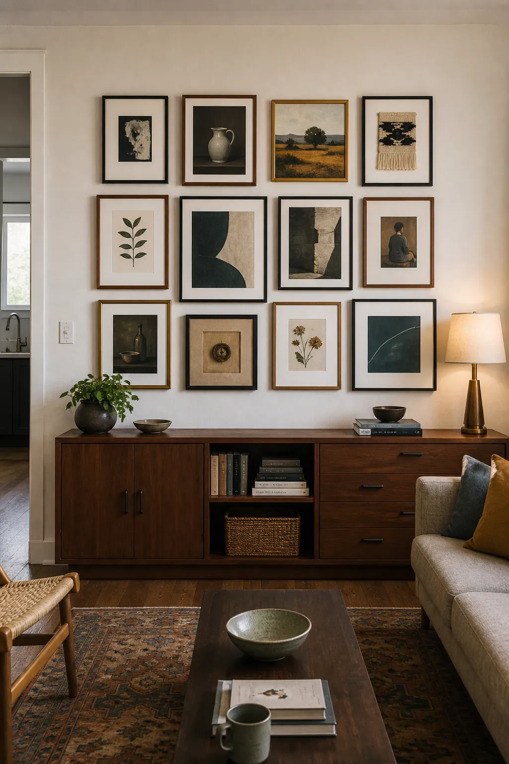
Mark the outer corners first, then solve the interior gaps on the floor before transferring the arrangement. Step straight back after each row to catch a frame that breaks the intended perimeter or overloads one quadrant.