
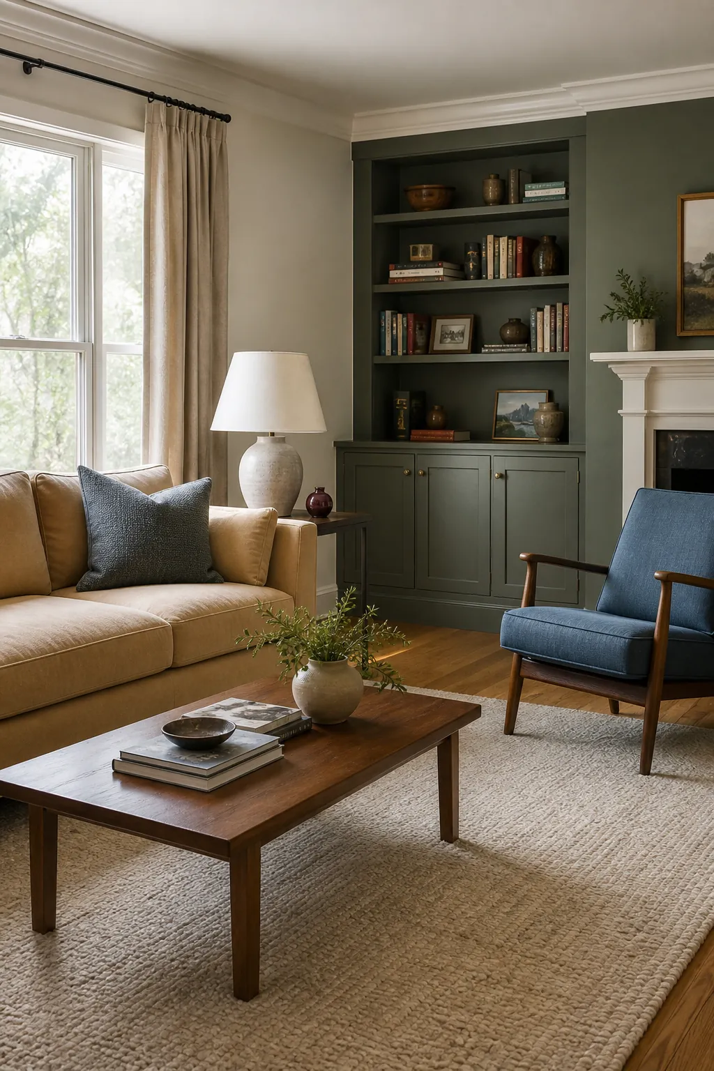
Home Depot’s BEHR wall gives you hundreds of options, but a useful shortlist should cover different light levels, undertones, and moods—not nineteen versions of beige. The colors below come from BEHR’s current palette and range from flexible whole-room neutrals to concentrated colors for millwork or a cozy living room.
A visualizer is good for eliminating obvious mismatches, not approving a final gallon. Screens cannot reproduce paint, and a small wet patch can be misleading. Paint two coats on a movable sample board, let it dry, and compare it against flooring, trim, sofa fabric, and lamps for at least a full day.
Blank Canvas
Blank Canvas is a warm off-white that gives living rooms openness without the hard glare of a blue-white. It works with oak, walnut, linen, stone, and black accents.
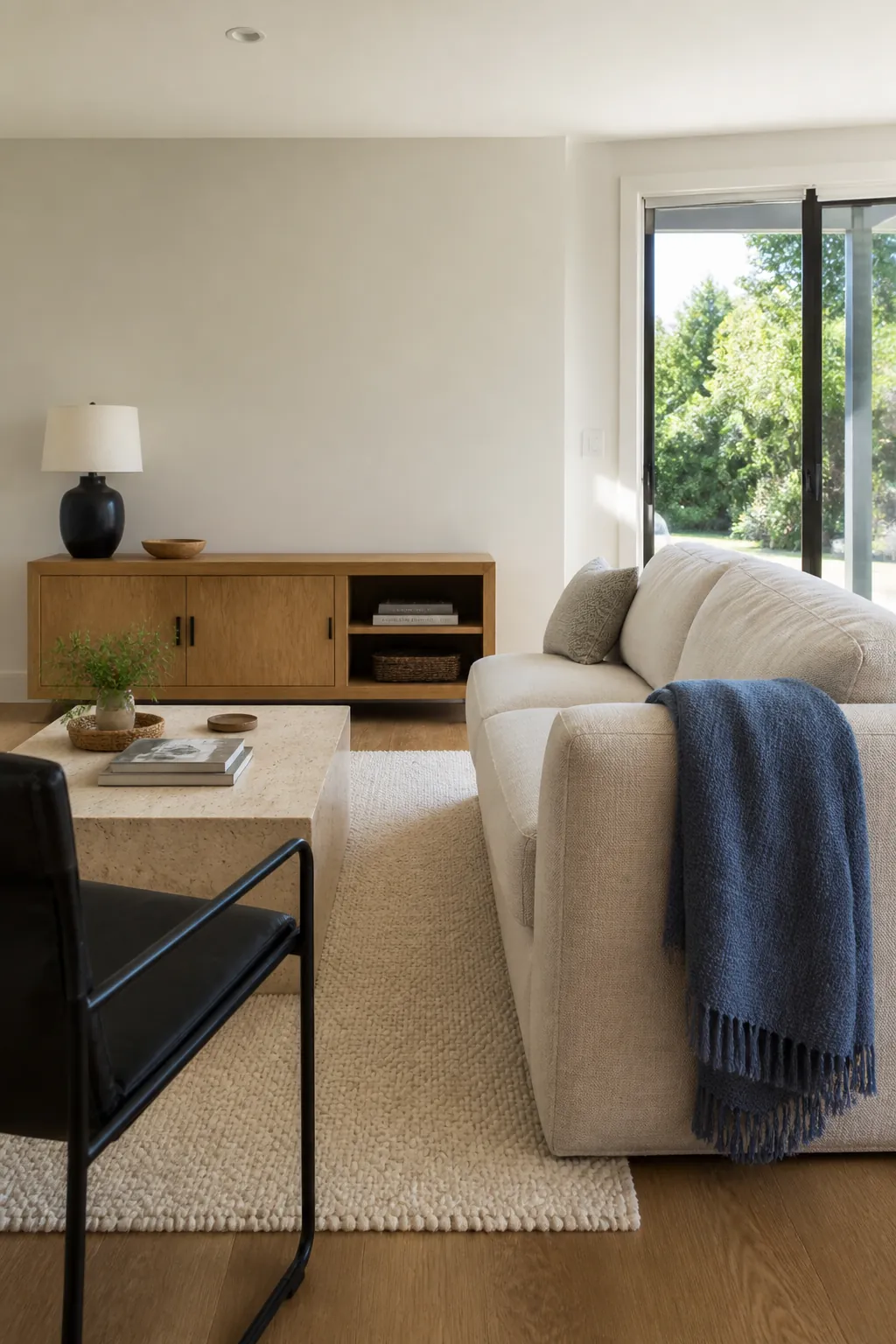
Compare it directly with existing trim. If the trim is much creamier, use Blank Canvas on both walls and trim in different sheens or choose a warmer partner.
Dainty Lace
Dainty Lace brings a softer, slightly aged quality to pale walls. It is well suited to new traditional living rooms with cream upholstery, antique wood, and muted patterned rugs.
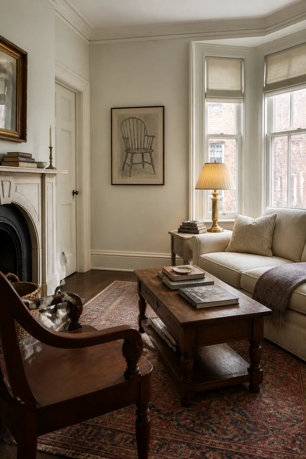
Use clear contrast in lamps, tables, or textiles so a pale palette still has structure. Several nearly identical creams can look unfinished.
Wheat Bread
Wheat Bread is a grounded beige that suits warm wood and whole-home paint schemes. Its depth helps bright rooms feel settled while remaining quiet enough for connected spaces.
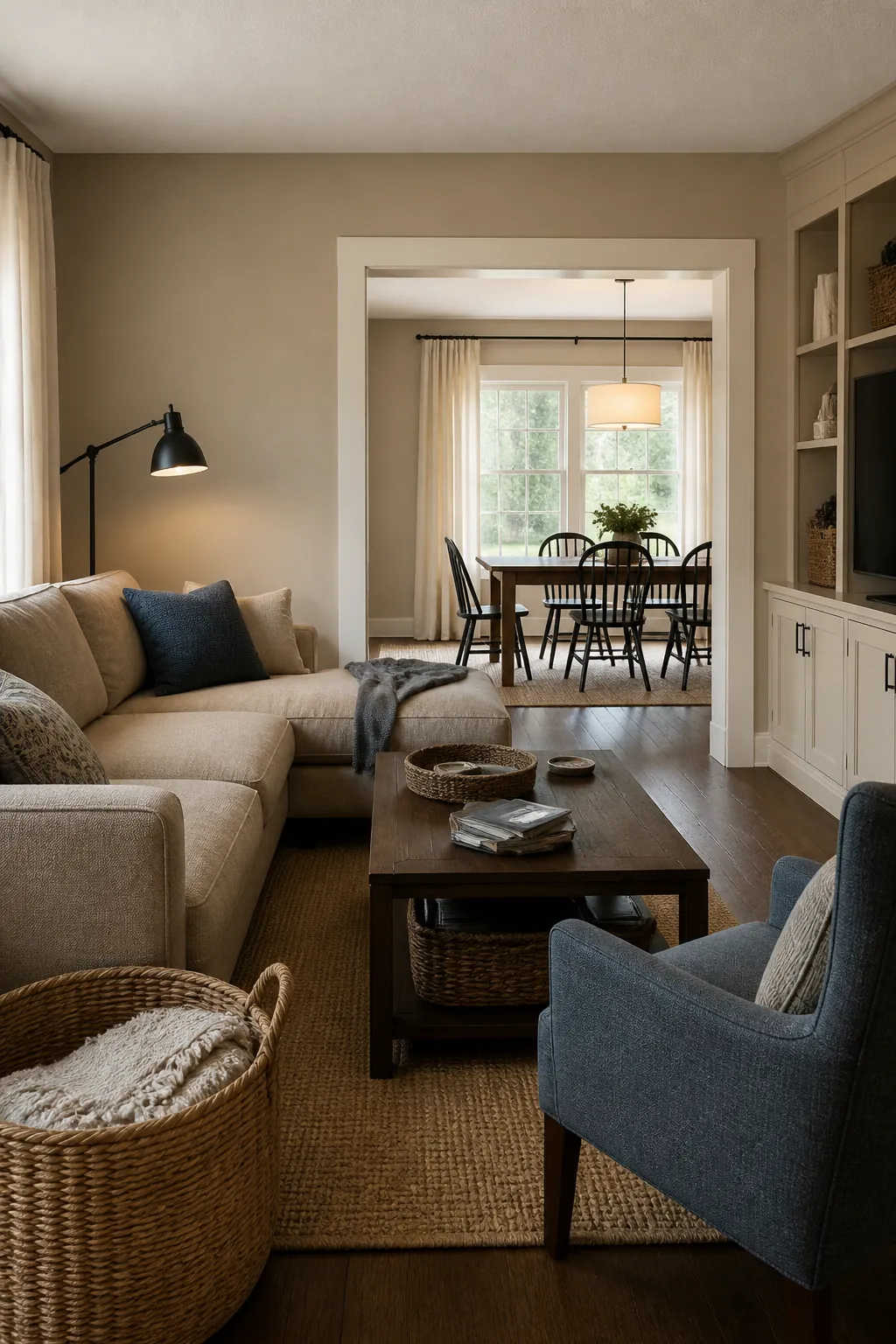
Pair it with cream, dark brown, and faded blue. Avoid filling the rest of the room with the same middle-value tan.
Mocha Ice
Mocha Ice offers mushroom-like warmth with a modern edge. It can bridge gray stone, brown furniture, and off-white trim more gracefully than a cool gray.
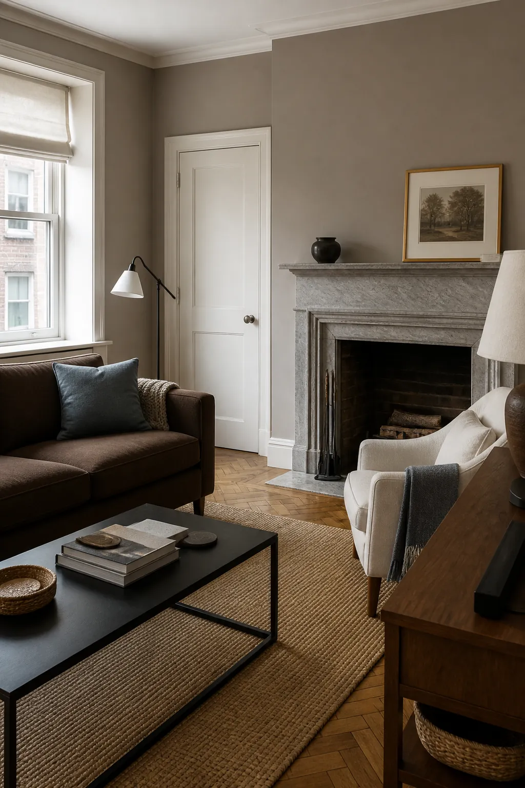
Test beside flooring first. Mushroom neutrals reveal more violet next to strongly yellow beige.
Smoked Tan
Smoked Tan creates a cozy neutral backdrop with enough brown to hold substantial furniture. Blue, olive, cream, and black keep it current.
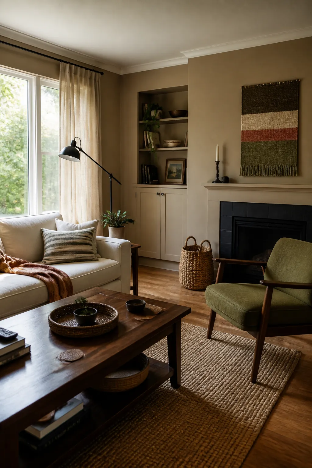
Use it where strong afternoon light washes out paler colors. Under warm bulbs, confirm that it remains tan rather than orange.
Rodeo Tan
Rodeo Tan gives a relaxed family room warmth without requiring a rustic theme. It is a practical companion for leather, medium oak, denim, and cream canvas.
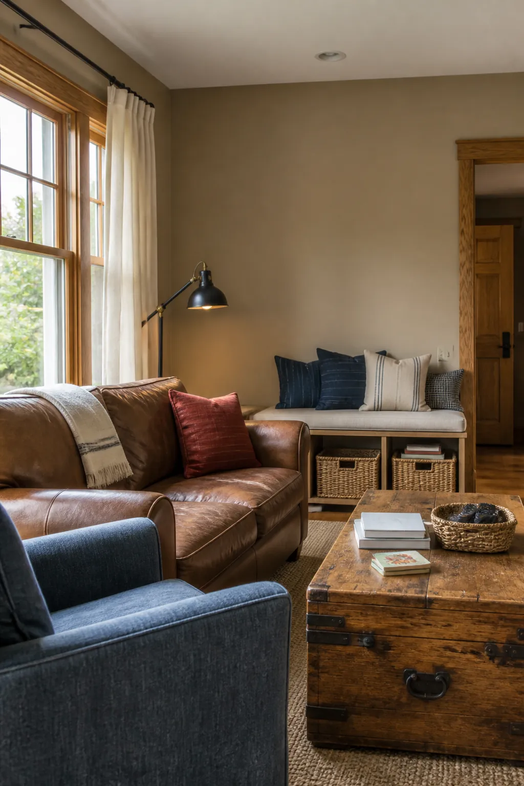
Keep the styling simple and material-led. Distressed signs and excessive western props make a versatile neutral feel themed.
Hidden Gem
Hidden Gem, BEHR’s 2026 Color of the Year, is a smoky jade blue-green. It gives walls or built-ins depth while remaining grounded beside walnut, camel, boucle, and aged brass.
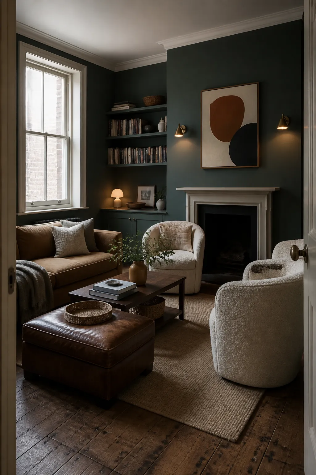
Use warm-white light and pale textiles if the room is small. The blue-green shifts substantially between window and evening light.
Urban Nature
Urban Nature is a quiet green that brings color to a neutral room without demanding a total redesign. It pairs naturally with oak, flax, black metal, and clay.
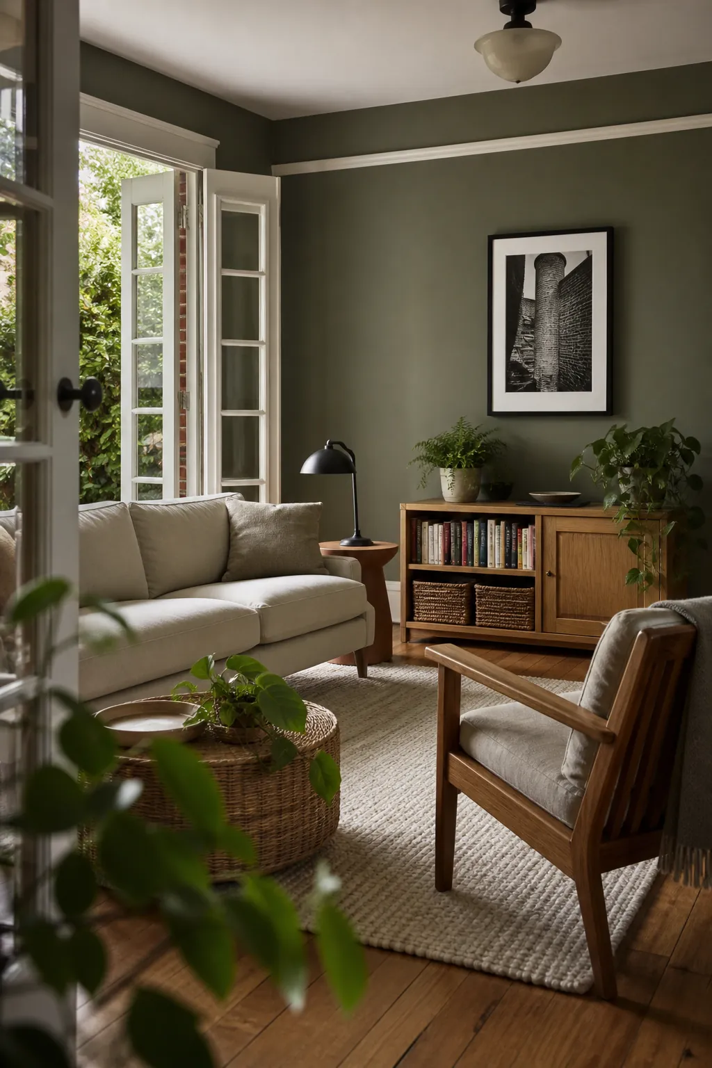
Let plants vary from the wall color instead of matching them. Tonal greens make both foliage and paint more believable.
Ecological
Ecological offers an earthier, more architectural green. Try it on bookcases, lower wall paneling, or all four walls in a garden-facing room.
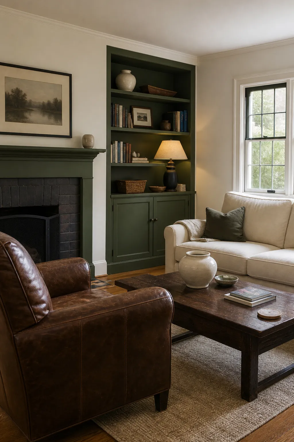
Cream upholstery and tobacco leather keep it warm. A small black element gives the green a clean boundary.
Watery
Watery is a soft blue-green suited to small living rooms and low-contrast schemes. Natural wood and woven fibers prevent it from feeling like a bathroom color.
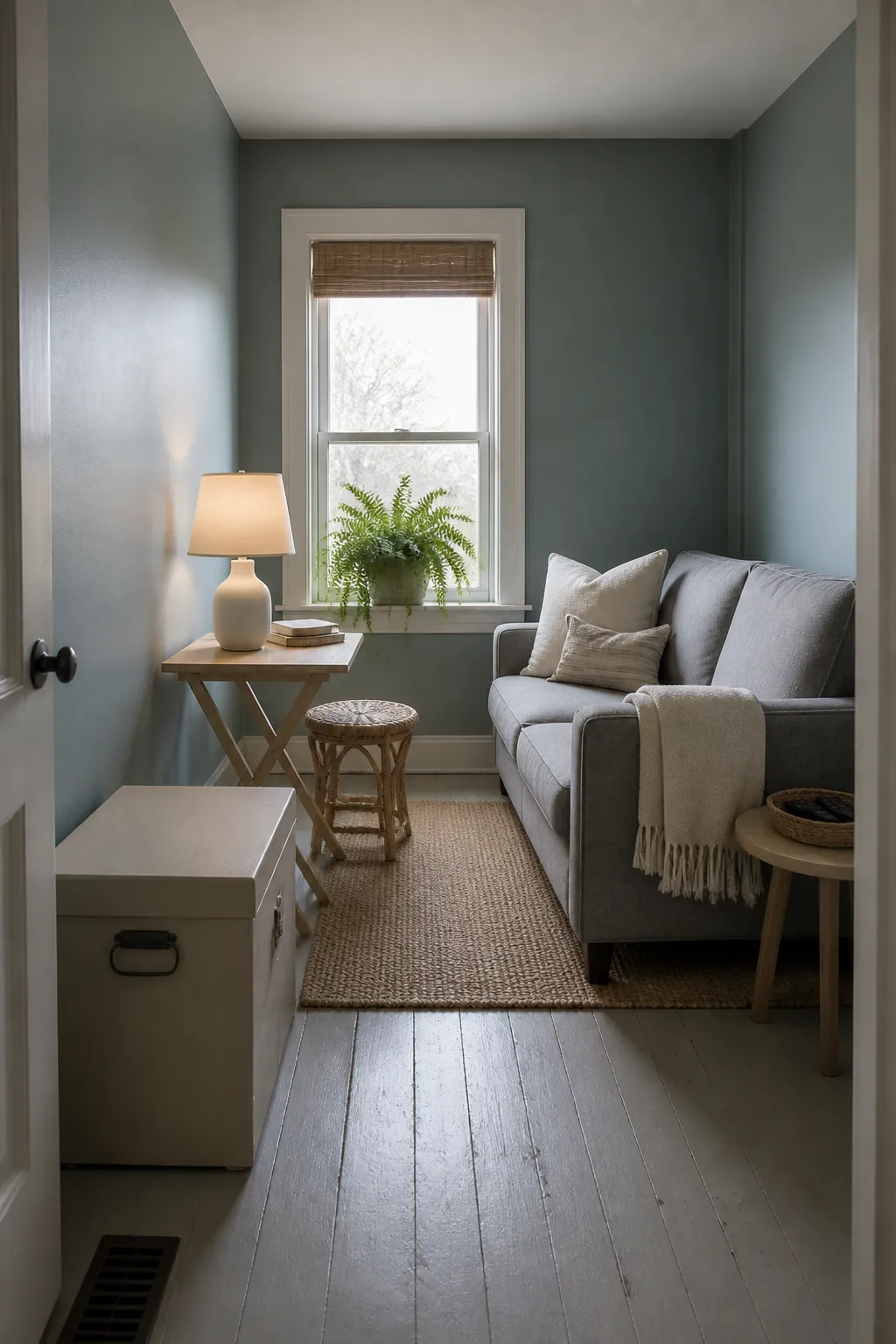
Sample it on every wall; pale blue-greens can turn cooler opposite a window and greener beside warm flooring.
Adirondack Blue
Adirondack Blue gives a room calm mid-tone color with enough weight for a living area. Walnut, cognac, rust, and parchment are natural partners.
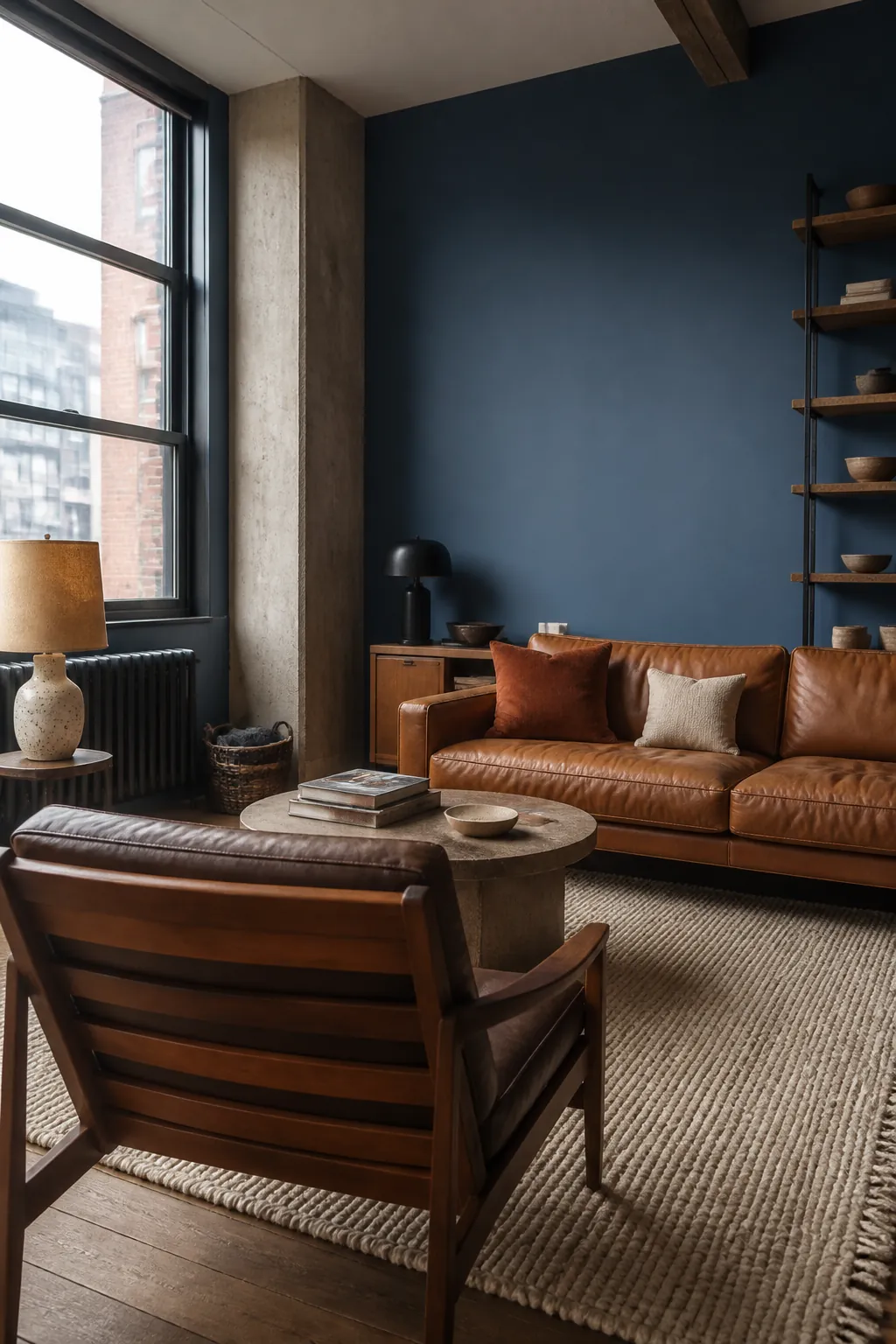
Use it on walls or millwork, then repeat the blue once in a pattern. Too many matched accessories flatten a nuanced color.
Nocturne Blue
Nocturne Blue is the choice for a library-like or evening-focused room. Its darkness works when pale seating and several low lamps preserve visible layers.
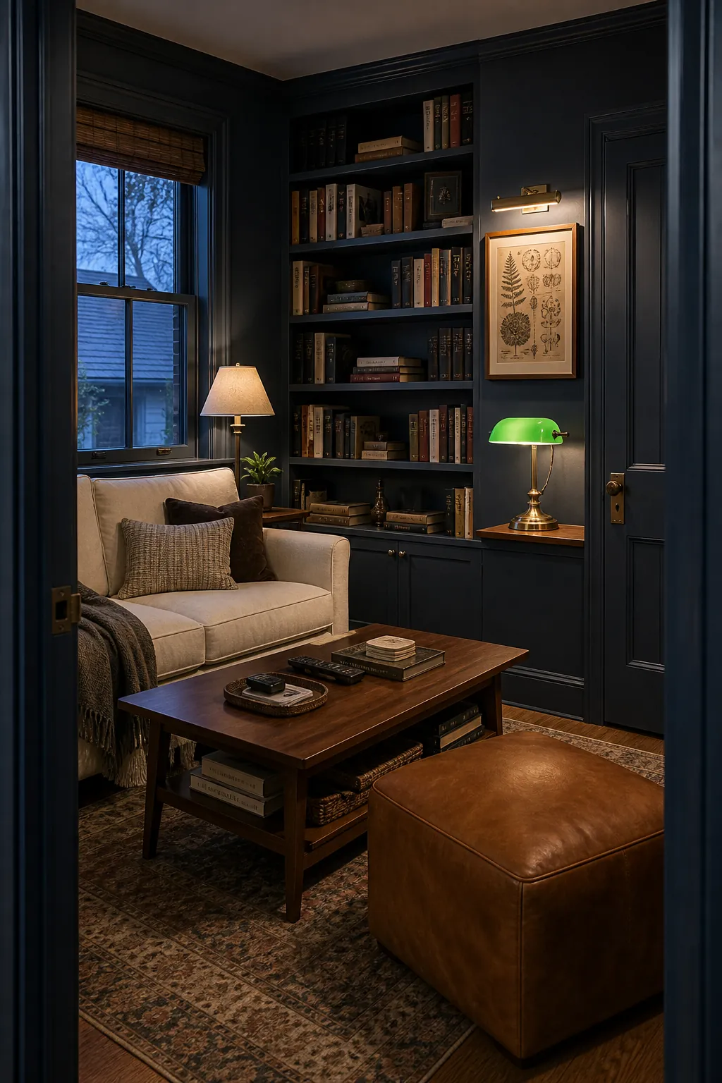
Paint trim to match for a calm envelope or keep it parchment for stronger architecture. Decide after viewing both samples at night.
Iced Copper
Iced Copper is a warm blush with more mineral restraint than clear pink. It flatters olive, dark wood, brass, cream, and brown leather.
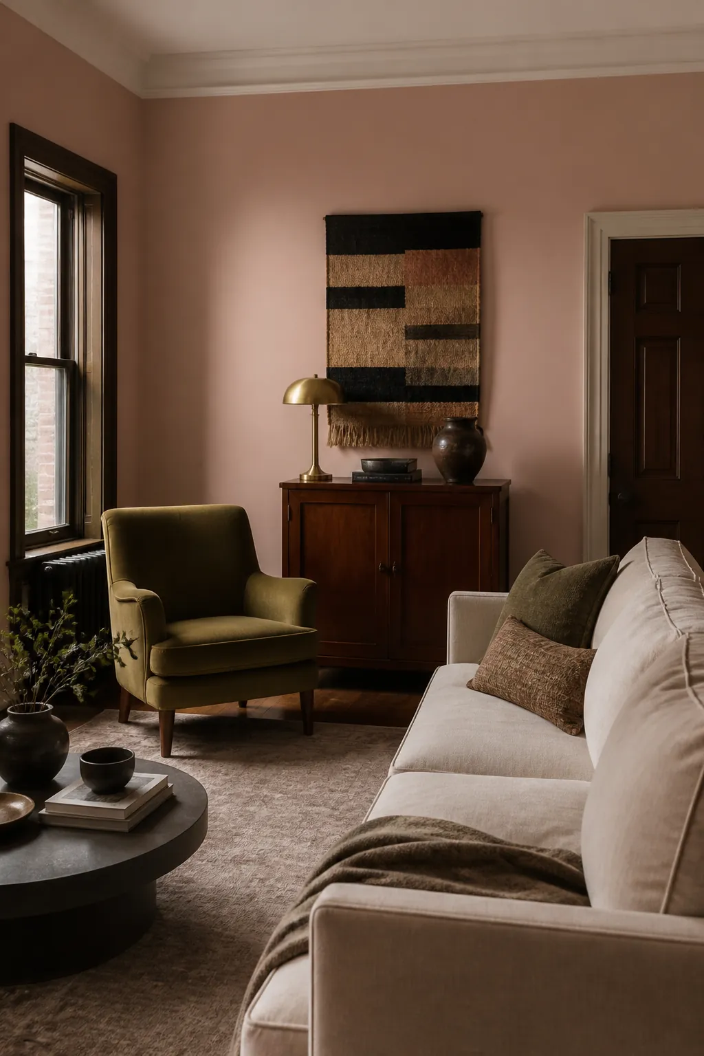
Use it where evening light matters. The color becomes warmer under lamps, so neutral bulbs protect its sophisticated side.
Terra Cotta Urn
Terra Cotta Urn introduces clay warmth that feels architectural beside limestone, flax, dark timber, and blue-green pottery.
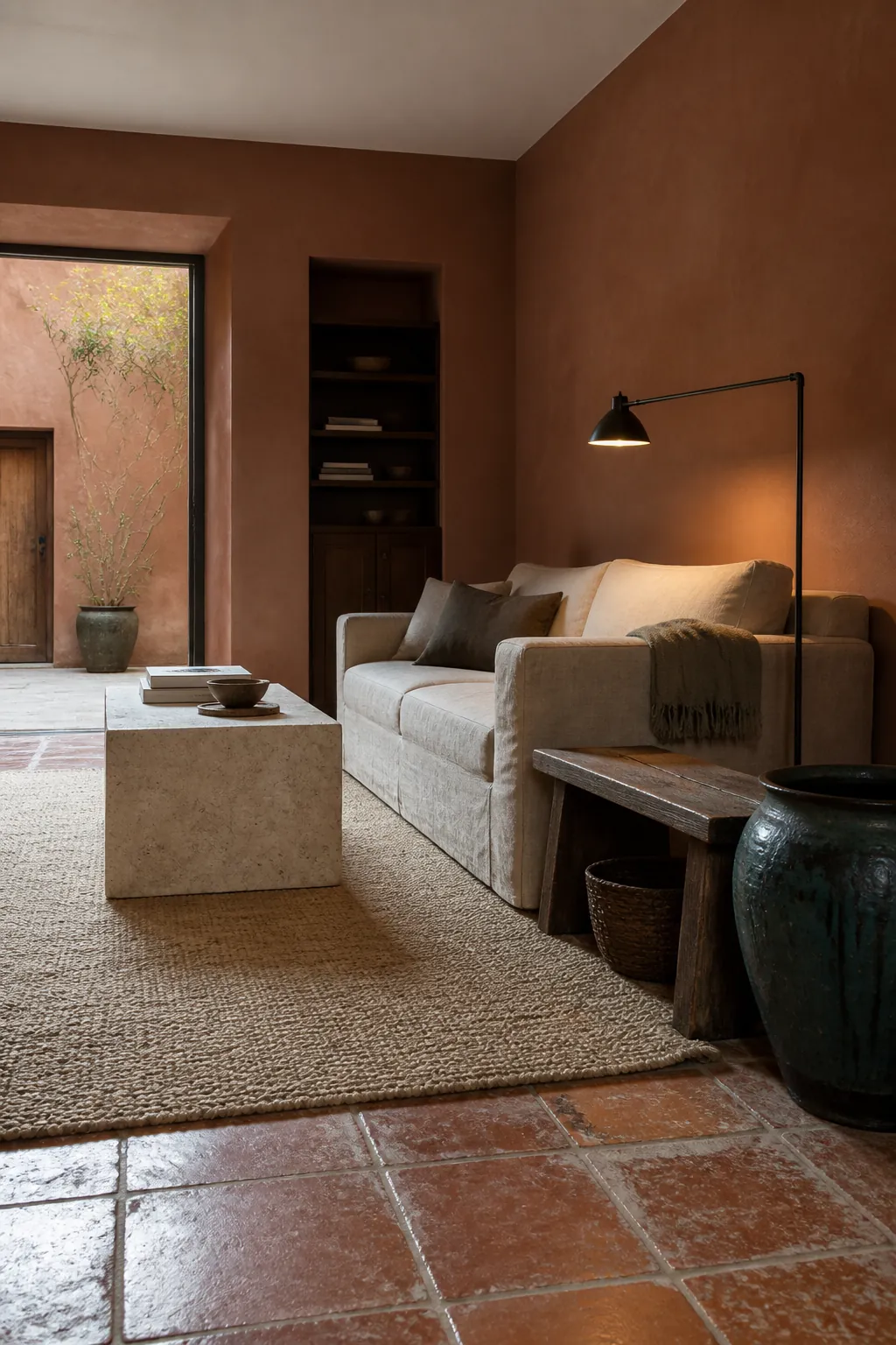
Keep it matte and avoid a global warm filter in the lighting. The shade should resemble fired clay, not bright orange.
Beehive
Beehive adds a muted ochre note to rooms that need sunlight and energy. Blue textiles, walnut, and chalky white keep the yellow grounded.
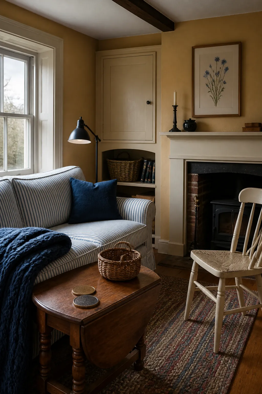
It is strongest in cloudy rooms or as a selected wall. Test under warm lamps so it does not become overly golden.
Rumors
Rumors is a deep ruby red suited to built-ins, doors, or intimate walls. Parchment, dusty blue, walnut, and aged metal make it feel collected.
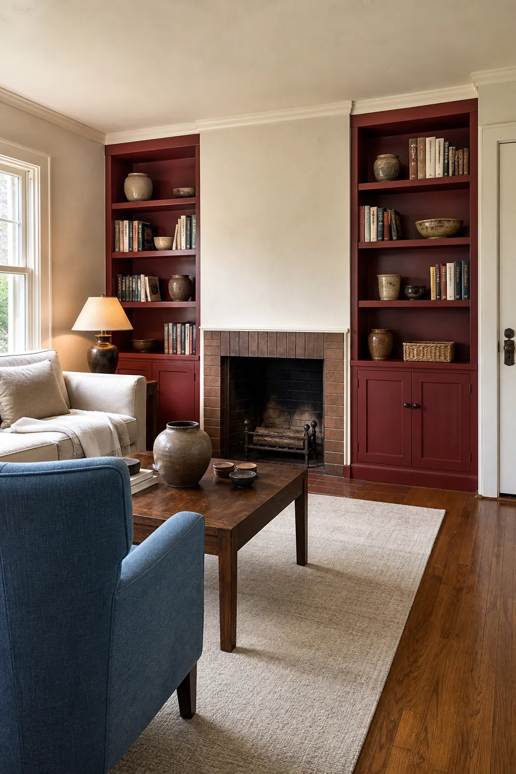
Start on joinery if full walls feel risky. A lower-sheen finish shows the color’s brown depth more calmly.
Curtain Call
Curtain Call brings wine-like drama to an evening living room. Pair it with cream wool, camel, walnut, and one cooler lavender-gray detail.
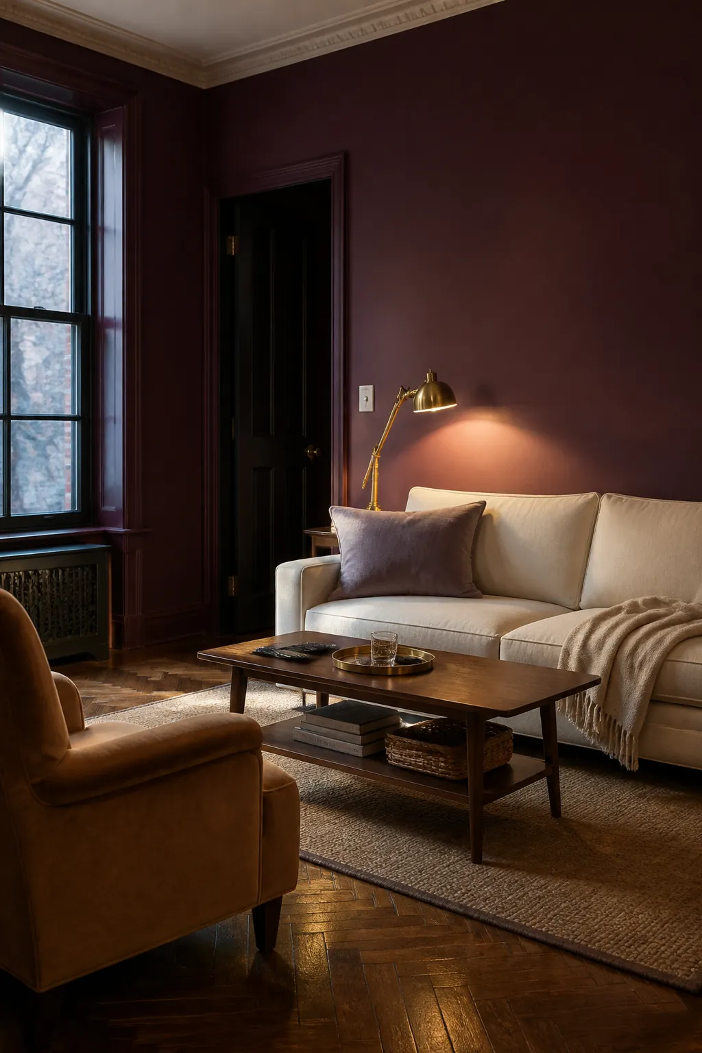
Distributed lamps are essential. One overhead light can leave deep red walls flat while several pools reveal their complexity.
Baronial Brown
Baronial Brown creates an enveloping room that connects naturally to walnut, leather, cream, and stone. It can be more flattering than charcoal beside warm fixed finishes.
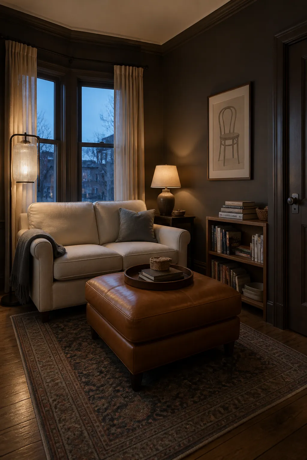
Use glass, pale textiles, and lights at several heights. The goal is a rich envelope, not a room where corners disappear.
Cracked Pepper
Cracked Pepper is a soft black for media walls, built-ins, trim, or full color drenching. It outlines architecture and makes warm wood and cream fabric look clearer.
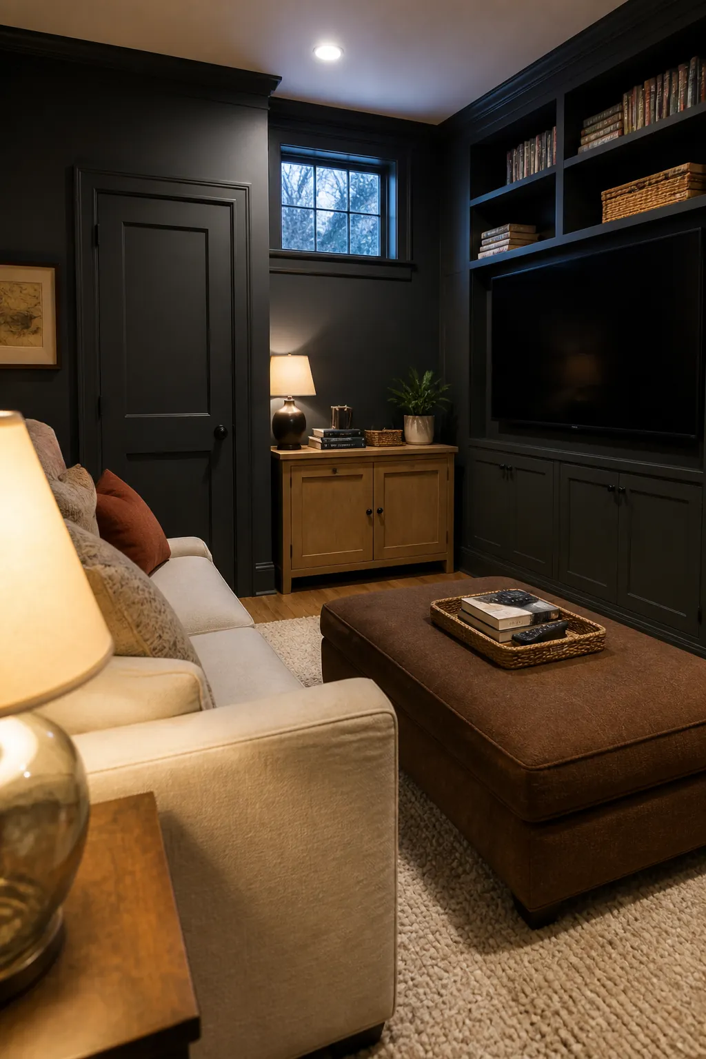
Test it beside the room’s stone and flooring, then choose sheen by surface: lower sheen calms walls, while more durable finishes suit trim and cabinetry. The best Home Depot living room paint color is not the most popular chip; it is the dried sample that improves every fixed finish in your actual light.