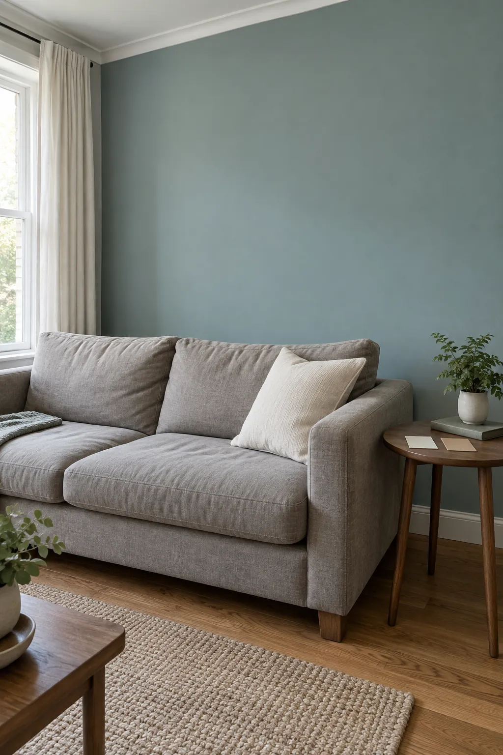
A paint sample can look calm in the shop and surprisingly blue beside your sofa. The floor, trim and daylight all change the comparison, so choose the room conditions before choosing a favourite shade. Start with colours that suit what you plan to keep, then test them where they will actually be seen.
Soft ivory for a room with warm timber
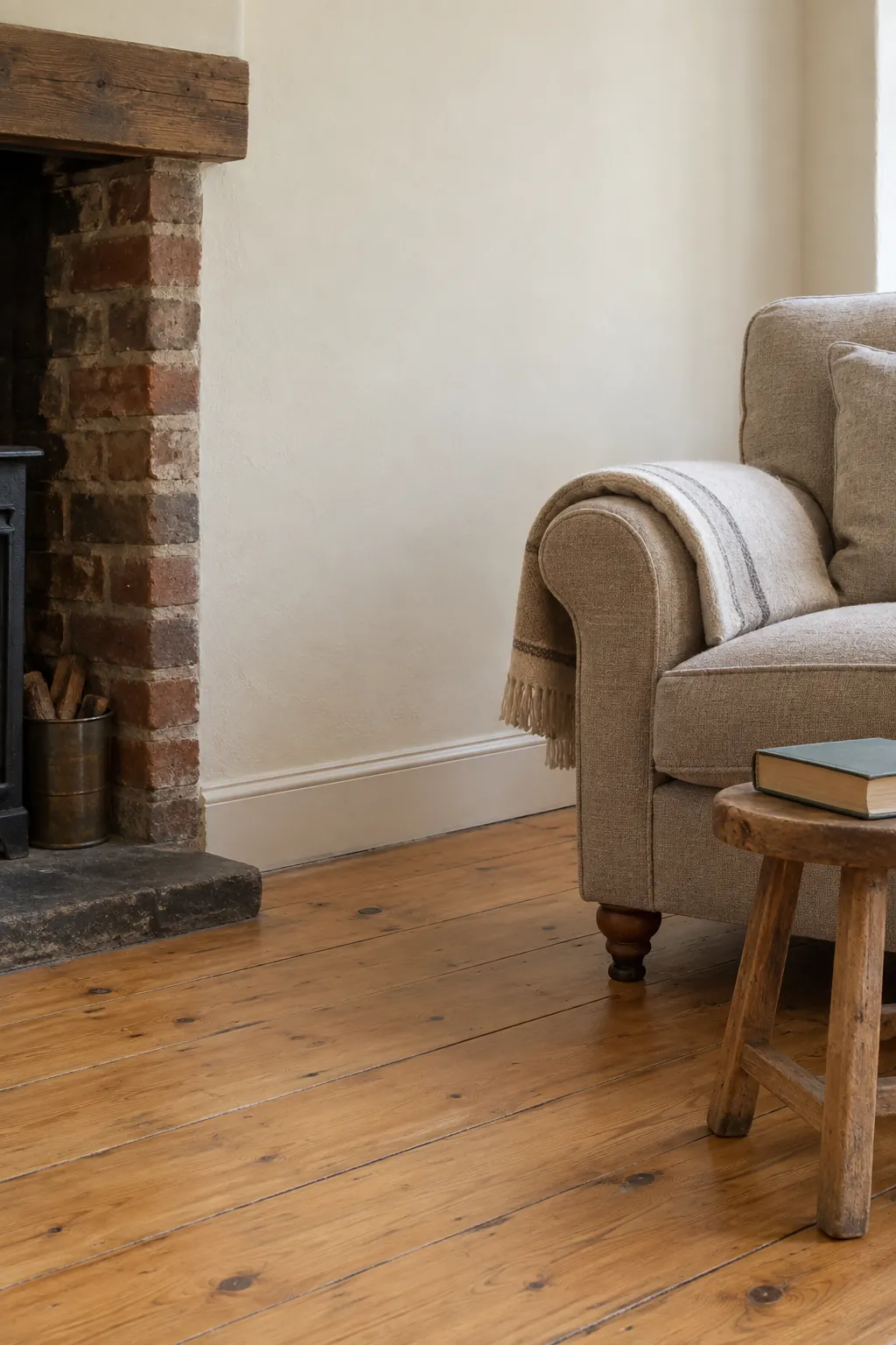
Ivory can sit comfortably beside honey coloured floors without the sharp contrast of a very cool white. Look for a sample that stays creamy rather than turning noticeably yellow in your evening light. In a farmhouse living room, plain linen and worn wood can provide the character while the walls stay quiet.
Chalk white around varied furniture
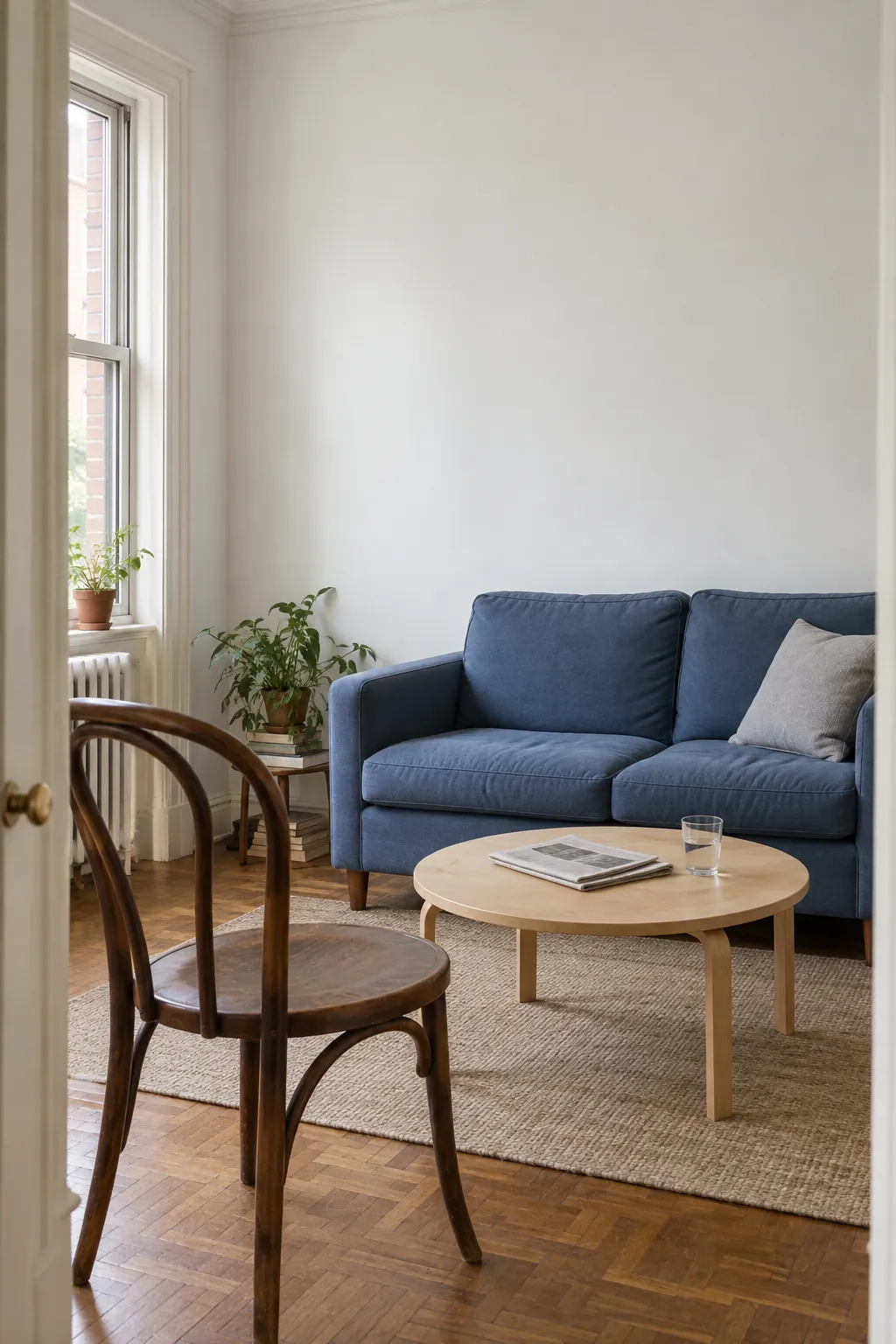
A chalky white gives differently coloured furniture a common background. Compare it with your existing trim, because two whites can make one another look unexpectedly grey or yellow. Choose the wall finish for the room’s use as well as its appearance, especially where chairs brush against the plaster.
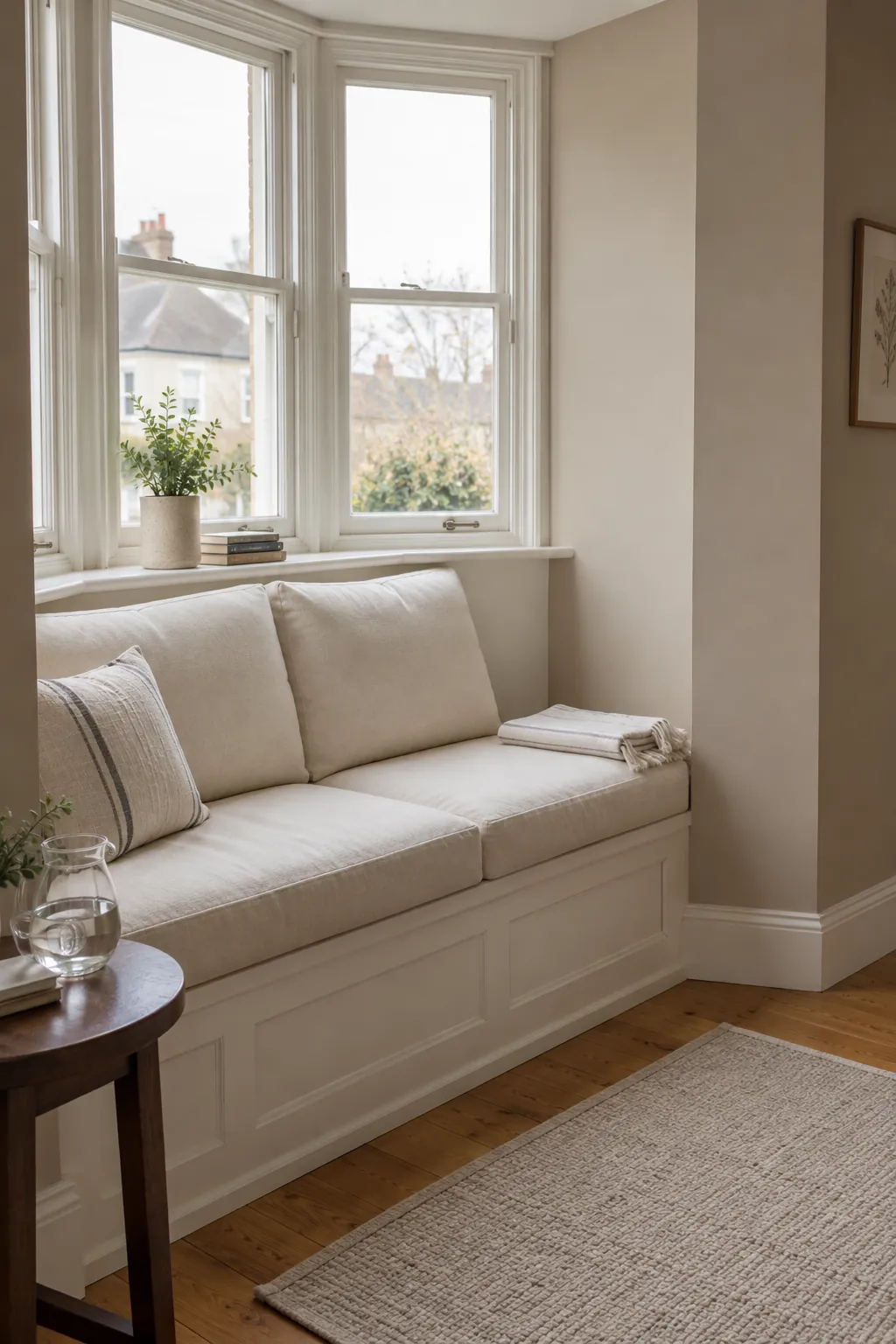
Oatmeal beside a pale sofa
Oatmeal paint creates a gentle outline around cream upholstery. Keep a visible difference between the wall and sofa rather than choosing two almost identical shades that clash by undertone. A darker wooden table can give this restrained combination a useful point of contrast.
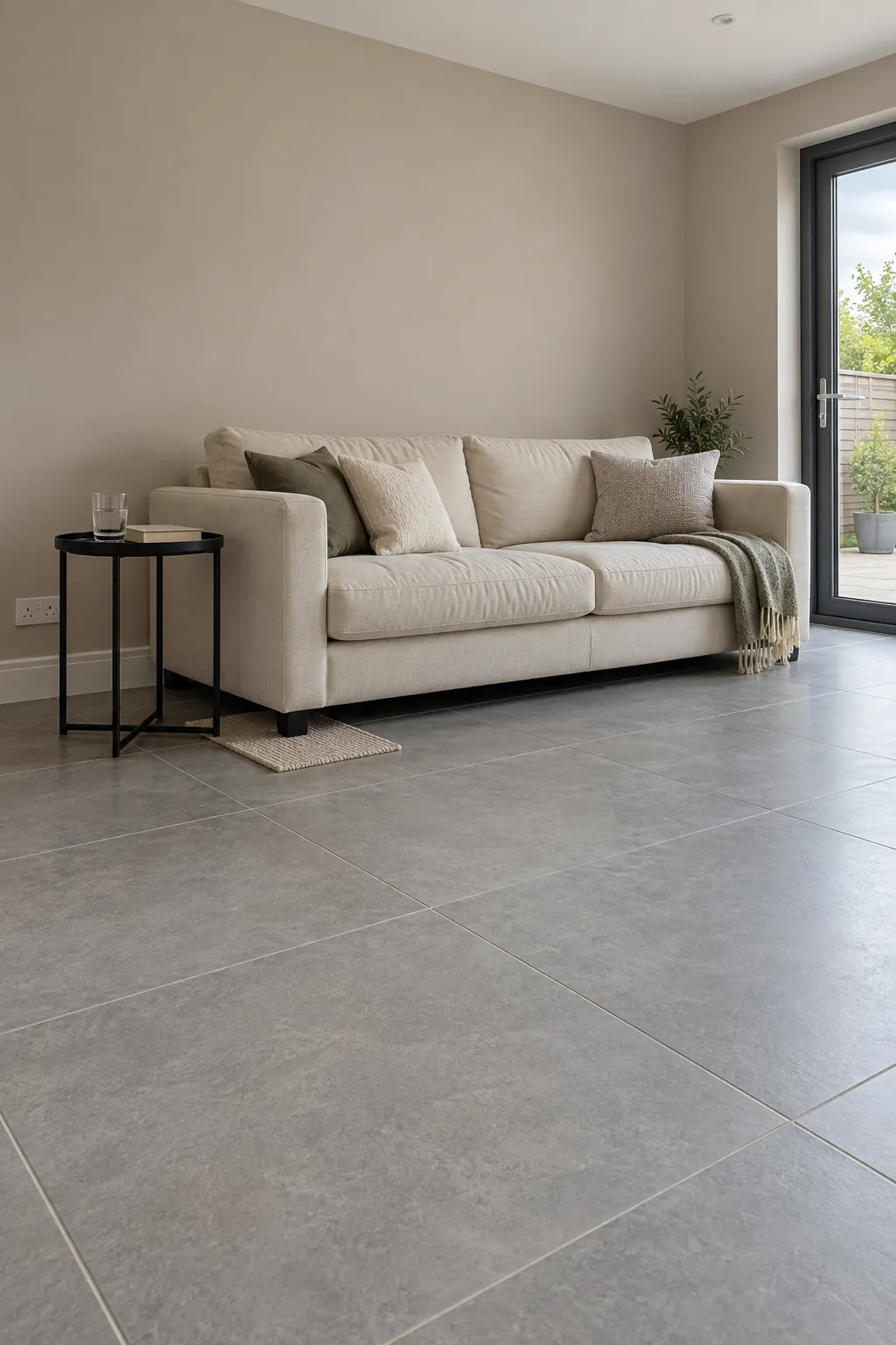
Warm greige with cool flooring
A greige with a modest warm base can soften a room dominated by grey tile. Test it directly above the floor instead of judging it against a white sheet alone. Some samples will show green or violet in that setting, so eliminate the ones that fight the fixed surface.
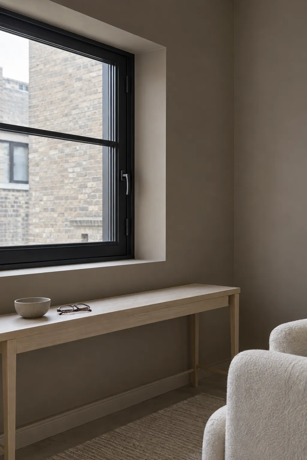
Mushroom with black window frames
Mushroom walls make black window frames feel deliberate while keeping the room softer than a stark monochrome scheme. The colour works best when its brown and grey components remain balanced in your light. Leave the window reveals uncluttered so the frame lines stay clear.
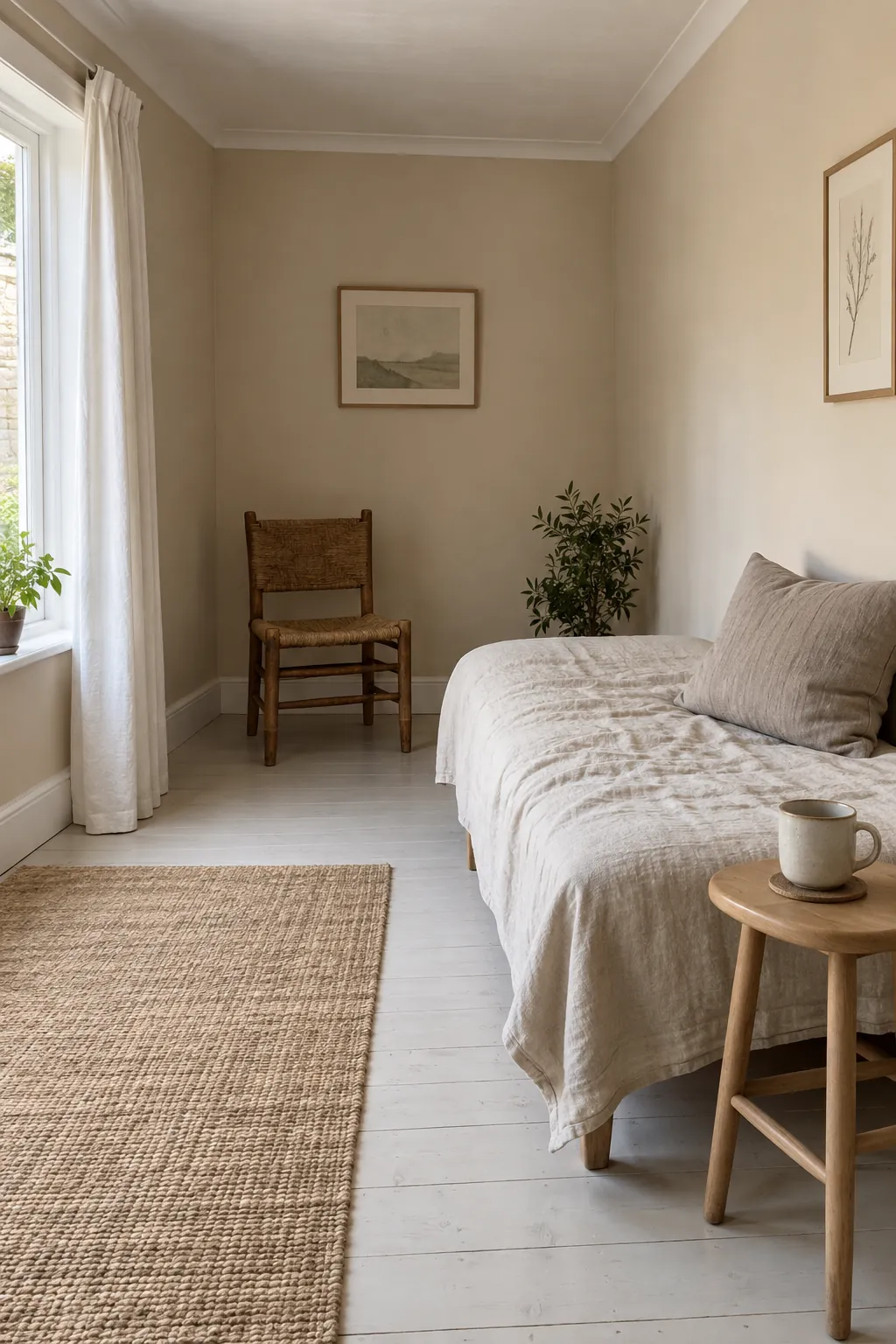
Pale sand for a relaxed sitting room
Sand paint offers warmth without the stronger yellow note of many creams. It can suit a sitting room used throughout the day, where changing light is more noticeable than a dramatic accent wall. Bring home a broad sample and view it near both the window and the deepest corner.
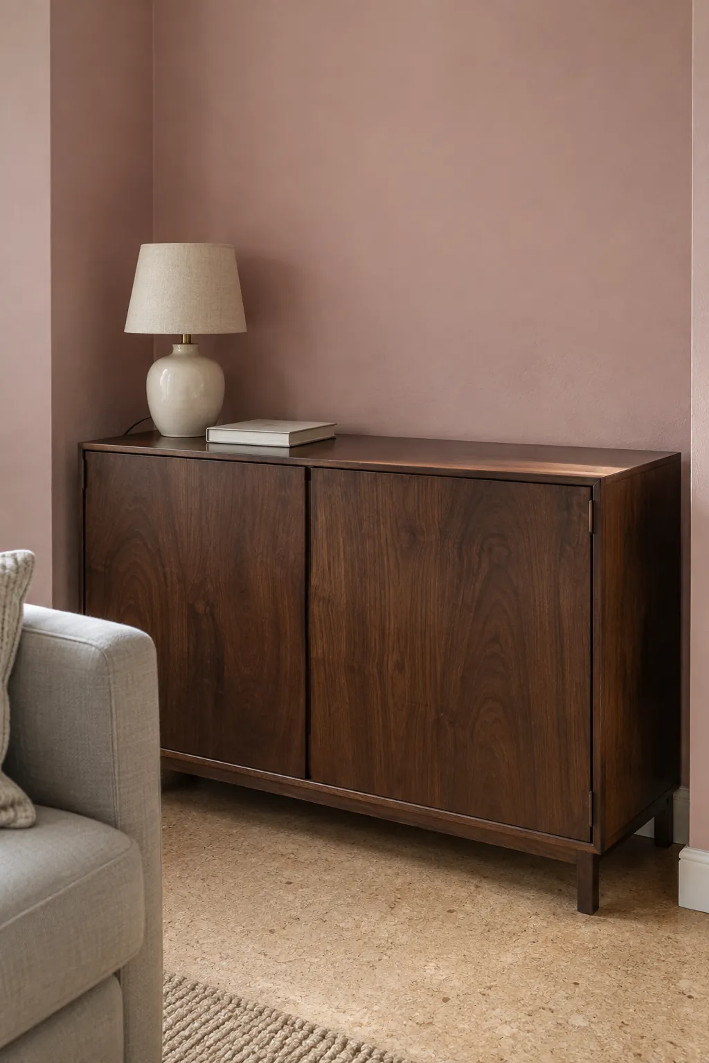
Dusty pink with dark wood
A muted pink wall can lift the appearance of dark wooden furniture without making the room sugary. Choose a pink with enough grey or brown to hold its character beside the wood. Plain upholstery keeps the wall colour from competing with several other strong choices.
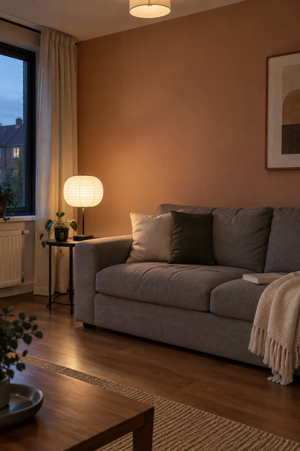
Clay for a room that needs warmth
Clay sits between pink, brown and orange, so individual paint samples can look quite different. Use it where you want an earthy background rather than a bright feature. Check the colour under your normal lamps, since a warm bulb can make an already warm shade feel much more orange.
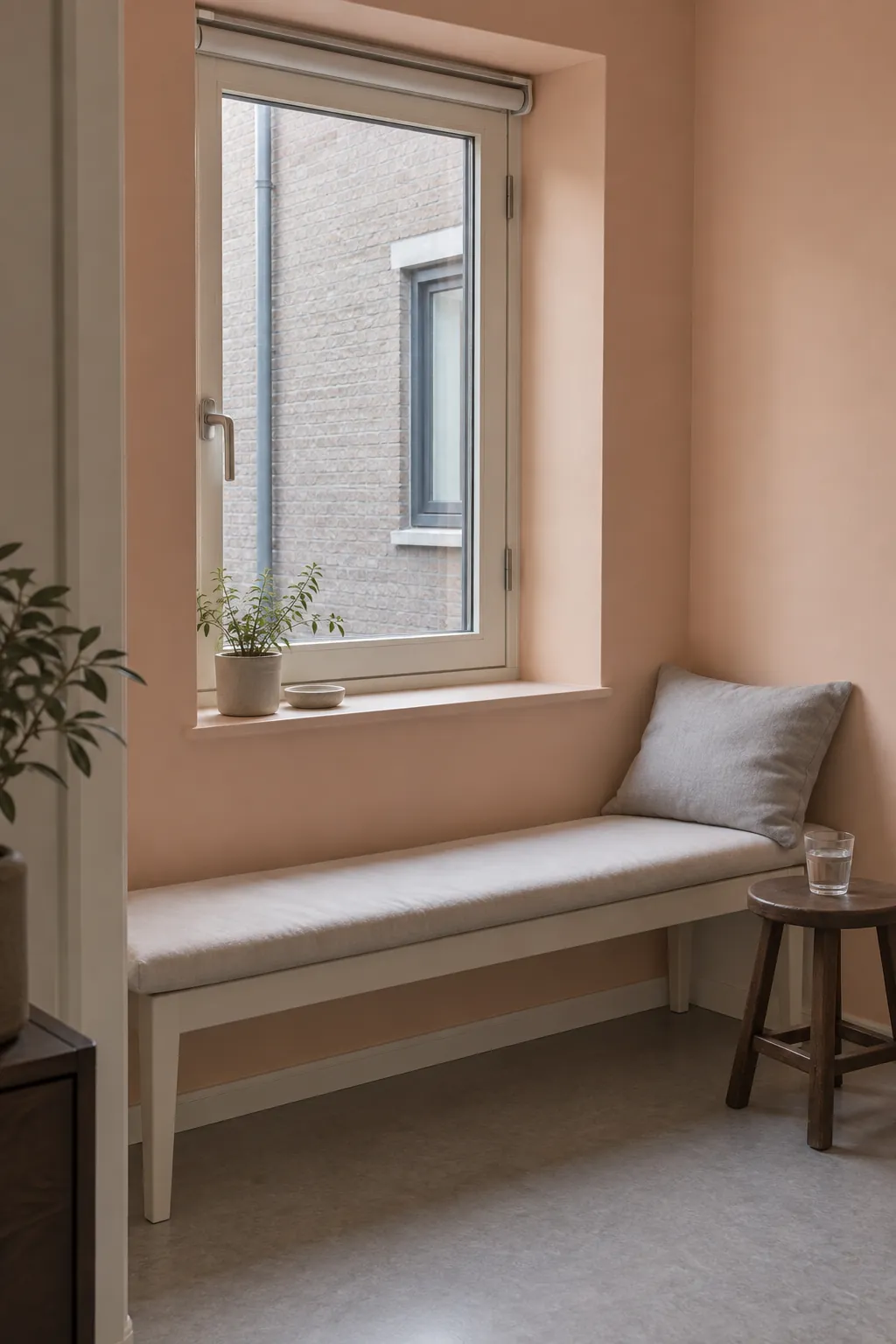
Pale peach near a shaded window
Pale peach can give a shaded room a warmer impression, but it will not create additional light. Keep the window treatment easy to open and place useful lighting where you read or work. A restrained peach sample is easier to live with than a saturated one across every wall.
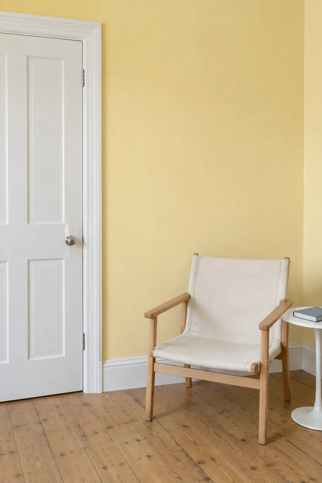
Butter yellow with simple white trim
Butter yellow brings a cheerful note to plain architecture. Keep the shade light and compare it with the trim before painting, because a creamy white can change how yellow the wall appears. Simple furniture lets the colour carry the room without requiring a busy pattern.
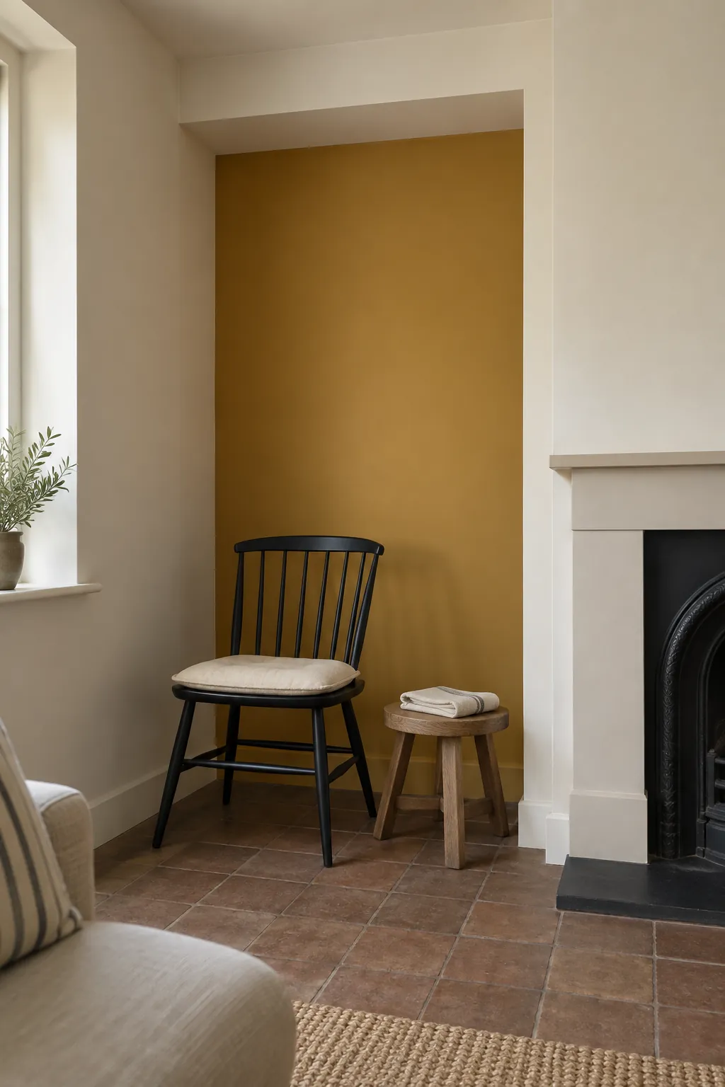
Ochre on a bounded wall
Ochre has enough depth to become the main feature of a room. A wall enclosed by real corners or an alcove is a clear place to use it when you prefer a smaller commitment. Carry one quiet natural material, such as oak or woven cotton, across the rest of the room.
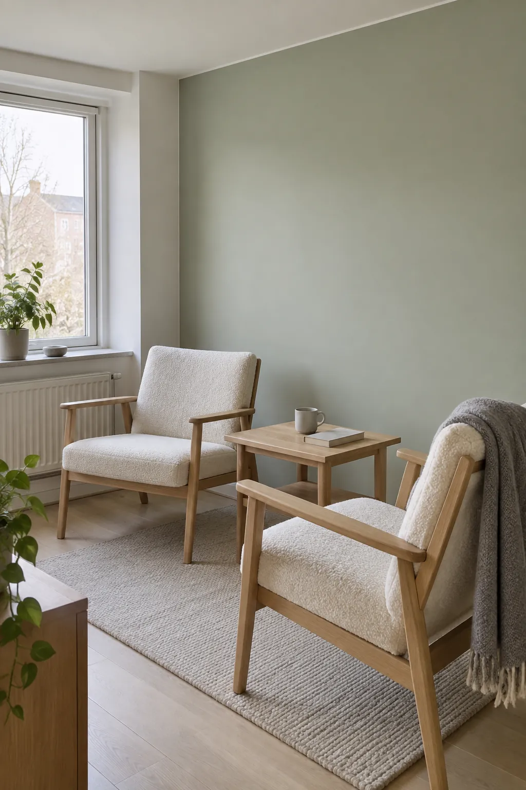
Pale sage for a calm backdrop
Pale sage is a useful starting point for a Scandinavian living room with light wood and simple upholstery. Its grey content can keep green from feeling too bright, though some versions become dull in weak light. Compare two or three samples at the same size rather than choosing from the colour name.
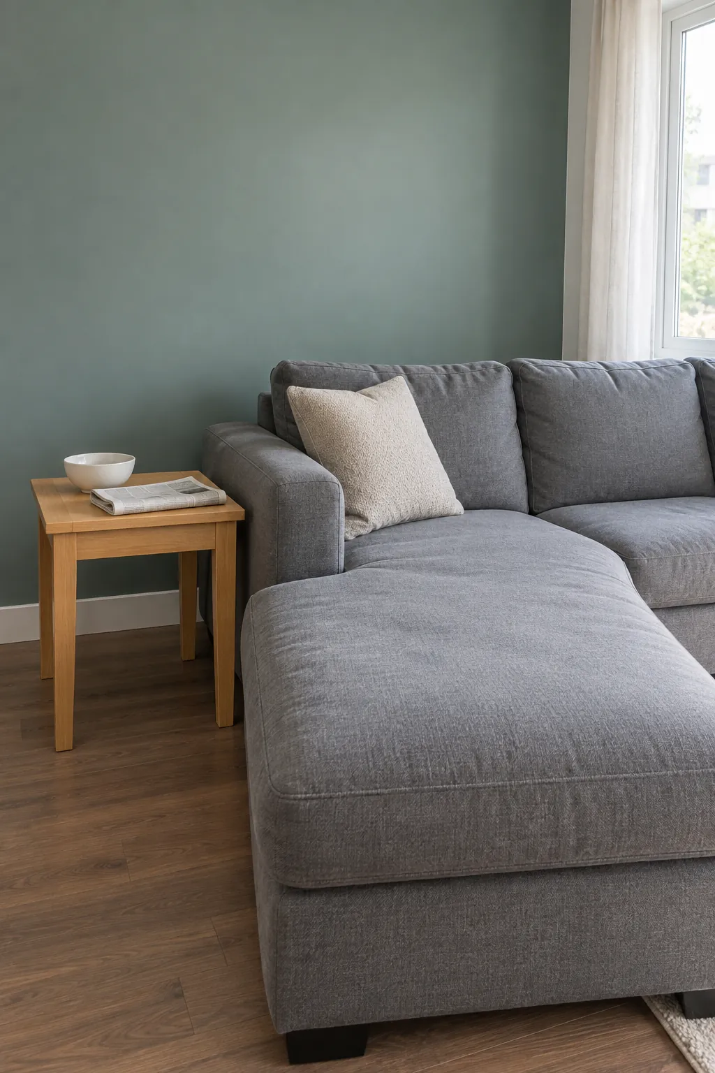
Eucalyptus green with a grey sofa
Eucalyptus has a cooler blue note that can relate to grey upholstery. Check whether your sofa leans blue, brown or violet before choosing the paint, since grey fabrics are rarely neutral in every light. A warm wooden surface can keep the combination from feeling cold.
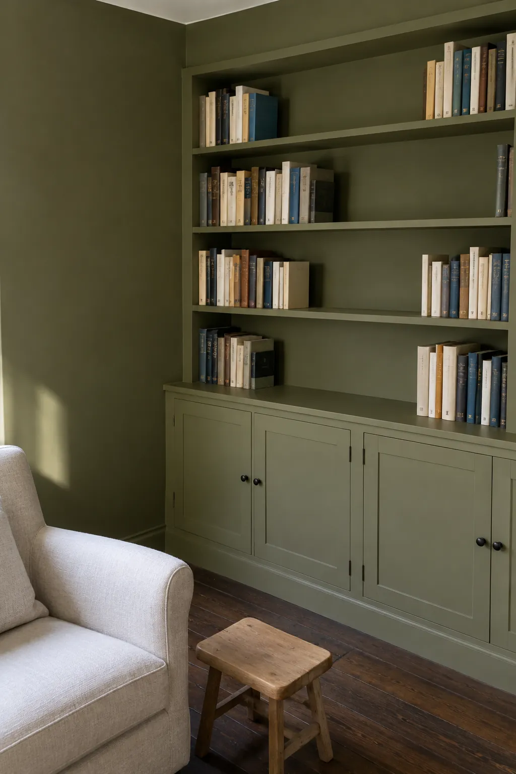
Olive around built in storage
Olive can give shelving and the surrounding wall a more continuous appearance when both use the same colour. The books and objects then become the lighter interruptions within that field. Use a suitable finish on doors and shelves so the attractive colour also survives daily handling.
Forest green for an evening room
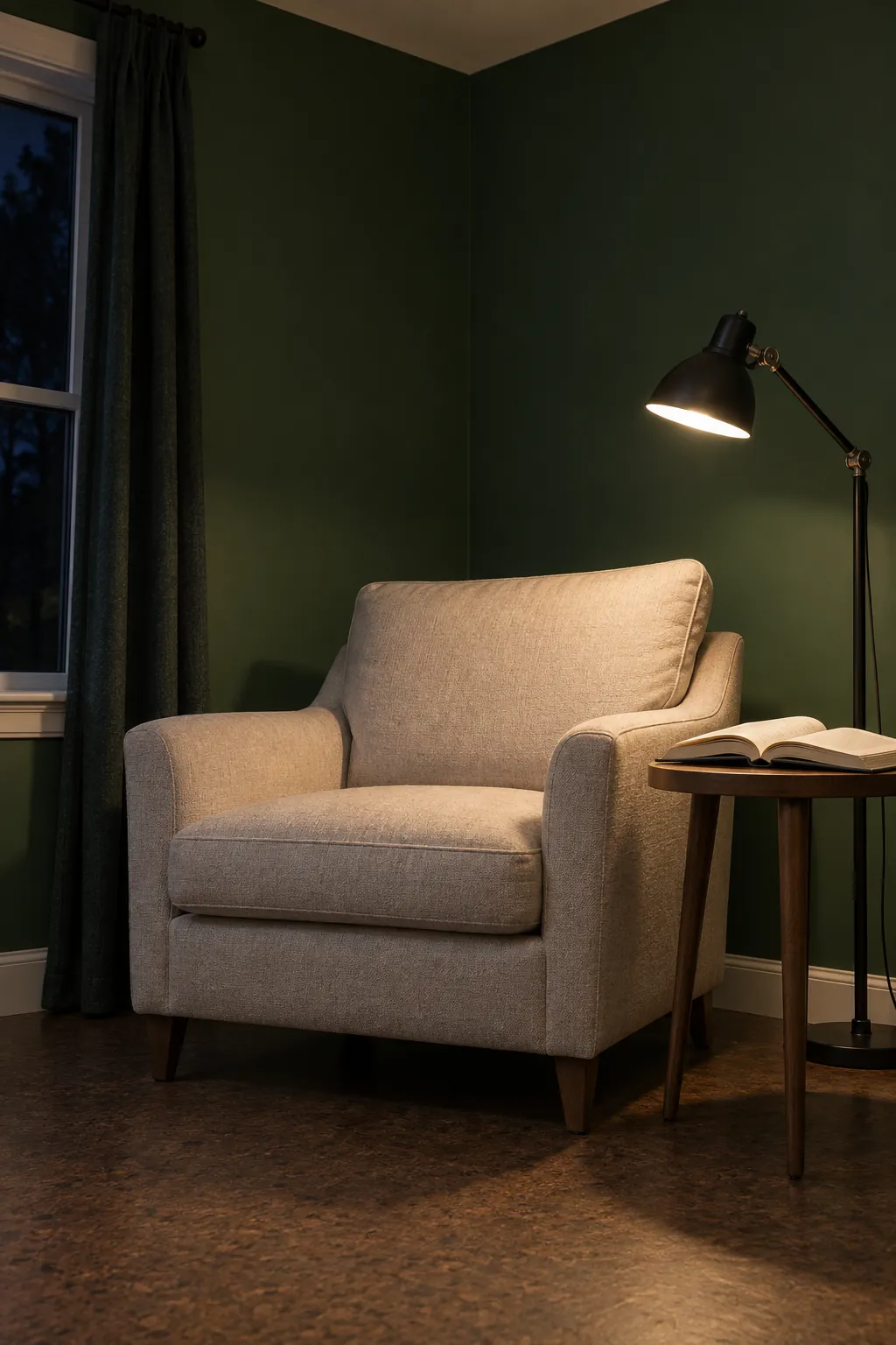
Forest green suits a room you want to feel enclosed and restful after dark. Plan the lamps before committing, because a dark wall will not compensate for a poorly lit reading chair. Pale upholstery can remain visible against the green without requiring a bright white ceiling or trim.
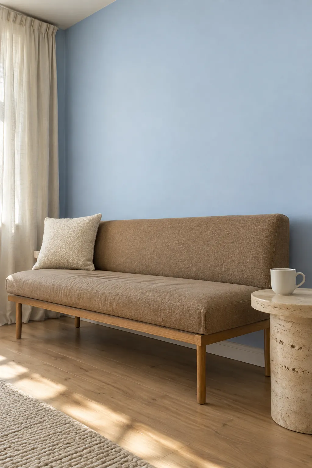
Powder blue with warm neutrals
Powder blue can feel fresh beside cream, tan and light brown materials. A very icy sample may look different from the soft blue living room you imagined, especially under cool daylight. Test the colour near the largest upholstered piece and keep the surrounding neutrals warm enough to balance it.
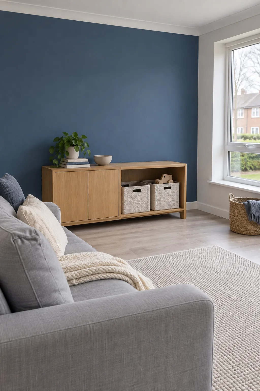
Denim blue for an everyday lounge
Denim blue offers more presence than a pastel without reaching the depth of navy. It can work across a frequently used lounge where you want colour but still need an easy background for ordinary furniture. Check that the sample remains blue in the room’s darker areas rather than becoming a flat grey.
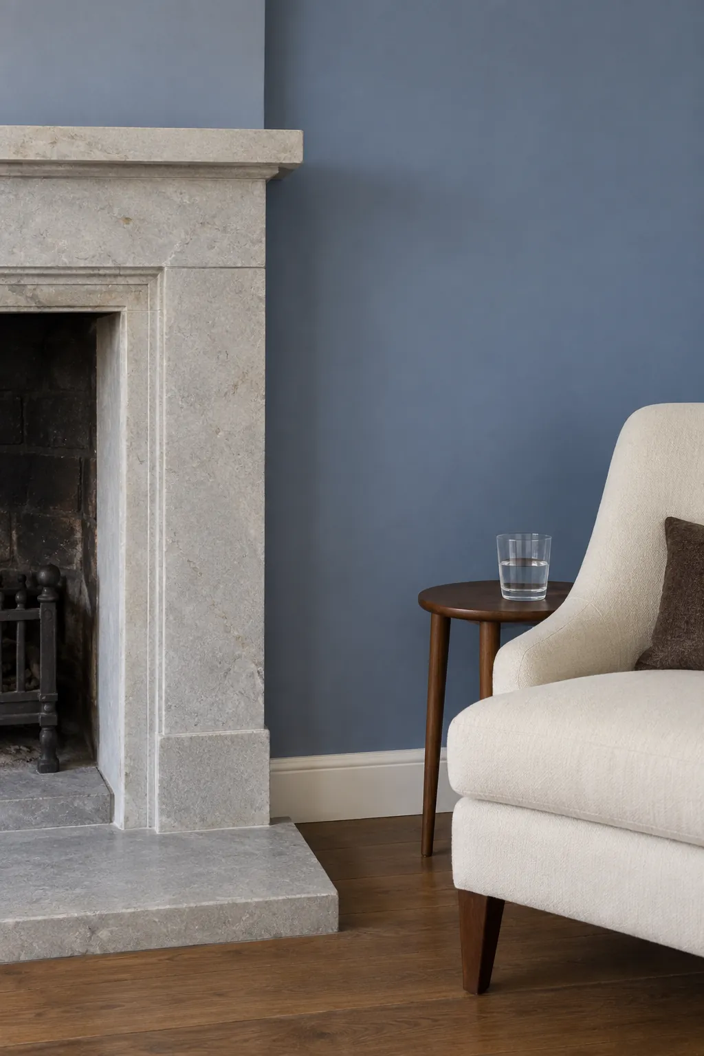
Slate blue beside stone
Slate blue can relate to cool stone while giving the wall a more definite colour. The stone’s own veining and undertone should guide the choice, rather than a photograph of someone else’s fireplace. Keep a sample beside the surround for several days so you see the pairing under changing light.
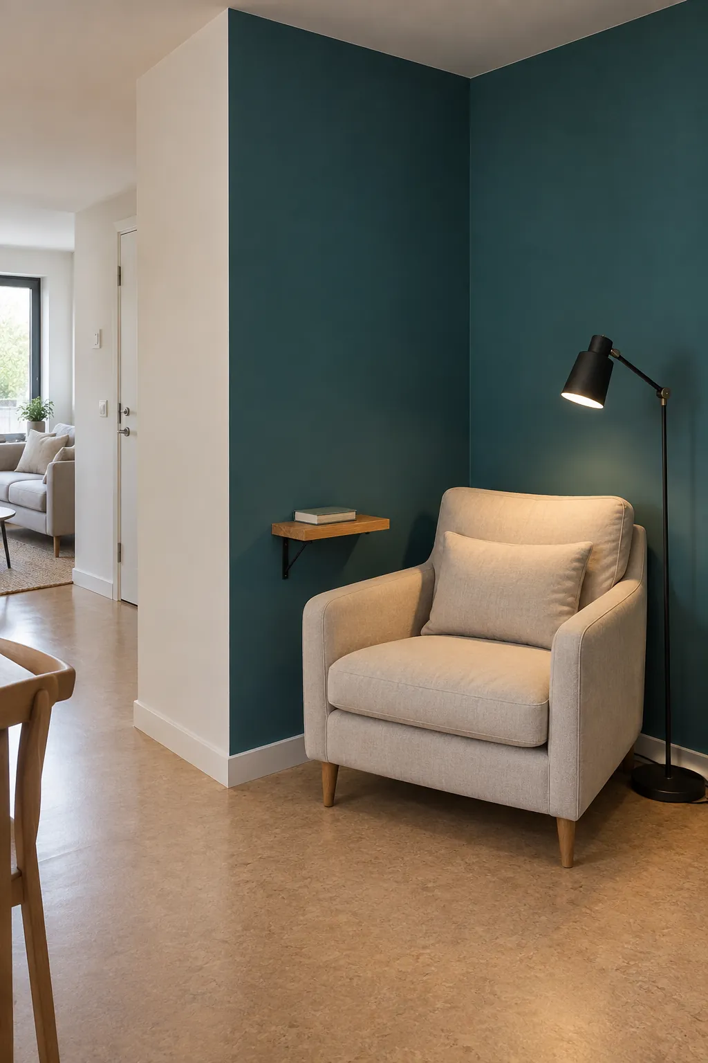
Deep teal for a sheltered corner
Deep teal can make a reading corner feel distinct within a larger living room layout. Use an existing wall return to define the painted area, keeping the boundary tied to the architecture. A light chair and a focused lamp help the corner remain useful when daylight falls.
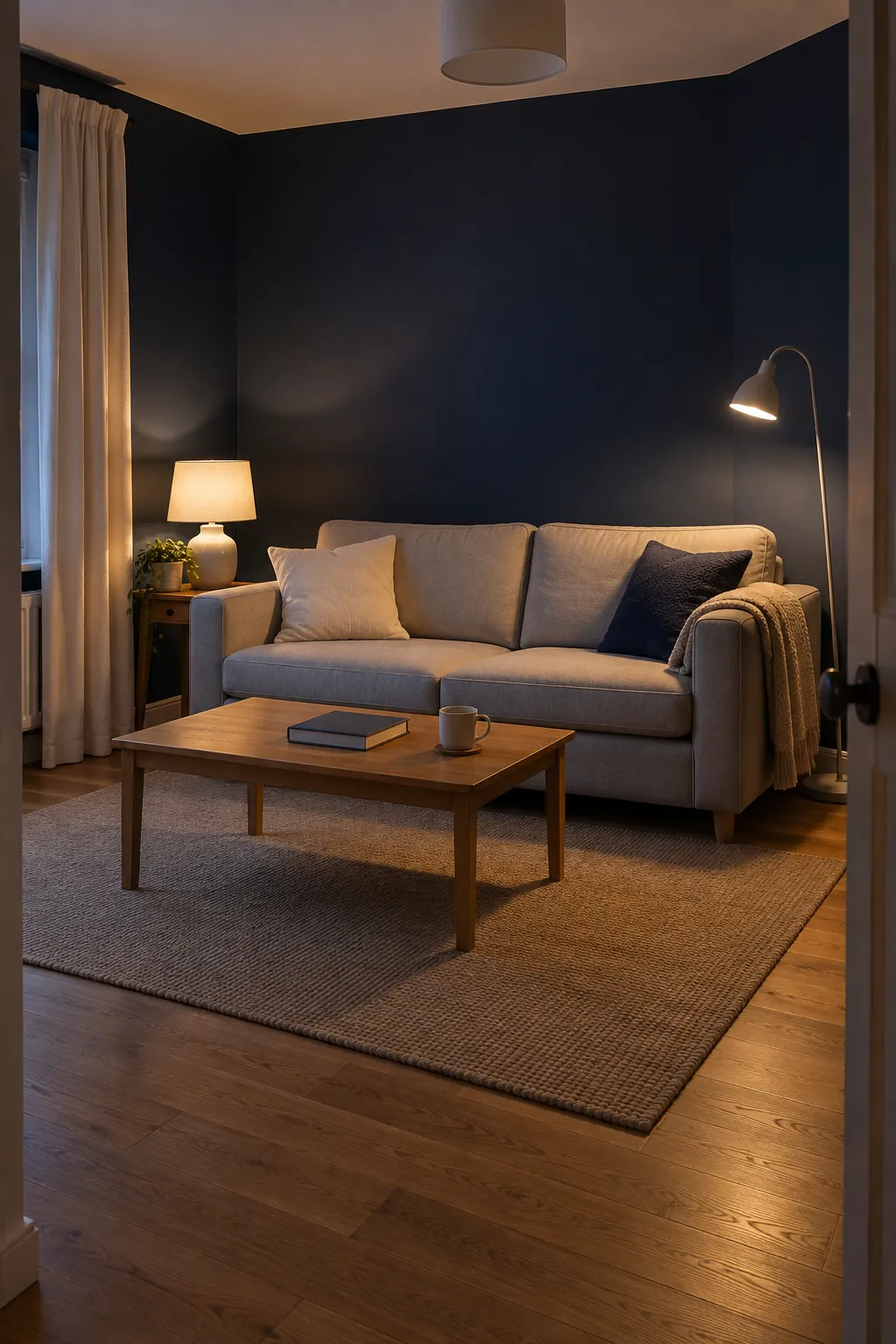
Navy with a clear lighting plan
Navy can create a moody living room, but the paint sample should be judged at night as carefully as in daylight. Spread light across the places you actually use rather than relying on one ceiling fitting. A matte wall limits distracting reflections, while more durable finishes may be appropriate for nearby woodwork.
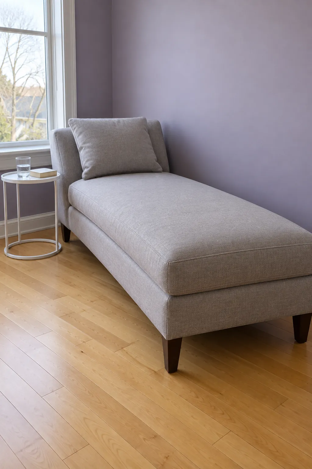
Smoky lavender with grey upholstery
Smoky lavender gives grey seating a subtle change of direction from the usual blue or beige wall. Its violet note can become stronger beside yellow toned wood, so compare the sample with the floor too. Keep other patterns quiet while deciding whether you enjoy that contrast.
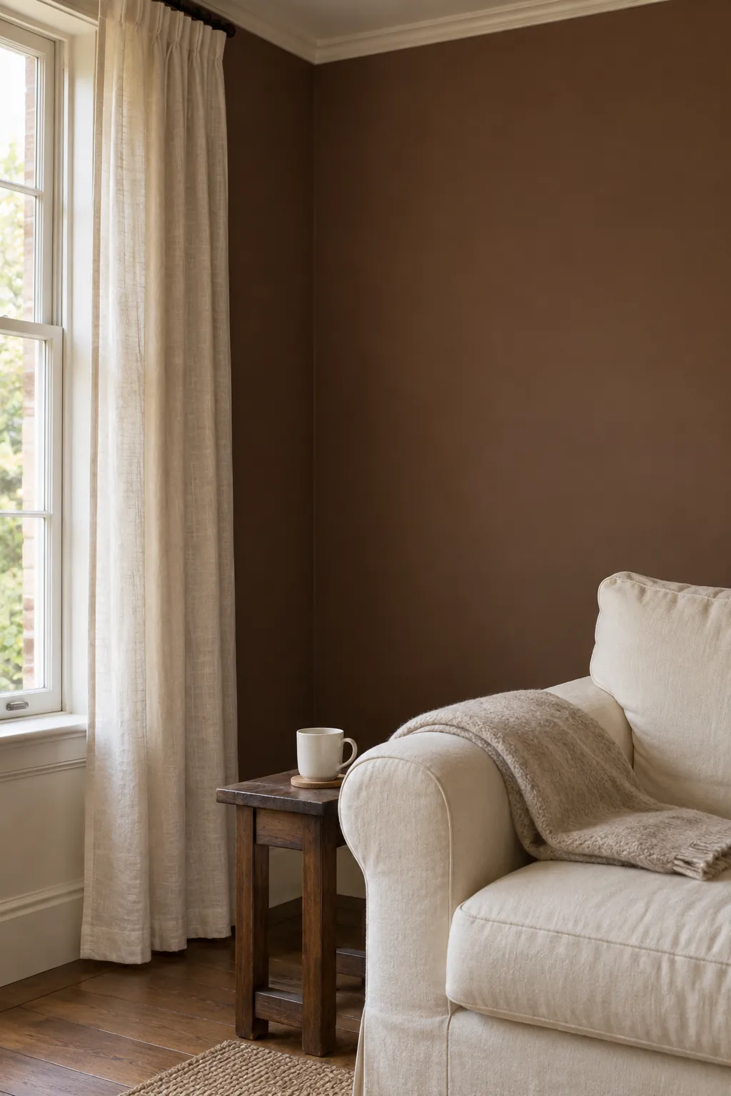
Cocoa brown with pale textiles
Cocoa walls provide a warm dark background for pale curtains and seating. Leave enough variation in texture that the brown does not turn the whole room into one flat surface. This is a colour to test in a large area, since a small chip rarely conveys how enveloping a full wall will feel.
Soft charcoal after a full room sample check
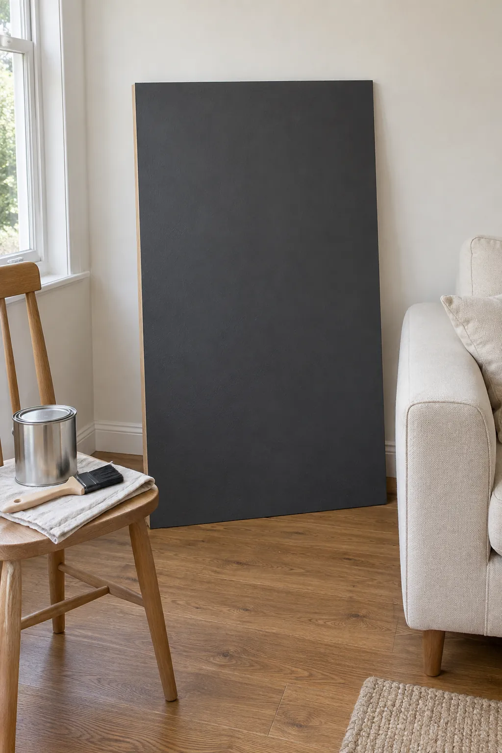
Soft charcoal can be a strong choice when you want the walls to recede behind lighter furniture. Before committing, move a large painted board between the brightest and darkest walls and inspect it under the lamps you keep. The best wall colors for a living room are the ones that work with its actual floor, furnishings and light, not just the colour you liked on a screen.