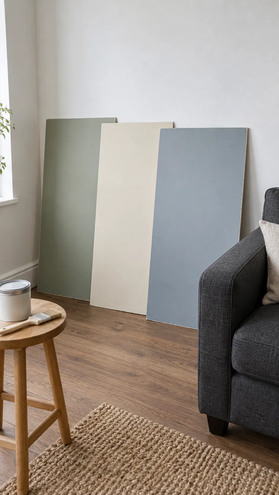
The sofa usually costs more to replace than the paint. Start with its color and the floor beneath it, then decide whether the room needs more warmth, clearer contrast or better lighting. A color that looks appealing online still has to work beside the furniture you use every day.
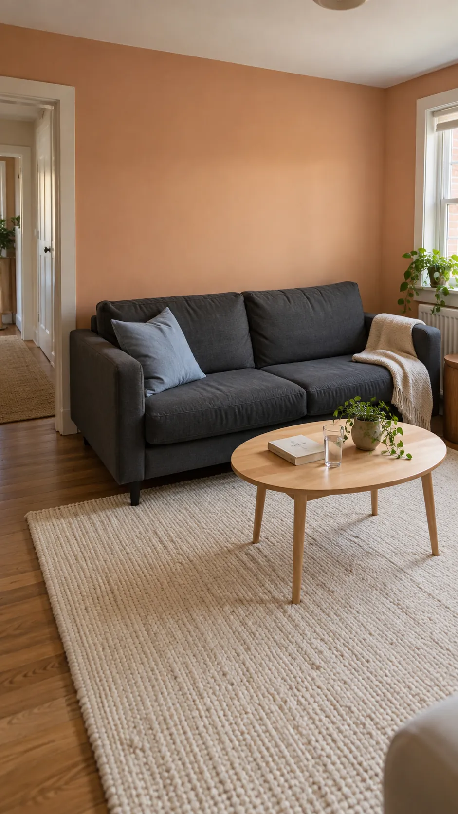
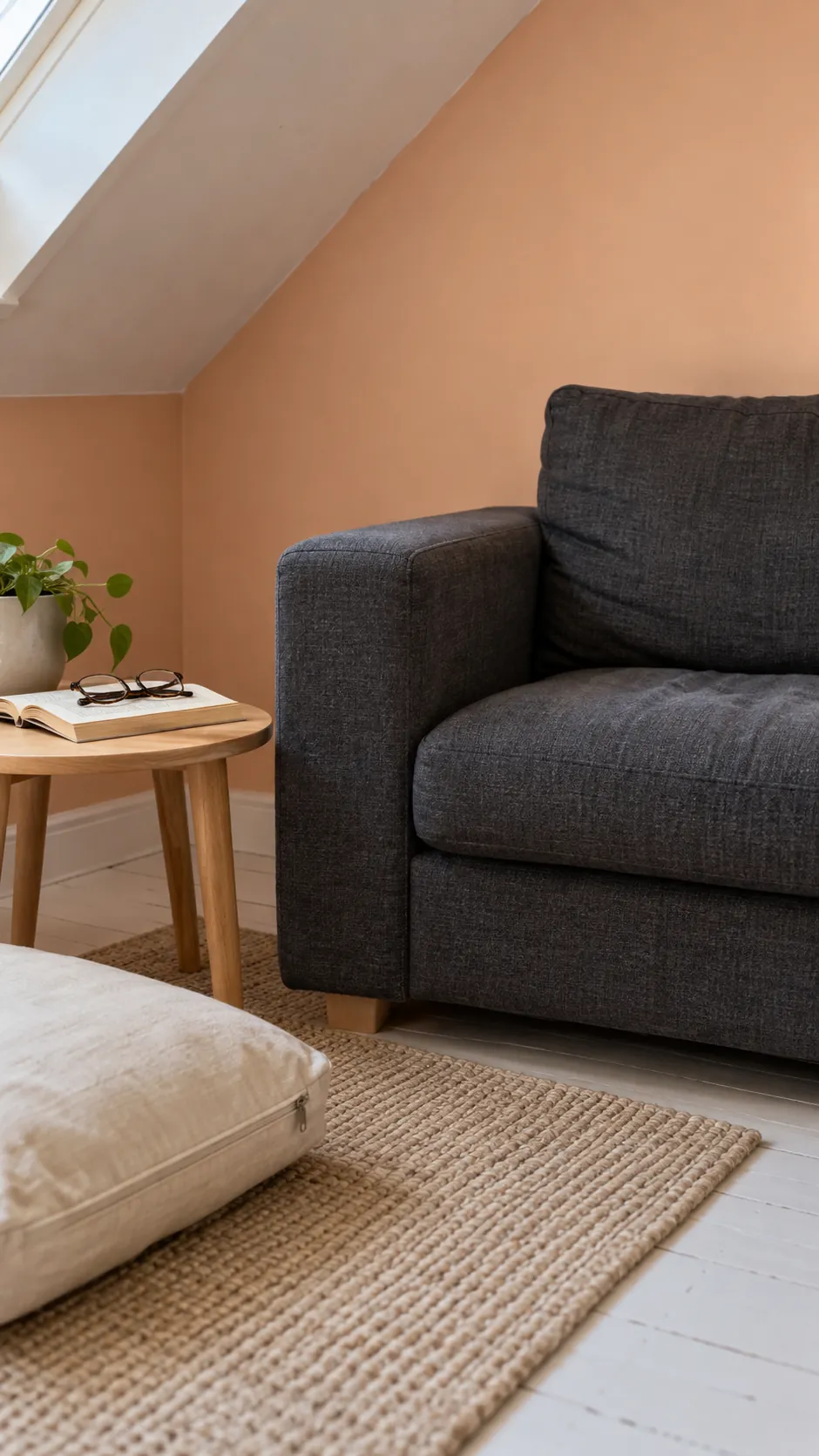
Apricot walls around a charcoal sofa
A charcoal sofa does not require a gray room around it. Soft apricot walls add warmth while a cream rug separates the dark upholstery from the floor. Choose a muted sample and compare it with your sofa fabric before painting the full wall.
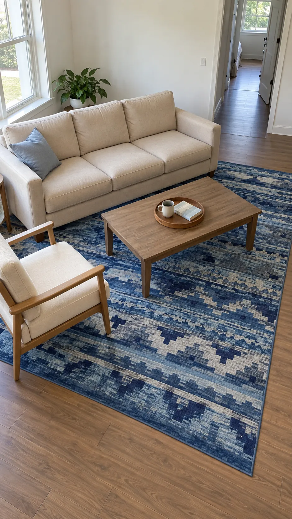
A blue rug beneath beige seating
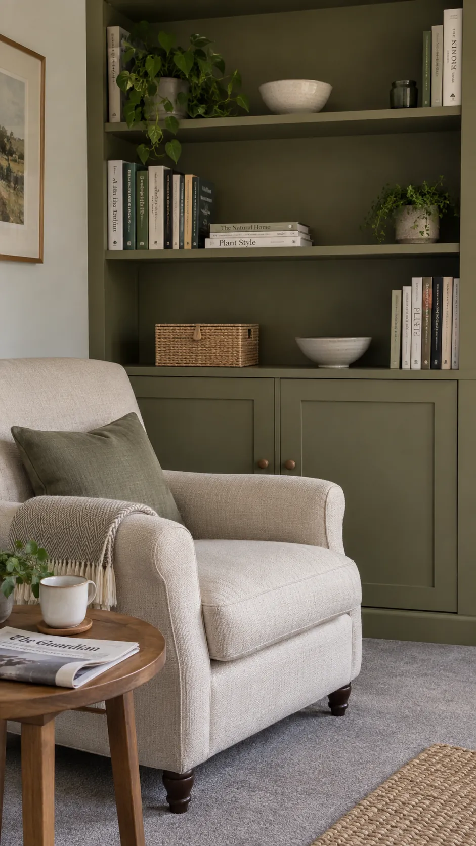
A blue rug can supply the color that a beige sofa lacks. Keep the rug large enough to sit beneath the front furniture legs so it reads as part of the seating arrangement. Pull one quieter blue from its pattern into a cushion, leaving the remaining textiles simple.
Olive built ins with pale upholstery
Painted olive shelving gives pale seating a stronger backdrop without changing the sofa. Leave some shelf space open so the green remains visible between books and useful objects. This works especially well when the storage already defines the room's main wall.
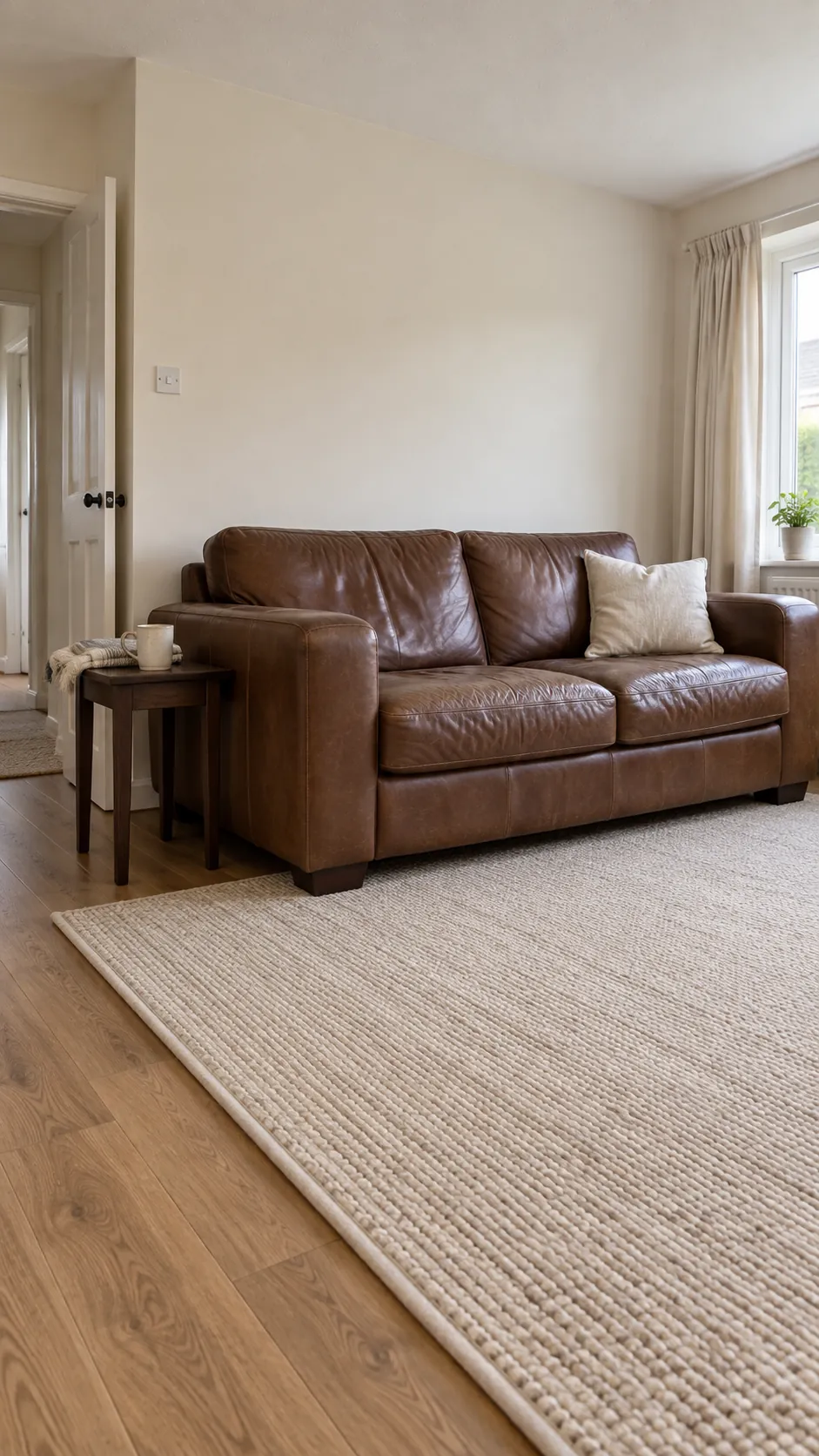
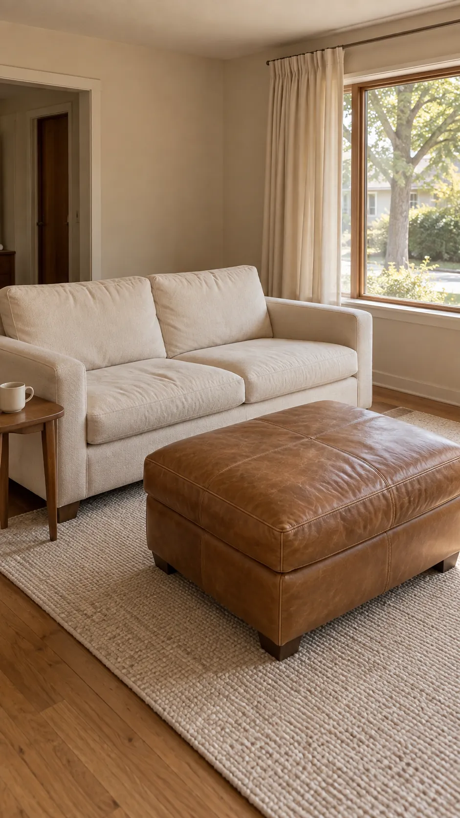
A cream envelope for brown leather
Brown leather can feel heavy when every nearby surface is equally dark. Cream walls and a lighter woven rug create separation without removing the leather's warmth. Use a dark table in a smaller proportion if you want to repeat the sofa's depth elsewhere.
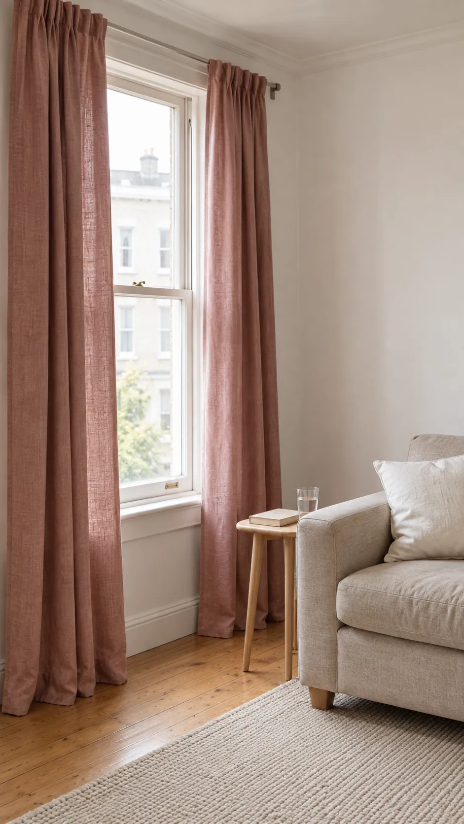
Dusty rose curtains in a white room
Curtains offer a broad area of color that can be changed more easily than wall paint. Dusty rose fabric gives white walls warmth while keeping the effect gentler than bright pink. Order a fabric sample first because daylight shining through it can change its apparent color.
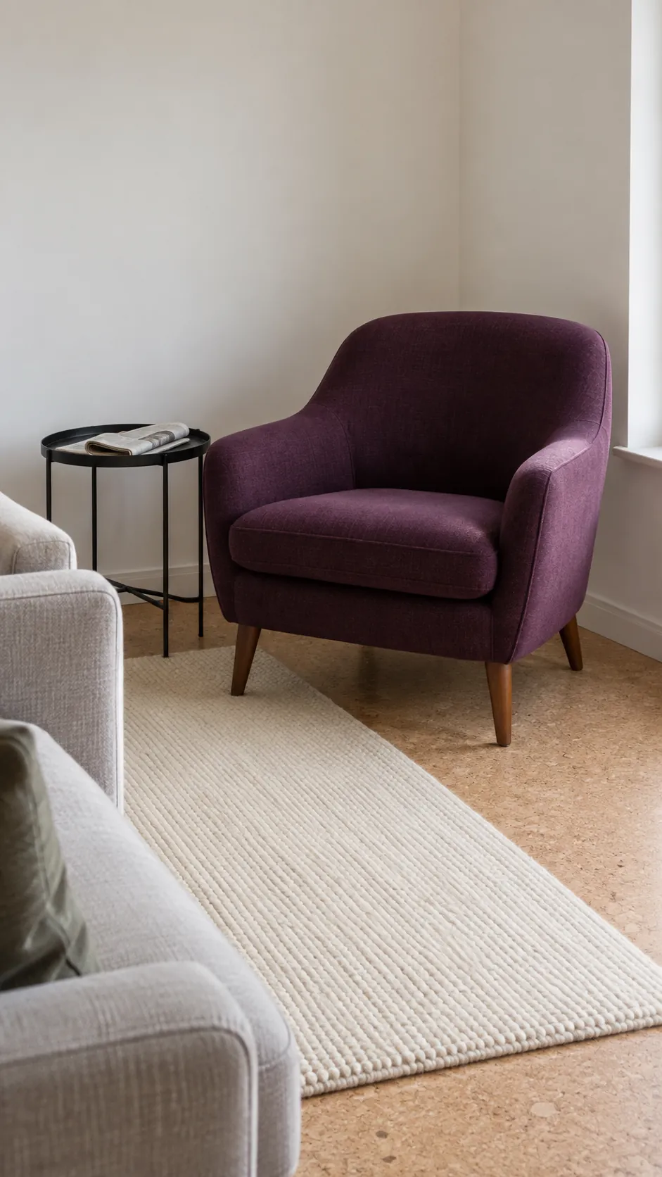
One aubergine chair as the accent
An aubergine chair can be enough color for an otherwise restrained sitting room. Give it a clear position within the conversation area so it feels useful, rather than parked as a decorative object. A pale cushion on the main sofa can bridge the chair to the rest of the room without matching everything.
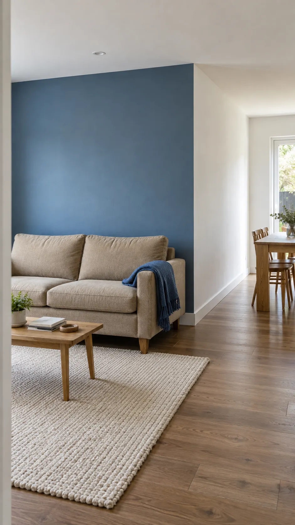
Blue walls that stop at a real corner
In an open plan living room, a physical corner is a clearer paint boundary than an arbitrary line halfway along a wall. Use blue within the seating zone and keep the continuous shared wall neutral if no natural stopping point exists. Repeat a small blue object beyond the boundary to connect the spaces.
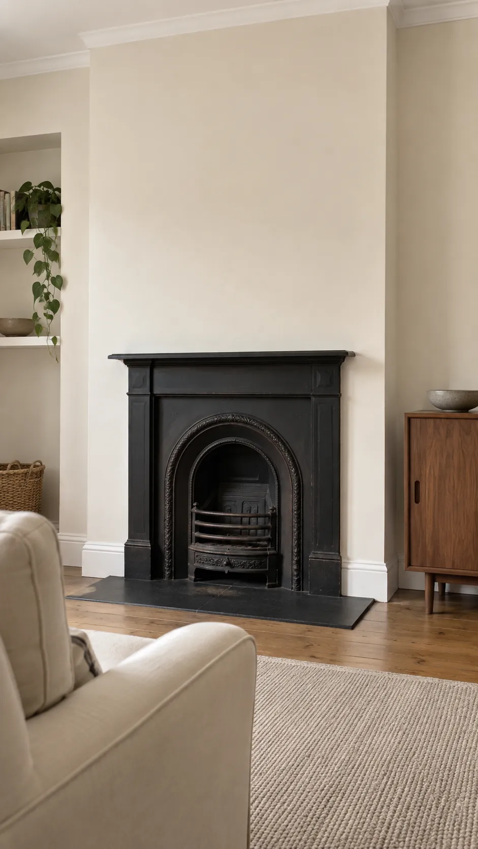
Warm white with a black fireplace
A black fireplace can provide all the contrast a warm white room needs. Keep nearby furniture lighter so the fireplace remains an intentional anchor. If the surround has detailed molding, test the finish sheen because reflected light will change how clearly those details show.
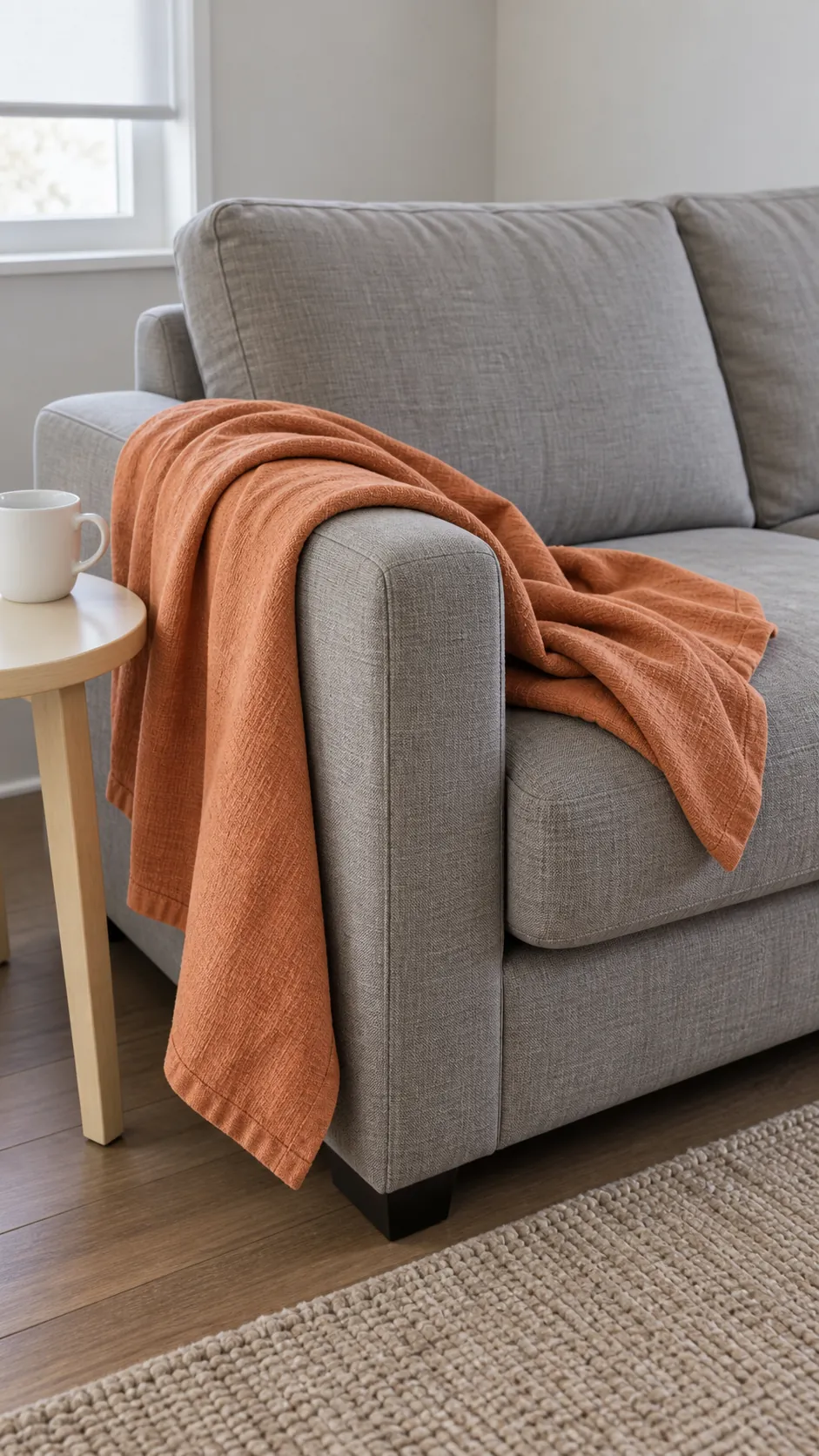
Muted orange through a single throw
A muted orange throw is a low commitment way to energize a cool gray sofa. Spread enough of it across the arm for the color to register, rather than folding it into a tiny decorative strip. Leave surrounding cushions quieter so the new accent does not become one of many competing notes.
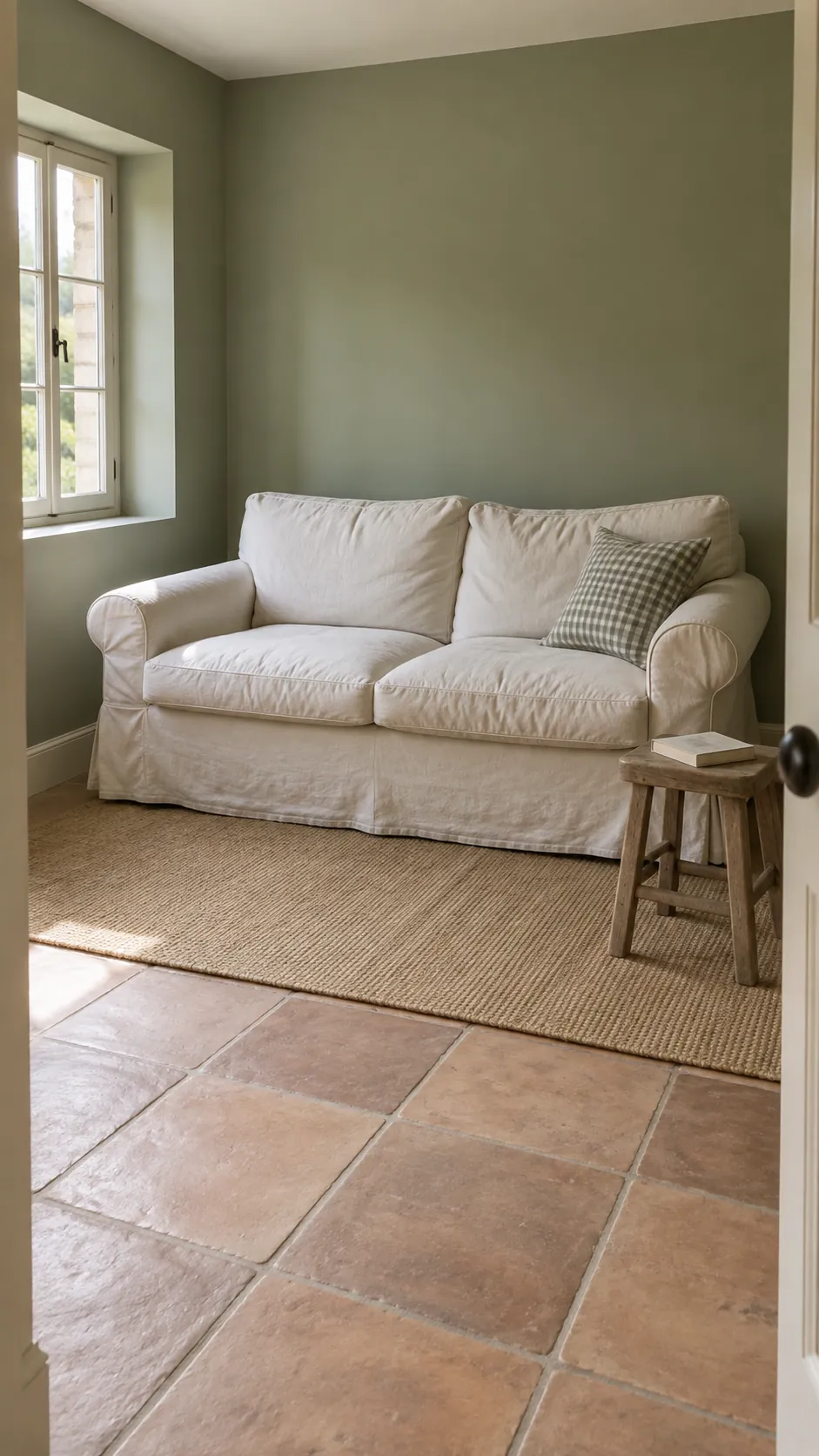
Sage walls and off white linen
Sage walls can support a relaxed farmhouse living room without themed signs or distressed furniture. Off white linen gives the green a soft companion, while ordinary wood furniture supplies warmth. Look at the sage beside your flooring because its gray or yellow undertone matters more than the color name.
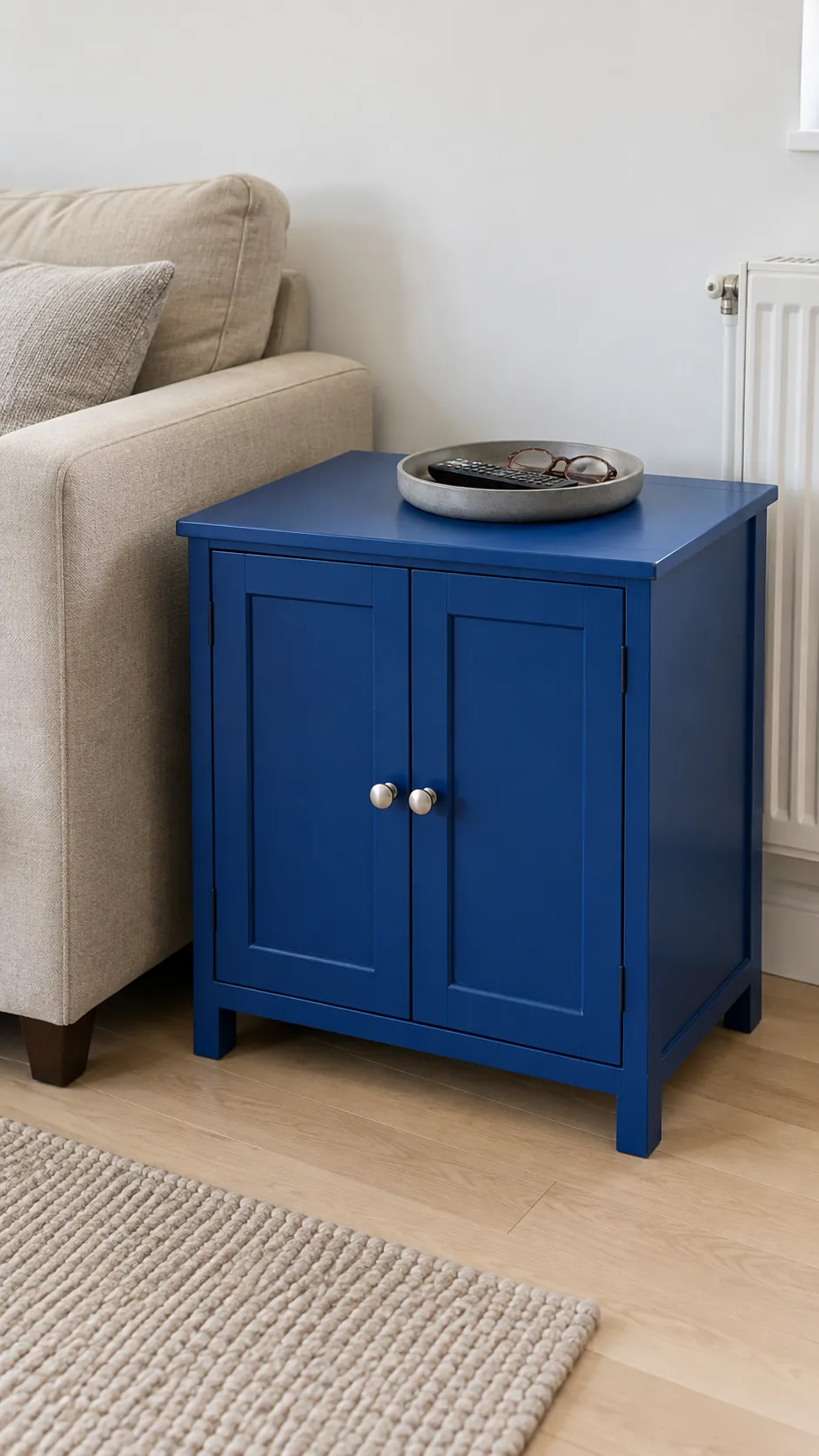
Cobalt on a small cabinet
A small cobalt cabinet can act as the room's strongest color while the walls stay pale. Choose a piece that solves a storage need so the accent earns its floor space. Keep the cabinet top relatively clear, allowing its shape and color to remain the focus.
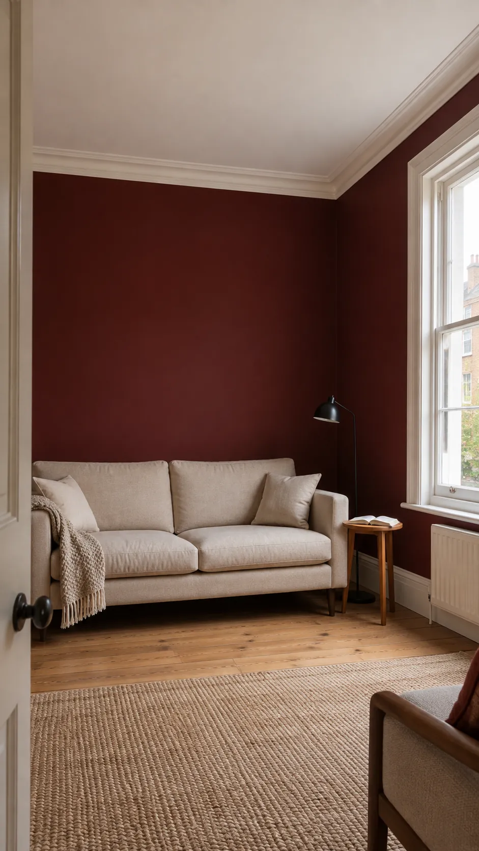
A pale ceiling above burgundy walls
Burgundy walls can make an evening lounge feel enclosed and comfortable. A pale ceiling offers relief, especially when the room has ordinary ceiling height. Add lamps near seating instead of expecting the ceiling fixture alone to make the dark walls feel lively.
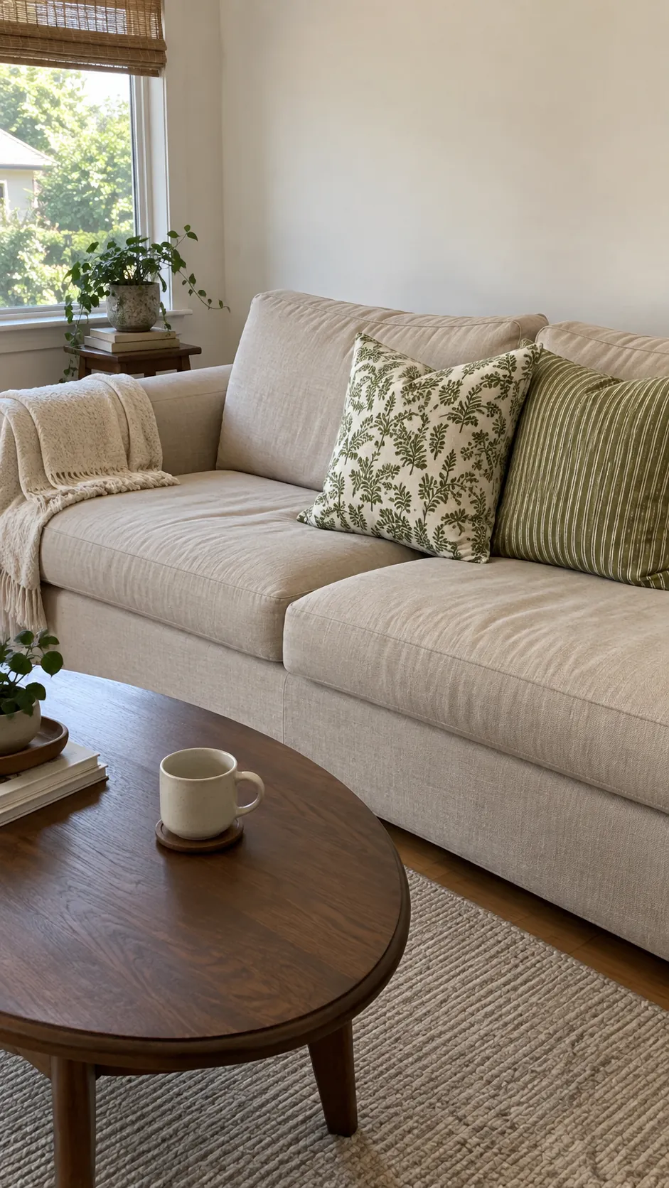
Sand upholstery with green patterned fabric
A sand colored sofa gives patterned green curtains or cushions room to stand out. Select one pattern scale that suits the room instead of mixing several equally bold motifs. This approach lets the fabric supply the living room color combination while larger furniture remains flexible.
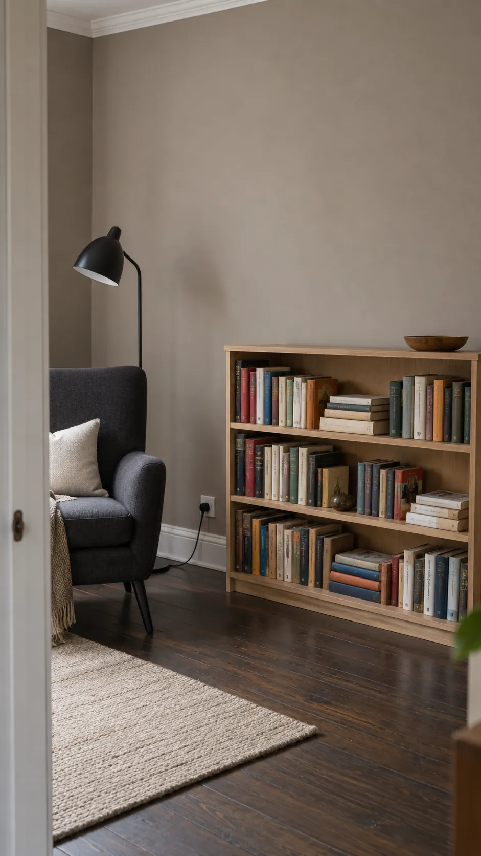
Taupe walls around colorful books
Books can already provide more color than a room needs from accessories. Taupe walls and simple shelving let their varied spines become a useful, changing palette. Arrange books for access and stability, leaving a few gaps rather than buying objects solely to fill every shelf.
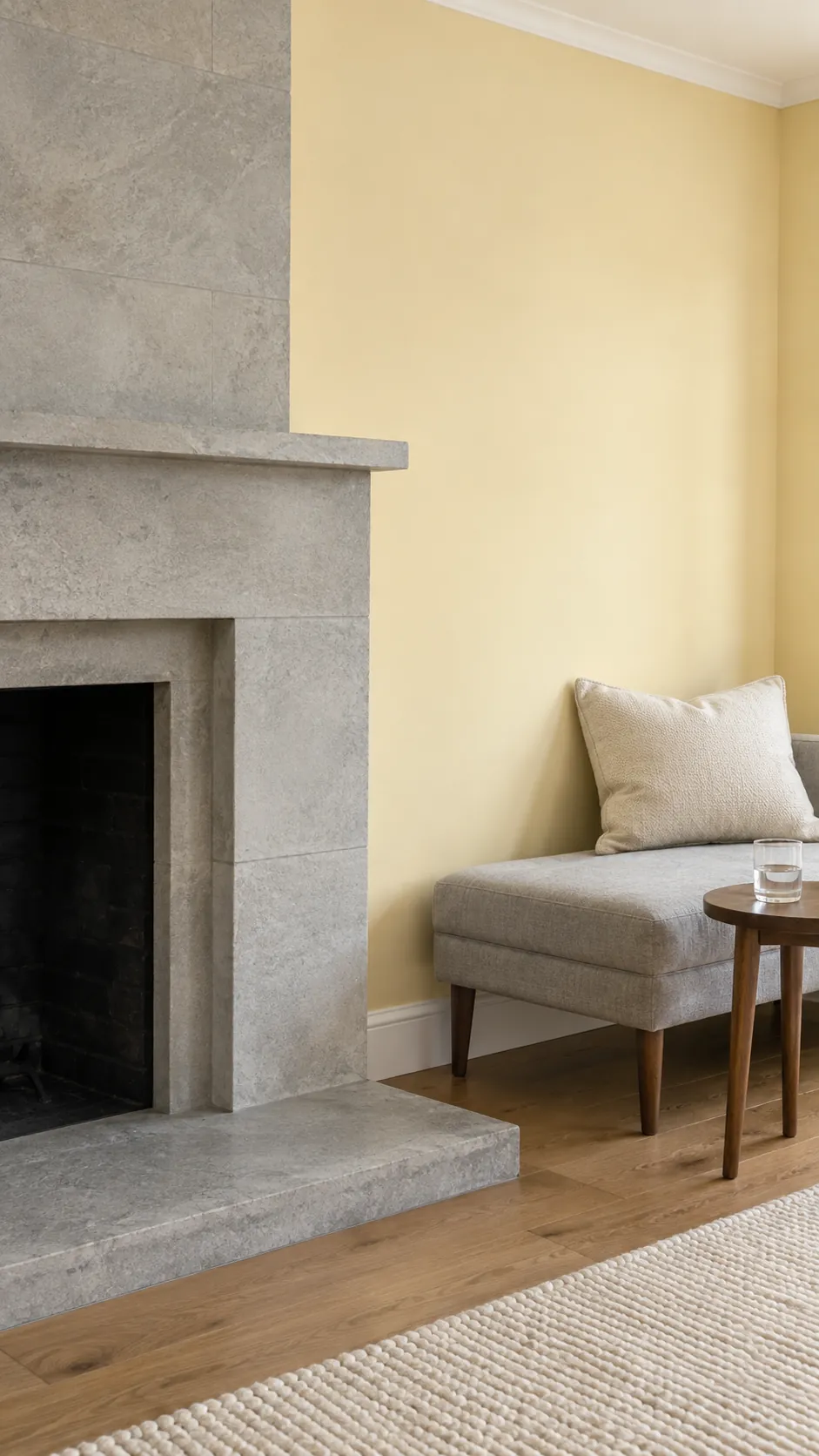
Pale yellow beside cool stone
Pale yellow can soften the effect of an existing cool stone fireplace or floor. Keep the yellow restrained so it complements the fixed surface instead of making the gray appear harsher. A large sample placed directly beside the stone will reveal that relationship better than a small card.
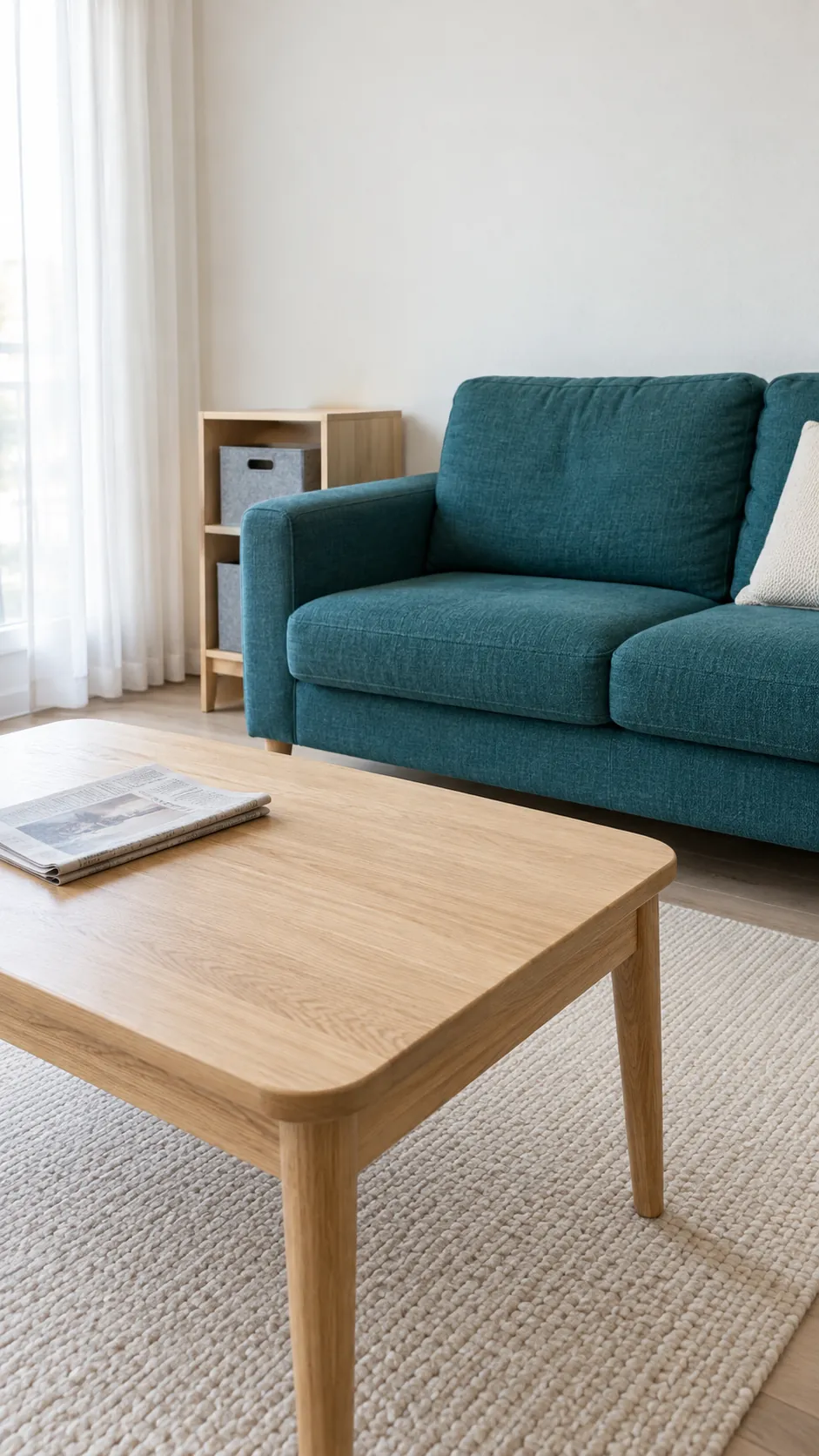
Teal upholstery with light oak
Teal seating gains warmth from light oak tables and shelving. Keep the wall color relatively quiet when the sofa already occupies a large share of the view. For Scandinavian living room ideas, simple furniture shapes and usable open space matter as much as the palette.
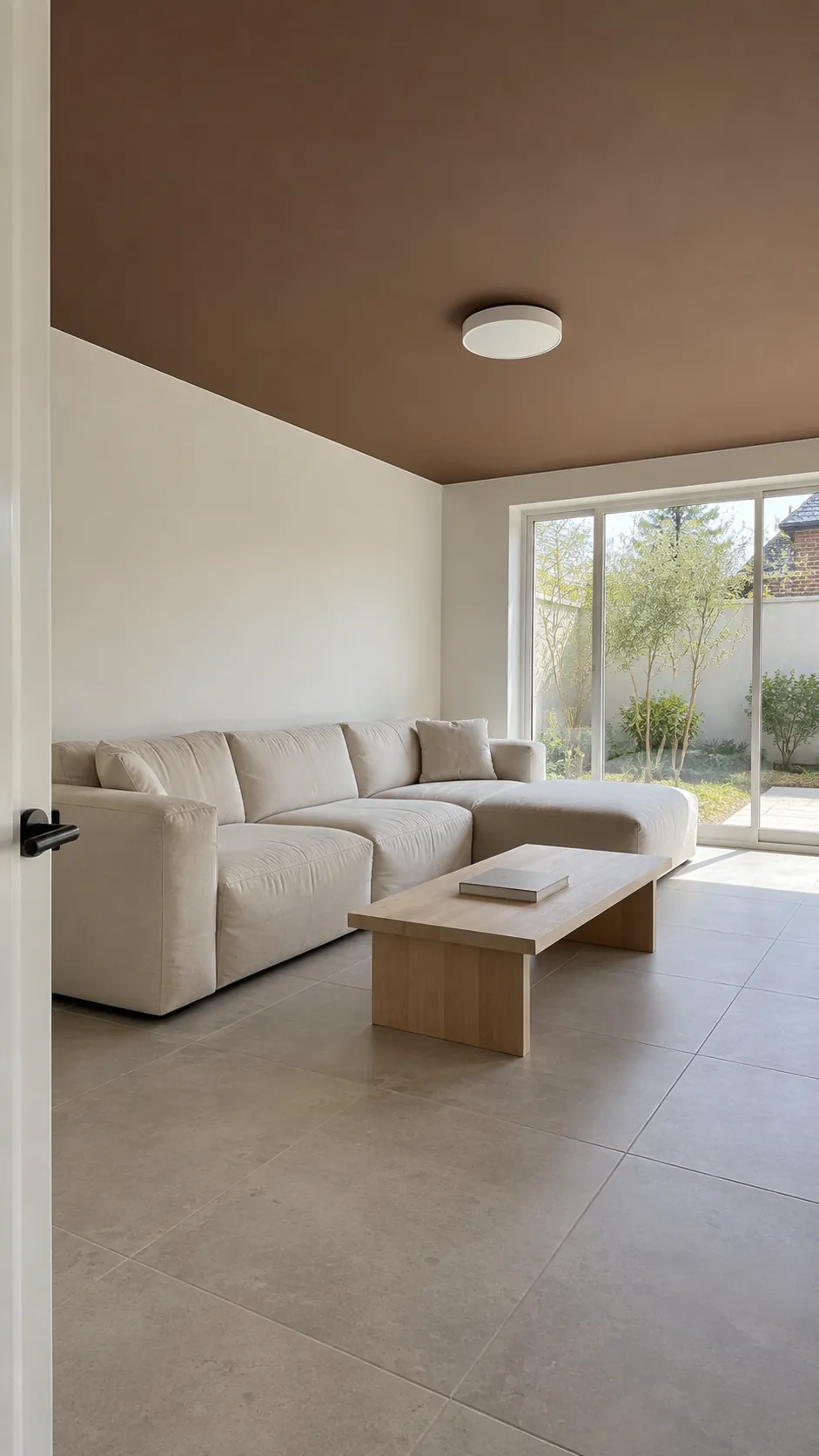
A painted brown ceiling in a bright room
A brown ceiling can bring visual shelter to a living room with generous daylight and height. Keep walls lighter and test the color overhead, where it receives different illumination than a vertical sample. This is a more permanent move than adding textiles, so assess it from every main seat.
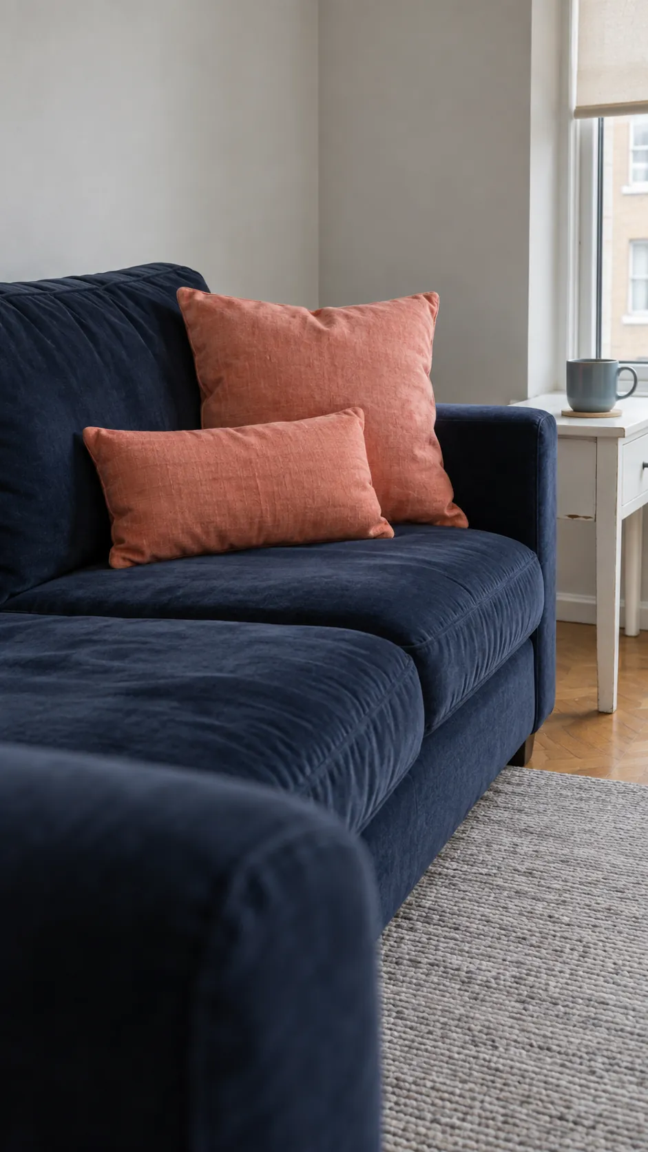
Coral cushions against navy
Coral creates a clear warm contrast on navy upholstery. Use cushions in a size that suits the sofa and leave room to sit comfortably. A cream rug can help the dark sofa and warm accent feel connected to a lighter room.
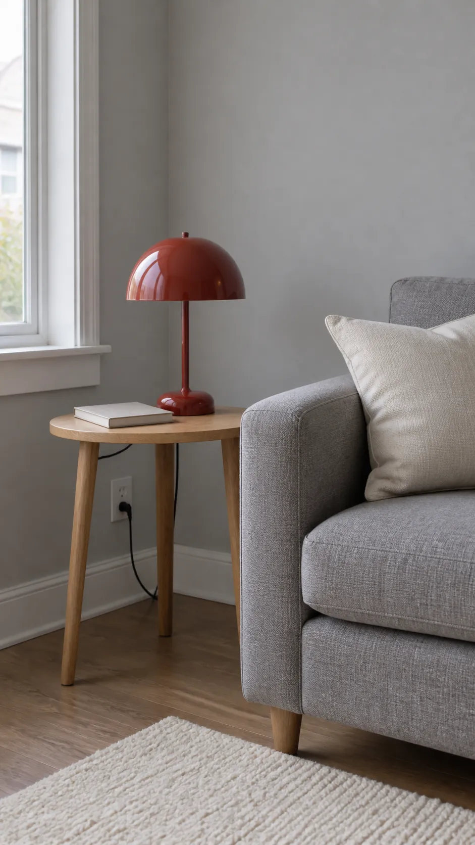
Soft gray with one red lamp
A red lamp introduces color at eye level without adding another large furniture piece. It works best when the lamp also improves the lighting beside a reading seat. Choose the bulb before judging the shade's effect, since illuminated fabric may look different from its daytime appearance.
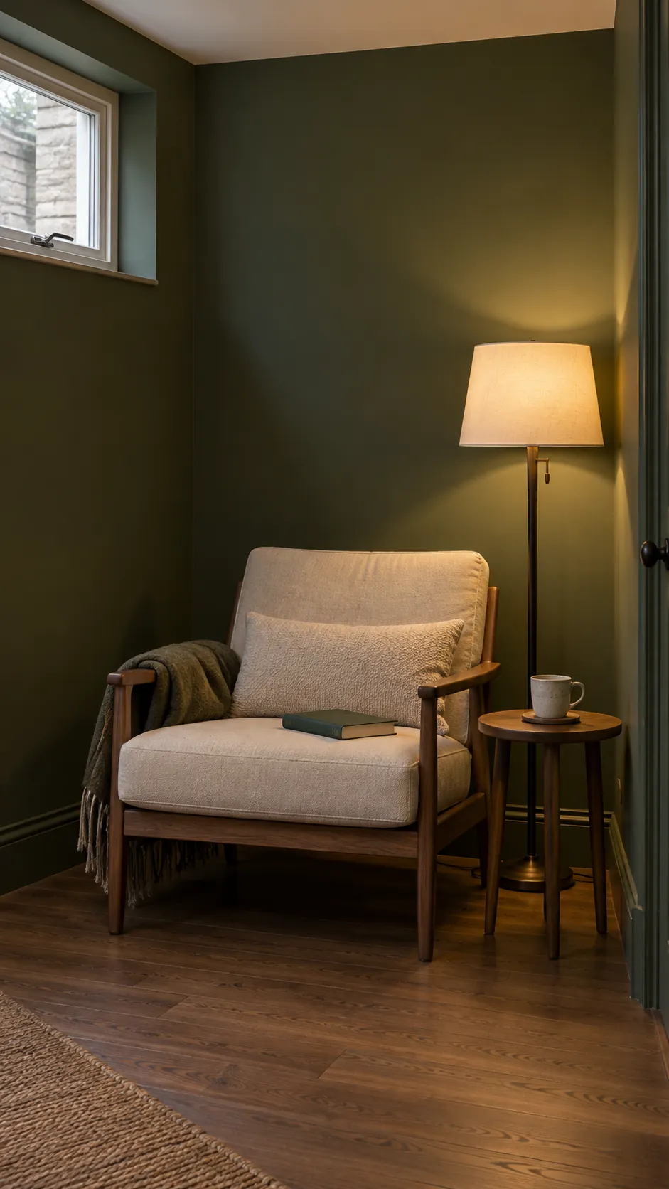
Moss green in a low light room
A low light room does not automatically become bright when painted white. Moss green can embrace a quieter mood, provided the furniture and lighting remain readable. Add separate light sources near the activities you actually do, and test the paint at the time you use the room most.
Cream and caramel without extra accents
Cream and caramel can create a complete palette on their own. Vary fabric, leather and wood texture so the room has depth without another bright color. Keep the largest pale and dark areas distinct, avoiding a room where every object sits at the same middle value.
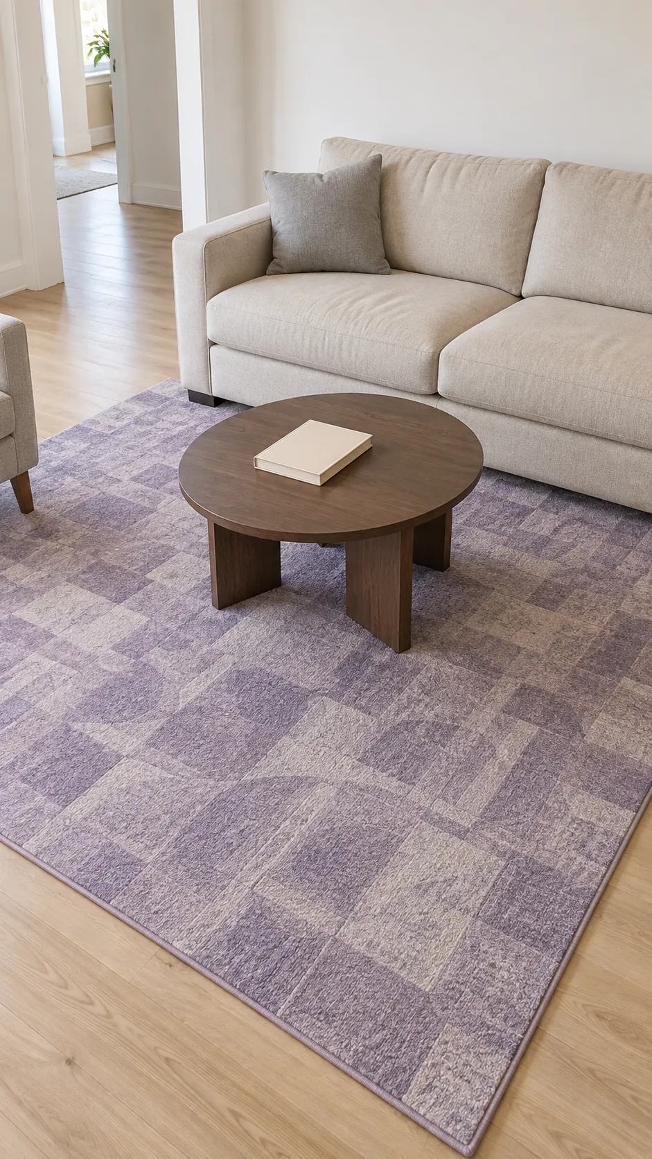
Lavender in the rug rather than the paint
A rug with restrained lavender details offers a gentle alternative to purple walls. Pair it with a neutral sofa and let the rug's other colors guide small accessories. Check the rug in your own light because gray leaning lavender can look very different under warm bulbs.
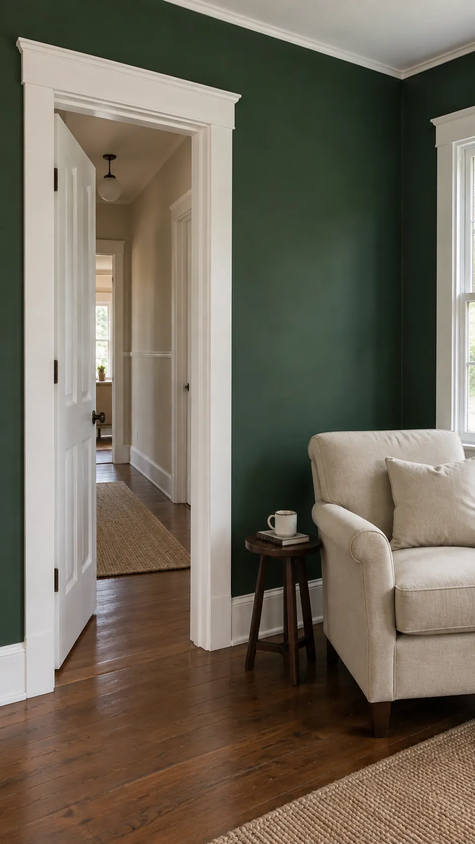
White trim around deep green
White trim creates a crisp boundary around deep green walls. The contrast can highlight good window proportions, but it also makes every painted edge more noticeable. Prepare the trim carefully and compare the white with existing doors before introducing a new shade.
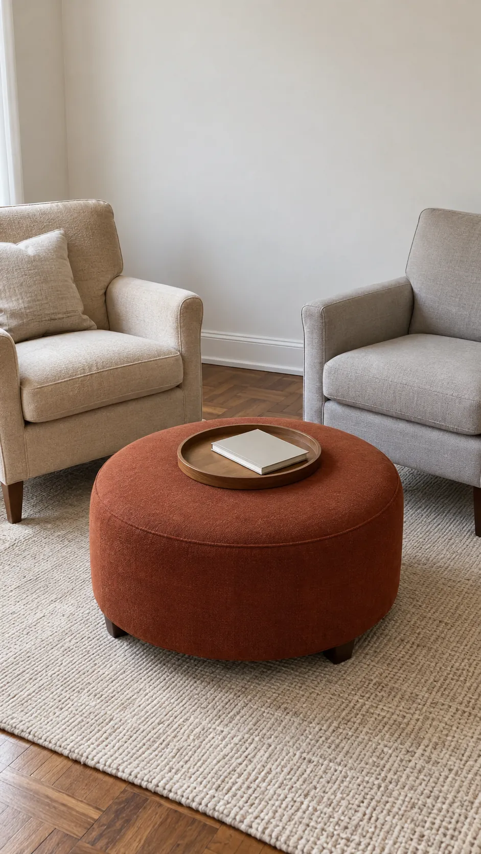
A rust ottoman between neutral chairs
A rust ottoman can connect two neutral chairs into a more purposeful seating group. Its color sits low in the room, making it useful when you want a quieter wall view. Choose a durable fabric and a size that leaves the walking route open.
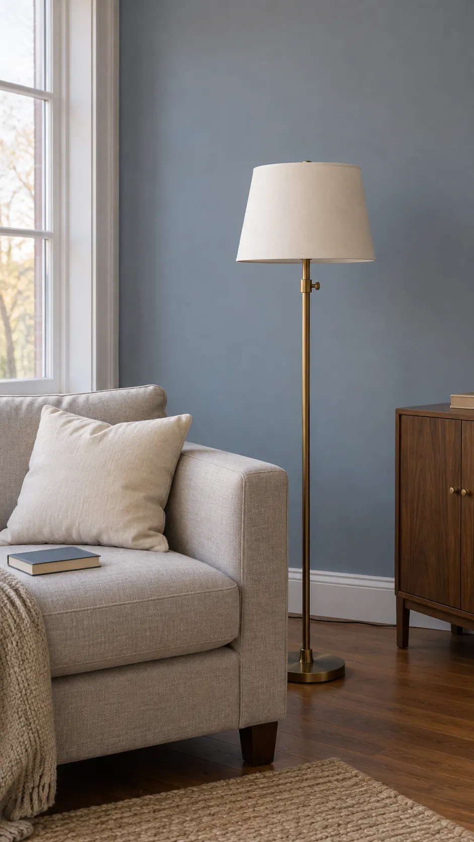
Blue gray with warm metal details
Blue gray walls can feel more welcoming with small warm metal details on lamps or handles. Keep those finishes limited instead of introducing several different shiny metals. The room should still read as blue gray first, with the metal providing a modest highlight.
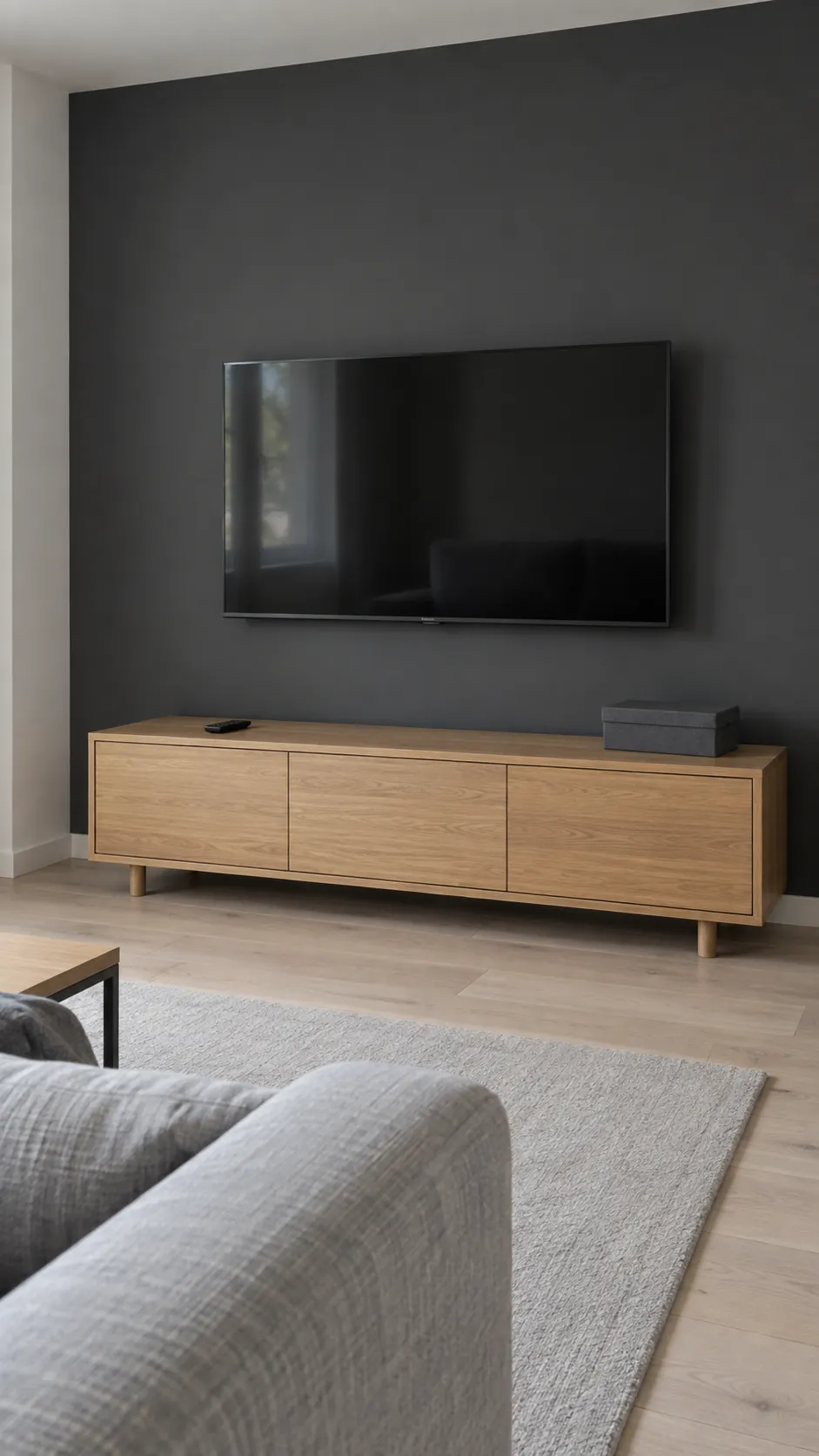
A dark wall behind the television
A dark wall can reduce the visual contrast between a television and its surroundings. Carry the color across a complete architectural area rather than painting a small rectangle around the screen. Keep lighting positioned to avoid glare, since wall color alone will not solve reflections.
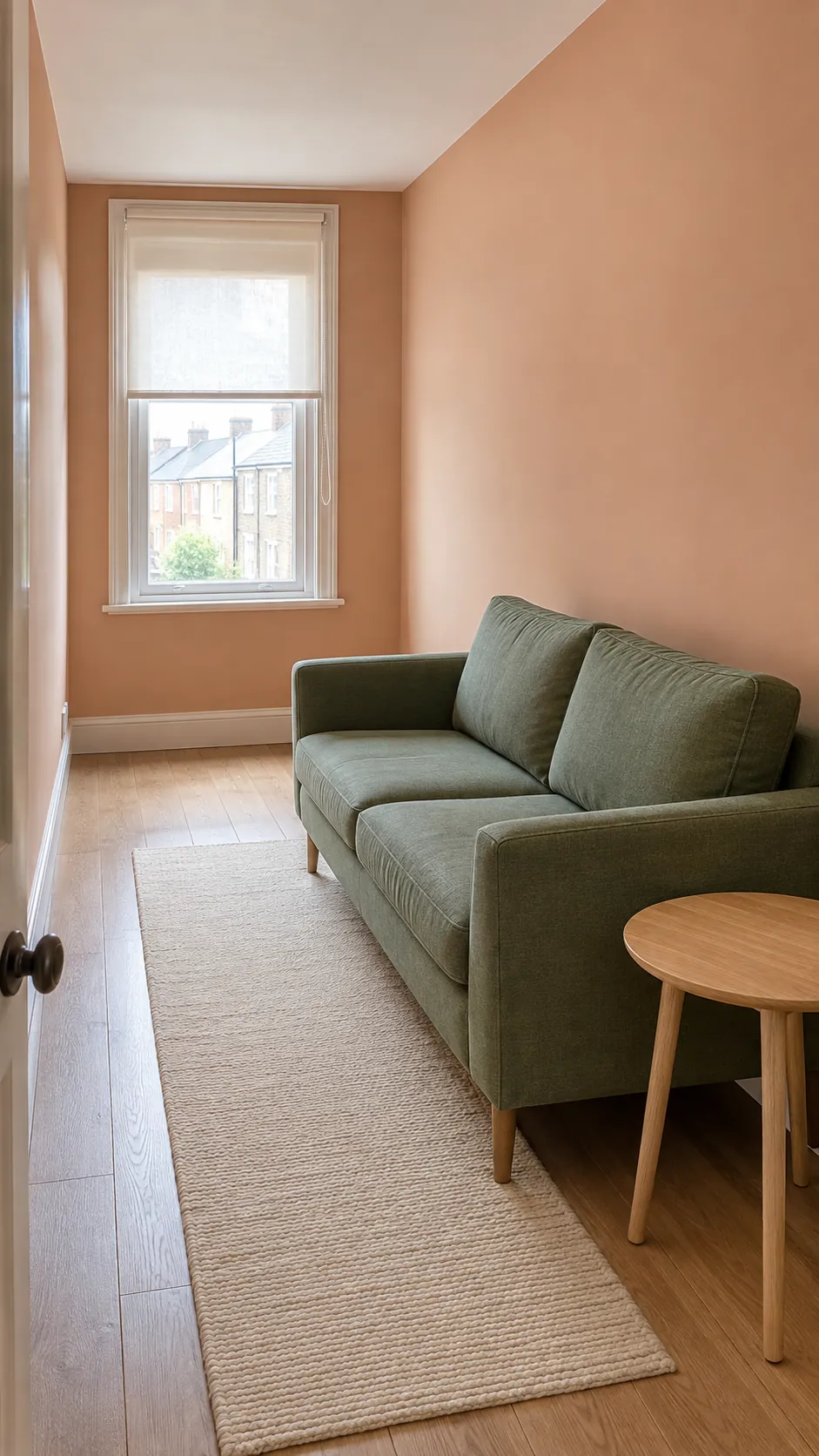
Peach and green in a narrow lounge
Peach walls and a muted green chair can give a narrow lounge character without adding bulky furniture. Keep the main walkway clear and use lighter textiles where the room feels most compressed. Color cannot correct an obstructed layout, so move the furniture before choosing the final paint.
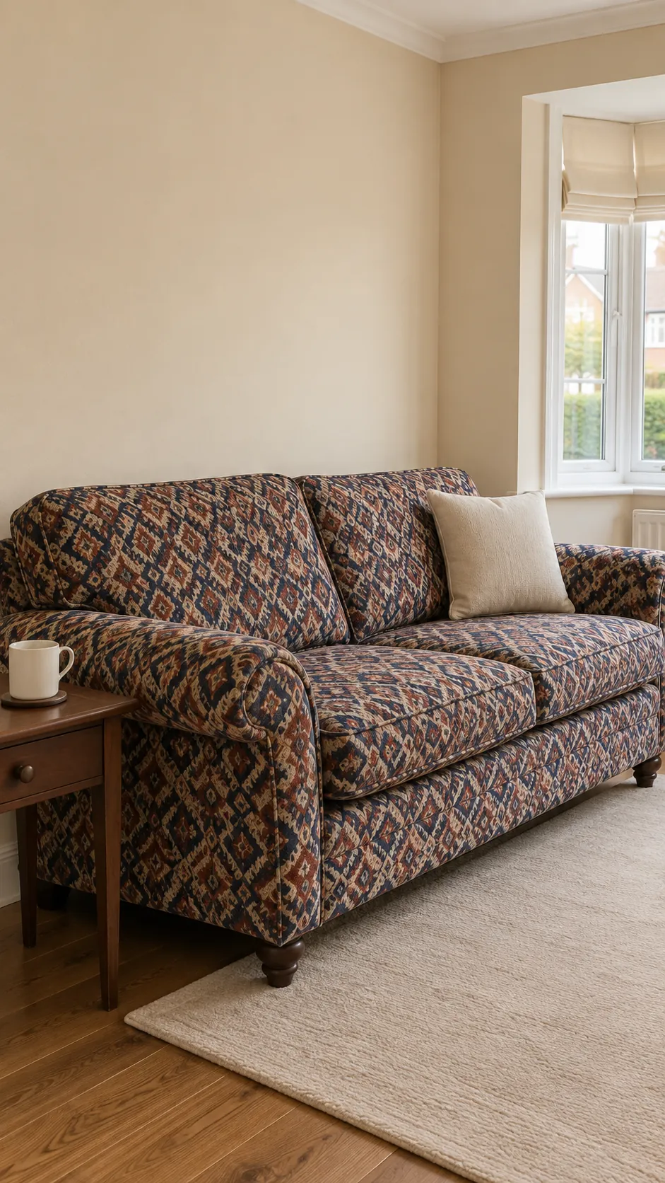
Parchment walls with a patterned sofa
A patterned sofa often contains the best starting palette for the whole room. Parchment walls can support it when the fabric includes warm pale areas. Choose one darker fabric color for a small supporting object instead of introducing an unrelated accent.
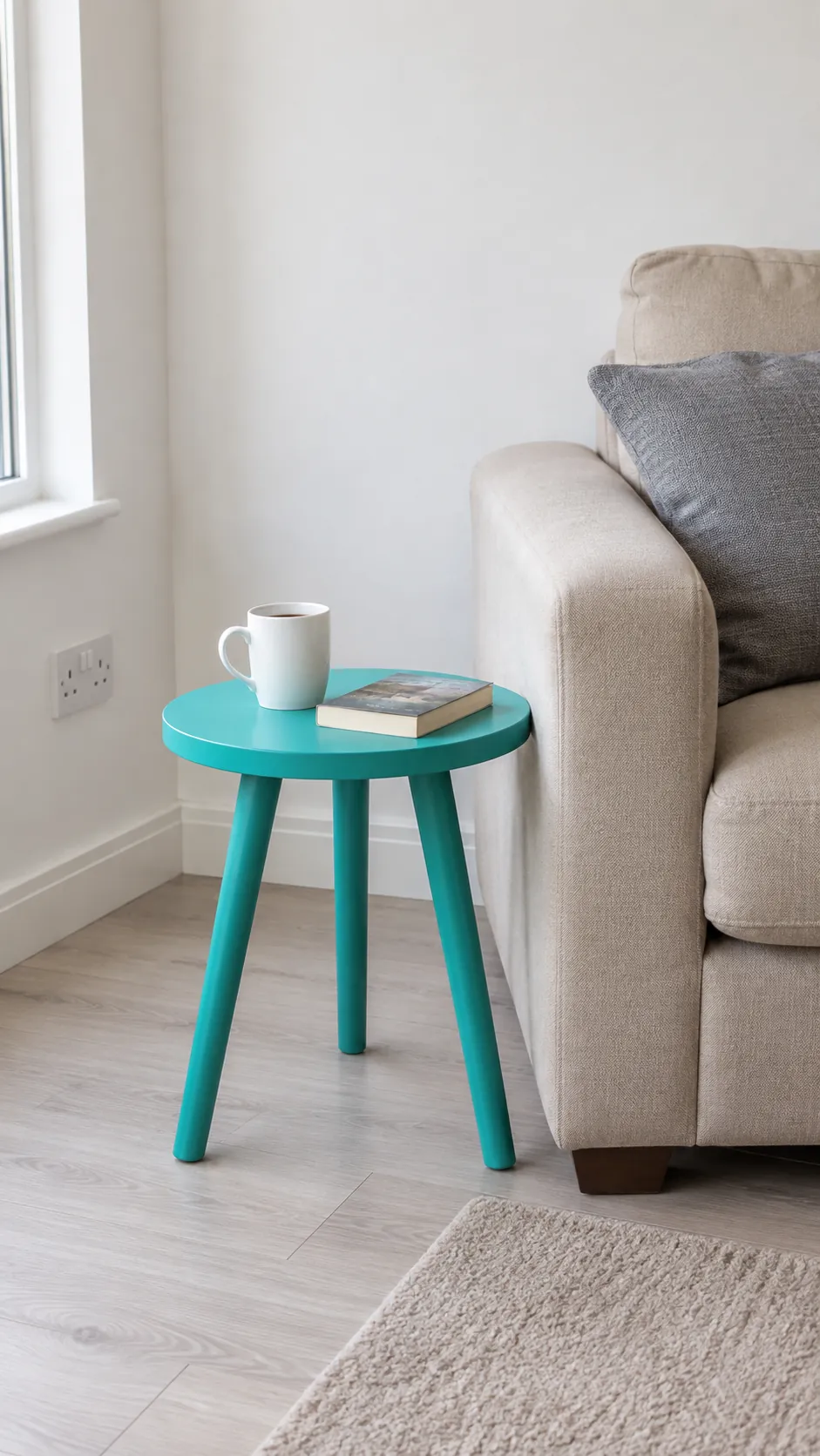
A turquoise table in a neutral rental
A turquoise side table offers a reversible color change for a rental lounge. Position it beside the seat that needs a reachable surface, keeping the accent tied to a real use. A small painted object is also easier to carry into a future home than a room full of coordinated purchases.
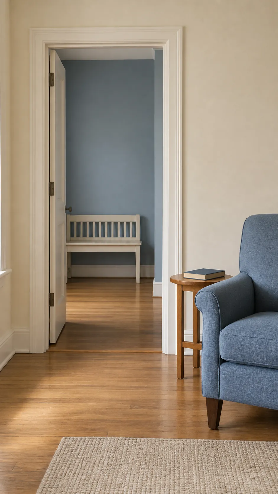
A two color scheme carried through doorways
Repeating two colors in different proportions can connect a lounge with nearby rooms. A blue sofa in the living room might relate to blue storage beyond the doorway while warm white remains the common wall color. The connection works through repetition, not through making every space look identical.
Paint samples judged beside the sofa
The final choice should survive your actual sofa, floor and lighting. Place large movable samples beside the upholstery, view them in daylight and after dark, then remove the options that look wrong at either time. Keep the sample that works with the room you have, rather than the one that looked best on a screen.