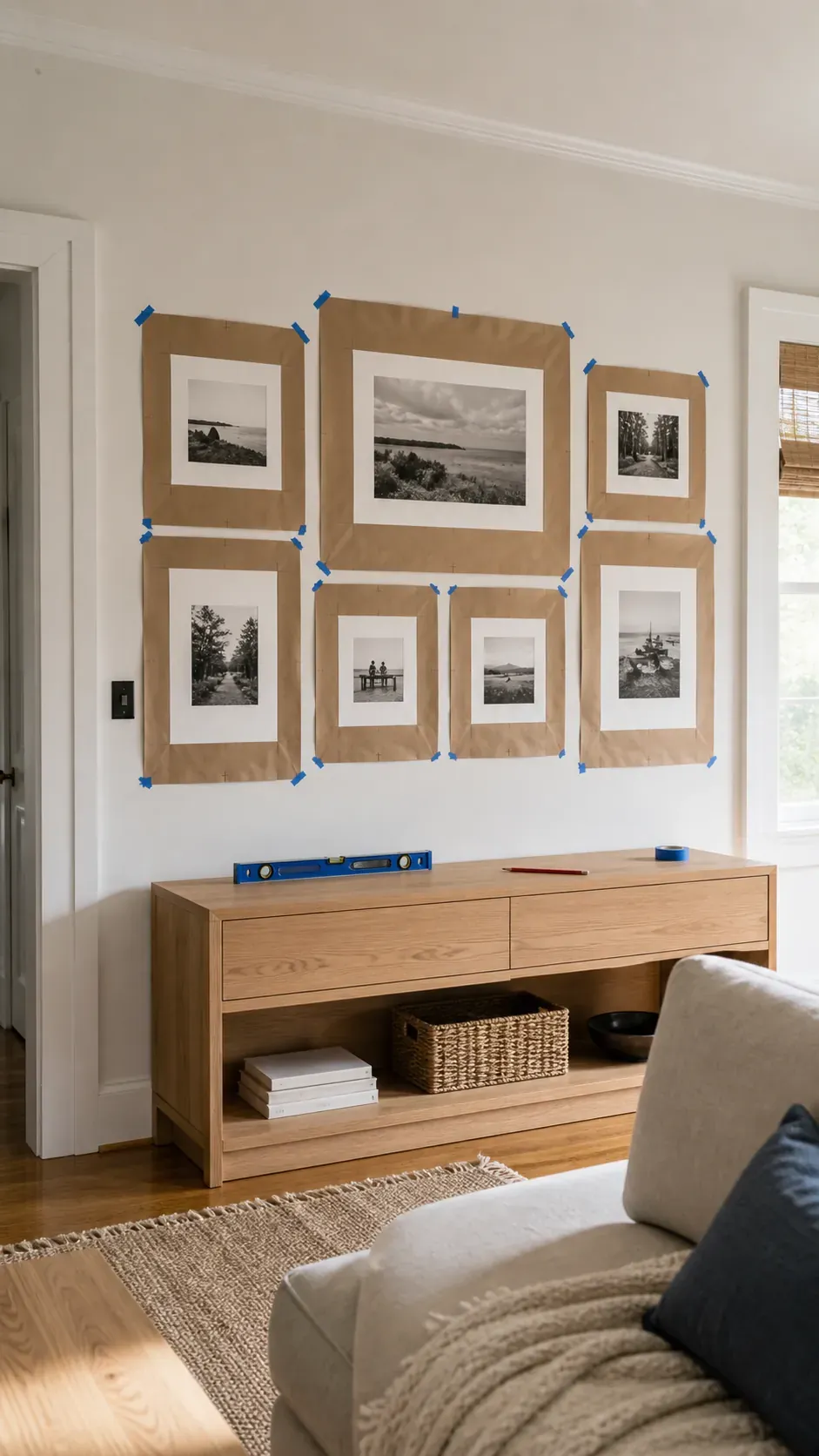
A photo display can hold wonderful memories and still feel unsettled when the frames ignore the furniture, drift out of level, or compete for attention. The most reliable approach is to decide what should anchor the eye, give the group a clear outer shape, and test the spacing before making holes. Hardware matters too, since the safest choice depends on the wall surface, frame weight, glazing, humidity, and what sits below.
Real decorating frustrations tend to be practical rather than purely stylistic. People often struggle with uneven gaps, collections that look too low, mixed finishes that lack a repeating thread, and adhesive strips that behave differently across paint and temperature conditions. The ideas below solve those problems through distinct layouts, materials, rooms, and ways to keep a collection flexible.
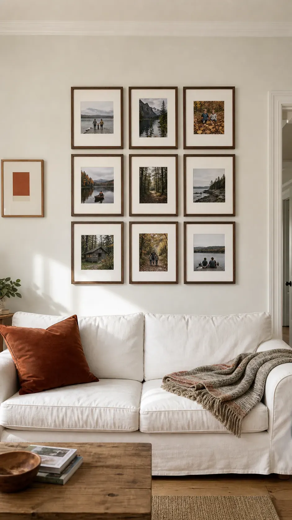
Centered Grid Above a Sofa
A centered grid gives family photographs the calm of one large artwork. Match the outer width to roughly two thirds of the sofa so the display relates to the furniture rather than floating across the wall. Equal mats can unify photos taken in different seasons and lighting. centered-grid
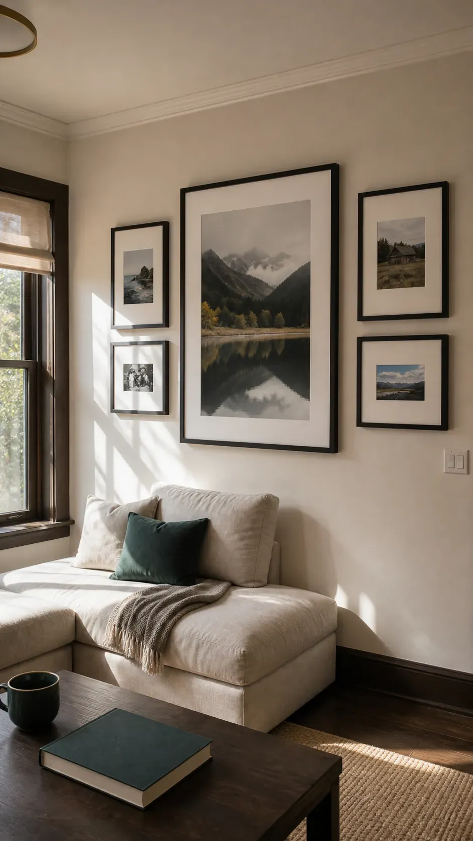
Single Oversized Frame Anchor
One oversized portrait can establish the visual center before smaller frames gather around it. Choose an image with generous negative space so faces do not feel crowded by neighboring pieces. This anchor also makes later additions easier because every new frame can be balanced against a fixed focal point. oversized-anchor
Slim Black Frame Matrix
Slim black frames create crisp rhythm without adding much visual weight. A matrix works especially well when the photos share a monochrome edit or a restrained color treatment. Keep every gap identical because even a small variation becomes obvious in a strict arrangement. black-matrix
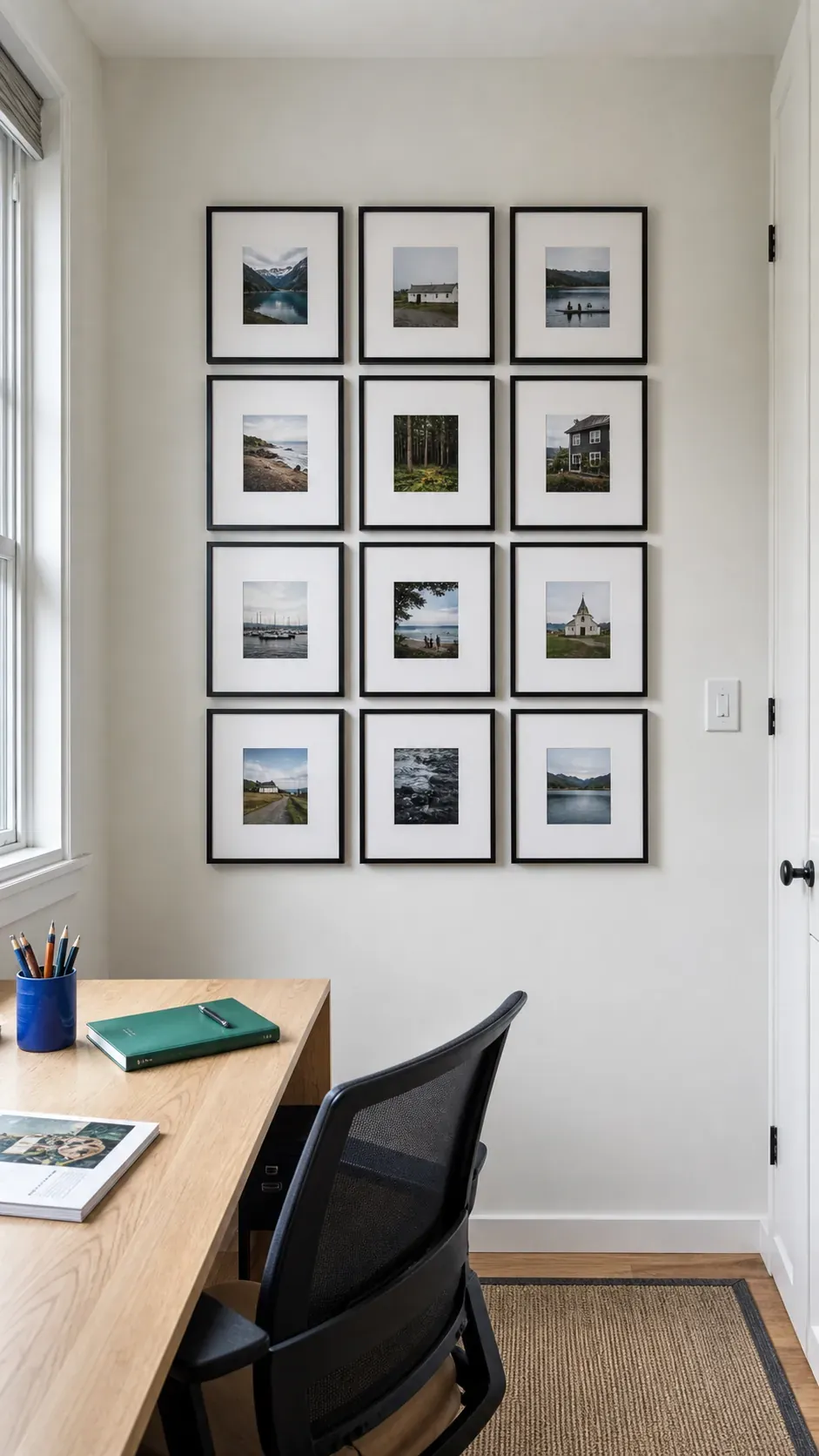
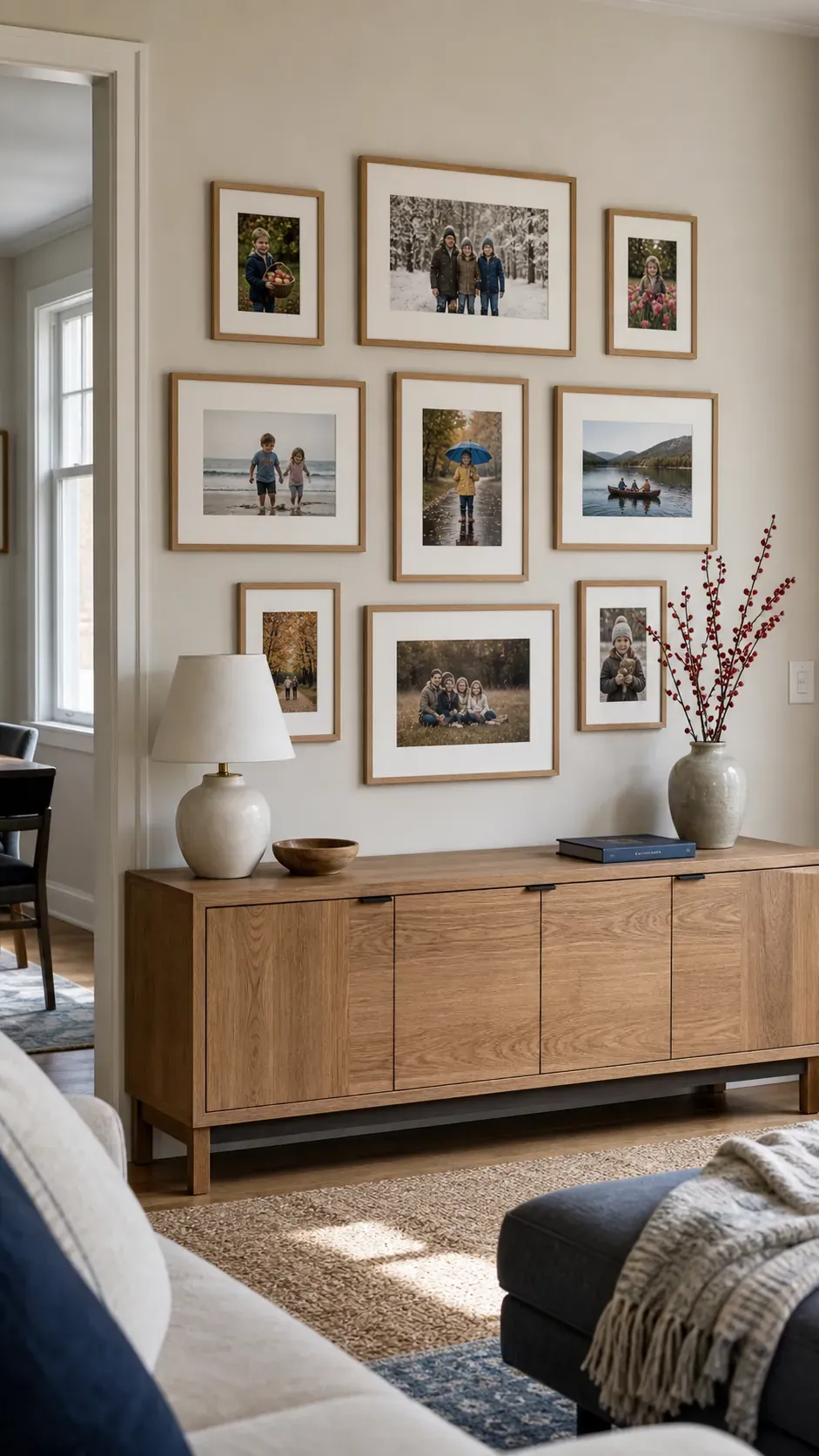
Warm Oak Family Gallery
Warm oak frames soften white walls and bring out skin tones in everyday family pictures. Use two or three frame sizes so the wall feels collected while the shared wood finish maintains order. Natural variation in the grain adds character without competing with the photographs. oak-gallery
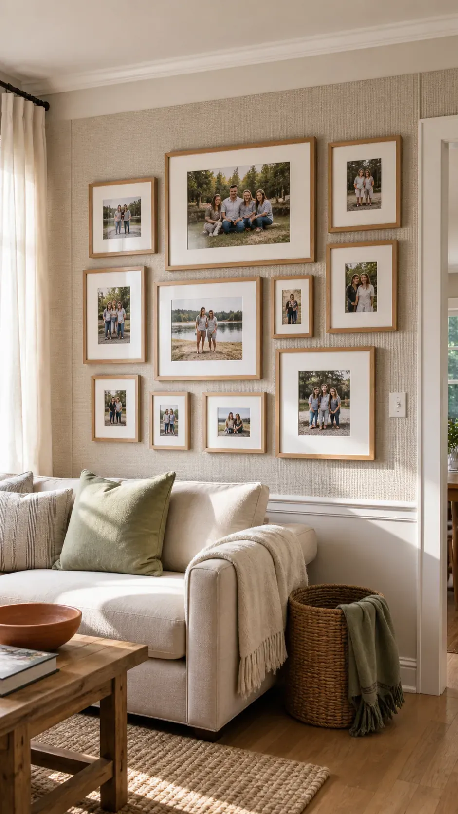
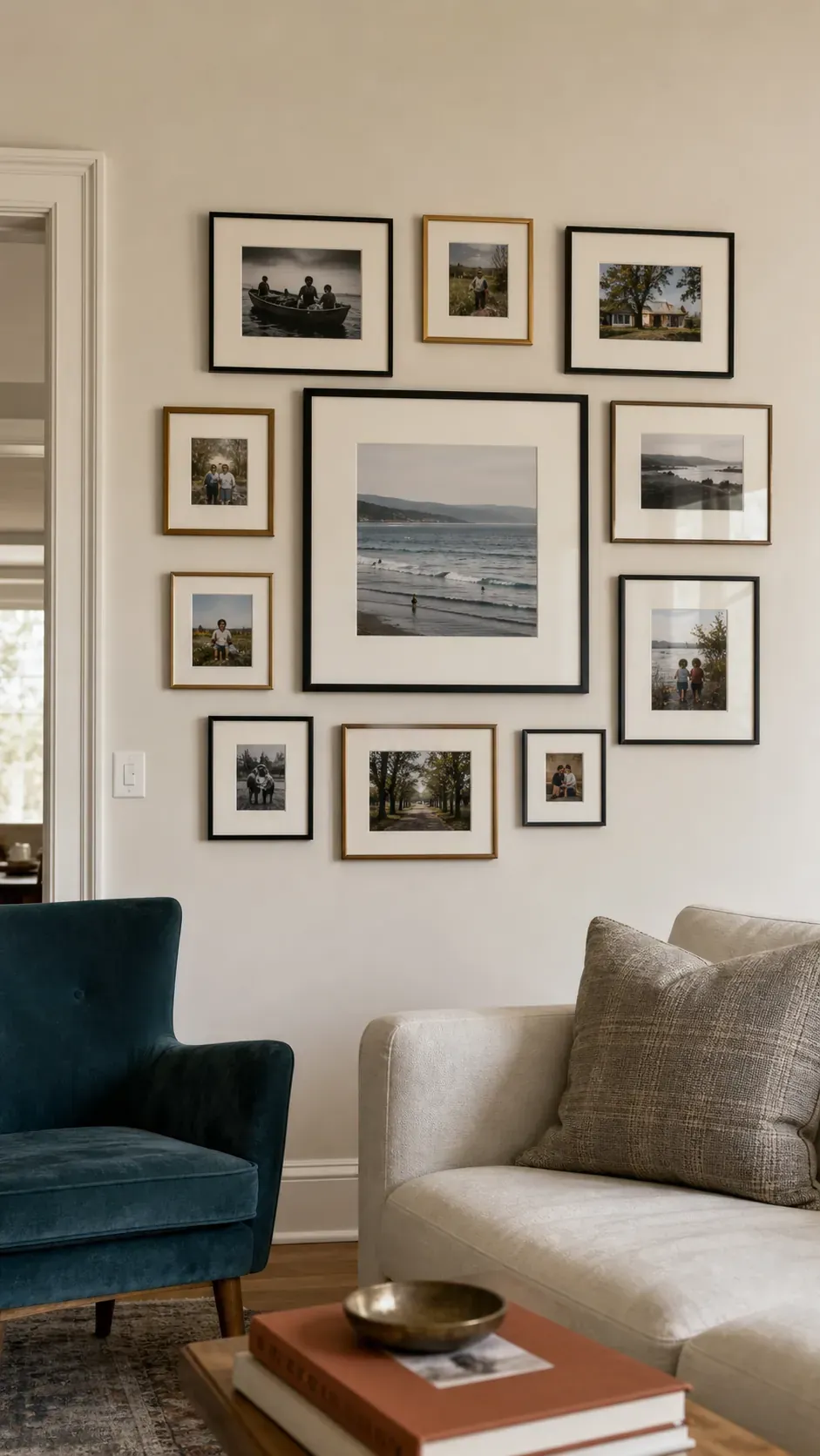
Mixed Metal Frame Collection
Brass, bronze, and black metal can coexist when one finish appears more often than the others. Repeat the dominant metal at the top, center, and lower edge to carry the eye through the arrangement. Thin profiles keep the mixture elegant rather than heavy. mixed-metal
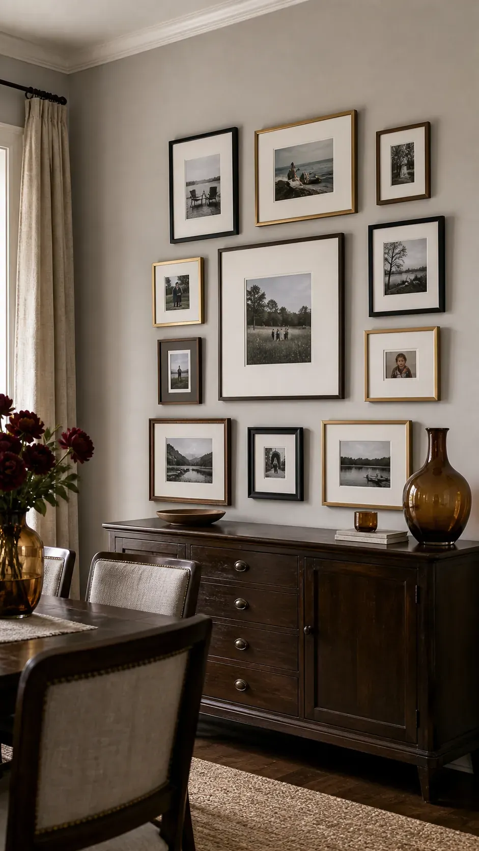
Picture Ledge Rotation
A picture ledge lets photos overlap slightly and change without fresh holes in the wall. Place the largest frame toward one side, then step down through medium and small sizes for an easy layered composition. Leave a little open ledge visible so the display does not read as storage. picture-ledge
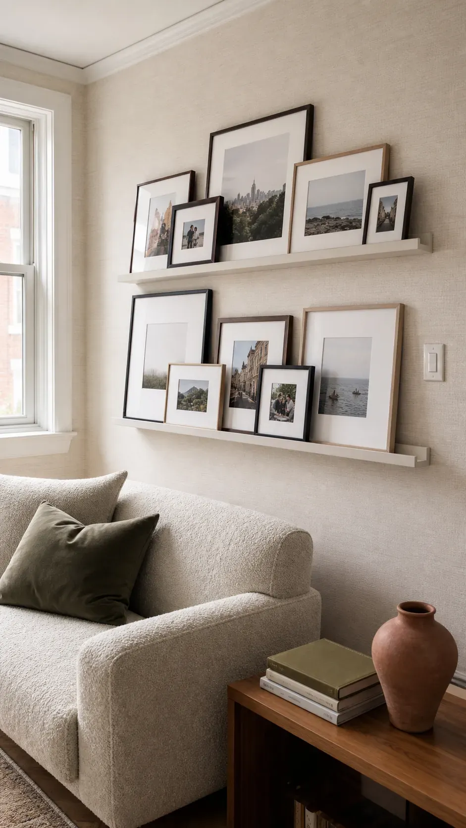
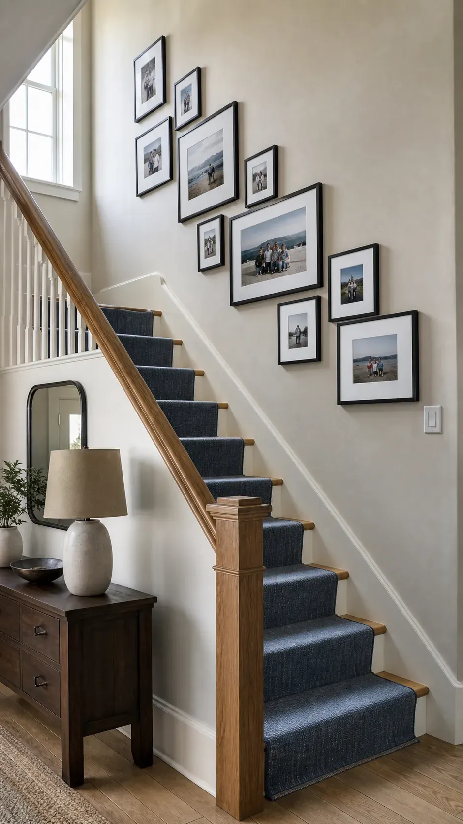
Staircase Rising Layout
A staircase gallery feels natural when its visual center follows the angle of the handrail. Establish a consistent imaginary line through the middle of the frames instead of aligning every top or bottom edge. Test the view from both the lower landing and the upper hallway before fixing the final positions. staircase-layout
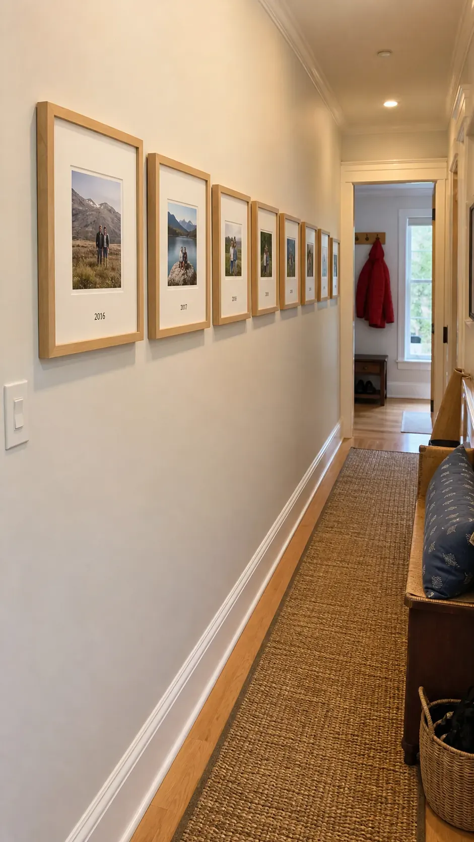
Hallway Timeline
A hallway can become a quiet family timeline with photos arranged in chronological order. Consistent frame sizes keep the story readable as people walk past. Small captions on the mats can mark places or years without turning the wall into a scrapbook page. hallway-timeline
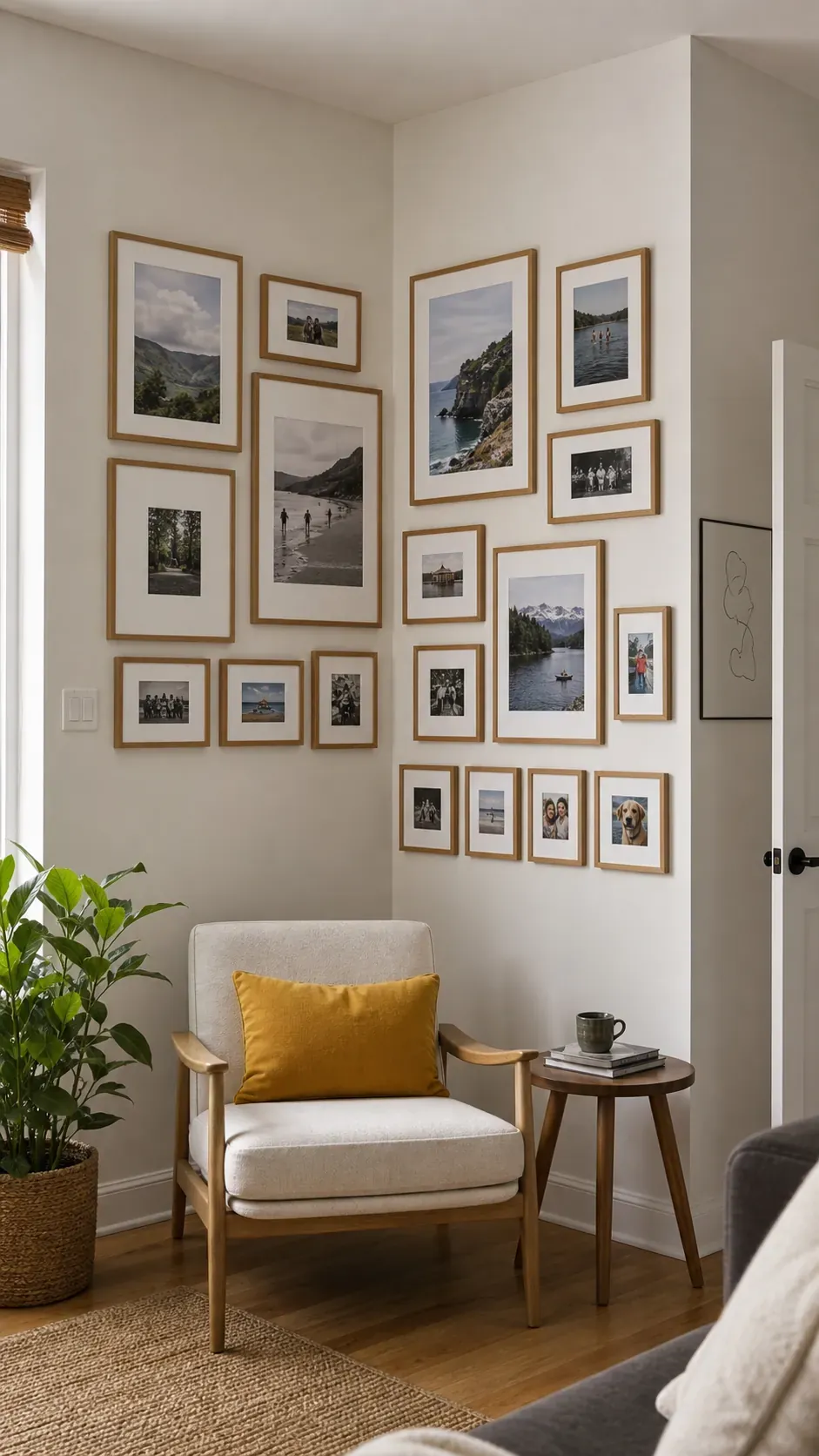
Corner Wrapping Gallery
Wrapping frames around an inside corner turns an awkward wall junction into a deliberate feature. Keep the distance from each frame to the corner similar on both walls so the composition feels connected. Use lighter frames near the edge to prevent the corner from looking crowded. corner-gallery
Floor to Ceiling Salon Wall
A floor to ceiling arrangement suits a narrow wall where horizontal space is limited. Begin with the largest pieces near normal eye level and let smaller frames extend upward and downward. Preserve a clear outer boundary so the abundance still reads as a single unit. salon-wall
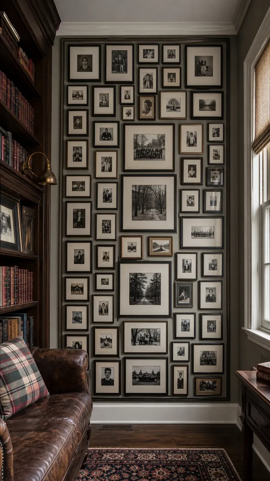
Monochrome Photo Story
Black and white editing can unite photographs from different cameras and decades. Vary the mat widths to give important portraits extra breathing room while keeping the frame finish consistent. The result feels curated without erasing the personality of each image. monochrome-story
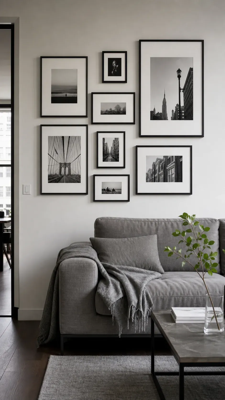
Color Coordinated Memories
A shared color thread can connect travel pictures, portraits, and candid scenes without forcing every photo through the same filter. Look for one repeated hue such as ocean blue or garden green and distribute it across the wall. Neutral mats provide pauses between stronger colors. color-coordinated
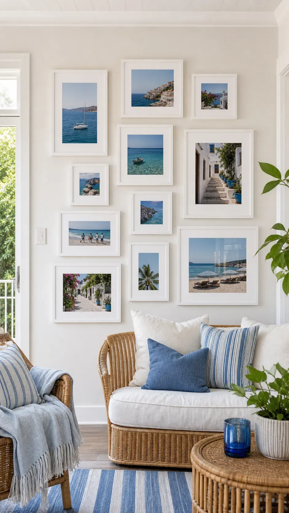
Gold Frame Accent Wall
Gold frames add warmth when their shine is controlled. Mix brushed and lightly aged finishes rather than using highly reflective gold on every piece. A soft wall color such as clay, sage, or warm white keeps the metal from feeling overly formal. gold-accent
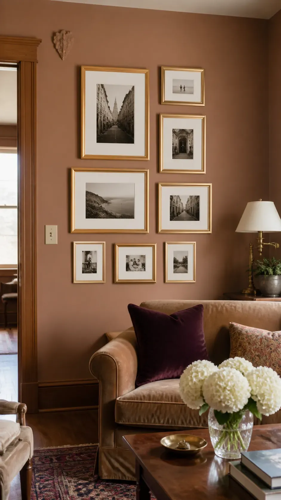
White Frames on Deep Paint
White frames stand out clearly against navy, forest, or charcoal walls. Wide white mats strengthen that contrast and prevent colorful photographs from disappearing into the paint. Keep the arrangement compact so the pale shapes feel connected. white-deep-wall
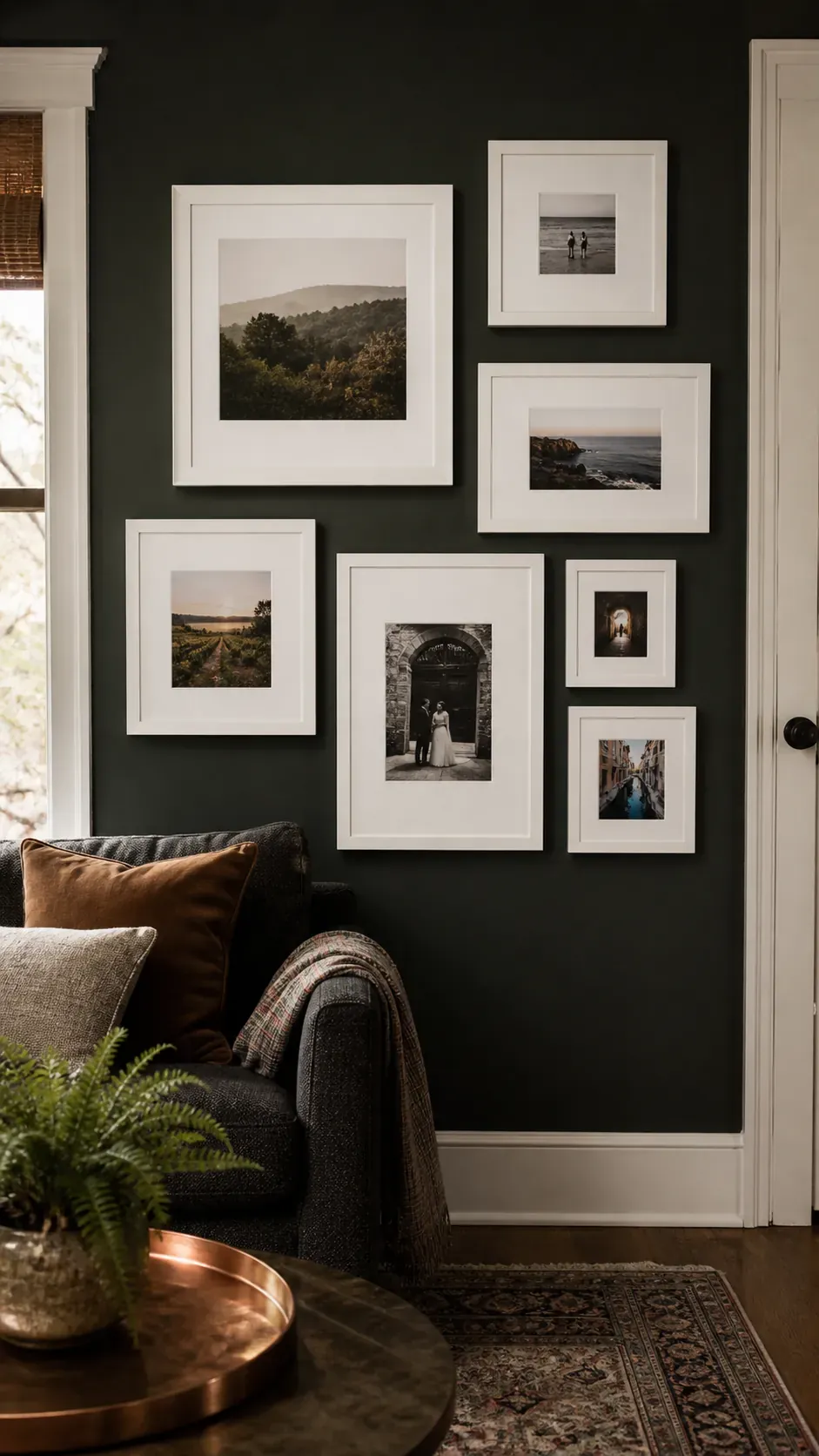
Tone on Tone Frame Display
Frames painted close to the wall color create texture without strong contrast. This approach works well in restful bedrooms or small rooms where a busy gallery could dominate. Let mat color and photo content provide the subtle separation. tone-on-tone
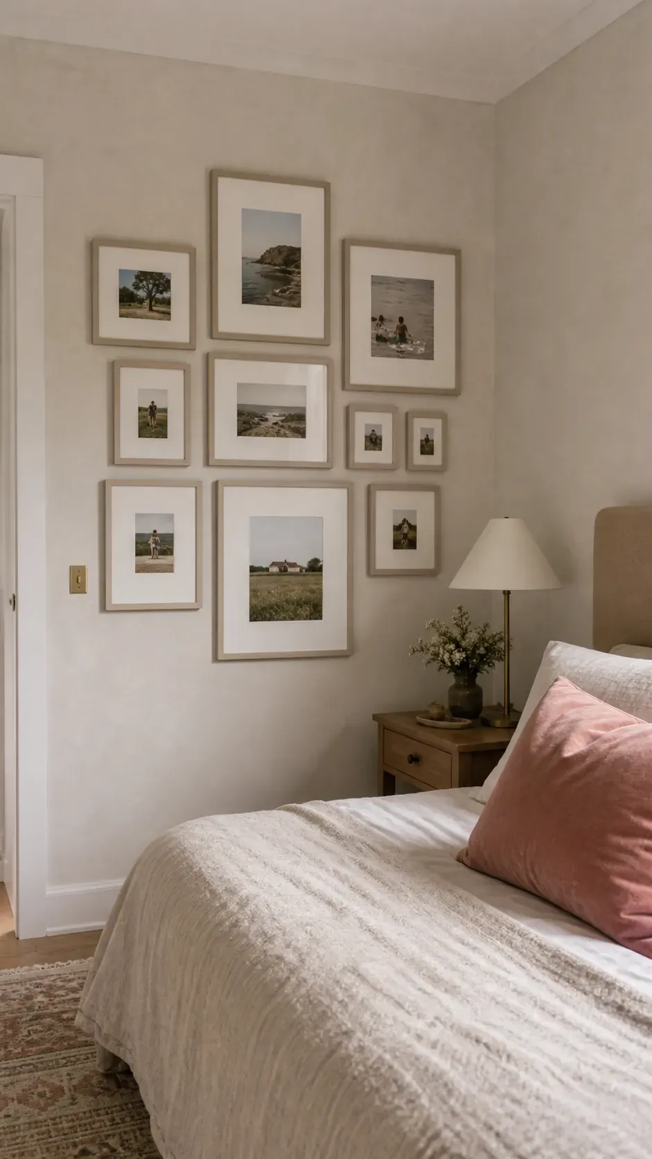
Vintage Frames with Modern Photos
Ornate vintage frames can make recent snapshots feel personal rather than formal. Limit the palette to two related finishes so carved details do not become visual noise. Simple mats create a clean buffer between contemporary photography and decorative edges. vintage-modern
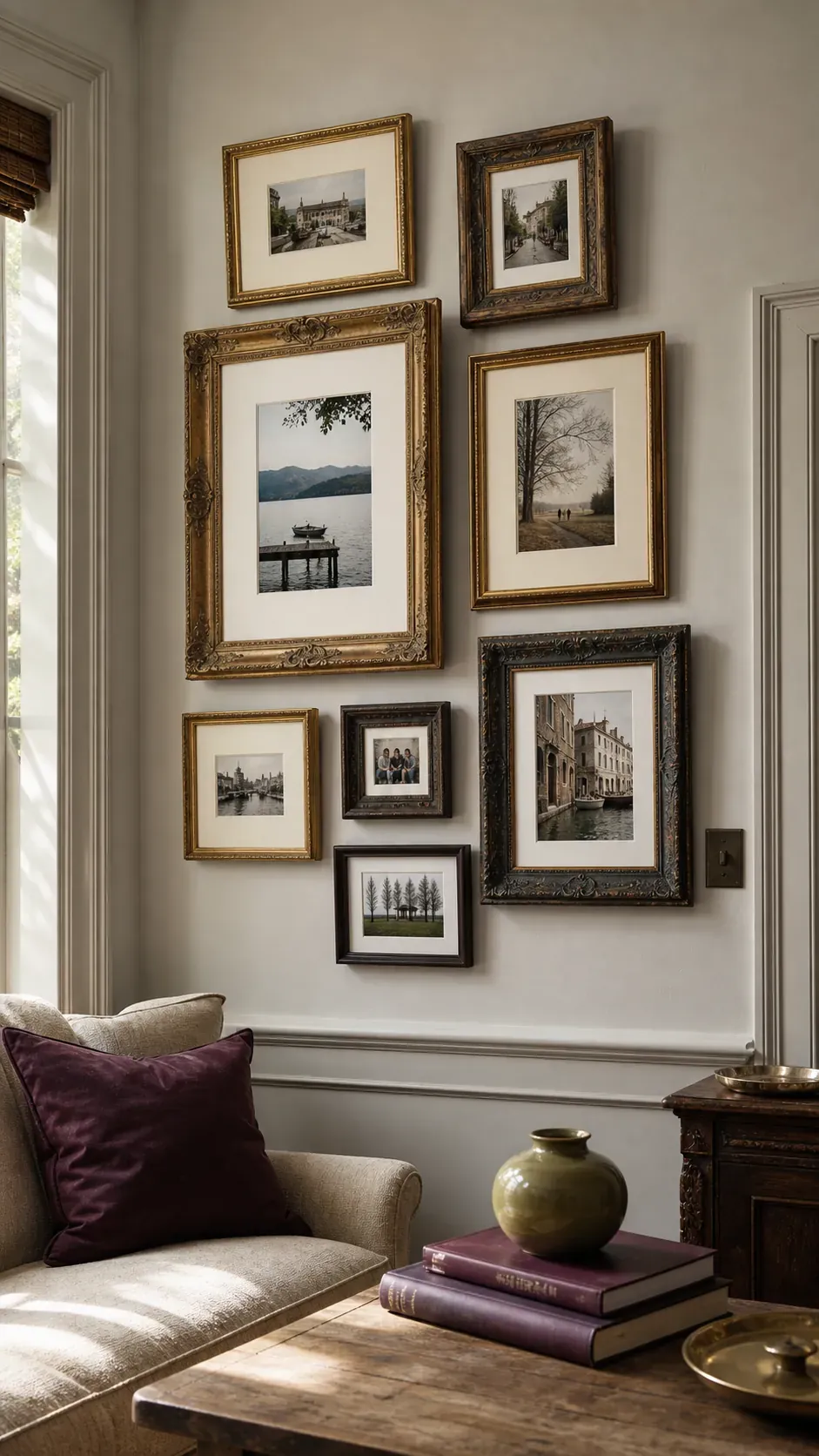
Thrifted Frame Cohesion
Thrifted frames become cohesive after a thoughtful edit rather than a total makeover. Repeat one element such as dark wood, narrow brass, or cream mats across the collection. Minor wear can stay visible because it supports the gathered over time character. thrifted-cohesion
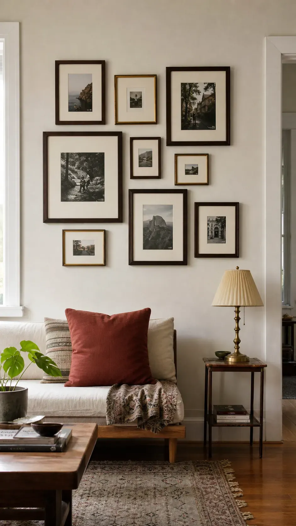
Painted Frame Color Block
Painted frames can introduce color in a controlled block above a desk or console. Choose neighboring hues and vary their intensity instead of using unrelated brights. Keep the photographs simple so the frame treatment remains playful rather than chaotic. painted-color-block
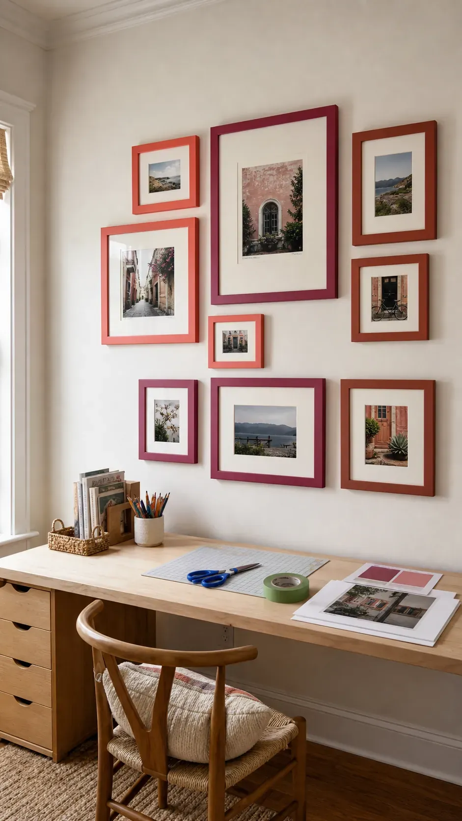
Small Space Mini Gallery
A mini gallery can give a compact apartment personality without consuming the whole wall. Use five to seven lightweight frames and keep the outer shape narrow. One slightly larger image creates hierarchy while close spacing makes the group read as a whole. mini-gallery
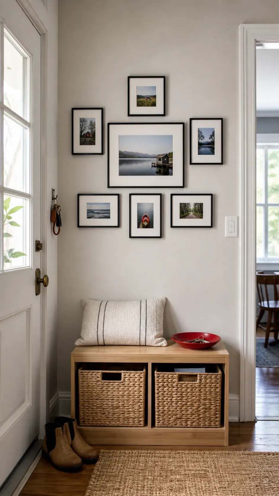
Rental Friendly Lightweight Wall
Light acrylic glazing and slim frames reduce the load for a rental friendly installation. Follow the hanger maker’s surface preparation, curing, and weight instructions rather than relying on extra strips as a guess. Avoid placing breakable frames above beds or seating when adhesive performance is uncertain. rental-friendly
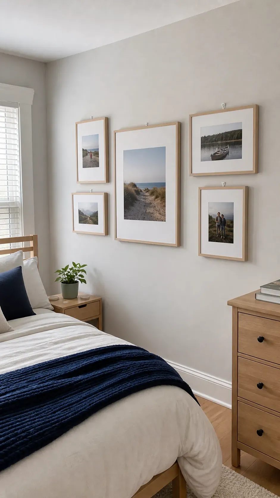
Desk Backdrop Photo Grid
A photo grid above a desk adds warmth while preserving a focused work zone. Align the display with the desk instead of the full wall so the composition supports the furniture below. Calm images and even spacing help the background feel organized during video calls. desk-backdrop
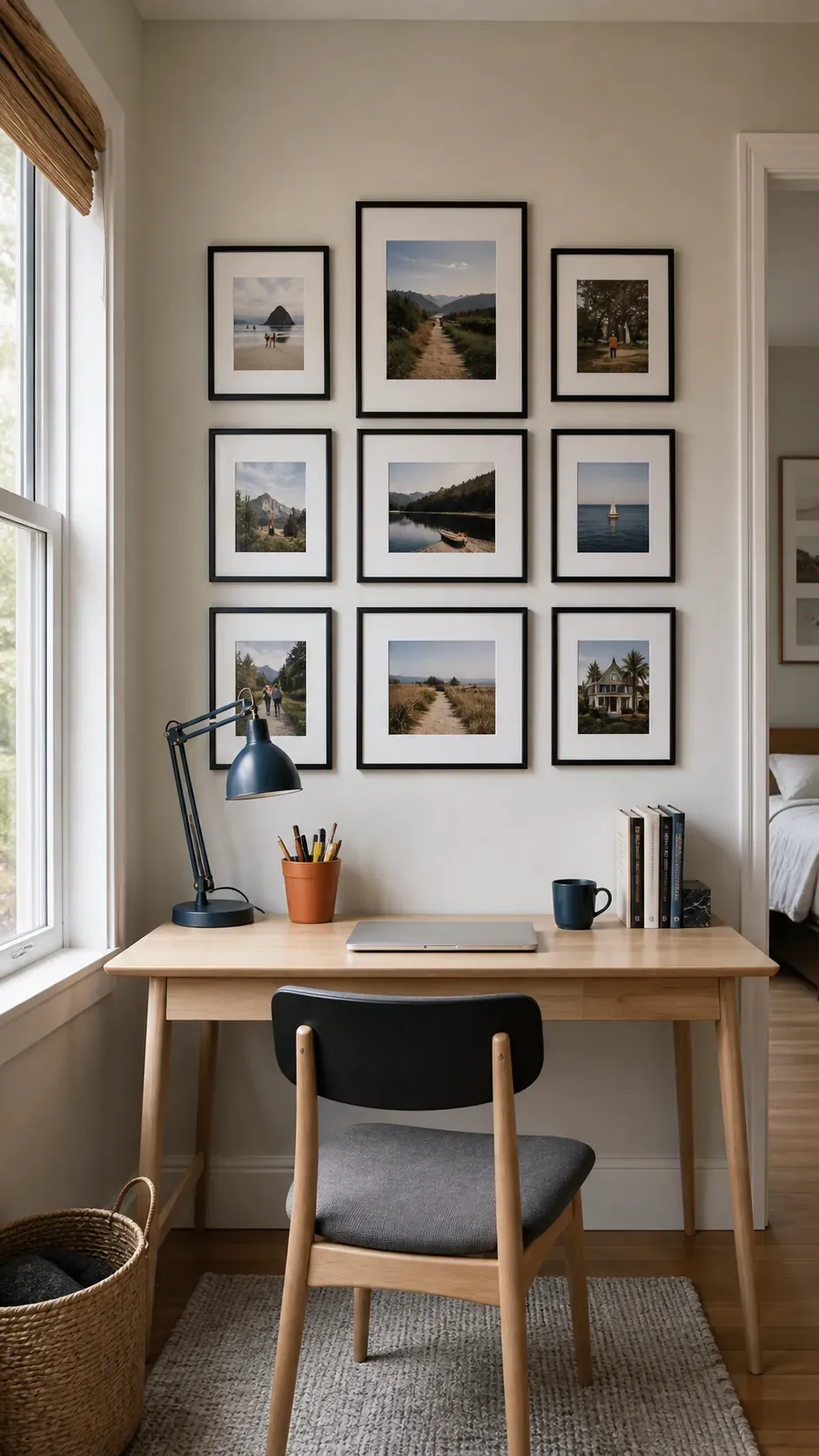
Entryway Welcome Gallery
Entryway photographs can introduce the people and places that define the home. Use durable frames and secure hardware because bags, coats, and doors create frequent movement nearby. A narrow console below gives the wall a visual base and a practical landing spot. entryway-welcome
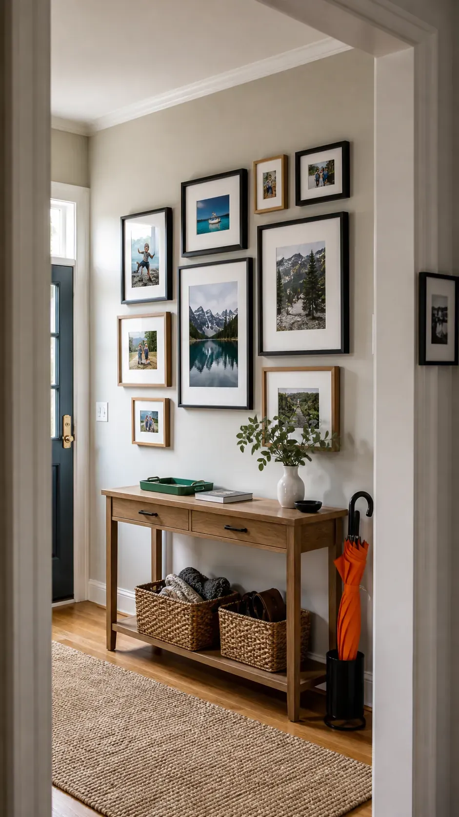
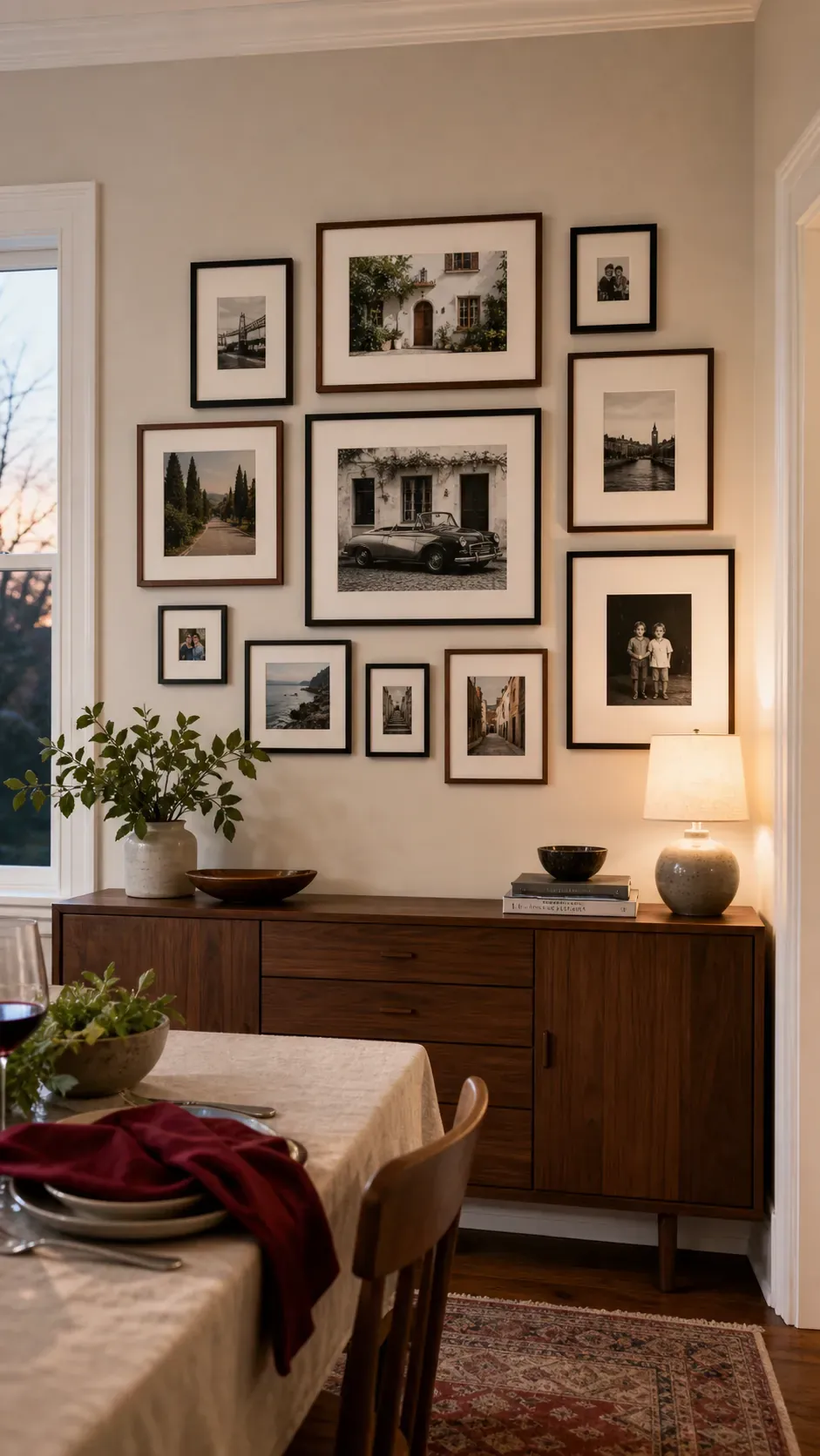
Dining Room Conversation Wall
A dining room gallery invites close viewing when the pictures have stories guests can ask about. Mix portraits with places, celebrations, and small details to create varied conversation points. Keep the lowest frames high enough to clear seated heads and chair movement. dining-conversation
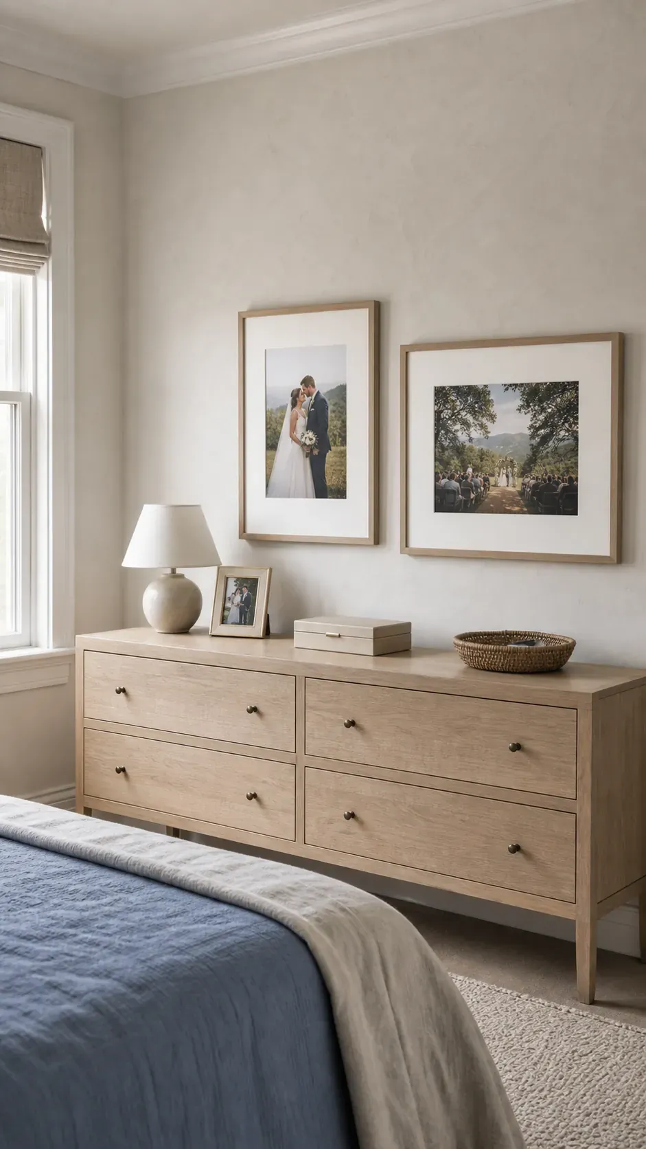
Bedroom Memory Pairing
A restrained pair of wedding or family photographs can feel more restful than a large collage in a bedroom. Match the image scale and mat proportions even if one frame is portrait and the other landscape. Position the pair in relation to the headboard or dresser for a stable composition. bedroom-pairing
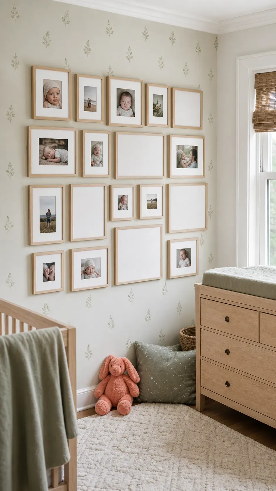
Nursery Growing Gallery
A nursery gallery can expand as new milestones arrive. Reserve open positions in the paper layout before hanging the first set so growth feels planned. Use secure lightweight frames with no glass within a child’s reach. nursery-growing
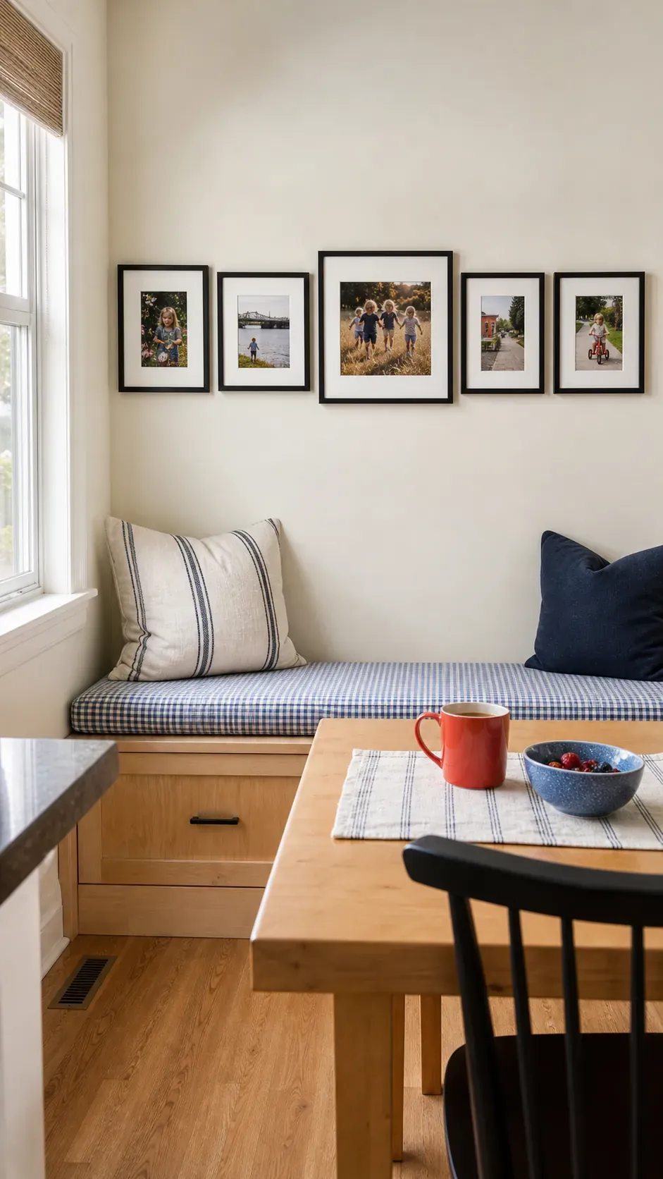
Kitchen Breakfast Nook Photos
A breakfast nook benefits from cheerful candid images that suit its daily energy. Choose wipeable frames and keep them away from direct steam or splatter. A horizontal arrangement follows the bench or table and makes a tight corner feel wider. breakfast-nook
Travel Memory Map Wall
Travel photographs gain context when they surround a simple map or destination label. Group images by region or journey instead of mixing every trip at random. Repeat frame finishes across destinations so the wall tells many stories in one visual language. travel-map
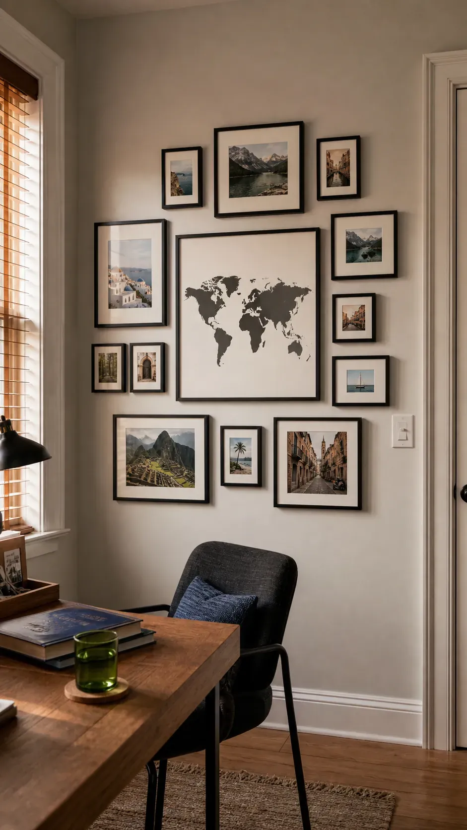
Seasonal Family Portrait Swap
A small set of front opening frames makes seasonal photo changes quick. Keep the layout permanent while rotating only the images, which avoids repeated measuring and wall damage. Store spare prints flat in labeled sleeves so favorites remain clean. seasonal-swap
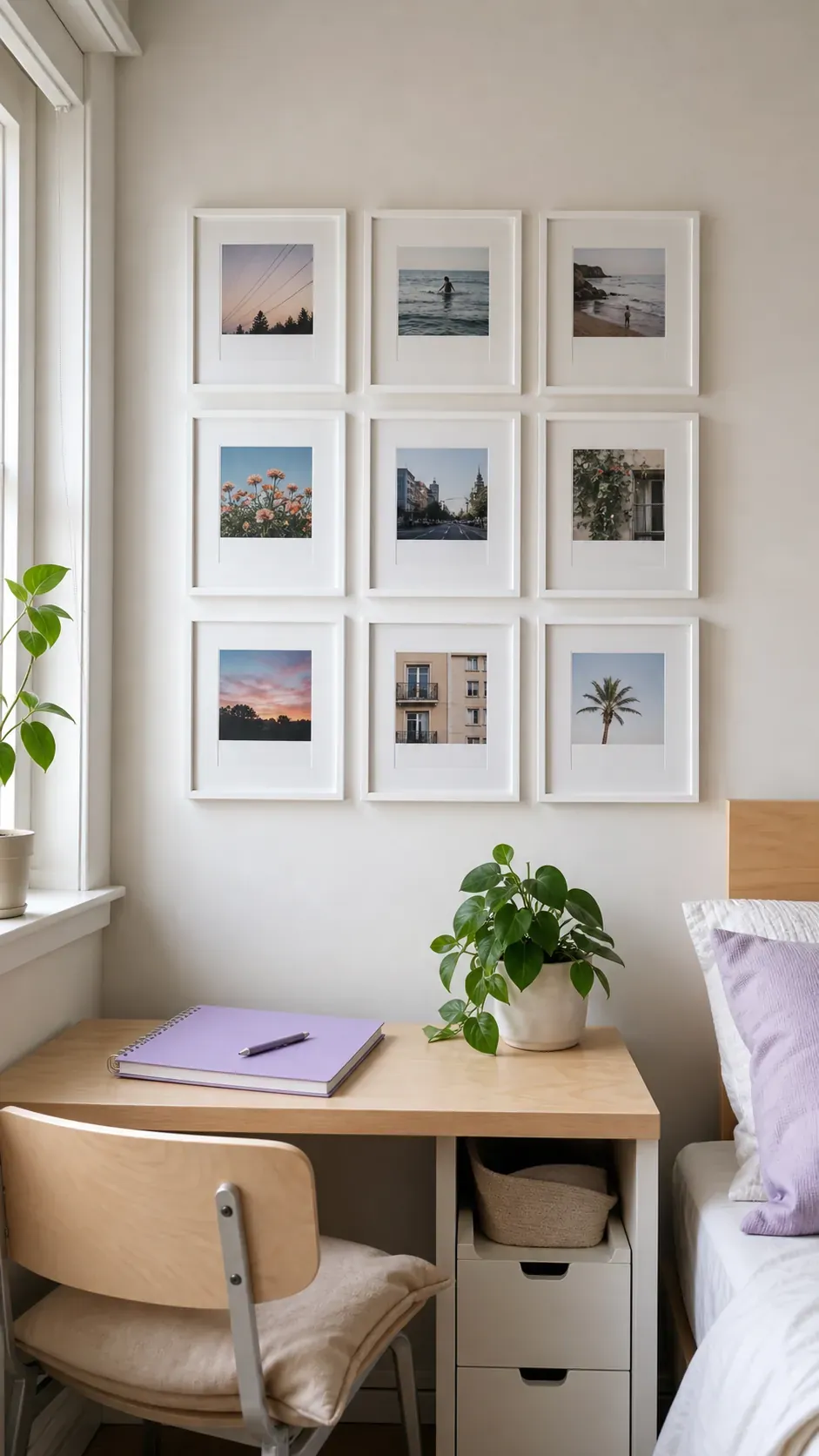
Polaroid Style Frame Rhythm
Square photos with generous white borders bring an informal instant print mood to a precise grid. Keep the image crops varied but align the outer frames carefully. This balance between casual content and disciplined spacing prevents the wall from feeling temporary. polaroid-rhythm
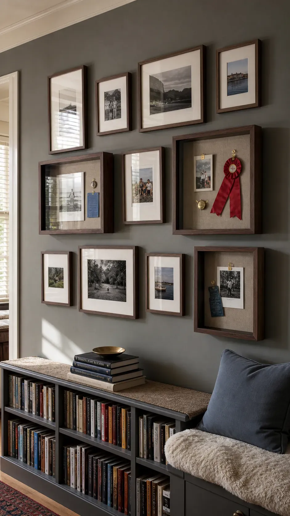
Shadow Box Memory Mix
A few shallow shadow boxes can add objects such as tickets, fabric, or small keepsakes among photographs. Use them sparingly because their depth and shadows carry more visual weight than flat frames. Place the deepest box near the center and secure it with hardware rated for the full loaded weight. shadow-box
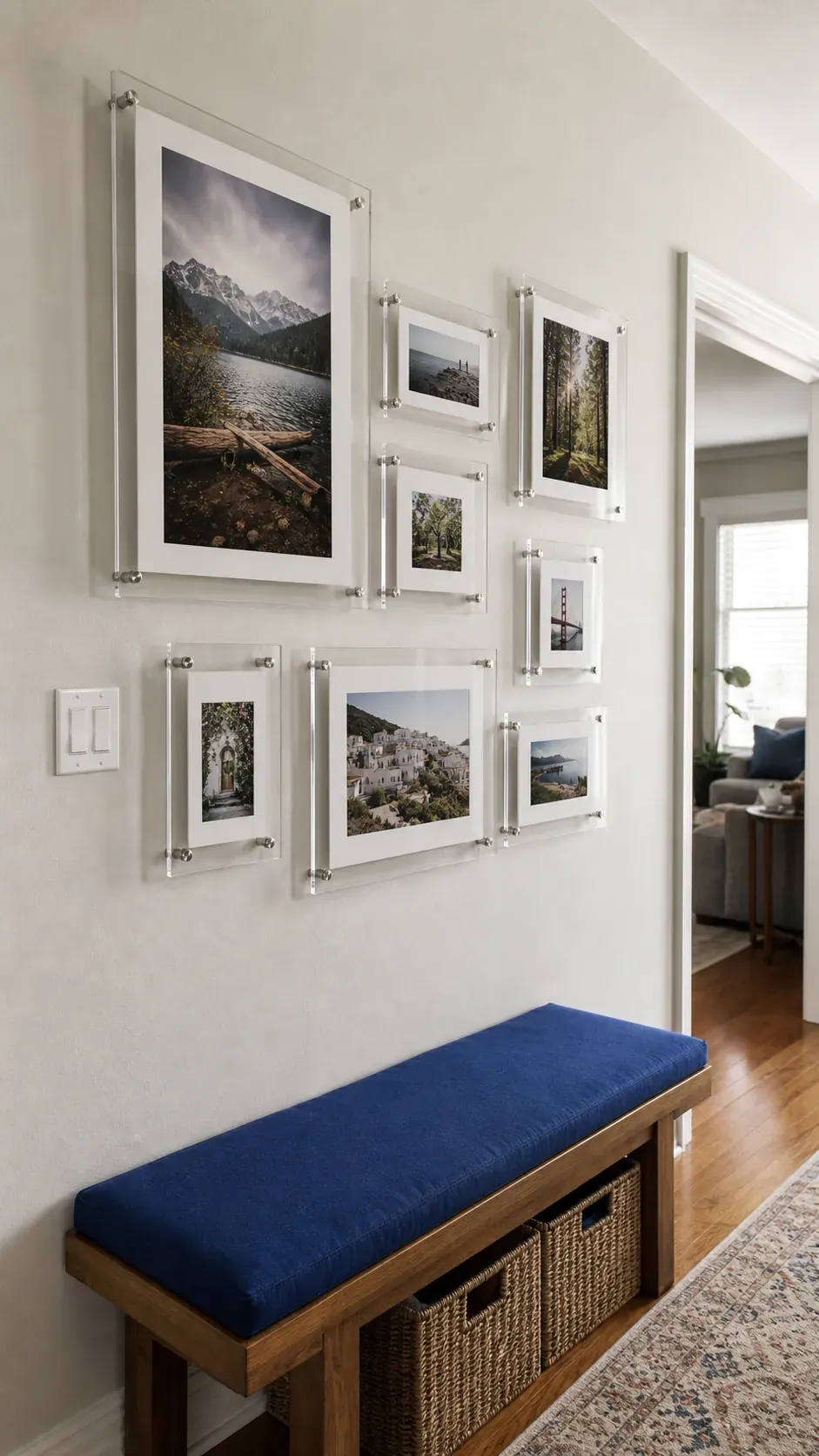
Floating Acrylic Frames
Floating acrylic frames give photographs a light contemporary edge. Consistent exposed borders make mixed image sizes feel related. Check glare from windows before hanging because reflections can hide the pictures at common viewing angles. floating-acrylic
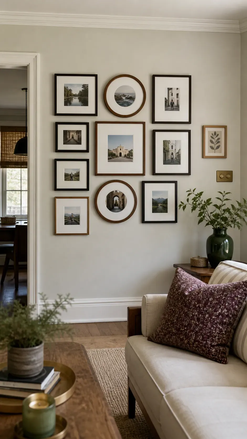
Round Frame Interruption
One or two round frames can loosen a collection dominated by rectangles. Place a circle near an internal corner of the layout where it can soften several straight edges. Repeating the round shape once elsewhere makes the choice look intentional. round-interruption
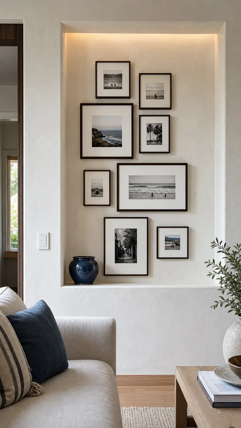
Architectural Niche Display
A shallow niche offers a natural boundary for a compact frame collection. Measure the empty margin on all sides so the display does not press against the trim. Smaller mats and slender frames preserve breathing room within the fixed recess. niche-display
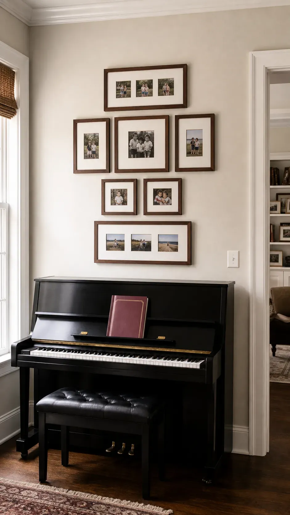
Above Piano Photo Composition
A piano provides a strong horizontal base for a photo wall. Keep the overall group narrower than the instrument and leave enough clearance for music, lamps, or the open lid. An anchor frame near the middle prevents smaller family photos from drifting visually. piano-composition
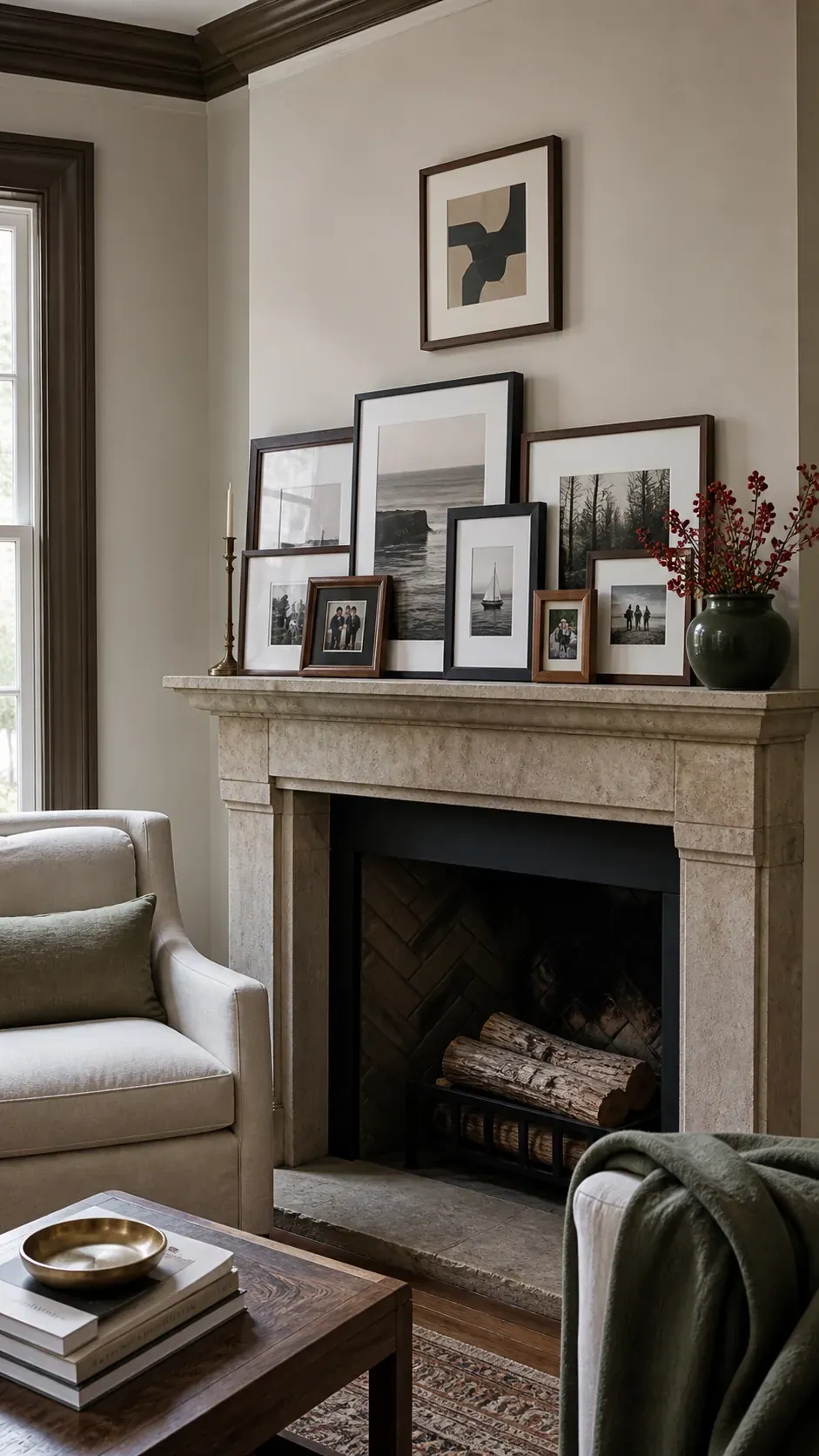
Mantel Layered Frames
Layered frames on a mantel create depth without hanging every piece. Overlap only the edges, never important faces, and vary heights so each image remains legible. Secure leaning frames where vibration or accidental contact could cause a fall. mantel-layered
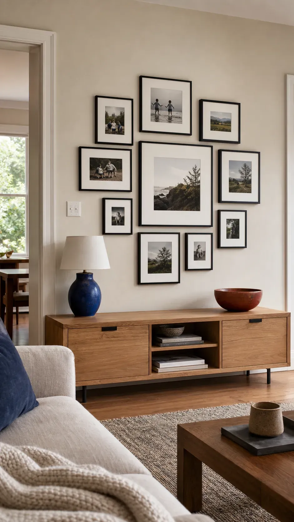
Low Console Balanced Cluster
A cluster above a low console can be more organic than a rigid grid. Balance visual weight through frame size, dark tones, and portrait placement rather than mirror symmetry. The gap above the furniture should be smaller than the empty space above the gallery. console-cluster
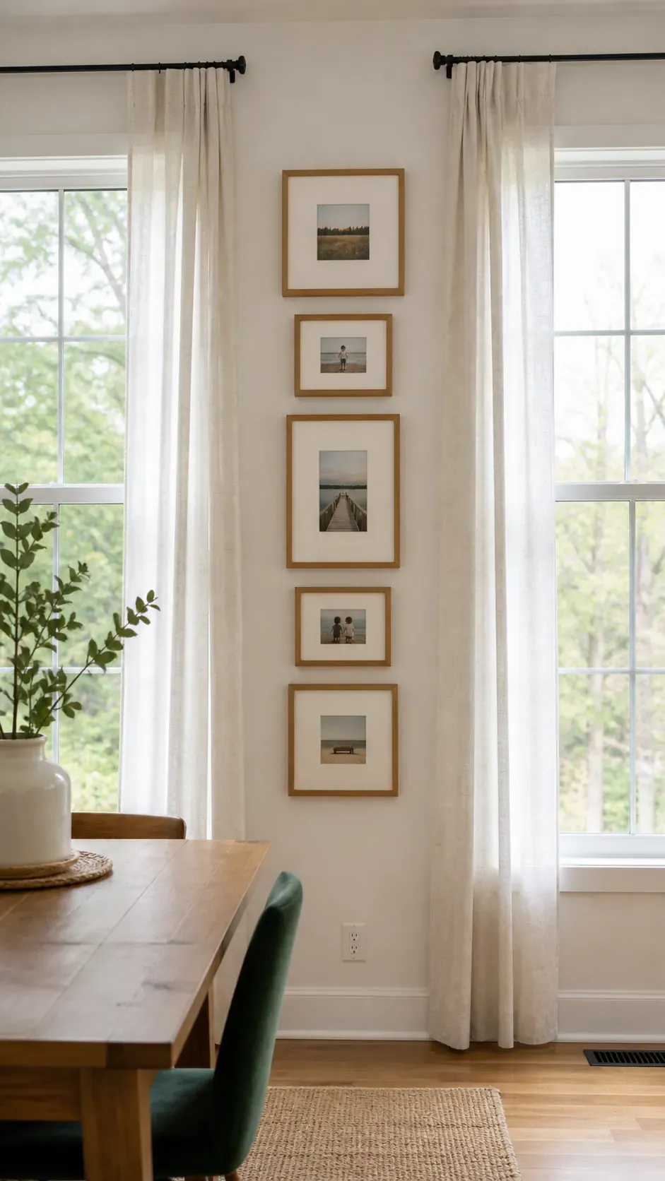
Vertical Strip Between Windows
A narrow strip between windows suits a stacked sequence of small portraits. Match frame widths and align their centers to emphasize the architecture. Window light can create glare, so matte glazing or a slight change in angle may improve visibility. between-windows
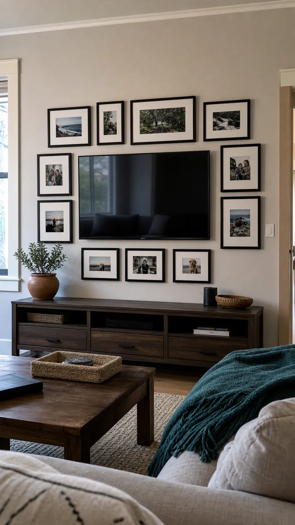
Around Television Photo Wall
Photos around a television work best when they create a broad outer shape rather than crowding the screen. Keep a consistent buffer around the television for ventilation, cables, and visual rest. Dark frames can relate to the screen while pale mats keep the display from becoming one heavy block. television-wall
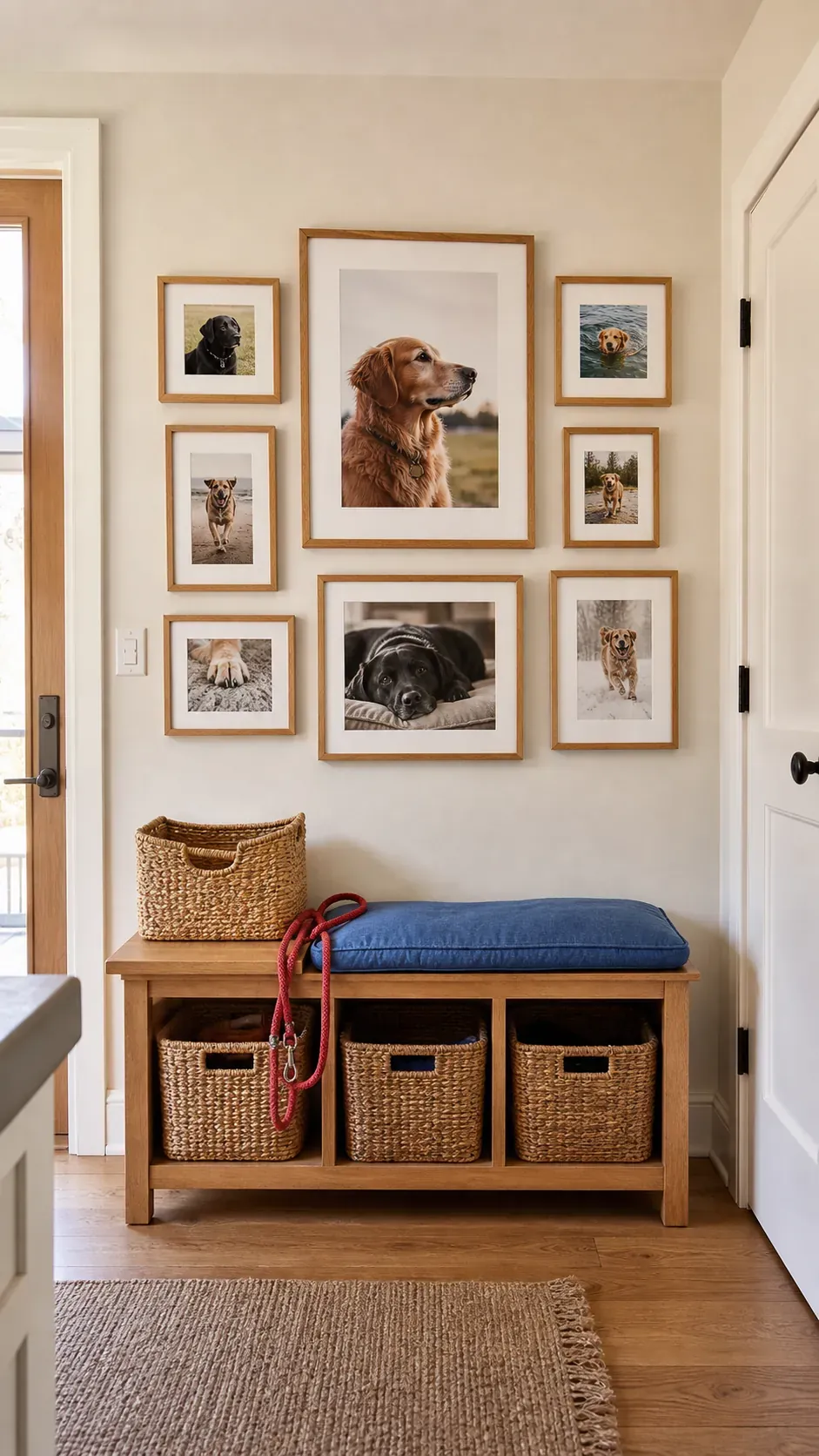
Pet Portrait Feature
A pet portrait collection feels richer when it includes quiet details as well as posed faces. Mix a favorite close portrait with movement, paws, toys, and familiar resting places. Consistent editing and frames turn different moments into one affectionate story. pet-portrait
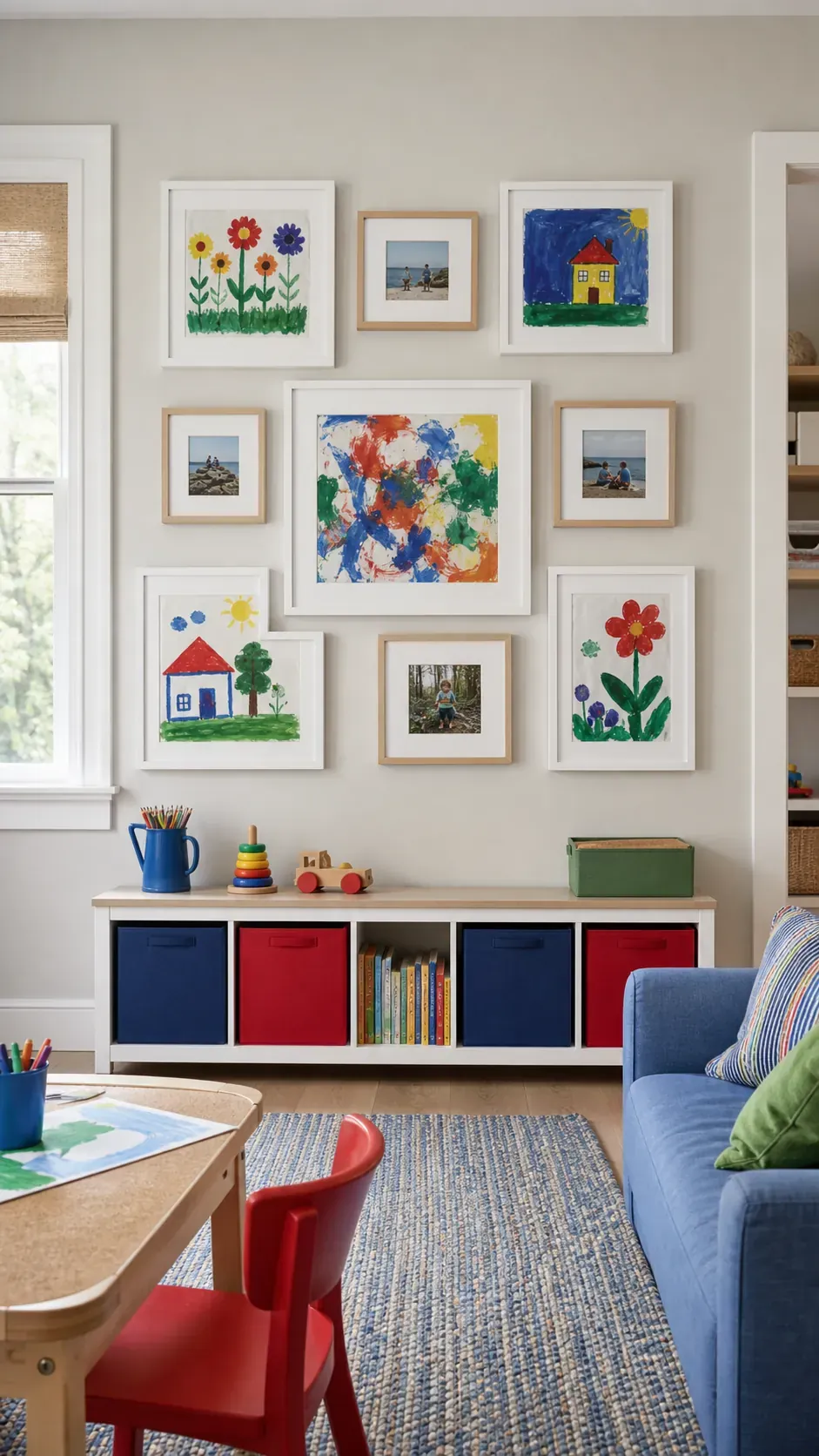
Children’s Art and Photo Mix
Children’s art can sit beside family photos when both receive equally considered framing. Use simple mats to calm bright paper colors and protect original pieces from direct contact with glazing. Rotate work periodically while keeping the outer layout stable. art-photo-mix
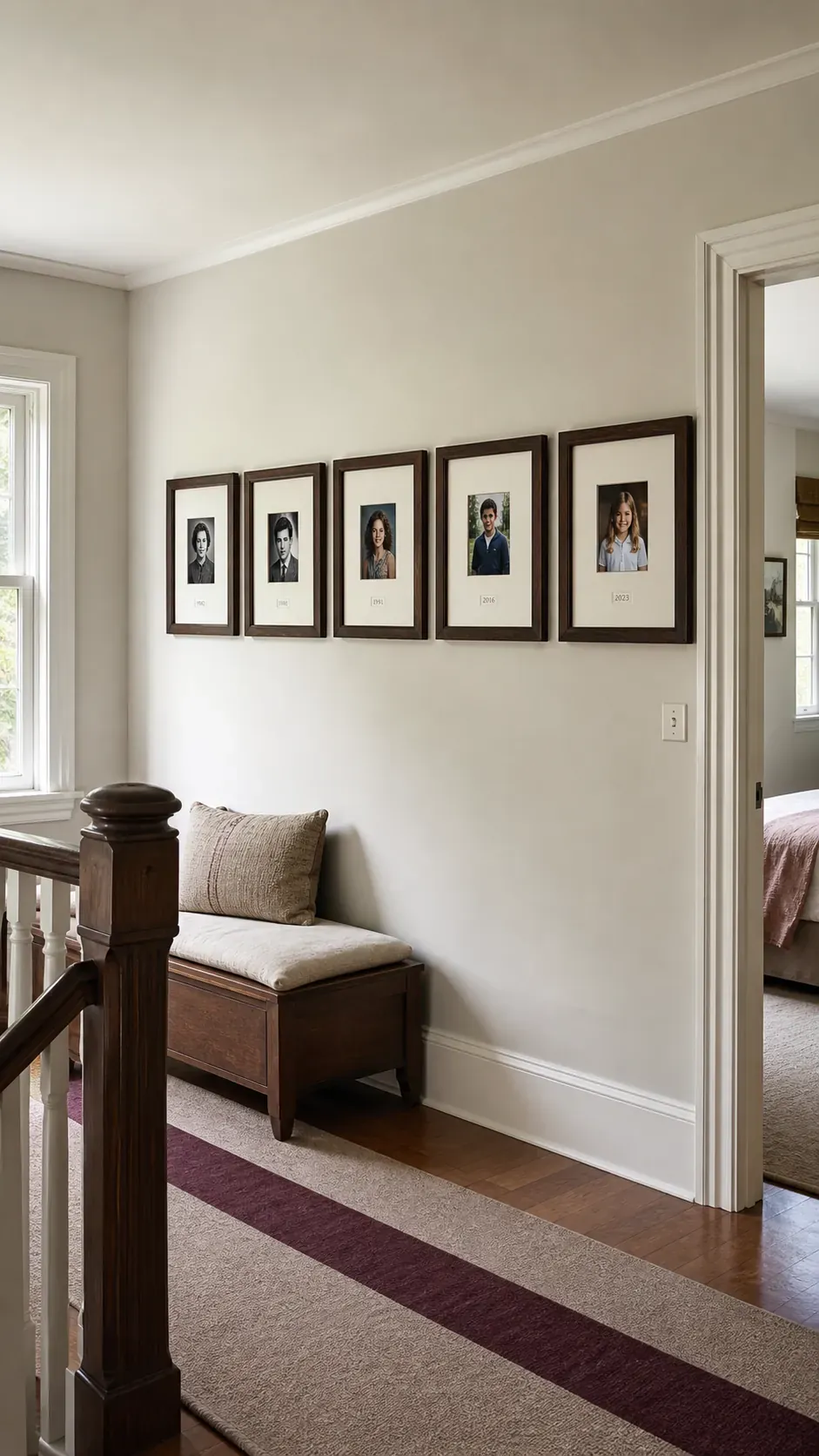
Generational Portrait Row
A row of portraits from several generations makes resemblance and change easy to see. Crop faces at similar scales and use matching mats so age and print quality differences do not distract. Small date labels can clarify the sequence while preserving a clean presentation. generational-row
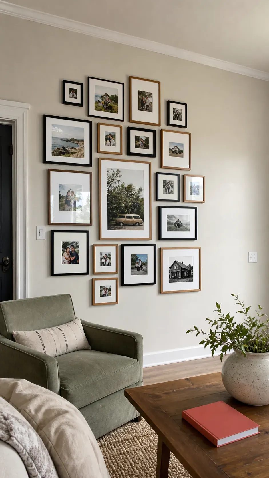
Expandable Organic Gallery
An organic gallery can grow without losing its shape when expansion zones are planned at the edges. Start with a dense, balanced core and leave two clear directions for future frames. Photograph and measure the initial layout so later additions can maintain its spacing rhythm. expandable-organic
Paper Template Planned Wall
Paper templates expose spacing and scale problems before the first hole is made. Trace every frame, mark its hanger position, and tape the shapes to the wall in the exact proposed arrangement. Live with the mock layout through changing daylight, then adjust anything that feels too high, scattered, or cramped. paper-template