
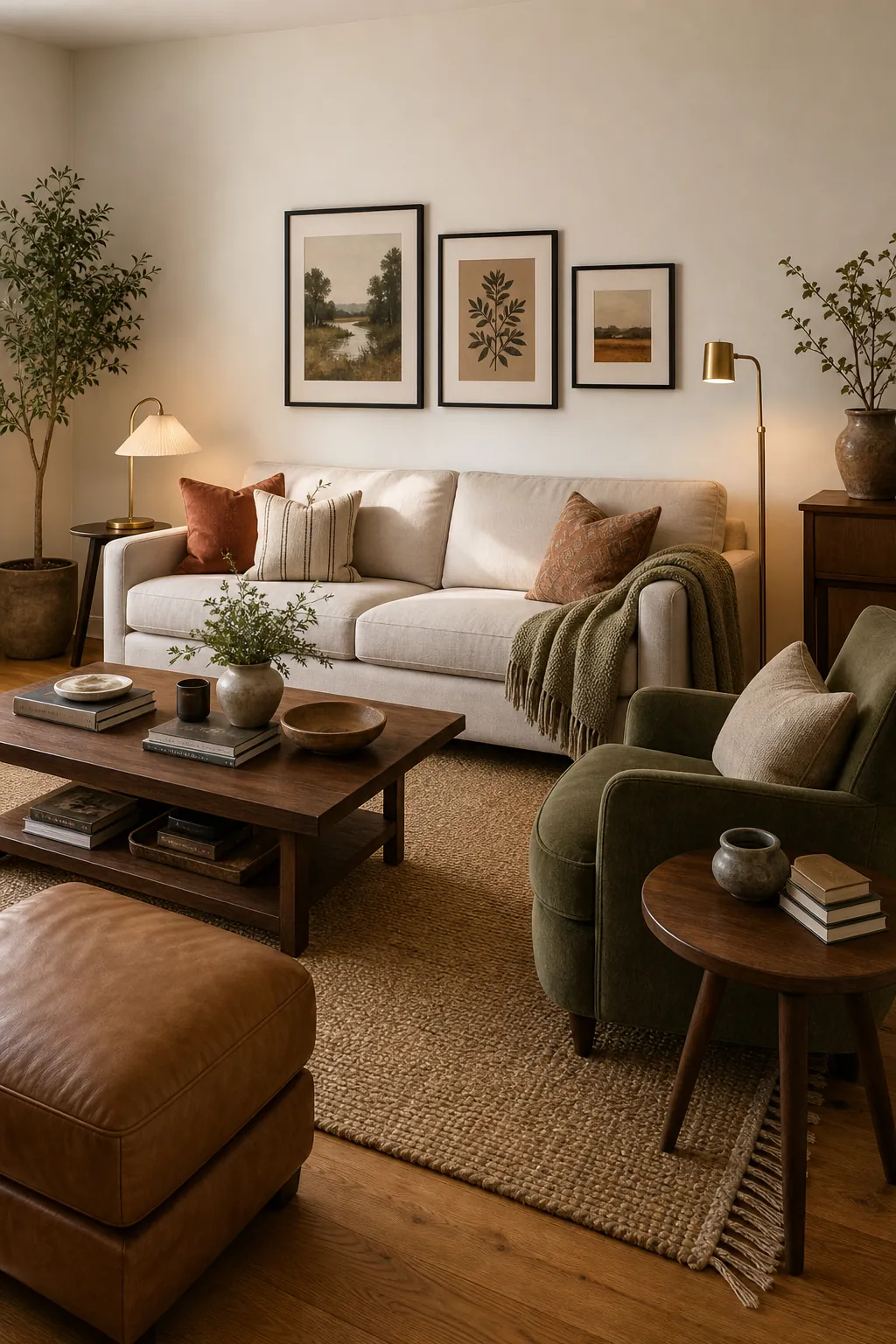
The best living room colors do more than look pretty on a paint card. They make the sofa look intentional, warm up the flooring, give art and pillows a reason to belong, and help the room feel calm even when real life is happening in it.
If your living room feels unfinished, the problem is often not that you need more decor. It is that the color story has not been decided. Choose one base, one or two accents, and enough texture and contrast to keep the space from feeling flat.
Choose the Base Color First
Your base color is the quietest part of the palette, but it does the most work. For many homes, that base is a warm white, soft greige, mushroom, pale taupe, or stone. These colors make strong furniture, wood floors, art, and rugs easier to combine.
A useful base color should look good next to your biggest fixed pieces. Hold samples beside the floor, sofa, curtains, and trim. If the base fights those pieces, every accent you add later will feel harder to control.
Use Earthy Colors When You Want Warmth Without Clutter
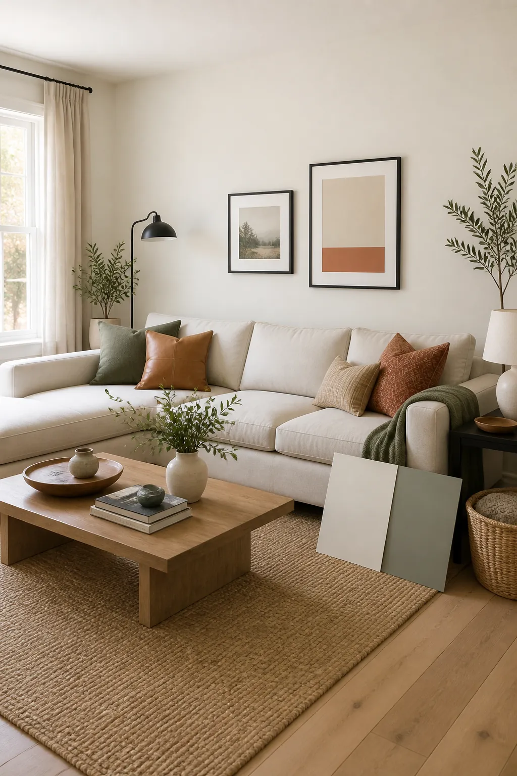
Earthy palettes work because they already exist together in nature. Olive, moss, clay, rust, sand, stone, cream, walnut, and charcoal can create a room that feels grounded without looking overly decorated.
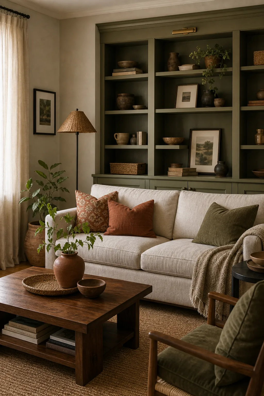
For an earthy living room, keep the wall or built-in color muted, then repeat related tones in pillows, ceramics, baskets, and wood. The repetition matters more than matching. A little rust in a pillow and a little terracotta in a vase can make green walls feel settled.
Give Light Rooms Enough Contrast
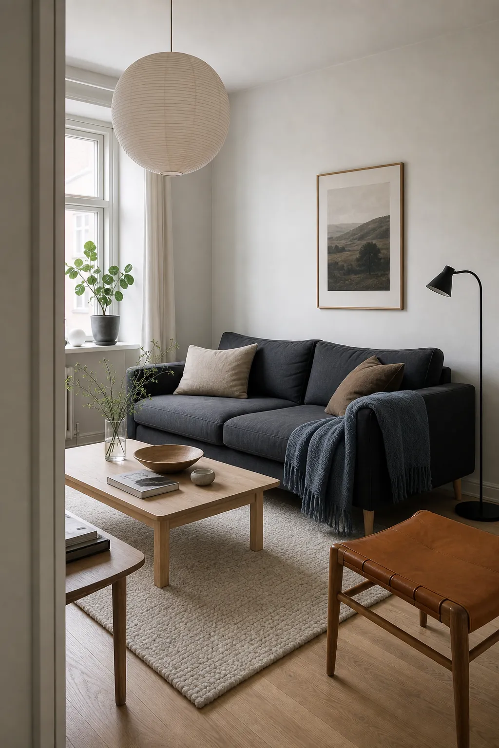
Light palettes can look beautiful, but they need contrast. A Scandinavian living room with white walls, pale wood, and cream textiles can turn blank if every surface has the same value. Add charcoal, black, blue-gray, tan leather, or deeper wood so the eye has structure.
This is especially useful in small spaces. Instead of filling a compact room with many colors, use a clean base, one dark anchor, and one muted accent. The room will feel designed, not busy.
Repeat Accent Colors in More Than One Place
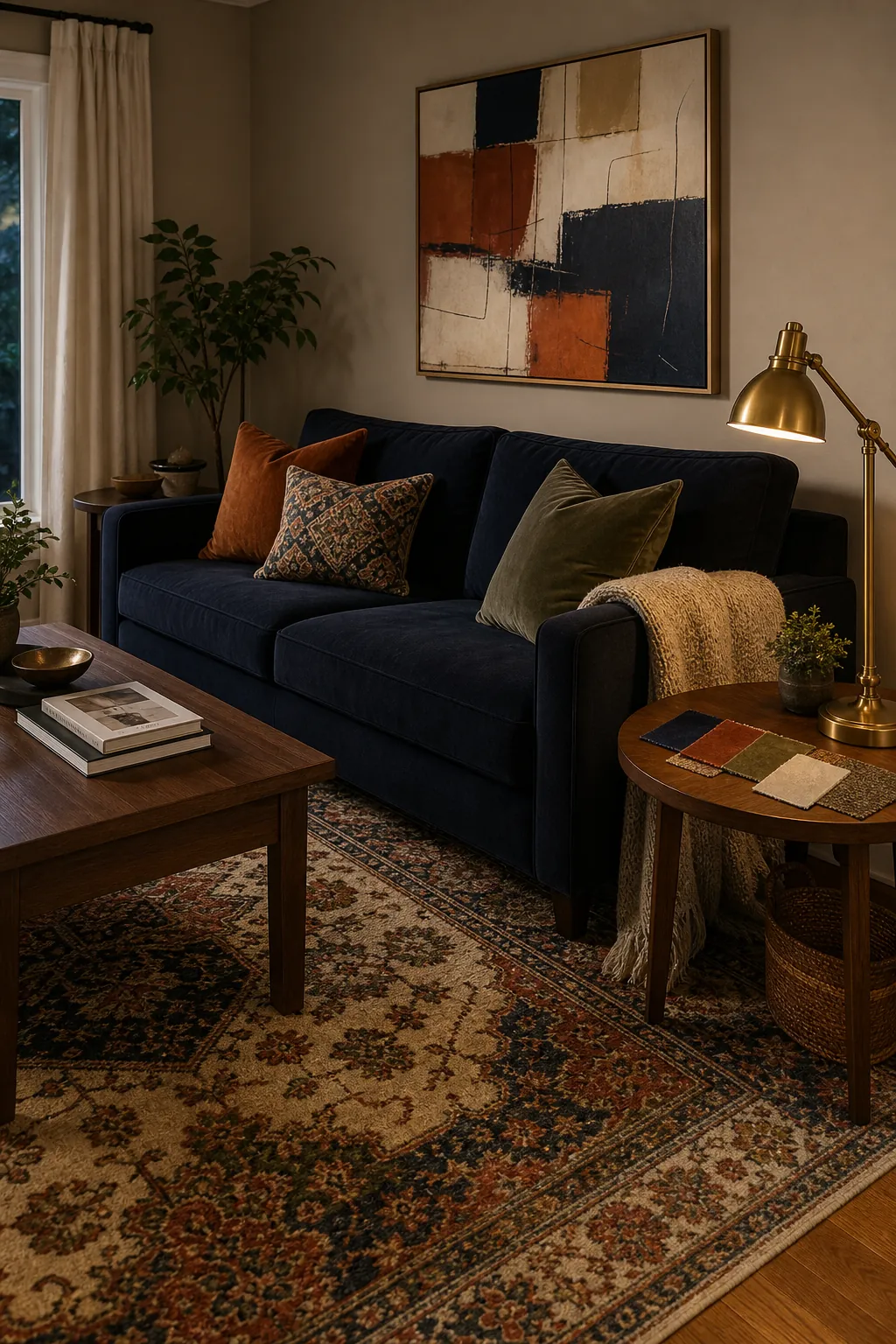
A strong color combination home trick is to repeat each accent at least three times. Navy can appear in the sofa, a piece of art, and a detail in the rug. Rust can show up in pillows, a vase, and a small stripe in the textile pattern. This makes the palette feel intentional.
Do not rely on one accent pillow to carry the whole color scheme. If a color appears only once, it looks accidental. When it appears in a few different materials, the room starts to feel collected.
Use Color to Define Open Spaces
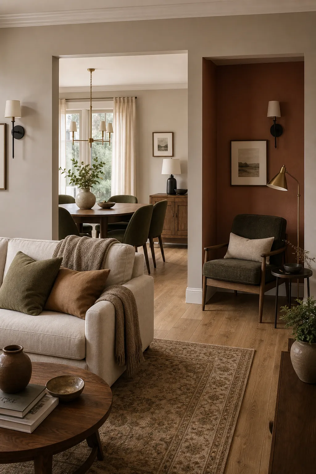
Open rooms need a color plan before they need more furniture. If your living room, dining area, and hallway are visible together, choose colors that look related from one viewpoint. A warm greige living area, clay reading nook, and olive dining chairs can feel varied without becoming chaotic.
This is where sitting room ideas often go wrong. Each zone gets a separate mood board, then the whole space feels disconnected. Instead, use one shared undertone, repeat your metals and woods, and let one deeper shade mark the cozier zone.
Let Art Lead the Final Palette
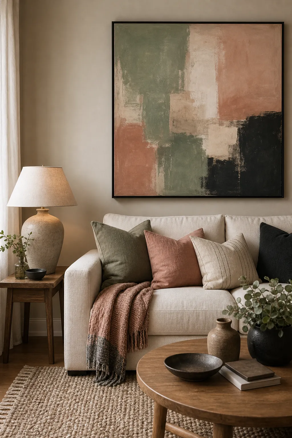
If you are stuck, look at the art, rug, or textile you already love. Those pieces usually contain the colors you can live with. Pull one quiet wall color, one medium accent, and one dark contrast from that item, then repeat them through pillows, throws, lamps, and frames.
This is the difference between living room colour schemes that feel styled and rooms that feel personal. The palette should look like it belongs to the home, not like it was copied from a trend board.
A good palette makes the room easier to finish. Once the base, accents, and contrast are clear, every future decision becomes simpler: the next pillow, the next lamp, the next frame, and even the next wall color have something to answer to.