
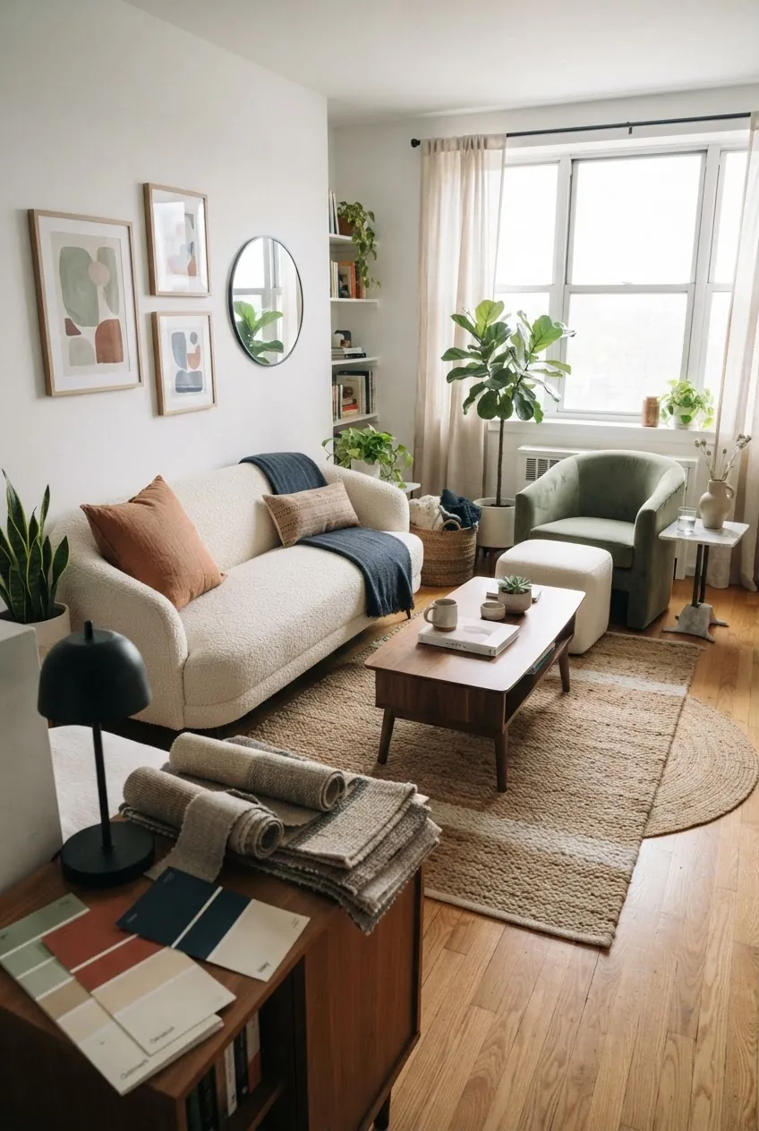
The easiest apartment color schemes living room decorators rely on do not start with paint. They start with the fixed pieces you already have: flooring, sofa fabric, window light, trim, carpet, and whatever furniture is too expensive to replace.
That is why so many small living room color ideas fail in real apartments. A palette can look beautiful on a mood board and still feel wrong once it meets gray rental carpet, orange wood floors, a brown sofa, or cool north-facing light. The goal is not to copy a showroom. The goal is to make the room feel intentional with colors you can repeat through rugs, curtains, pillows, art, lamps, and one or two bolder pieces.
Use these living room color palette ideas as practical starting points. Each scheme includes a main neutral, a support color, and an accent so you can build a homey apartment living room without buying everything at once.
Before You Pick A Palette, Read The Room You Already Have
First, decide whether the room is asking for warmth, contrast, or calm. If the apartment has gray carpet and white walls, it usually needs warmth from wood, beige, rust, clay, olive, or cream. If the room has yellow oak floors, orange brick, or honey cabinets nearby, it often needs a cooler counterweight like dusty blue, sage, navy, teal, or gray-blue. If the room already has many colors, use one quiet neutral and repeat only two accents.
A good apartment color palette should also answer a renter’s real problems: Can I keep the walls white? Will this work with a sofa I already own? Can the room feel cozy without becoming dark? Will the colors still make sense from the kitchen or bedroom doorway? Those questions matter more than a perfect paint chip.
1. Warm White, Oatmeal, And Soft Black
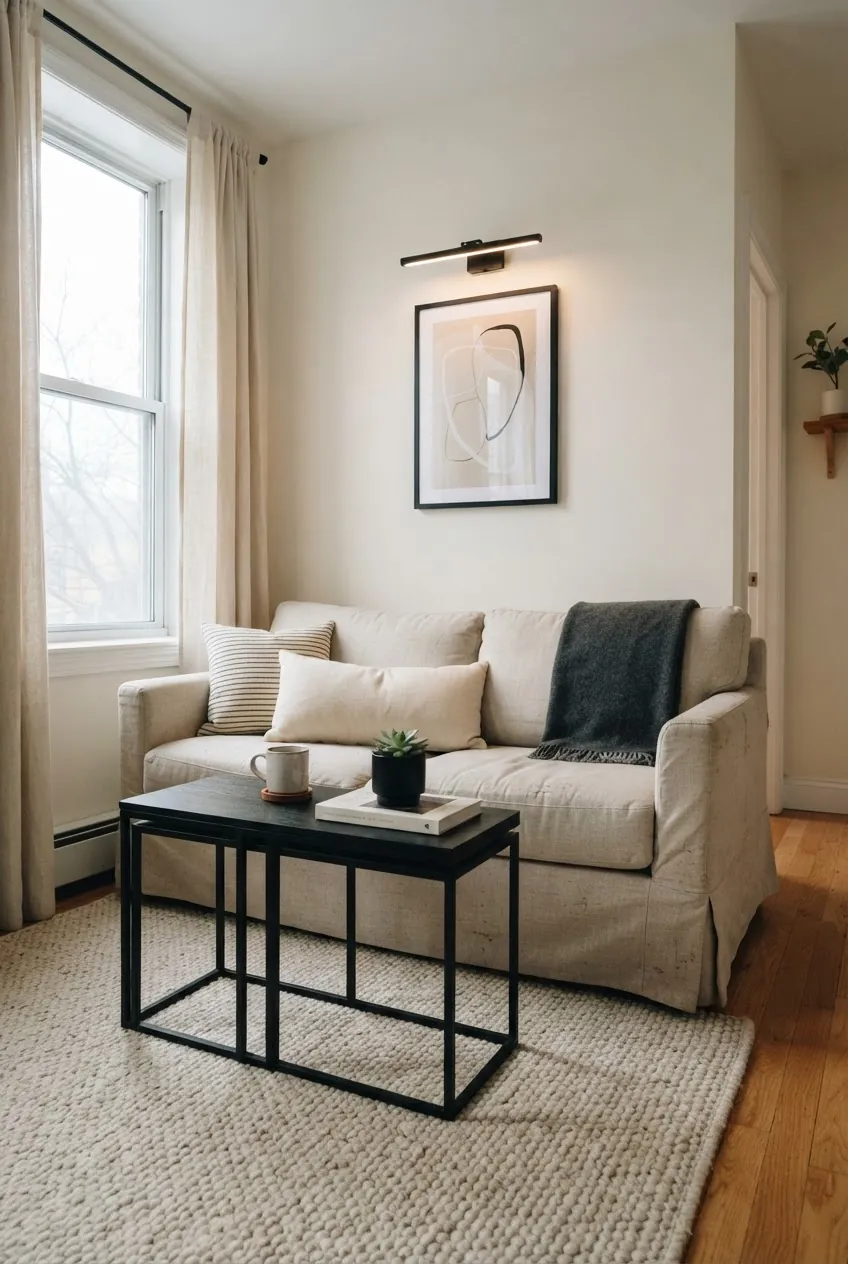
This is the safest choice when you want the room to feel bright but not blank. Warm white walls, an oatmeal sofa, cream curtains, and a few soft black accents give the living room structure without making it feel harsh. It works especially well in rentals with plain white walls because the black pieces make the white look deliberate.
Use black in thin lines: a floor lamp, picture frames, cabinet pulls, nesting tables, or a striped pillow. Keep the larger pieces warm and tactile. If the palette starts to feel too quiet, add one natural texture such as a jute rug, woven basket, or walnut tray.
2. Sage Green, Cream, And Walnut
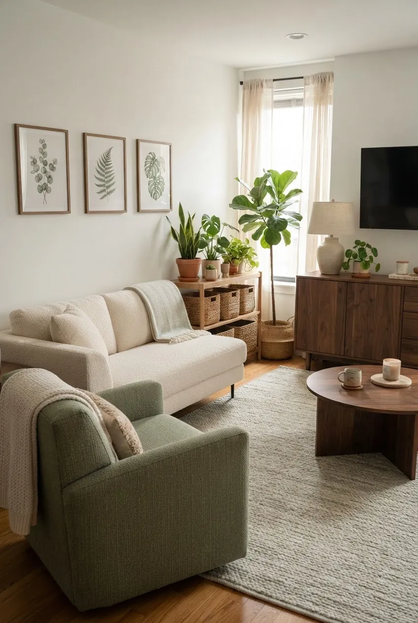
Sage, cream, and walnut is one of the most forgiving living room color scheme ideas cozy apartment owners can use. Sage softens bright white walls. Walnut adds weight. Cream keeps everything open.
Try this palette if you have plants, wood furniture, or a sofa in beige, ivory, tan, or light gray. The key is to repeat sage in at least three places: a chair, pillows, art, curtains, or a cabinet. One sage object can look accidental. Three make the room feel designed.
3. Dusty Blue, Greige, And Cognac
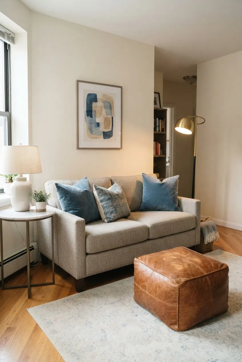
Dusty blue is useful when the apartment already has warm floors, orange wood, tan carpet, or a cognac leather piece. It cools the room down without making it feel cold. Greige acts as the bridge between warm and cool tones.
Use dusty blue in pillows, artwork, curtains, or a rug with a blue field. Then let cognac show up in leather, wood, or a single warm pillow. This is a strong cool tone living room option for anyone who likes calm color but still wants contrast.
4. Terracotta, Ivory, And Olive
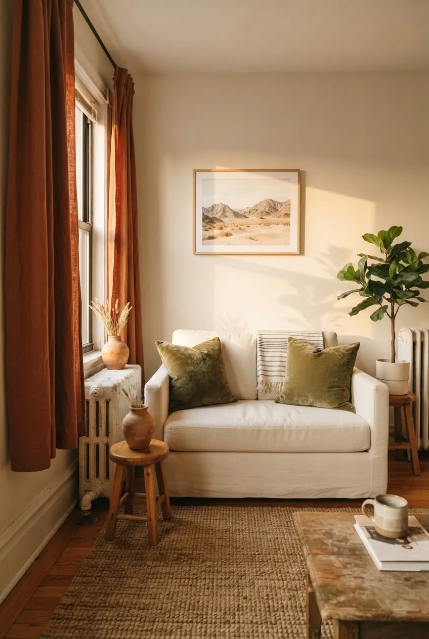
Terracotta gives a rental living room warmth fast, but it needs ivory to breathe and olive to keep it grounded. Without the olive, terracotta can drift too orange. Without the ivory, it can make a small room feel heavy.
This scheme works beautifully through curtains, clay pottery, rust-toned pillows, olive throws, and a cream sofa. If you cannot change the walls, make the window treatment the color moment. A terracotta curtain panel can do more for the room than a dozen tiny accessories.
5. Charcoal, Camel, And Brass
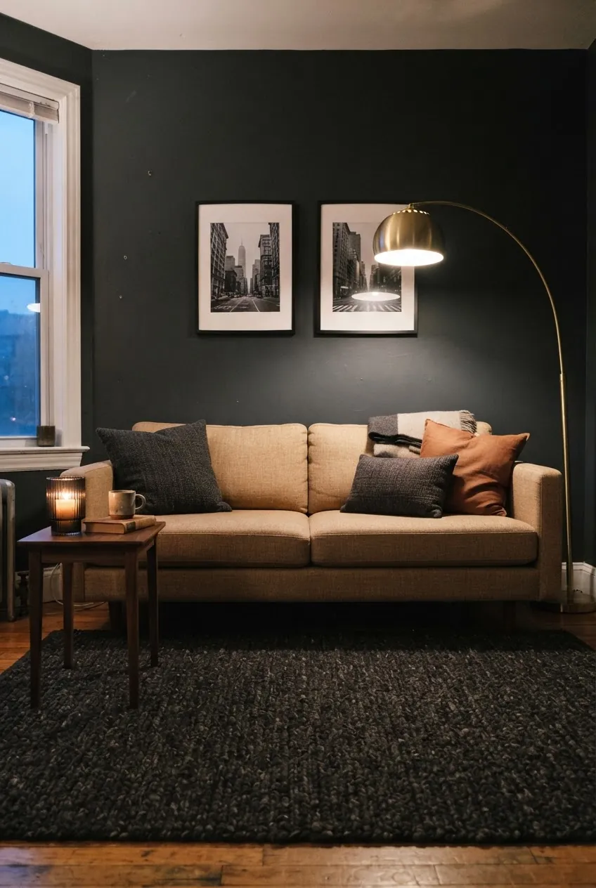
Dark colors can work in apartments when you commit to the mood instead of fighting it. Charcoal gives depth, camel warms it up, and brass catches the light. This is best for rooms used mostly in the evening or rooms where you want a cozy, intimate feel.
If you are nervous, keep the charcoal to one wall, a media cabinet, or a large rug. Then bring in camel through the sofa, leather chair, pillows, or a throw. Brass should be small and warm: a lamp, tray, frame, or candle holder.
6. Mushroom Taupe, Linen, And Soft Black
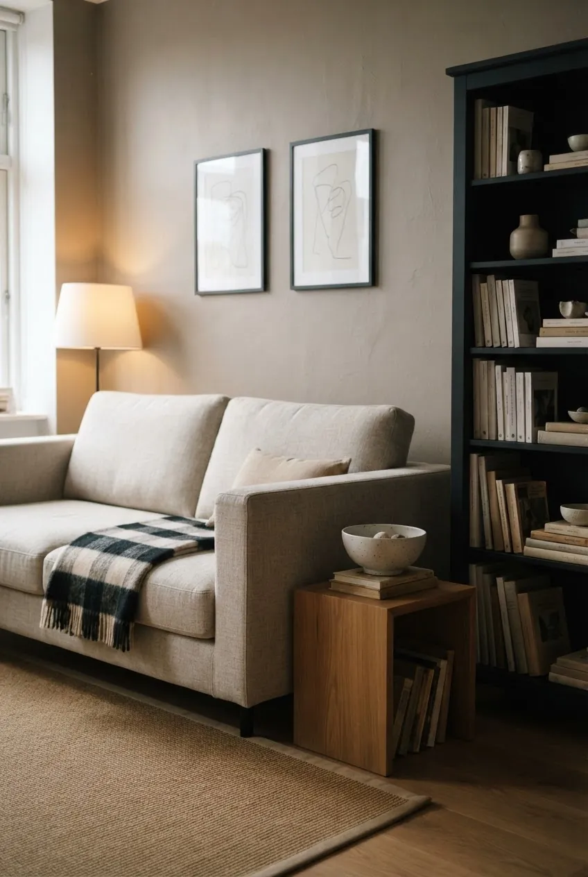
Mushroom taupe is a strong answer when beige feels too yellow and gray feels too cold. It is quiet, but it has enough depth to make white trim, linen upholstery, and black accents look more expensive.
Use this palette if you like neutral rooms but do not want an all-beige interior. The trick is texture: linen sofa, wool rug, ceramic lamp, paper art, woven throw, and a soft black bookcase or frame. It is neutral, but it gives your eye somewhere to land.
7. Navy, Warm White, And Rattan
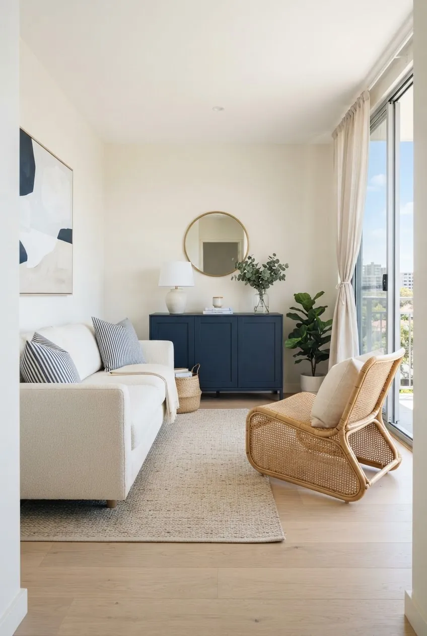
Navy gives a small living room polish without demanding bright color everywhere. Warm white keeps it fresh, and rattan prevents the blue from feeling stiff. This is a useful option for apartments with balcony doors, bright windows, or simple modern furniture.
Keep navy in larger but controlled pieces: a cabinet, curtains, rug, or one chair. Rattan can show up as a lounge chair, basket, lampshade, or tray. Avoid adding too many coastal props. The palette is stronger when it feels clean rather than themed.
8. Blush Beige, Deep Green, And Aged Gold
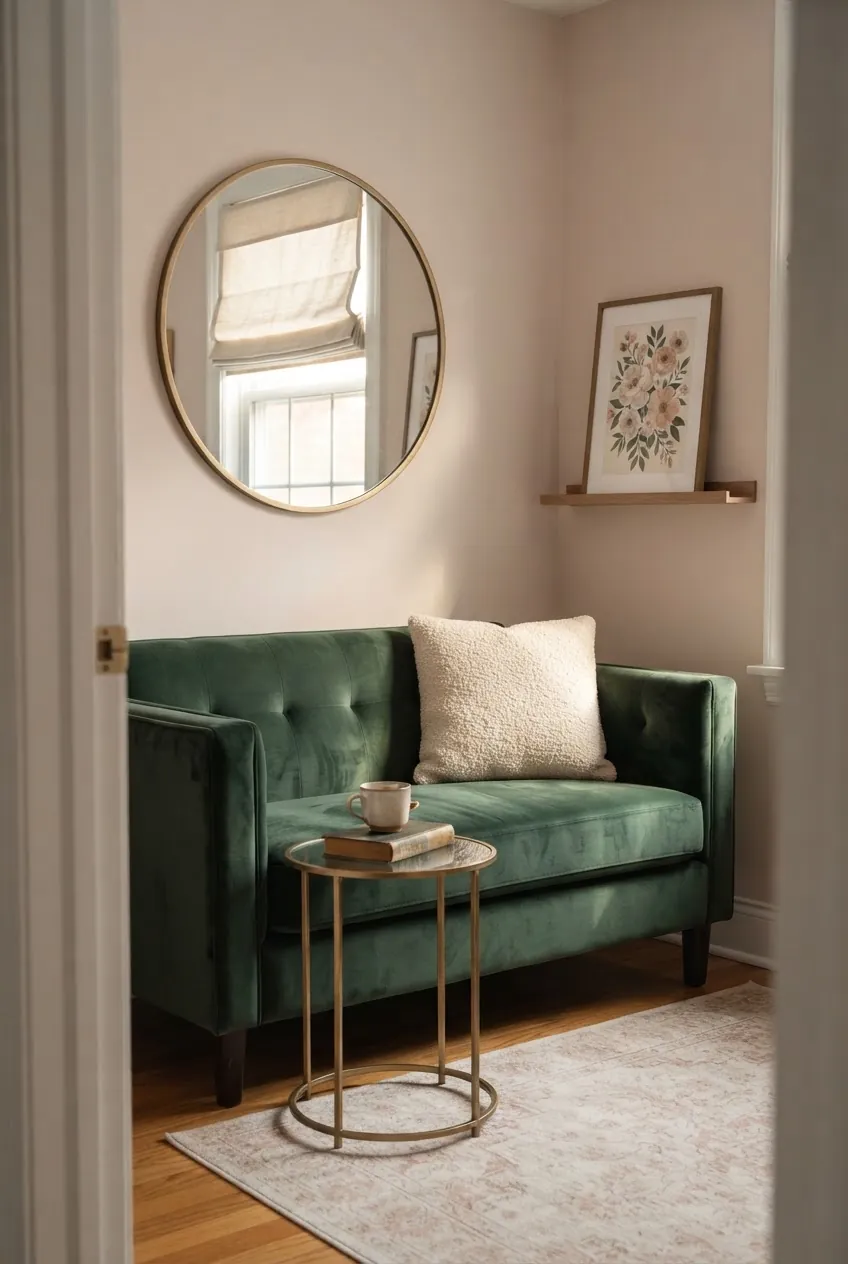
Blush beige is softer than tan and warmer than gray. Pair it with deep green and aged gold and the room feels layered, not sugary. This is one of those living room color combinations ideas that borrows softness from bedroom inspirations but still works in a grown-up sitting area.
Use deep green as the anchor: a loveseat, chair, curtain, or large pillow. Keep gold aged or brushed, not shiny. If the room starts to feel too delicate, add black frames or a dark wood table.
9. Cool Gray-Blue, Sand, And Walnut
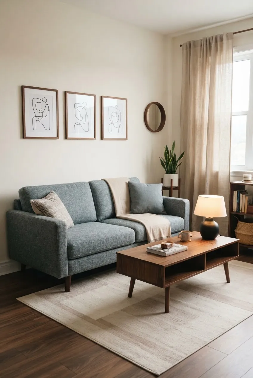
Gray-blue is calmer than navy and more colorful than plain gray. It is useful in apartments that get cool light because sand and walnut keep it from feeling chilly. This palette is also friendly to existing gray sofas or gray rugs.
Use sand for curtains, pillows, or a rug. Add walnut in the coffee table, media unit, frames, or side table. The room should feel balanced between warm and cool, not split into two separate color stories.
10. Olive, Rust, And Cream
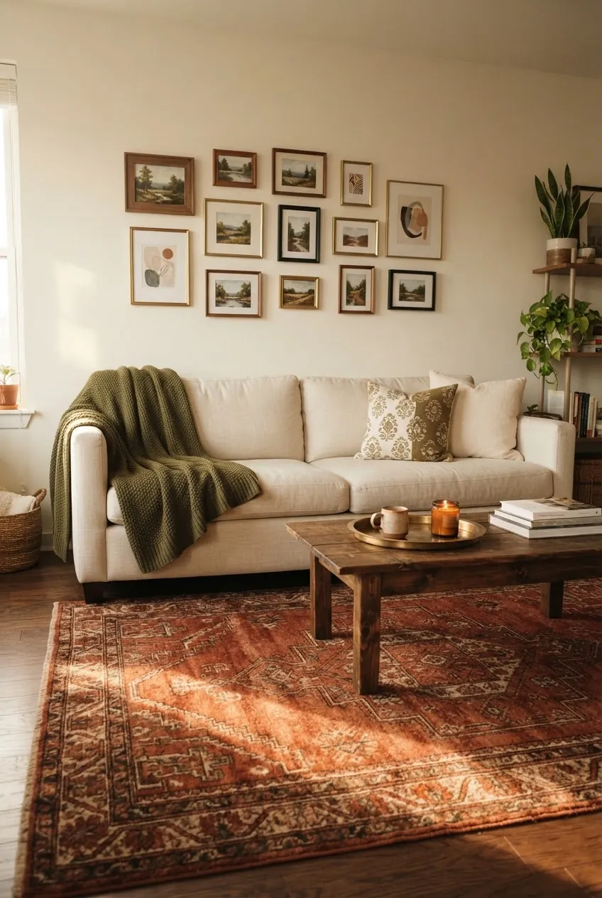
Olive and rust are both earthy, but they do different jobs. Olive calms the room. Rust warms it. Cream keeps the palette from feeling too dark. Together they make a rental feel collected instead of temporary.
A rust patterned rug is often the easiest starting point. From there, add olive pillows or a throw, cream upholstery, and a few dark wood or brass pieces. This is a strong choice if your apartment has basic white walls and needs instant personality.
11. Chocolate Brown, Ivory, And Sky Blue
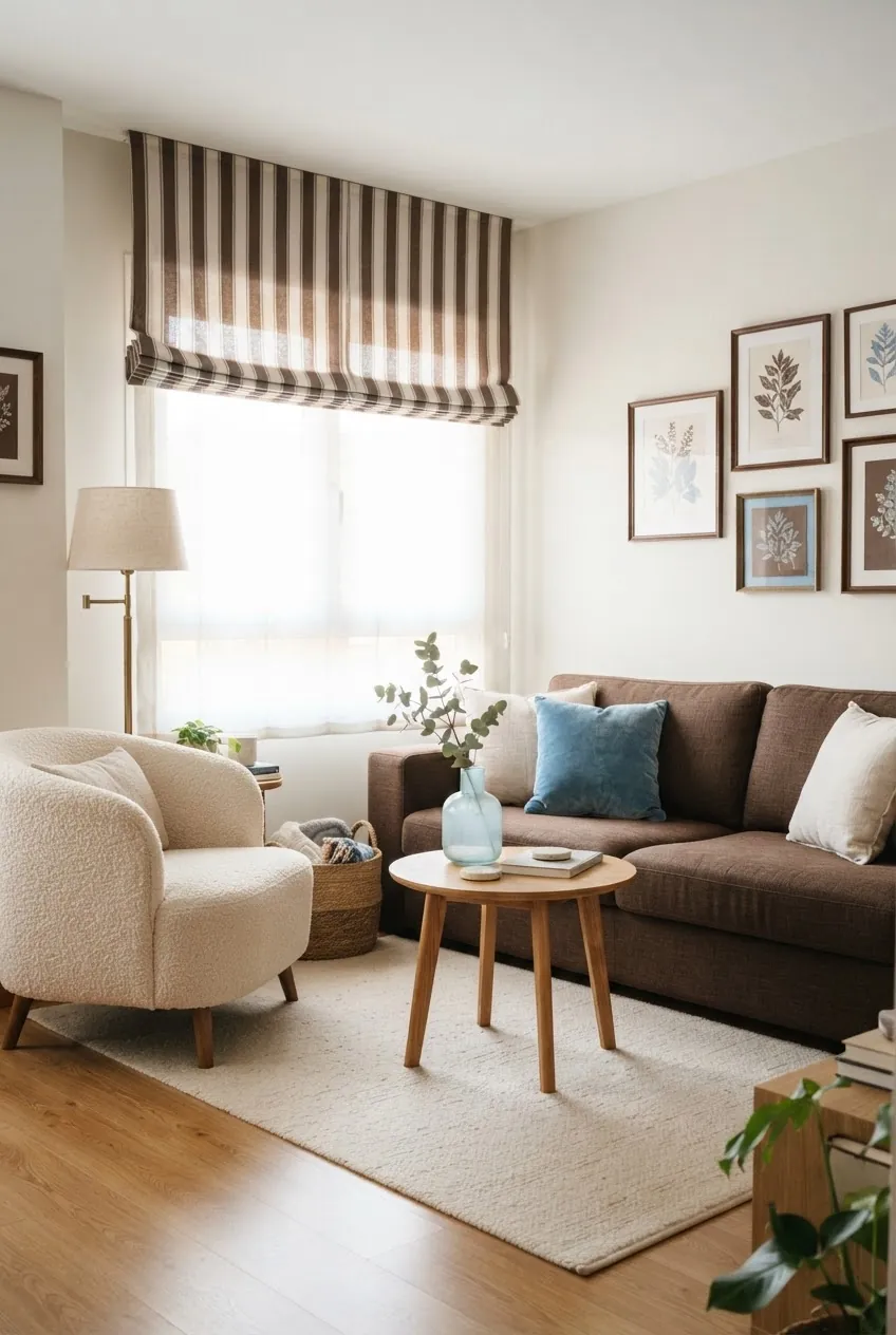
If you already own a brown sofa, do not pretend it is not there. Make it the anchor. Chocolate brown looks fresher with ivory and sky blue because the blue lifts the room and the ivory creates breathing room.
Repeat sky blue in small, clear moments: pillows, glass vase, art, or a lampshade. Keep the rug light enough to separate the sofa from the floor. Brown becomes a design choice when the rest of the room supports it.
12. Lavender-Gray, Cream, And Espresso
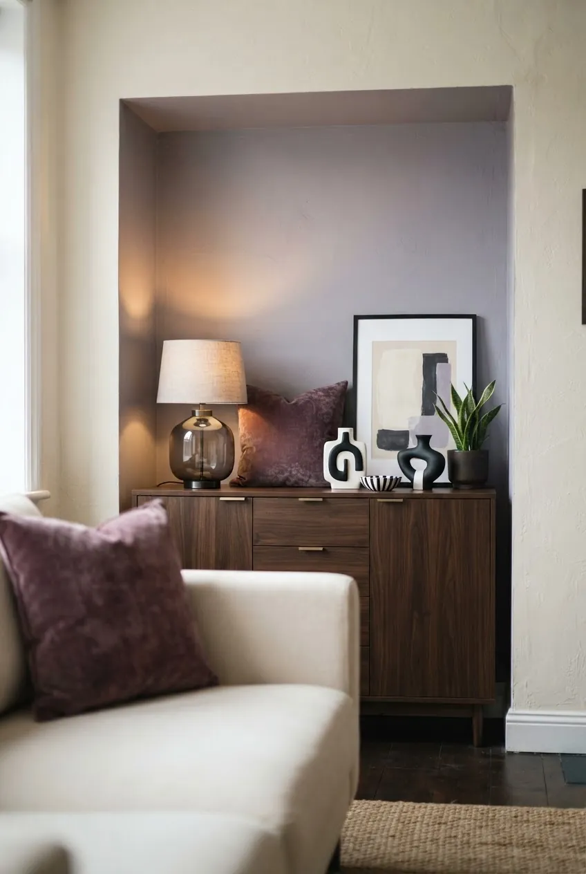
Lavender-gray is subtle enough for a living room but more interesting than standard greige. Espresso gives it weight, and cream keeps it soft. This scheme works well when you want color that feels quiet rather than bright.
Try it in an alcove, cabinet, large art piece, or pillows before painting a whole room. A little plum or smoky glass can deepen the palette. Avoid pastel purple accessories; the strength of this scheme is its restraint.
13. Butter Yellow, Warm Gray, And White Oak
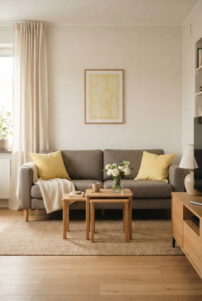
Butter yellow can make a small apartment feel cheerful, but it needs warm gray and white oak to keep it grounded. The yellow should feel like daylight, not a highlighter.
This is best when the apartment lacks charm but gets decent natural light. Use yellow in pillows, a lamp, art, or a small chair. White oak furniture and warm gray upholstery keep the whole room easy to live with.
14. Forest Green, Cream, And Cognac

Forest green gives apartment living rooms depth, especially when the walls have to stay white. Cream softens the contrast. Cognac keeps the green from feeling too formal.
Curtains are the renter friendly power move here. Forest green curtains can change the whole mood without touching the paint. Add a cognac leather chair, warm wood, or tan pillows, and the room starts to feel finished.
15. Soft Clay, Plaster White, And Matte Black
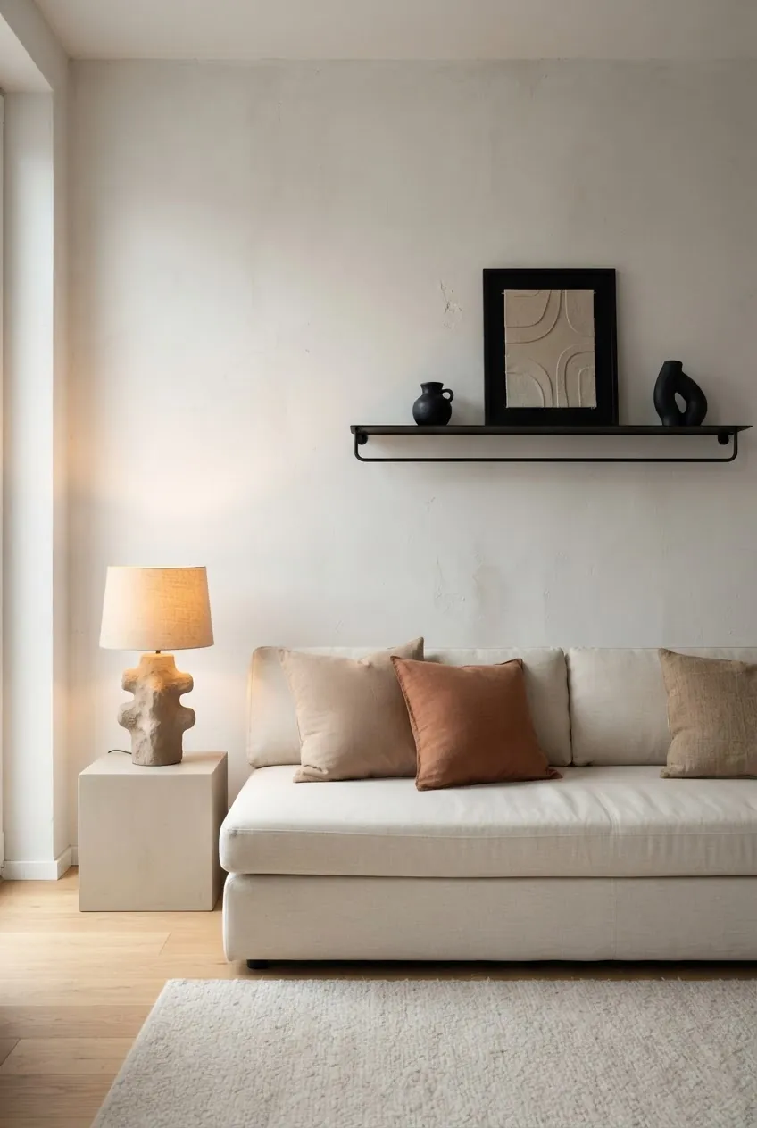
Soft clay is the warmer, quieter cousin of terracotta. It works well with plaster white and matte black when you want a modern room that does not feel cold.
Keep the clay accents rounded and tactile: ceramic lamp, pillow, vase, or art. Use matte black for thin structure, such as a shelf, frame, lamp, or table leg. This palette is ideal for edited apartments where every piece has to earn its place.
16. Teal, Beige, And Coral
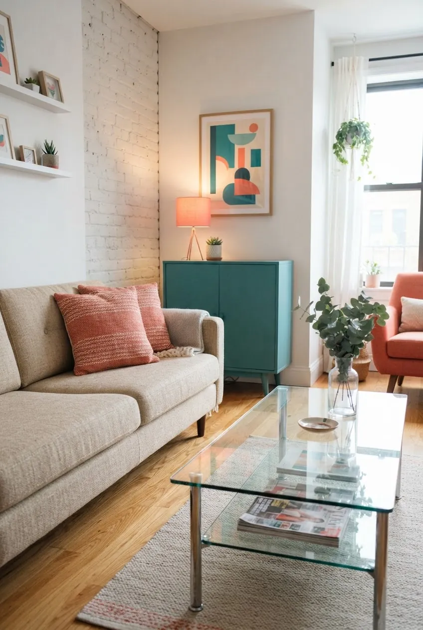
Teal and coral can look loud if they fight for equal attention. Beige is what makes them usable in a real apartment. Let teal be the main color and coral the spark.
This scheme is good for a budget update because it works through movable pieces: a painted secondhand cabinet, coral pillows, a lampshade, art, or a throw. Keep the sofa and rug quieter so the room feels energetic instead of chaotic.
17. Layered Warm Neutrals With One Burgundy Accent
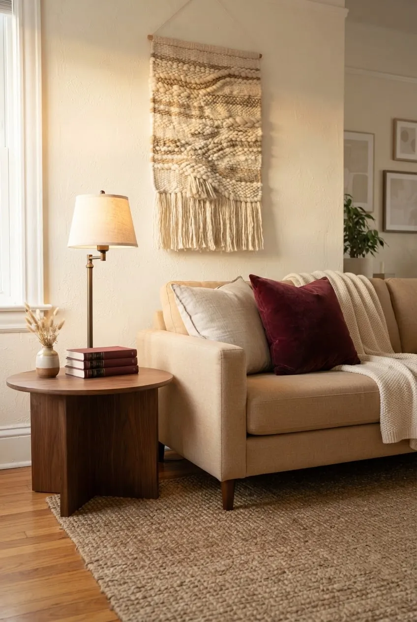
Warm neutral rooms often fall flat because every piece is the same value. Add one deep accent and the room immediately feels more intentional. Burgundy works especially well because it is rich without being neon.
Layer cream, tan, warm beige, oatmeal, and walnut first. Then add burgundy in two or three small places: a velvet pillow, a book stack, a lamp shade, or art. The accent should be noticeable, but not everywhere.
How To Make Any Living Room Color Palette Feel Cohesive
- Repeat each accent at least twice. A single colored pillow looks random. A pillow plus art plus a vase looks intentional.
- Match undertones before you match names. Cream, beige, gray, and white all lean warm or cool. Put samples next to your floor and sofa before buying.
- Use the rug as the bridge. If the sofa, curtains, and wall color do not connect, choose a rug that contains two of those colors.
- Control the strongest color. In a small room, bold color often works better in curtains, a cabinet, a chair, or art than across every surface.
- Let lighting finish the palette. Warm bulbs, fabric shades, and low lamps can make cozy living room designs color schemes feel much more expensive.
The Simple Rule
Choose one color that calms the room, one color that warms it, and one accent that gives it a point of view. That is enough. The best apartment color schemes living room renters can actually use are not complicated; they are repeated, edited, and honest about the furniture and light already in the space.