
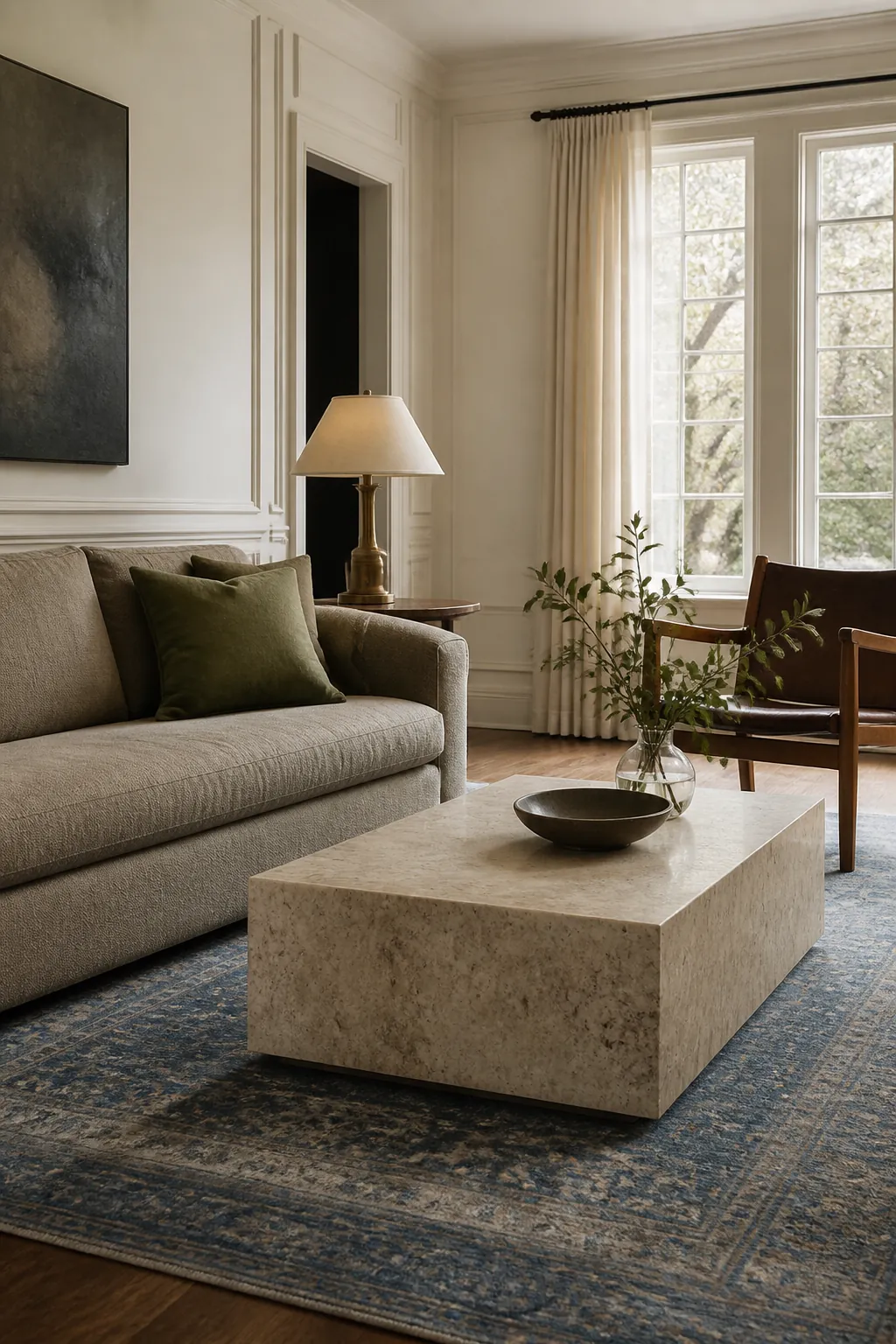
A timeless living room color is not a shade that never appears in trend reports. It is a color with enough nuance to connect the room’s permanent materials—wood, stone, trim, daylight—and enough flexibility to support new textiles later. Even white can date a room when its undertone fights the floor.
Paint large boards rather than the wall, move them beside every fixed finish, and observe them for several days. These 17 dependable colors range from warm neutrals to deep historic hues, each with a practical reason it continues to work in new traditional and warm transitional living rooms.
Soft Warm White
Warm white softens glare and makes wood, linen, stone, and collected furniture feel related. Choose one that is slightly deeper than the trim so the architecture stays visible.
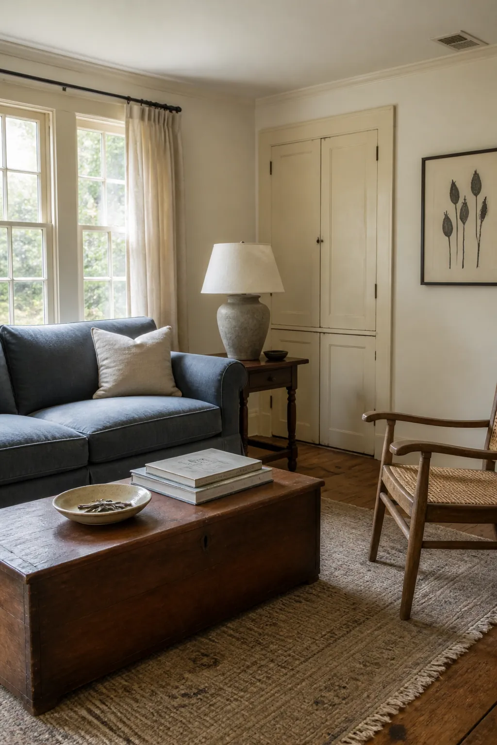
Test beside existing cream paint; a cleaner wall white can make older trim look dingy. Texture, not more pale color, gives this scheme depth.
Natural Linen
Natural linen sits between cream and beige with a quiet, fibrous warmth. It is one of the best paint colors for a living room containing oak, cane, travertine, or flax upholstery.
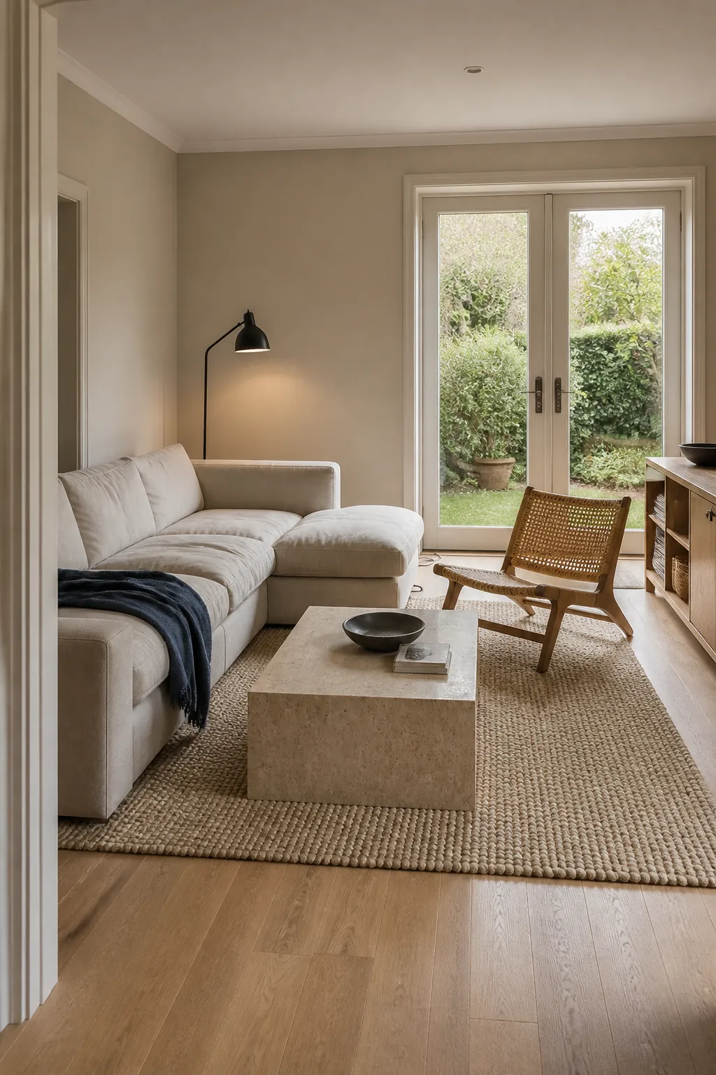
Add clear dark notes such as walnut or blackened bronze. Without value contrast, several near-beiges can blur into a flat builder palette.
Mushroom Taupe
Mushroom taupe’s violet-brown undertone makes colorful upholstery look intentional while remaining neutral. It is particularly useful beside dark wood and crisp off-white molding.
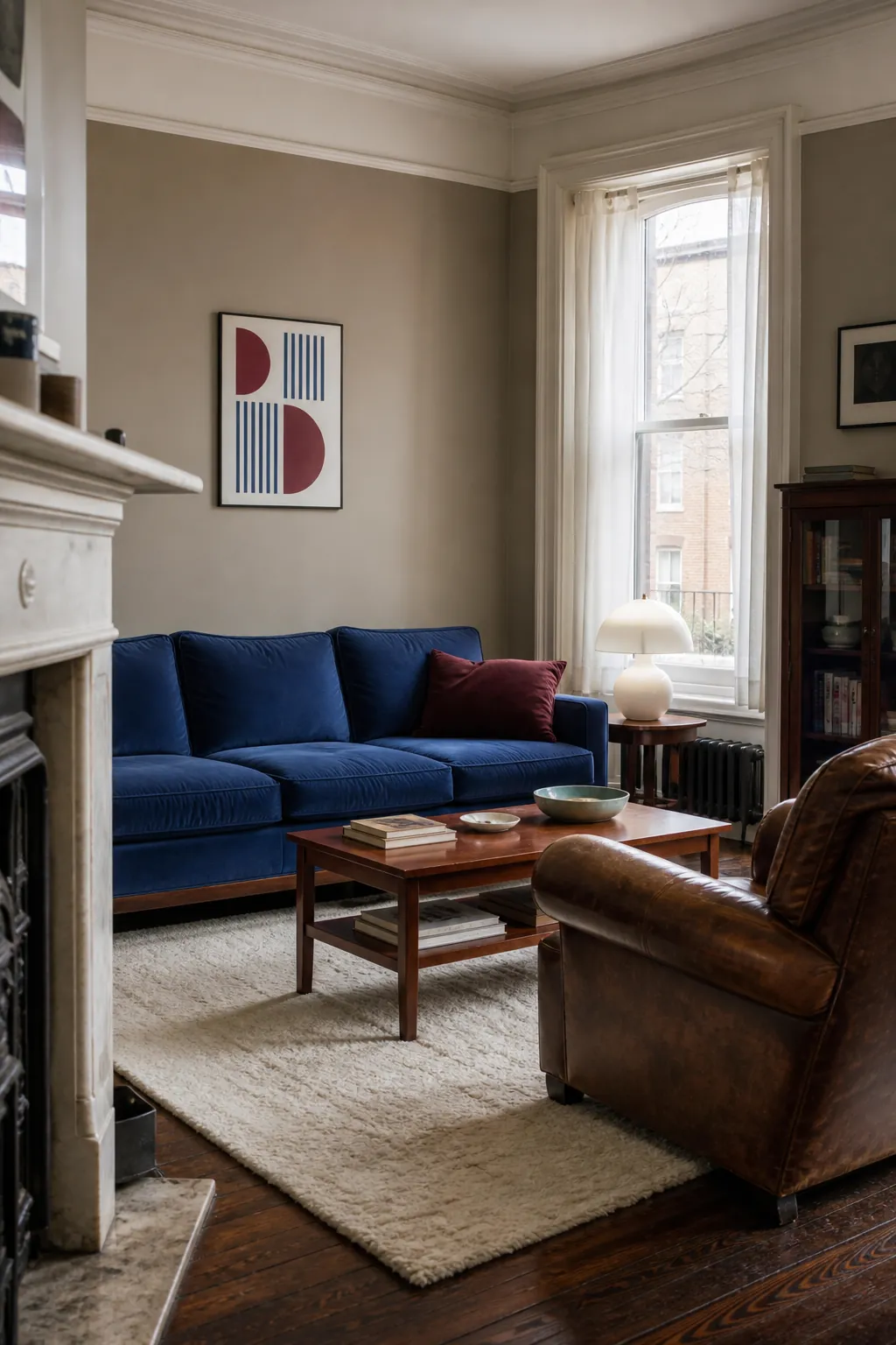
Compare it with stone and carpet before committing. Yellow-beige flooring can exaggerate its violet side, while walnut often makes it appear warmer.
Classic Putty
Putty is a restrained gray-beige that echoes old plaster. It gives a transitional style living room a calm bridge between formal trim and simple contemporary furniture.
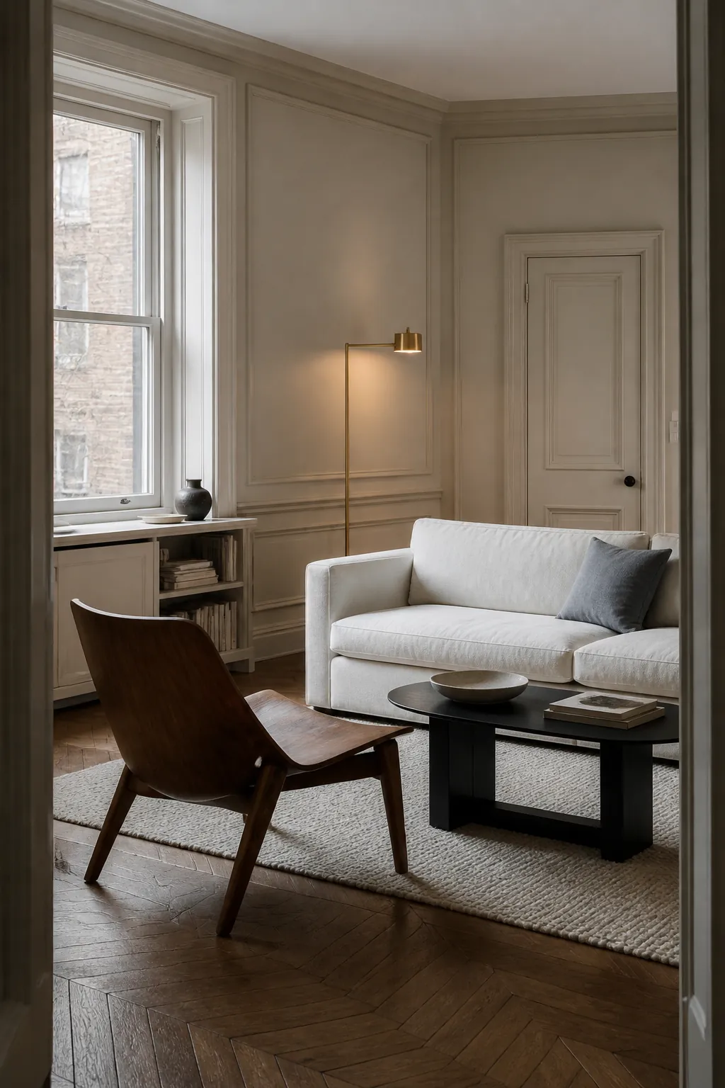
Use wool, aged brass, oak, and ink-blue accents to keep it dimensional. Putty should read mineral, not cold concrete gray.
Camel Beige
Camel beige has enough golden-brown pigment to flatter cognac leather and honey wood. Cream, faded blue, and dark chocolate prevent it from becoming overly yellow.
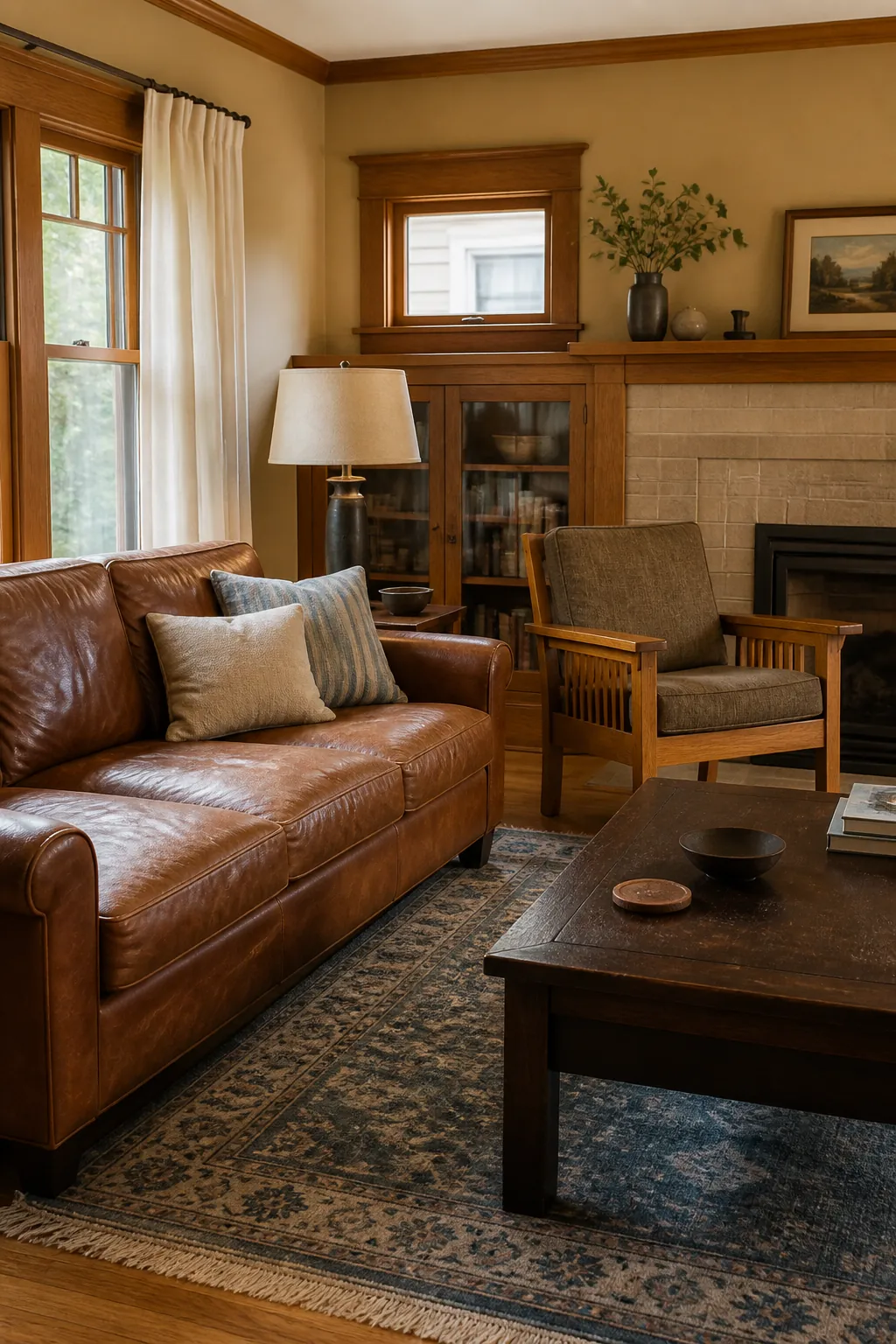
This warm paint color works best in a room with clear light-dark structure. Keep ceilings and curtains lighter than the walls.
Quiet Sage
Sage endures because it behaves like a natural neutral beside wood, stone, and garden views. Choose a version with enough gray to avoid minty sweetness.
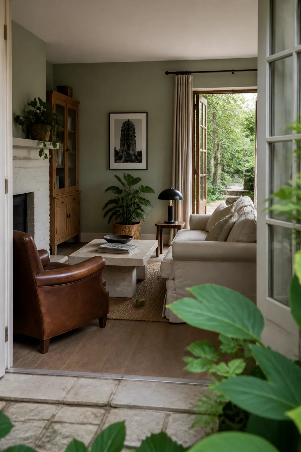
Repeat the green loosely in foliage rather than matching it. Cream upholstery and tobacco leather provide grounding warmth.
Soft Olive
Soft olive is browner and more enveloping than sage. It suits cozy traditional living rooms with antique oak, patterned rugs, and brass lighting.
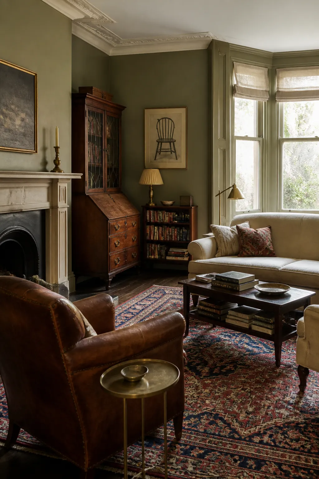
Use warm-white trim instead of a sharp blue-white. The softer edge respects the olive’s earthy undertone.
Slate Blue-Gray
Slate blue-gray remains flexible because it can read as color or neutral throughout the day. It connects especially well to walnut, charcoal, cream, and weathered stone.
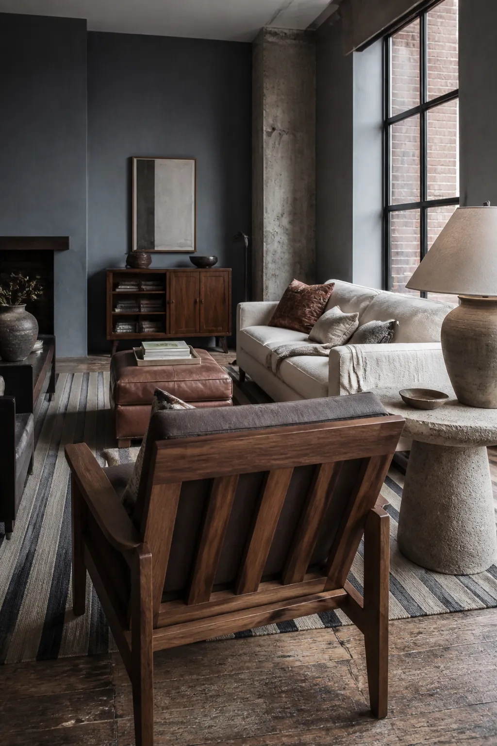
In a north-facing room, sample warmer blue-grays first. A cool version under blue daylight can feel harder than expected.
Deep Navy
Deep navy has the authority of black with more color and softness. It works on walls, millwork, or trim when pale upholstery and layered lamps maintain contrast.
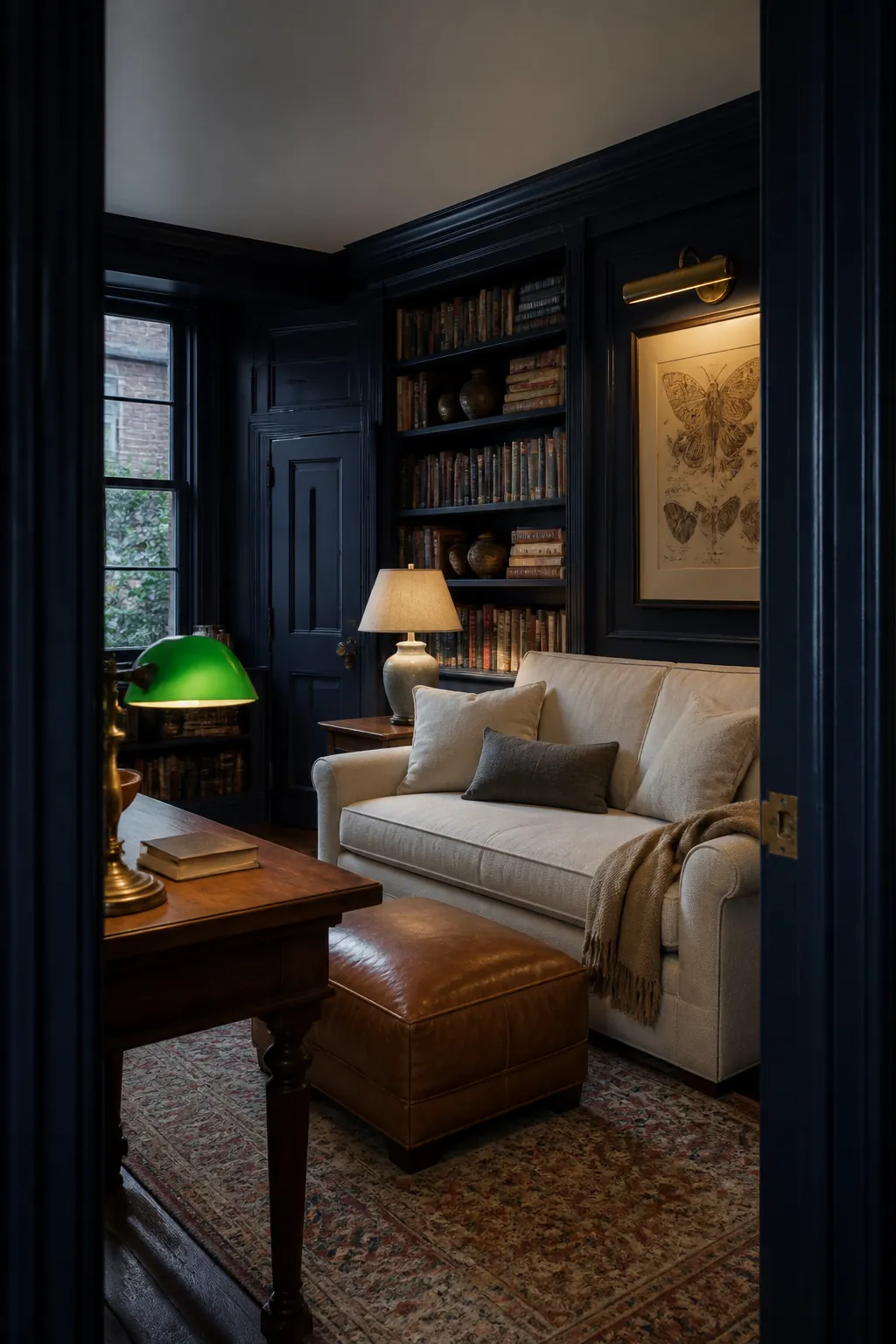
Avoid automatic nautical styling. Walnut, camel, oxblood, and parchment create a more enduring library-like palette.
Weathered Terracotta
Weathered terracotta resembles brick dust and aged plaster rather than bright orange. It gives plain rooms architectural warmth and flatters cream, dark timber, and blue-green accents.
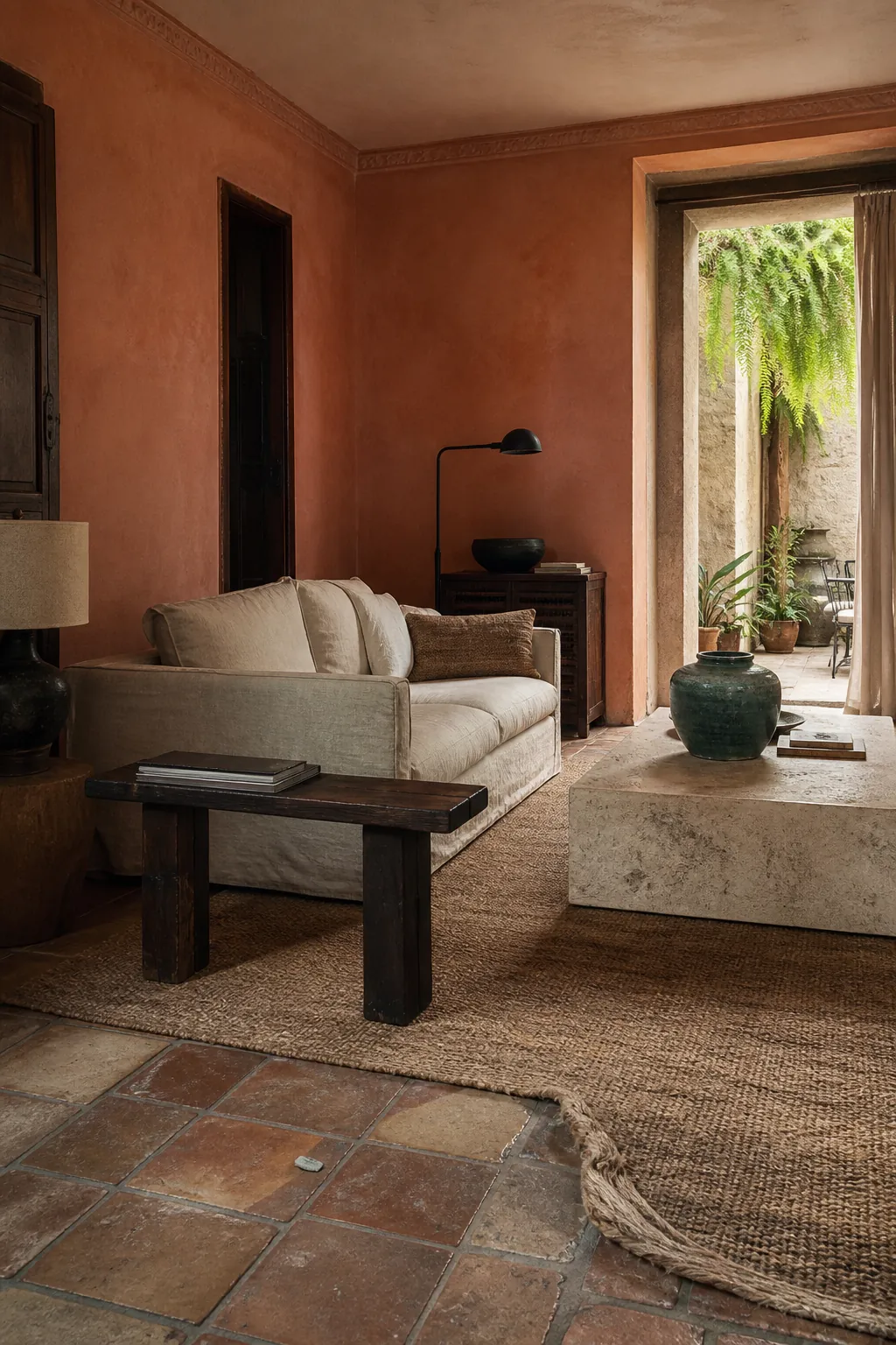
A matte or mineral finish makes it feel established. Test at night so warm lamps do not push the color too orange.
Oxblood Red
Oxblood is a deep red-brown that has appeared in traditional interiors for generations. Use it on built-ins, doors, or a compact room where its visual weight supports intimacy.
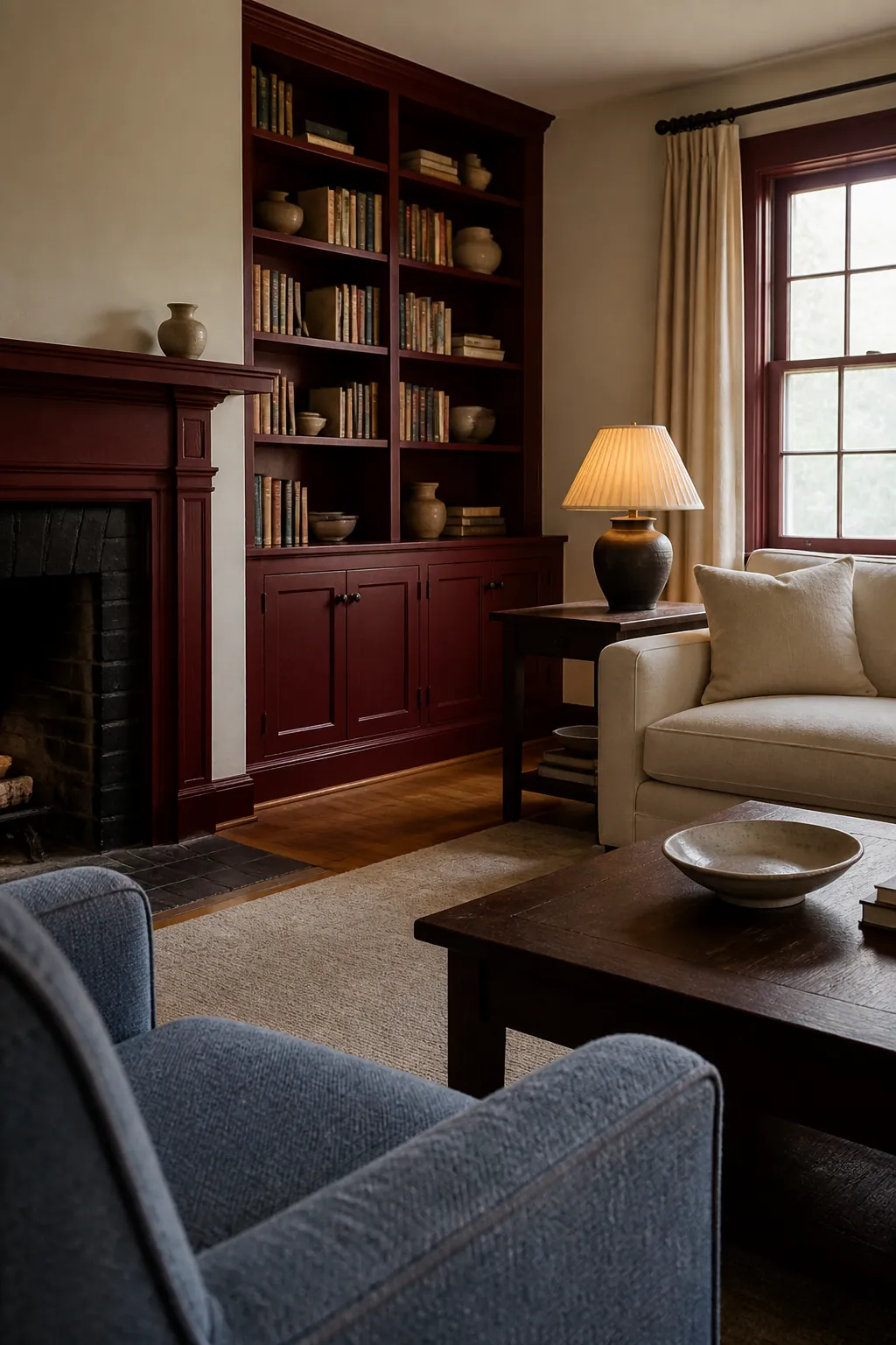
Pair it with parchment, dusty blue, and dark oak. Clear red or too much gloss can make the same idea feel theatrical.
Chocolate Brown
Chocolate brown creates a warm envelope and makes pale art, books, and upholstery stand out. It is more forgiving than charcoal beside reddish or golden wood.
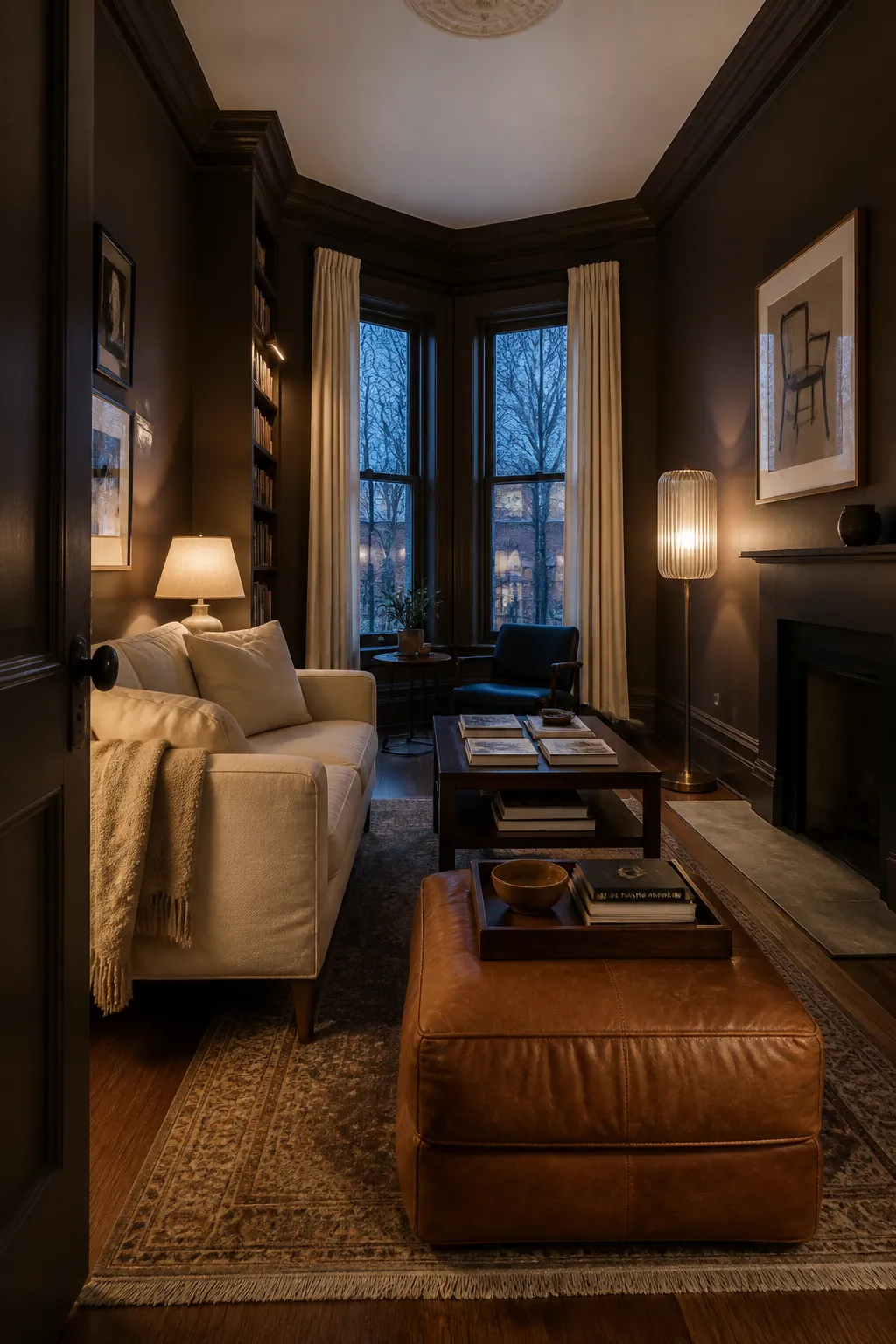
Plan light at three heights and keep the ceiling slightly lighter if the room is low. Dark paint should reveal depth, not erase it.
Dusty Rose
Dusty rose behaves like an earth tone when it contains brown or clay. Olive, mahogany, charcoal, and mushroom make it feel settled rather than sugary.
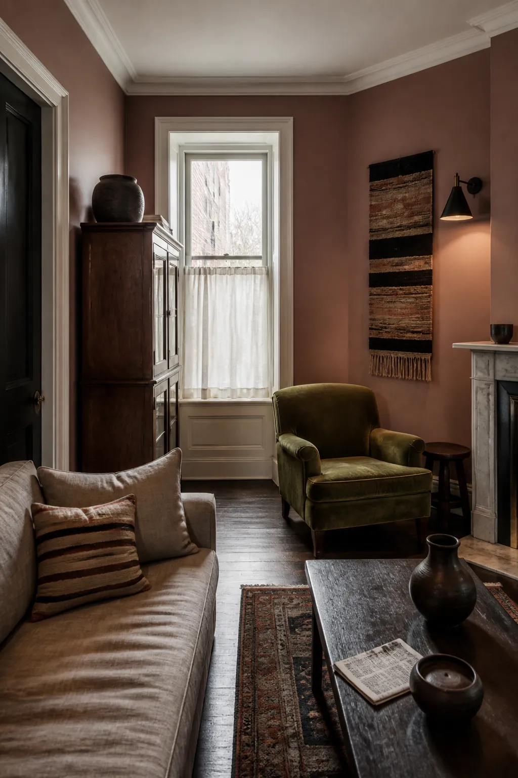
It is particularly flattering under evening light. Select the quietest sample that still reads as pink in daylight.
Antique Ochre
Antique ochre brings sun-warmed depth without the brightness of clear yellow. It pairs naturally with blue, walnut, cream, and black iron in a new traditional living room.
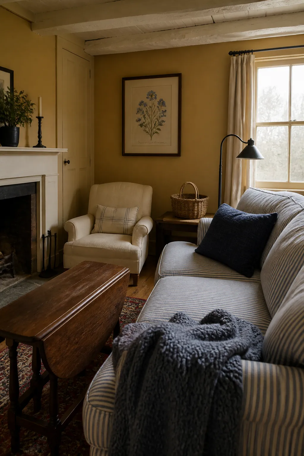
Use a muted, browned version for full walls. Clear mustard works better as a small textile accent than an architectural field.
Soft Charcoal
Soft charcoal outlines architecture and helps televisions recede, yet it remains lighter and more nuanced than black. Brown wood and cream textiles keep it welcoming.
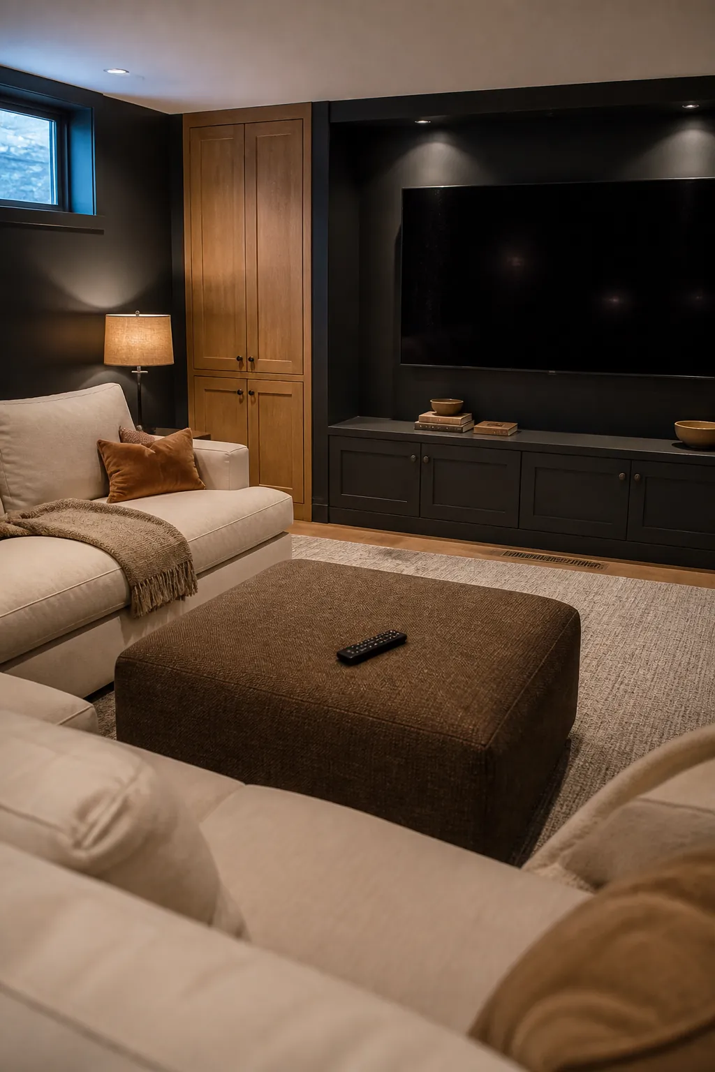
Choose a charcoal with the same warm or cool bias as the room’s stone. Mismatched grays are more likely to date a scheme than darkness itself.
Faded Mineral Blue
Faded mineral blue has the relaxed quality of old pigment. It works with antiques, modern upholstery, warm metal, and both pale and dark wood.
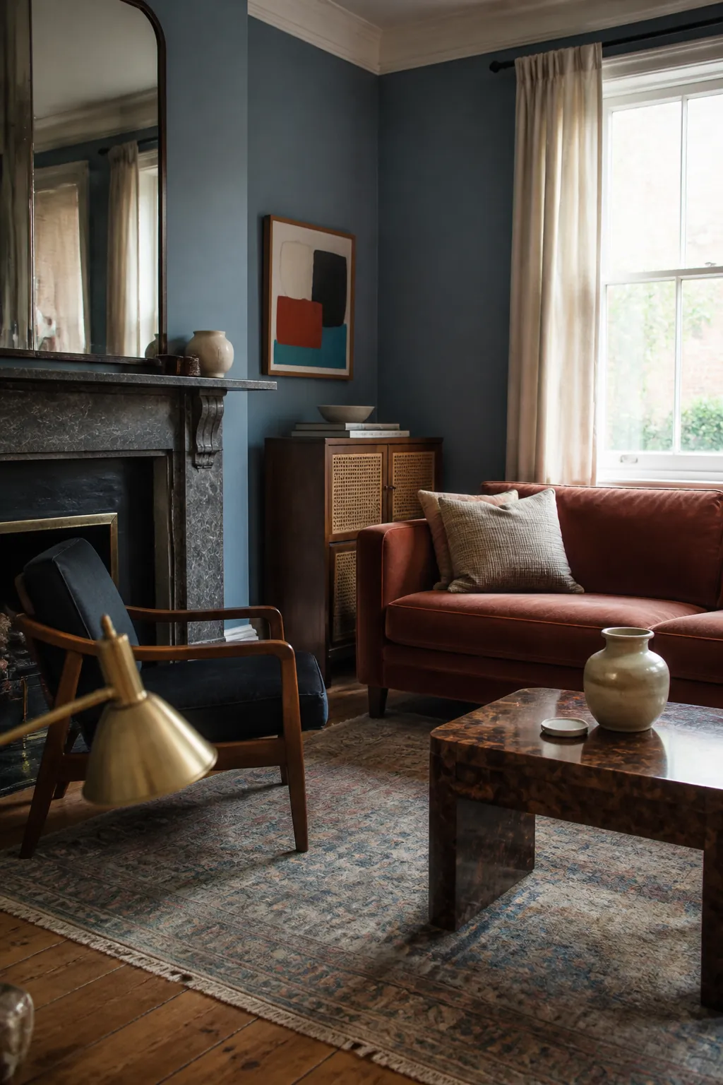
Its restraint makes it a dependable choice for adding color to a neutral living room. Repeat it once in a patterned textile and stop.
Warm Soft Black
Warm soft black is the deepest option, useful when a room needs an architectural background for books, art objects, or pale furnishings. Brown undertones help it connect to timber rather than oppose it.
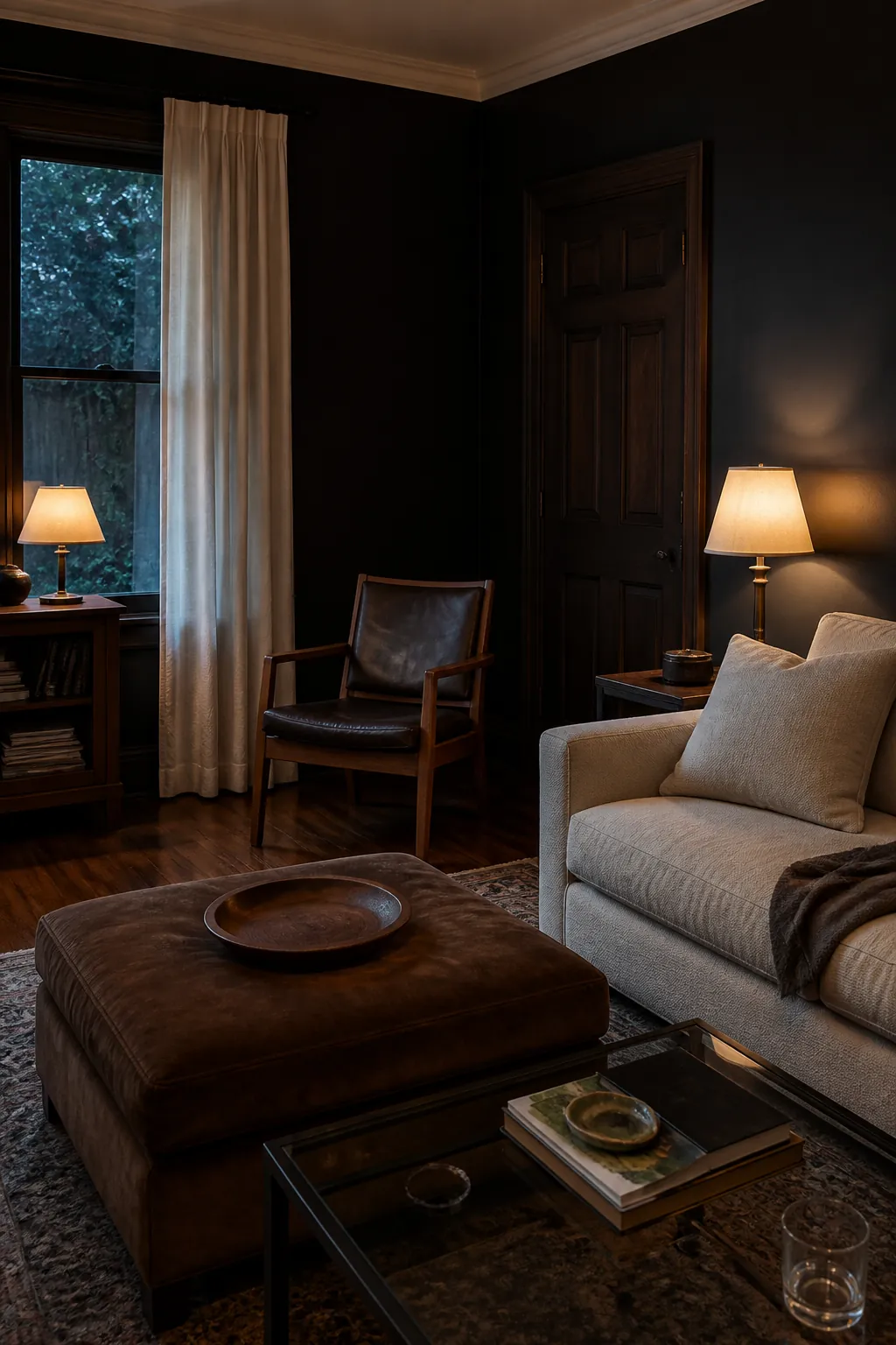
Give it cream, aged walnut, reflective glass, and multiple low lamps. No color is automatically timeless; the lasting choice is the one that continues to improve the room’s fixed finishes in morning, afternoon, and evening light.