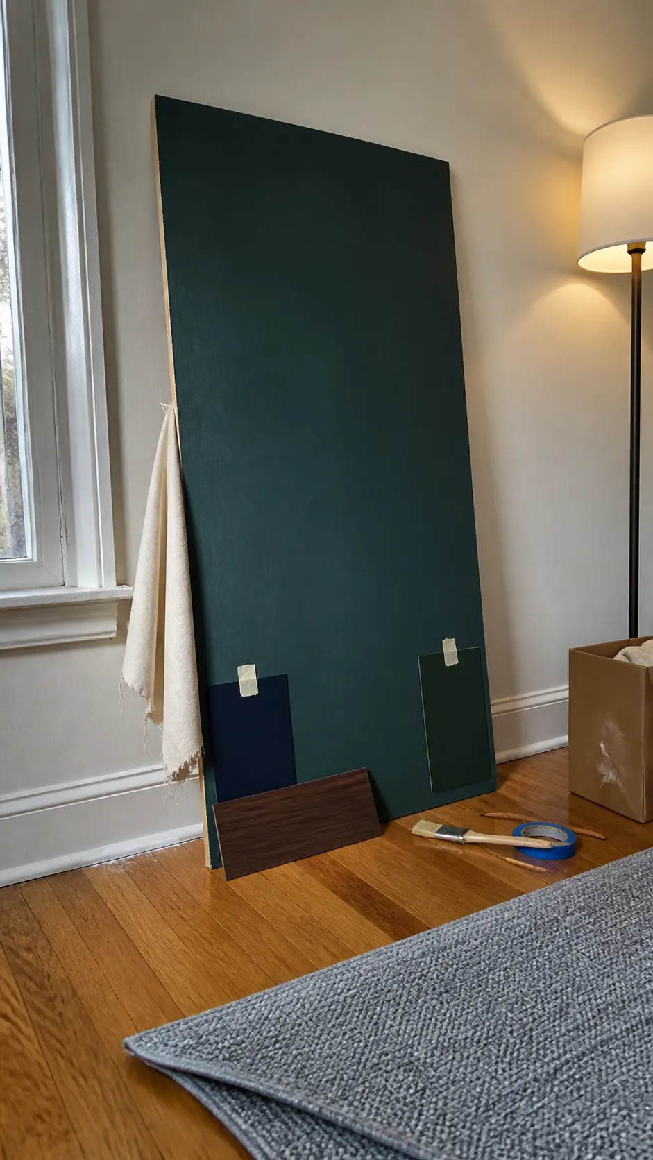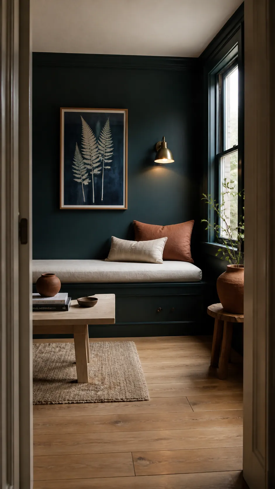
Midnight green is a very dark blue-green that can look teal in daylight and almost black in low light. A commonly cited digital reference is hex #004953, or RGB 0, 73, 83, but the name is not a universal paint standard. One brand’s midnight green may be bluer, grayer, or more forest-like than another, so the sample in your actual room matters more than the name on the card.
Midnight Green Sits Between Deep Teal and Green
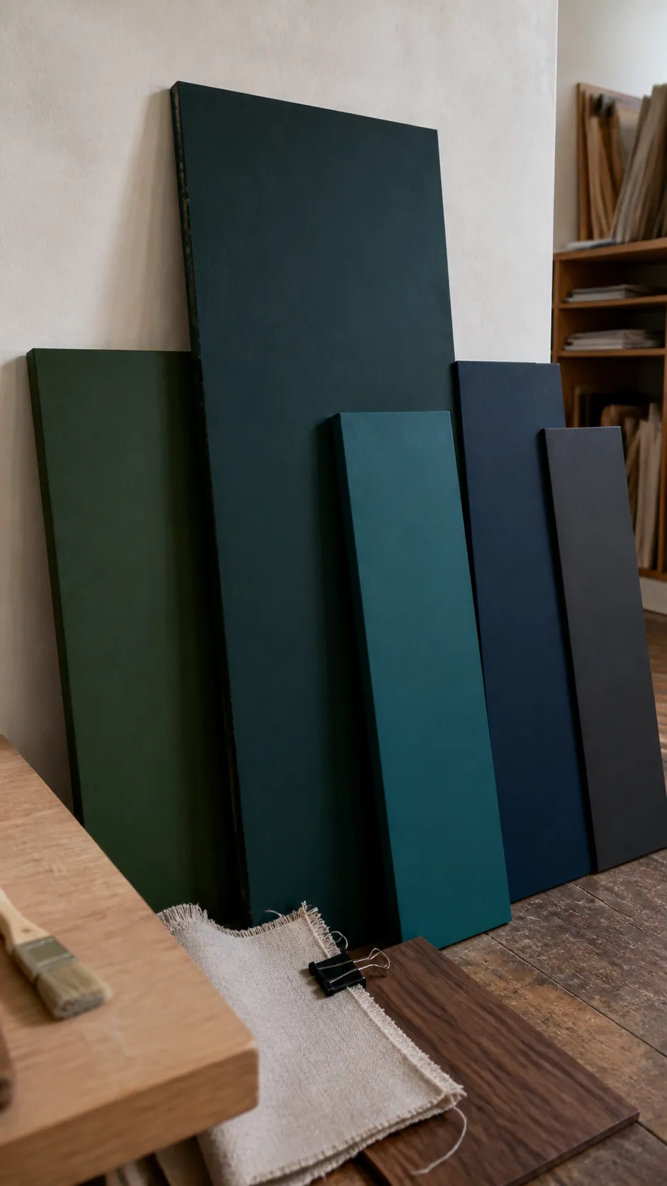
Compared with a classic forest green, midnight green usually contains more blue and less obvious yellow. Compared with navy, it retains a green cast, especially near warm white or natural wood. It is deeper and less vivid than turquoise, so it reads as a shaded architectural color rather than a tropical accent.
That in-between quality explains why photographs can be misleading. A camera’s white balance, screen settings, and surrounding colors can push the same surface toward blue or green. For a useful midnight green shade comparison, place real samples beside a known navy, forest green, and charcoal.
Light Reveals Its Blue-Green Undertone
North-facing daylight often emphasizes the blue side of midnight green, while warmer southern or late-afternoon light can reveal more green. At night, a weak overhead bulb may make it look black. This shifting quality is attractive when you plan for it and frustrating when you expect a fixed swatch color.
Use a large movable sample board and check it vertically at morning, midday, and after dark. Place it in corners as well as near windows. If the midnight green paint color loses all visible hue, improve layered lighting or choose a slightly lighter, grayer version.
Warm White and Wood Make It Easier to Read
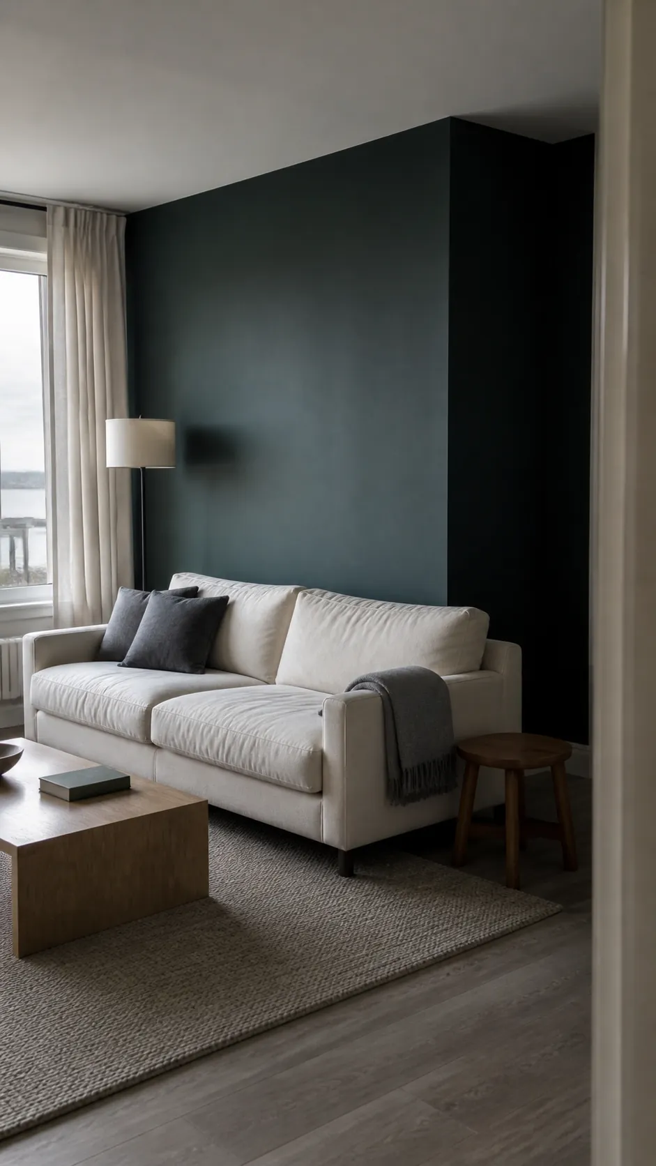
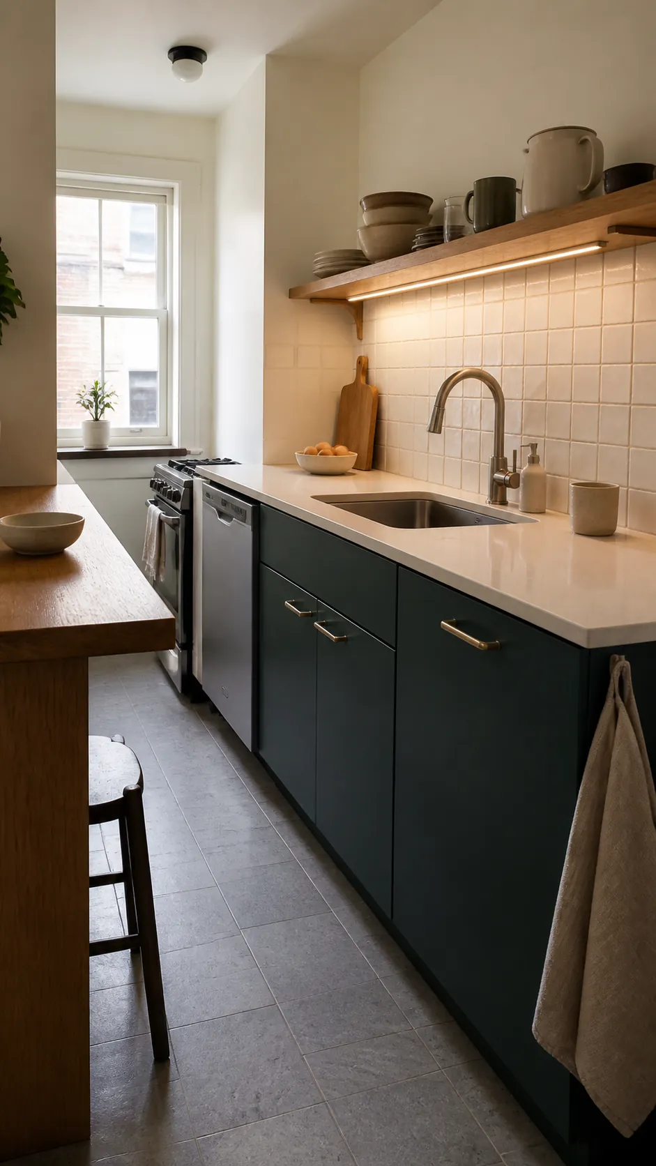
Warm white creates a clear light boundary around midnight green, while oak and walnut add the warmth its blue undertone lacks. This is why midnight green with brass and wood feels balanced rather than cold. Use pale surfaces broadly and reserve metal for smaller reflected highlights.
In a kitchen, dark lower cabinets beneath cream walls are easier to live with than a fully color-drenched scheme. In a living room, a cream sofa and oak table keep midnight green walls visibly colored. Avoid pairing every dark surface with black unless strong daylight is available.
Dusty Pink and Terracotta Add Soft Contrast
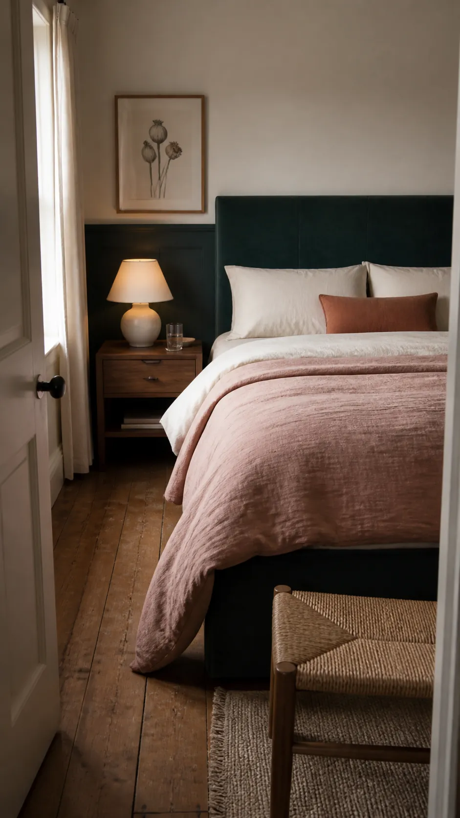
Because midnight green leans blue, clay pink, dusty rose, and muted terracotta bring useful warmth. These accents are less predictable than beige but still subdued enough for a bedroom. Choose washed linen, wool, or pottery so texture supports the color relationship.
One quilt, chair, or curtain panel can be sufficient. Repeat the warm accent once at a much smaller scale, then let cream and wood connect the palette. Bright coral may overpower the shade, while muddy brown can make it look dull.
Use the Finish to Control the Mood
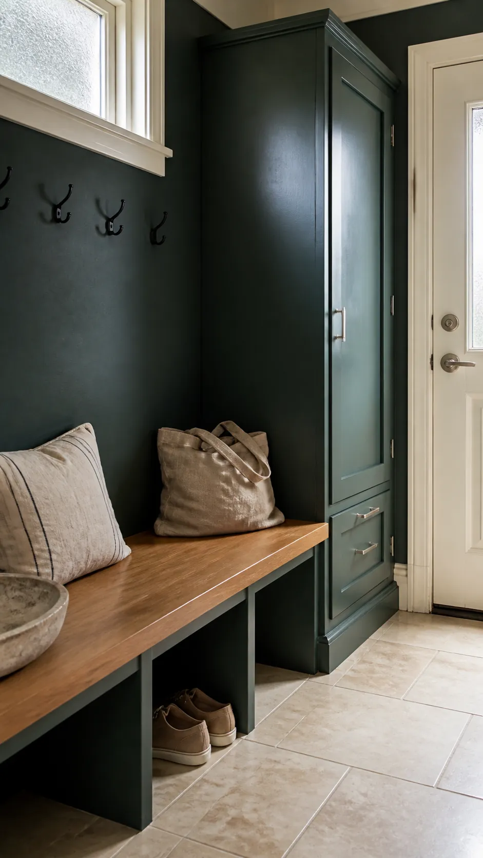
Matte midnight green absorbs light and feels calm, making it a good choice for walls with minor imperfections. Eggshell reveals more depth and is easier to wipe in halls or kitchens. Satin or gloss can look almost liquid, but it also magnifies surface flaws and creates stronger reflections.
Different finishes of the same color can produce a layered result on walls, trim, and furniture. Test them separately rather than assuming the formula will appear identical. A glossy cabinet beside a matte wall may look lighter even when both use the same tint.
Choose the Sample, Not the Color Name
Start with the intended surface and room rather than trying to locate one official can of midnight green. Compare at least three candidates with blue-green undertones, label the backs, and move them around the space. Keep your fixed flooring, counters, trim, and largest textiles visible during every comparison.
The right sample should remain recognizably green beside navy and recognizably blue-green beside forest green. It should also hold detail under your normal lamps. If it passes those tests, it is the right midnight green for your home—even if its manufacturer gives it a completely different name.