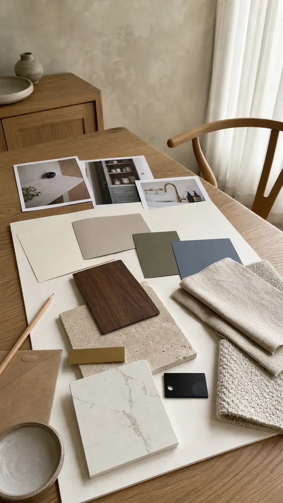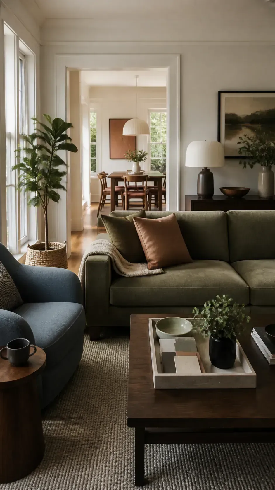
A paint chip can look calm in the store and strangely gray, green, or yellow once it reaches your wall. That shift is not a sign that you have poor taste. It usually means the color was chosen before the light, flooring, cabinetry, and connected sightlines were treated as one system.
The most convincing homes do not force every room to match. They repeat a few undertones, materials, and accent colors often enough that each space feels related. The result is a house that flows while still allowing a bedroom to feel restful, a kitchen to feel fresh, and a living room to carry more personality.
Begin With Finishes That Are Staying
Start with the colors that are expensive or impractical to replace. Flooring, stone counters, tile, large rugs, wood cabinetry, and a favorite sofa establish the undertone family before wall paint enters the conversation. A cream stone with warm veining will usually cooperate with clay, olive, muted blue, mushroom, and warm white more easily than with a sharp blue white.
Place samples beside those fixed finishes instead of judging them on an empty wall. Look for a shared temperature rather than an exact match. A warm oak floor can support cool color when that color has enough softness or a subtle earthy undertone to bridge the contrast.
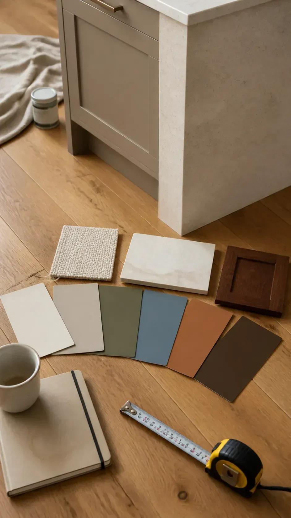
Choose One Quiet Connecting Neutral
A connecting neutral gives hallways, open living zones, and shared transitions a stable background. It does not need to cover every room. Its job is to create visual breathing space between stronger choices and to keep trim, doors, and ceilings from competing with the rest of the palette.
Warm white, pale putty, soft stone, or a diluted greige can all work, but the name on the card matters less than the behavior in your house. Compare the sample with the brightest white already present, then inspect whether it turns pink, green, violet, or muddy. A useful neutral stays pleasant beside your fixed finishes even when its apparent depth changes through the day.
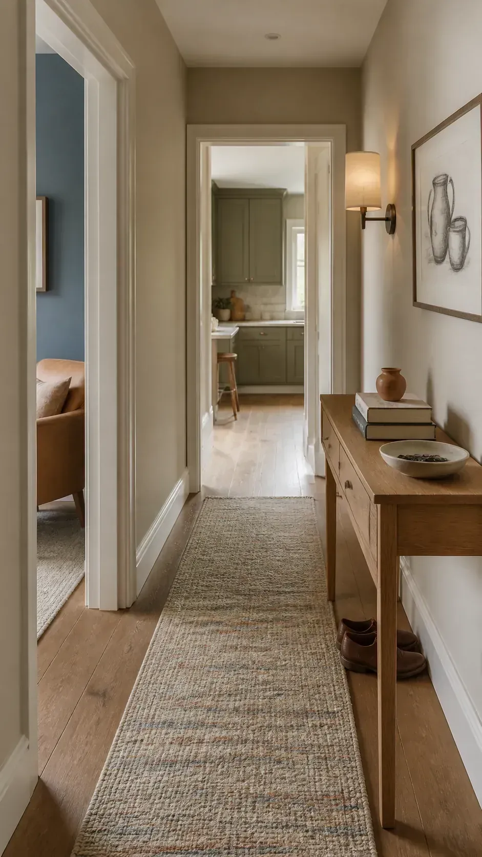
Build A Small Family Of Supporting Colors
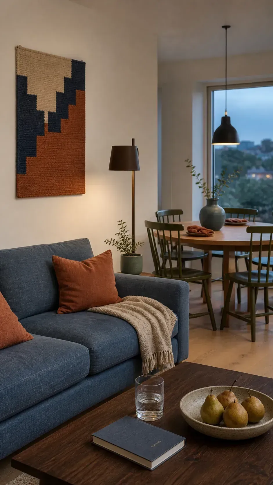
Once the neutral is settled, select two or three supporting hues with a similar level of softness. Dusty blue, muted olive, earthy terracotta, and deep brown can feel contemporary together because none of them is shouting at a different intensity. One can lead in a living room, another can appear on kitchen cabinetry, and the deepest tone can be reserved for a reading nook or compact powder room.
Repeat each supporting color at least once outside its main room. A blue wall might reappear in dining chair fabric, while olive cabinetry may be echoed by a ceramic lamp or striped cushion. These small repetitions create continuity without making the whole home color palette feel rigid or overly coordinated.
Let Natural Light Change The Assignment
The same paint can look crisp in one room and dull in the next. Window direction, porch overhangs, trees, neighboring buildings, and reflected flooring color all affect what reaches the wall. This is why a single neutral across an entire level can produce several apparently different colors.
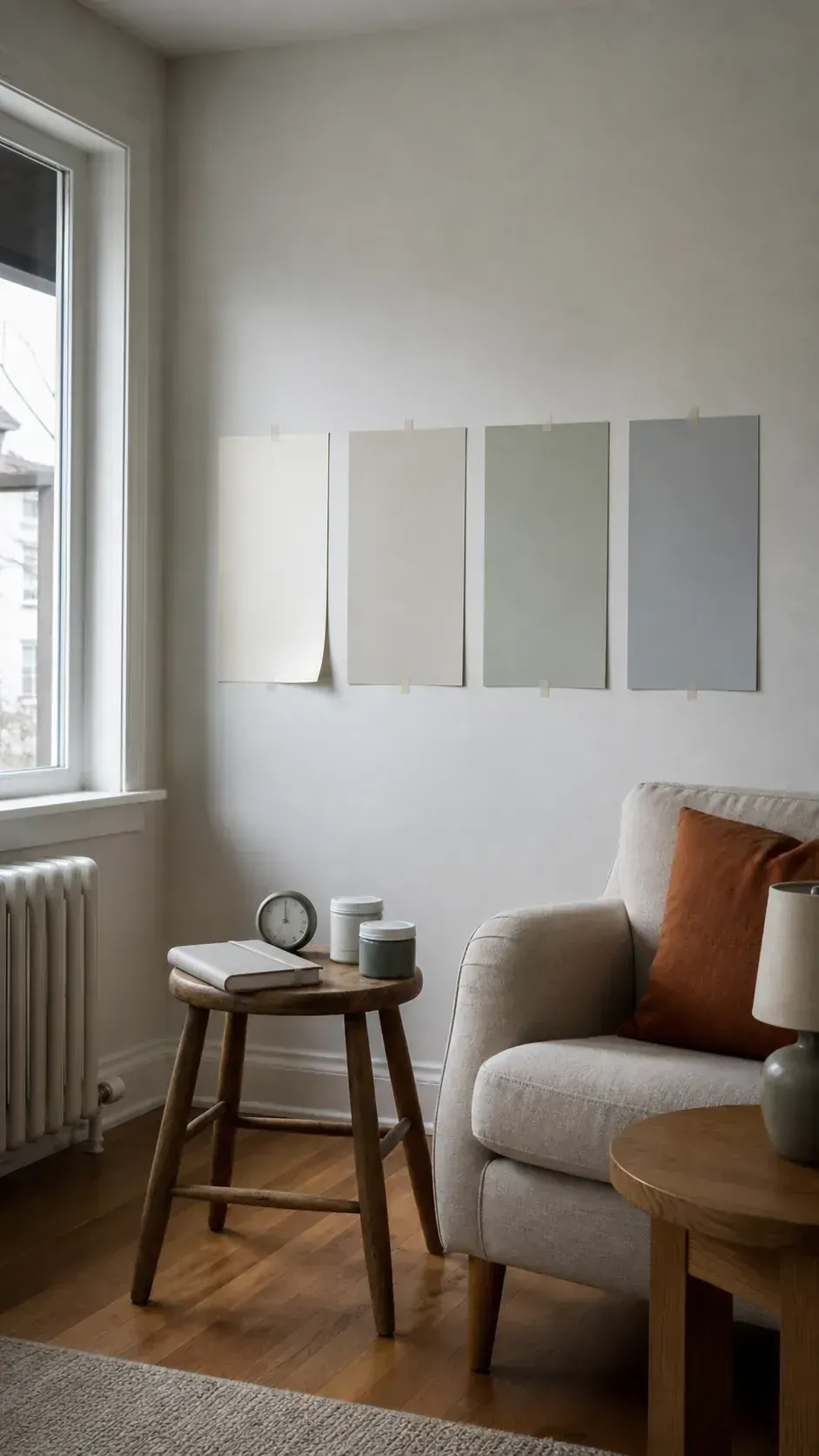
Use large movable samples and observe them in the morning, late afternoon, and after lamps are switched on. A darker room may need a color with more warmth or chroma rather than simply a lighter version of the same gray. Give the sample several ordinary days, because a cloudy morning and a bright weekend can tell very different stories.
Use Sightlines To Decide Where Color Changes
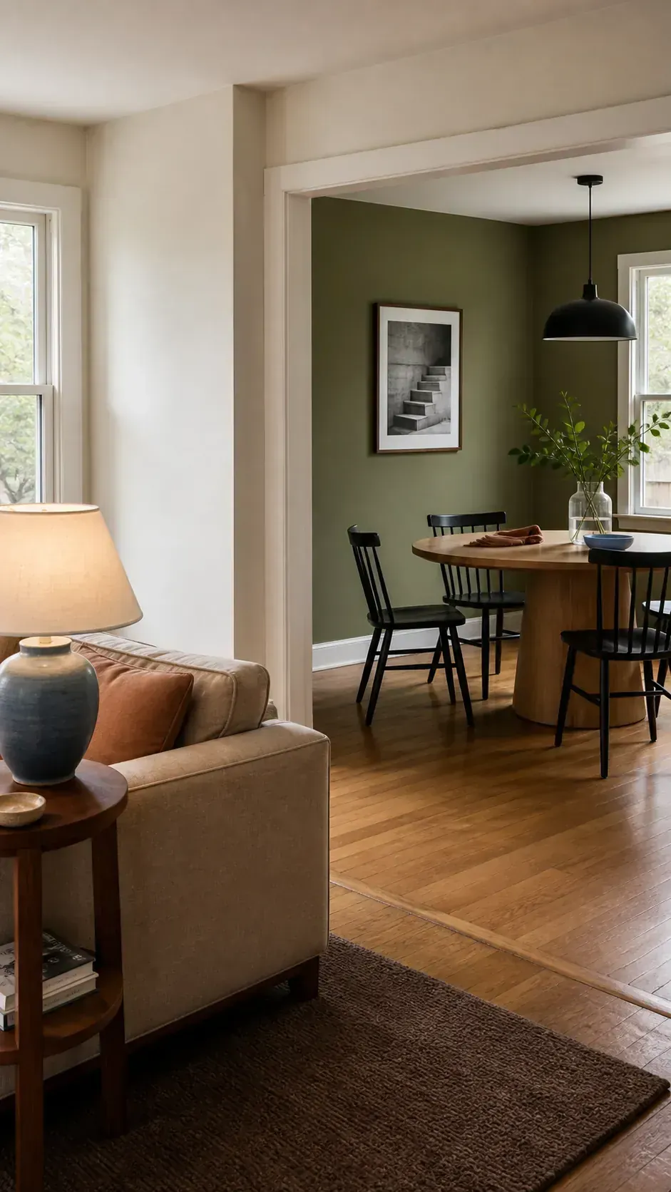
Open rooms need a deliberate transition point. A trimmed doorway, an inside corner, a change in ceiling height, or a built in cabinet can provide a natural stopping place. Changing color halfway across an uninterrupted wall usually makes the plan feel accidental.
Stand at the entry and note every room visible at once. Then repeat the exercise from the kitchen and main seating area. Colors that appear together do not have to match, but they should share enough temperature, depth, or material context to avoid a visual argument.
Test The Palette As A Real Room System
Lay the final paint samples beside fabric, wood, metal, tile, and a photograph of each major fixed finish. This simple palette board reveals whether every choice has the same weight or whether one cold gray is breaking an otherwise warm composition. It also helps you decide where black, brass, chrome, or natural wood should repeat.
Before buying full quantities, paint generous sample areas or use large removable sheets in the actual rooms. Move them between walls and live with them under your normal lamps. The right modern interior color palette is not the one that looks perfect in isolation; it is the one that keeps working as you walk through the home during an ordinary day.