A gallery can make a living room feel personal, but more pictures do not automatically make it feel finished. Start with the furniture, doorways and viewing distance, then decide where the collection should hold your attention. A clear boundary gives even an eclectic mix somewhere to belong.
A gallery scaled to the sofa
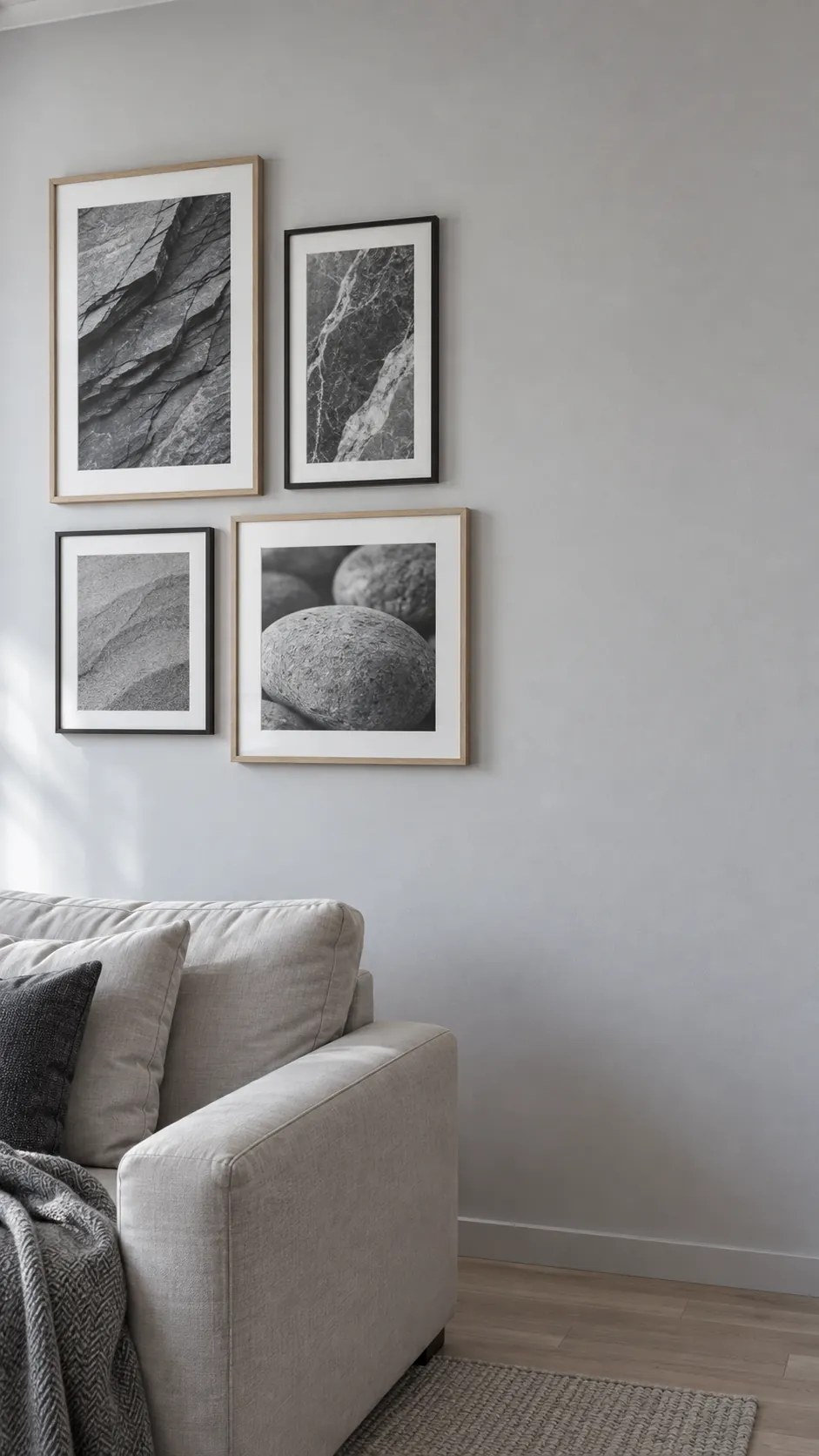
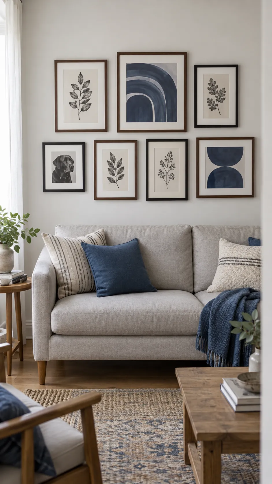
Use the sofa as the visual anchor for the collection instead of spreading pictures across the entire wall. Mark the proposed outer boundary with paper and look at it from the room entrance before choosing individual positions. Leaving visible wall beyond both ends of the group helps the furniture and pictures read together.
One bold print with a supporting cast
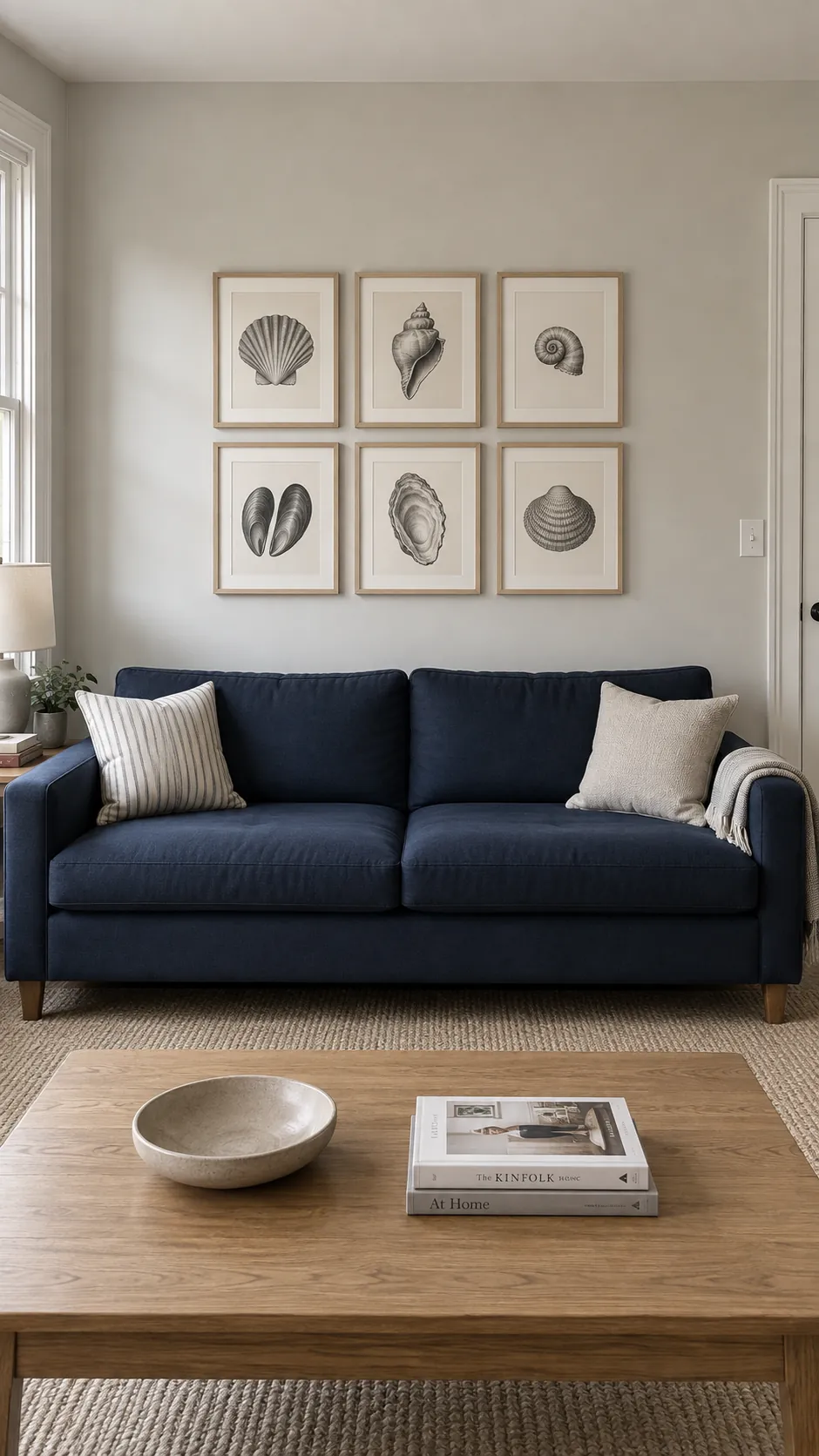
A strong central print gives an assorted collection somewhere to begin. Choose the work with the clearest shape or deepest contrast, then place quieter pieces around it. The anchor does not have to sit exactly in the middle of the wall. Let the supporting frames balance its weight without forming a tight border on every side. This suits an eclectic living room where the pictures arrived one at a time.
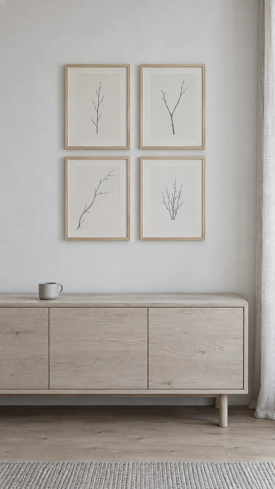
A spare Scandinavian arrangement
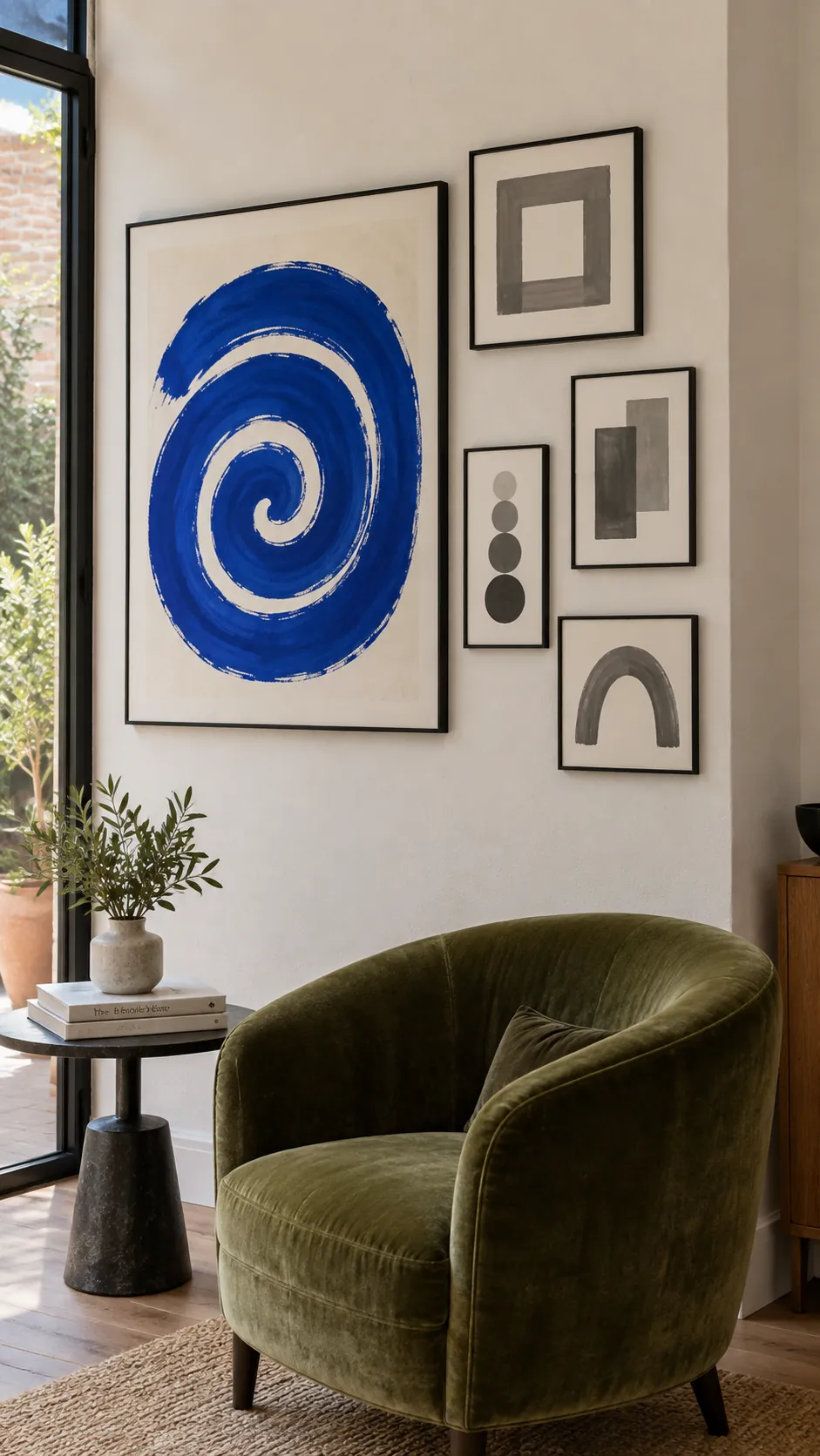
A Scandinavian living room can carry several pictures without losing its sense of space. Use pale timber frames and prints with generous unprinted margins. Limit the group to one defined area above a low cabinet, leaving neighboring walls quiet. The empty space is part of the arrangement, so resist adding a tiny picture simply because a gap exists.
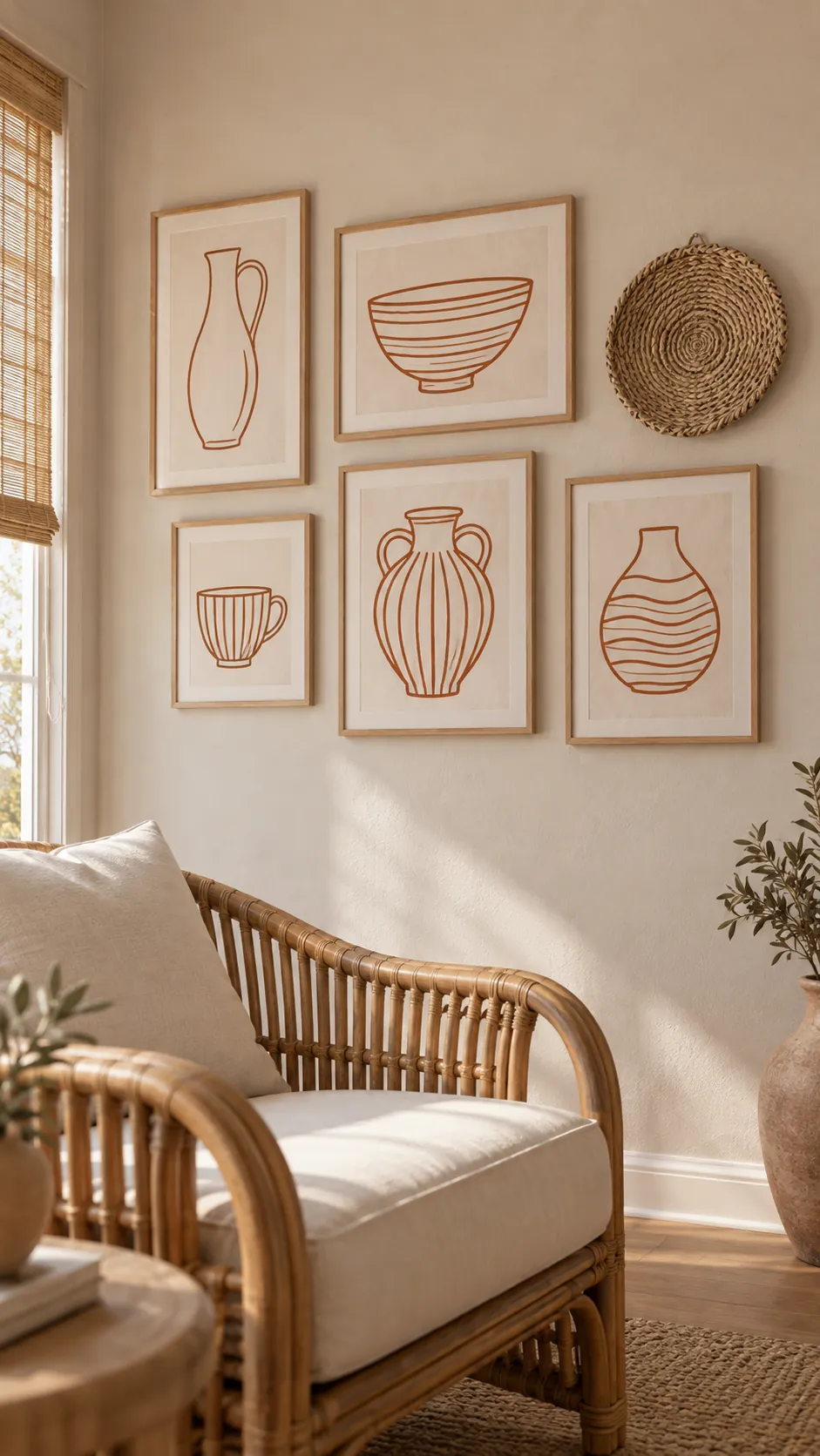
A boho mix with one woven accent
A small woven piece adds a different surface among framed prints. Repeat its natural fiber color in a few frame finishes so it belongs to the collection. Keep the rest of the wall relatively simple if the room already has patterned textiles.
Check the depth of the woven piece before placing it beside a projecting frame. Give its irregular outline extra room rather than forcing it into a precise grid. One tactile accent is often enough to change the character of the whole group.
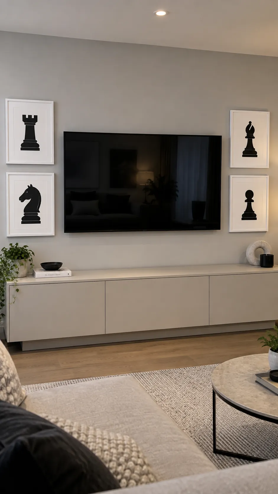
A composed gallery around the television
A television can sit within a gallery when the surrounding works have enough visual weight to relate to the screen. Start with a few medium pictures beside it rather than scattering miniature frames along the top edge. Leave all ventilation openings and service access clear. Avoid glossy glazing in positions that catch the same window glare as the screen. The pictures should remain interesting when the television is switched off.
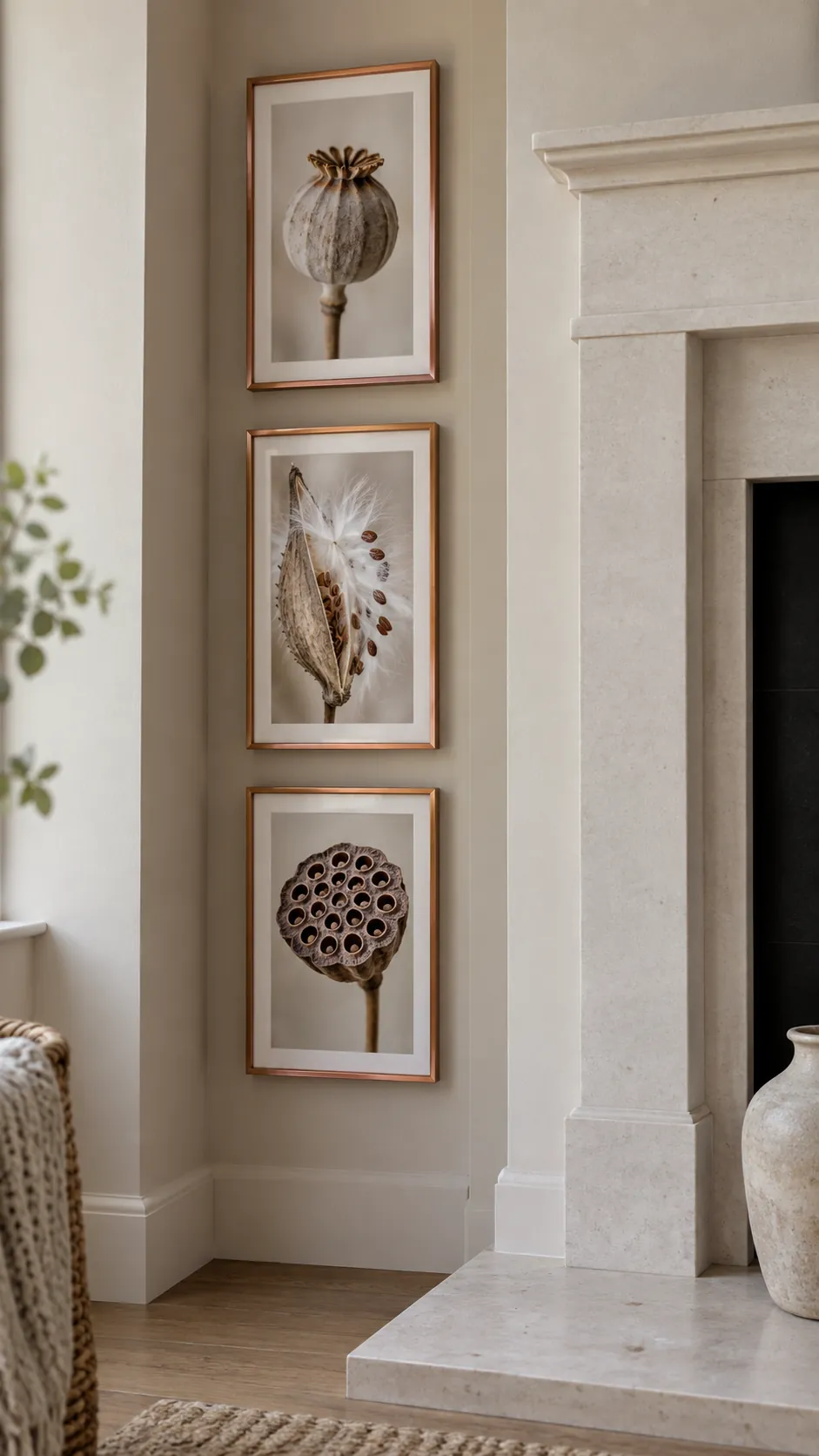
A narrow gallery in a fireplace alcove
An alcove beside the fireplace offers a contained place for smaller works. Arrange the collection to suit the alcove width and leave the fireplace itself visually distinct. Follow the appliance or fireplace clearance guidance and keep valuable paper away from heat.
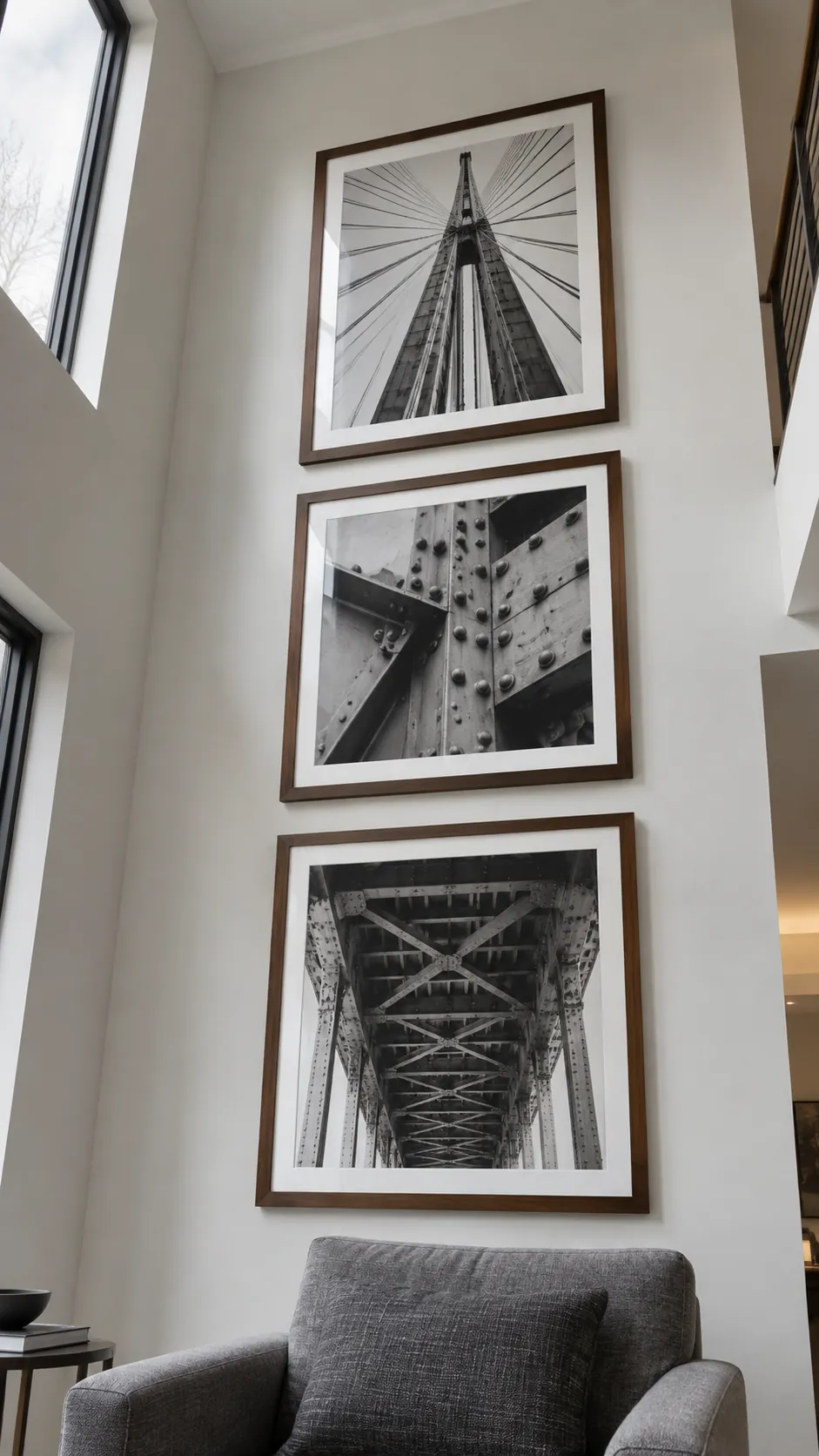
A tall column for a high ceiling
A vertical collection can make a tall living room feel intentional without decorating every upper surface. Stack a few larger works with clear gaps so the height feels connected to the furniture below. Keep the lowest picture easy to view from the seating area. If the upper work becomes difficult to appreciate, shorten the column rather than chasing the ceiling.
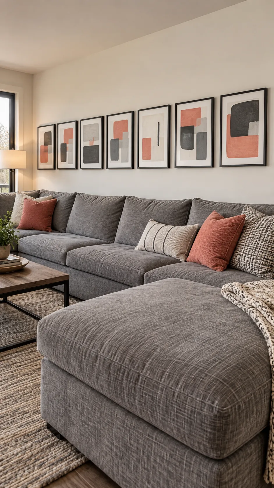
A low band above a long sectional
A long sectional usually needs a broad arrangement rather than a narrow tower of pictures. Let several medium works form a relaxed band over the main seating run. Keep the group low enough to relate to the sofa while allowing comfortable head clearance. Test the full width with templates because a collection that looks large on the floor may seem small above deep seating. A limited frame palette helps the long sequence feel connected.
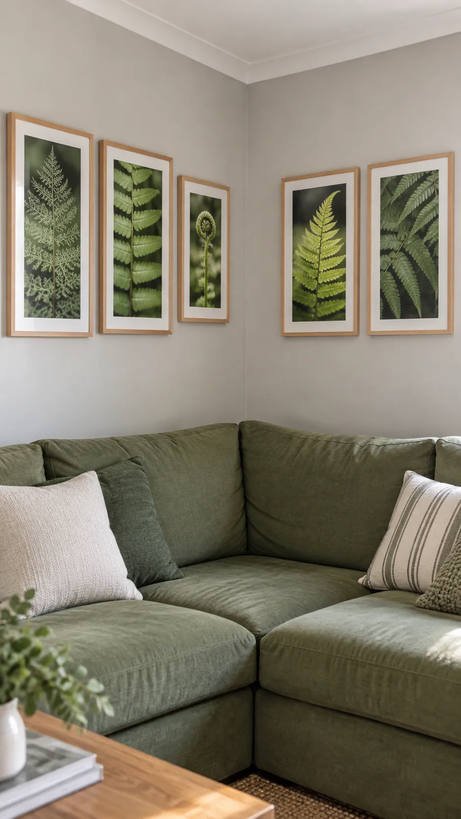
A gallery that turns a corner
Carry a related collection onto the adjacent wall when a sectional wraps around the room. Let each wall have its own small composition instead of trying to mirror every frame. A shared subject or mat color can connect the two sides without crowding the corner.
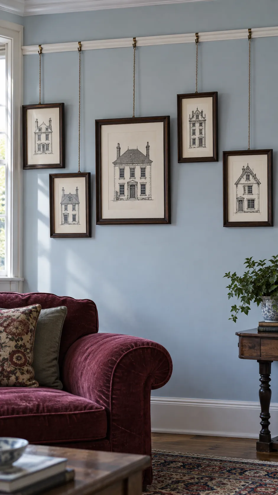
A picture rail with visible hanging cords
A traditional picture rail can support a flexible gallery without adding a fresh wall fixing for every change. Choose hooks and cords rated for the frame weight and the rail system. Keep cords tidy and allow their vertical lines to become part of the design.
Plan the picture positions before adjusting cord lengths so the wall does not become a tangle of diagonals. Heavy or fragile frames deserve particular care and suitable hardware. The rail should function as a mounting system, not merely a decorative strip.
A bookcase side panel made personal
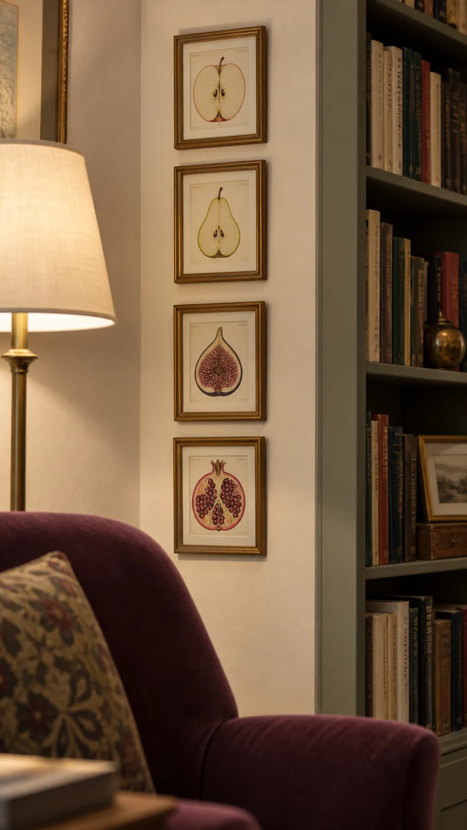
The wall beside a bookcase can hold a compact gallery that extends the feeling of a reading area. Choose small prints that reward nearby viewing, such as illustrations or close photographs. Leave enough separation from the shelves that the frame edges do not merge with book spines. This is useful when the sofa wall is already occupied by a window.
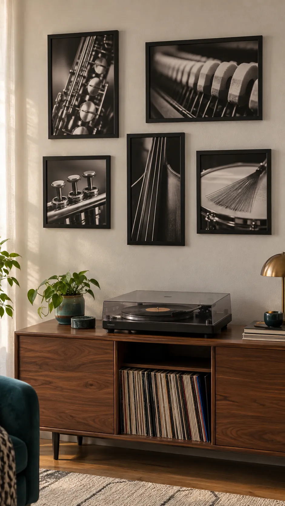
A gallery above the record cabinet
Album related artwork and personal music photographs can give a record corner a clear identity. Keep the cabinet top usable for opening the turntable cover and handling records. Use the display to tell a specific story rather than filling it with unrelated music slogans. A mixture of square and rectangular formats can echo record sleeves without turning every picture into a matching cover.
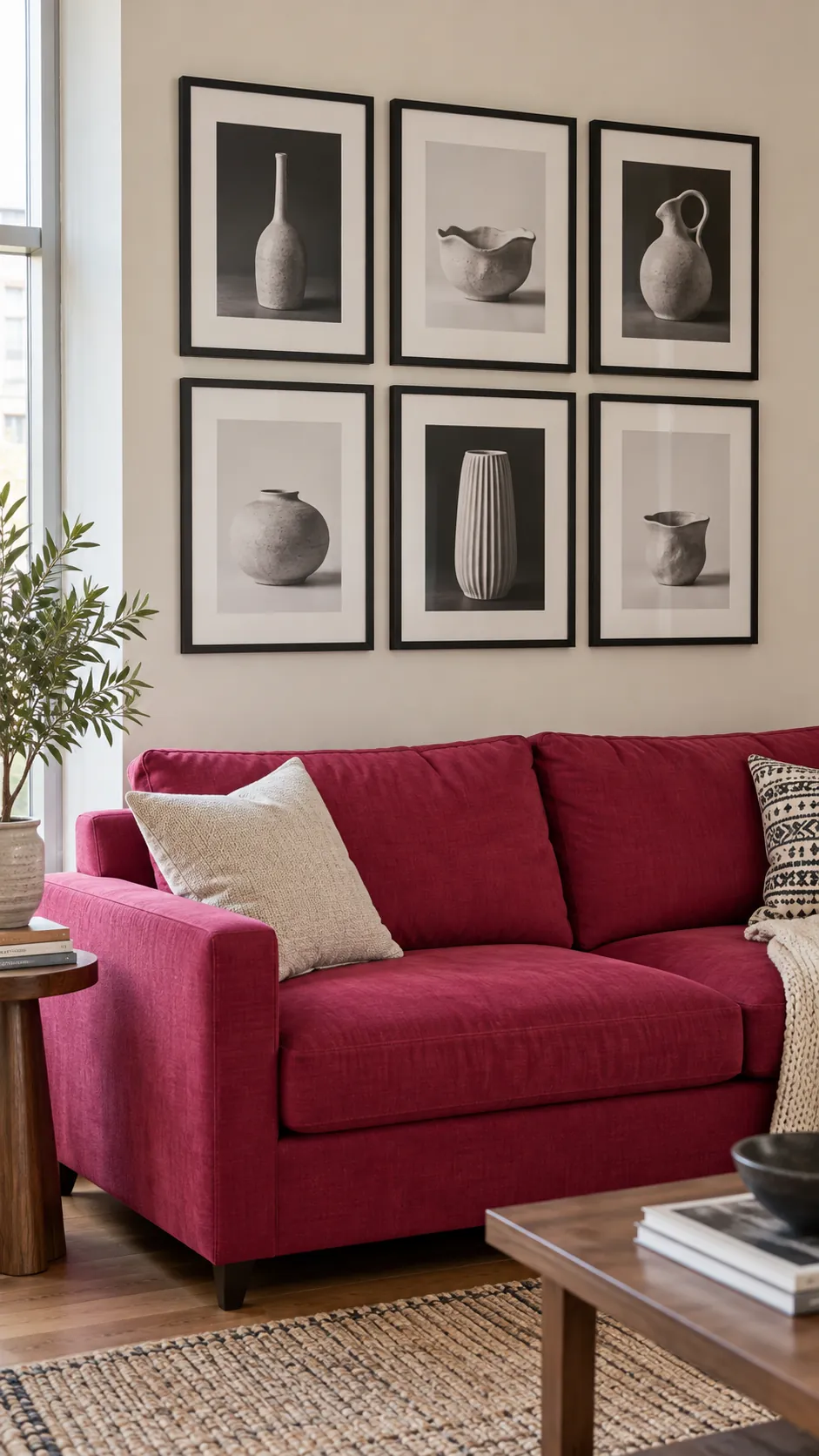
A quiet monochrome wall in a colorful room
Monochrome pictures can bring order to a living room with a strongly colored sofa or rug. Vary the subjects while keeping the photographs or drawings in a related tonal range. The room already supplies color, so the gallery can contribute shape and detail. Check that the darkest picture is balanced by another dark element within the group. This prevents a single frame from appearing to pull the arrangement sideways.
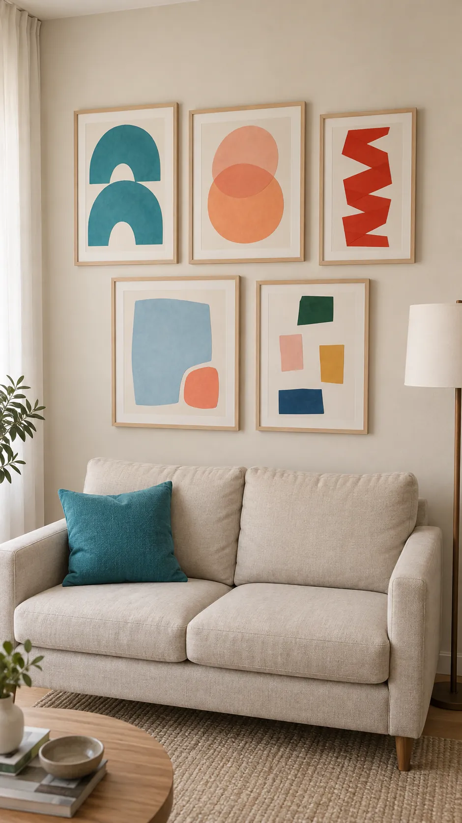
Colorful art in a neutral living room
A neutral living room gives colorful prints room to be the main event. Select a small group of colors that recur across different works rather than buying a complete matching set. Carry one of those colors into a cushion or small everyday object for a gentle connection.
An earthy palette with charcoal outlines
Rust, clay and muted olive can sit comfortably together when charcoal appears in several works. The dark marks give a soft palette enough definition to be seen across the room. Use simple frames so the color relationships stay easy to read. Avoid matching every shade to the upholstery, which can make personal art feel like an accessory pack.
One round mirror at the outside edge
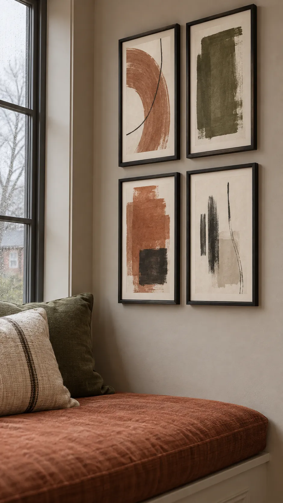
A round mirror can break up rectangular frames and reflect useful daylight. Position it toward an outer edge of the collection where its curved outline has room. Look into it from the sofa to check what it actually reflects.
A mirror that shows a cluttered doorway may add more visual activity than expected. Use mounting hardware suited to its weight and wall type. Keep nearby frames far enough away that their corners do not seem to press against the circle.
A small portrait collection beside a window
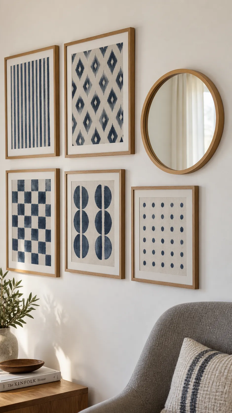
A narrow wall beside a window suits intimate portraits that can be viewed close up. Group them vertically and keep their scale modest enough for the strip of wall. Display copies of precious photographs where strong light could fade the originals. Check glare at the time of day when the room is used most.
A display that floats above a console
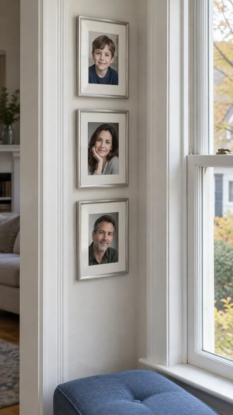
A console gives a gallery a lower boundary even when the sofa sits away from the wall. Center the whole picture group on the console and leave its surface useful for lamps or storage. This can define the sitting area in an open room without adding a partition.
A gallery inside painted molding
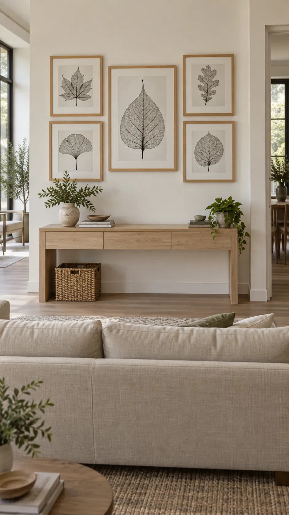
Wall molding can act as an outer frame for a carefully sized collection. Measure the inner panel before arranging the pictures and leave a margin inside every molded edge. Keep the frames visually lighter than the architectural border if the molding is already prominent. One well filled panel usually reads more clearly than several panels crowded with small works. Choose picture positions that respect the existing wall divisions.
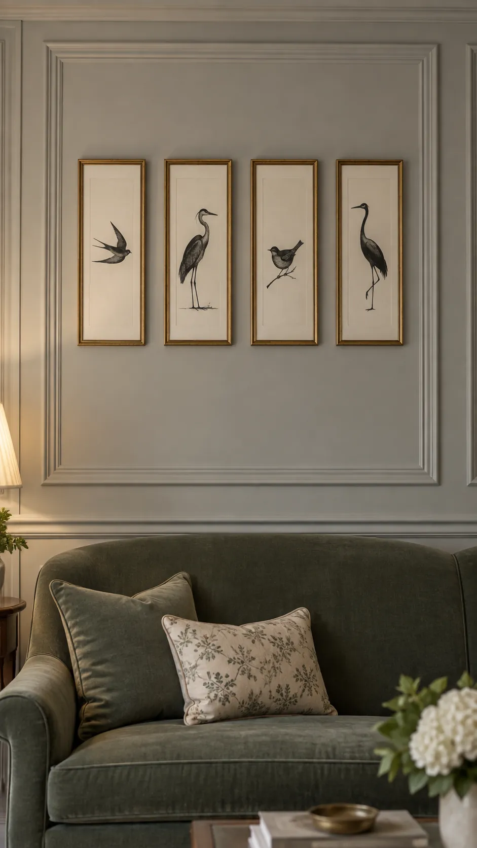
A pair of picture ledges with breathing room
Picture ledges suit a living room where prints and photographs change often. Leave enough space between ledges to remove the tallest frame comfortably. Keep overlaps shallow so they do not hide the subjects. Follow the shelf load limits and secure loose pieces where falling could cause harm.
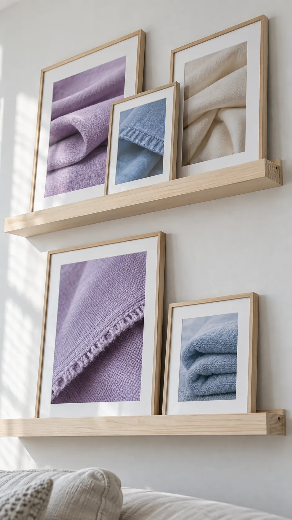
A salon wall with a clear outer shape
A dense collection feels more deliberate when its outside boundary has a recognizable shape. Set the top and side limits first, then place the largest frames within them. Use smaller works to resolve awkward spaces rather than buying filler simply to cover plaster.
Photograph a floor layout and compare it with the wall dimensions before hanging. Similar gaps help the eye move through different subjects and frame finishes. Keep a few quiet prints among detailed works so the collection has places to rest.
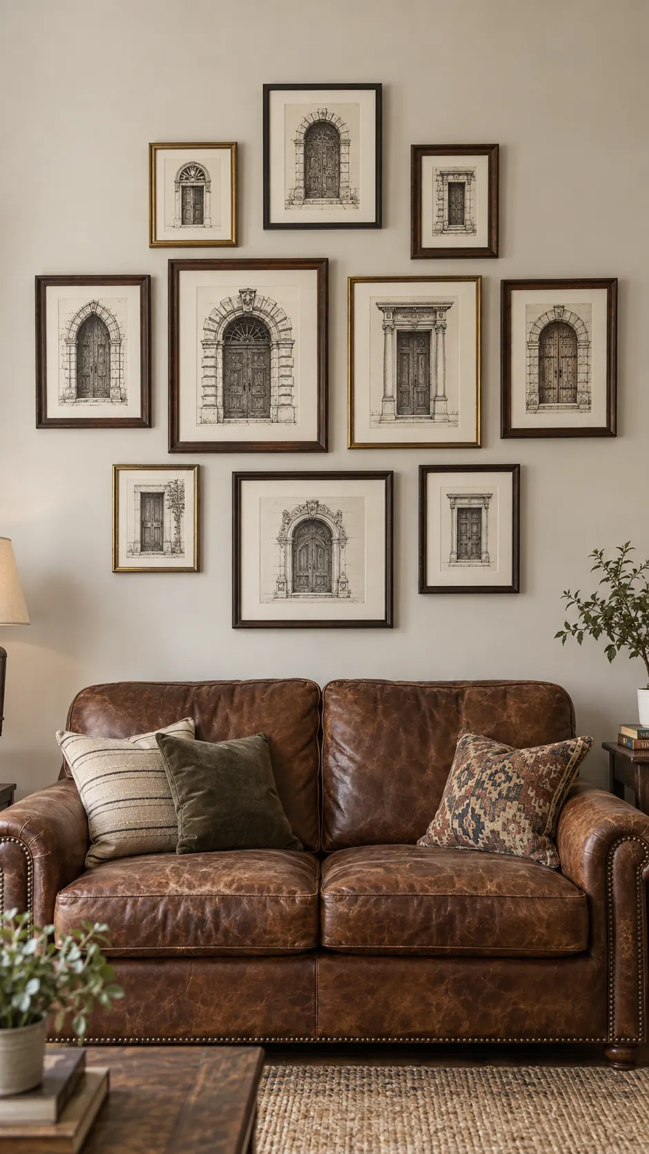
Large mats around small treasured images
Small postcards or photographs can have presence when wide mats give them room. Choose mat openings that preserve important edges and use suitable mounting materials for valuable originals. Repeating the mat color makes very different images easier to combine.
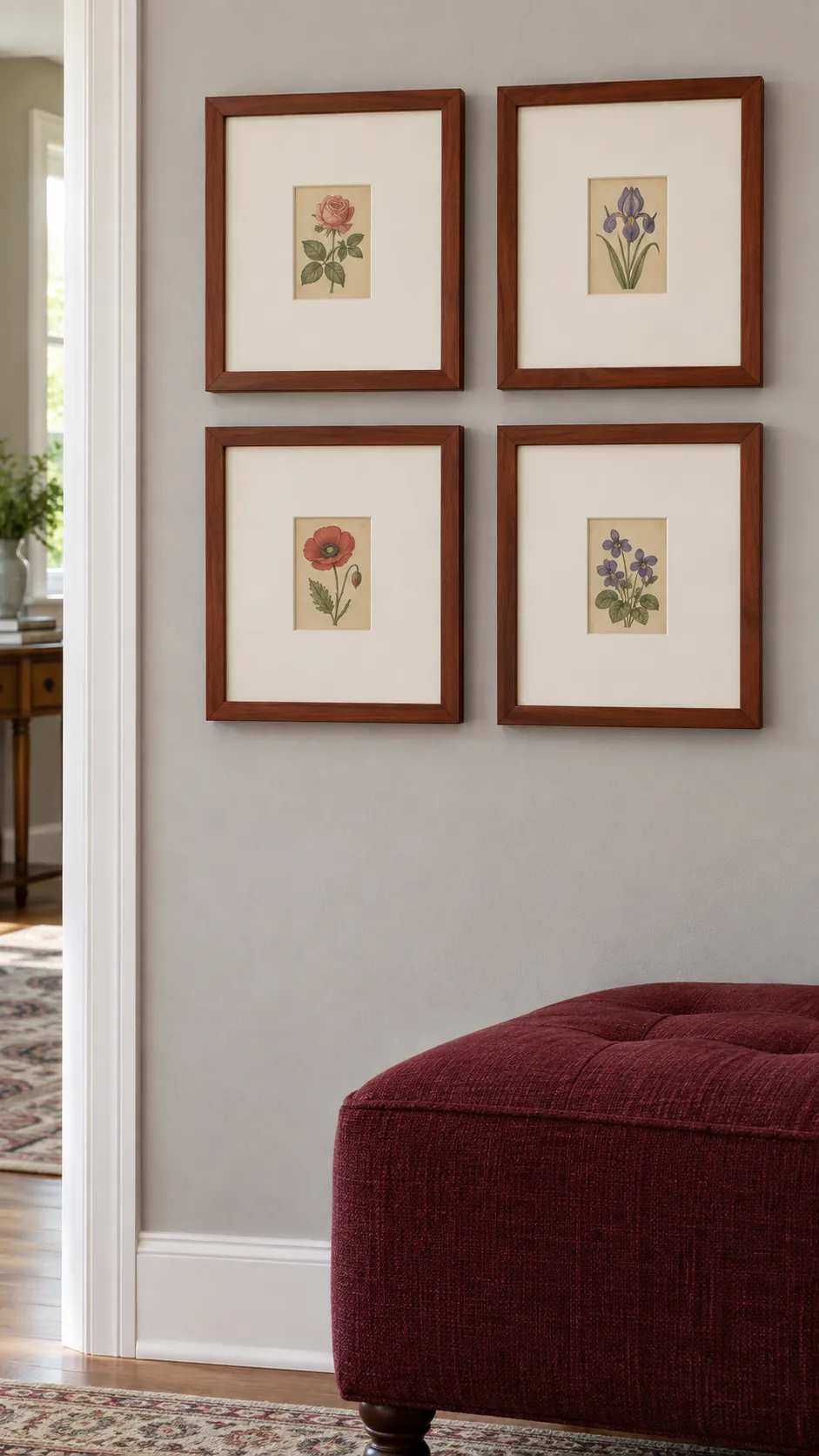
A gallery that shares a color with the rug
A rug can provide a useful starting palette when the artwork feels disconnected from the room. Pull one secondary color from it and repeat that color in several pictures. Leave the remaining art colors free to vary. The connection should be noticeable without making the wall look like a duplicate of the rug pattern.
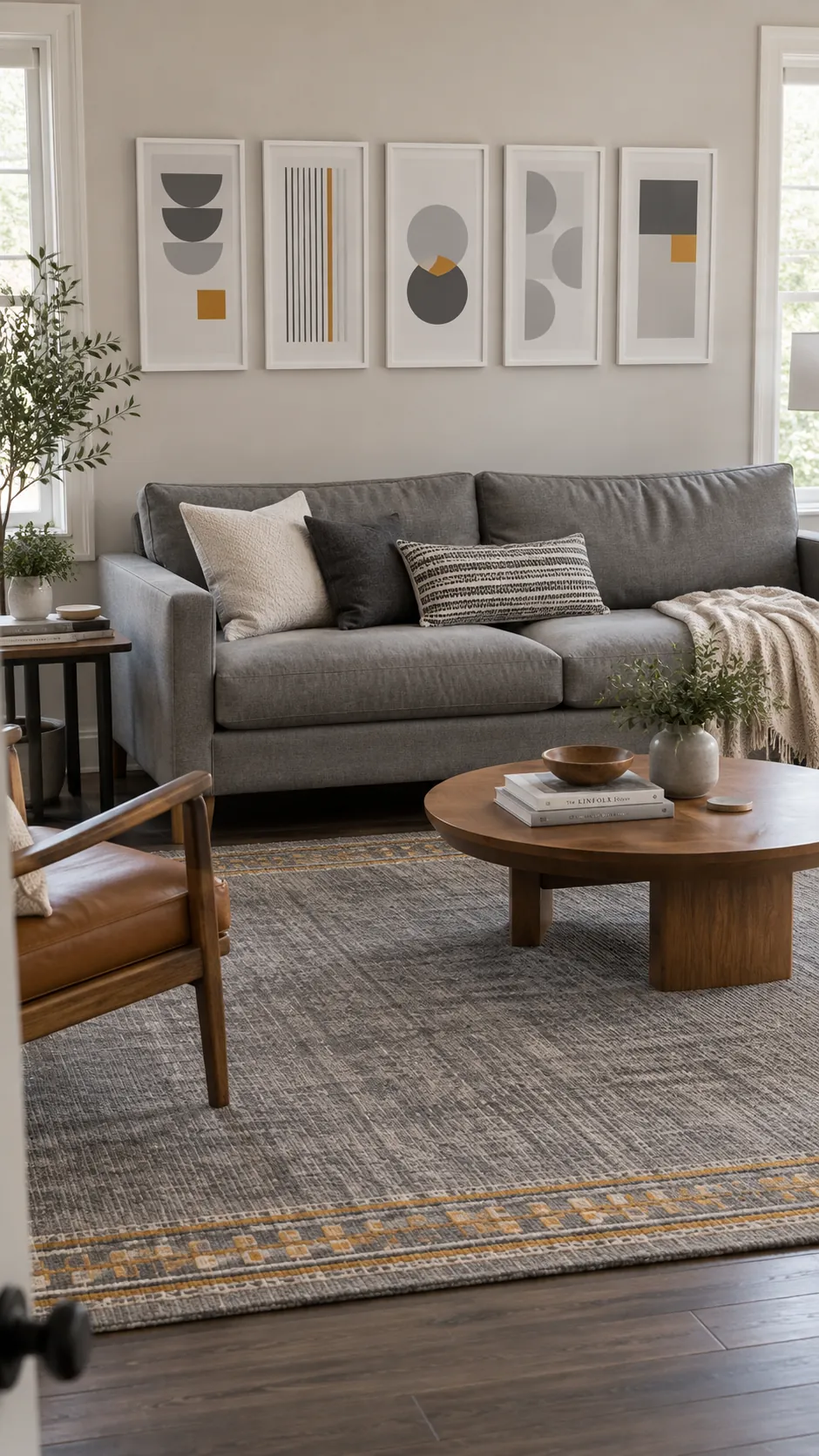
A gentle asymmetrical cluster
An asymmetrical gallery works best when the visual weight still feels balanced. Place one substantial work to the side and use several smaller pieces to answer it across the group. Step back far enough to judge the whole shape rather than focusing on individual gaps. Dark frames and dense images usually carry more weight than pale open prints. Adjust those relationships before adding another object.
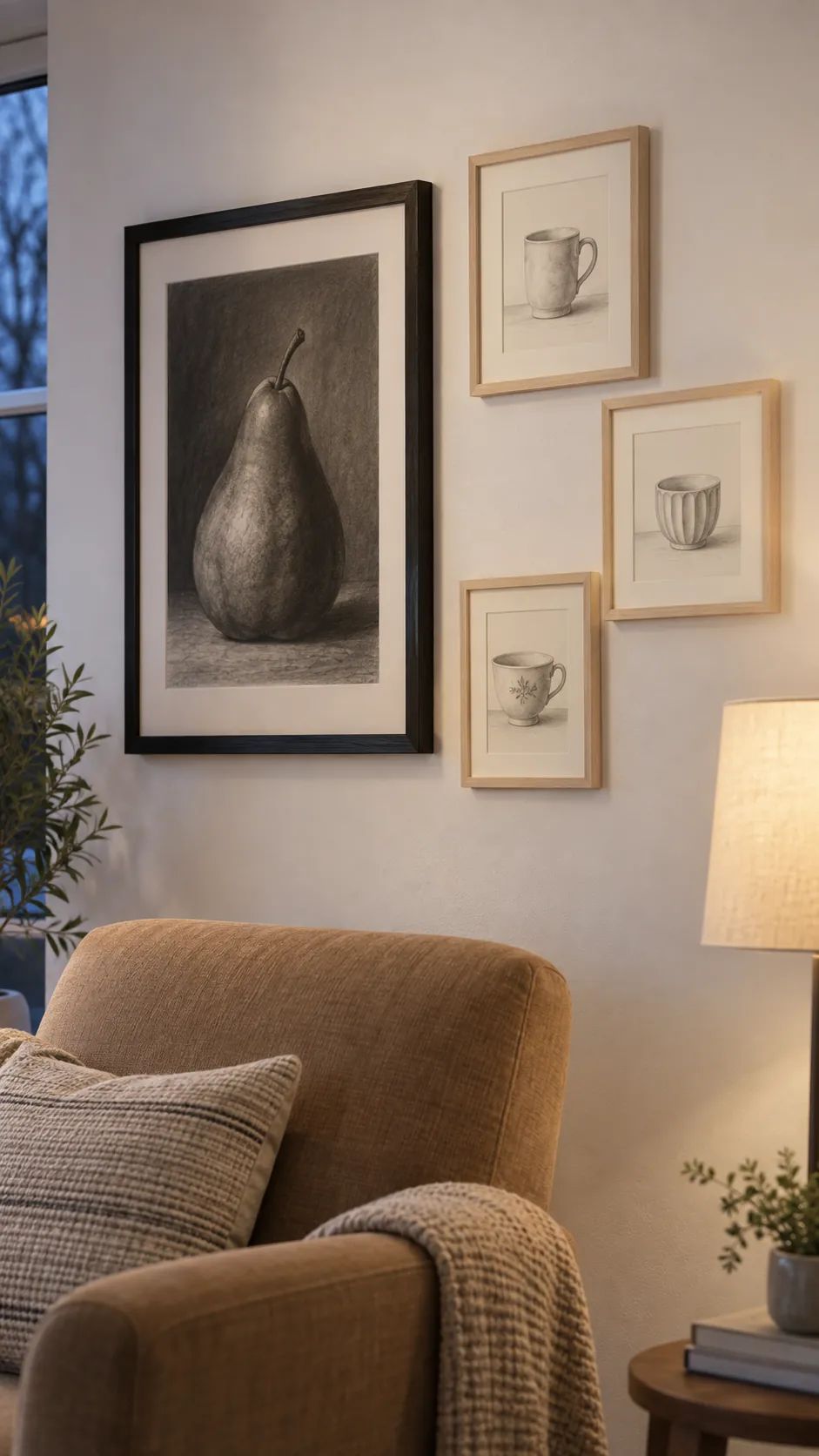
A gallery above a compact loveseat
A small loveseat can be overwhelmed by a sprawling collection intended for a much longer sofa. Choose a few medium pieces and give them clear margins around the group. Keeping the display compact leaves room for a side lamp and makes a small sitting area feel considered.
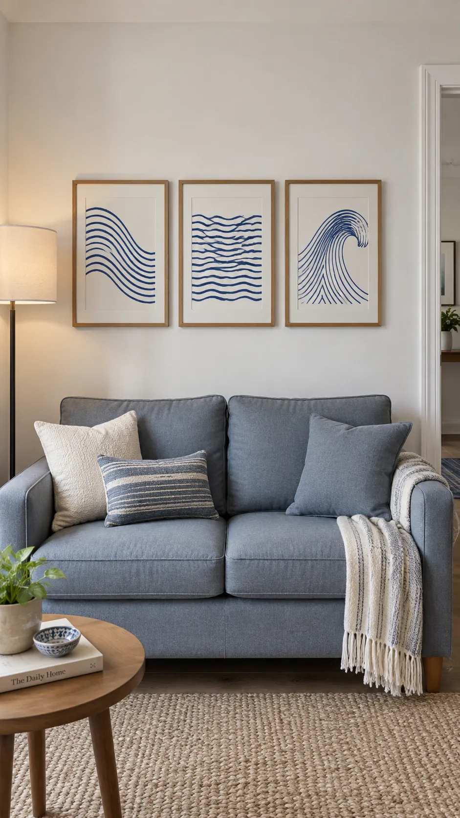
A gallery that defines the reading end
In a multipurpose living room, a small gallery can mark the reading end as its own destination. Hang detailed pictures near the chair where they can be appreciated at close range. Let the main television or conversation area keep a different focal point. This avoids making every wall compete for attention.
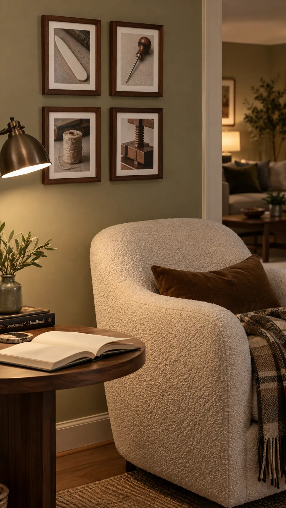
An edited wall with space for the next favorite
Take away the least meaningful piece before deciding that the gallery needs more. A collection feels personal when each work earns its place through a memory, subject or visual pleasure. Keep a note of frame sizes and a photograph of the arrangement for future additions. Leave an open edge where a new favorite could belong. The most useful gallery wall inspiration is a layout that supports your life as it changes.