Two colors can look convincing on separate samples and compete as soon as they fill a room. Start by controlling their intensity and the size of each colored surface. That gives you a clearer route to a calm pale scheme or a deeper interior with enough contrast to stay usable.
Choose the softness before the shade
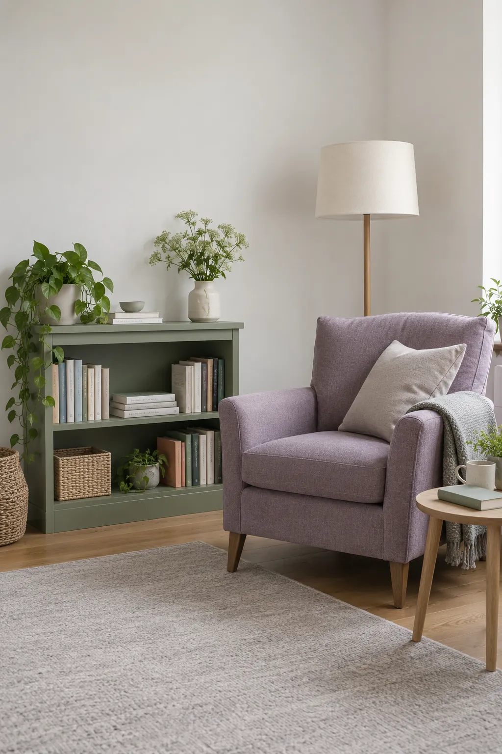
Purple can make a room feel louder than you expected when its intensity is much stronger than the green beside it. Begin by deciding whether you want a muted palette or a rich one. Sage green and lilac decor is a useful soft starting point, while emerald green and plum create a deeper contrast.
Compare samples against the floor and the largest piece of furniture you will keep. A lavender with a blue cast may feel crisp beside a cool green, but it can look unexpectedly sharp against yellow toned timber. A gray softened lilac often sits more quietly beside sage than a vivid violet does.
Place the samples together on the surfaces where they will be used. Keep one pale neutral in the group so you can see how much contrast the two colors create. Judge the combination in the room before choosing a paint name or ordering from a screen.
Let the larger piece lead
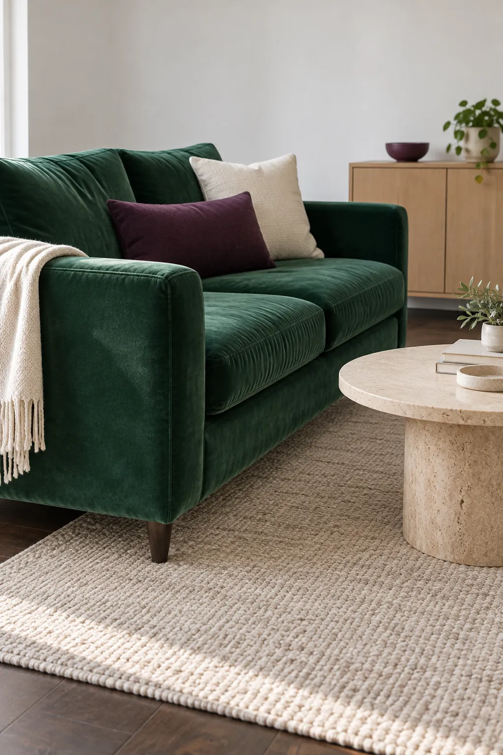
For a green and purple living room, a green sofa with purple pillows is a manageable first move. Let the sofa carry the larger color area, then repeat purple in one separate object elsewhere in the seating group. Keep the rug or nearby walls quieter so the accents do not compete with several other patterns.
A saturated plum cushion looks stronger than a pale lilac cushion of the same size. You may need less of it, especially against emerald upholstery. If both large pieces are dark, a light rug and an open area of wall help their outlines remain visible.
Look at the room from the entrance after removing one accessory. If the palette becomes easier to read, that object did not need to be there. Color balance comes from the areas you see together, not from buying equal numbers of green and purple items.
Use olive and lavender for a softer bedroom
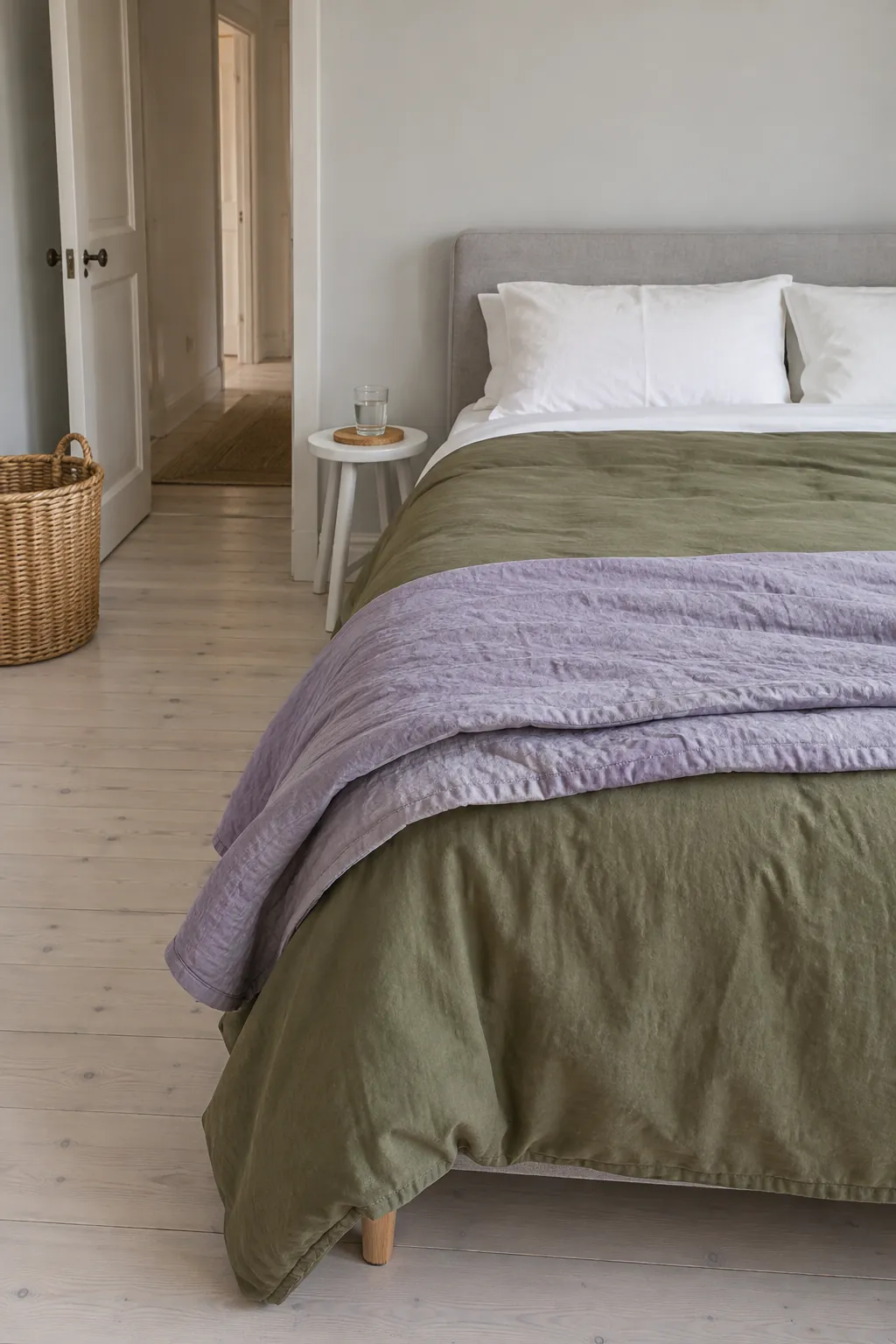
Olive green and lavender decor offers a gentler bedroom direction when bright emerald feels too intense. The yellow note in olive creates an interesting contrast with lavender, while cream sheets and plain timber can give both colors a quieter setting. Test the exact fabrics together because olive can range from brownish to surprisingly bright.
Use one color on the main bed layer and the other on a smaller quilt, cushion, or headboard. Leave some sheet or pillowcase visible between dark surfaces so the bed retains clear layers. Matte cotton and linen reduce the glare that can make pale purple look shiny.
A green purple bedroom color palette also needs to work when you are getting ready for sleep. Compare the fabrics under your bedside lamps before you commit. Choose washable covers and a fabric weight that suits your climate rather than selecting only for a photograph.
Build the lighting before committing to dark walls
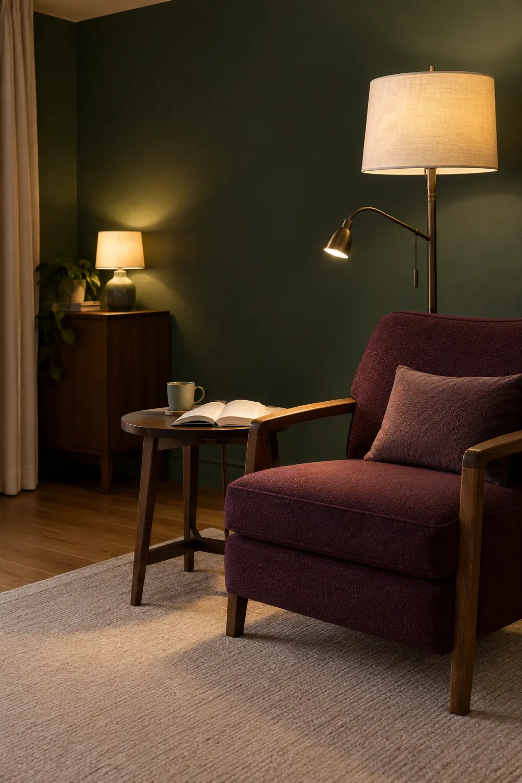
Moody green and purple rooms need a lighting plan, especially when the walls and upholstery are both deep. A single ceiling light may leave the chair, corners, and working surfaces too dim. Add useful light where you read and a separate gentle source that reveals part of the wall.
Keep bulb color consistent in the lamps you normally use together, then test paint samples under those lamps. Two bulbs described as warm white can still make fabrics look different, so view the real pairing rather than relying on the label alone. Direct a shaded reading lamp onto the book area instead of creating glare at eye level.
If the room still feels heavy, change a large surrounding surface before adding more decorative objects. A lighter curtain, pale rug, or cream lampshade can separate dark furniture from the background. You can enjoy a deep palette without making every surface dark.
Use a pattern as a color bridge
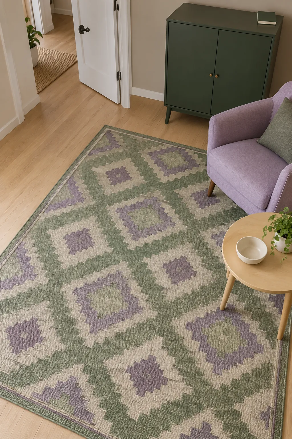
A rug or textile containing both colors can make purple accents with green walls feel connected. Choose the patterned piece first, then pull one green and one purple from it for the nearby solids. Exact matching is less important than keeping their intensity compatible.
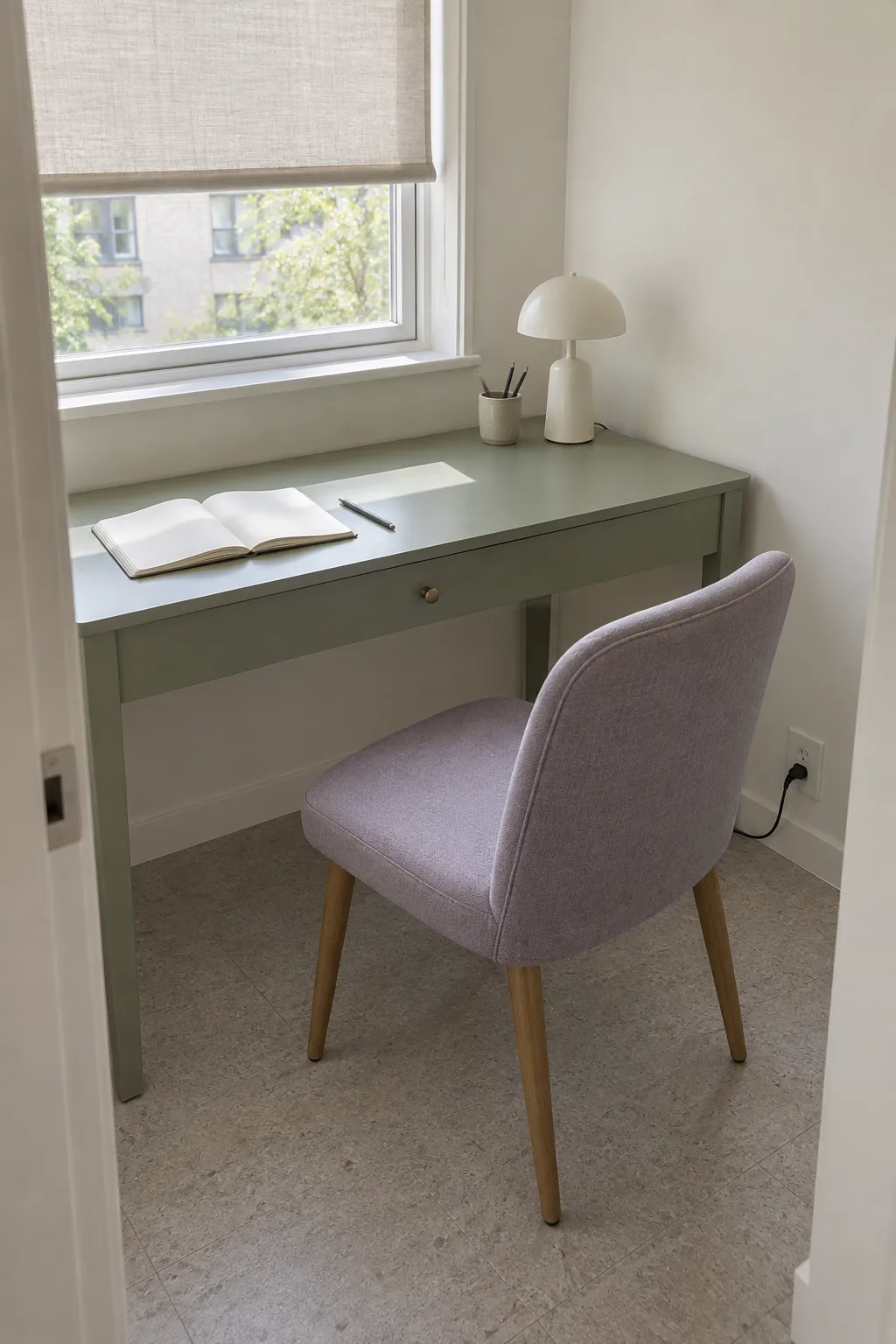
Leave the other large textiles plain if the connecting pattern is busy. A small geometric rug can support a lilac chair and green cabinet without requiring patterned curtains too. Check a full repeat or a generous sample because a tiny product crop may hide the strongest part of the design.
Consider the cleaning and placement requirements before treating a rug as the answer. Confirm that it clears the door and sits securely on your floor. A beautiful bridge between colors is only useful if it works in the route people walk every day.
Try the pairing in one movable group
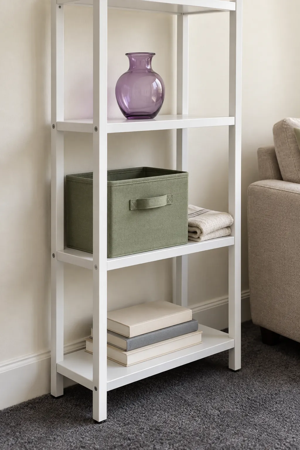
You do not need to repaint to find out whether you enjoy these colors together. Put a green storage box and a purple vessel on an existing freestanding shelf, or try a lilac cover on a cushion you already own. Keep the experiment small enough to change without regret.
View the arrangement during a normal week and note which color draws your eye first. If purple dominates, reduce its area or choose a dustier shade; if the green disappears into a dark background, place it beside a lighter surface. Adjust one thing at a time so the effect of each change stays clear.
Use the version you still enjoy under ordinary evening light as the basis for the next purchase. Take your approved samples with you when shopping and check them against the item itself. Keep the first permanent change limited to the surface that will make the most useful difference.