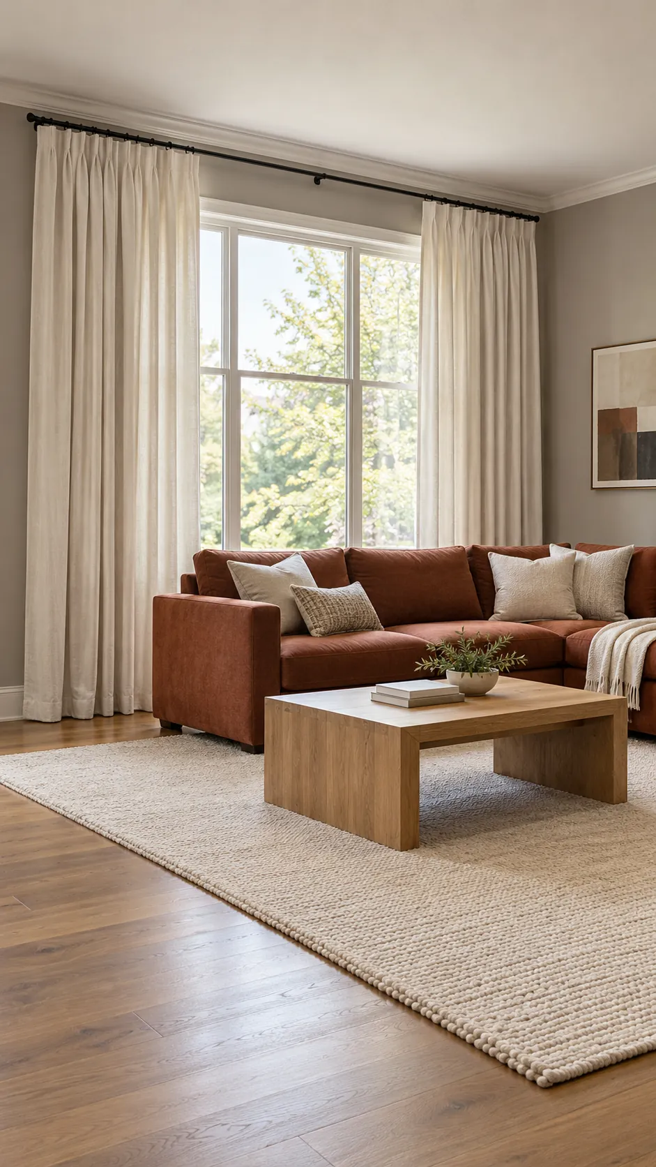
Curtains occupy enough visual space to either intensify a wall and sofa clash or make it look intentional. The safest choice is not always to match the wall or copy the sofa. A good curtain carries a shared undertone, repeats a useful color from elsewhere, and provides enough contrast to remain distinct from both fixed surfaces.
Indexed Reddit discussions reveal two frequent mistakes: panels that are too matchy with the sofa and thin curtains that look accidental. Readers also struggle with patterns that compete with rugs. The process below separates color, pattern, light, and proportion so you can judge each decision before buying every panel.
Identify the Actual Undertone Conflict
Compare the wall, sofa, and curtain samples beside one another in daylight. A gray sofa may lean blue or green, while a beige wall may lean yellow or pink, and those hidden colors create the apparent clash. Name each undertone before choosing a bridge color, because a generic label such as gray or beige is not specific enough.
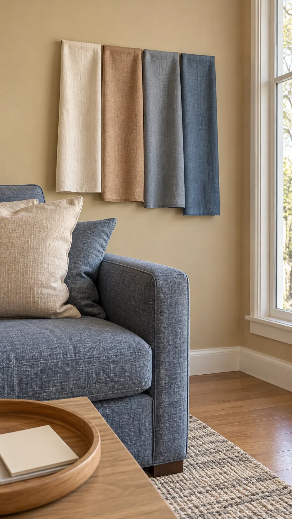
Choose a Bridge Neutral Before a Bold Color
Cream, flax, oatmeal, and light greige can bridge warm walls and cool upholstery without matching either one exactly. Select a neutral that contains a trace of the wall warmth plus enough gray to relate to the sofa. Avoid optic white when both fixed colors are muted, since the sharp white can make the mismatch look stronger.
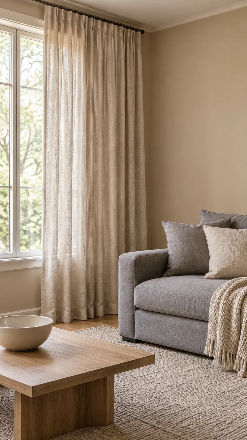
Pull One Supporting Color From the Rug
When the rug already includes both sofa and wall colors, choose one quieter supporting shade from its pattern. A muted blue, olive, rust, or camel curtain can repeat that shade and make the room read as a complete palette. Do not select the loudest motif unless the window is meant to be the main focal point.
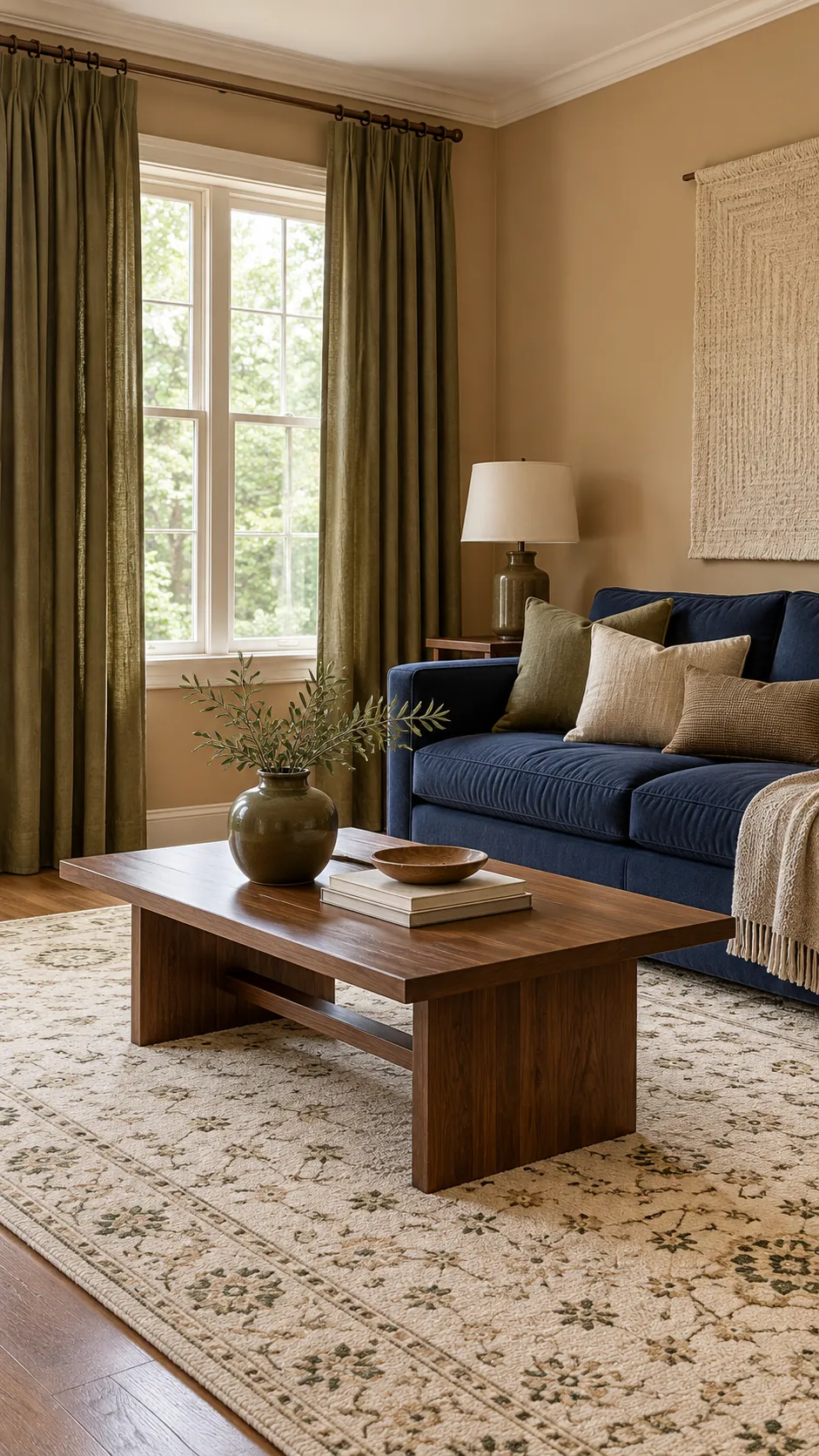
Use Pattern Only When It Solves the Color Gap
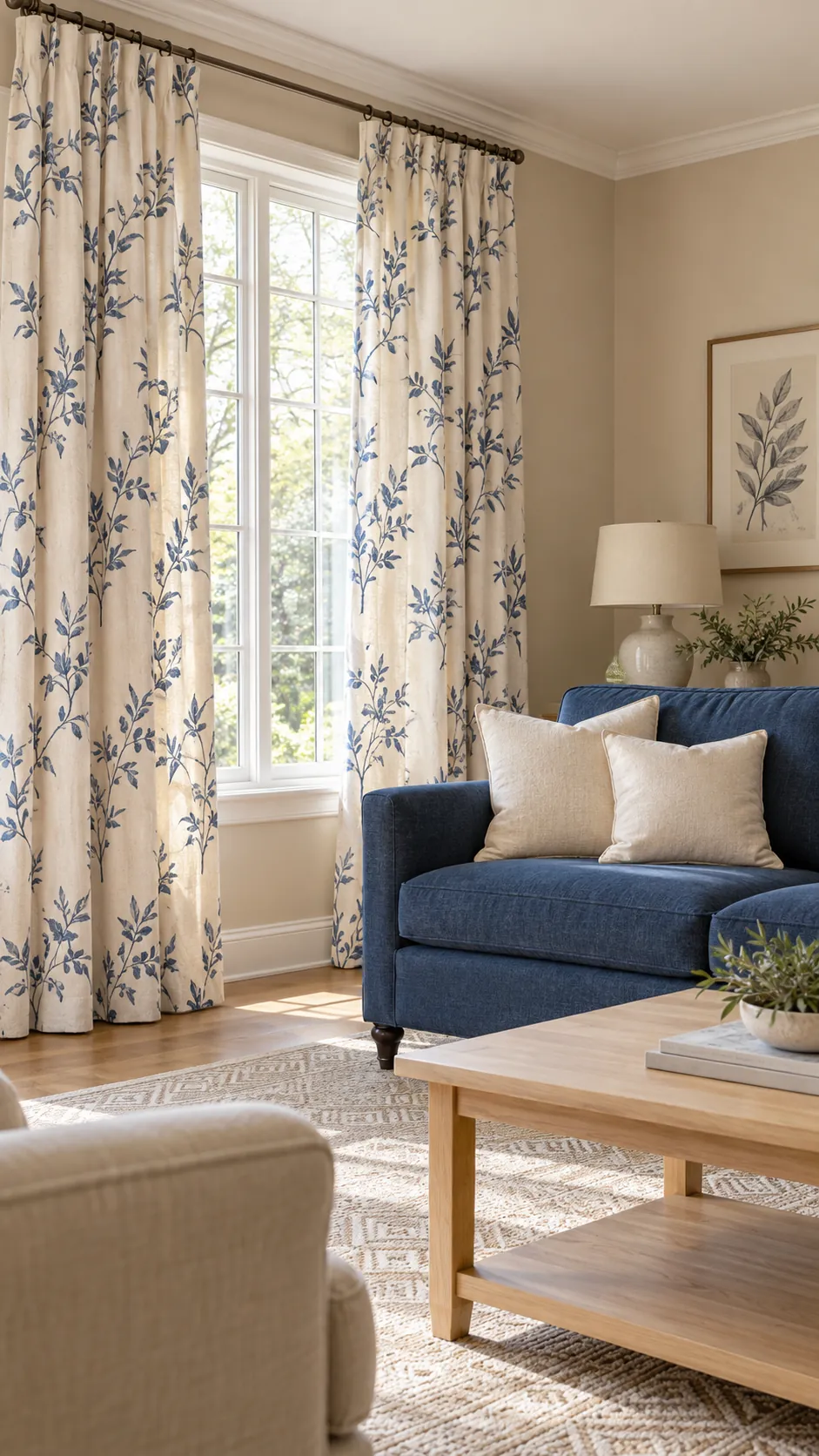
A patterned curtain is useful when its background relates to the wall and its motif repeats the sofa. Keep the scale different from the rug pattern, such as a broad botanical beside a fine geometric rug. If both textiles have equal contrast and similar motif size, the pattern conflict may feel worse than the original color clash.
Test the Fabric in Daylight and Lamplight
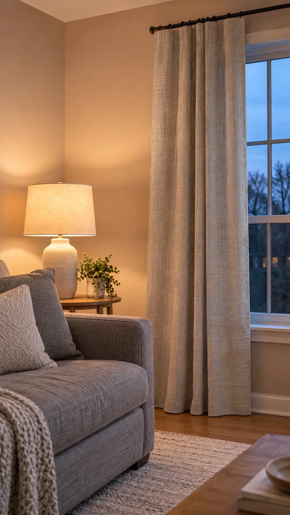
Curtain color changes more than a small swatch because light passes through the entire panel. Pin a large sample at the window and view it on a bright morning, a cloudy afternoon, and after the lamps come on. Warm bulbs can pull yellow from cream fabric, while strong daylight can reveal green or violet in gray fabric.
Hang Panels High, Wide, and Full
Correct proportion can make a safe neutral curtain look deliberate. Mount the rod above the frame, extend it beyond the glass, and use enough fabric to form generous folds when the curtains are closed. Let the panels finish at the floor so the window reads as one tall element rather than a short patch between clashing colors.