A mat should help each photograph belong to the room and to the group without changing the character of the image. When family photos come from different years, cameras, and lighting conditions, one universal bright white mat can make some pictures look dull or overly warm. The best choice starts with the lightest important tone in each photograph, then checks how that tone behaves beside the wall and frame.
Read the Photograph Before the Room
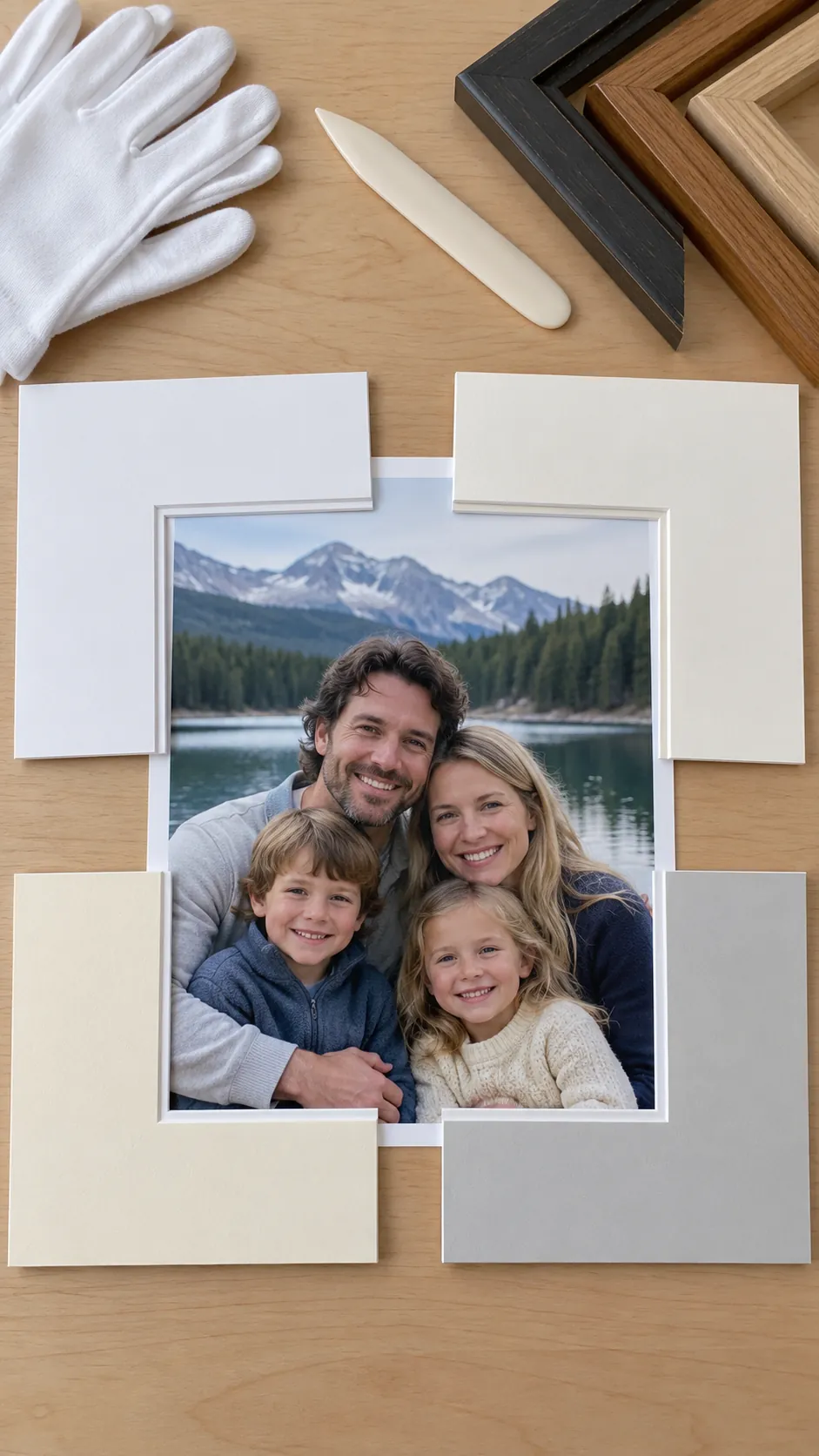
Place the unframed photograph on white, cream, soft gray, and one deeper neutral sample. Watch the faces first, since a mat that makes skin appear gray, orange, or washed out is usually wrong even if it suits the furniture. A good mat repeats a quiet light tone from the image or provides gentle contrast without becoming the brightest object.
Choose White for Clear Cool Images
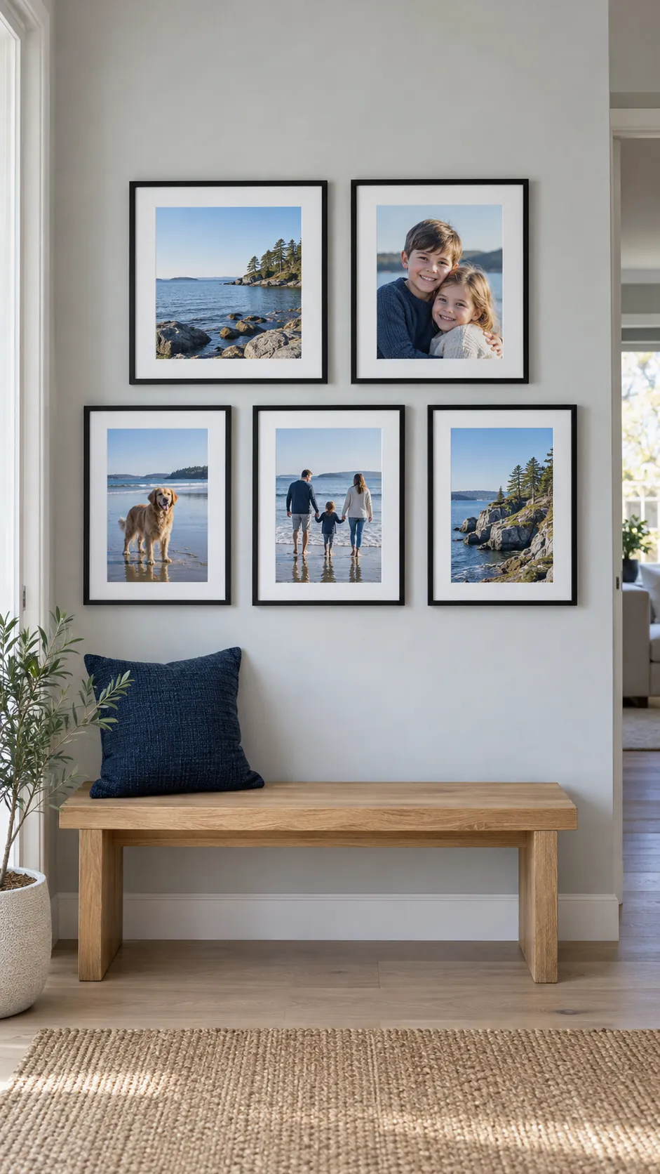
Clean white works well with crisp daylight photographs, black and white prints, blue skies, and images that already contain bright neutral highlights. It can sharpen a contemporary family photo gallery wall and connect frames with different finishes.
Avoid a very blue white beside older prints with yellowed paper or warm indoor lighting. The contrast can exaggerate age and make skin tones look more orange. A softer white often gives the same fresh effect with less visual friction.
Use Cream to Support Warm Tones
Cream and ivory mats suit sunset portraits, film photographs, sepia prints, warm wood interiors, and pictures with golden skin tones. The mat should look softly warm rather than visibly yellow. Compare it with the whites inside the photograph, because an overly creamy border can make a natural print look stained.
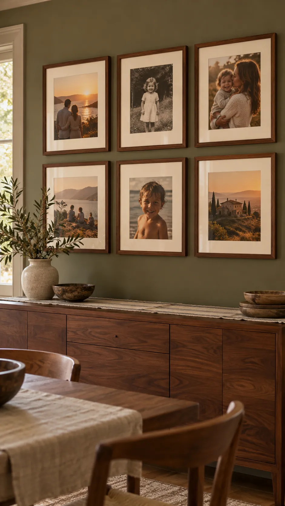
Let Soft Gray Bridge Mixed Color Temperatures
A pale neutral gray can connect cool outdoor photos with warmer indoor portraits. It reduces the stark difference between bright white borders and aged prints while remaining quieter than a colored mat. Choose a gray with the same undertone as the wall, then confirm that it does not drain color from faces.
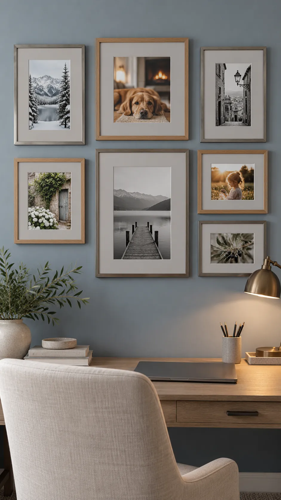
Coordinate the Group Without Making It Identical
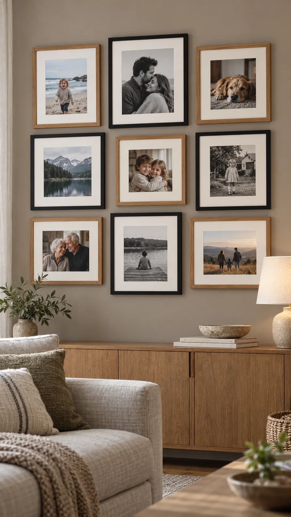
Gallery wall cohesion can come from repeated mat brightness, repeated frame color, or repeated spacing. You do not need all three. If the photographs vary widely, use two related mat colors, such as warm white and pale stone, and repeat each across the arrangement.
Distribute the two colors across the wall instead of placing every cream mat on one side. Keep mat widths within a small family so the display still shares a visual rhythm. A wider mat can give a small or visually busy photograph enough quiet space.
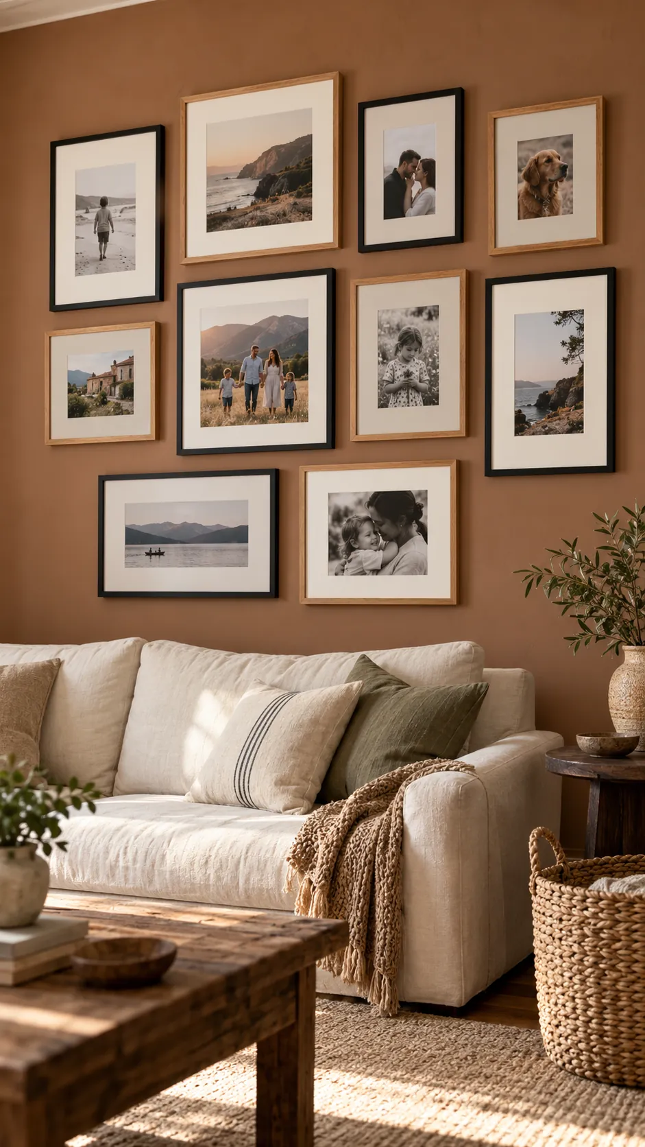
Test Every Sample in the Actual Light
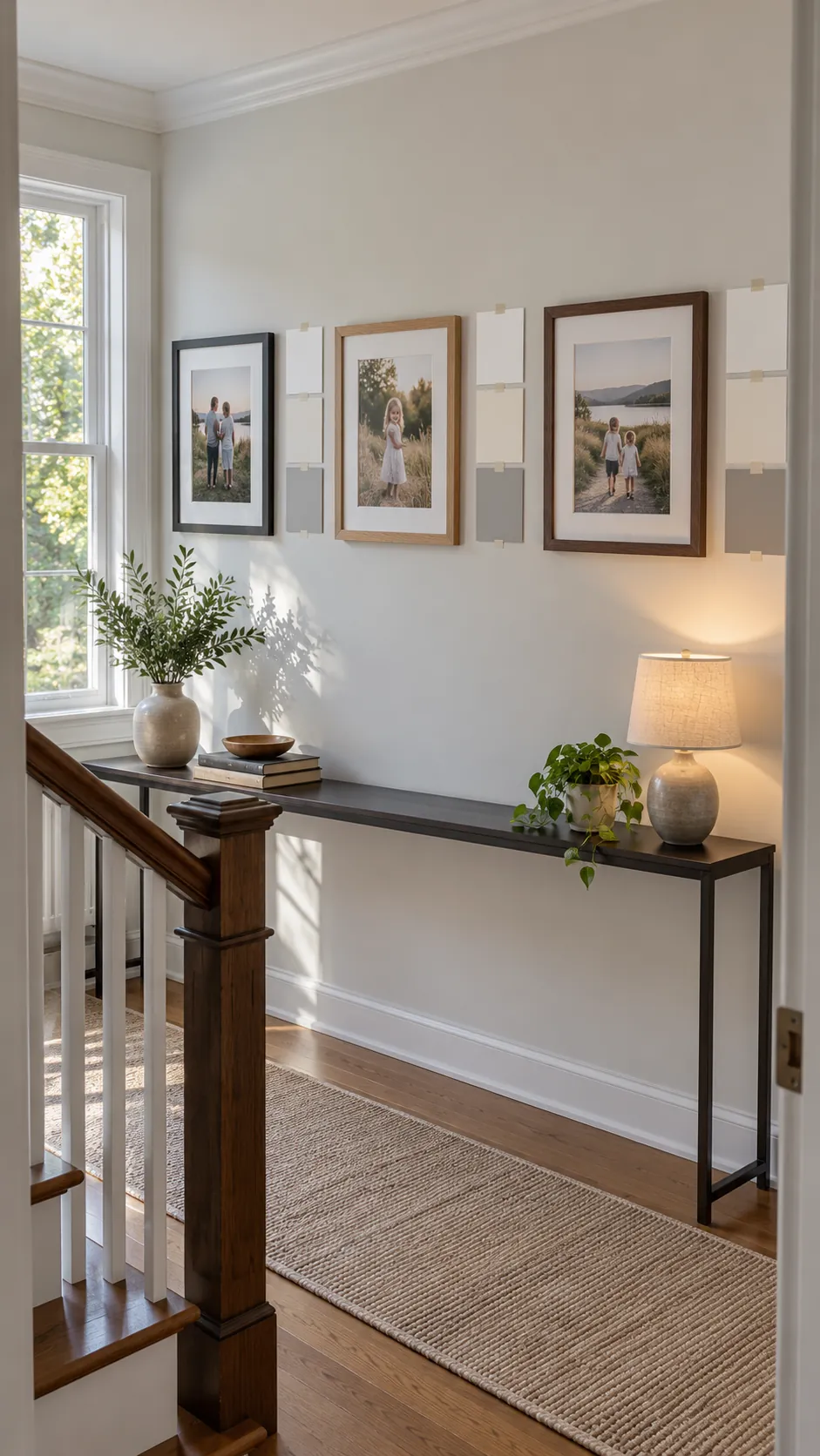
Tape mat samples beside the photographs on the intended wall and check them in morning, afternoon, and evening light. Lamps can turn a neutral cream noticeably yellow, while a shaded room can make cool white feel blue. View the group from the normal doorway or seating position, since a choice that looks obvious at arm length may disappear at room distance.
Make the final picture mat selection only after the frame finish is present. Black frames increase contrast, pale wood softens it, and warm wood strengthens cream undertones. Keep the option that supports faces and keeps the full wall calm under the light you use most often.