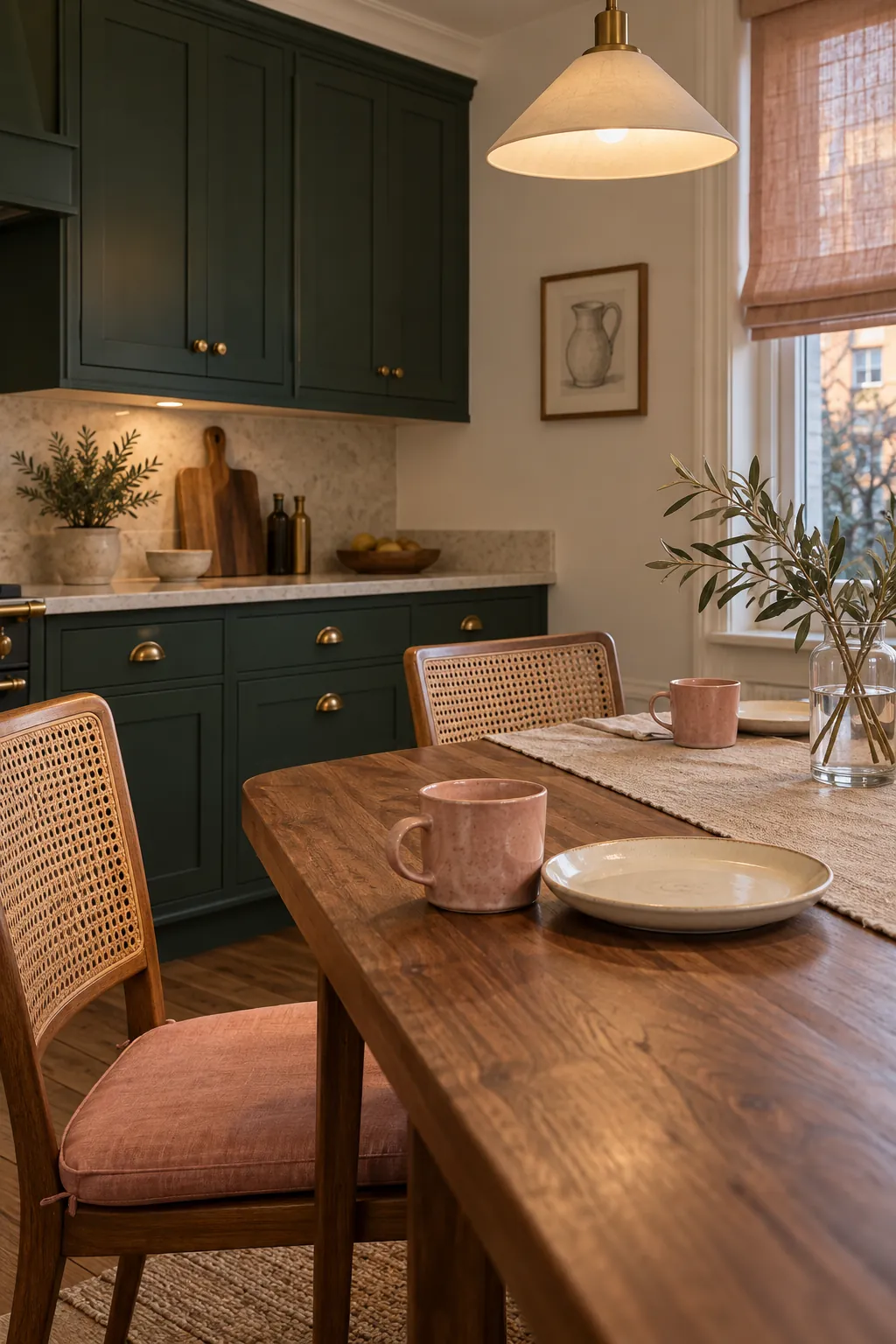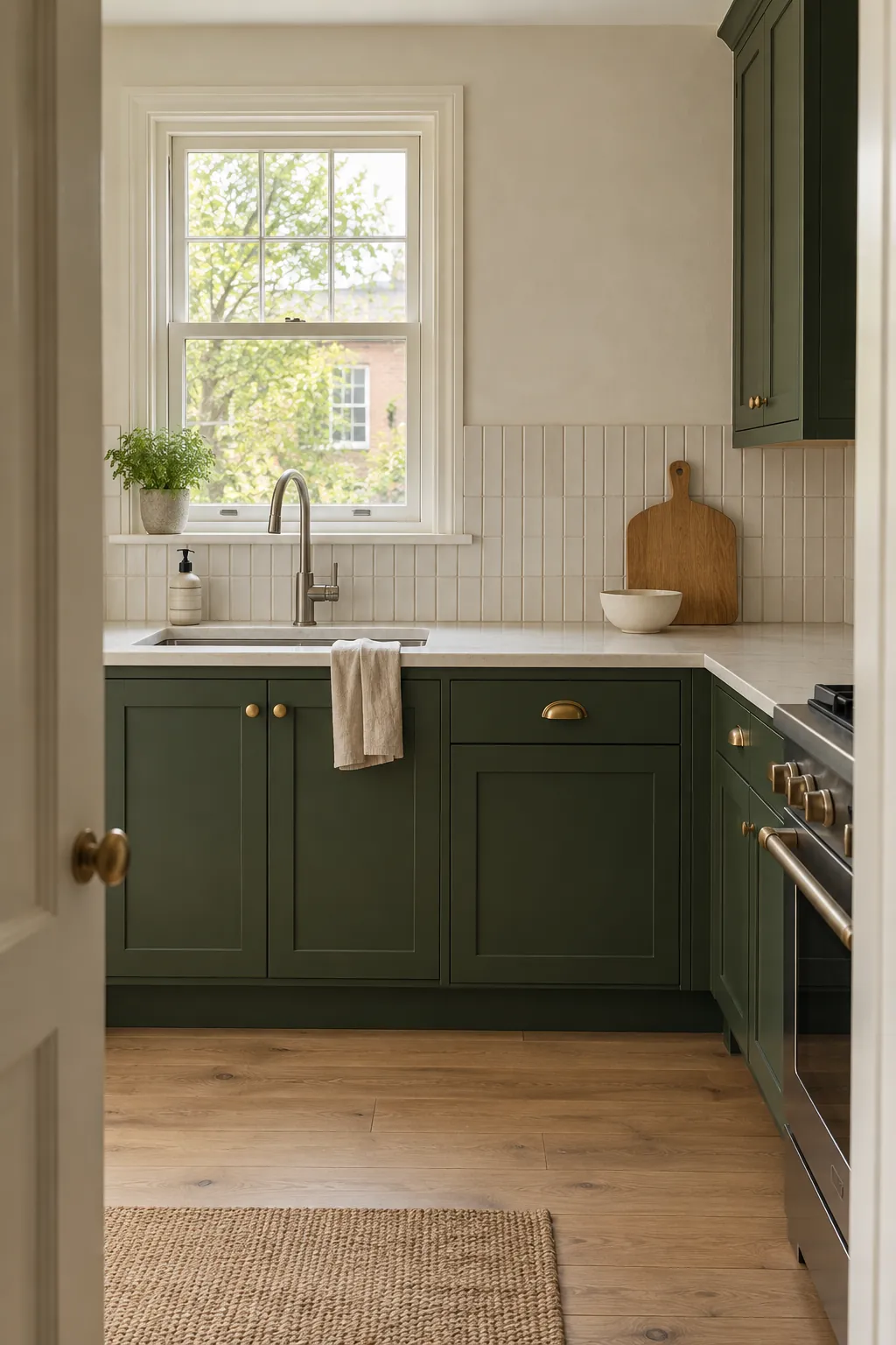
The best companion color depends on the green itself and on the finishes that cannot change. A pale sage behaves differently from forest green, while a warm wood floor can shift both. Start with the counter, floor, and appliance colors, then choose one supporting family that connects those fixed surfaces to the cabinets.
Warm White
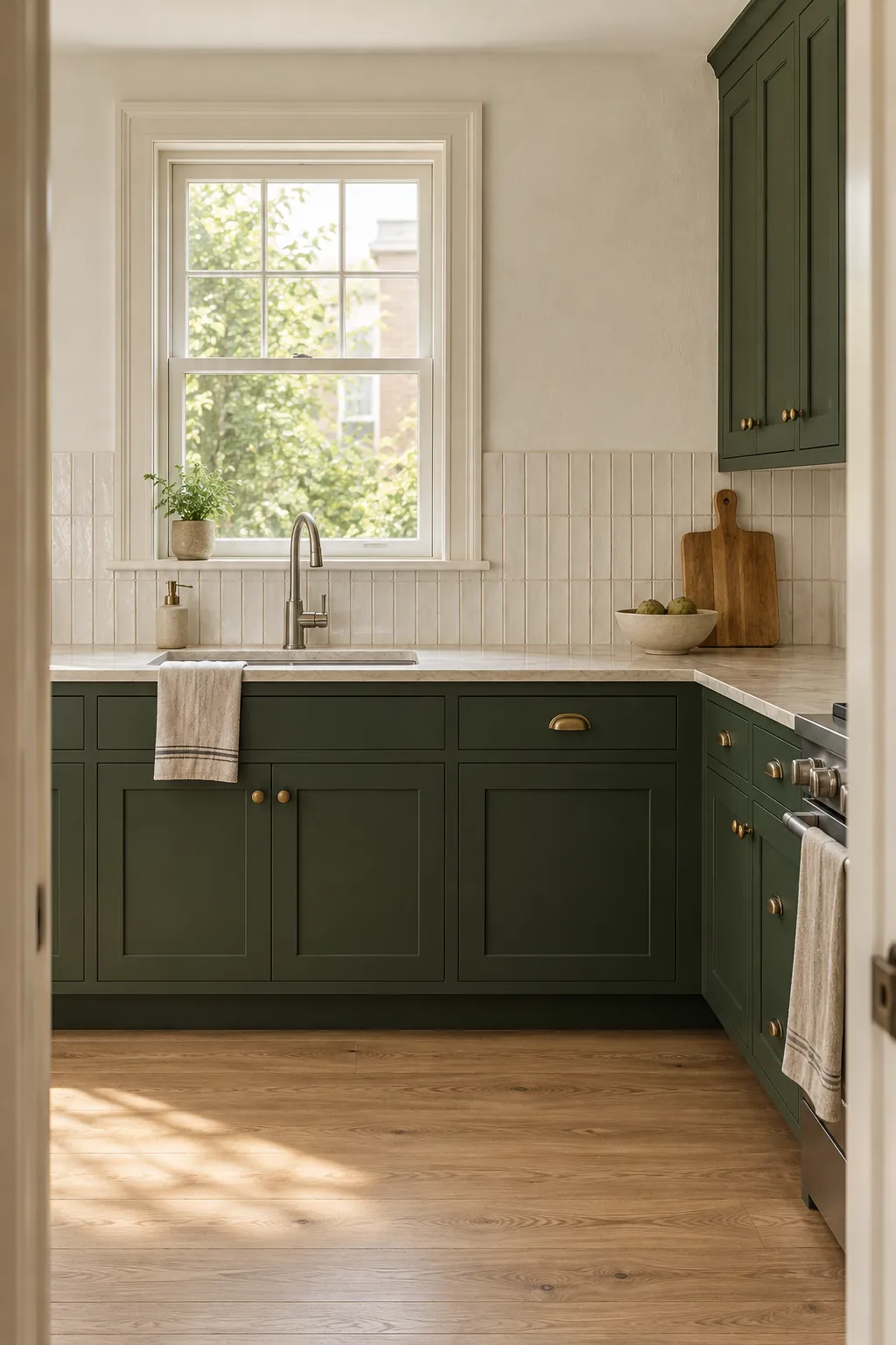
Warm white is the most flexible partner because it gives green room to remain the focal color. Choose a white that repeats the creamy or beige note in the counter rather than a bright blue white. Use it across walls and backsplash for a continuous background, then add texture through tile shape or stone finish. This pairing suits sage, olive, emerald, and forest cabinets, especially in kitchens that need more reflected light.
Natural Wood
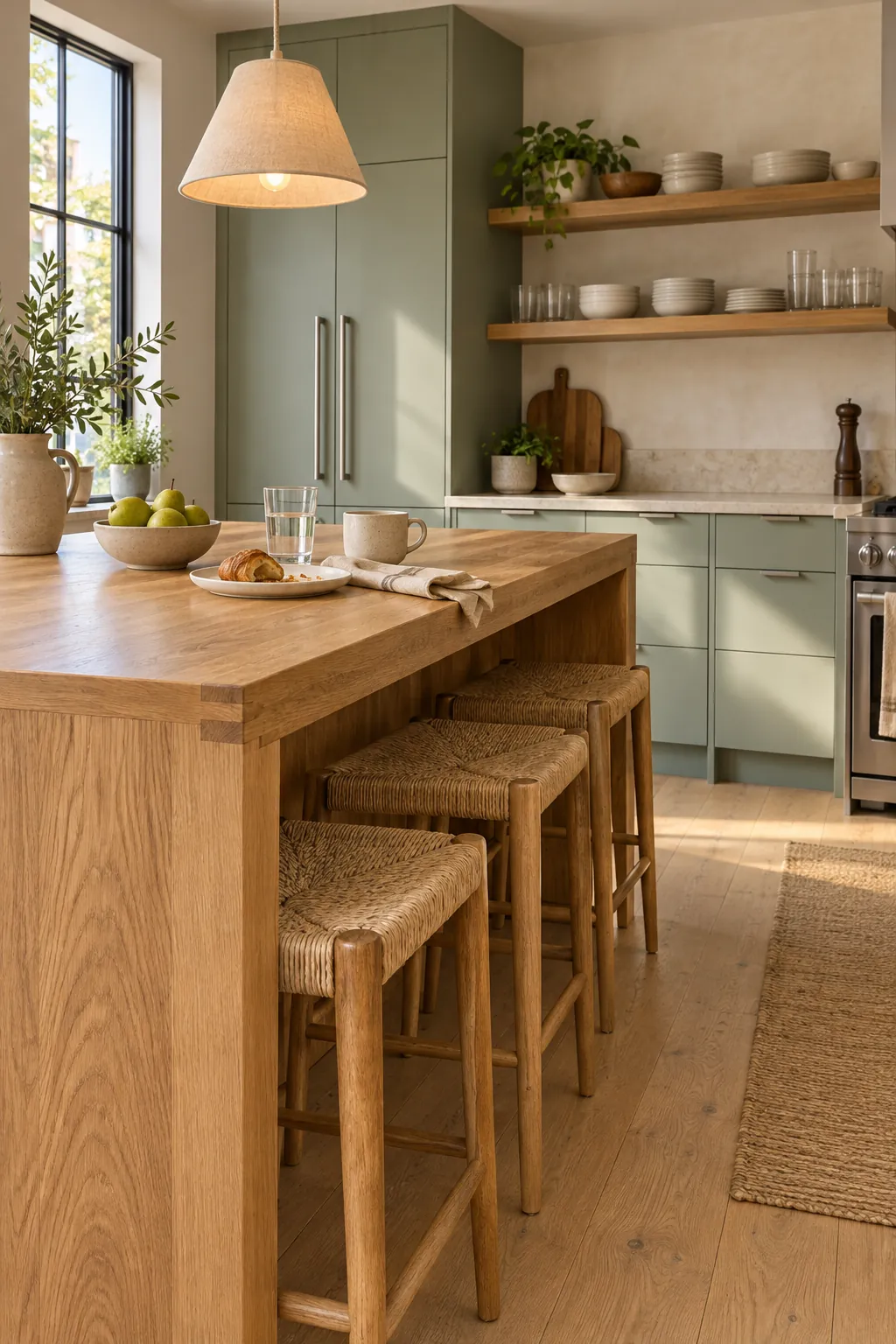
Wood introduces warmth without asking another paint color to compete with green. Pale oak keeps sage and eucalyptus cabinets light, while walnut gives deeper green a richer and more traditional character. Repeat one wood tone on an island, shelves, stools, or a dining table instead of mixing several unrelated species. Cream stone and simple hardware can bridge the painted and natural surfaces.
Mushroom and Taupe
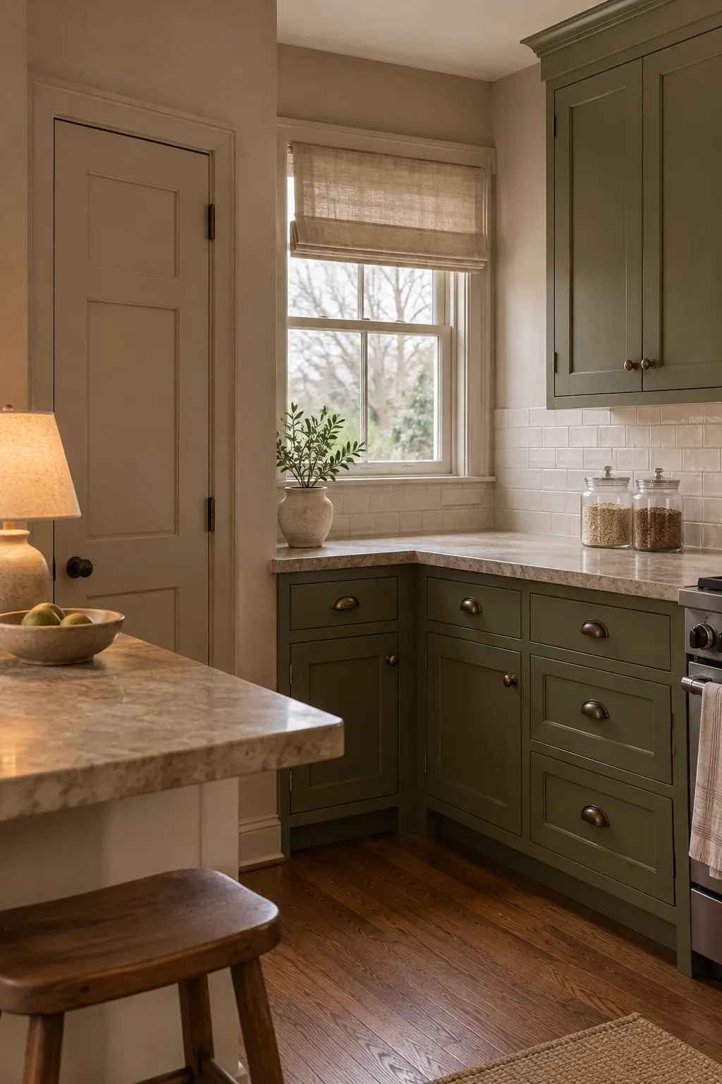
Mushroom and taupe soften green without making the kitchen look stark. They are useful when the counter contains beige, greige, or brown veining that a plain white wall would expose. Keep the neutral lighter than the cabinets so the room retains clear contrast. Test large samples beside the cabinet and floor because a taupe with too much purple can make olive green look dull.
Terracotta and Clay
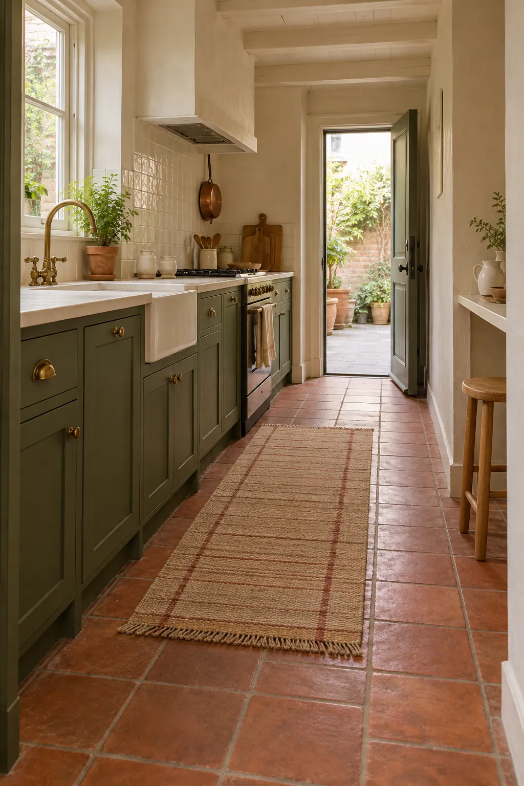
Terracotta and muted clay sit opposite green in a way that feels earthy rather than loud. Use these warm shades on a floor, runner, crockery, or a small painted pantry instead of covering every wall. Cream between the green and clay gives the eye a place to rest. This palette works especially well with olive and moss cabinets, natural wood, and aged brass.
Navy and Charcoal
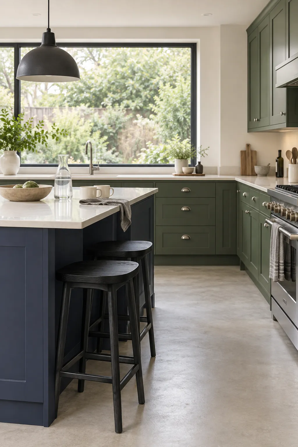
Navy and charcoal can give green cabinets a crisp architectural edge when they stay in smaller areas. A navy island, charcoal window frame, or dark stool can connect green with black appliances and stainless steel. Keep counters and walls pale so the two deep colors do not close in the room. Choose a muted navy rather than a bright royal blue, and repeat it only where the layout needs definition.
Dusty Blush
Dusty blush offers a softer warm contrast than terracotta and works best as a restrained accent. Bring it in through a washable runner, linen blind, two stools, or small ceramics while cream remains the main neutral. The pink must be muted and slightly earthy so it does not turn the kitchen into a pastel theme. Pair it with deep forest or muted emerald cabinets, walnut, and a small amount of aged brass for a balanced result.