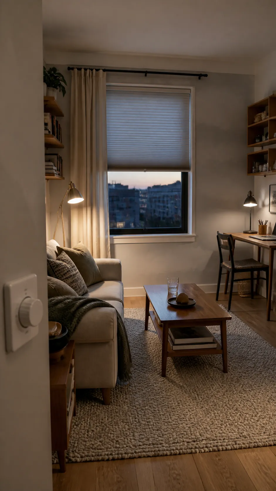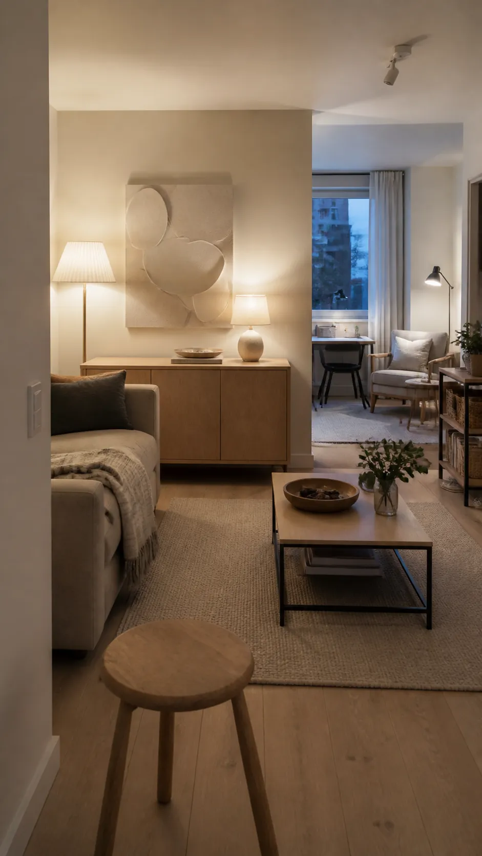
A small home becomes tiring when every surface, color, and light source asks for attention at once. The answer is not to erase personality or paint everything white; it is to reduce visual conflict so the eye can settle.
In decorating discussions, people often describe wanting a room that feels warm but not orange, neutral but not sterile, and bright without harsh overhead glare. Those are not contradictions. They are signs that color and light have to be planned together.
Use this process in order. It starts with the daylight you already have, builds a compact palette around fixed finishes, then places warm lighting and storage where they support real routines.
Read the Room Before Choosing a Palette
Calm begins with observation, not a paint card. Photograph the room in the morning, at midday, and after sunset, then note which surfaces go gray, yellow, or overly blue as the light changes.
A north-facing room may need a warm undertone to keep weak daylight from feeling cold, while a bright west-facing room often benefits from a quieter, less saturated base. The goal is not maximum brightness; it is predictable color across the hours when you actually use the room.
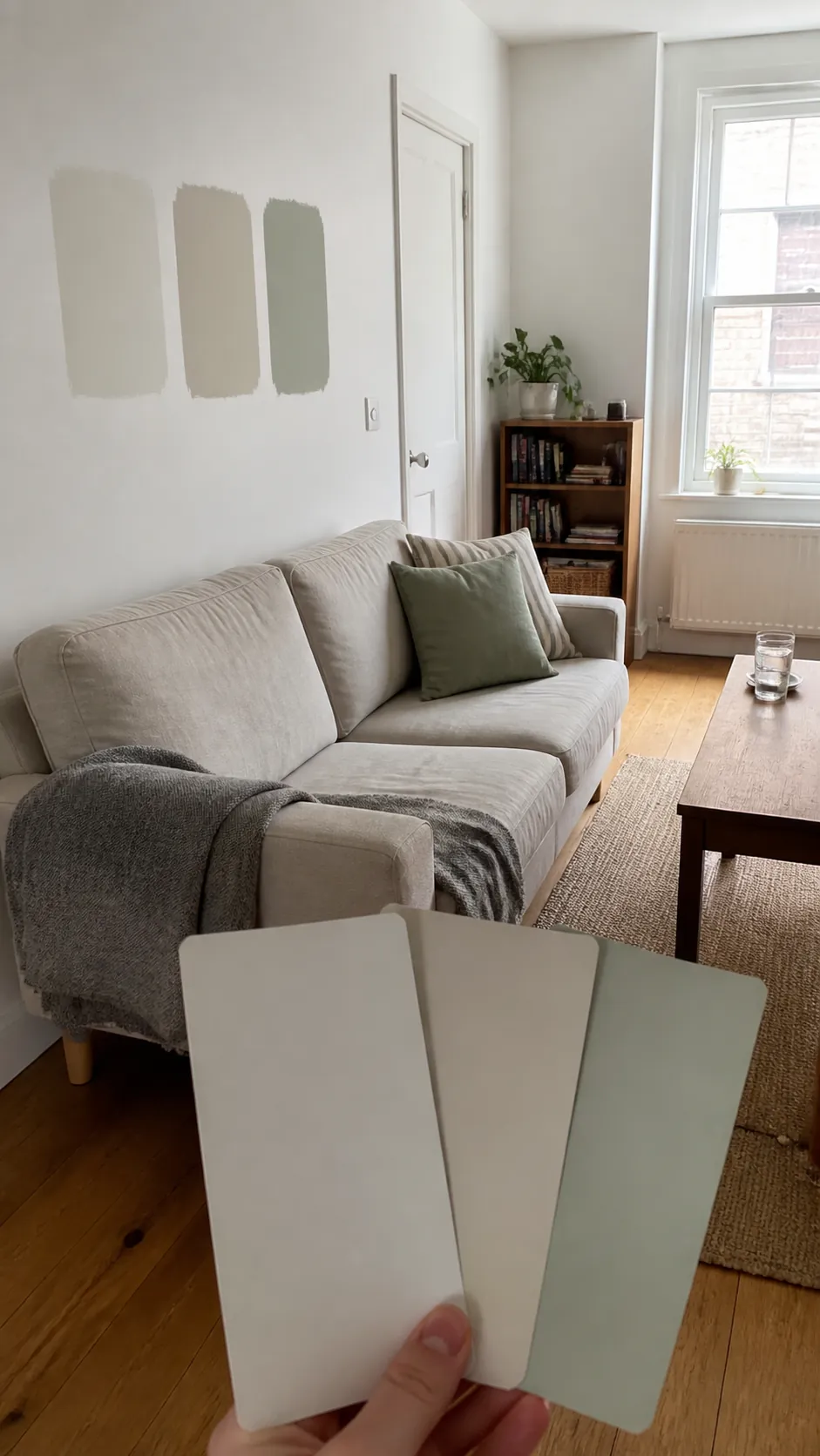
Test generous samples on more than one wall and look at them beside the floor, sofa, curtains, and largest storage piece. A color that seems peaceful in isolation can create visual noise when its undertone fights the fixed finishes.
Reddit decorating discussions often reveal this exact mismatch: cool gray and navy rooms paired with intensely amber lamps can look cinematic online but strangely murky at home. Let the existing daylight and permanent materials set the temperature range first.
Build a Narrow Palette With Soft Contrast
A calm small home does not have to be beige, and it does not have to be colorless. It does need a clear hierarchy: one quiet background family, one grounding midtone, and one restrained accent that appears in a few deliberate places.
Keep neighboring large surfaces relatively close in value so the eye can travel through the room without stopping at every boundary. Trim can sit near the wall color instead of creating a sharp white outline, and large storage can echo the wall or floor rather than announce itself.
Then add contrast where it helps orientation—a darker chair, a walnut table edge, or a muted olive cushion. Soft contrast gives the eye a place to rest without flattening the room.
Limit tiny unrelated color hits. Ten small accents create more visual activity than one deeper object with enough scale to feel intentional.
Use Texture to Keep Neutrals From Feeling Sterile
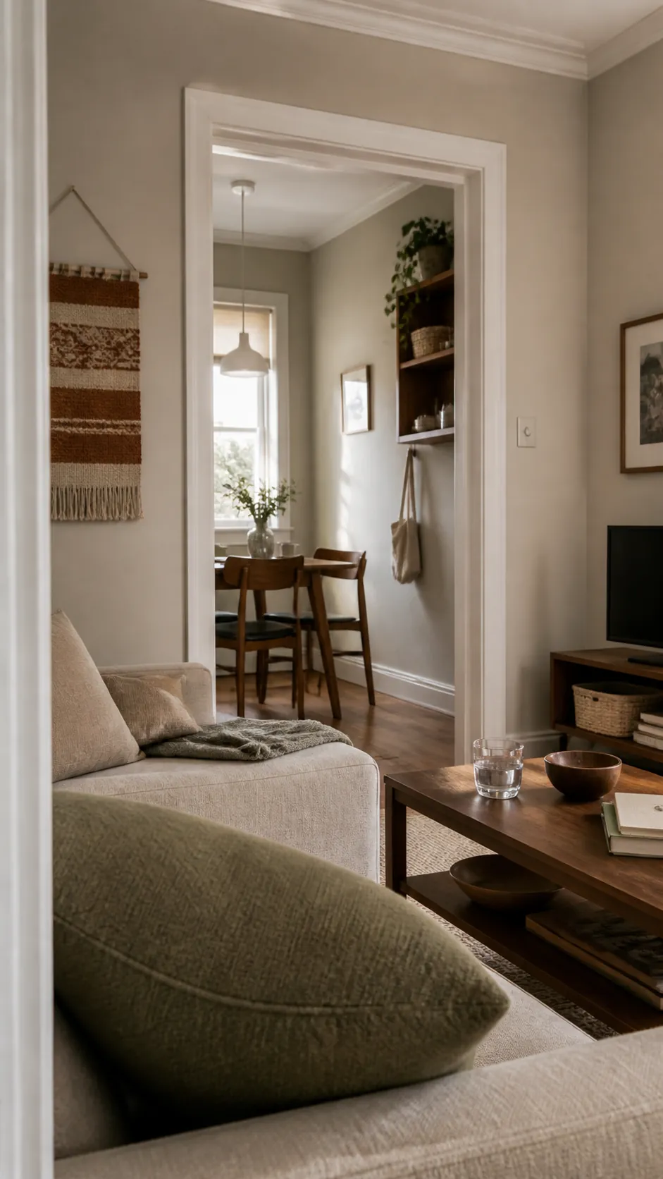
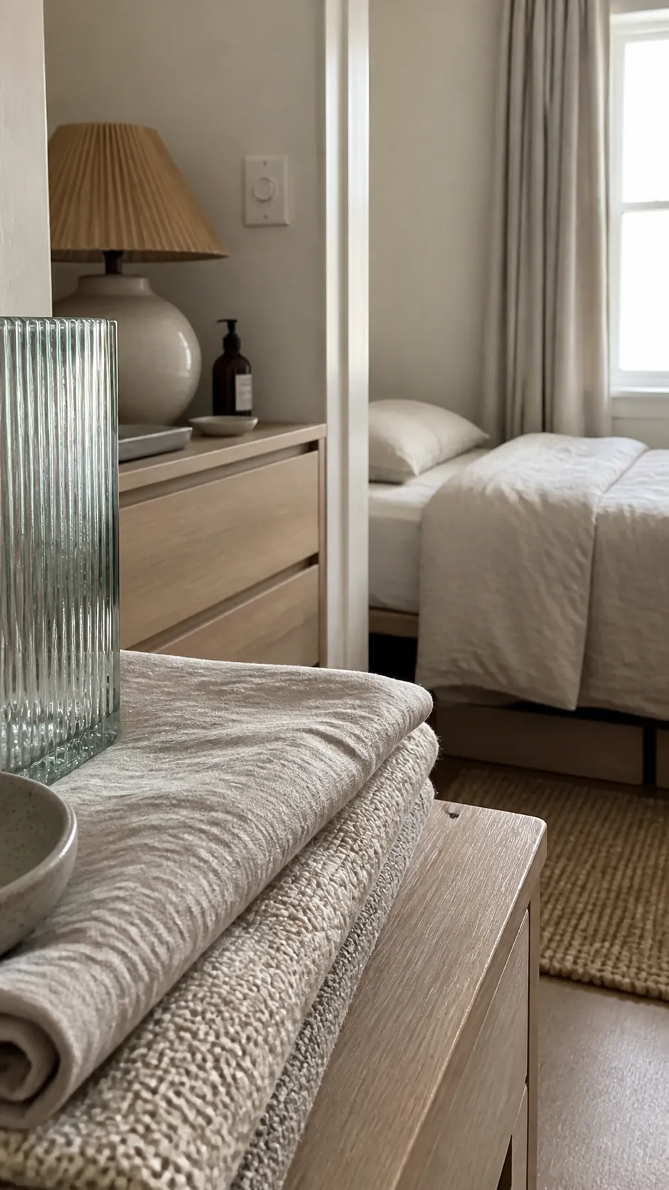
When the palette narrows, texture has to do more of the work. Linen, wool, unfinished wood, ribbed glass, matte ceramic, and a softly irregular painted wall can create depth without adding another competing color.
Repeat a material once or twice across the room so it reads as a thread rather than a collection. A woven basket can relate to a natural-fiber shade; a pale oak shelf can echo the legs of a small table.
Avoid filling every surface with texture. One nubby throw, one smooth ceramic group, and visible wood grain are easier to absorb than layers of fringe, pattern, and open storage.
This is how neutral decor stays warm and personal: the room reveals itself slowly instead of demanding attention all at once.
Layer Light at Different Heights
One bright overhead fixture creates a single intensity and a hard direction. A calm small home feels better when ambient, task, and accent light are distributed at different heights around the activities that matter.
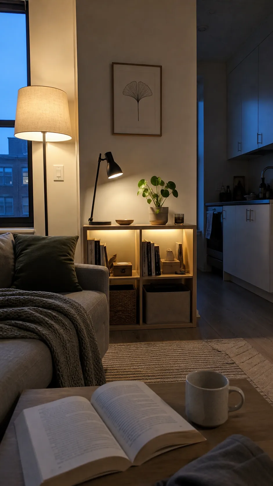
Use a shaded floor or table lamp for the broad evening glow, a focused source at the desk or reading chair, and one low accent on a shelf or wall. Keep bare bulbs out of normal sightlines and let shades, ceilings, and walls diffuse the light.
Choose lamps whose color temperatures relate to one another. Warm lighting can feel restful, but an exaggerated orange cast makes soft colors muddy and skin tones unnatural.
Put multiple ambient lamps on one control if switching them individually becomes a daily irritation. Keep task lighting separate so the room can remain gentle while the work surface stays clear.
Reduce Visual Interruptions Along Sightlines
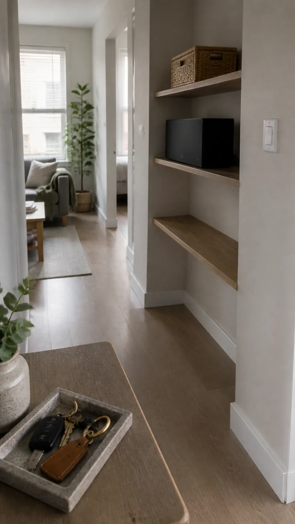
Calm is partly the absence of repeated interruptions. Stand at the entrance and notice the first surfaces your eye meets: loose cords, several open baskets, high-contrast labels, a crowded console, or furniture that pinches the walkway.
Group daily objects by use and give the group a defined landing place. A tray can turn keys, glasses, and a small notebook into one visual unit; a lidded box can quiet chargers and spare cables.
Leave some shelf area deliberately empty and preserve a clear path through the room. Negative space is functional capacity, not an unfinished decorating job.
Concealment should still support daily life. If storage is difficult to reach, clutter will return to the nearest surface within days.
Tune the Room for Day and Evening
A calm room is not a fixed photograph. Open window coverings when daylight is useful, soften glare where it is harsh, and shift the lamp mix as the day changes.
In the afternoon, reflected daylight may be enough for general use while a desk lamp handles close work. After sunset, lower the ambient level and keep light close to seating, shelves, and the paths people actually use.
Live with the arrangement for a week before buying more. Notice where you squint, where a corner disappears, which color becomes dirty under a lamp, and which surface attracts clutter.
Then make one adjustment at a time. The most relaxing home is not the one with the palest palette or the most lamps; it is the one whose color, light, storage, and routines stop competing for your attention.