
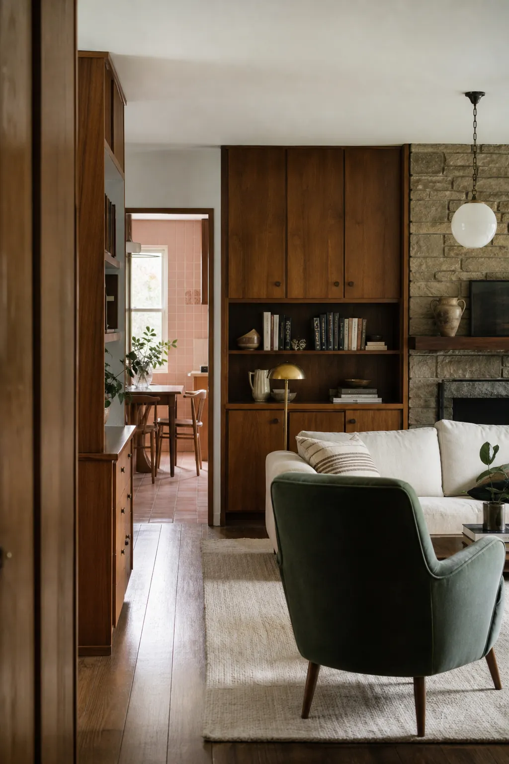
A dated feature usually looks worst when the rest of the room is trying to pretend it is not there. Pink tile surrounded by chilly white updates, orange wood beside gray vinyl, or a heavy stone fireplace paired with tiny modern decor creates a visual argument. The feature wins—but it looks accidental.
The cheaper, more convincing move is often to make one old finish part of a deliberate palette. Clean and repair it, repeat one of its colors or materials, remove the elements that amplify its least flattering undertone, and add a few current shapes for contrast. That is not surrendering to an outdated room. It is editing what the house already gives you.
Treat Vintage Pink Tile as the Palette, Not the Problem
Original pink bathroom tile can look remarkably fresh once dingy grout, yellowed paint, and mismatched accessories are removed from the equation. First determine whether the tile is sound. Repair grout and caulk with products appropriate to the surface, then choose a supporting color from the tile itself: warm white, burgundy, cocoa, muted green, or deep navy often gives pink enough contrast to feel intentional.
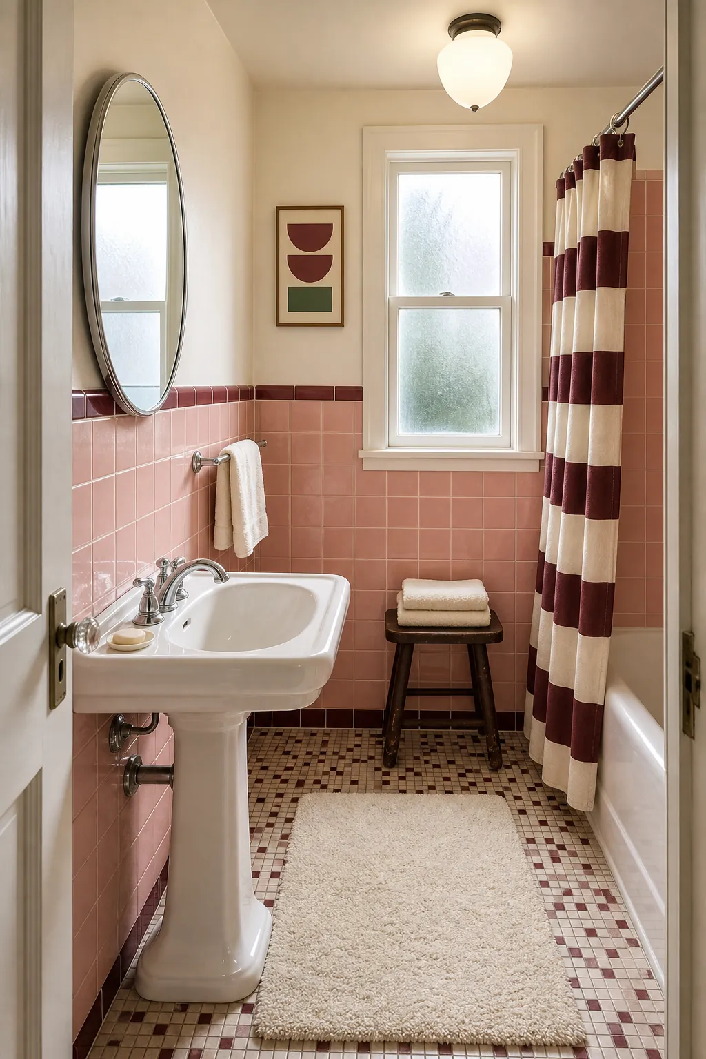
Update the pieces that telegraph neglect rather than age: a corroded faucet, weak ceiling light, peeling mirror, plastic storage, or tired shower curtain. Repeat the tile color once in a textile or print, then stop. A room that confidently includes pink looks designed; a room full of beige objects attempting to disguise pink looks undecided.
Balance Orange Wood Cabinets With Contrast
Wood cabinets become visually heavy when every surrounding finish has the same yellow-orange undertone. Before painting solid wood, try changing what touches it. Creamy wall color, deep green or blue accents, a simple light backsplash, and restrained black or aged-brass hardware can separate the cabinet shape from the room.
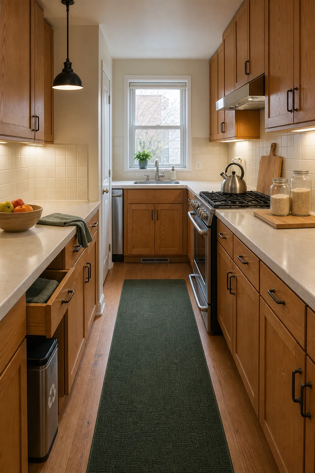
Clean the doors, repair loose hinges, adjust uneven gaps, and replace only hardware that truly fights the style. Condition matters more than the decade. A well-kept cabinet with consistent pulls looks like a material choice; a door hanging crooked beneath trendy lighting still looks overdue for maintenance.
Give a Stone Fireplace Enough Visual Weight
A large stone fireplace cannot be minimized with a tiny clock and two small candlesticks. Instead, acknowledge its scale. Use one substantial object on the mantel, a generous mirror or clearly defined artwork above it when appropriate, and furniture with enough visual mass to relate to the masonry.
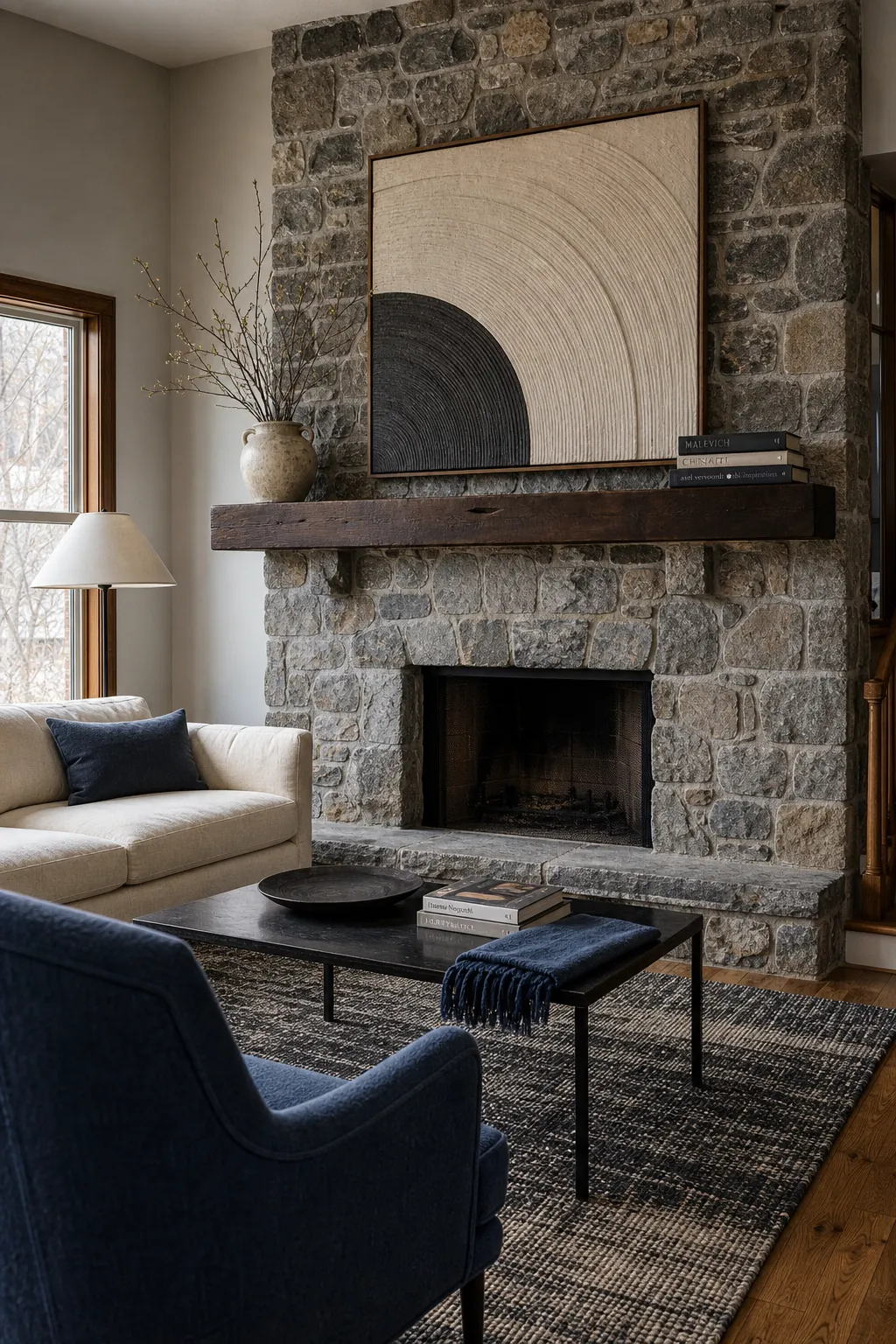
Pull one quiet color from the stone into the rug or upholstery, then introduce contrast through black metal, dark wood, or a saturated textile. Clean soot and repair failing mortar before decorating. Painting masonry is difficult to reverse and can create maintenance problems, so understand the material and long-term consequences before coating it.
Simplify Around Busy Tile Countertops
Tile counters and heavily patterned backsplashes feel more chaotic when they are surrounded by many little appliances, colorful packaging, ornate hardware, and another competing pattern. Clear the visual field first. Group daily items on one tray, hide duplicates, and choose towels, paint, and containers from a narrow palette already present in the tile.
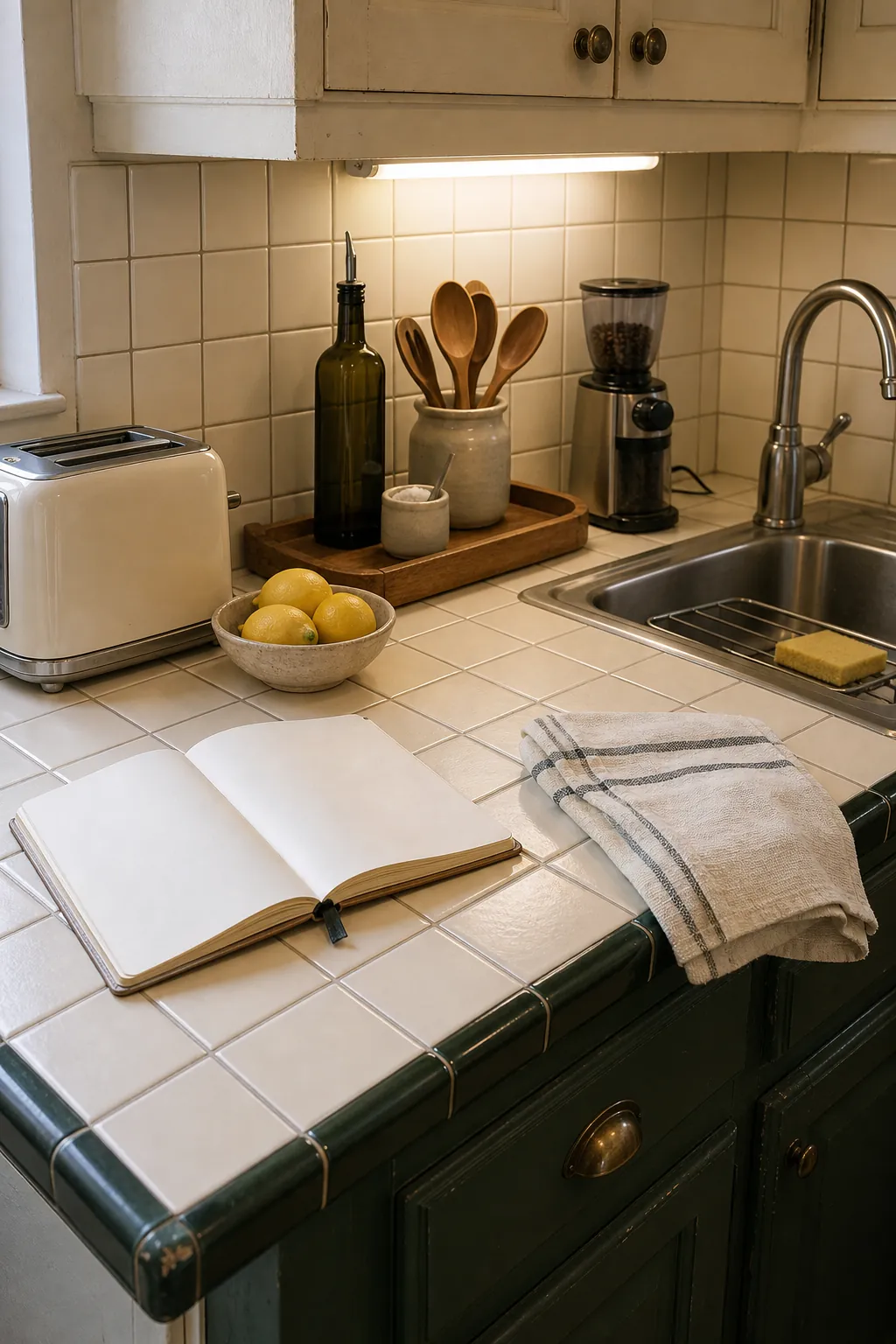
Replace damaged grout and seal it when the material requires it. If the counter remains functional, a cleaner visual perimeter may buy years before a remodel. One modern faucet or straightforward pendant can supply contrast, but avoid layering several competing “updates” that each belong to a different trend.
Make Wood Paneling Look Architectural
Wood paneling reads as intentional when it has boundaries and a relationship to other wood in the room. Let one paneled wall act as an architectural backdrop, then keep adjacent walls lighter and simpler. Echo the paneling’s tone in one furniture piece while using upholstery and rugs that create clear contrast.
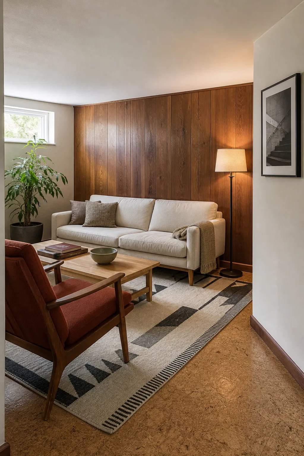
Clean gently, repair lifted edges, and test any finish product in an inconspicuous spot. Better lighting is often transformative: a shaded floor lamp and diffuse ceiling light reveal grain instead of turning the room into a dark box. If the paneling is damaged sheet material rather than quality wood, painting may be reasonable—but preparation determines whether the result looks crisp.
Use Lighting and Hardware to Connect Eras
Small replacement pieces can bridge old architecture and current furnishings. Choose lighting with a clean shape but a material already present in the room: opal glass beside vintage tile, aged brass near warm wood, or blackened metal against rough stone. Hardware should repeat consistently enough to look planned, but every metal in a house does not need to match.
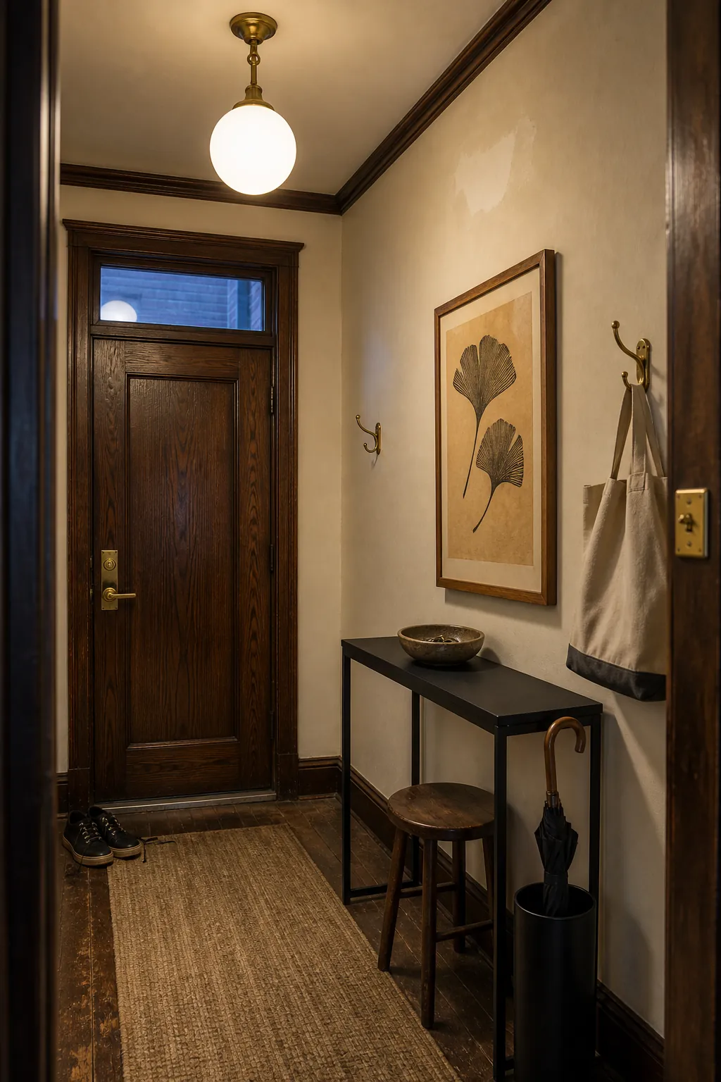
Measure before buying, keep old parts when they belong to the house, and use qualified trades for electrical or plumbing changes. The goal is not to erase evidence of age. It is to remove the random, failing, or low-quality layer that prevents the original feature from reading clearly.
Decide What to Keep by Looking at the Whole Room
Keep a dated feature when it is sound, difficult to replace well, useful, or full of character you can build around. Replace it when it is failing, unsafe, impossible to maintain, or prevents the room from functioning. Take photos, remove clutter, clean thoroughly, and test paint and textile samples beside the fixed finish at different times of day before making an irreversible choice.
An intentional room does not require every surface to come from the same decade. It requires visible decisions: a limited palette, repeated materials, appropriate scale, maintained details, and enough contrast to let old and new pieces support one another. When those relationships are clear, age becomes character instead of a flaw you failed to hide.