
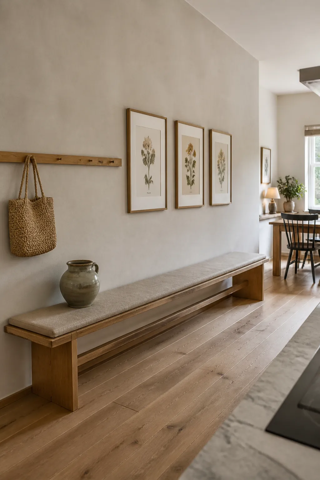
A long blank wall can make a finished kitchen feel oddly temporary. The challenge is not finding something attractive to hang. It is choosing a composition that fills enough visual space while leaving counters, walkways, and cleaning routines easy to manage.
The most convincing solution usually treats the wall as part of the room rather than as a separate display. Start by noticing where people enter, where chairs pull out, and which sight line feels empty from the adjoining room. Those practical clues tell you whether the wall needs rhythm, storage, softness, or one strong focal point.
Build a gallery around one steady baseline
A kitchen gallery wall looks calmer when the frames share an invisible baseline, even if their sizes differ. Place that line at roughly eye level from the main approach, then spread the arrangement horizontally before adding a second tier. Washable frames with acrylic fronts are easier to live with near cooking zones than delicate open mounts.
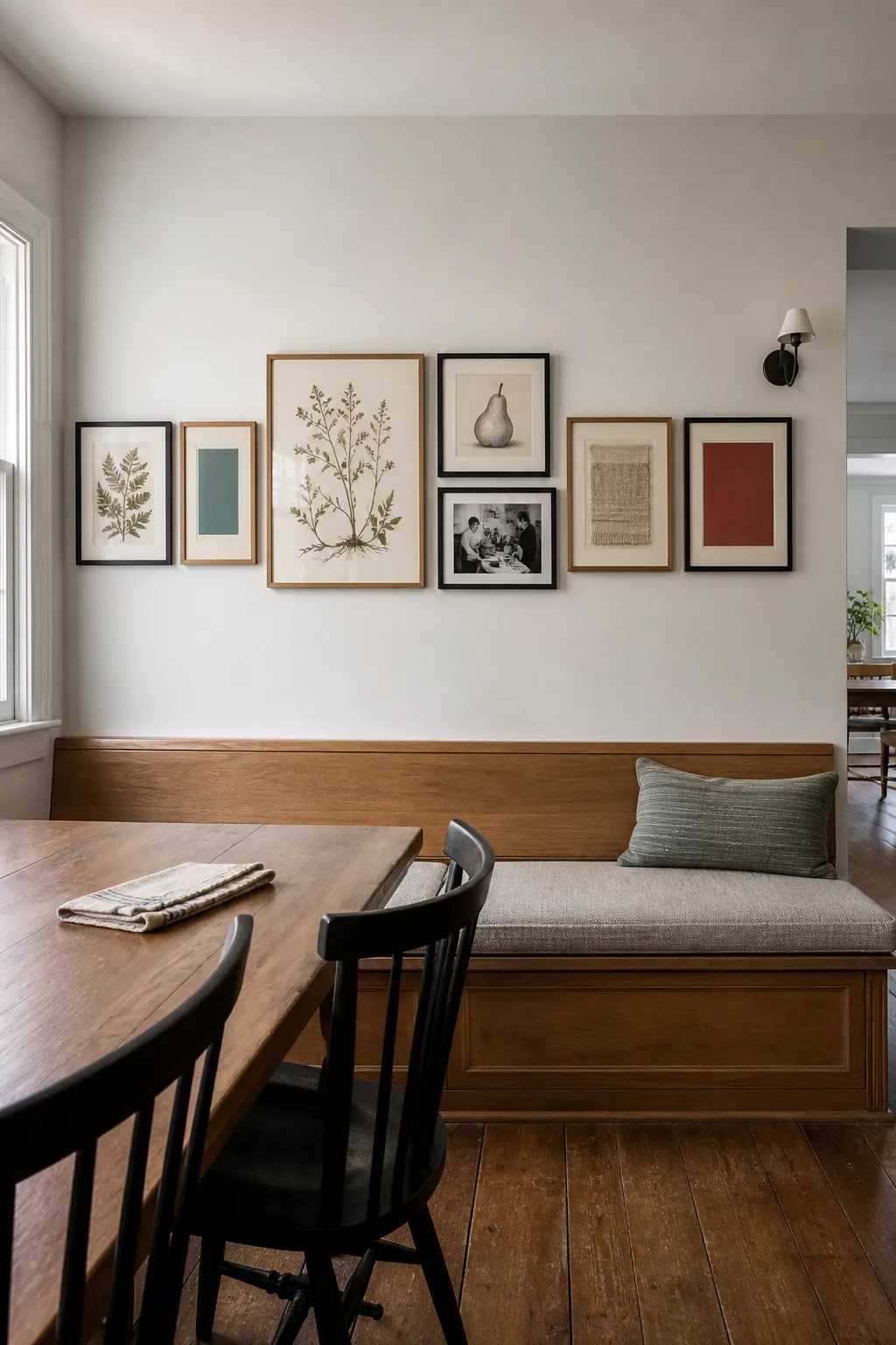
Choose images that can survive repetition without feeling themed. A mix of botanical studies, food sketches, and a small family photograph can connect the kitchen to daily life without turning the display into restaurant decor. Leave more breathing room at the ends than between frames so the collection reads as one unit.
Use a picture ledge for flexible layers
A shallow picture ledge is useful when you like to change art but do not want fresh holes every season. Keep the largest piece slightly away from center and overlap smaller prints in front of it. The layered depth makes an empty kitchen wall feel finished while using only a few inches of projection.
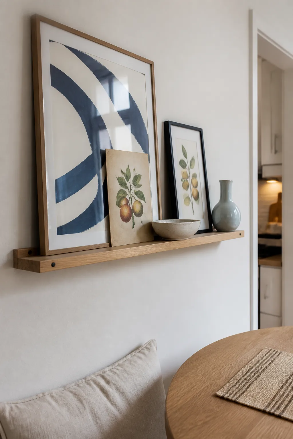
Limit the ledge to objects that are easy to lift and wipe. A small bowl, one framed print, and a ceramic vessel create enough variation without collecting visual noise. If the wall is beside a table, check that seated heads and pulled chairs remain clear of every edge.
Turn a rail into useful wall rhythm
A continuous wooden rail can make a long wall useful without the weight of upper cabinets. Space hooks generously and hang only attractive tools that genuinely earn their place, such as a linen apron, two handled baskets, and a small herb snip. Repeated gaps matter as much as the objects because they keep the line from feeling crowded.
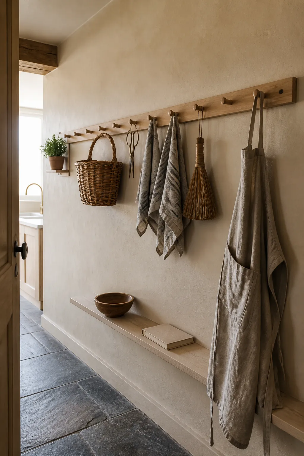
Mount the rail where hands can reach it but shoulders will not brush against hanging pieces. Near a prep area, reserve the closest hooks for frequently used items and keep decorative pieces farther away. This approach works especially well for simple home decor ideas because the arrangement can evolve with actual habits.
Anchor the wall with one woven textile
Hard kitchen surfaces often need softness more than another framed print. A flat woven textile can absorb visual echo, introduce scale, and cover a broad section of wall with very little depth. Choose a tightly woven piece with a clear geometric motif, then keep it well away from steam, grease, and open flame.
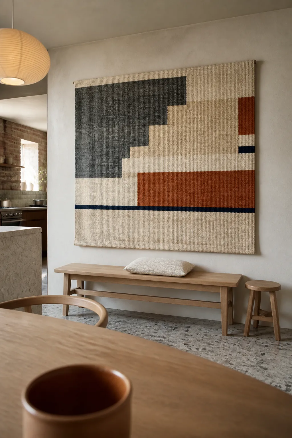
The textile should relate to the wall width, not just the furniture below it. A piece that spans about two thirds of a bench or sideboard usually feels grounded. Neutral fibers with one dark accent can add definition while remaining easier to coordinate than a busy multicolor pattern.
Create a measured plate composition
A plate display can suit a kitchen without becoming overly literal when the forms and finishes are edited. Mix a few matte stoneware pieces with shallow glazed bowls, then arrange them in a loose horizontal wave. Trace each shape on paper first so the final spacing feels intentional across the long span.
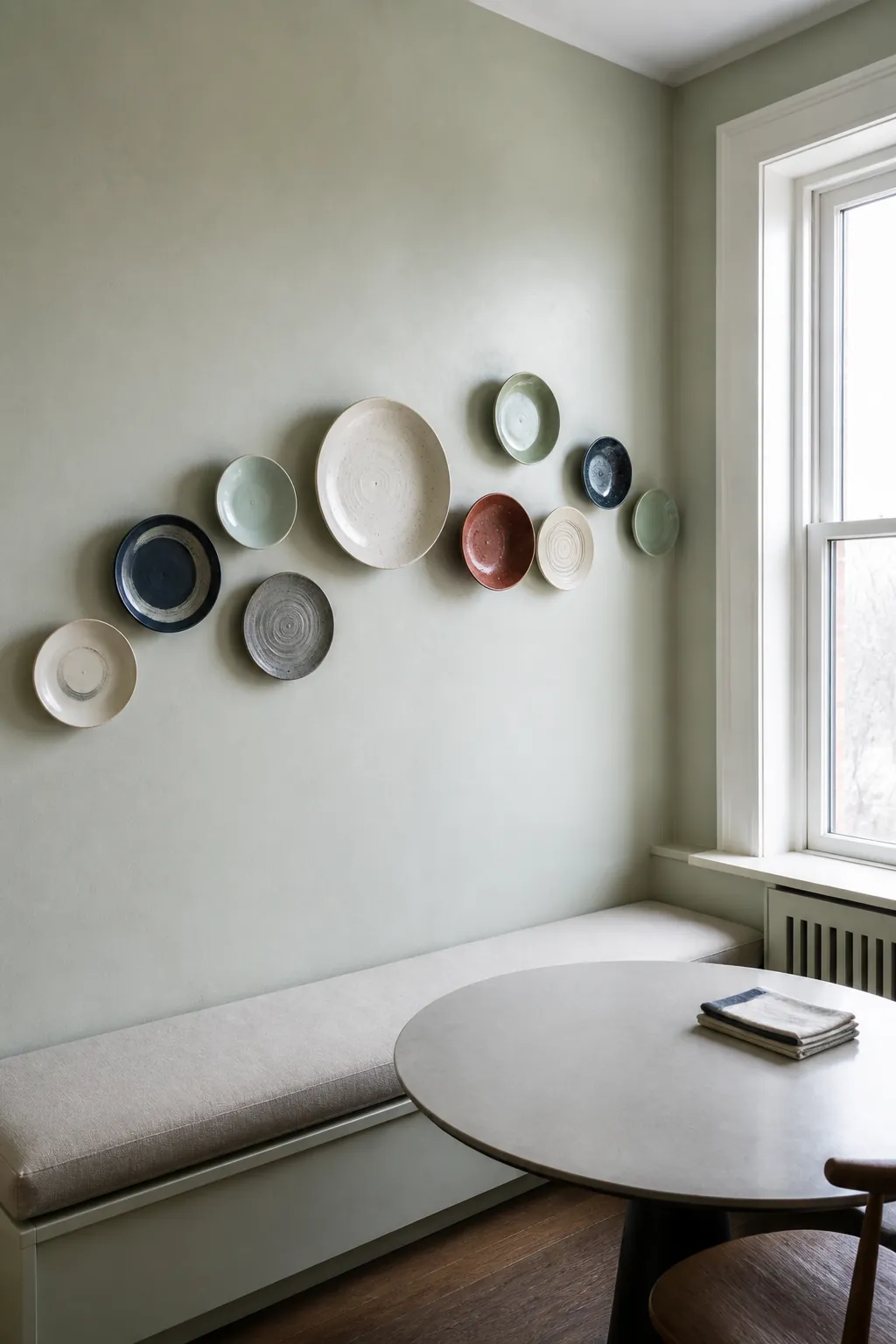
Use secure hangers rated for the weight of every piece. Avoid positioning fragile ceramics above a stove, sink, or place where a door can strike the wall. The best kitchen collage wall ideas leave deliberate empty areas, which let handmade edges and glaze differences remain visible.
Balance the full length with a narrow console
When floor space allows, a slim console can connect wall decor with useful storage. Choose a shallow piece that preserves the main path, then place a tall lamp at one end and a round mirror off center above it. The uneven heights create a visual route across the wall without forcing every object into a matched pair.
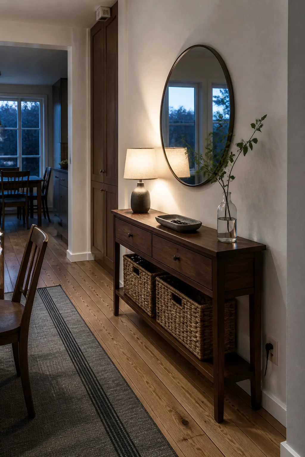
Measure the remaining passage after opening nearby drawers and pulling out chairs. Baskets can hold linens, but their contents should stay below the console top so the surface remains visually quiet. When the layout respects movement first, the decorated wall feels permanent instead of squeezed into leftover space.