
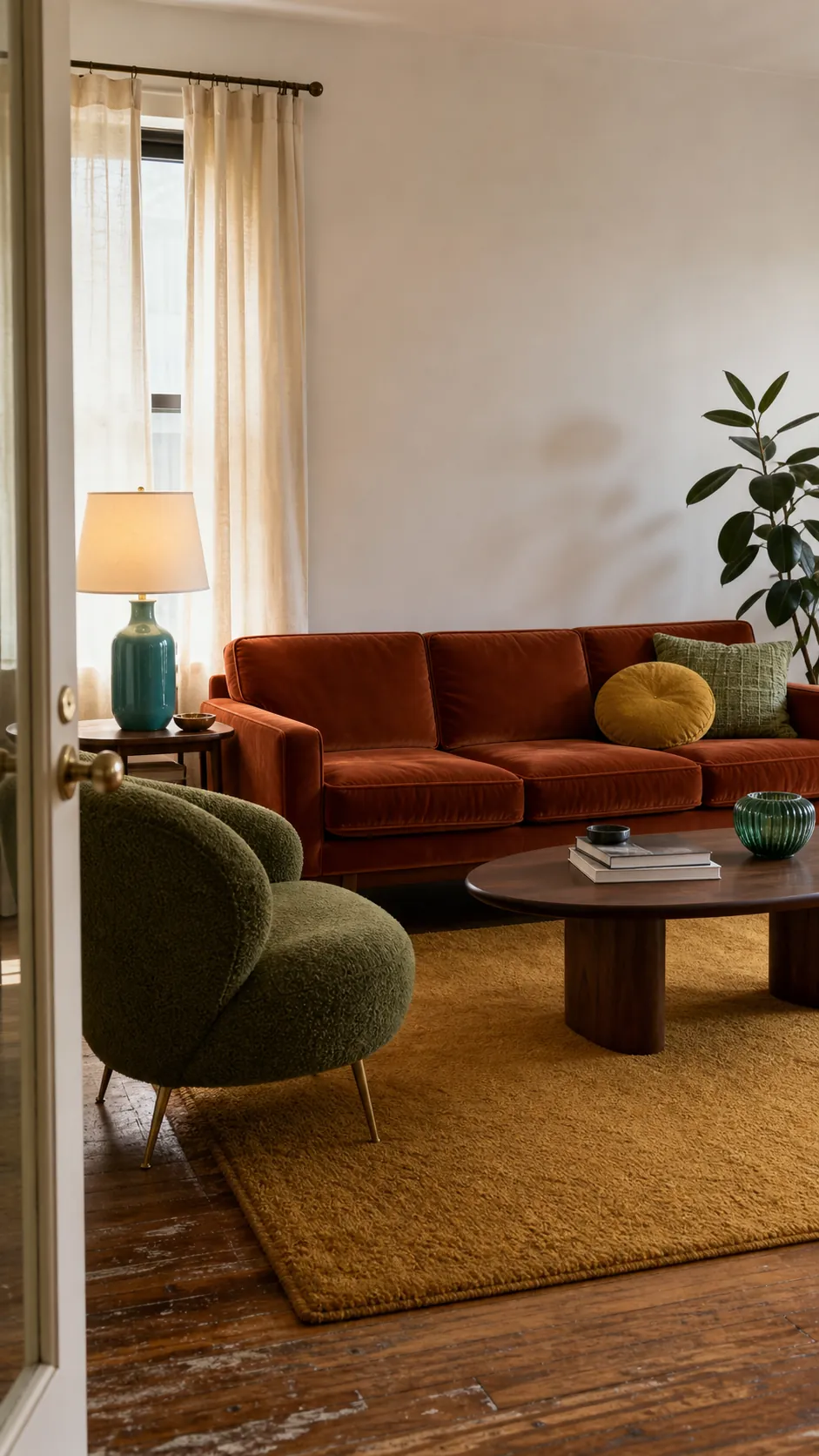
A retro living room does not need to look like a preserved 1970s set. The most convincing rooms borrow the era’s confidence—earthy color, rounded shapes, tactile fabrics—and edit it for the way people live now. If your room feels beige, brown, or strangely disconnected, the answer is rarely “add every vintage color.” It is to build a clear hierarchy.
Choose one color to lead, one to support it, and one small note that creates tension. Then repeat those colors in different materials rather than scattering tiny matching accessories everywhere. The six palettes below show how to make retro color ideas feel warm, personal, and intentional in a real living room.
Avocado Green, Walnut, and Warm Cream
Avocado green is one of the quickest ways to signal a retro color palette, but it works best when it is treated as a grounded botanical neutral rather than a novelty shade. Use it on one substantial element: a sofa, a painted bookcase, full-length curtains, or a large rug. Walnut furniture gives the green historical context, while warm cream keeps the room from becoming murky.
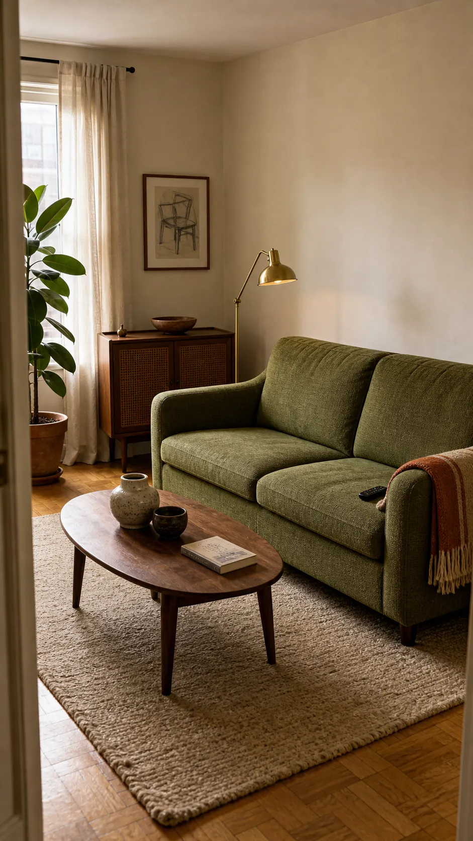
Keep the cream creamy—not icy white—and let natural textures soften the contrast. A wool rug, slubby linen curtains, cane-front cabinet, and a few aged brass details give the palette depth. For a renter-friendly version, leave the walls neutral and concentrate green in upholstery, a throw, and two or three large ceramic pieces. The scale of the color matters more than the number of green objects.
Burnt Orange, Olive, and Inky Blue
Burnt orange and olive are natural partners, but a room containing only warm earth tones can flatten into “fifty shades of brown.” Inky blue supplies the missing cool note. Make orange the emotional center—a sofa, pair of lounge chairs, or broad curtain panels—then use olive on a rug or painted cabinet. Add blue in a single visually firm place such as an ottoman, lamp base, or large textile.
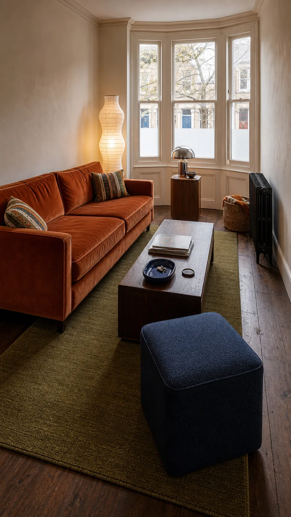
The blue does not need equal representation. Its job is to create focus and stop the warm colors from blending together. Dark stained wood, smoked glass, and aged bronze all suit this scheme, but keep one pale surface visible so light can move through the room. A cream ceiling, oatmeal rug border, or pale lampshade is enough.
Mustard, Teal, and Soft Rose
This combination captures the playful side of colorful home decor without relying on primary colors. Mustard brings warmth, teal provides depth, and soft rose prevents the result from feeling too masculine or too heavy. In a small living room, let teal occupy the far wall or a compact loveseat, then distribute mustard and rose through substantial textiles rather than many little ornaments.
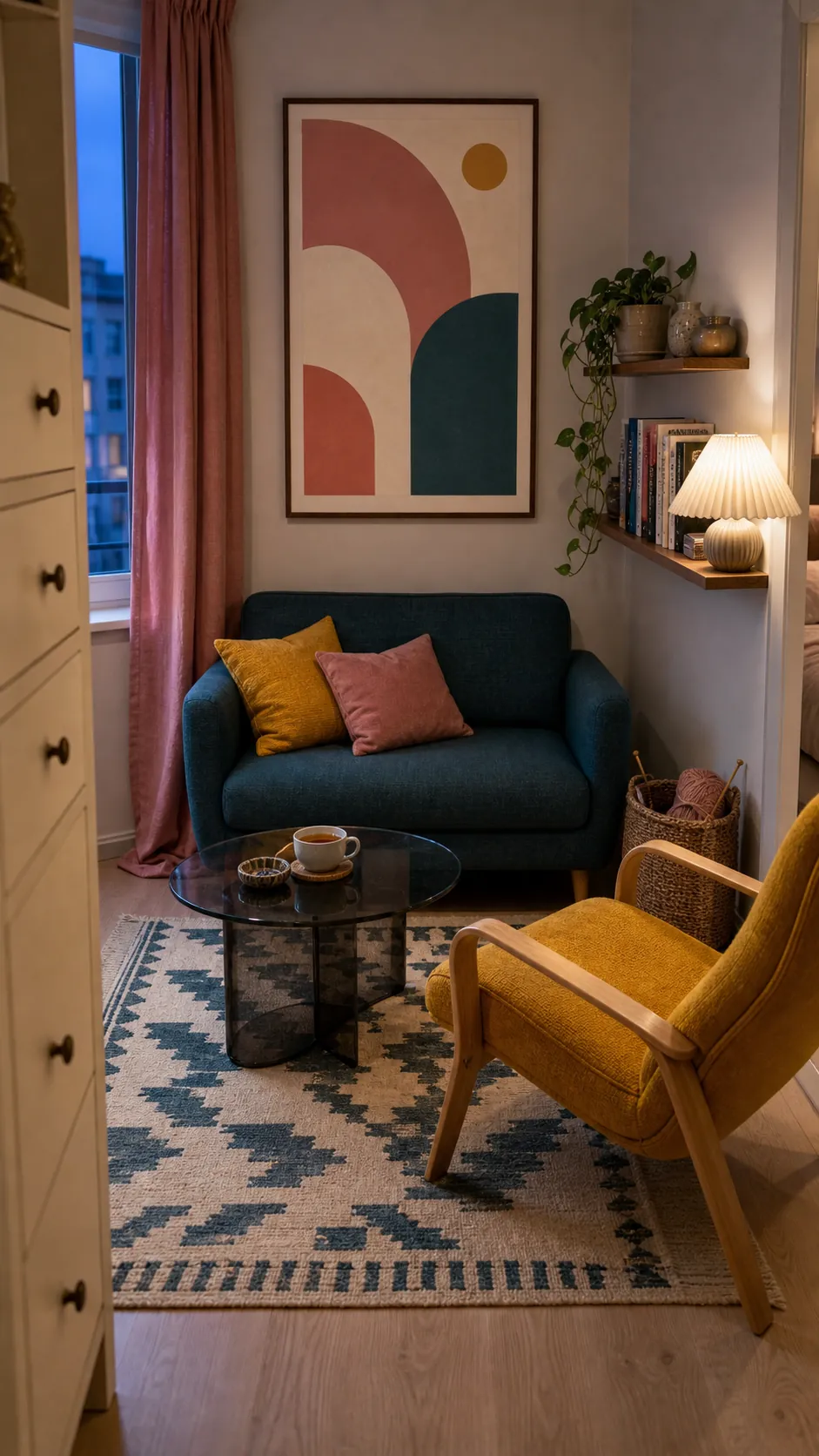
A patterned rug can connect all three shades, but it should not be the only place they appear. Echo one rug color in a curtain edge, cushion, or lampshade. Matte finishes and visible fabric weave make these saturated colors easier to live with than glossy, perfectly smooth surfaces. Think collected and tactile, not coordinated to the last accessory.
Chocolate Brown, Tomato Red, and Powder Blue
If you already own a brown sofa or inherited dark wood furniture, do not fight it by adding more beige. Tomato red gives brown energy, while powder blue creates the clean contrast that makes the older pieces look deliberate. This is especially effective in a vintage living room with substantial furniture that cannot be replaced immediately.
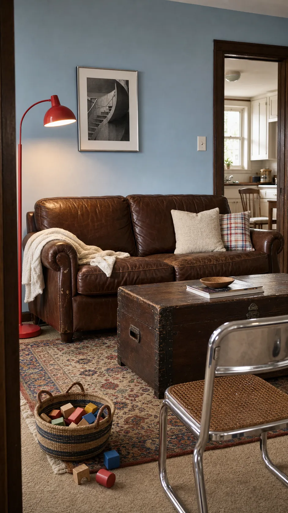
Try powder blue on the walls, brown in the largest upholstered piece, and red on one chair or a generously sized floor lamp. Avoid peppering the room with lots of tiny red objects; that creates visual static. Crisp off-white trim and a medium-value rug keep the combination buoyant, while chrome or polished steel introduces a subtle postmodern edge.
Plum, Ochre, and Mushroom
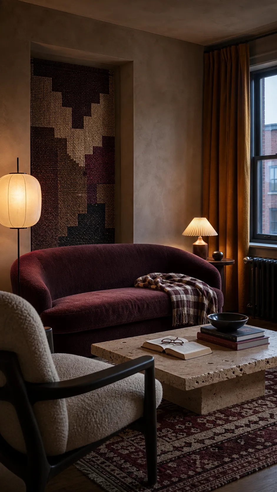
For a moodier retro living room, plum and ochre create a rich contrast that feels more sophisticated than the familiar orange-and-green formula. Mushroom—a gray-brown with warmth—gives both colors somewhere to rest. Use mushroom across the room’s largest quiet surfaces, then let plum and ochre divide the focal points.
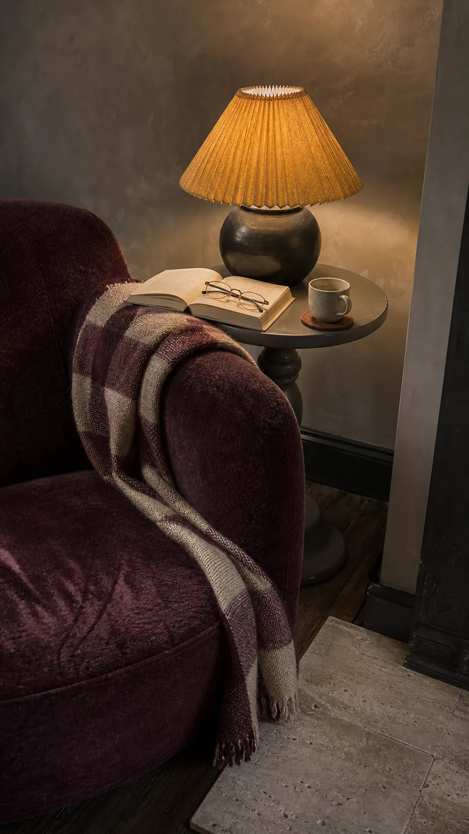
This palette benefits from low, layered lighting. A shaded floor lamp, table lamp, and warm ceiling pendant reveal the depth of velvet, wool, and stained wood without turning everything yellow. If the room receives little daylight, choose a red-leaning plum and a clear ochre instead of near-black purple and muddy mustard. Test swatches beside the actual flooring at morning and evening.
Persimmon, Aqua, and Natural Rattan
Persimmon and aqua deliver the sunnier, more optimistic side of nostalgic decor. The pairing can become cartoonish when both shades are equally loud, so choose one dominant color and soften the other. A persimmon chair against a muted aqua wall feels lively; a full-strength orange wall beside a vivid turquoise sofa often feels competitive.
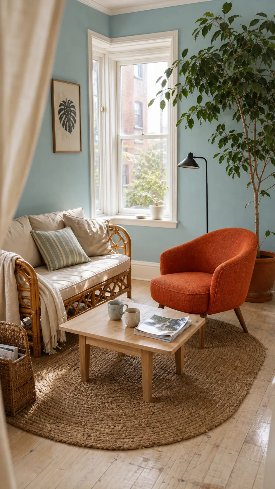
Rattan, pale oak, woven grasscloth, and unbleached cotton provide a bridge between the colors. Black accents should be thin and functional—a lamp stem, picture rail, or table frame—rather than broad blocks. This palette is particularly useful in a bright apartment because it keeps the room cheerful without relying on stark white.
How to Choose the Right Retro Palette for Your Room
Begin with the fixed elements: flooring, fireplace stone, wood cabinets, and any sofa you must keep. Name their undertones before choosing paint. Warm orange floors usually cooperate with olive, teal, powder blue, cream, and plum more easily than with another similar brown. Cool gray flooring often needs ochre, rust, walnut, or mushroom to feel less stark.
Next, decide where the eye should land. Put the strongest color there and reduce the saturation as you move outward. Repeat the lead color two or three times at different scales, leave breathing room around patterned pieces, and vary texture more than hue. Before buying anything large, place fabric and paint samples together in the actual room for several days. The goal is not perfect historical accuracy; it is a room whose color choices look connected to one another and unmistakably connected to you.