Forest green is easy to admire and surprisingly easy to misuse. Its depth can make a room feel grounded and expensive, but the wrong companion can turn it muddy, festive, or much darker than expected. The most reliable answer is that forest green looks best with warm off-white, camel, natural wood, dusty pink, terracotta, muted blue, and restrained brass. The right choice depends less on a color-wheel rule than on the room’s light, existing finishes, and how much green you plan to use.
Start With Warm White or Cream
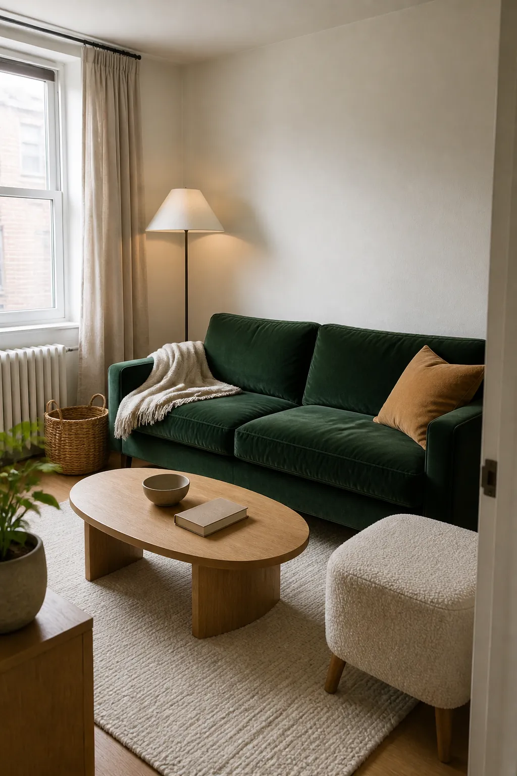
If you want the safest forest green interior color palette, begin with cream rather than brilliant white. A soft ivory, oatmeal, or chalky warm white gives the eye a place to rest and keeps a deep green wall, sofa, or cabinet from swallowing the room. Crisp blue-white can work in a bright modern space, but in weak daylight it may make the green look colder and the contrast harsher.
Use the pale neutral on the largest remaining surfaces: adjacent walls, ceiling, curtains, or a substantial rug. Then repeat forest green in only two or three smaller places so the scheme looks connected instead of matched. This approach also helps renters who want forest green curtains and textiles without repainting.
Let Natural Wood Supply the Warmth
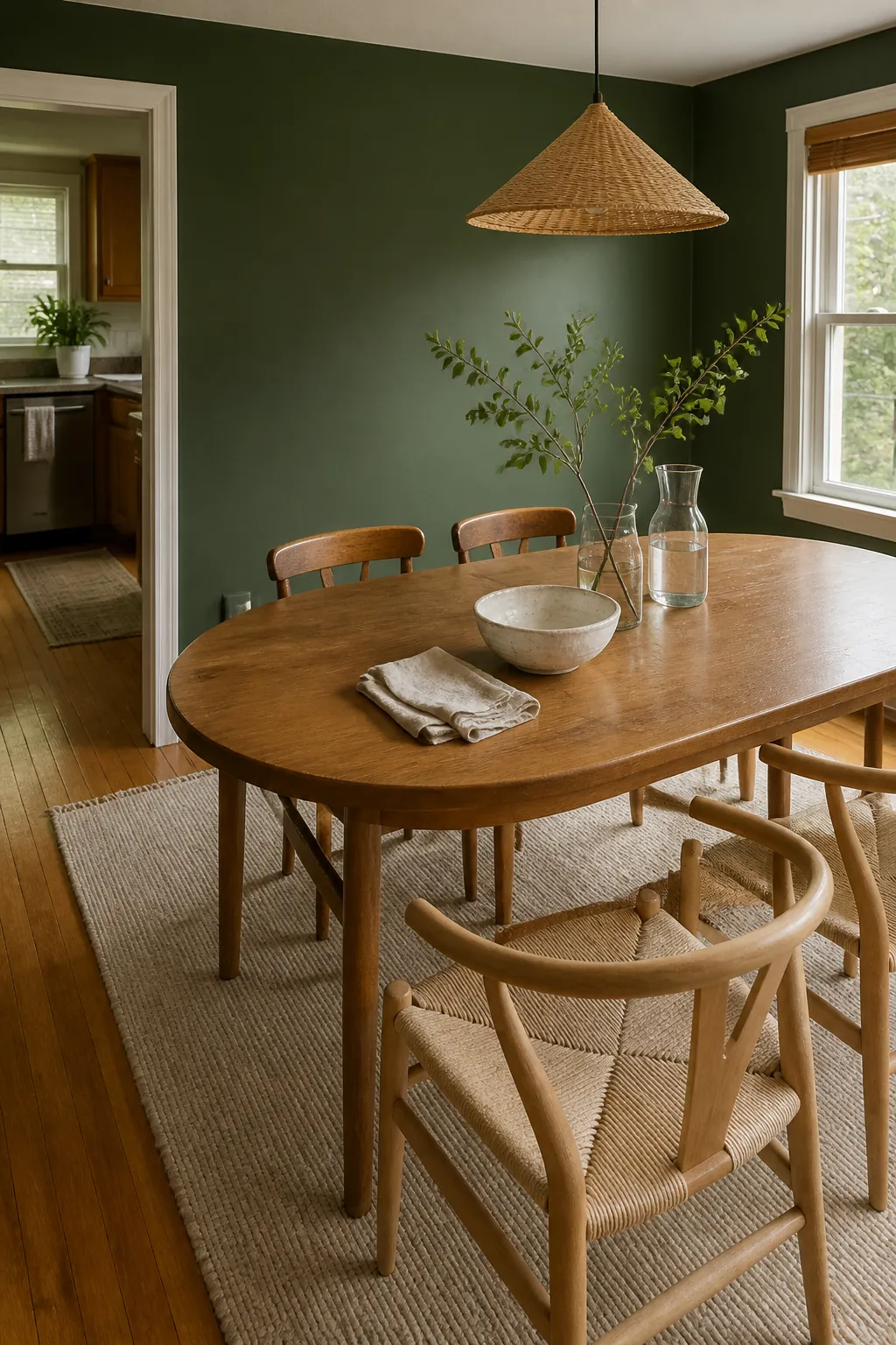
Forest green with natural wood works because both colors already belong to an earthy visual family, yet the wood’s orange or golden undertone quietly warms the cooler green. White oak creates a lighter Scandinavian mood, walnut adds polish, and medium oak gives the most forgiving everyday balance. Existing floors matter more than a tiny paint chip, so judge samples beside the actual timber at morning and evening.
Avoid forcing every wood finish to match. Two related tones usually look more natural than a complete furniture suite, especially when a cream textile separates the green from darker walnut. If the room already has reddish cherry or mahogany, keep additional red accents muted so the result does not drift toward a holiday palette.
Choose Blush, Dusty Rose, or Berry for Contrast
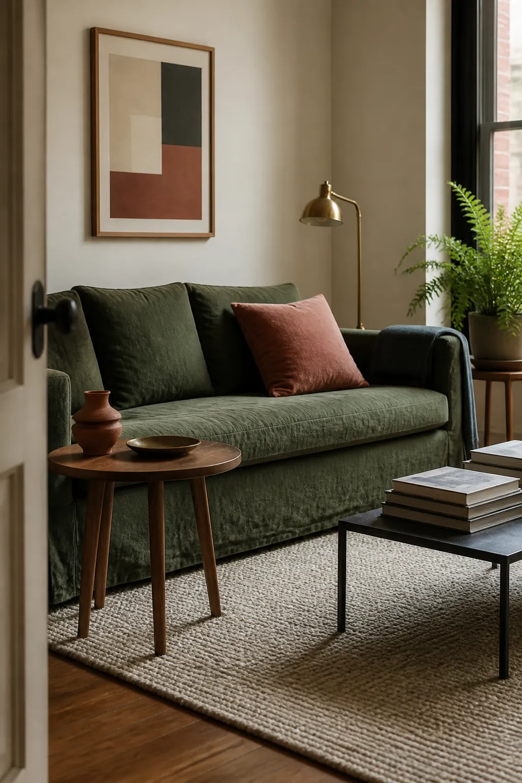
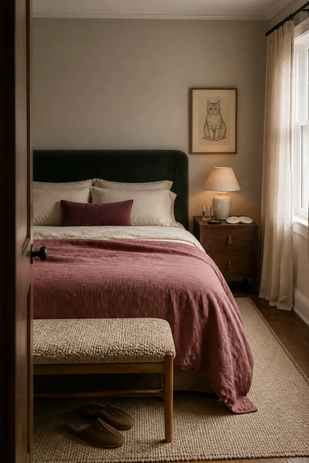
Red sits opposite green in traditional color theory, but pure red against forest green often reads as Christmas. The practical decorating move is to shift red toward a quieter relative. Dusty rose feels gentle, clay pink feels earthy, and a small amount of berry or burgundy creates a richer, more traditional room.
Keep the contrast color subordinate. A rose throw, one patterned cushion, or a burgundy reading chair is usually enough when green covers a wall. If forest green appears only as an accent, the pink family can occupy a larger surface. The shared low saturation is what makes the combination sophisticated rather than sugary.
Use Terracotta and Ochre for an Earthier Room
Terracotta, rust, and muted ochre bring sun-baked warmth to forest green without creating the sharpness of true red or bright yellow. They are especially effective in rooms with leather, pottery, brick, jute, or medium-toned wood. The combination feels relaxed because the colors are complex and slightly weathered rather than clean and synthetic.
Choose one warm accent as the lead and let the others appear only in small details. Too many orange-brown notes can make a compact room feel visually crowded. A terracotta lamp base and a rust-striped cushion, balanced by plenty of cream, will usually do more than an entire set of matching accessories.

Pair It With Blue for a Calm, Tonal Scheme
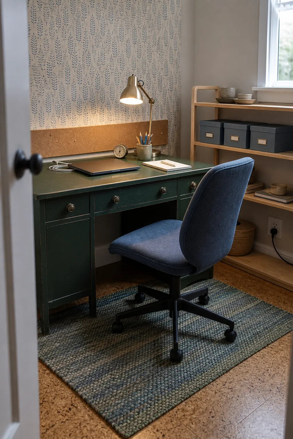
Blue and green are neighbors in many natural scenes, so muted blue can make forest green feel calm rather than dramatic. Dusty blue lifts a bedroom, slate blue suits a tailored living room, and deep navy creates an enveloping effect in a space with generous daylight. The key is to vary the values: if the green is very dark, include at least one noticeably lighter blue or neutral.
Repeat a bridging material such as denim, blue-green ceramic, or a rug that contains both hues. That connector prevents the palette from looking like two unrelated color blocks. In a north-facing room, choose a blue with a softened gray undertone and add warm lamps so the scheme does not become chilly.
Add Black and Brass in Small, Deliberate Doses
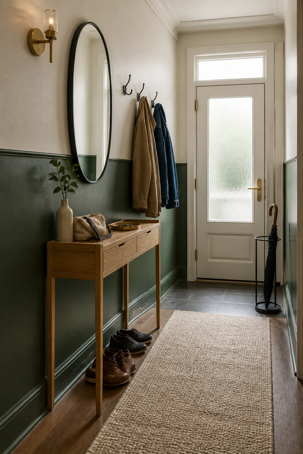
Black sharpens forest green, while brass adds reflected warmth. Both are useful finishing colors, not ideal co-stars in most average-size rooms. Thin black frames, a dark curtain rod, or tapered furniture legs can define the scheme without making it oppressive. Aged brass works better than highly polished yellow gold when the goal is a collected, natural look.
Pay attention to repetition. One isolated brass object looks accidental, while two or three small touches establish intent. The same is true of black. Keep broad black surfaces for rooms with strong daylight, and introduce pale fabric, light flooring, or an open wall nearby to preserve visual breathing room.
Test the Palette in the Room You Actually Have
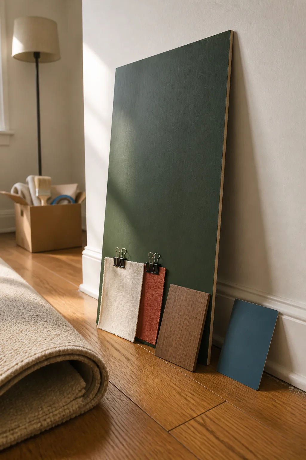
Before buying paint or a large sofa, collect the fixed elements you cannot easily change: flooring, carpet, worktops, trim, and major furniture. Place a forest green sample beside them, then add no more than two possible companion colors. View the group vertically as well as flat on a table, because light reaches a wall differently from a floor.
Check the arrangement in daylight, under your normal lamps, and after dark. If the green turns nearly black, increase the area of cream or choose a slightly grayer, lighter green. If the room feels themed, remove one obvious accent and add texture instead. The best forest green paint color combinations are not the ones with the most colors; they are the ones that make existing materials look intentional.