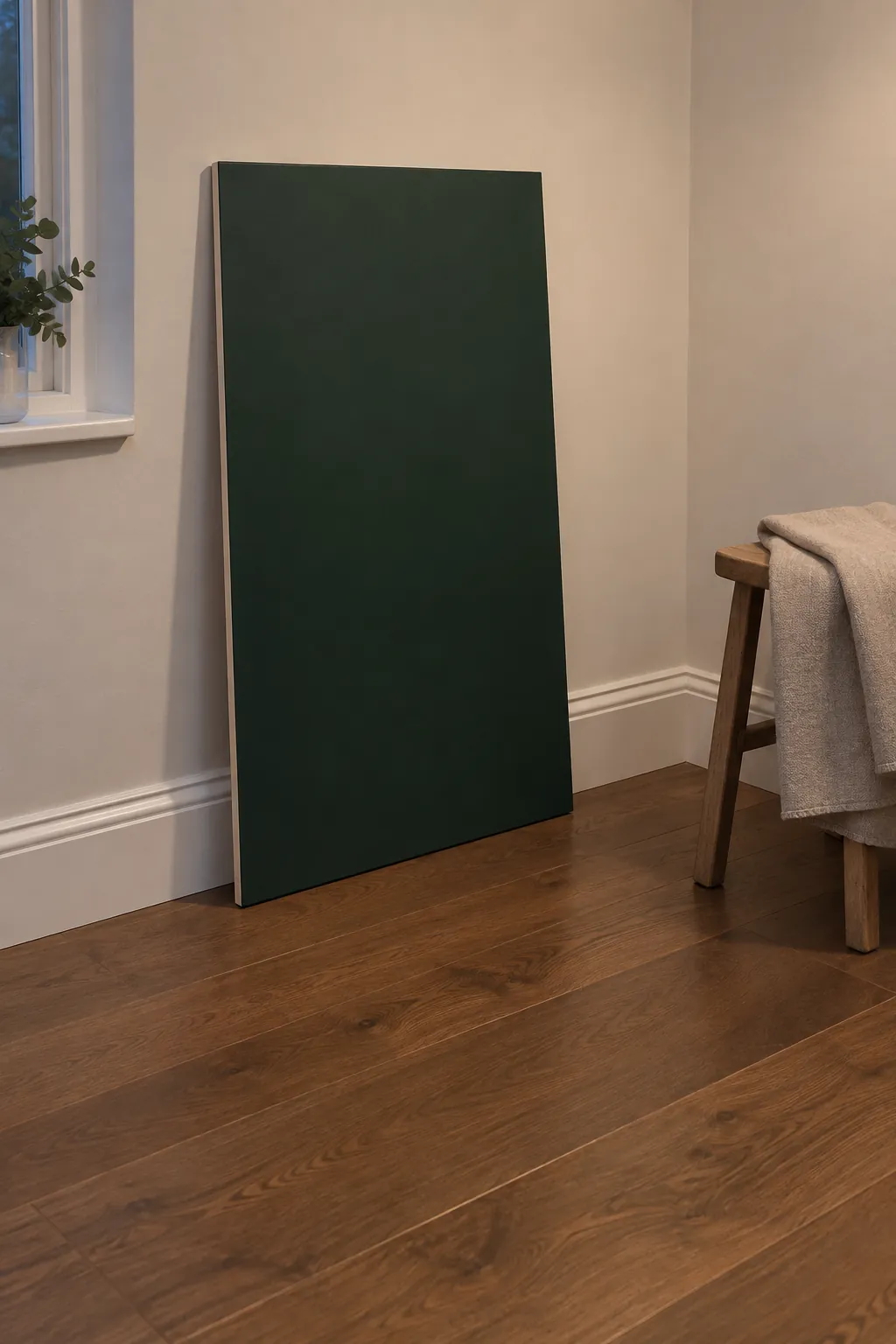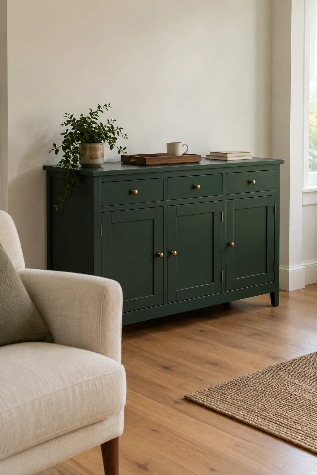
Two products can carry the same green name and look surprisingly different beside your sofa. One reads cool and inky, the other looks brighter or more yellow. Understanding the shade helps, but the label alone cannot tell you how it will behave in your room.
A deep green associated with dark glass
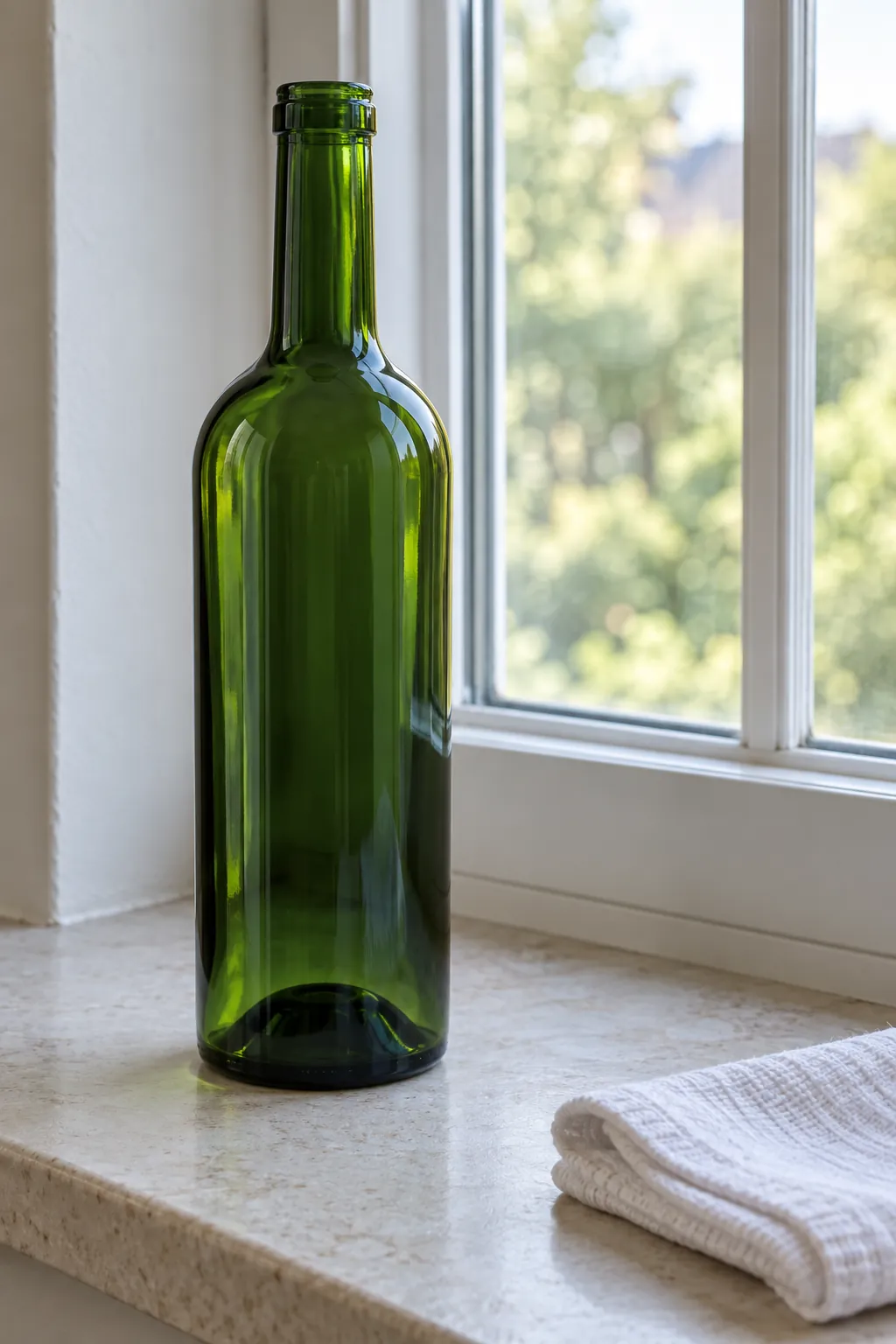
Bottle green usually means a deep, dark green inspired by green glass bottles. It often has a cool or blue leaning character, although paint and fabric makers use the name differently. Think rich and shaded rather than pale sage, bright lime or yellow olive.
The name describes a family of appearances, not a single guaranteed paint formula. Transparent glass can look lighter at its edges and much darker through its thick base, while opaque paint behaves differently. Use the bottle association to understand the mood, then inspect the actual product you plan to buy.
Bottle, forest and emerald overlap more than names suggest
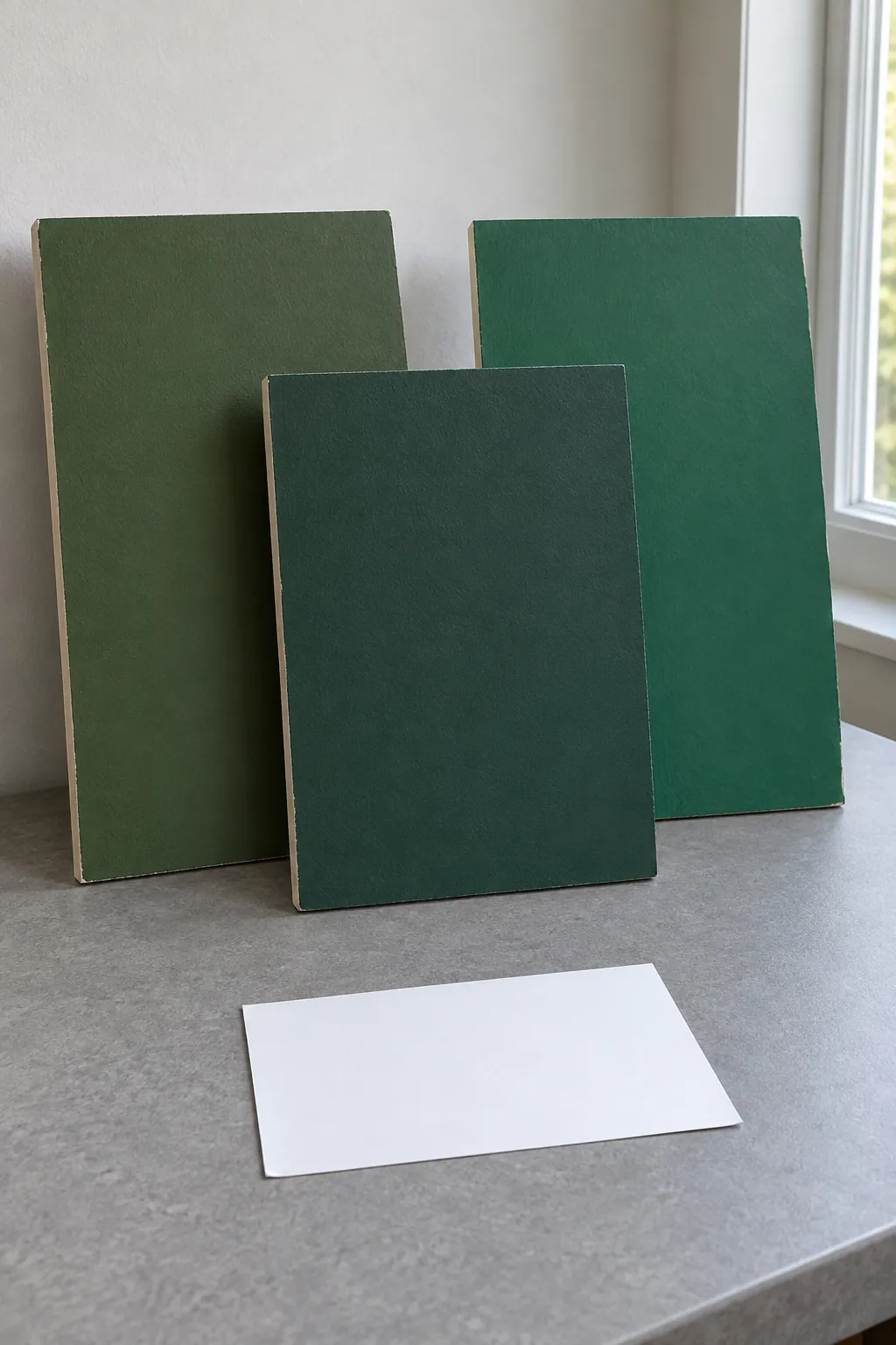
For a useful bottle green shade comparison, consider depth, brightness and undertone separately. Bottle green is commonly presented as dark and restrained. Emerald often suggests a clearer, more vivid jewel green, while forest green often suggests a leafy, sometimes earthier shade.
These are tendencies rather than boundaries. One brand’s forest may look cooler than another brand’s bottle green, and an emerald velvet can appear nearly black when its pile turns away from the light. Teal is generally more visibly blue, but very cool dark greens can sit close to it.
Compare physical samples beside one another instead of trusting product names. A colour that seemed neutral on its own may reveal a blue, yellow or grey tendency once a neighbouring sample gives your eye a reference.
Why it can look almost black on a wall
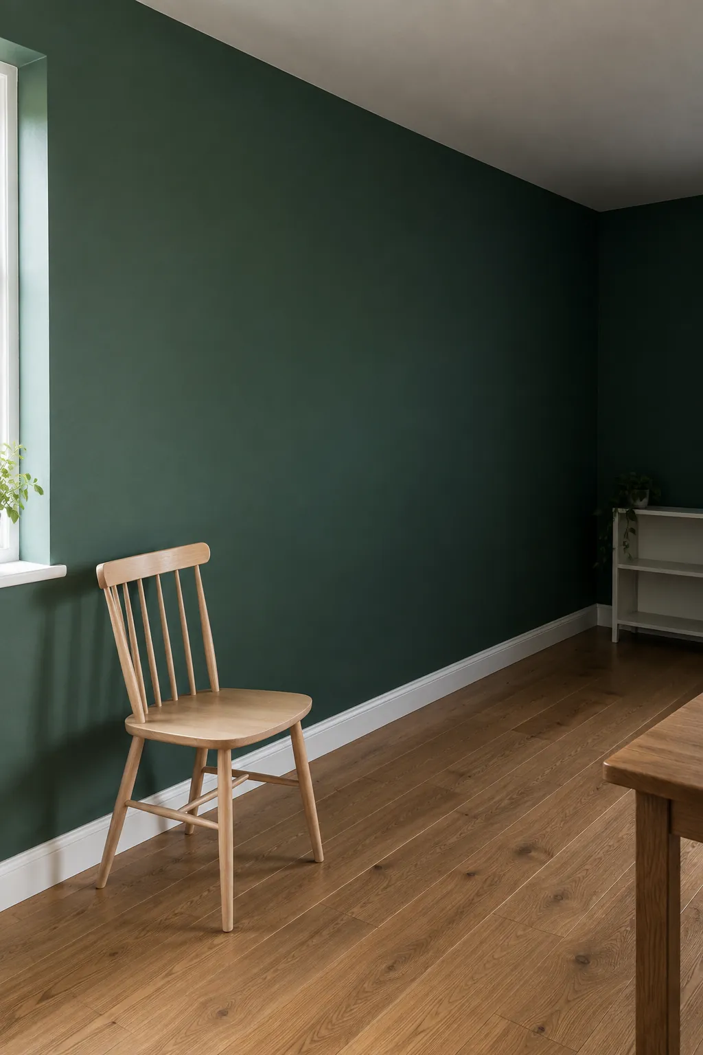
Deep paint reflects less light than a pale finish, so a bottle green wall can lose much of its visible colour in a dim corner. The effect depends on the actual paint, the light reaching it and the surfaces around it. A bright photograph cannot tell you how the same colour will look during an evening at home.
When comparing bottle green paint color options, check the manufacturer’s light reflectance value if available. LRV describes how much visible light a surface reflects on a scale from 0 to 100, with lower values reflecting less. It helps compare depth, but it does not replace looking at undertone, finish and a real sample in the room.
The finish changes the impression
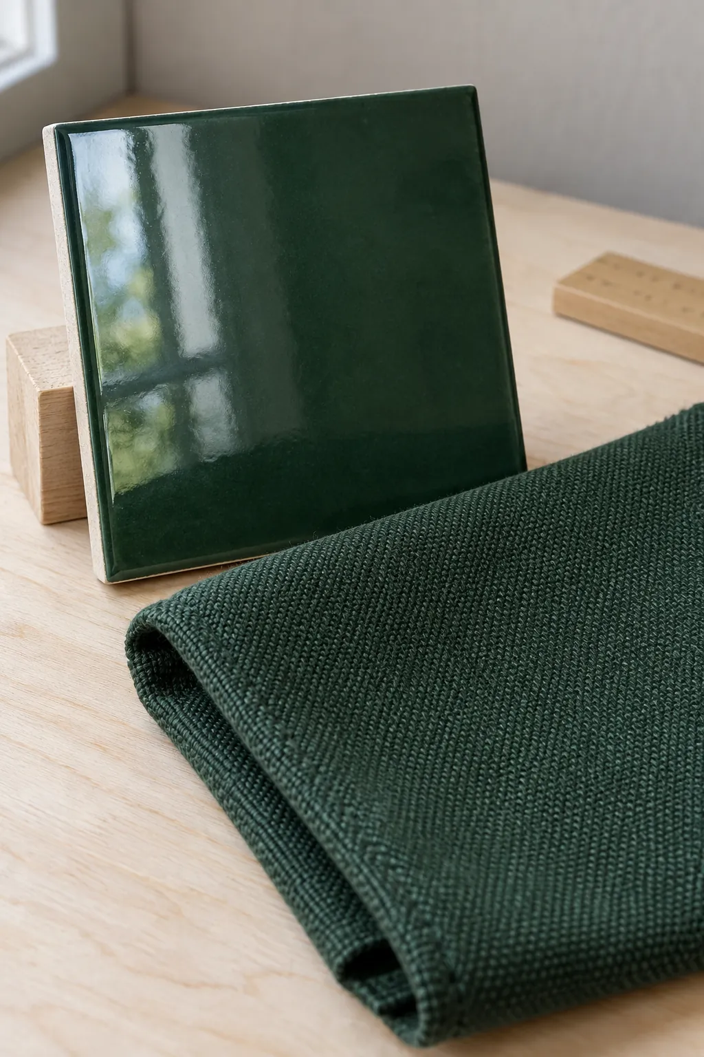
A matte painted wall, glazed tile and velvet cushion can share a similar green while looking quite different. Glossy surfaces produce brighter reflections, and those highlights can make a deep colour appear more lively. Velvet changes with its pile direction, whereas a flat textile may look more even.
For bottle green furniture accents, choose the material as carefully as the shade. A lacquered side table can be a sharper visual statement than a woven cushion of similar colour. If you want a quiet bedroom, compare a fabric sample and a paint sample together instead of trying to match them from separate screens.
Digital swatches and the illustrative photographs here can suggest a direction, but neither is a reliable colour match for a particular paint or fabric. Buy the manufacturer’s actual sample before committing.
Give the dark green a useful companion
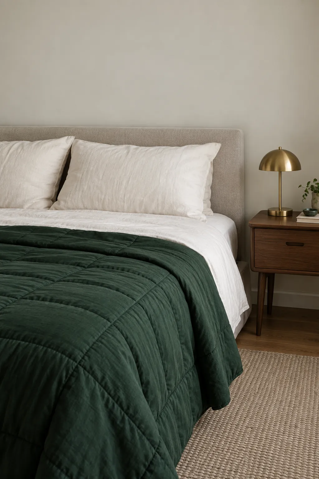
Ivory and soft stone make bottle green easier to read by introducing a lighter neighbour. Oak, walnut and camel add warmth, while a muted rose or clay accent creates a softer contrast. Start with the fixed floor and furniture, then decide which companion helps the room feel balanced.
Bottle green with brass and wood can work well when the metal is a small highlight rather than another dominant finish. In bottle green living room decor, a wooden side table and one brass lamp may be enough. For a bottle green bedroom palette, pale bedding can provide the larger light surface that a few small accessories cannot.
Choose the sample that works in your room
Narrow the choice to a few bottle green color swatches, then make larger samples using the paint maker’s recommended preparation and coats. Let the finish dry properly before judging it. Keep the sample upright, since a board lying flat on a table receives different light from a wall.
Look at each sample beside your trim, flooring and largest textile in morning light and under your usual evening lamps. Move it into the darkest corner as well as the brightest area. If it turns too blue, too muddy or too close to black for your taste, compare another actual shade rather than trying to correct it with accessories.
For bottle green wall ideas in a small room, test a clearly bounded surface before deciding on every wall. A recess, cabinet or fabric accent can provide the depth you want with a smaller commitment. Keep the sample you enjoy in the room you actually have, even if its label uses a different green name.