
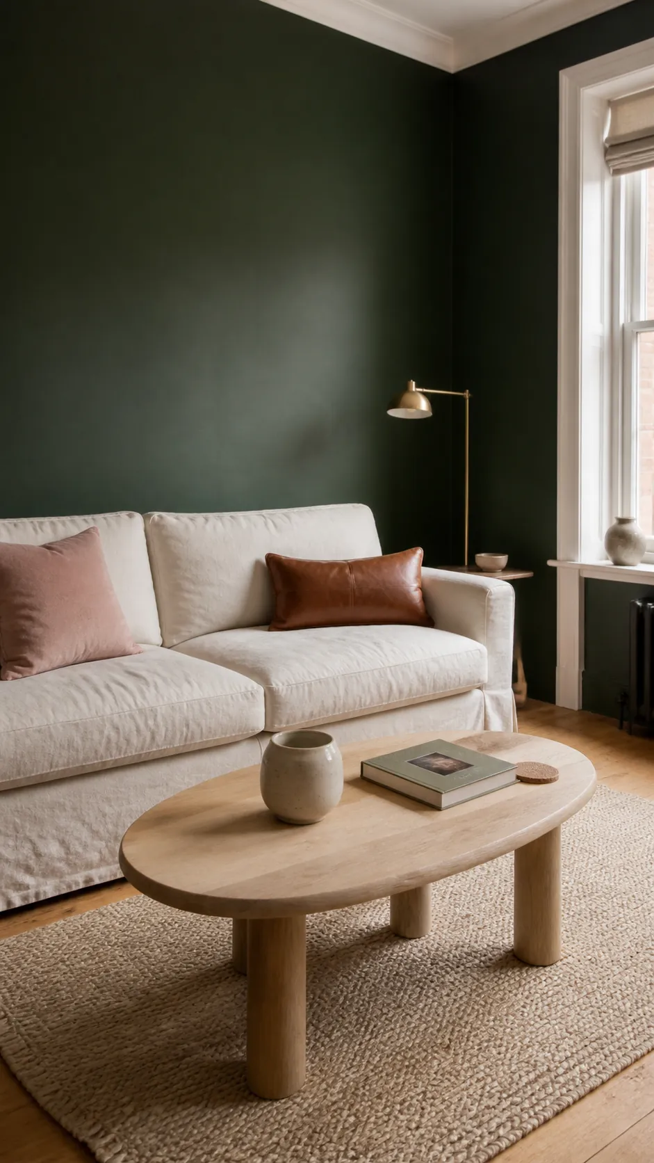
Forest green can look calm and architectural in one room, then heavy or muddy in another. The difference is rarely the green alone. It comes from the undertone beside it, the amount of daylight in the room, and whether lighter colors are doing enough visual work.
The most reliable matches are warm white, cream, beige, natural wood, blush pink, terracotta, muted blue, and restrained black or brass accents. Before committing, place the actual fabrics, wood samples, and large paint swatches together in morning and evening light; a blue-leaning green and a yellow-leaning green will not respond to the same companions.
Warm White Keeps Forest Green Clear and Airy
Warm white is the safest answer when forest green already covers a large surface such as walls, cabinetry, or a sofa. Choose ivory, chalk, or soft cream rather than a sharp blue-white, which can make a yellow-based green look dull. The lighter color reflects daylight and gives the eye a resting place without flattening the richer hue.
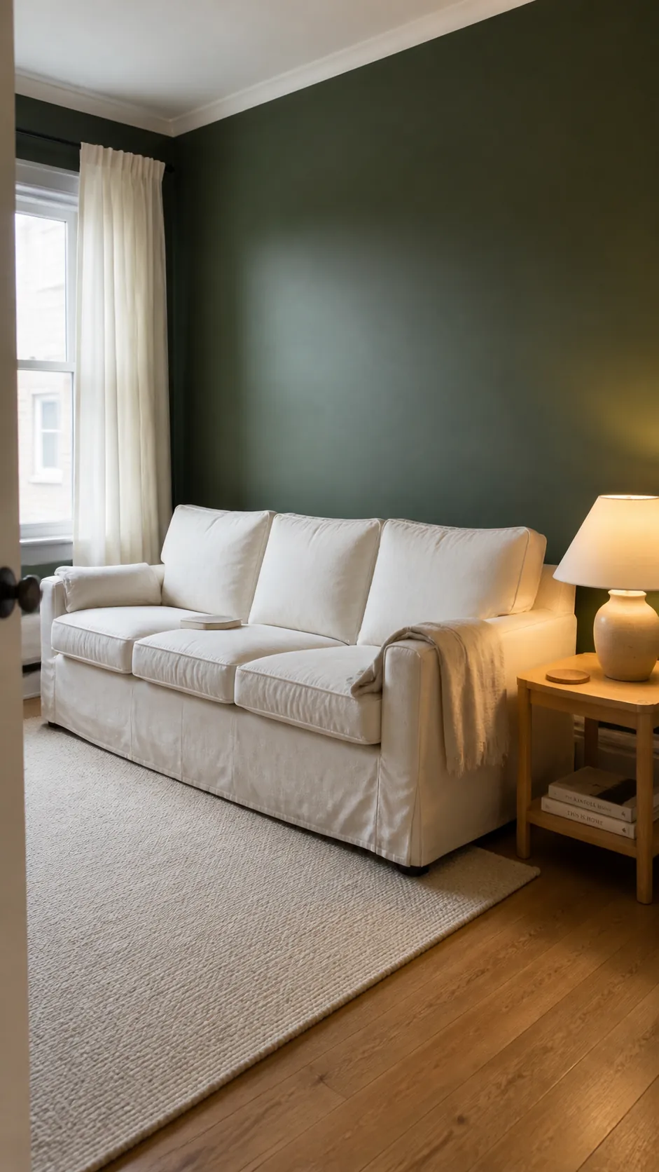
Use the white on ceilings, trim, lampshades, or the largest upholstered piece instead of scattering tiny white accessories everywhere. In a north-facing room, a creamy white also counteracts cool gray daylight. A useful starting proportion is roughly two parts light neutral to one part forest green when the room feels dim or compact.
Beige and Taupe Make the Palette Softer
Beige, mushroom, oatmeal, and warm taupe reduce the contrast while keeping the room grounded. They suit relaxed living rooms and bedrooms where crisp white would feel too formal. Look for neutrals with brown, pink, or subtle yellow undertones; a cold gray-beige can leave deep green looking disconnected.
Let one neutral occupy a meaningful area—a wool rug, linen curtains, or a full wall—so it reads as part of the forest green interior color palette. Then repeat it once in a smaller material such as a ceramic lamp or woven throw. Texture matters more than adding another color: bouclé, linen, jute, and matte plaster stop a two-color scheme from feeling flat.
Natural Wood Adds Warmth Without Competing
Forest green with natural wood works because both colors feel grounded, but the wood species changes the mood. Pale oak and ash make the scheme lighter and more contemporary, while walnut and mahogany create a deeper, traditional effect. Honeyed teak or medium oak is especially useful when the green has a cool blue cast.
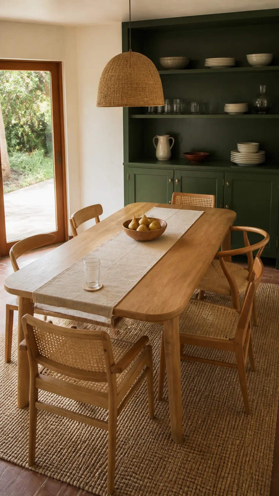
Avoid matching every timber finish exactly. Two related wood tones look more natural than a furniture set, provided they share a warm or cool direction. Keep visible grain and handmade texture in the scheme, and add a pale rug beneath dark furniture so the floor, table, and green walls do not merge into one heavy band.
Blush Pink Creates a Gentle Complement
Because red sits opposite green on the traditional color wheel, softened red tones create contrast without shouting. Dusty rose, plaster pink, and muted blush are easier to live with than sugary pastel pink. This pairing is particularly effective in a forest green bedroom color scheme, where pink linen or a faded rug warms the dark backdrop.
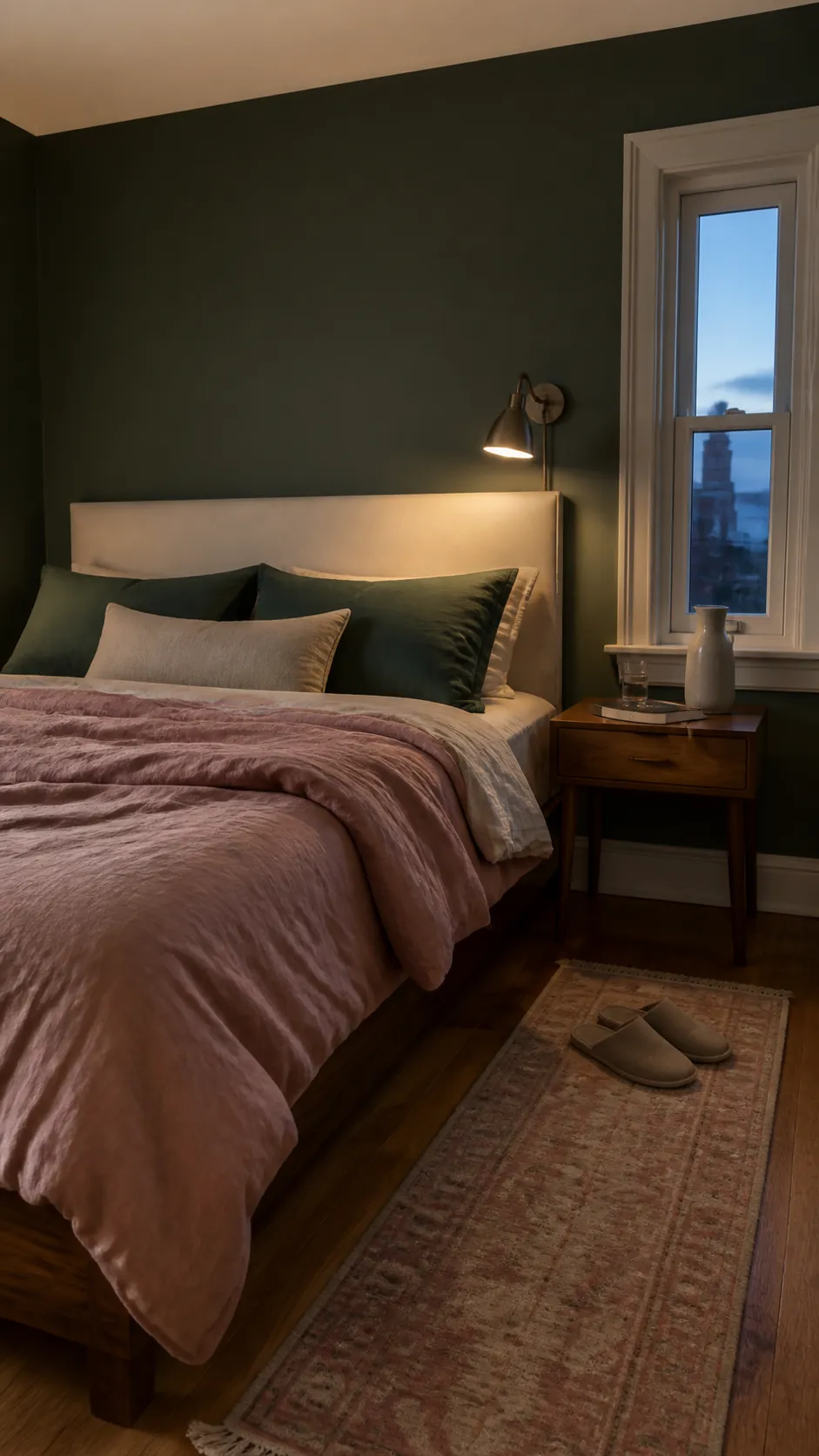
Keep the pink dusty and limited to one or two substantial elements rather than many decorative objects. Repeat a small amount of green in the bedding or rug to connect foreground and background. The result feels grown-up when both colors are slightly grayed and the hardware stays simple, such as aged brass, dark bronze, or natural timber.
Terracotta and Rust Bring Out Earthy Undertones
Terracotta, burnt orange, cinnamon, and rust are strong partners for forest green because they echo clay, leather, and autumn foliage. They produce more energy than beige but remain connected to natural materials. A single rust-colored chair, clay lamp, or patterned cushion can be enough to animate a green room.
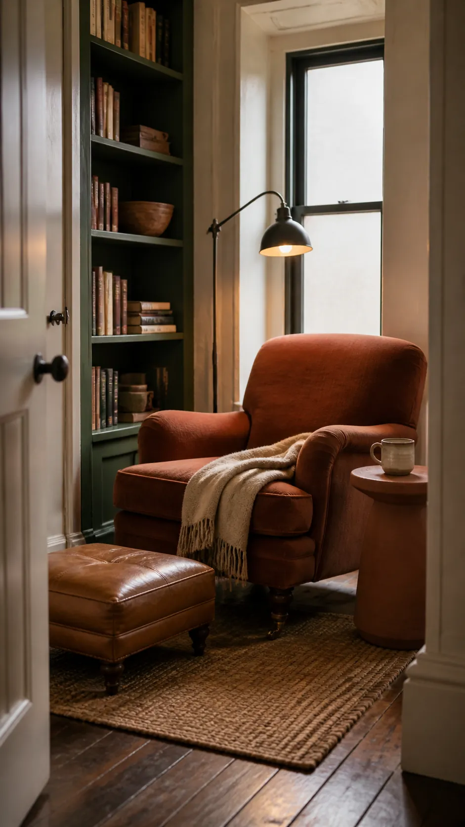
Control the heat by surrounding the accent with cream, tan, or warm wood. Bright orange can feel sporty, while a browned orange feels established and tactile. If the forest green paint color combination already includes red-toned flooring, pull a muted rust from that wood rather than introducing an unrelated orange.
Muted Blue Makes Forest Green Feel Tailored
Navy, denim, slate blue, and smoky blue sit close enough to green to feel harmonious, yet they create visible layering. This is a useful route for a home office, library, or bedroom where you want depth without a warm accent. It works best when the green itself has a cool or balanced undertone.
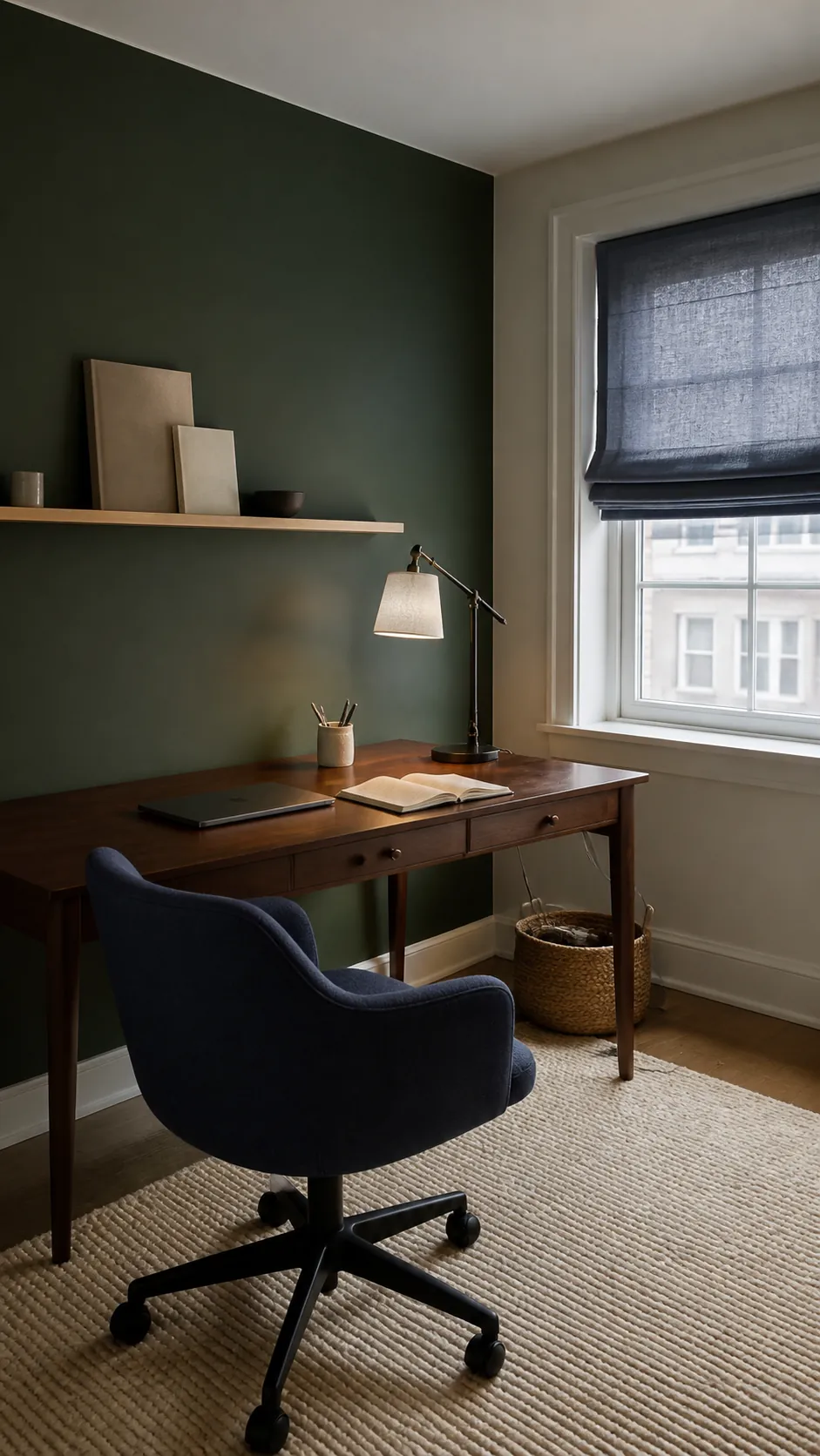
Separate the two dark hues with a lighter bridge such as parchment, pale oak, or a cream rug. Without that break, navy and green may collapse together in low light. Judge this pairing after sunset as well as during the day, because warm bulbs can turn blue fabric dull while making a yellow-based green appear more olive.
Black and Brass Sharpen the Edges
Black gives forest green a clean outline, while brass adds a small point of warmth and reflection. Use them as finishes, not equal color partners: slim frames, cabinet pulls, a tap, a lamp stem, or the legs of a side table are enough. Too much black beside deep green can make a modest room feel closed in.
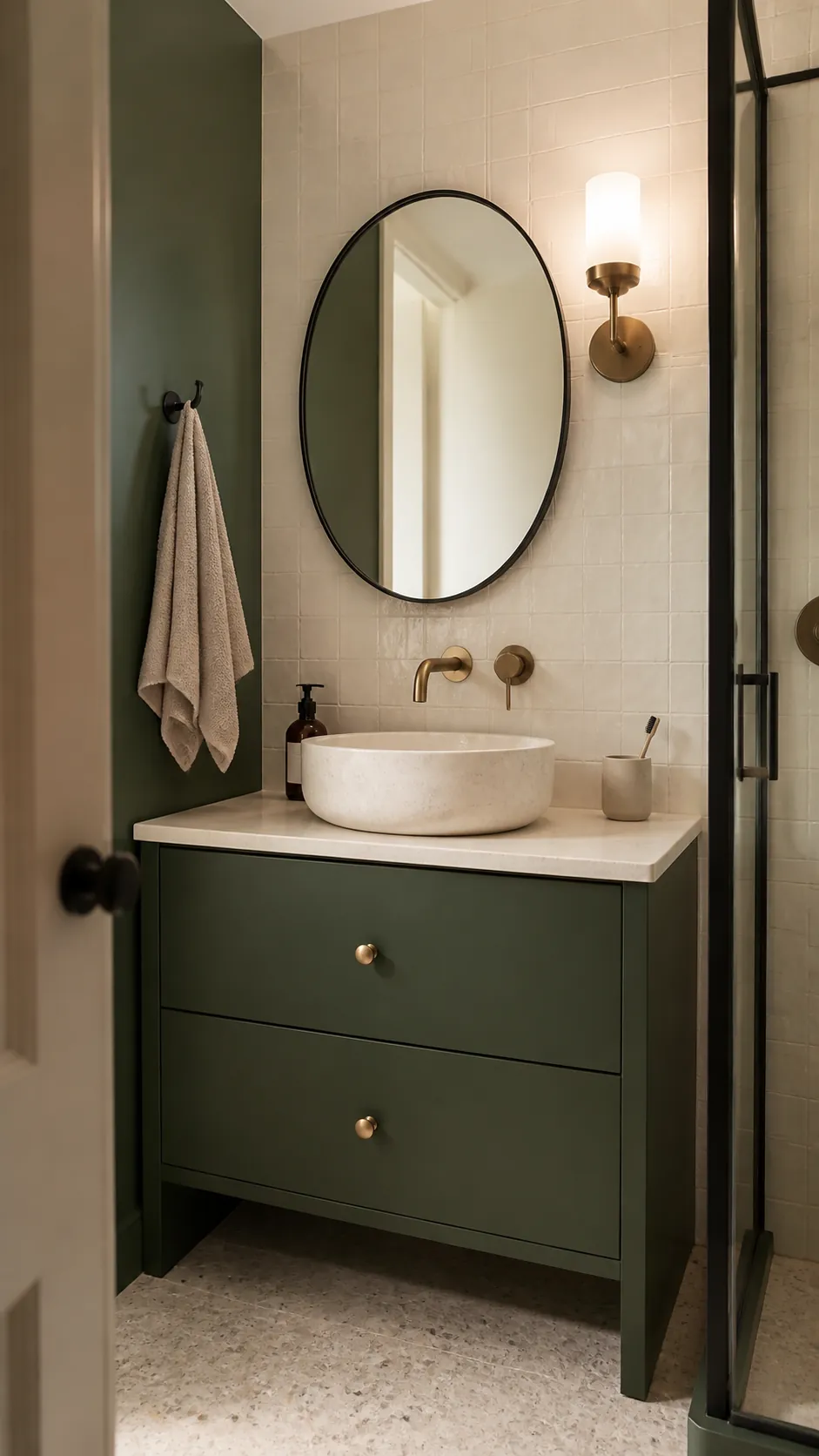
Choose one dominant metal finish and let the other appear once or twice. Aged or brushed brass looks quieter than polished yellow metal and is more forgiving beside warm neutrals. For forest green accent decor in a rental, black frames and a brass floor lamp can create this structure without changing permanent surfaces.
Sage and Olive Build a Layered Green Scheme
Forest green does not always need a contrasting partner. Sage, olive, moss, and eucalyptus create a tonal palette that feels calm when their undertones agree. Keep the darkest green on the smallest or most architectural surface, then use a pale green across textiles or surrounding walls so the hierarchy remains clear.
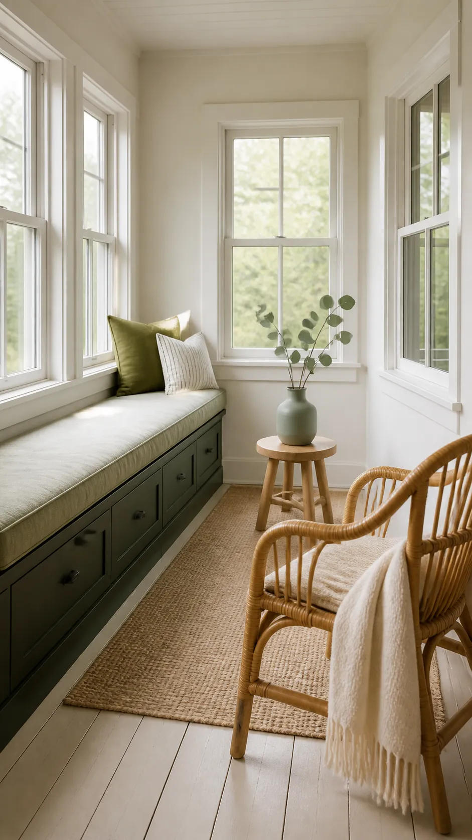
Add cream and wood between the greens, and vary the finishes: matte paint, washed linen, glazed ceramic, and leafy stems all reflect light differently. Test each candidate beside the permanent flooring and in the room itself. The right match is the one that keeps forest green intentional in your actual light, not the pairing that looks most perfect on a screen.