
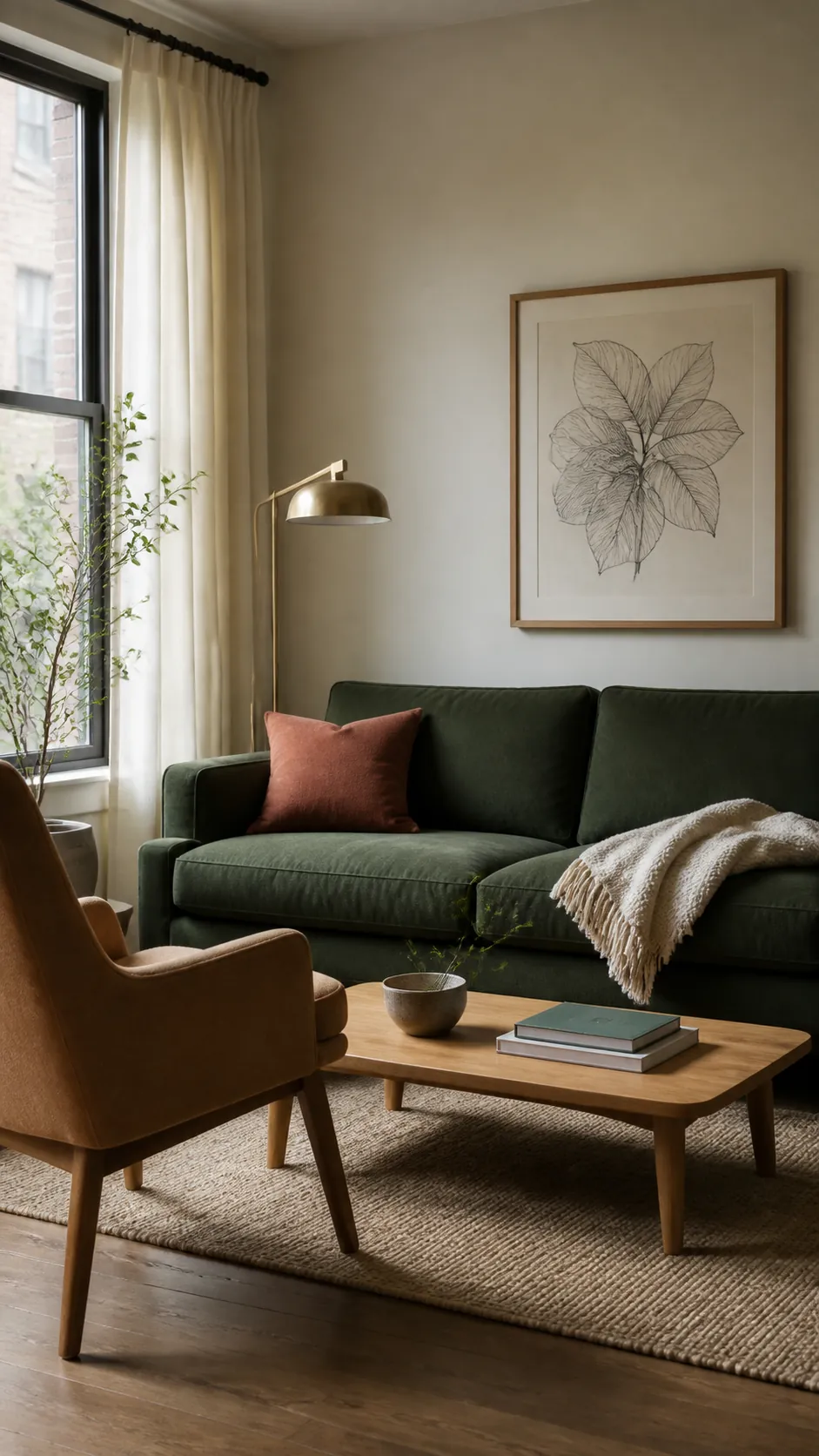
Dark green can make a room feel grounded and enveloping, yet the same shade can turn heavy when every surrounding surface is equally deep. The useful question is not simply which color looks attractive beside green. It is which color supplies the light, warmth, or contrast that the room is currently missing.
Start by looking at the green in daylight and again after lamps are on. A blue leaning forest green behaves differently from a yellow leaning olive, while flooring, upholstery, and window direction can shift both. Treat the fixed finishes as part of the palette before buying paint, curtains, or a rug.
Warm White Makes Dark Green Feel Clearer
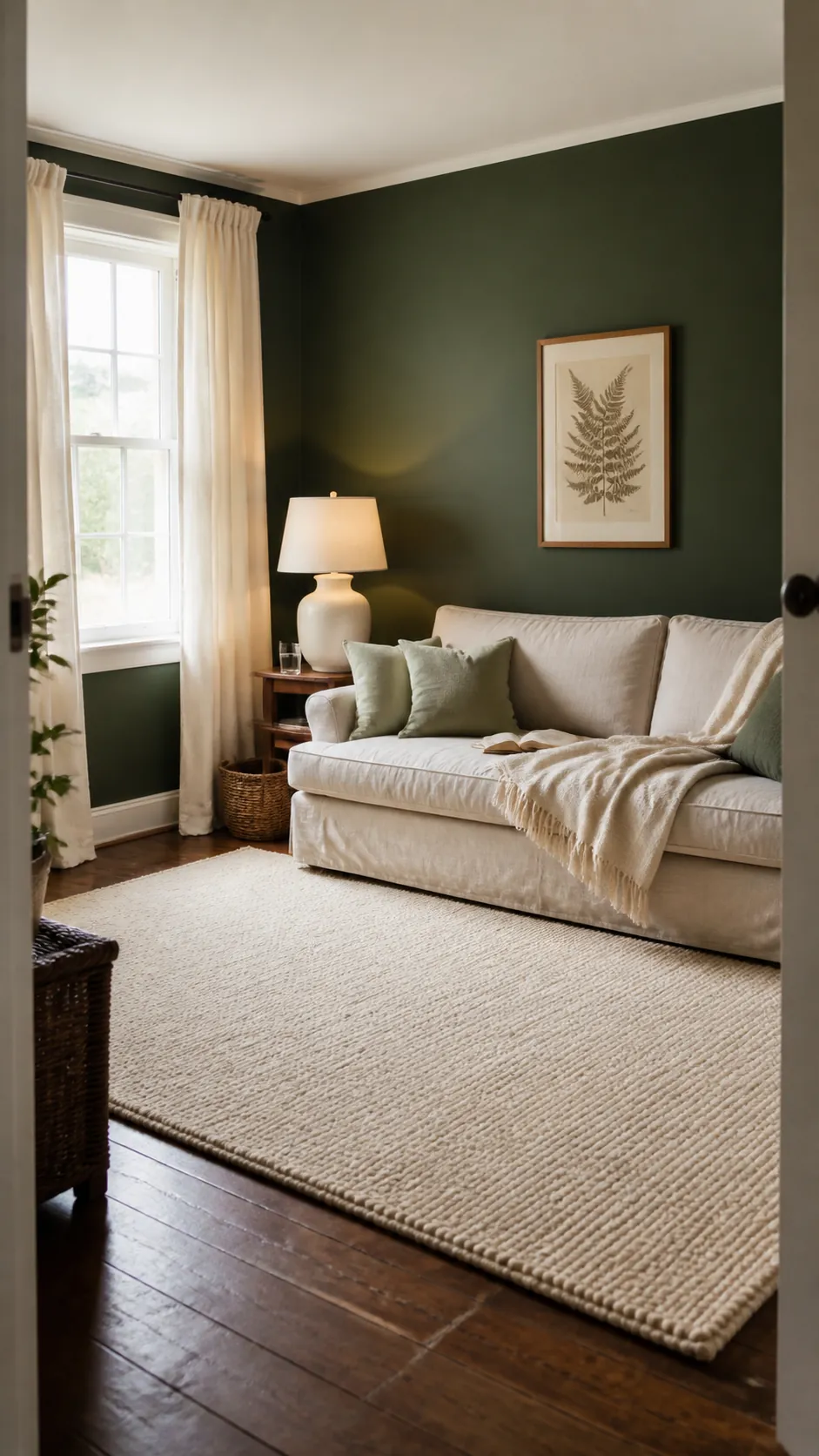
A soft warm white is the safest partner when dark green already covers a large surface. It reflects light without creating the clinical contrast that a brilliant cool white can produce. Look for cream, ivory, or chalky white with a restrained beige undertone.
Use it on ceilings, curtains, lampshades, and broad rugs so the eye gets places to rest. Large pale areas matter more than a handful of tiny white accessories, especially in a room with modest windows. Repeat the same white two or three times to make the choice look deliberate.
Camel and Tan Add Comfortable Warmth
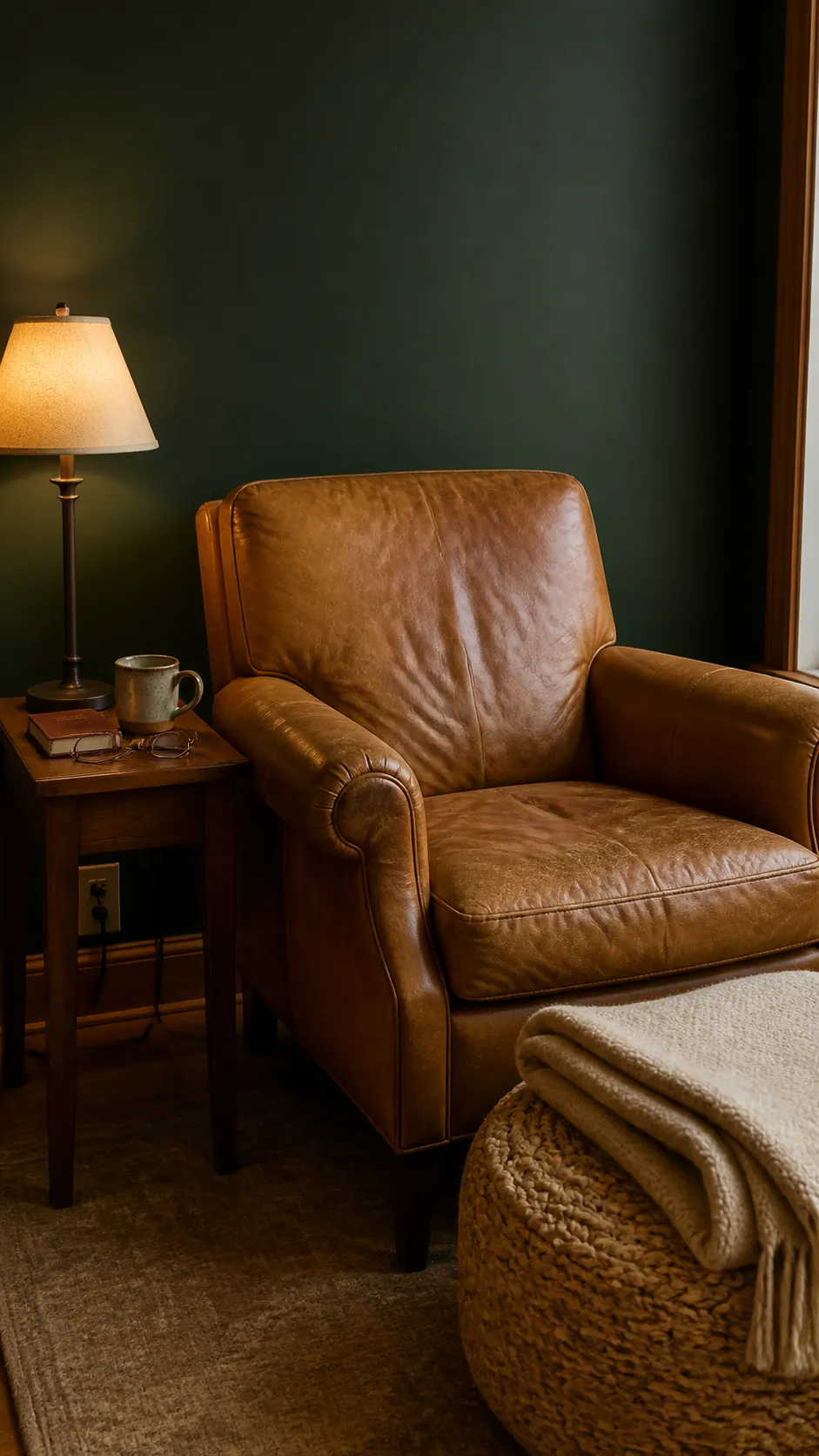
Camel, tan, and cognac soften the seriousness of dark green without fighting its natural character. They are particularly effective on leather, linen, wool, and woven storage because the material variation keeps the pairing from looking flat. A camel chair beside a dark green sofa can also separate two large blocks of color.
Choose a muted tan rather than a saturated orange brown when the room already has red flooring or cherry wood. If the green leans olive, a slightly toasted camel will feel harmonious. If it leans blue, a quieter mushroom tan usually creates a cleaner bridge.
Natural Wood Grounds the Palette
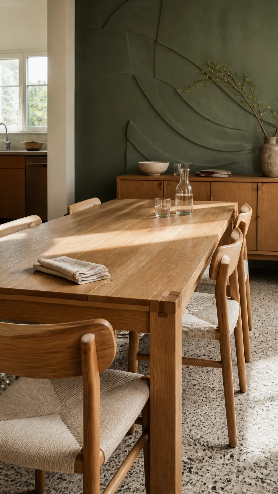
Natural wood gives dark green a believable organic context and introduces several warm tones at once. Pale oak keeps a compact room open, while walnut creates a richer and more formal mood. Medium oak often offers the easiest balance because it is warm enough to contrast but not so dark that it disappears.
Let visible grain do part of the decorating. A simple table, slatted cabinet, or timber frame is more useful than many small brown ornaments. Match the wood intensity to the available light, then repeat its tone in only one or two supporting details.
Blush and Dusty Rose Create Gentle Contrast
Muted pink sits near the opposite side of the color wheel, so it brings dark green forward without the seasonal effect of clear red. Dusty rose, plaster pink, and faded clay pink are easier to live with than sugary pastel shades. They work well in bedding, cushions, a small chair, or a patterned rug.
Keep the pink slightly grayed when the green is cool and forest like. With warmer olive green, choose a clay based blush that relates to earthy flooring. The most convincing result includes a neutral buffer such as oatmeal linen between the two colors.
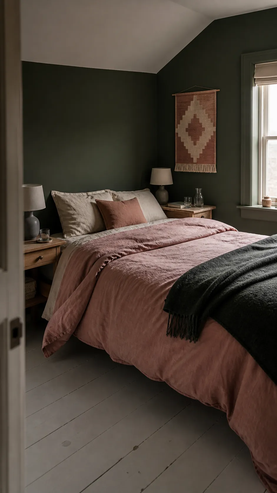
Terracotta and Rust Bring Energy
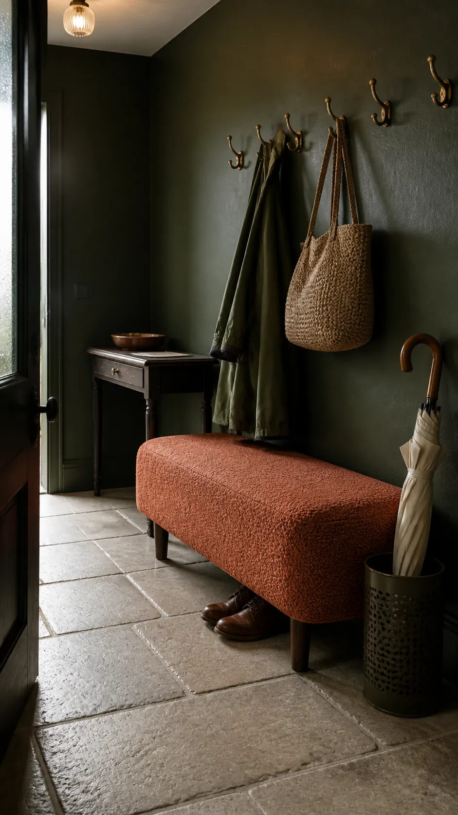
Terracotta and rust provide a stronger warm contrast than blush, making them useful when a dark green room feels visually sleepy. The pairing recalls foliage and fired earth, but it still needs restraint indoors. Choose one substantial rust element, such as a rug or lounge chair, rather than scattering many bright orange accents.
A patterned textile can blend green, rust, cream, and brown more smoothly than solid blocks can. Avoid a bright primary red, which can make the scheme feel festive. Lower saturation is the key to keeping complementary colors sophisticated.
Navy and Dusty Blue Build a Cooler Scheme
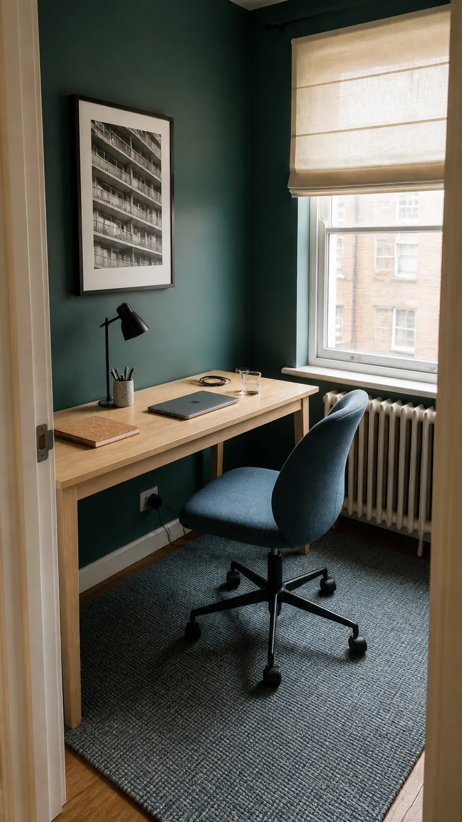
Blue and dark green sit comfortably together because both can read as quiet, natural colors. Navy makes a library or bedroom feel cocooning, while dusty blue introduces more visible separation. This approach works best when cream or pale wood remains present to prevent the room from becoming an unbroken dark mass.
Vary the textures when the values are close. Velvet green beside crisp blue cotton and a nubby cream throw is easier to read than three smooth fabrics. Use a patterned textile to confirm that the colors belong to the same planned palette.
Brass Gives Dark Green a Focus Point
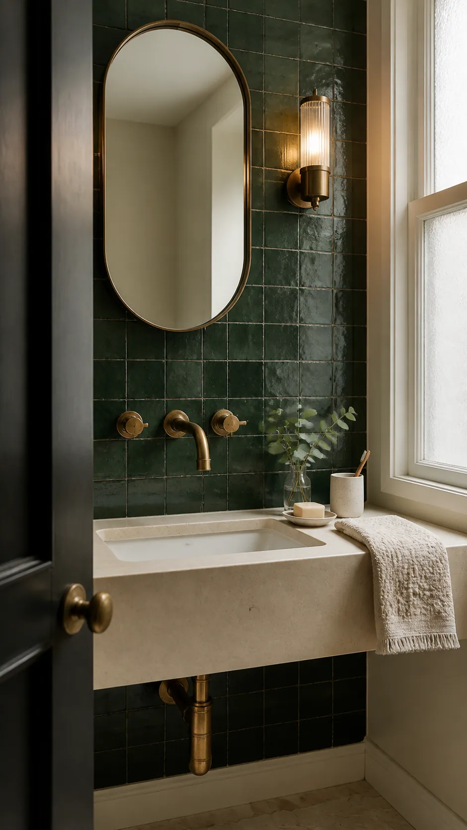
Brass, bronze, and warm metallic finishes catch light that dark green tends to absorb. A lamp, cabinet handle, mirror edge, or picture light can create enough sparkle without turning the room formal. Aged or brushed finishes usually feel more natural than highly polished yellow metal.
Treat metal as an accent rather than a full secondary color. Repeat it in a few small functional pieces and stop before every fixture matches. Mixed metals can work when their finish is similarly subdued and one clearly remains dominant.
Black and Charcoal Need Plenty of Relief
Black can sharpen a dark green interior color palette through thin outlines, legs, frames, and hardware. Charcoal upholstery can also work in a bright room, but large black seating against dark green walls often removes too much visual separation. The room then needs a generous pale rug, light curtains, and clear pools of lamplight.
Before committing, photograph the room at morning, afternoon, and night. Samples should sit beside the actual floor and largest textile rather than on an empty wall. The best match is the one that corrects the room under its weakest light, not only the one that looks appealing on a screen.